[RU]
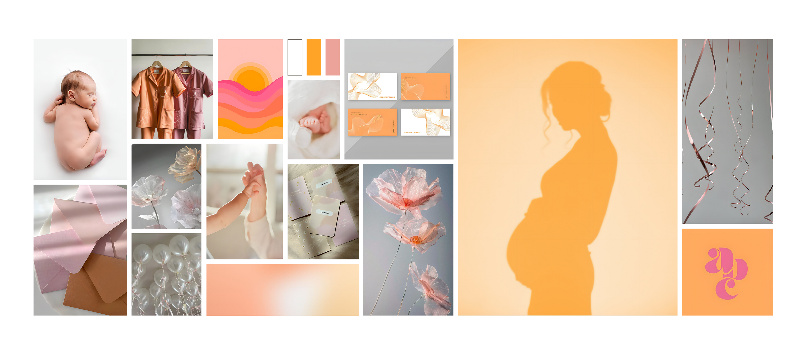
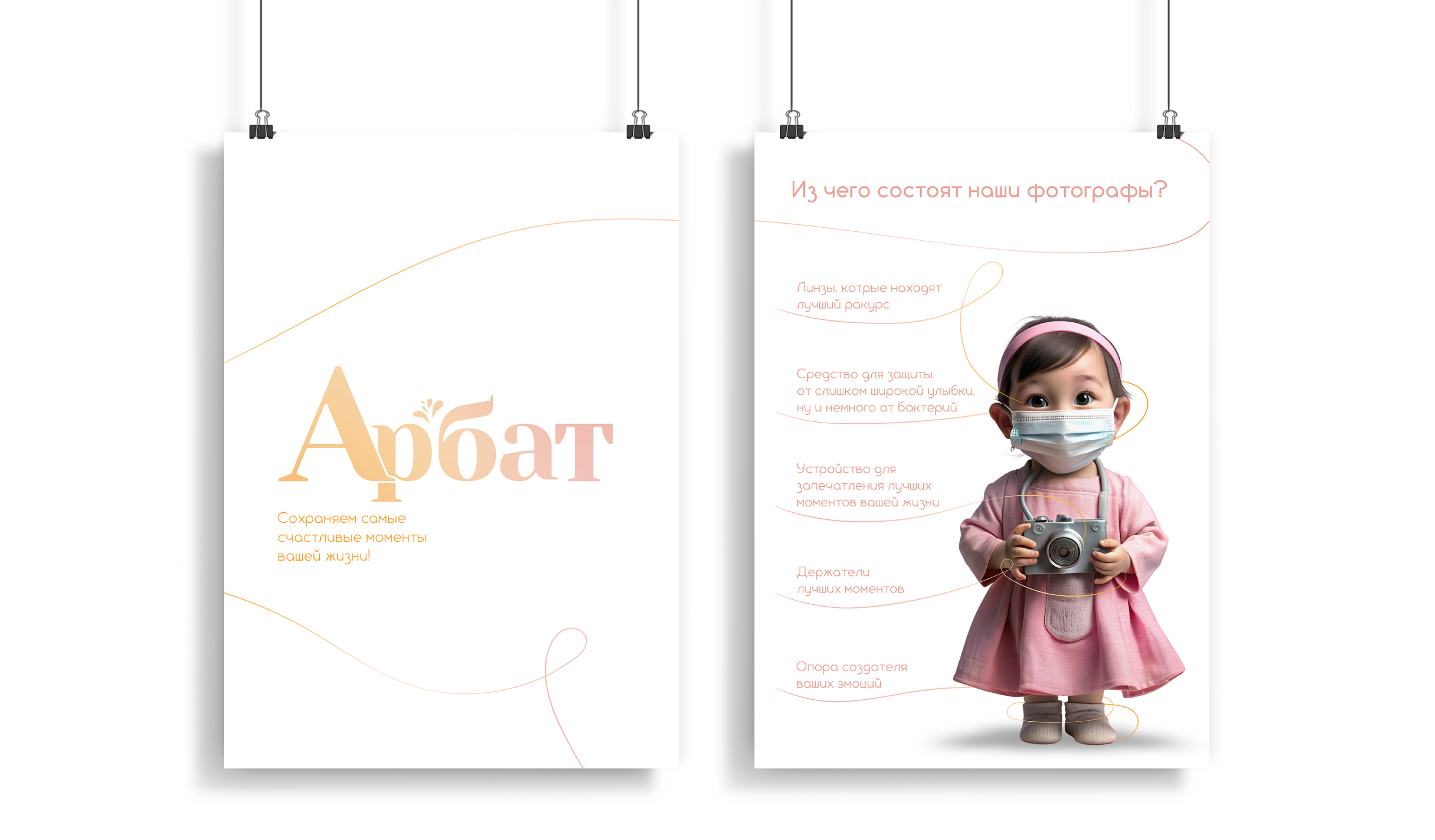
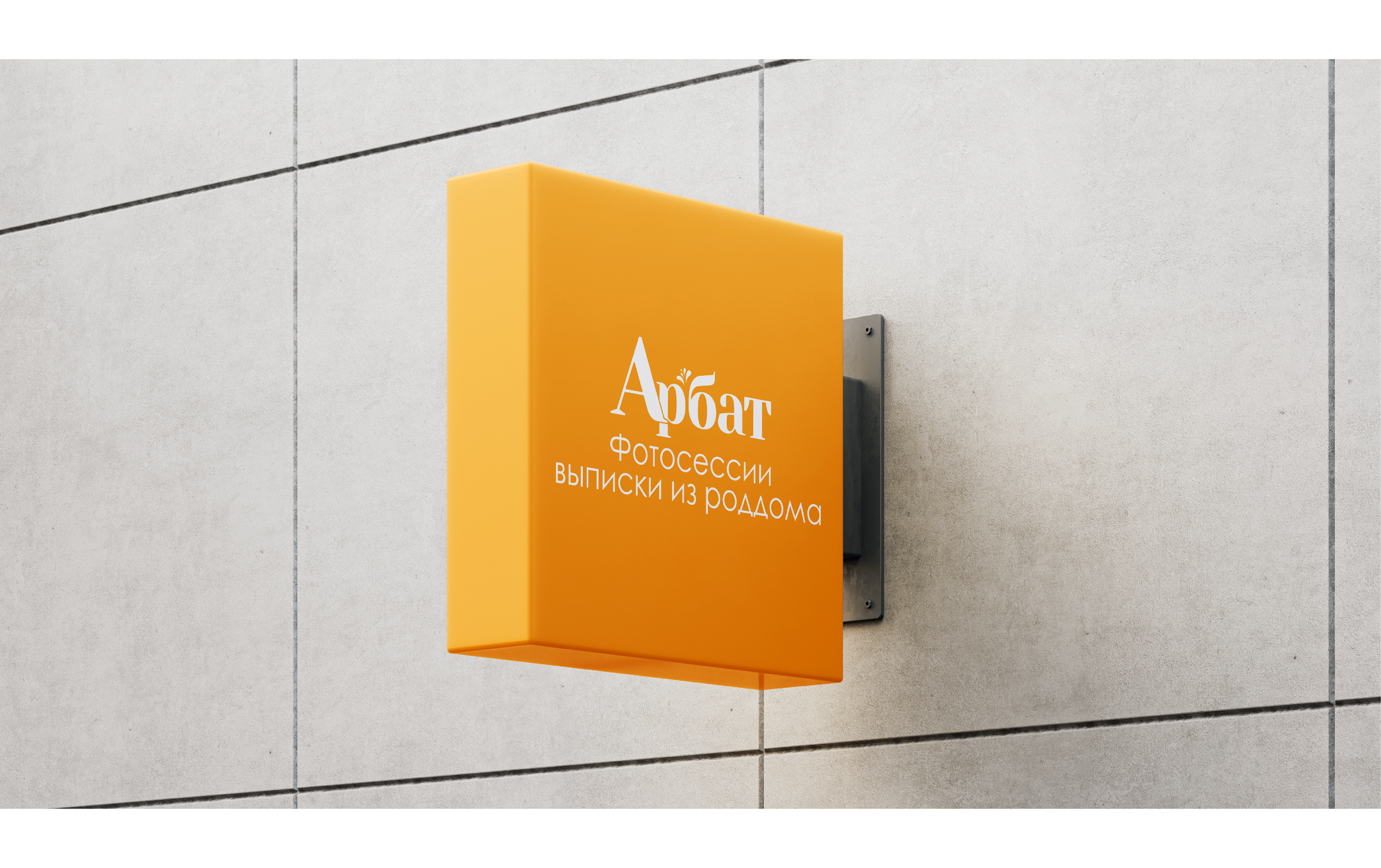
Арбат — фотостудия, оказывающая профессиональные услуги репортажной фотосъёмки в роддомах.
Основная миссия бренда — сохранить память людей о самом долгожданном событии после рождения ребёнка — выписке из роддома.
Задача — разработать фирменный стиль, сохраняя позиционирование бренда: умеренная строгость,
как знак качества, и счастливые эмоции, характеризующие само событие съемок.
[ENG]
Arbat is a photo studio providing professional reportage photography services in maternity hospitals.
The main mission of the brand is to preserve people's memory of the most long-awaited event after the birth
of a child - discharge from the maternity hospital.
The task is to develop a corporate style, keeping the brand positioning: moderate strictness, as a sign
of quality, and happy emotions, characterizing the very event of filming.
Дизайнер — janapelka.dsgn
[RU]
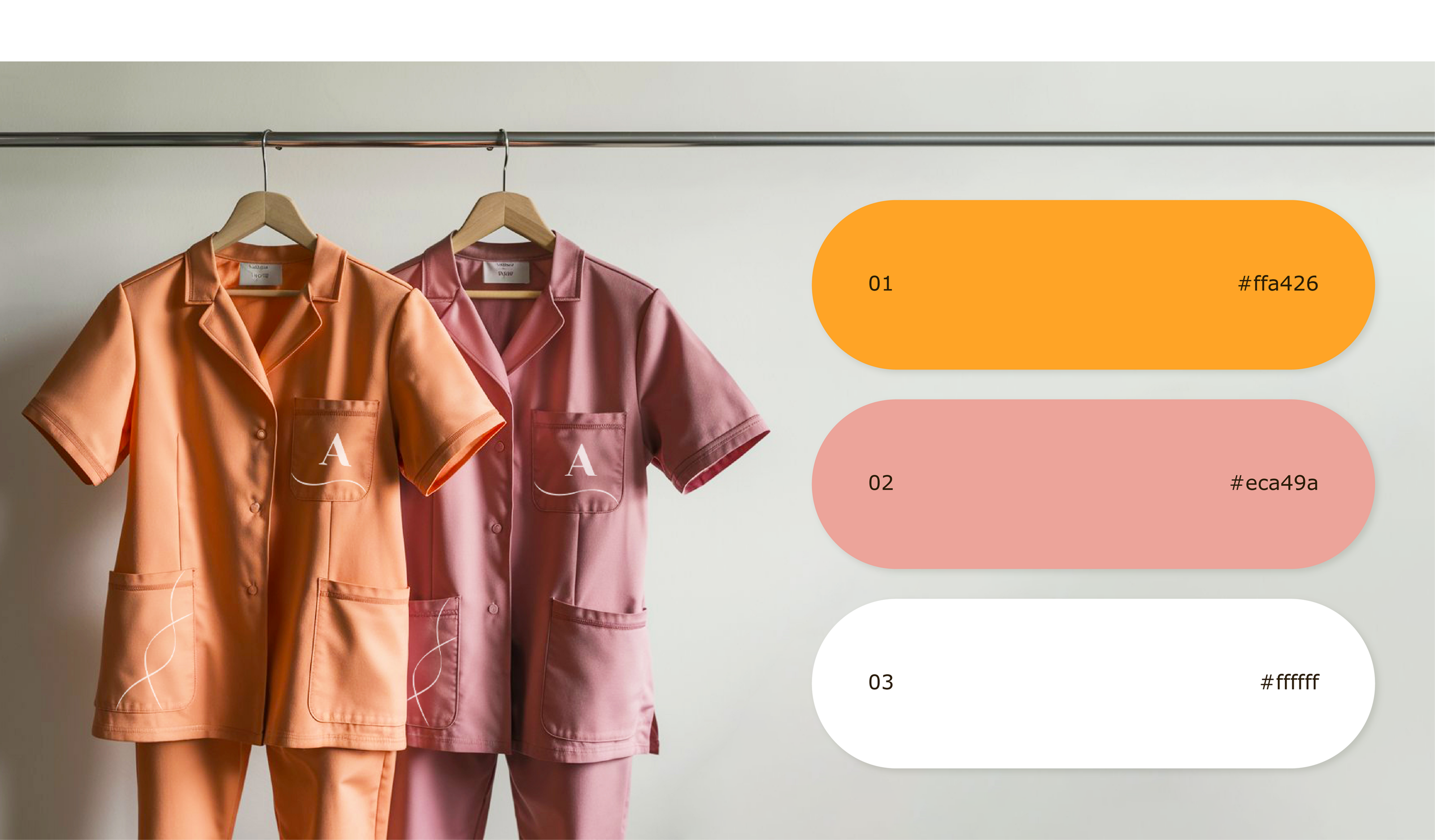
Решение — за основу был взят шрифт с закруглёнными засечками для придания серьёзности бренда и добавлен графический элемент, в виде капель воды, между буквами Р и Б, чтобы напомнить об основной его миссии (счастливые эмоции). Фирменные цвета логотипа отводят серьёзность на второй план, чтобы не запутать целевую аудиторию компании, и еще больше окунуть её в ощущение радости и беззаботного детства.
[ENG]
Solution — a font with rounded serifs was taken as a basis to give seriousness to the brand and a graphic element in the form of water drops was added between the letters P and B to remind about its main mission (happy emotions). The corporate colors of the logo put seriousness on the back burner so as not to confuse the company's target audience, and to plunge them even more into the feeling of joy and carefree childhood.
СПАСИБО ЗА ИНТЕРЕС К МОЕЙ РАБОТЕ!
Меня зовут - Диана. Я графический дизайнер.
Вы можете связаться со мной и мы обсудим все детали работы.
THANK YOU FOR YOUR INTEREST IN MY WORK!
My name is Diana. I'm a graphic designer.
You can contact me and we will discuss all the details of the job.
КОНТАКТЫ | CONTACTS
What's App | Telegram | Instagram