The design concept of the kombucha | clear mind | packaging and branding by Sofya Grazhevich | 2024

What is kombucha?
Kombucha, also known as "tea mushroom", is a fermented drink that is made on the basis of sweet tea and a symbiotic culture of bacteria and yeast. This drink has been around for thousands of years and is traditional in some cultures, where it is revered for its many beneficial properties.
The concept of the "clear mind" brand
In today's world, where information overload, stress and a sedentary lifestyle have become the norm, we all need something that will help keep our minds clear and improve our physical well-being. People strive for harmony in life, for a state where they can successfully manage their responsibilities while simultaneously enjoying moments of rest and relaxation. That's why I decided to create a kombucha, which is not only useful, but also aimed at cleansing and restoring the body. "Clear mind” helps to free the mind from unnecessary worries and restore harmony to the body.
Idea:
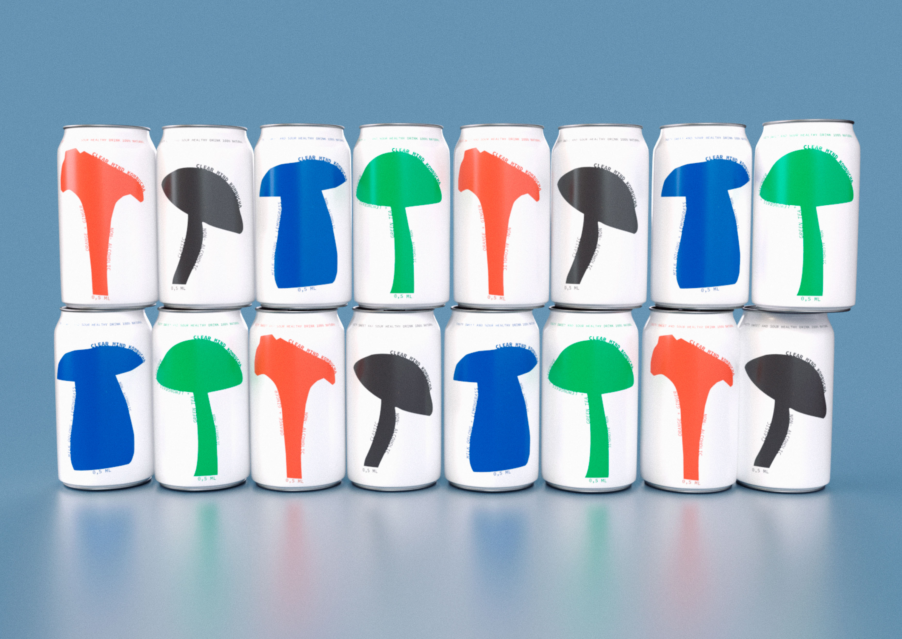
It's just colorful mushrooms!
The mission of the "clear mind" brand
The brand's mission is to support each person on their way to harmony between work and leisure by offering a natural and refreshing drink that promotes mental clarity and inner peace. I believe that a combination of health care and pleasure can help people achieve a state of "life-balance", which ultimately leads to a happier and more productive life. The brand strives for a world where taking care of mental and physical health becomes a natural part of everyday life. "Clear Mind" is a kombucha brand that supports people on this path, helping them maintain mental clarity and inner balance.
Clear your mind with my combo!
I wish you a pleasant viewing and good day
Packaging and visual identity
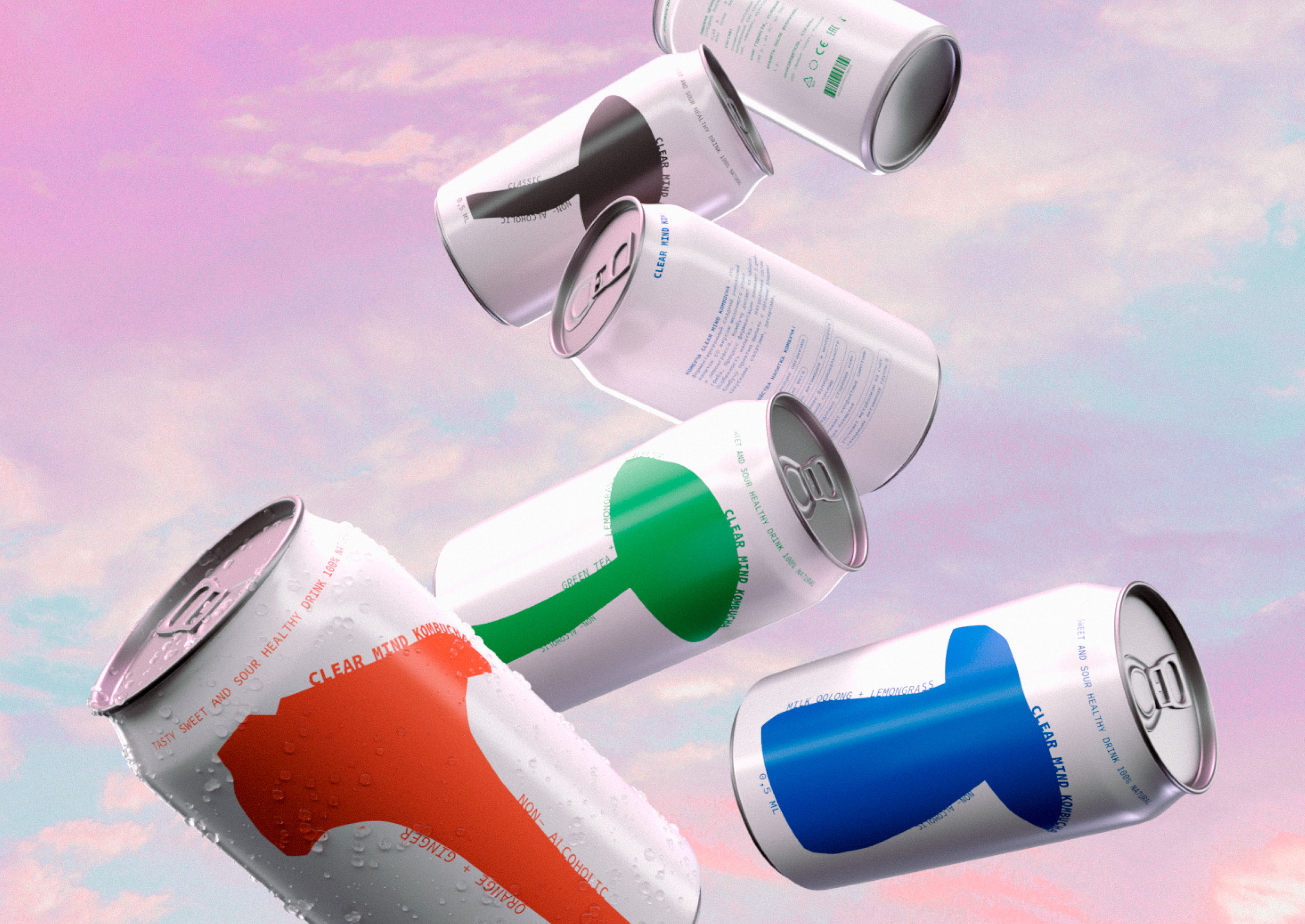
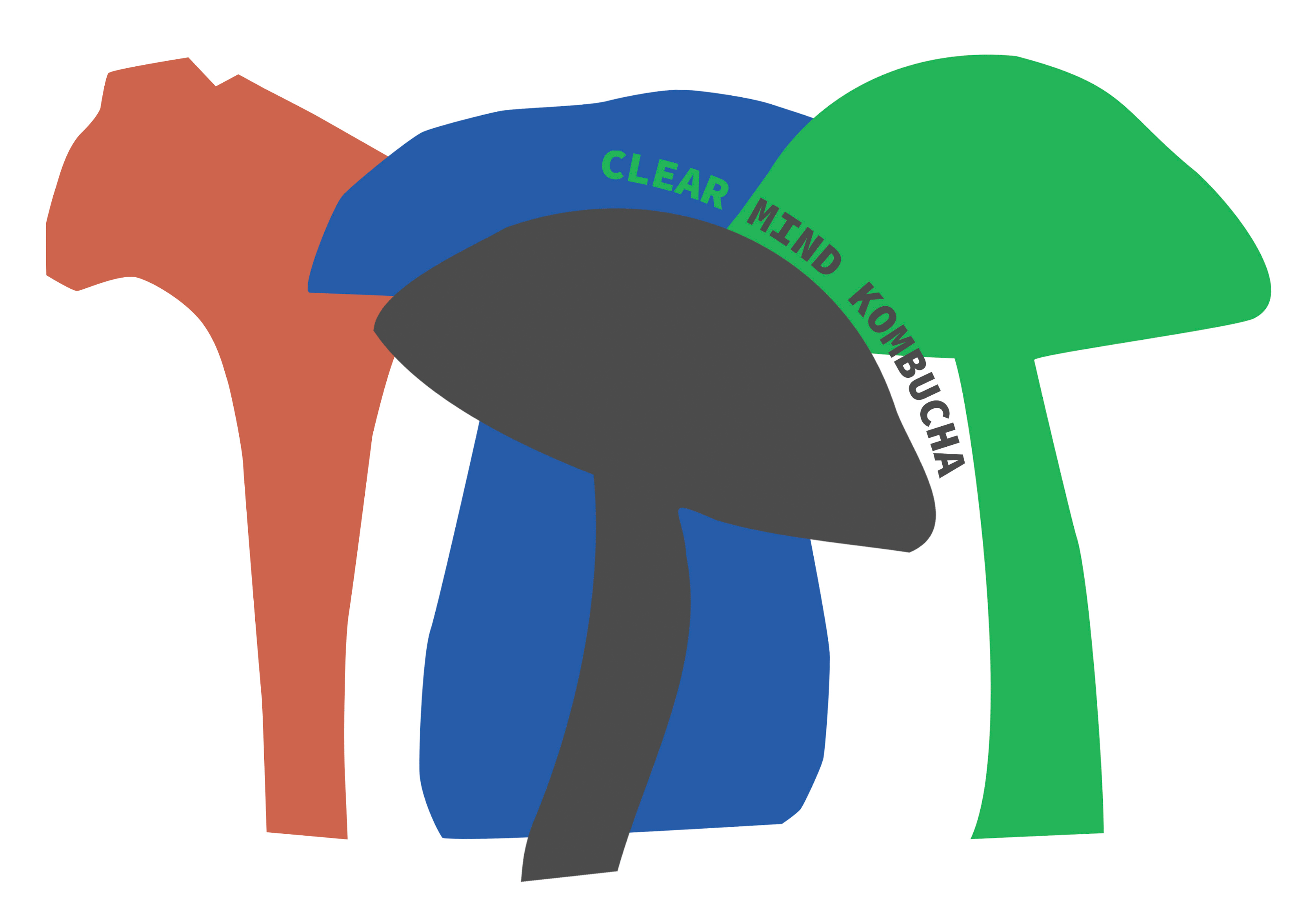
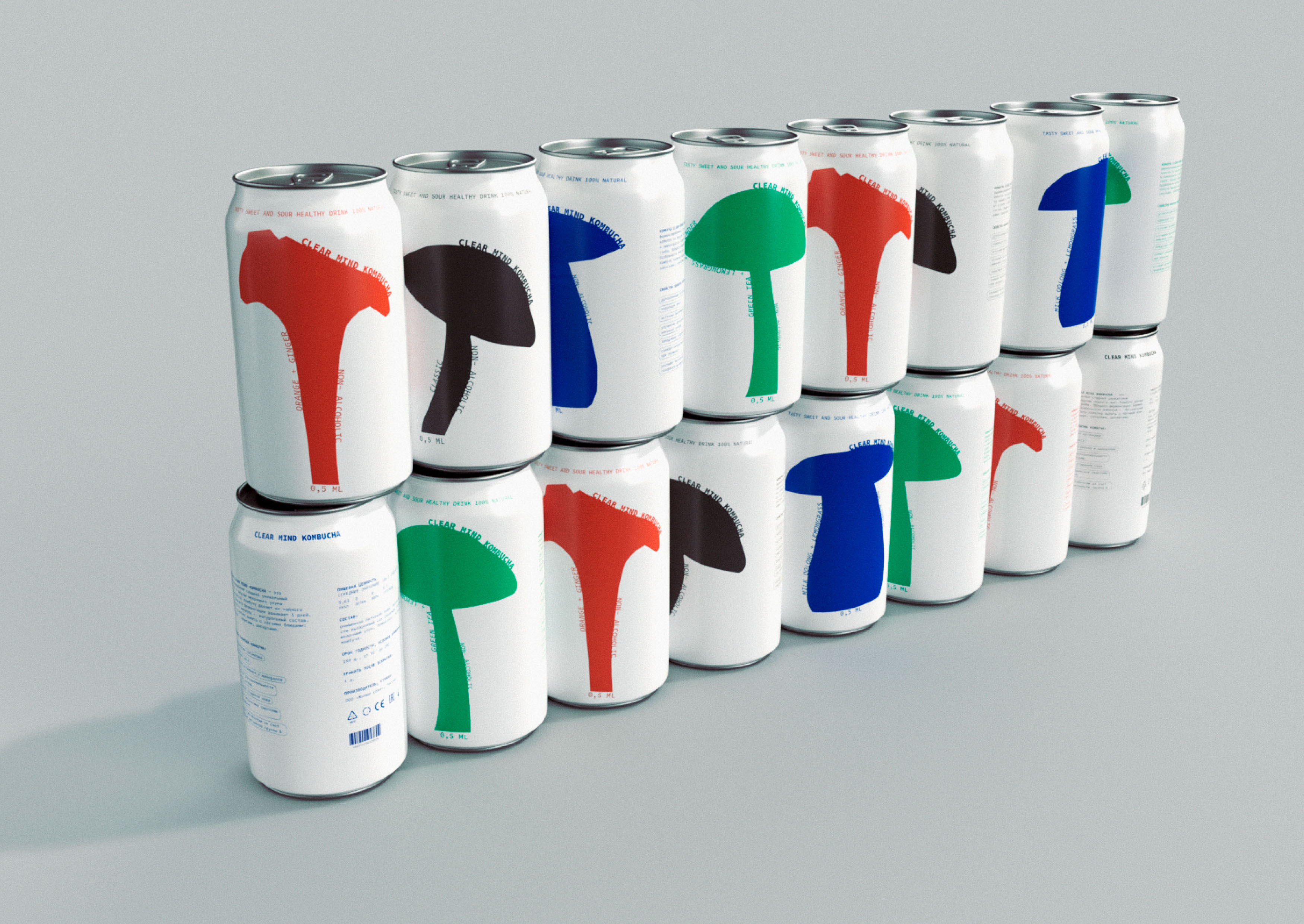
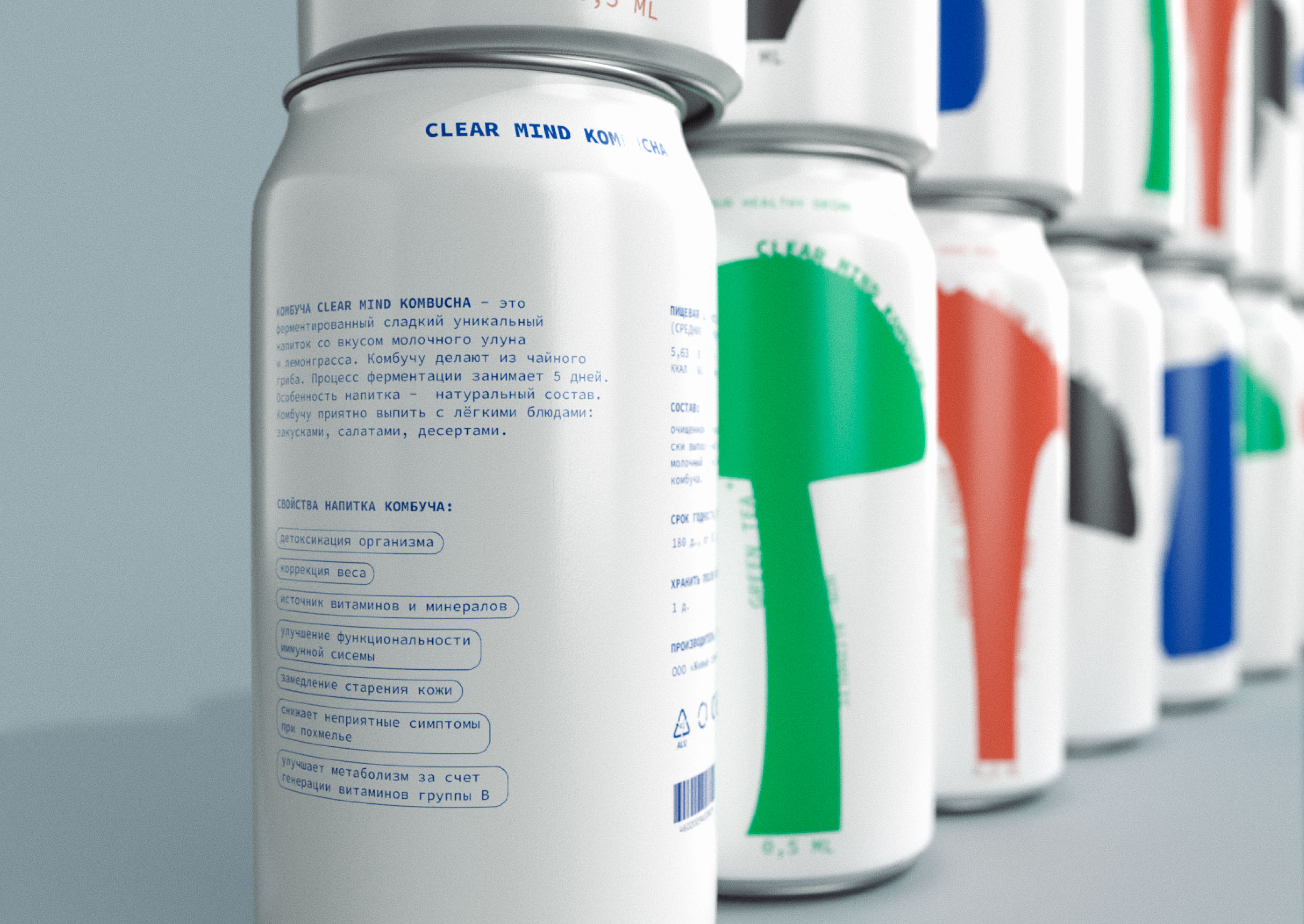
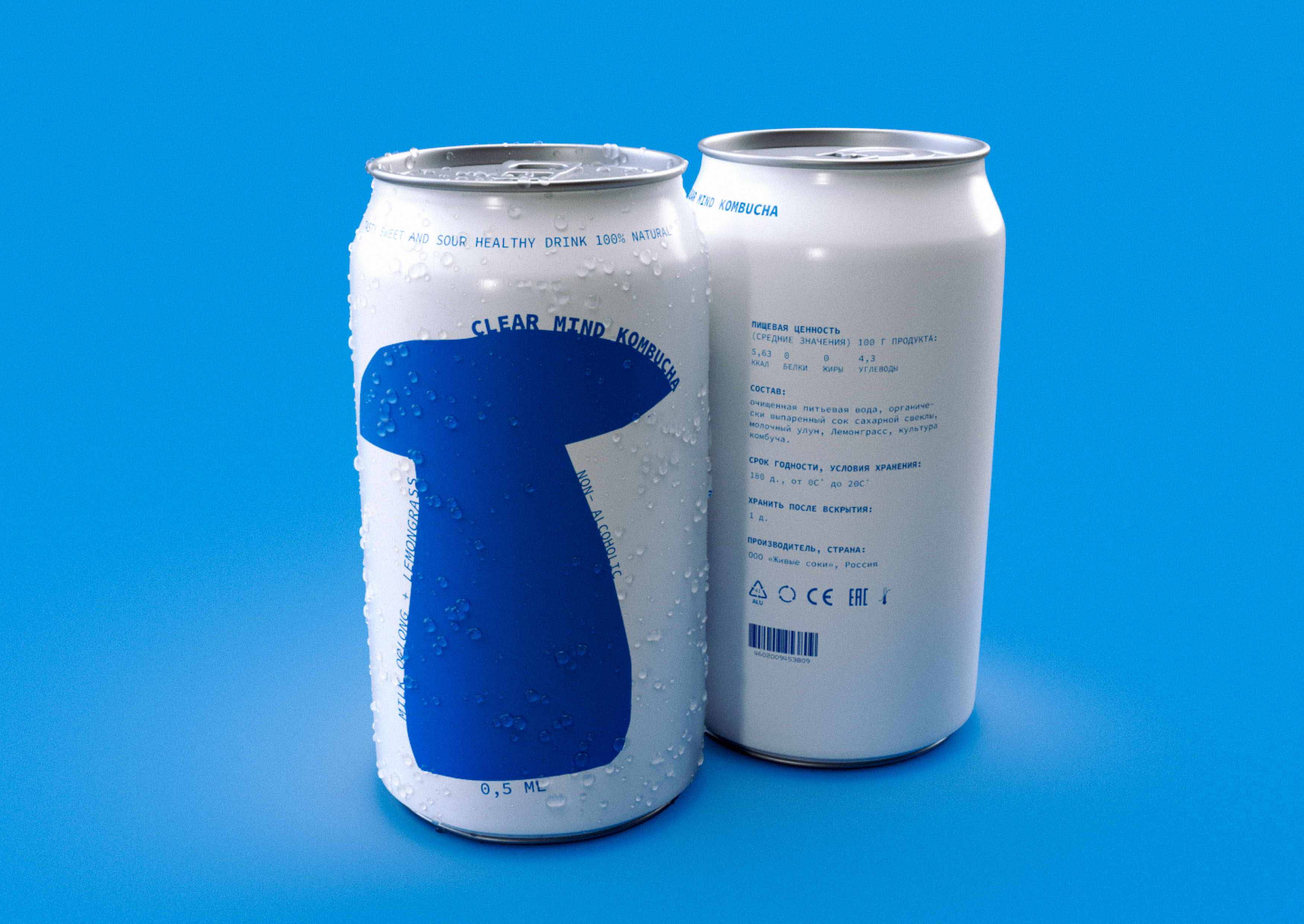
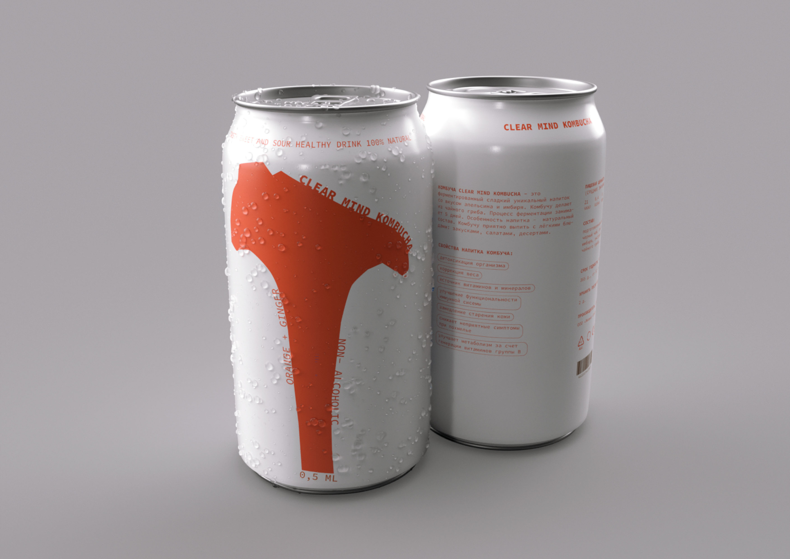
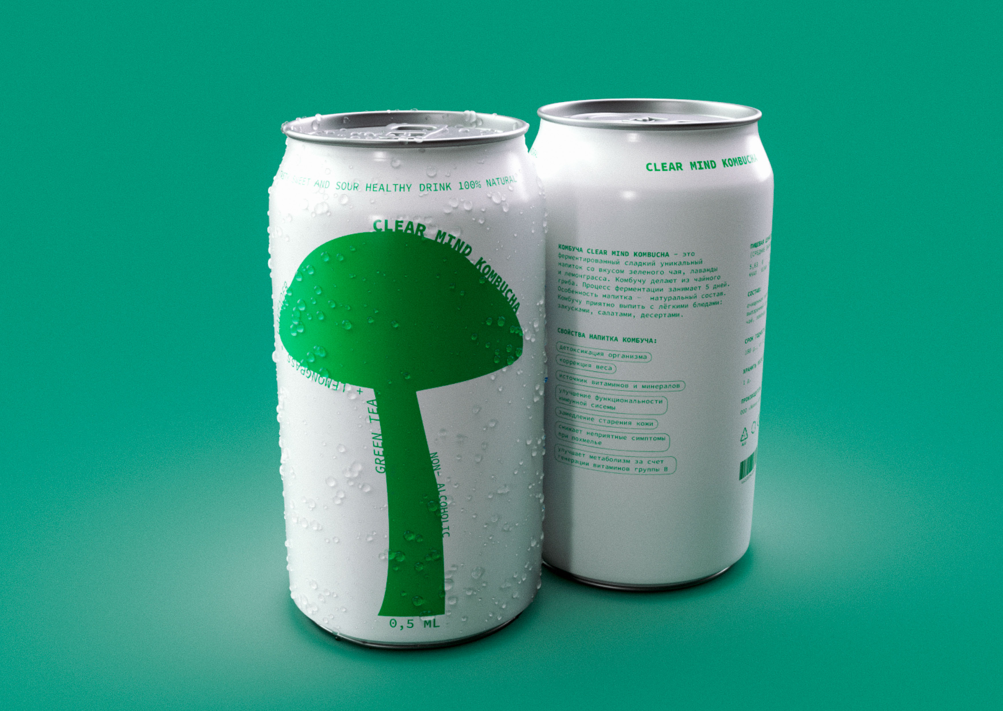
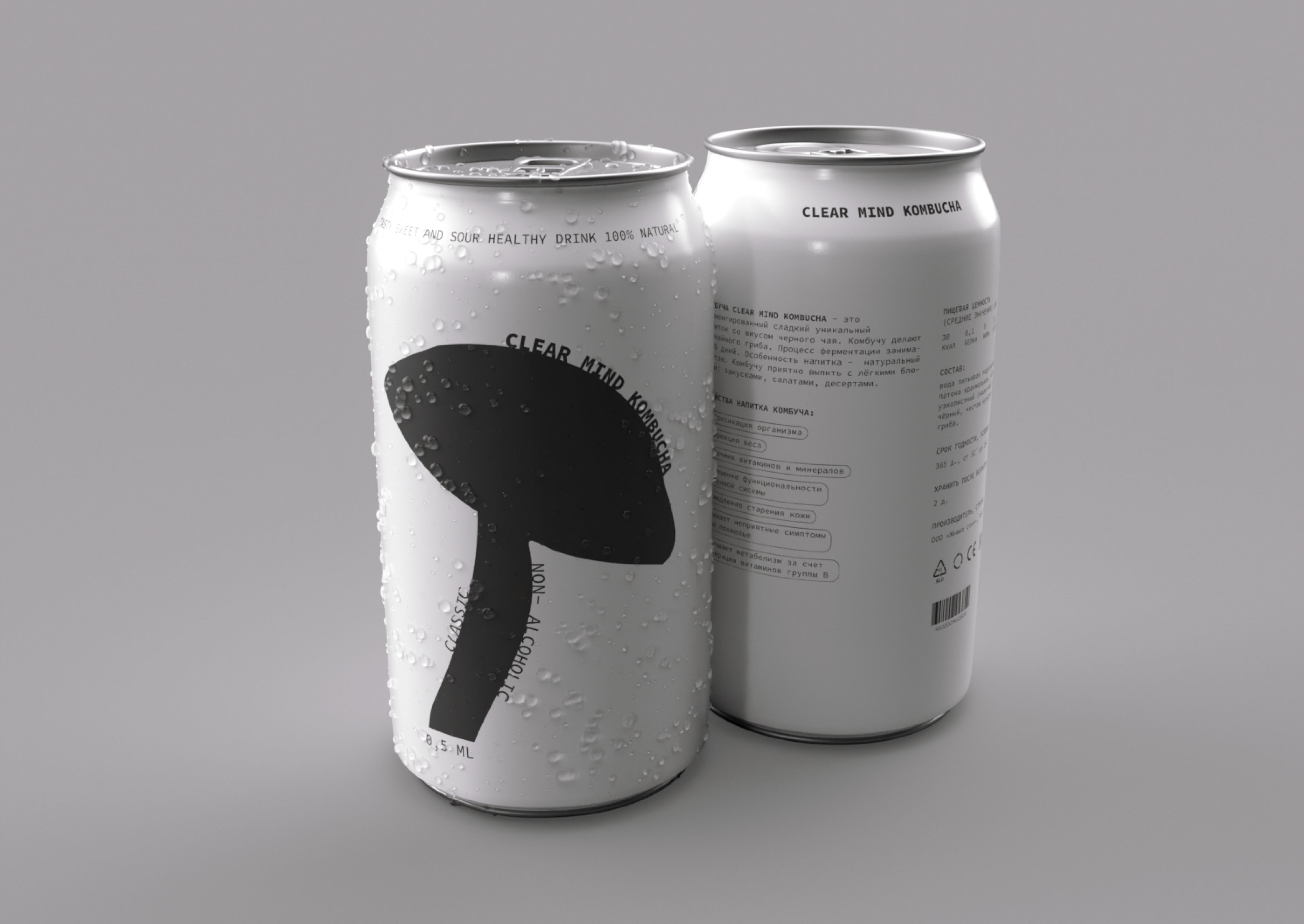
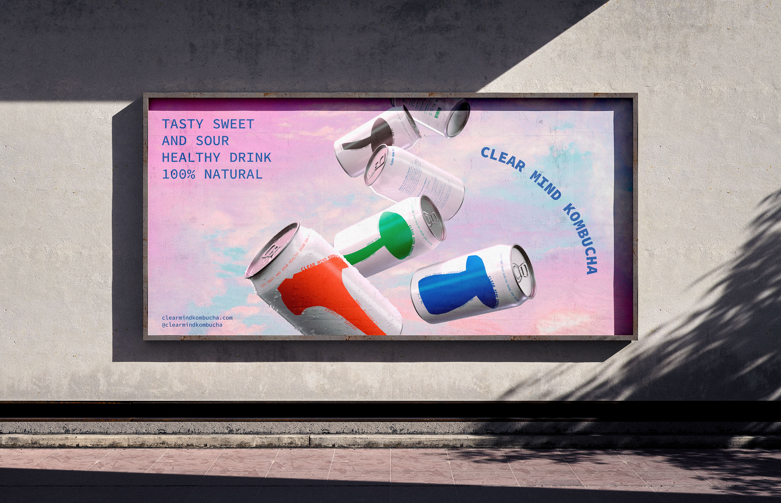
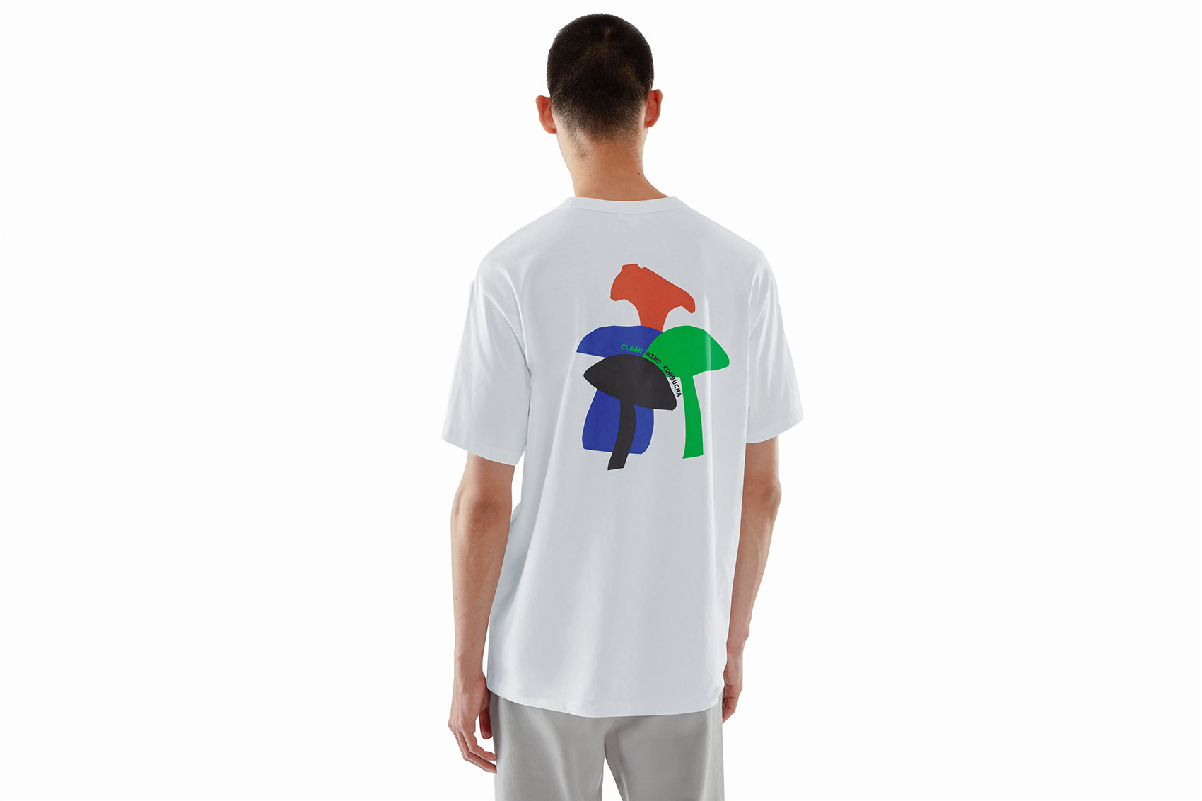
The "Clear Mind" packaging is a continuation of the "life-balance" philosophy. It is bright, but not overloaded with details, easy to perceive, but with elements of fun. "Clear Mind" differs from other brands in its simplicity and lightness, reflected in the packaging design and in the product itself. Such a kombucha is not only useful, but also visually understandable for everyone. Kombucha is also known as kombucha, so each aluminum jar has a minimalistic illustration of different types of mushrooms. What could be simpler and clearer? This is a reflection of the lightness, simplicity and joy that I want to bring to the lives of the brand's customers. The color scheme of the packaging corresponds to the philosophy of each taste: each jar has only one main color, nothing superfluous. If you put a ruler in a row, you will get a “mushroom forest” - this is a reference to the development of a community where everyone can get help, support and motivation.
Brand values
Harmony: I believe in the importance of balance between different aspects of life. The product is designed to help people find this balance.
Simplicity: In a complex world full of stress and responsibilities, I offer a simple solution to maintain health and good mood.
Fun: the brand was created to bring joy. I believe that fun and joy are important components of a happy life for every person.
Mindfulness: The brand encourages a conscious approach to life, where every moment is valuable and can be filled with meaning and joy.
Health: The brand takes care of the physical and mental health of its customers by offering a natural product that supports their well-being.

The design concept of the kombucha | clear mind | packaging and branding by Sofya Grazhevich | 2024
art-direction & packing design — Sofya Grazhevich
curators — Leonid Slavin, Evgeny Razumov
master's degree: HSE ART AND DESIGN SCHOOL
Instagram: sofarsofya
my telegram channel
Publications:
thanks for watching and have a nice day!