Brand Identity
- Villa GComi
EN
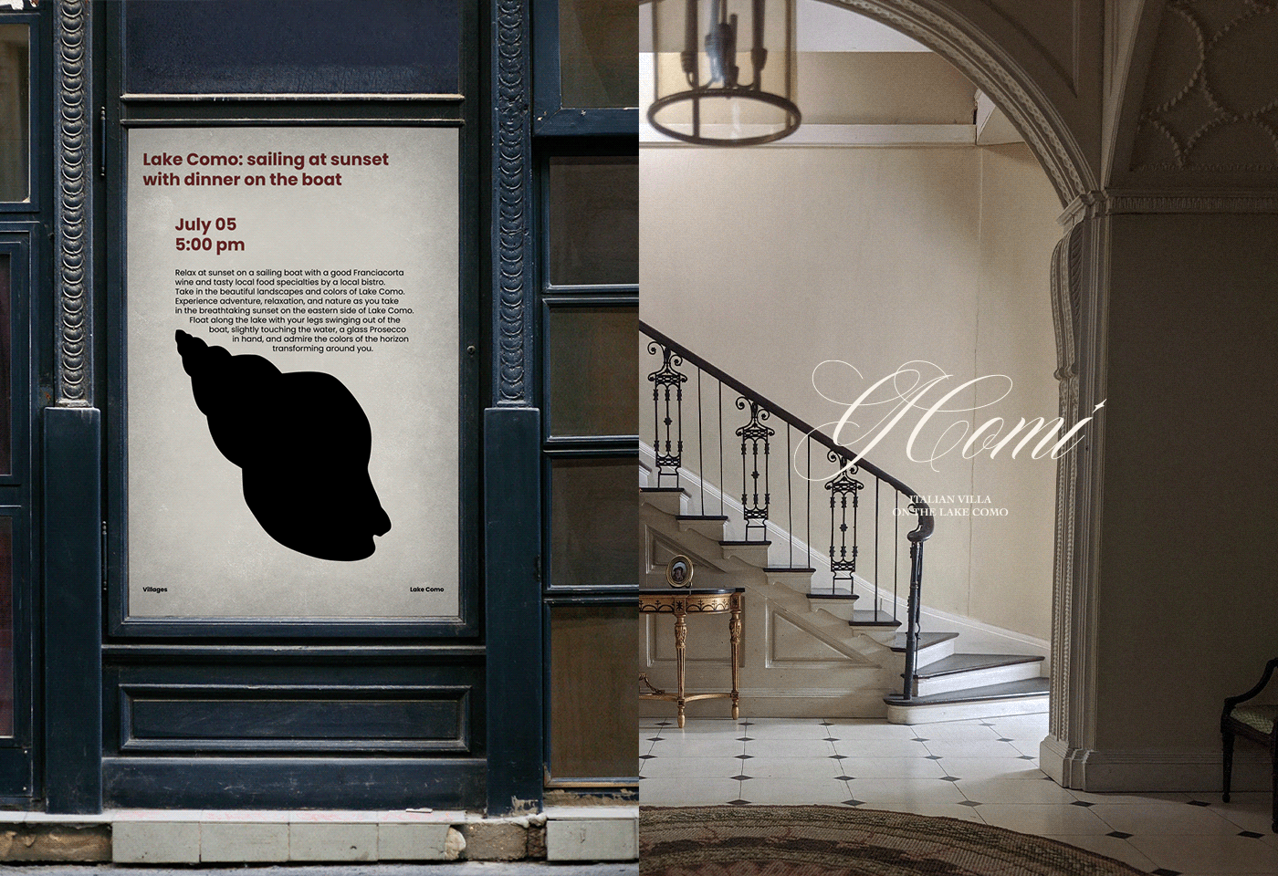
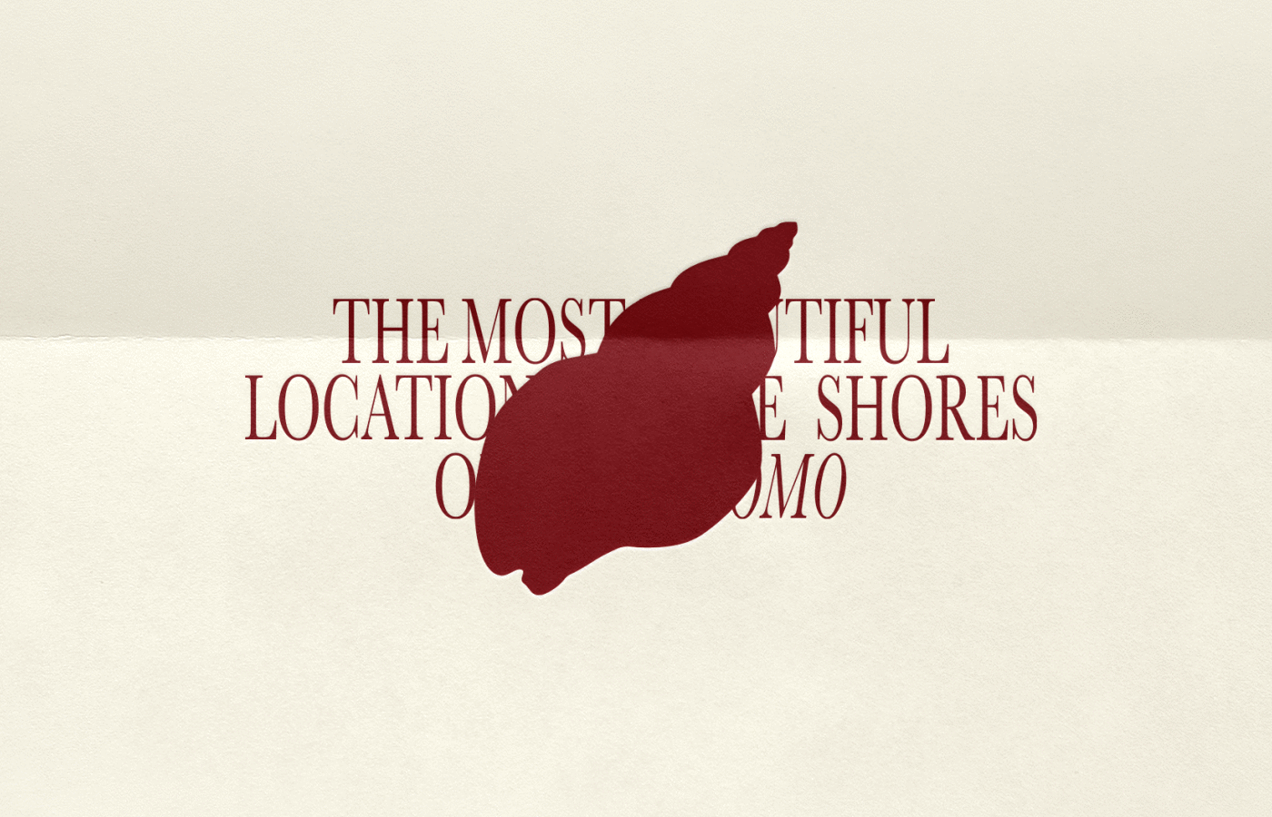
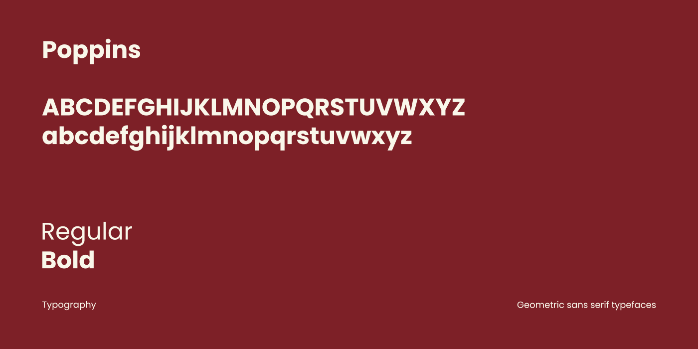
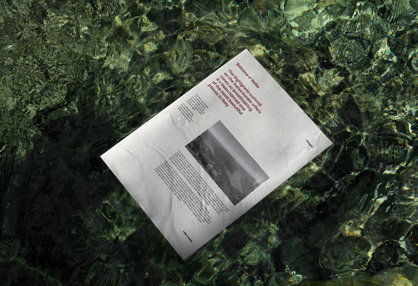
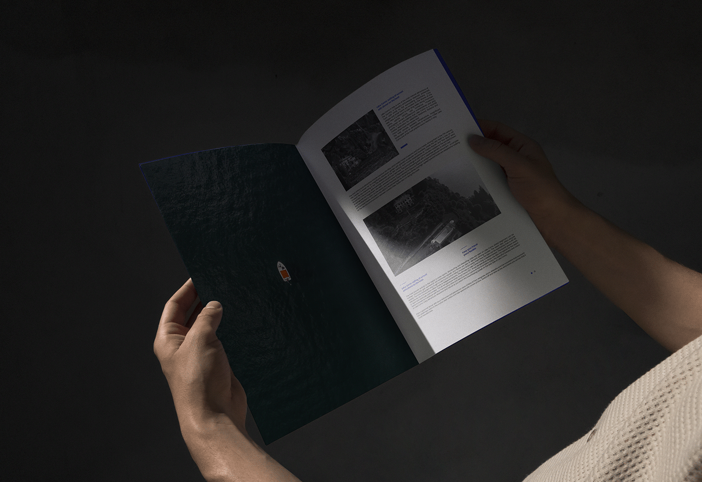
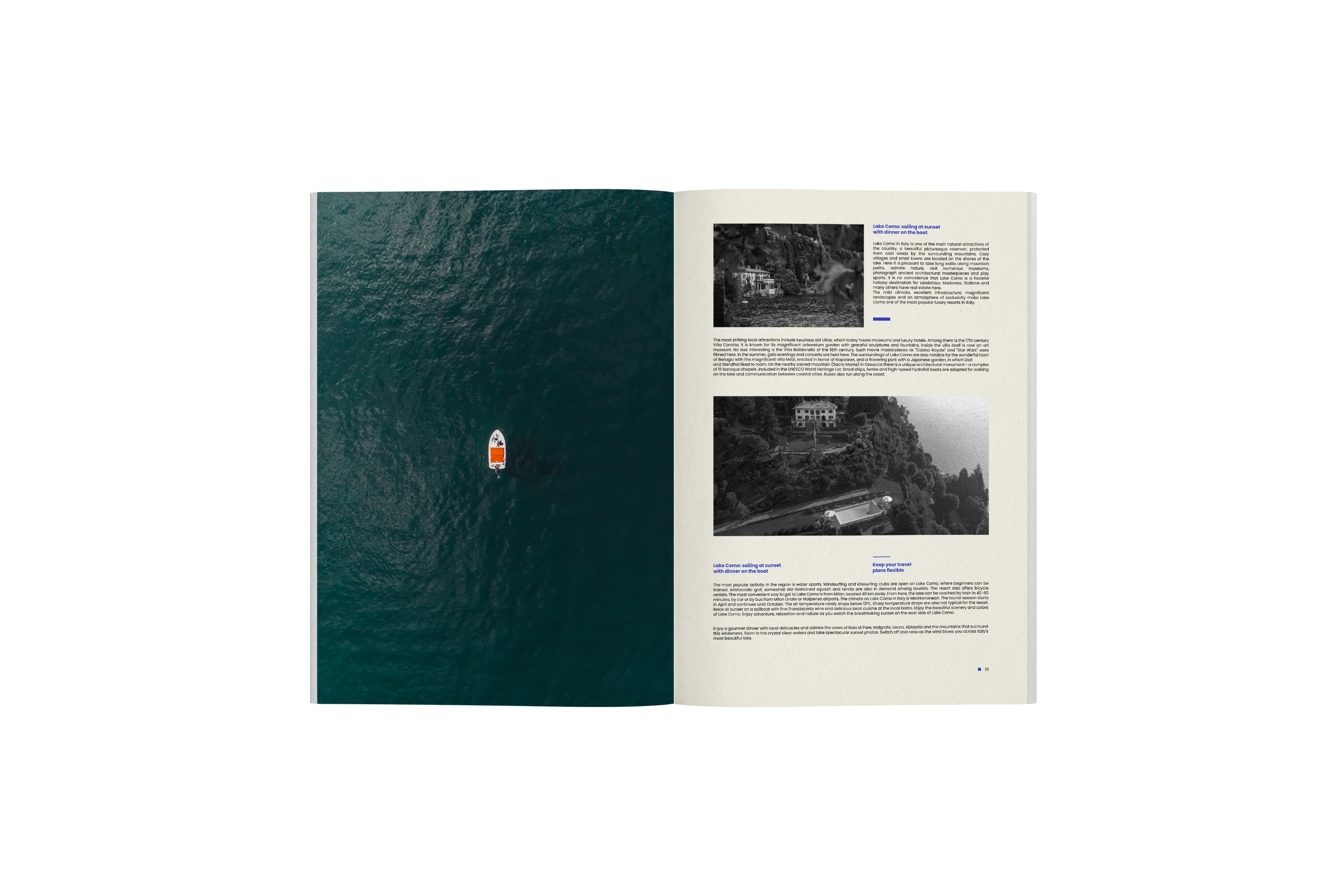
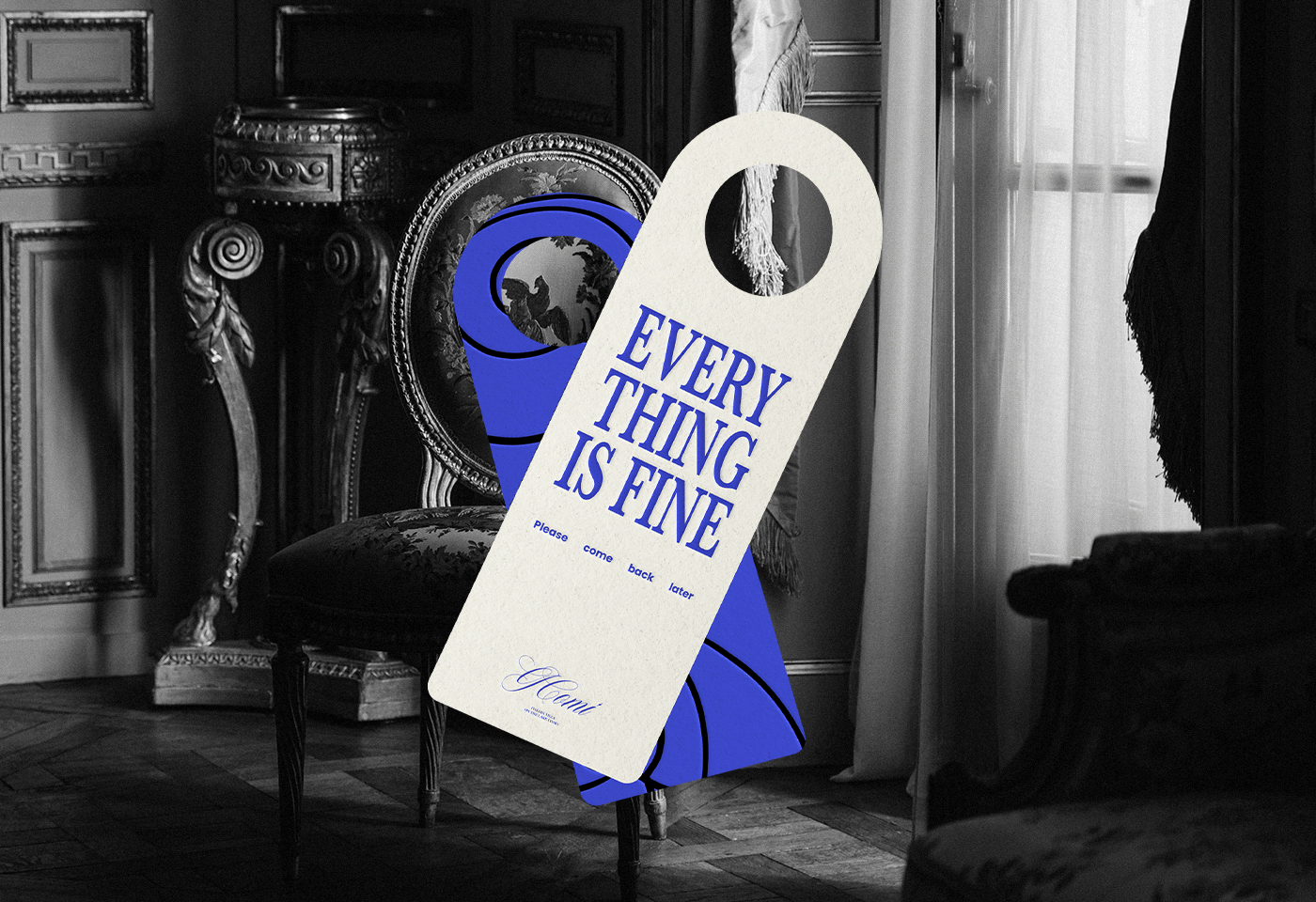
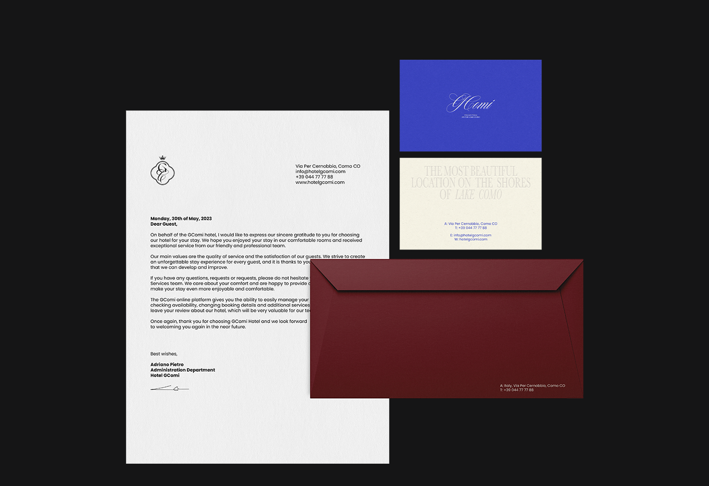
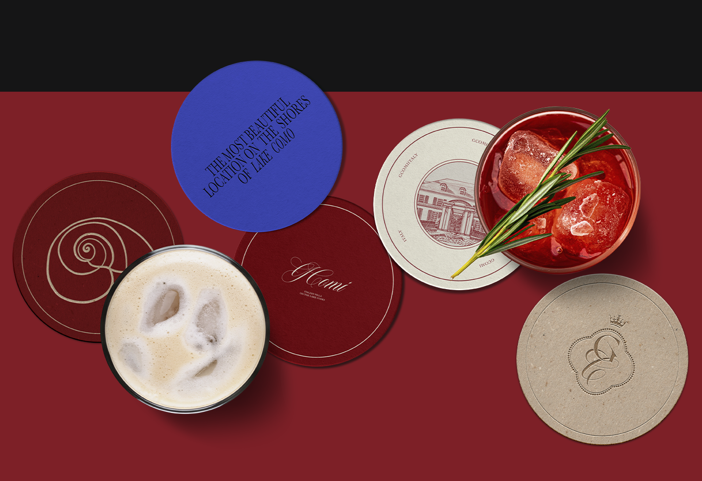
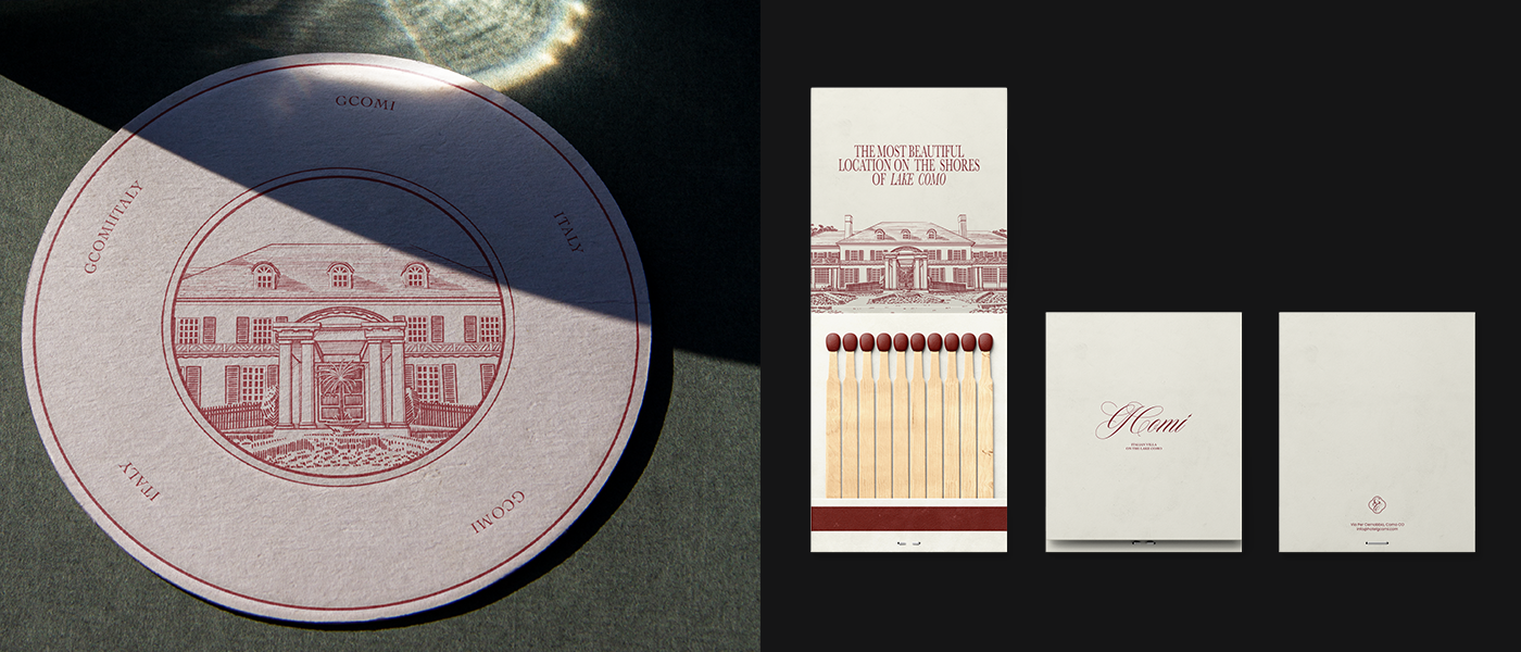
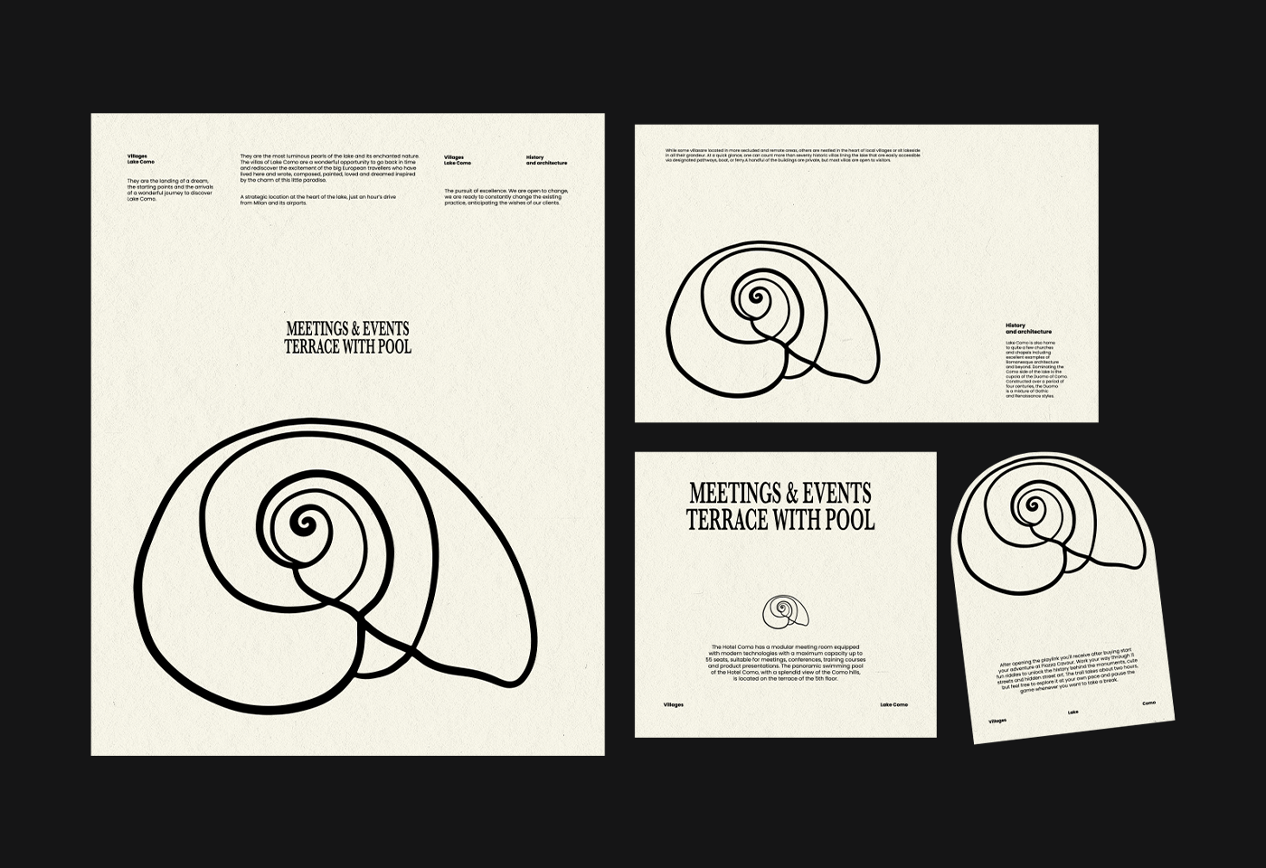
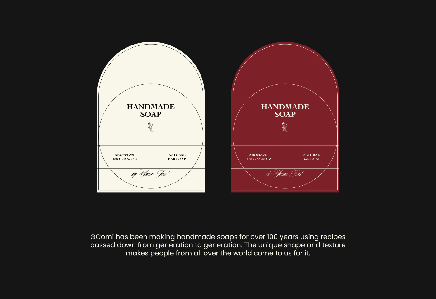
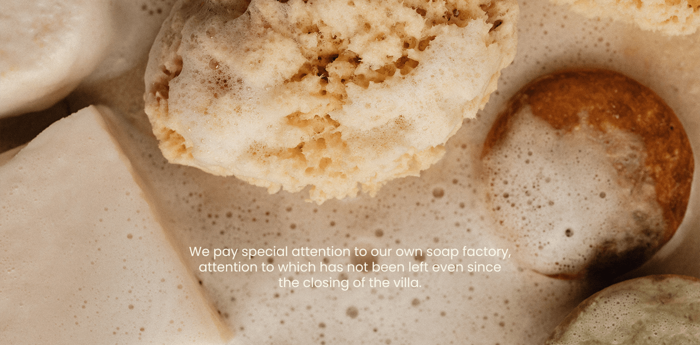
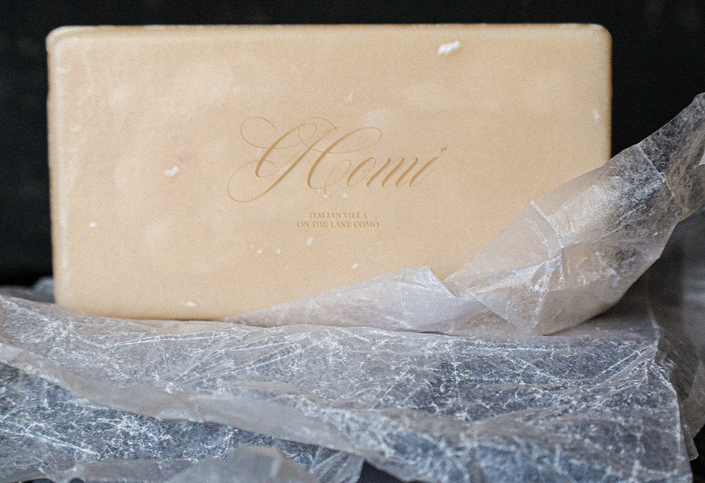
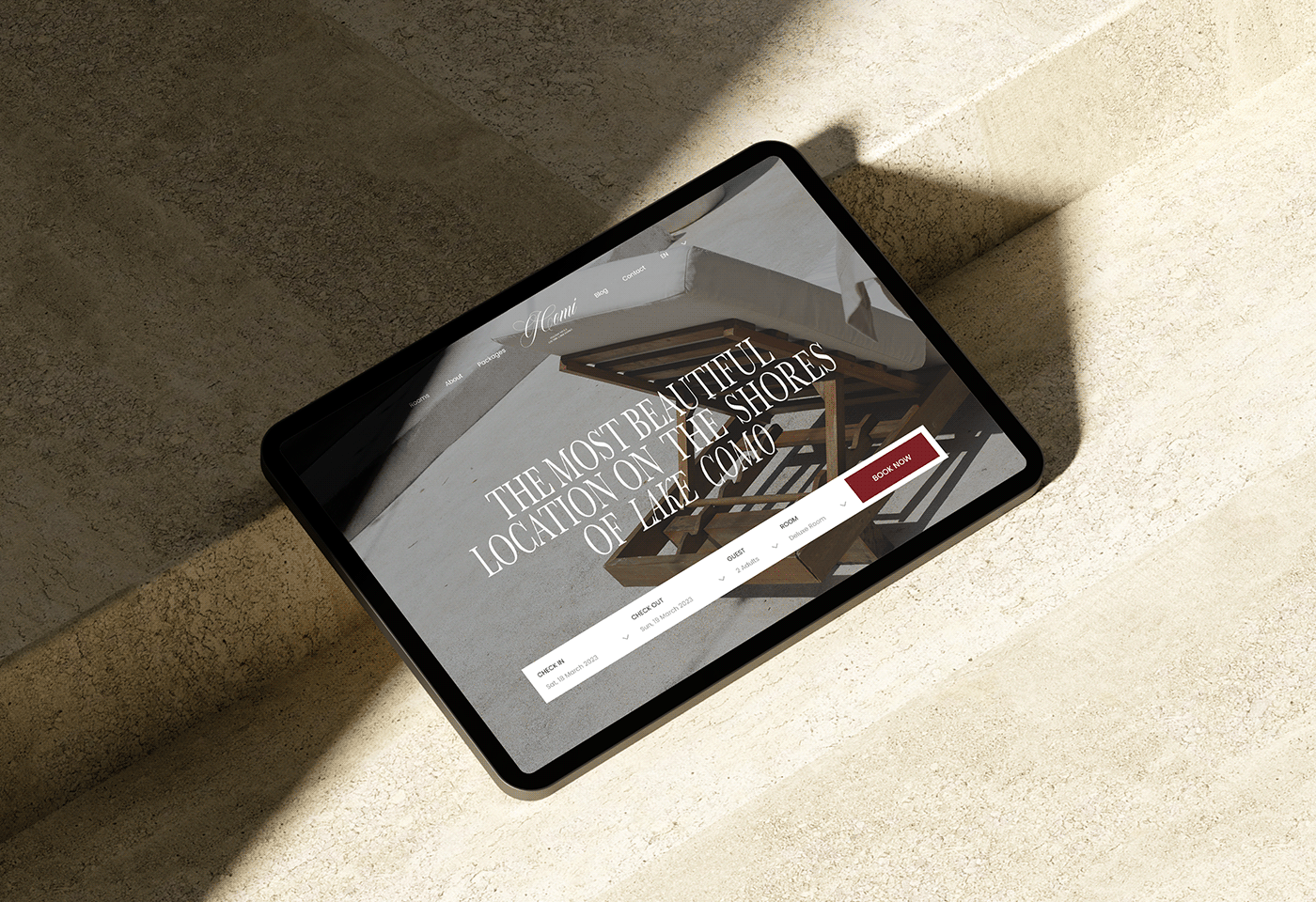
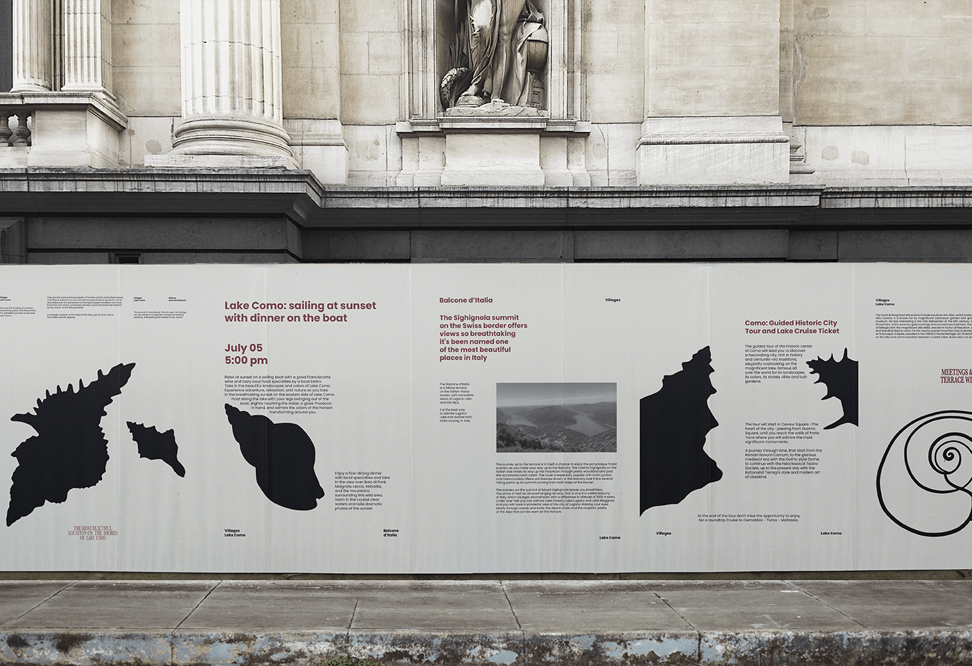
Villa GComi is the pearl of Lake Como in Italy, using silhouettes of shells in graphics as a metaphor to convey the idea of the beauty and uniqueness of this place. The project focuses on Swiss typography in posters, emphasizing a strict, logical style. The logo is crafted in a sophisticated handwritten style, perfectly matching the main seashell graphic. An emblem was developed in the project, where the first two letters of the name G and C are connected.
RU
Вилла GComi – жемчужина озера Комо в Италии, используются силуэты ракушек в графике как метафора для передачи идеи о красоте и уникальности этого места. В проекте идет упор на швейцарскую типографику в плакатах, подчеркивая строгий, логически выстроенный стиль. Логотип выполнен в утонченном рукописном стиле, идеально сочетаясь с основной графикой, изображающей ракушки. В проекте была разработана эмблема, где соединены две первые буквы названия G и C.