Project Goal and Objective
Develop a new brand mark and typography for the bakery, adhering to the existing brand style that is actively integrated into the interior design. Seamlessly incorporate the new mark and logo into the existing image and ensure easy scalability for the digital environment.
The task was to study the brandbook and interiors of the café “Little Bakery”, and then create a new logo and brand spelling that easily scales and adapts to digital platforms while maintaining the company's brand identity. Additionally, in the last step, I needed to create a style guide in Figma to demonstrate the possibilities and limitations of using the logo. I used Adobe Illustrator to create the logo and Figma for the layouts and style guide.
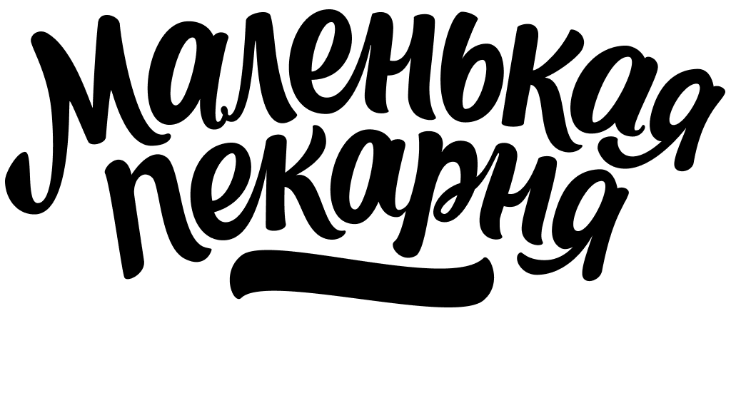
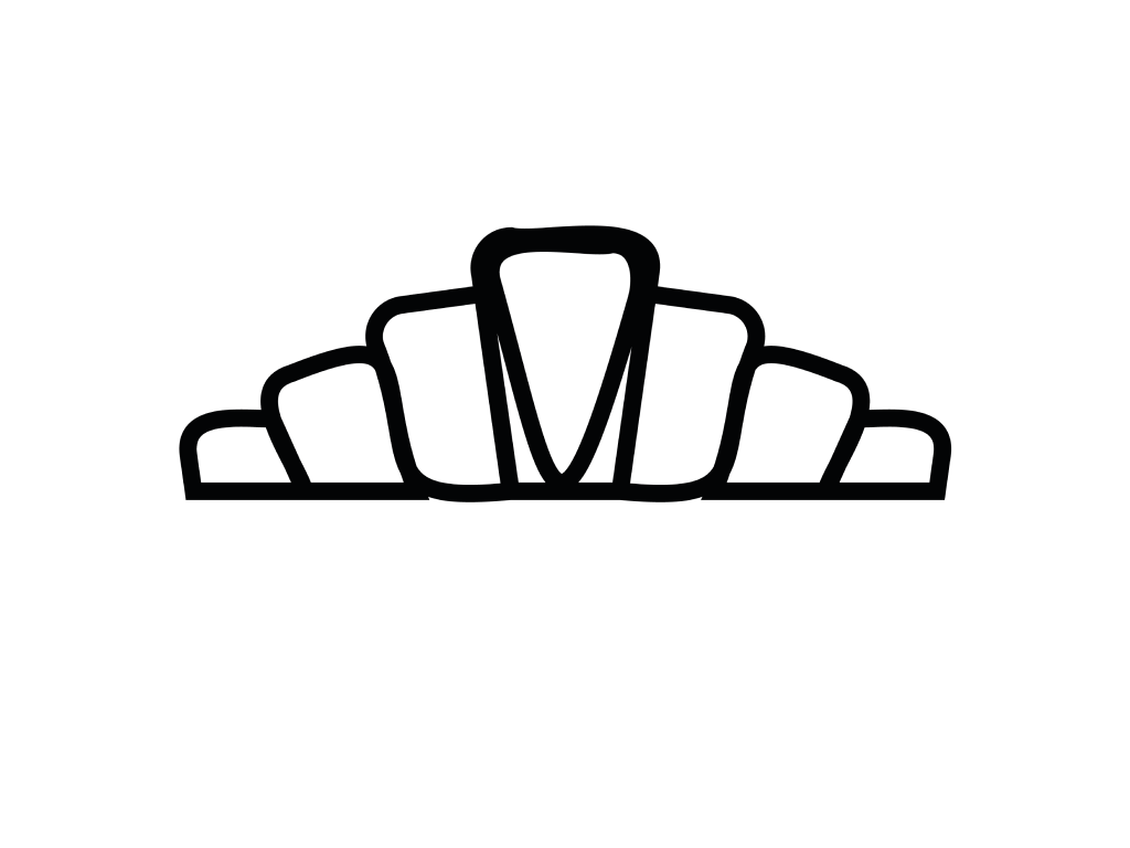
Old logo
When the company began actively expanding into the digital space, issues with the logo arose. It didn’t scale well and lost readability in smaller formats, such as for website menus or social media layouts. As a result, it was decided to develop a new brand mark and lettering, essentially undertaking a minor rebranding.
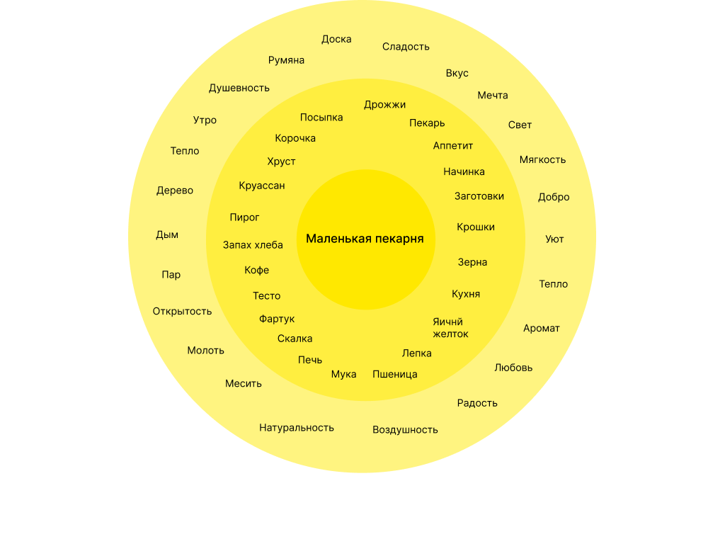
The process of searching for a metaphor
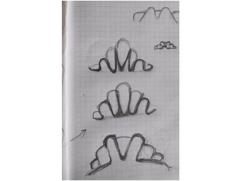
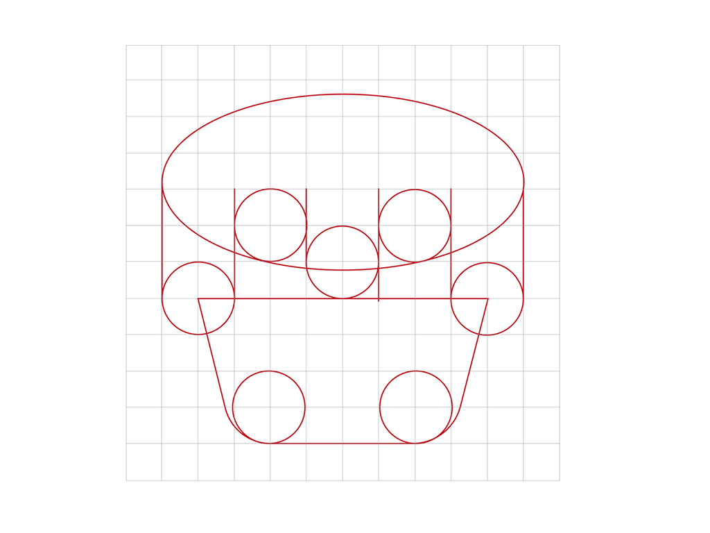
In the first stage, I used the method of the associative field to search for key images. I thought of a bakery as a place where bread is baked and turned to images of fire, ovens, and warmth. The first ideas emerged: fire resembling a loaf of bread, a chef's hat shaped like a small bakery, bread, and a semicircle resembling an oven, etc. These concepts formed the basis for further research.
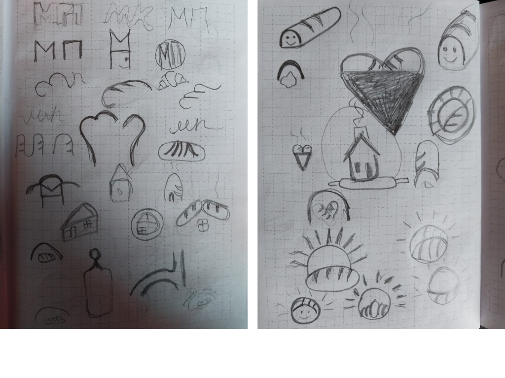
Development of Ideas
Several other options were also considered: buns resembling the roof of a house, a bakery building with a roof shaped like a croissant, and large bakery windows with a chandelier in the shape of the letter “M” and a table in the shape of the letter “П.” These images were strong, but they did not reflect the entire idea. Therefore, I continued the search for a metaphor that could capture the essence of “Little Bakery.”
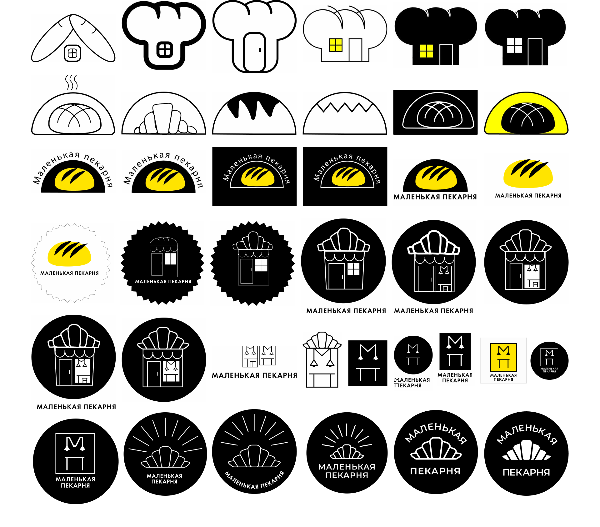
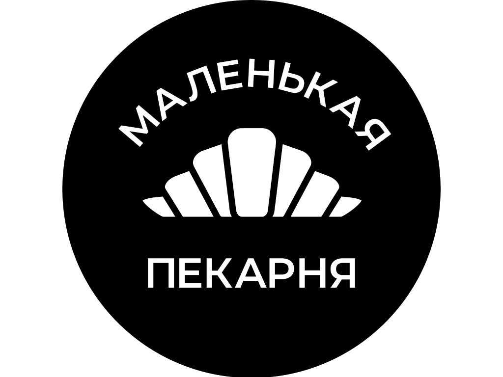
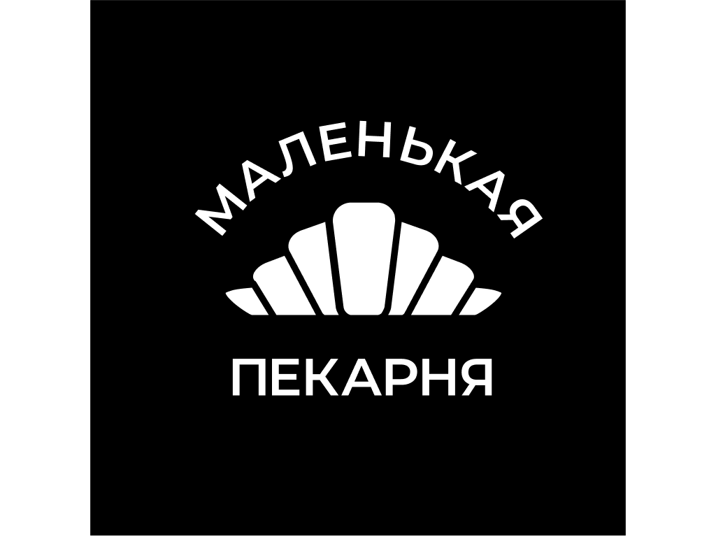
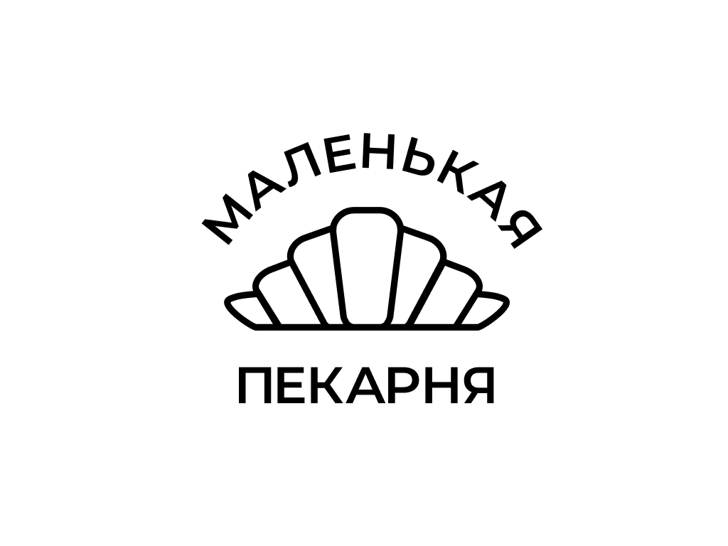
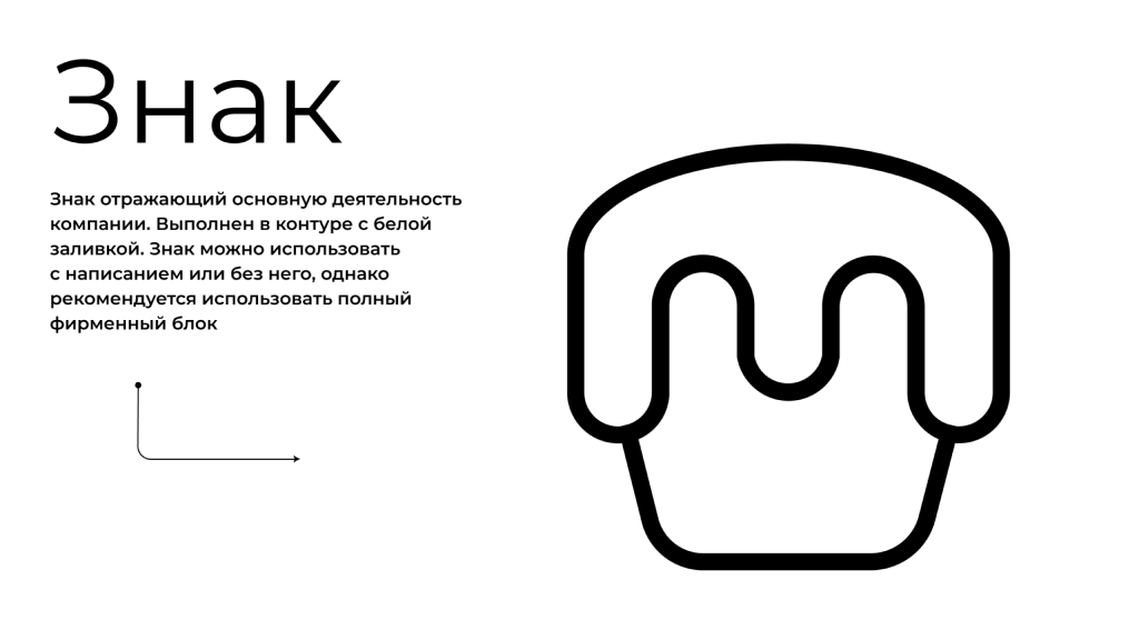
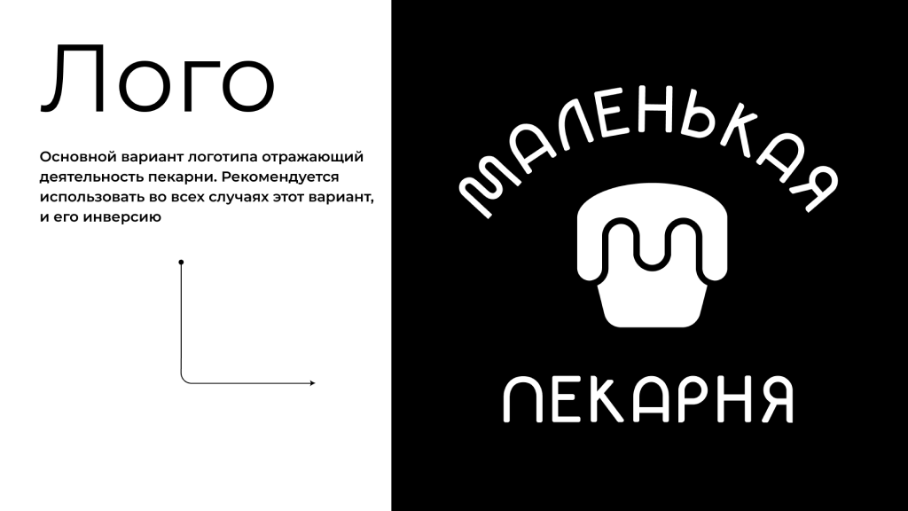
The Final Concept
In the end, I was faced with a choice: to reflect the bakery through the image of the oven in the form of the sun, symbolizing the morning, or to focus on the croissant itself, a recognizable symbol of baking. As a result, I decided on a variant where the croissant became the central element, organically integrated into the text made along the contour of the oven. This variant emphasizes the main thing — baked goods, creating a simple but clear visual image that immediately signals to passers-by that this is the place to have a tasty snack.
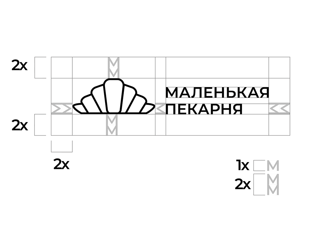
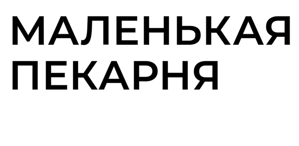
For the brand writing, I used the Montserrat font in the Semibold weight. Its geometric shape ensures excellent readability even at small sizes.
I completed the first version of the logo, in which the croissant was the central element within the brand writing, outlined in the shape of an oven. This version reflected the cozy, homey atmosphere of the bakery, with an emphasis on baked goods.
However, after presenting the first logo sketch to the client, it became clear that it was important for him to include the first letters of the bakery's name — “M” and “П.” This required a revision of the concept. Attempts to integrate these letters into the version with the croissant were unsuccessful, which led me to explore new ideas.
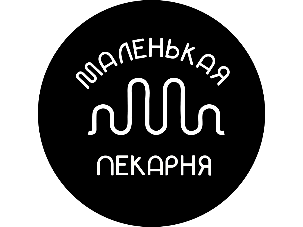
The New Concept
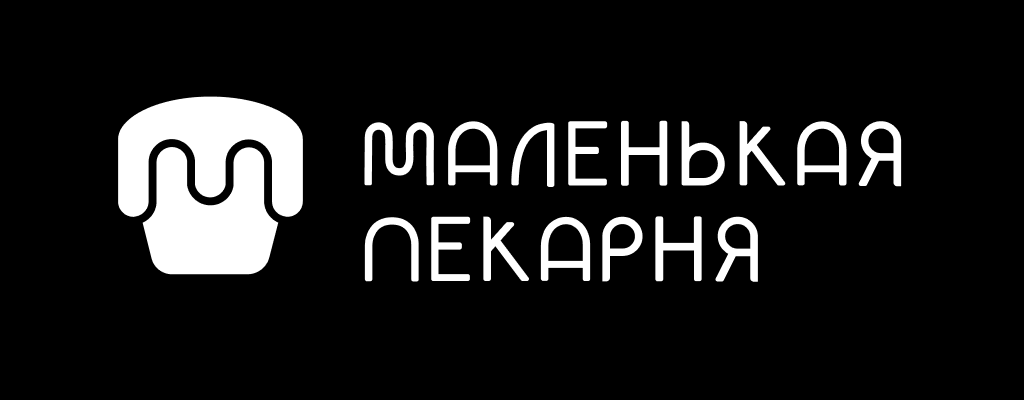
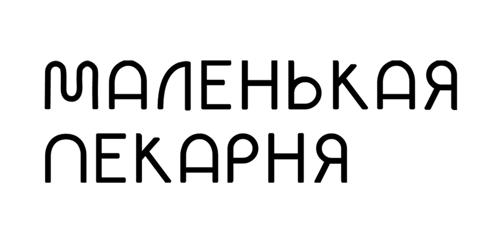
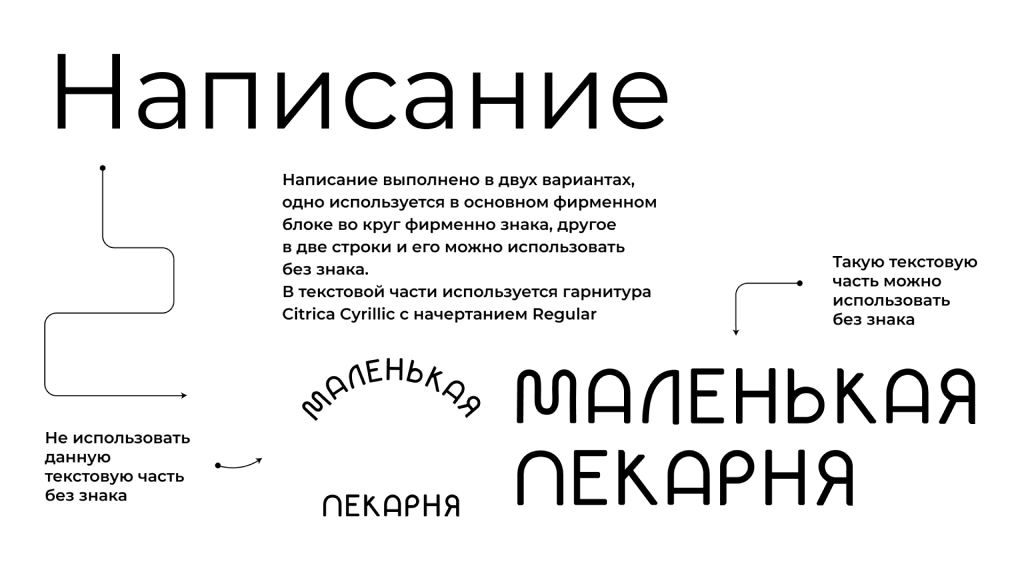
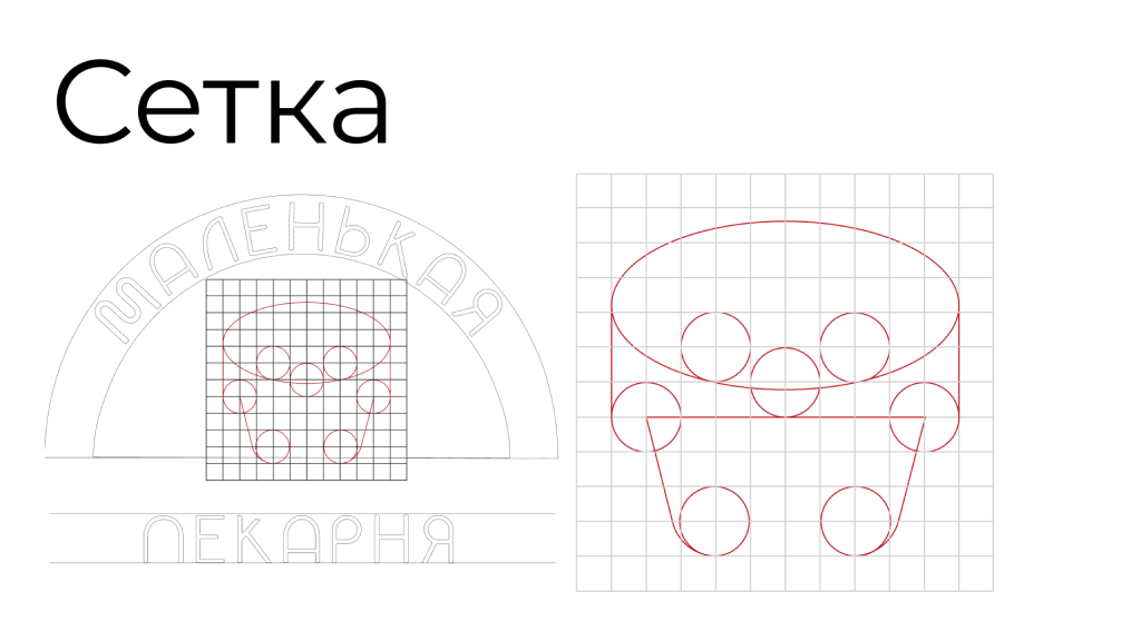
Inspiration came from the image of a glazed cupcake. The glaze on the logo smoothly forms the silhouettes of the letters “M” and “П,” representing the name of the bakery. The writing, shaped like an oven, remained the same, but I replaced the font with Citrica Cyrillic to better match the updated symbol.
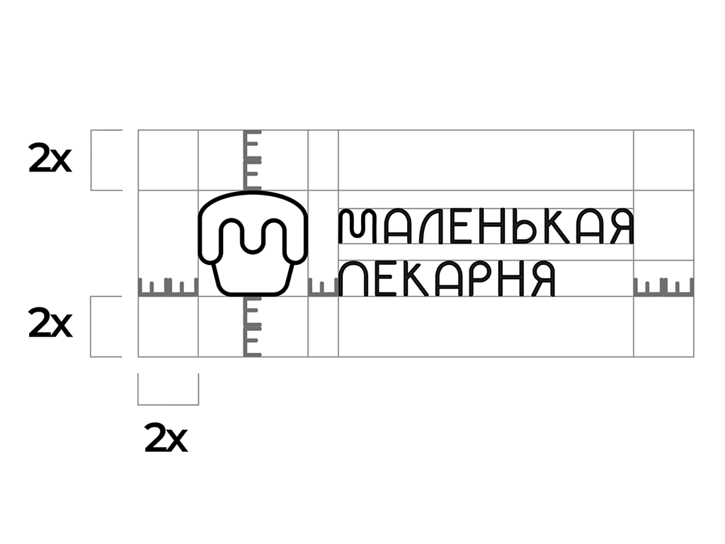
The shape and style of the Citrica font in the Regular weight complement the brand logo, creating a cohesive image. During the text development process, an outline was used, as the thin lines of the font affected readability at small sizes. To improve readability at smaller scales, letter spacing was applied, and the letter “M” was replaced with a form that better matches the design of the logo.
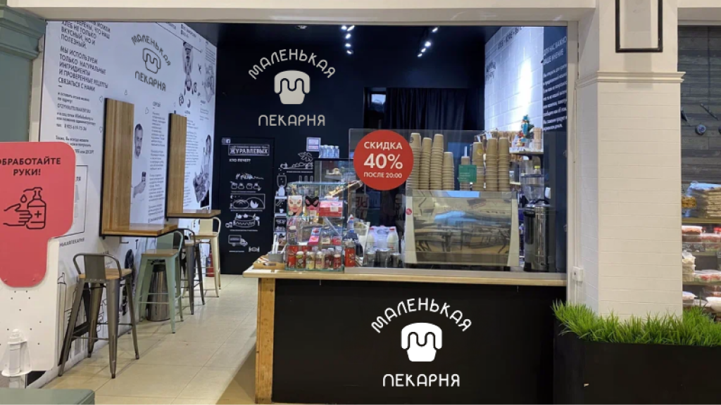
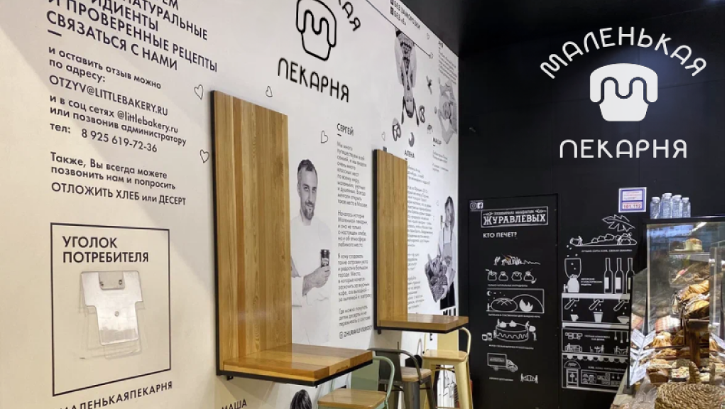
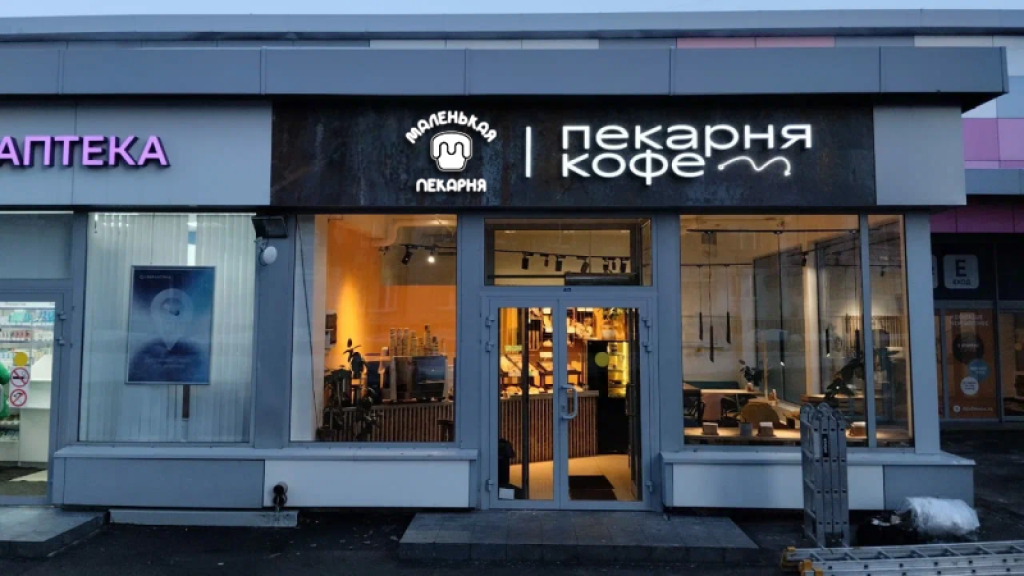
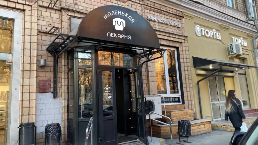
Logo in Café Interior
The modern and minimalist design of the logo perfectly complements the interior, creating an appealing look for customers. The logo is harmoniously integrated into the café space, enhancing branding while maintaining visual appeal and functionality.
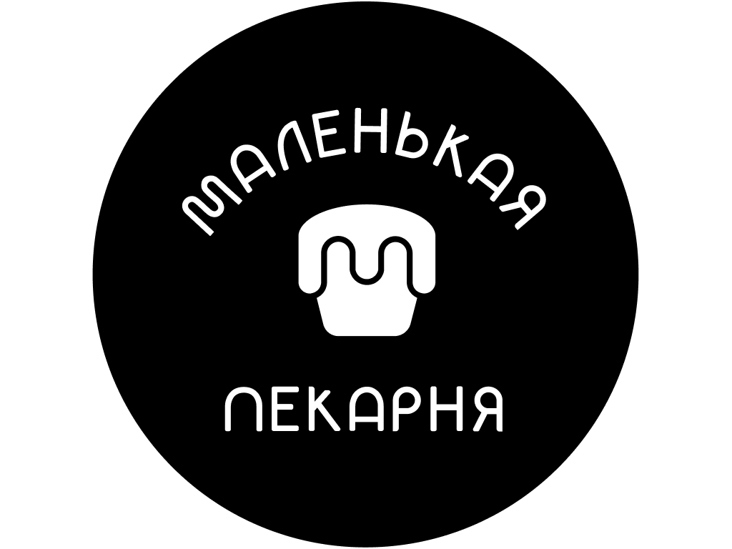
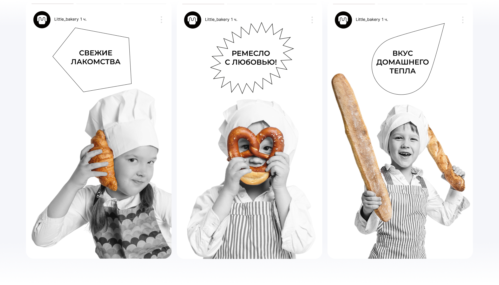
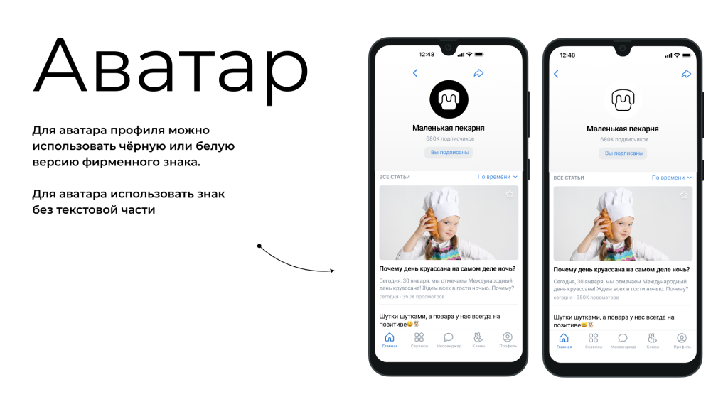
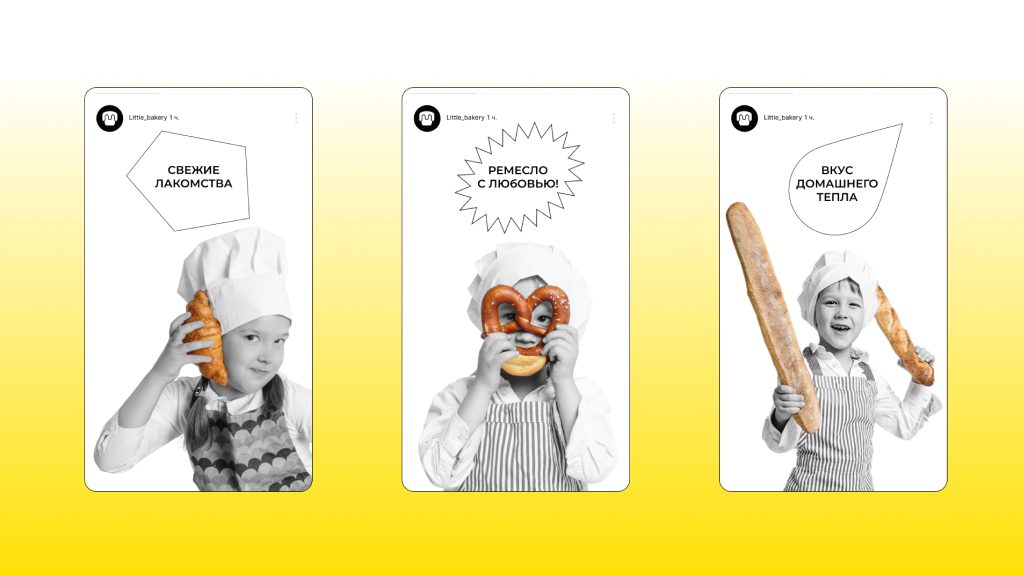
Logo in Social Media
The logo on the social media account avatar is presented in a minimalist and modern style. Its simple and concise shape makes it easily recognizable even at a small size, which is important for social media. This design looks professional and attracts attention while emphasizing the brand's identity.
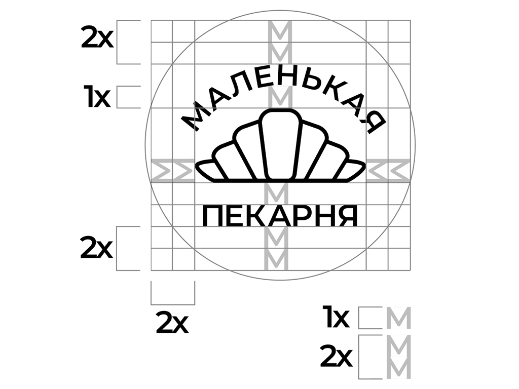
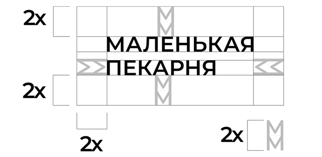
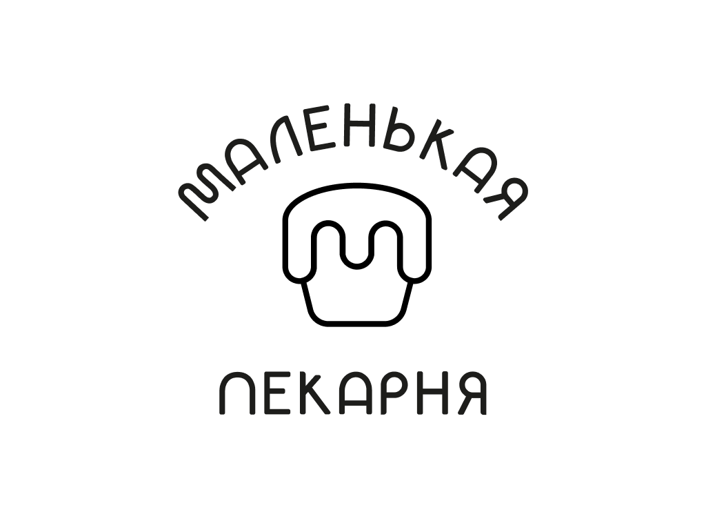
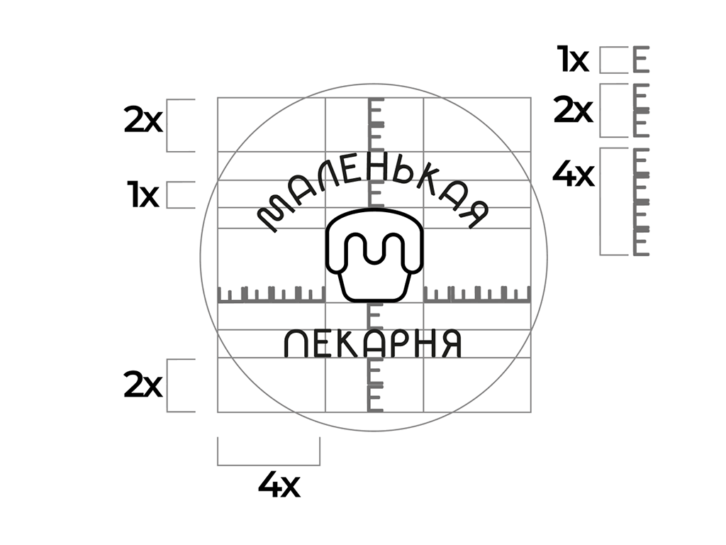
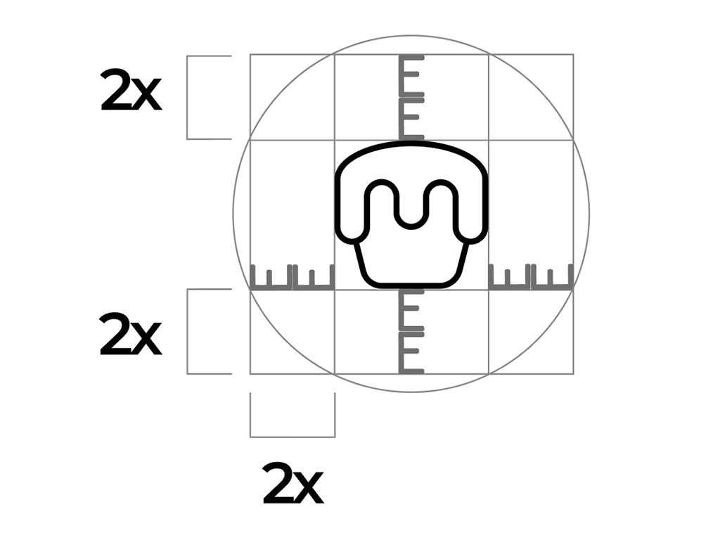
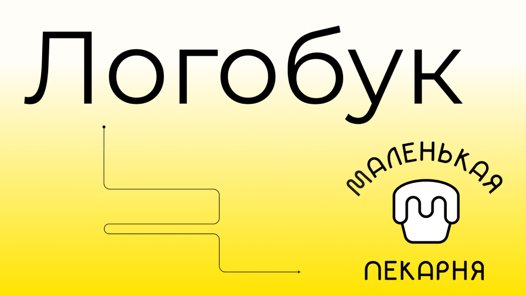
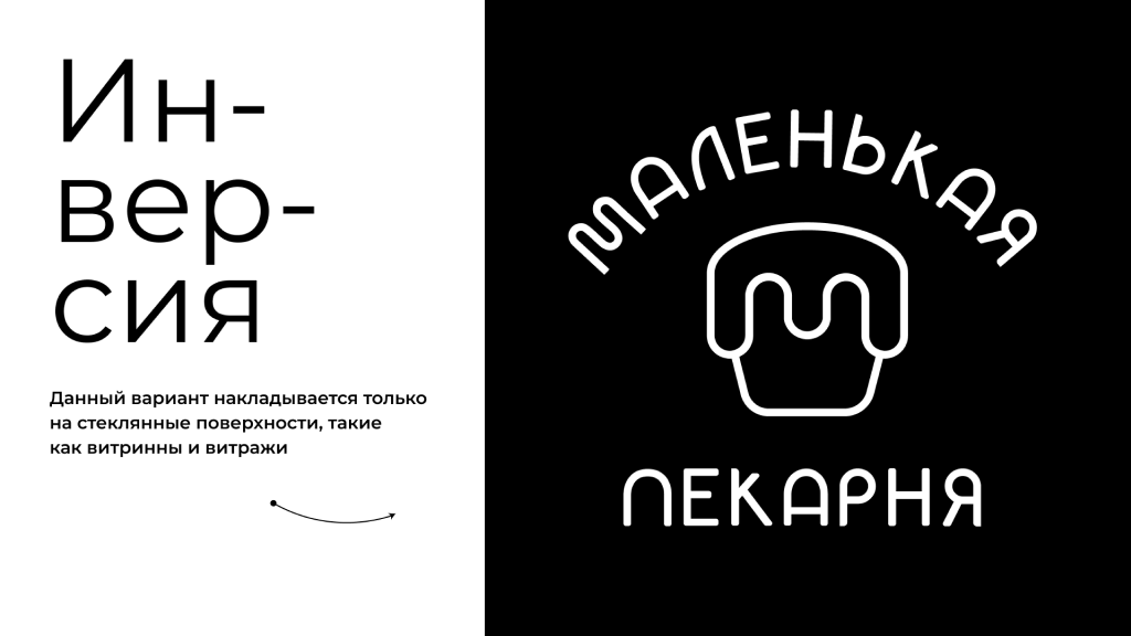
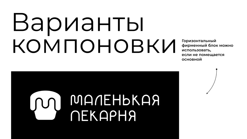
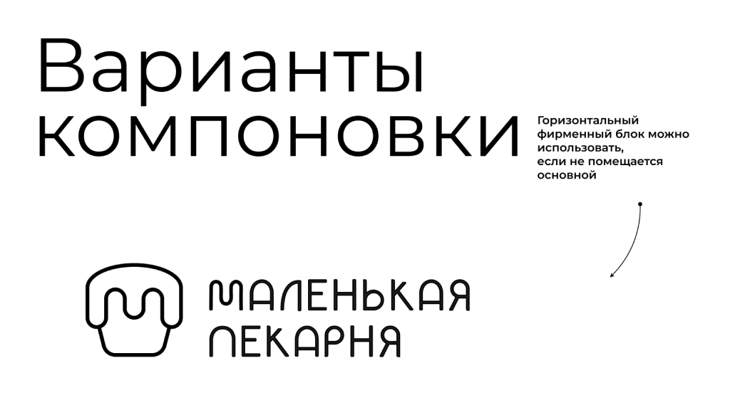
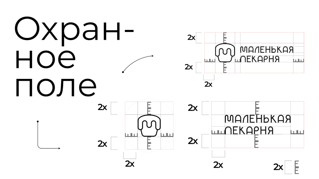
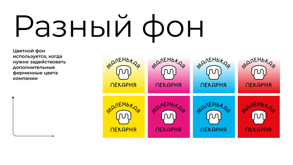
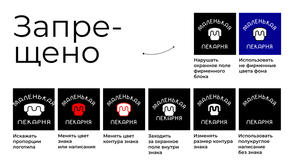
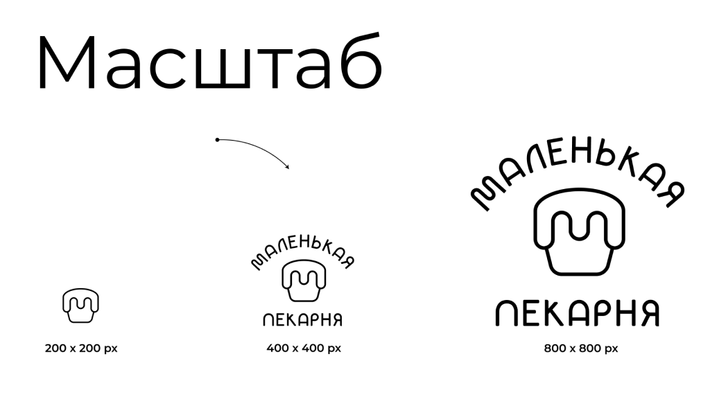
Logobook
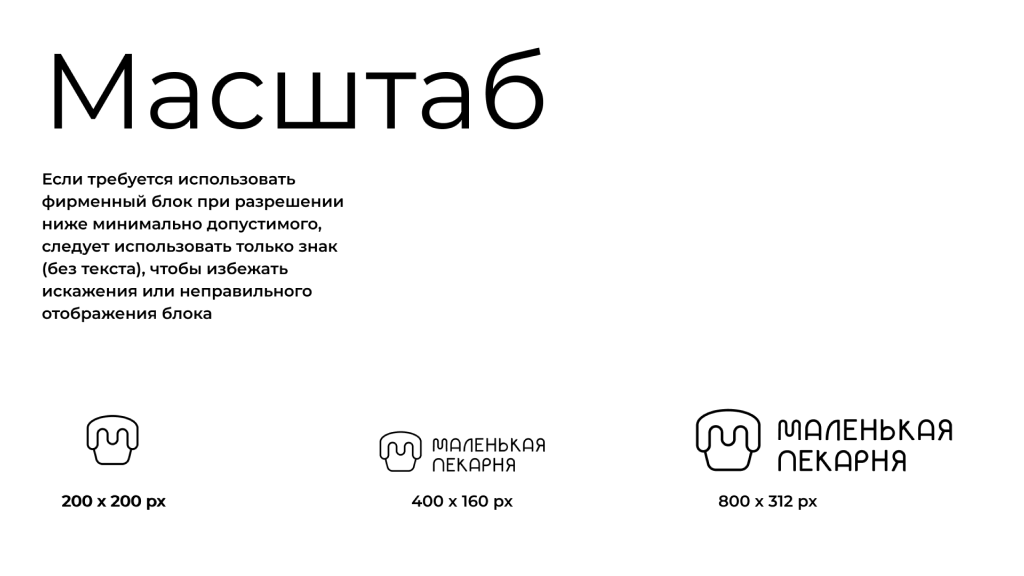
Finally, the logobook was completed, demonstrating the possibilities and limitations of using the logo.
Conclusion
As a result of the work, a new logo was created that fully addresses the client’s original challenges. The new design retains the bakery’s brand identity while becoming more modern and minimalist. This has allowed it to integrate seamlessly into the café's interior and adapt well for digital platforms such as social media. The logo now scales easily, maintains legibility at smaller sizes, and attracts attention, improving the brand's perception in both physical and digital spaces.