Park Quantum is a unique cluster of quantum, photonic and fluid technologies for Russia, where education and scientific developments are combined into a single mechanism.
It is a new entity of world-class advanced infrastructure, technology and engineering education, with a full cycle of research and development of innovative products that respond to today's "grand challenges".
The customer asked us to create a new brand from scratch, beginning with a strong brand strategy. They wanted an easy-to-understand, inspiring, and creative brand that would appeal to a young audience, while still being "adult" enough to appeal to government customers and business elites. you first encounter the topic of quantum physics, you are afraid of its complexity, dryness, and technology. But after getting to know her better, she can't help but inspire. This is a world where everything is based on theories and hypotheses. A world that you can know a lot about, but it's never enough. Therefore, the process of developing innovations resembles magic, and at the same time – art.
The team of Quantum Park is composed of ambitious and unique individuals. They are not afraid of the unknown, but instead embrace it with ease and excitement. This path inspires them, as they know that there will always be more questions than answers. However, if they can find even one answer, it will change our future for the better.
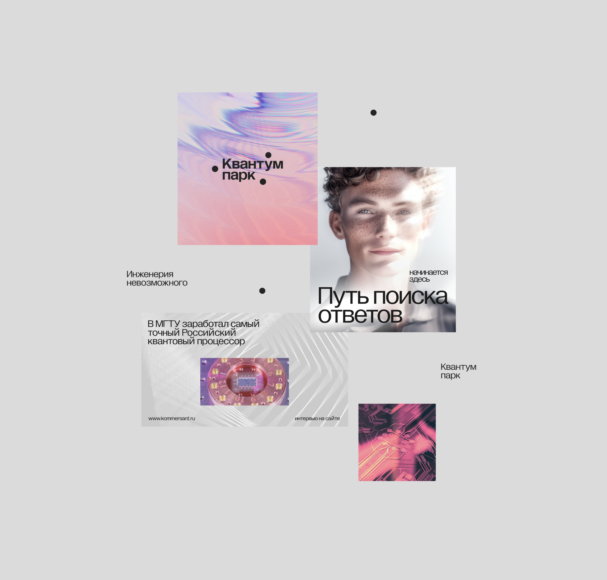
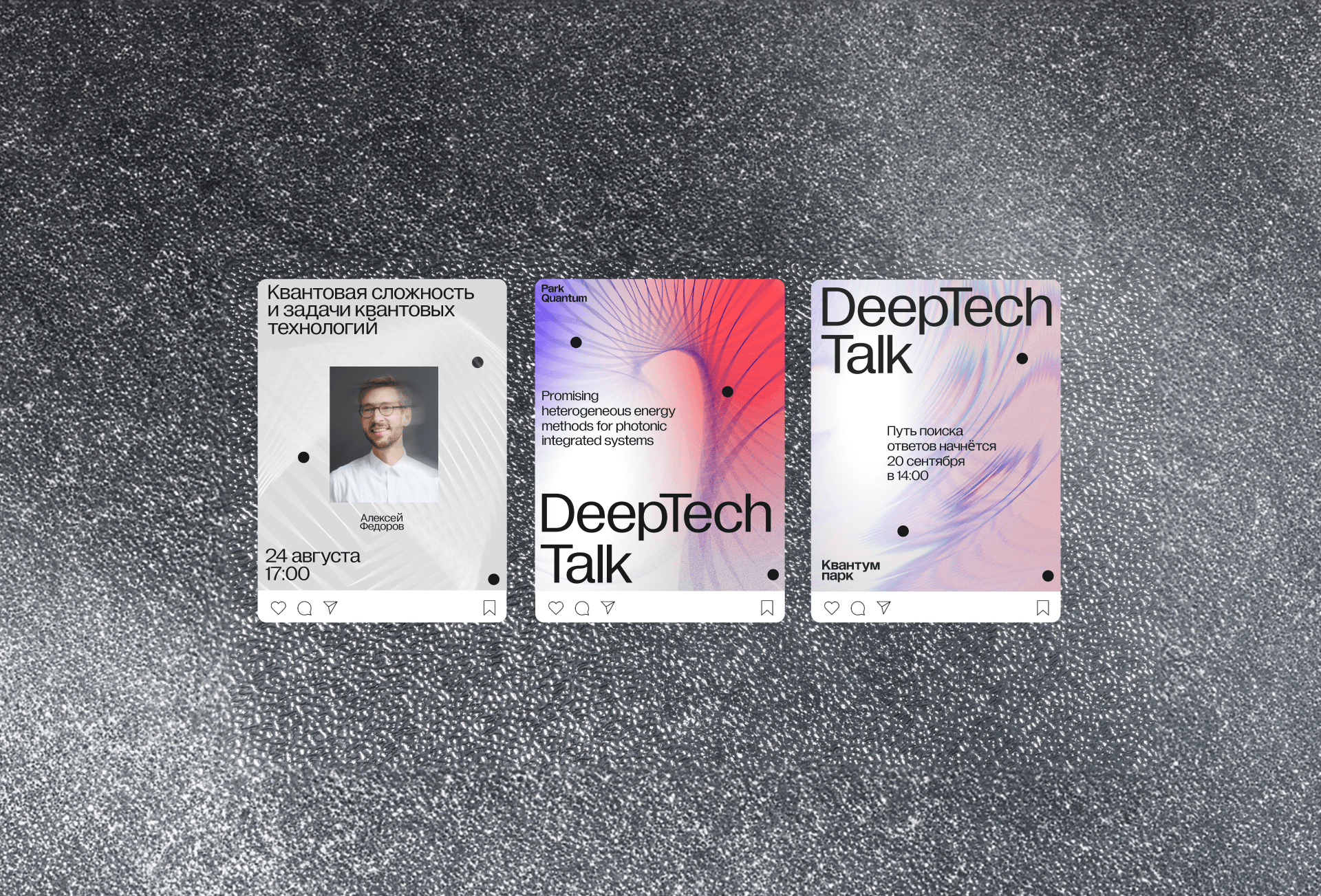
The way of finding answers.
This is the concept of Quantum Park branding.
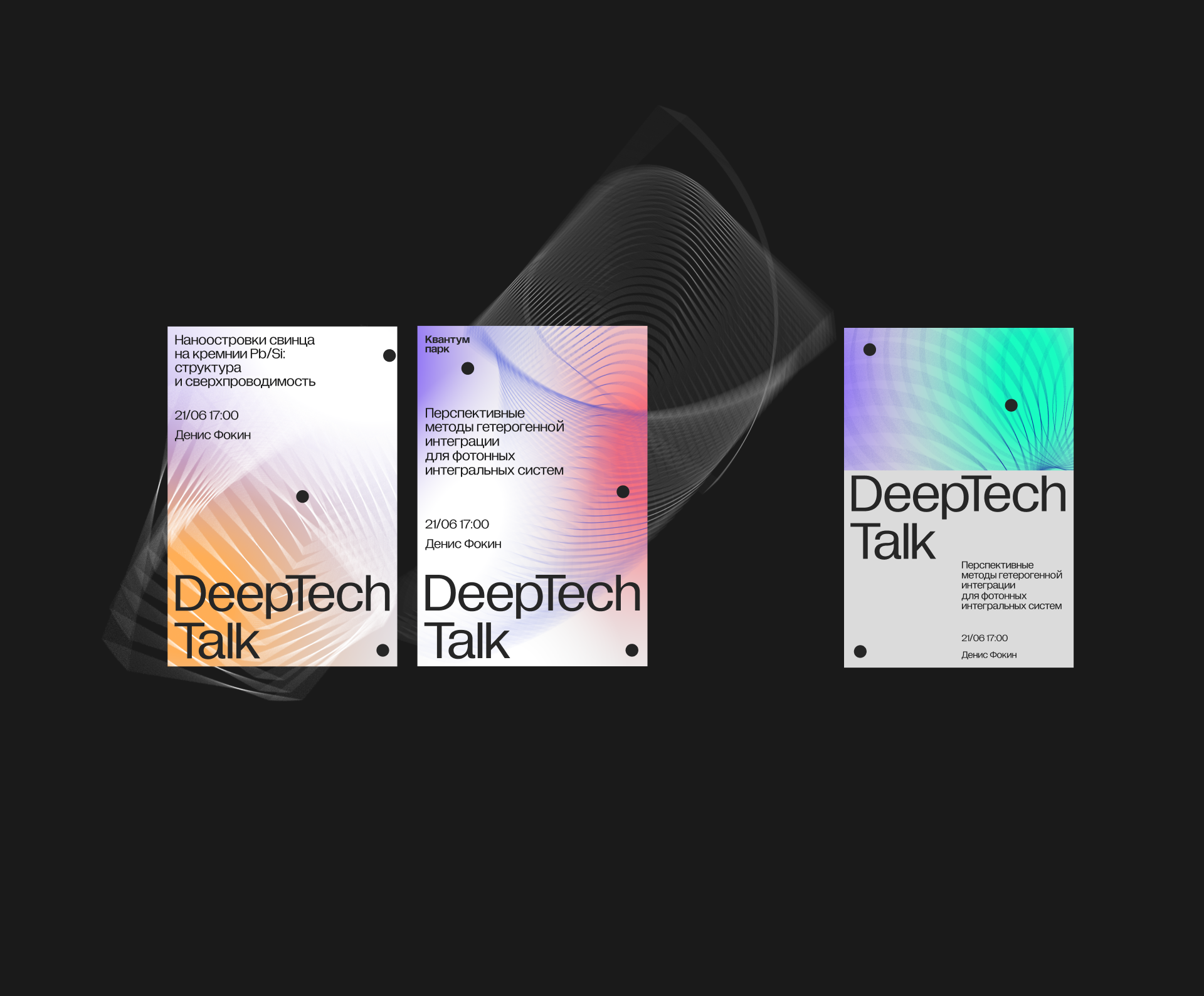
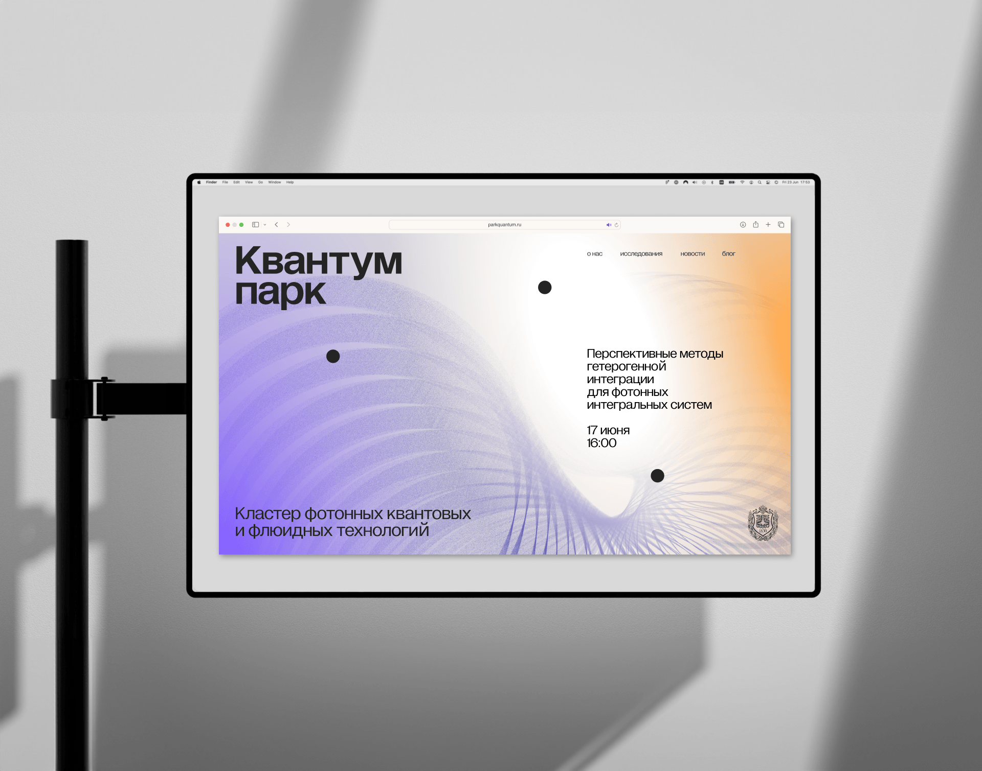
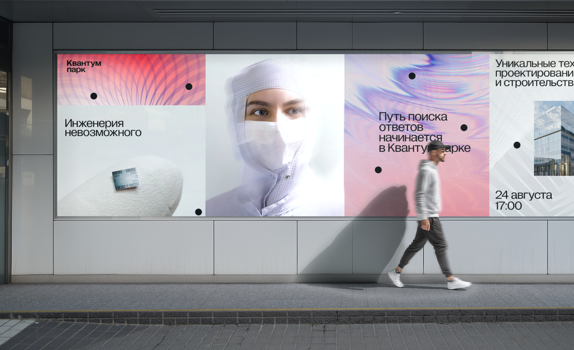
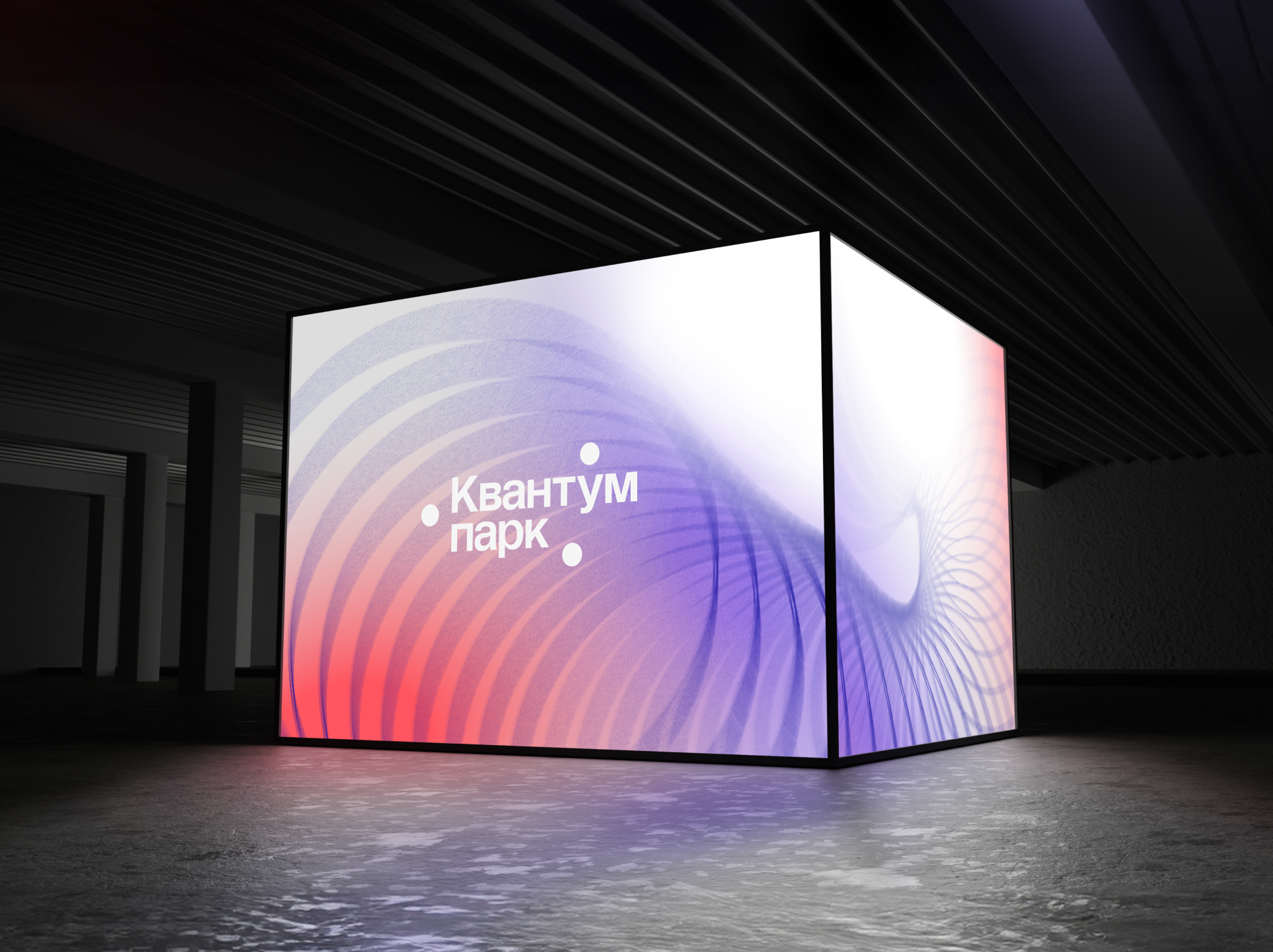
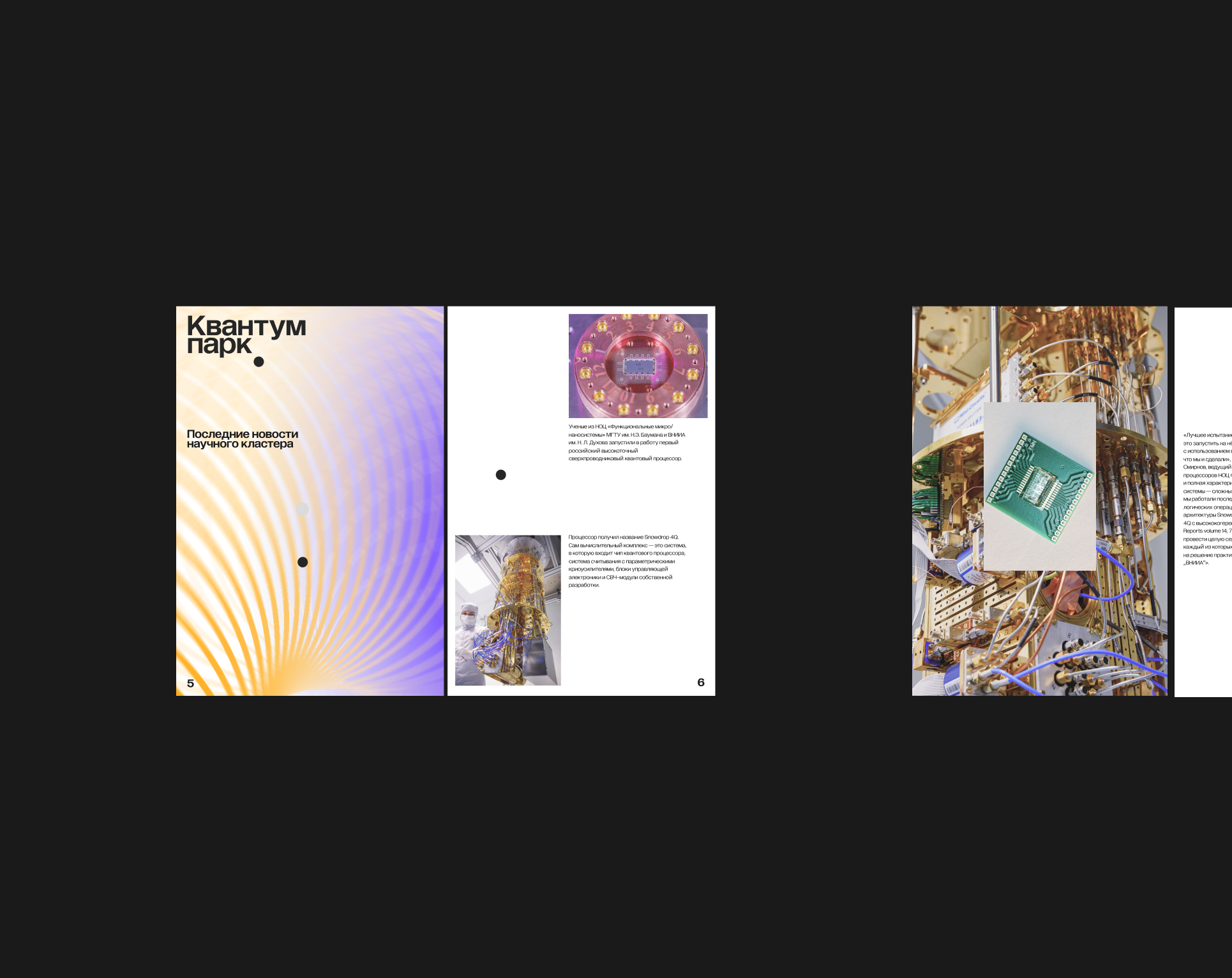
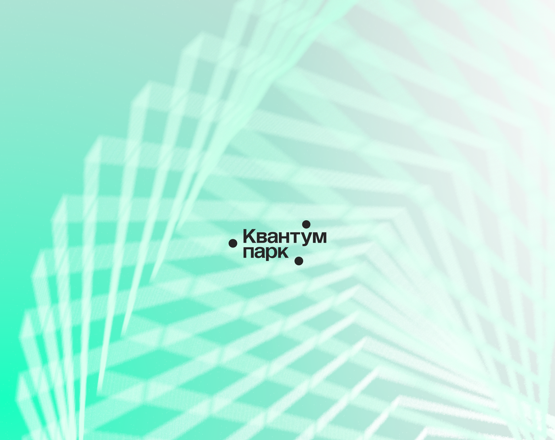
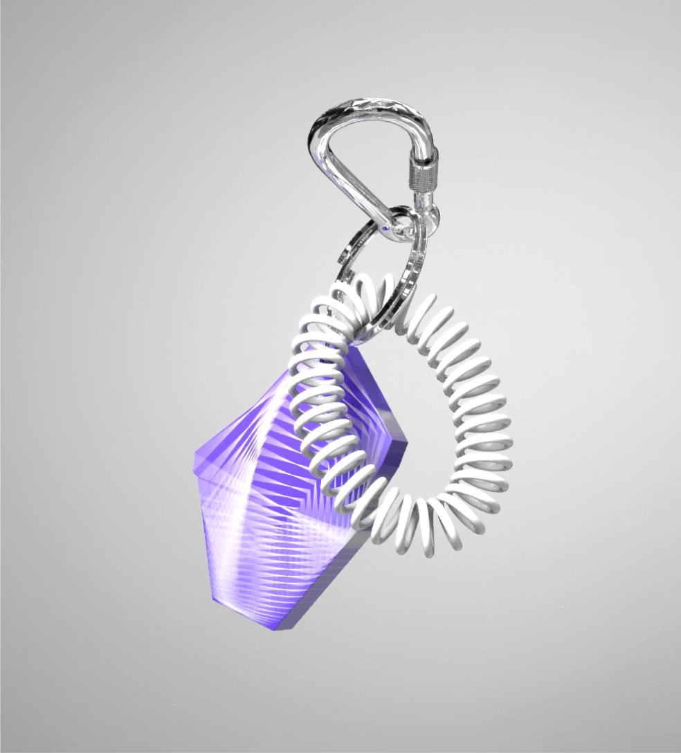
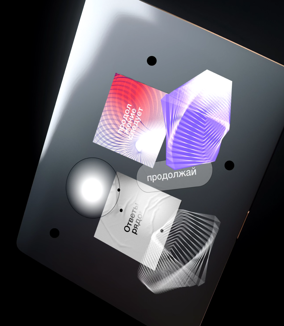
This is where the scientific path of finding answers begins with many steps, experiments, dives and discoveries. And this path begins in Quantum Park. In identity, the main metaphor is the same path that resembles a spiral going deep / into the distance. The path can be different – in shape, color, direction. The spiral consists of a contour shape repeated many times and this technique symbolizes endless steps and experiments in development.
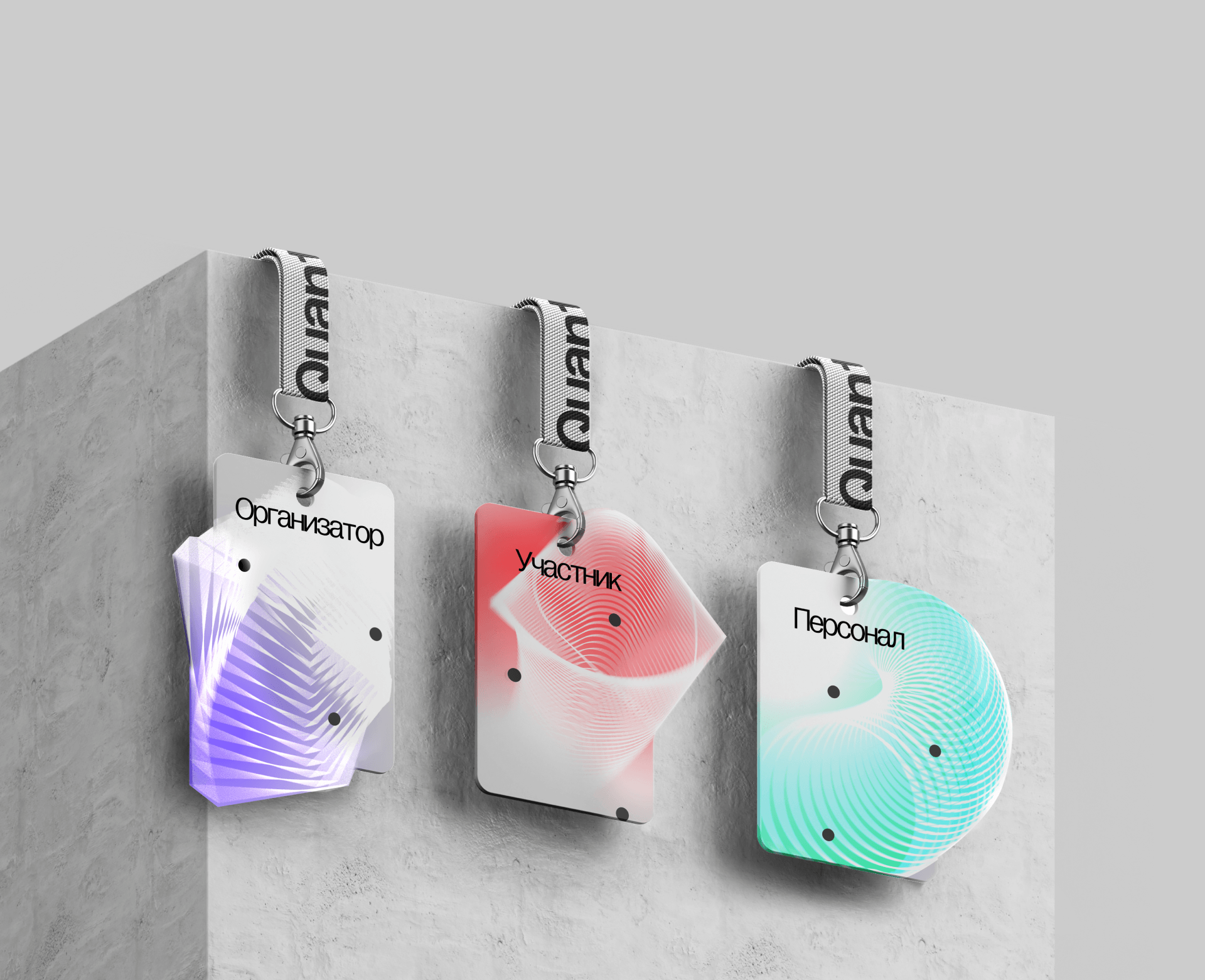
The contour style of the pattern, which resembles a design, references the engineering field. We have also developed generative "soft" patterns as additional graphics to highlight developments in quantum physics, soft matter, and fluid physics.
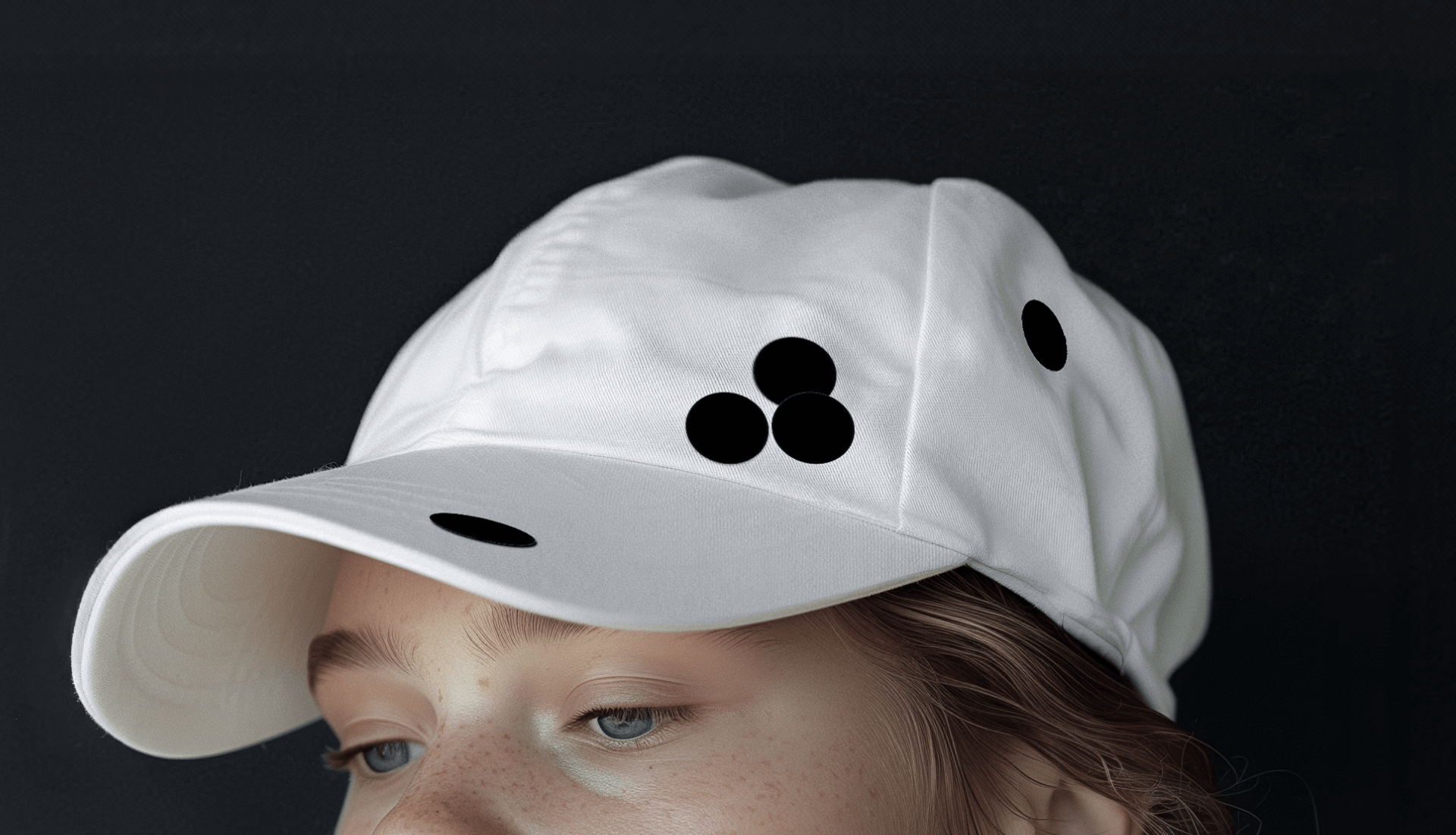
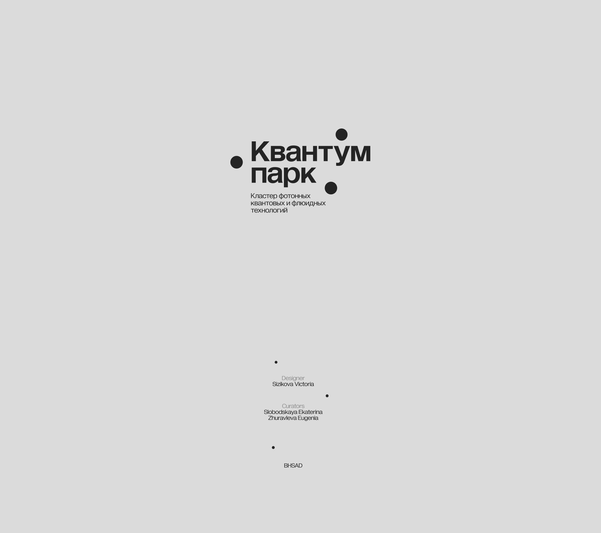
In the logo, we paid special attention to the concept of quanta and used the principle of quantum superposition. This principle states that a single quantum can be in multiple places and states simultaneously. In the logo, three dots represent a single quantum, similar to how three scientific centers come together to form a single Park Quantum. These dots move freely in space and can occupy different positions depending on the layout.
The result is a light identity with several accent colors, avoiding the sterility often associated with the scientific field while adding dynamism and emotion.
We tried to keep our branding light, intelligent, and bold in order to inspire young scientists within the walls of Park Quantum to continue on their difficult but exciting journey.
but exciting journey.


