ABOUT BRAND
ru
The MOTHERS — это онлайн Монтессори-пространство для осознанных мам. Основная задача пространства помощь мамам шаг за шагом осознать важность раннего развития ребенка через формирование самостоятельности и интересу к обучению, создать развивающую среду Монтессори в домашних условиях, построить доверительные отношения с ребёнком, внедрить на регулярной основе интересные тематические занятия для гармоничного развития ребёнка.
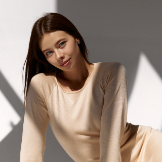
Клиент описал свой бренд как : эстетичный, осознанный, актуальный, благотворный, интеллигентный.
eng
The MOTHERS is an online Montessori space for conscious mothers. The main task of the space is to help
mothers step by step realize the importance of a child’s early development through the formation of independence
and interest in learning, create a Montessori development environment at home, build a trusting relationship
with your child, introduce interesting thematic activities on a regular basis for the harmonious development of the child.
The client described their brand as: aesthetic, conscious, relevant, wholesome, intelligent.
ru
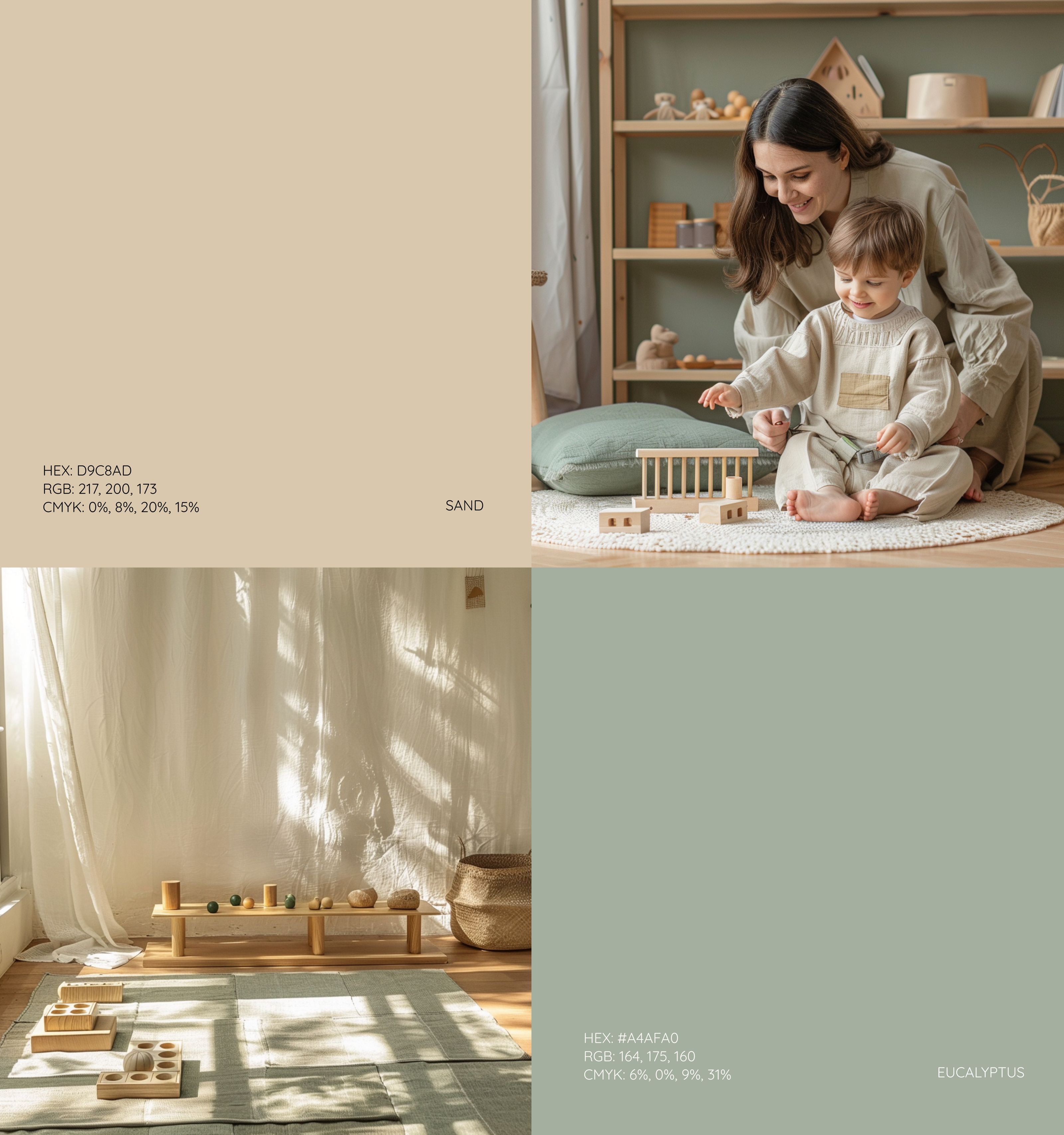
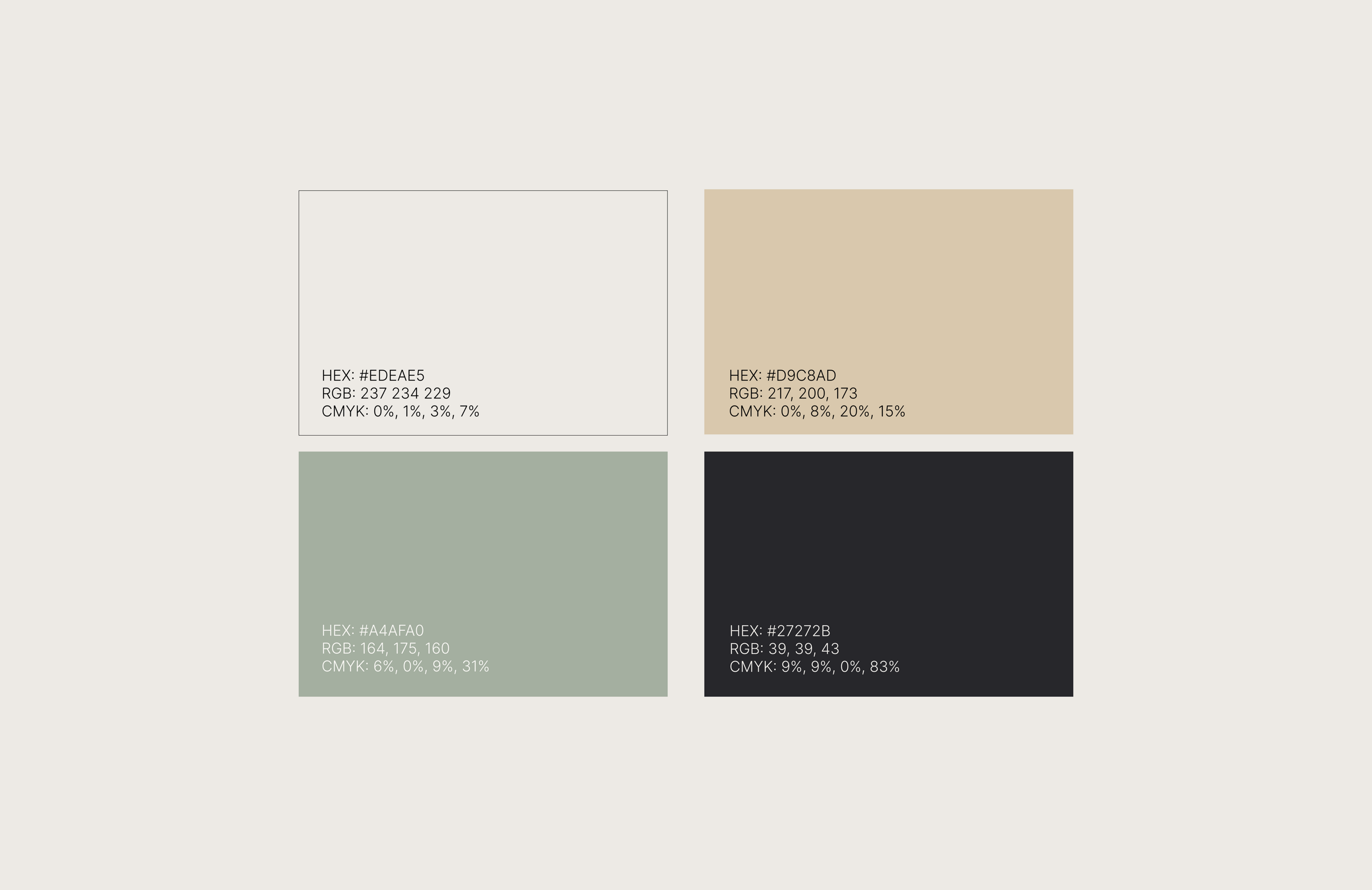
Я решила использовать кремовый как базовый цвет, ассоциируется со спокойствием и теплотой, эвкалиптовый в палитре освежает, вызывает ассоциацию с природой (“Мать- природа”), натуральностью и экологичностью (экологичное воспитание детей)
теплый песочный — вызывает ассоциацию с комфортом, теплым пляжным песочком (в методике Монтессори преобладают игрушки из дерева натуральных материалов).
eng
I decided to use cream as the base color, it is associated with calm and warmth, eucalyptus in the palette is refreshing, evokes an association with nature (“Mother Nature”), naturalness and environmental friendliness (eco-friendly parenting) warm sand - evokes an association with comfort, warm beach sand (in the Montessori method, toys made from wood and natural materials predominate).
ru
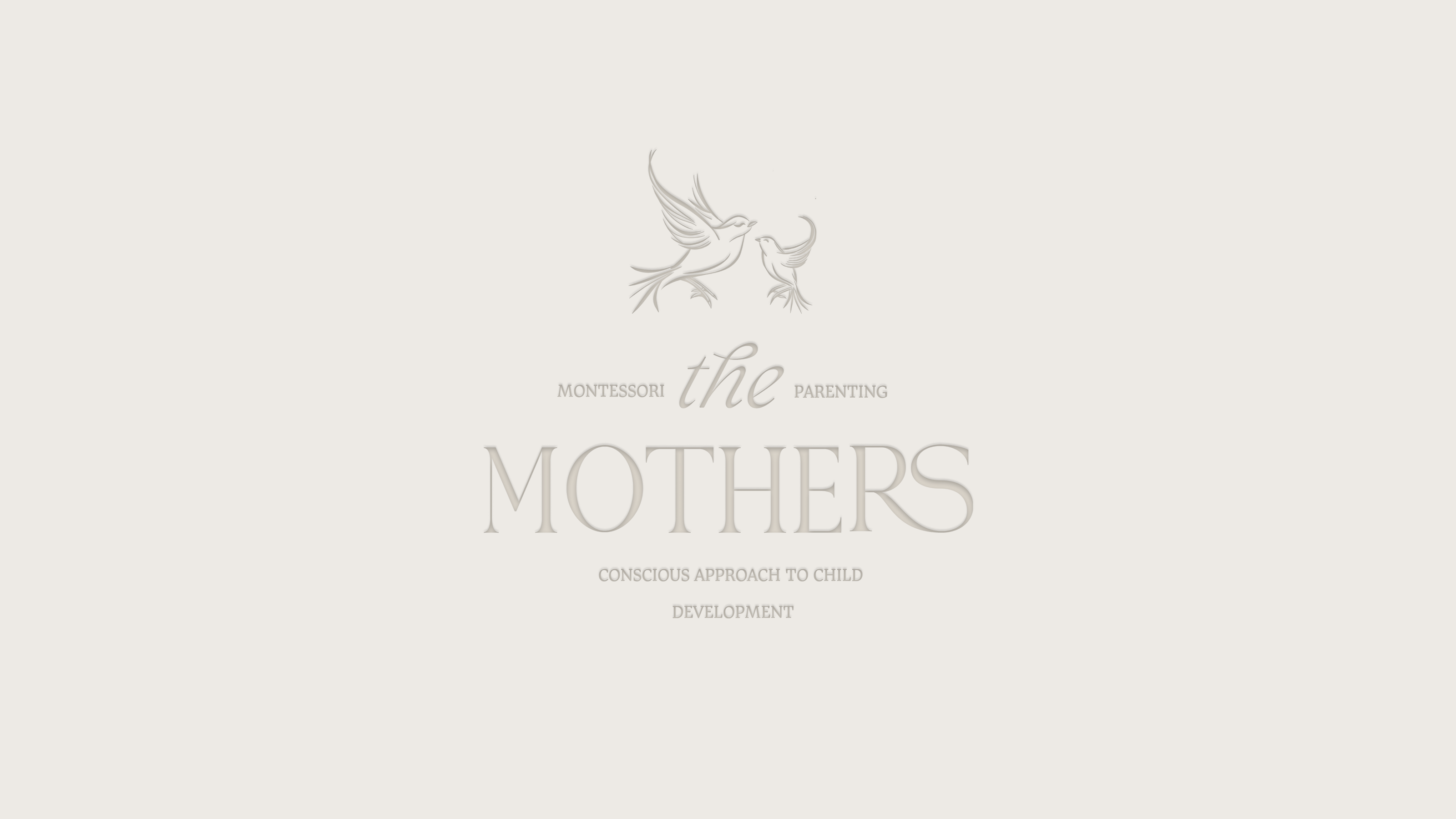
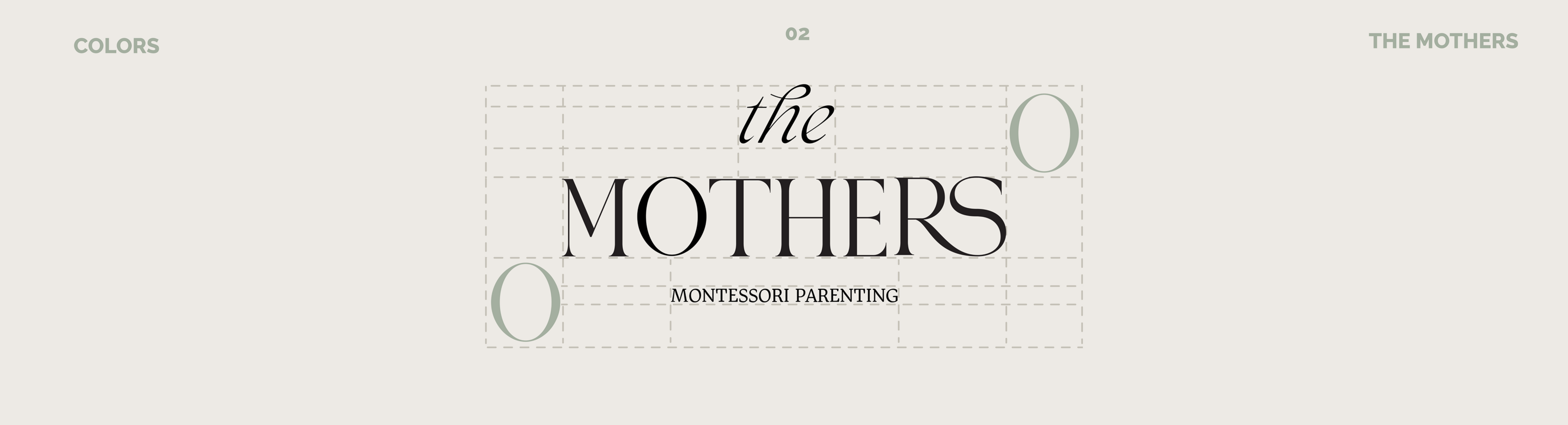
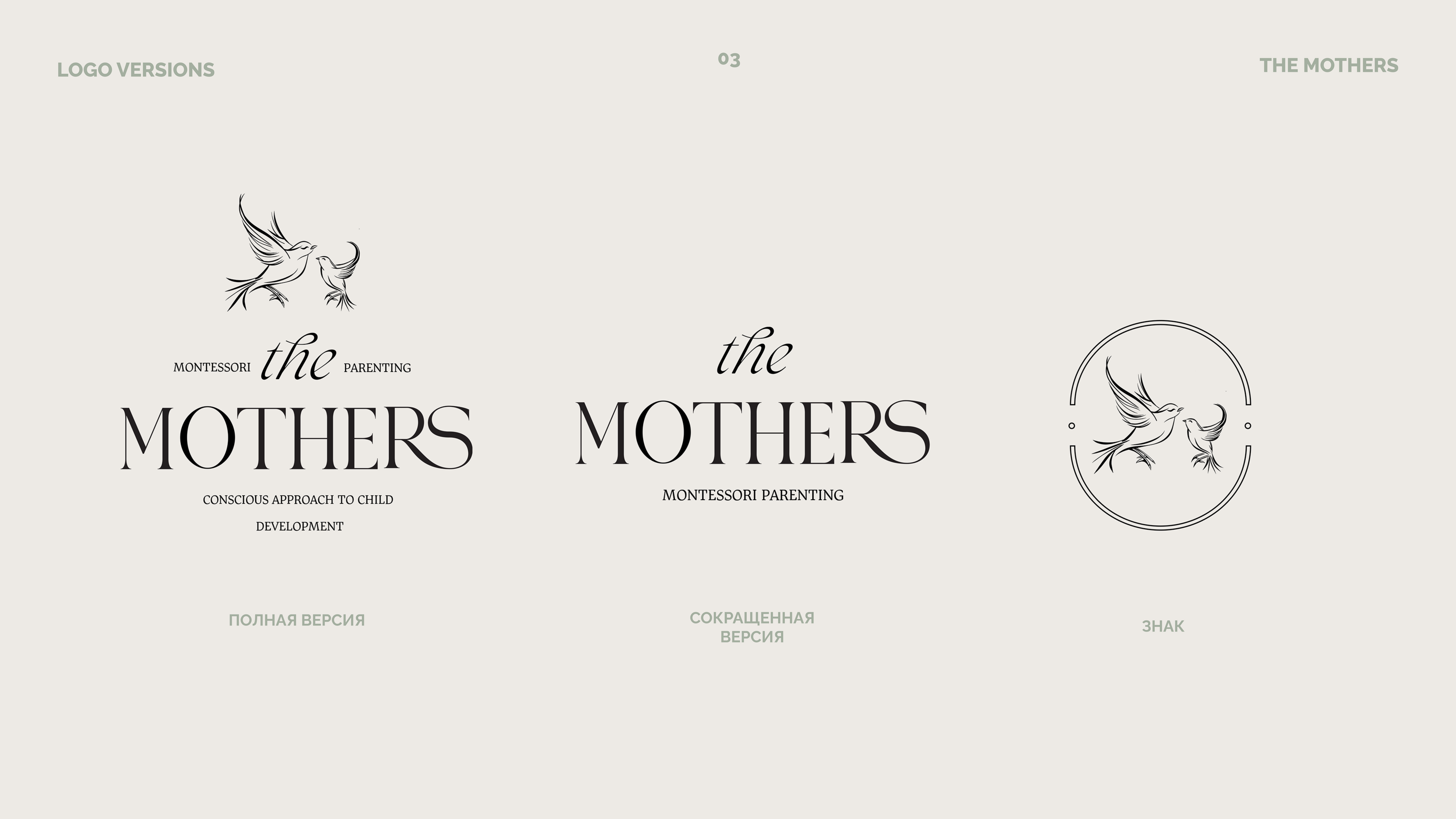
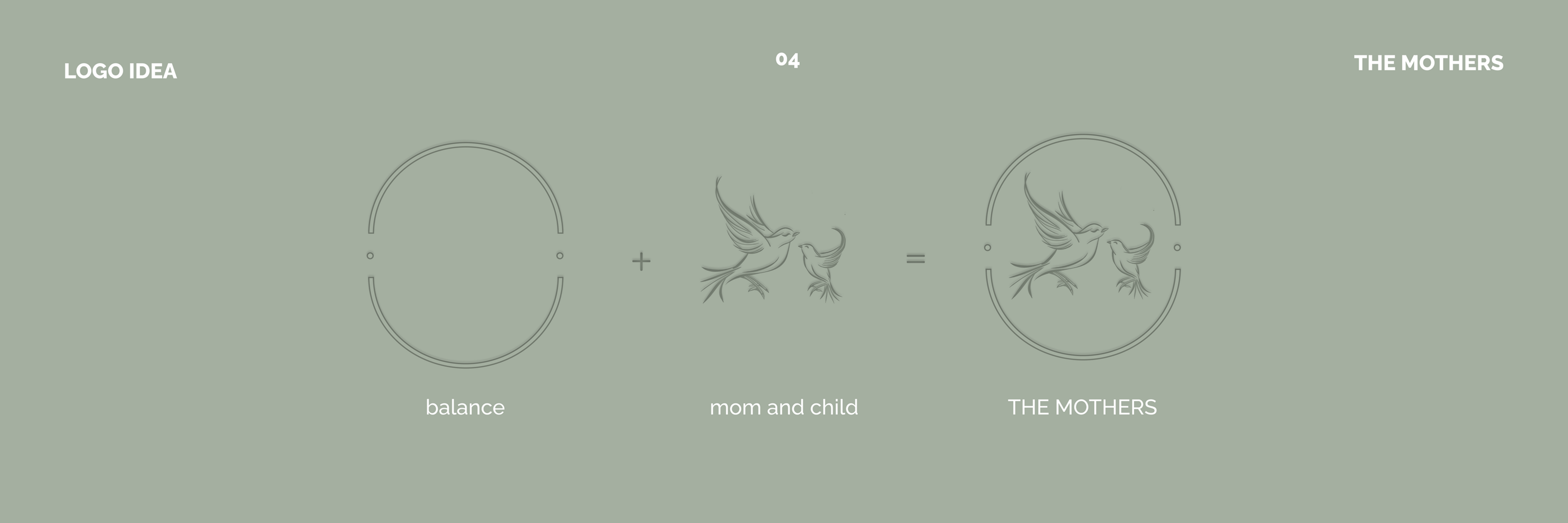
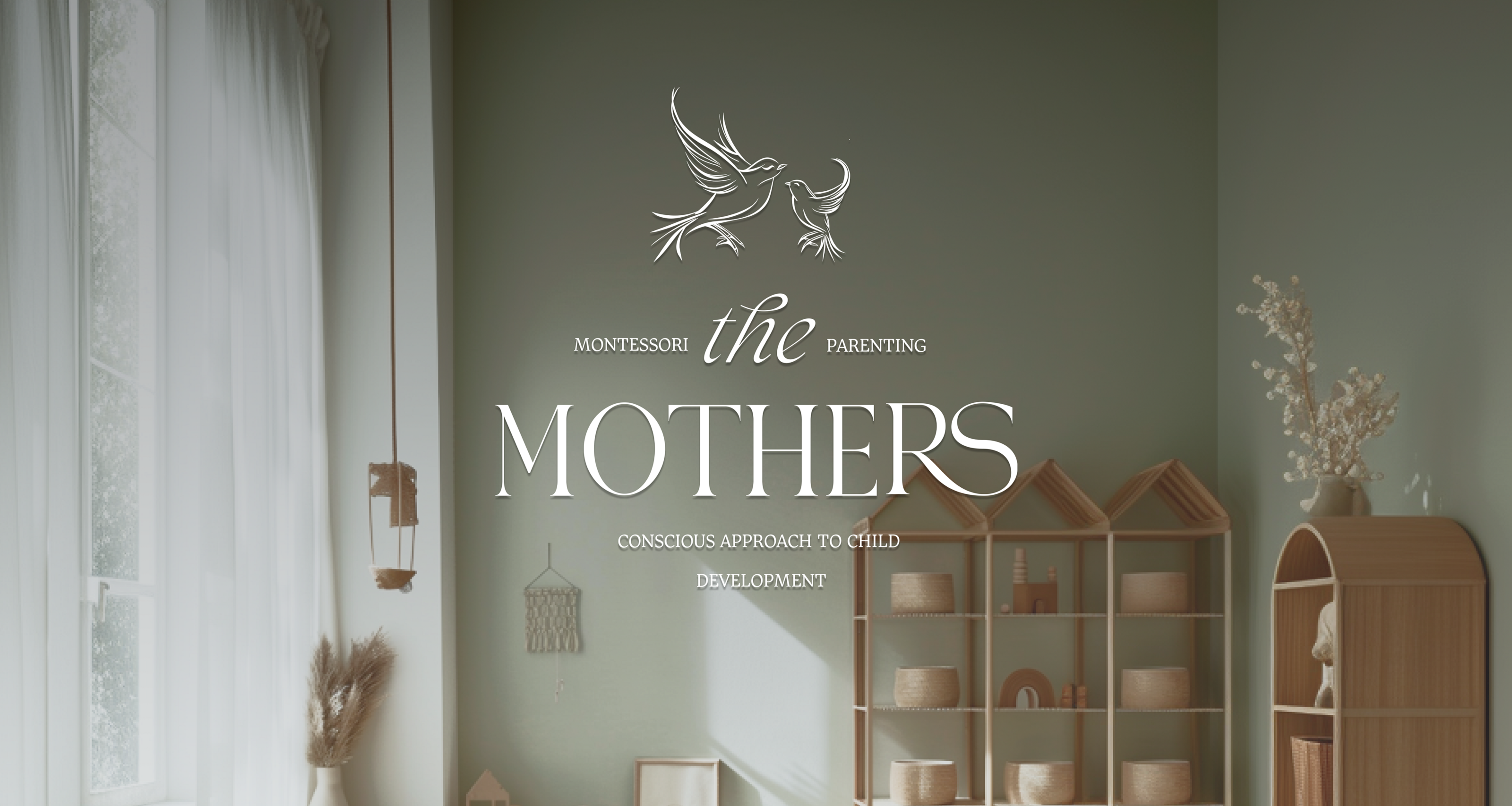
В знаке логотипа я отразила идею связи ребенка с родителем, гармонии в отношениях, особый трепетный мир в котором есть только мать и ребенок. Мама-птичка проводник в этот мир для птенца.
Мама-наблюдатель, поддерживает и направляет, она в гармонии и к доверию к миру.
eng
In the logo, I developed the idea of a connection between a child and a parent, harmony in relationships, a special trembling world in which there is only a mother and a child. The mother bird is a guide to this world for the chick.
Mom is an observer, supports and guides, she is in harmony and trusts the world.
Thank You for watching!
Designer: Ekaterina Chistyakova
contact me — INSTAGRAM / TELEGRAM