About the Project
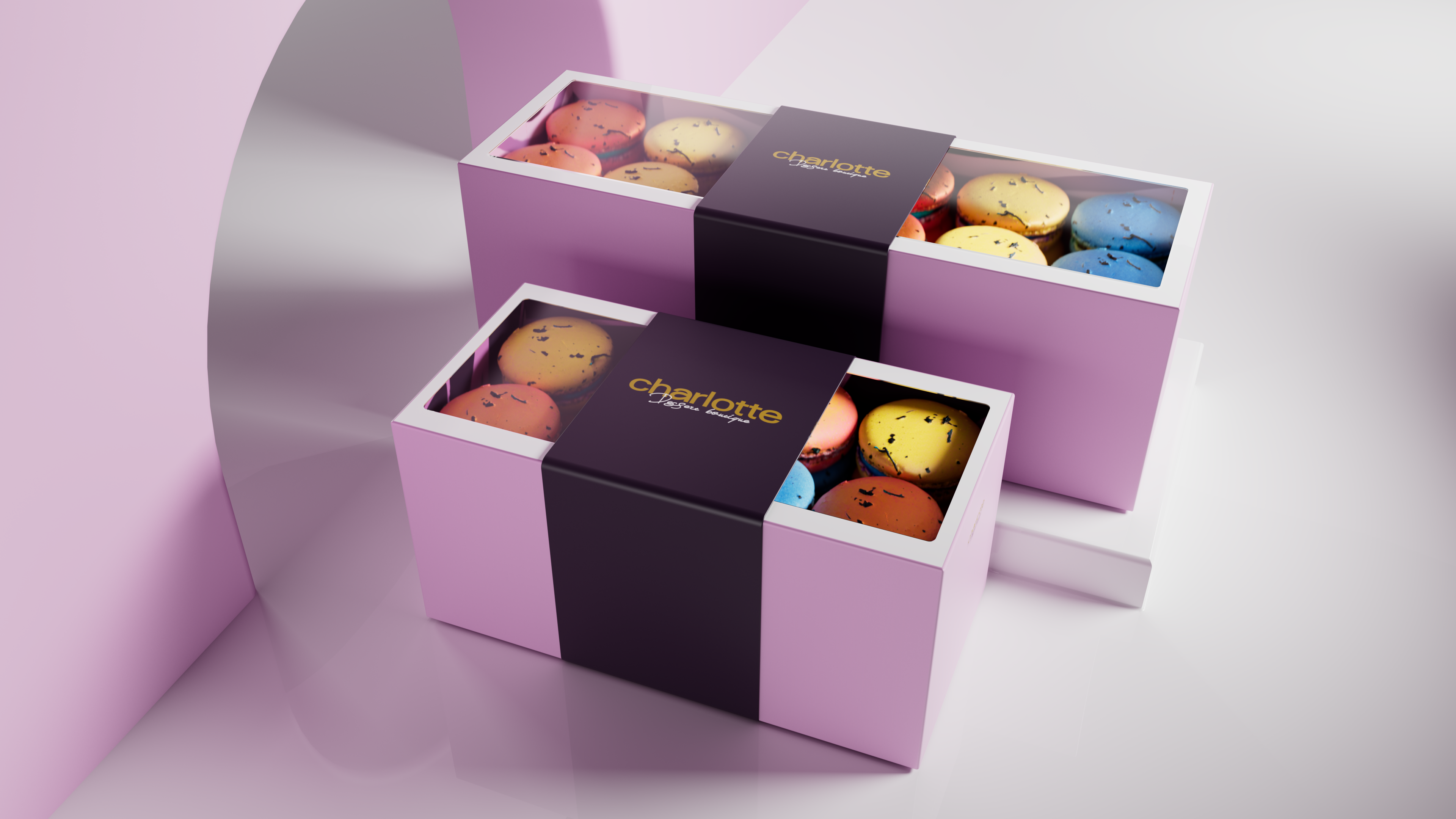
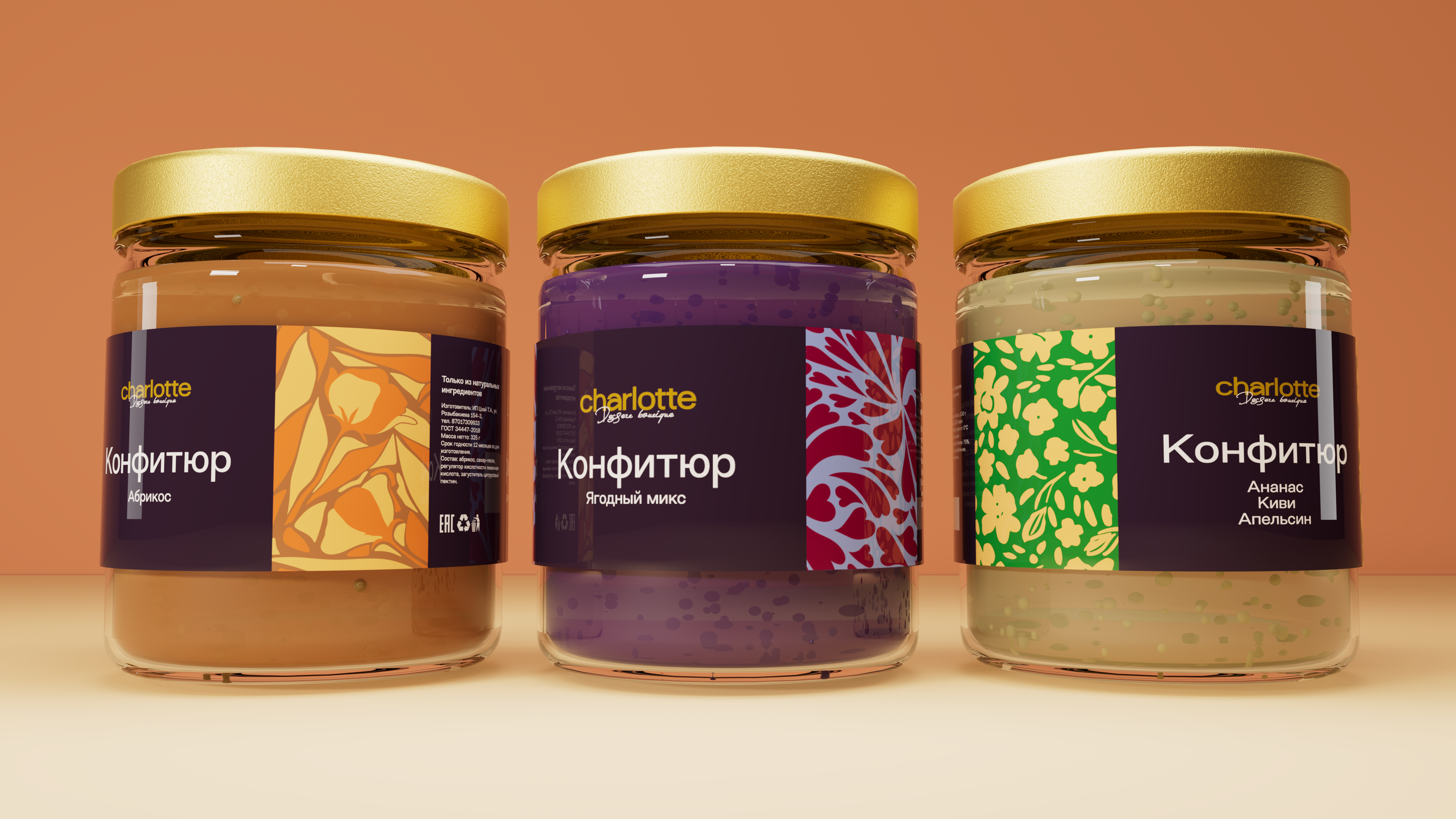
For the new dessert line "Charlotte," our objective was to create vibrant and appetizing visuals that would showcase the product’s essence. We focused on crafting a color palette that would bring out the "deliciously gummy" colors of the marmalade, highlighting each dessert with eye-catching yet tasteful compositions.
Creative Approach
The color scheme was chosen to reflect the flavor and variety of the desserts, with each jar and box designed to evoke a sense of freshness and quality. To keep the attention on the product, we opted for a neutral environment composed of simple geometric shapes, allowing the vibrant packaging and textures to stand out without distractions.