RU
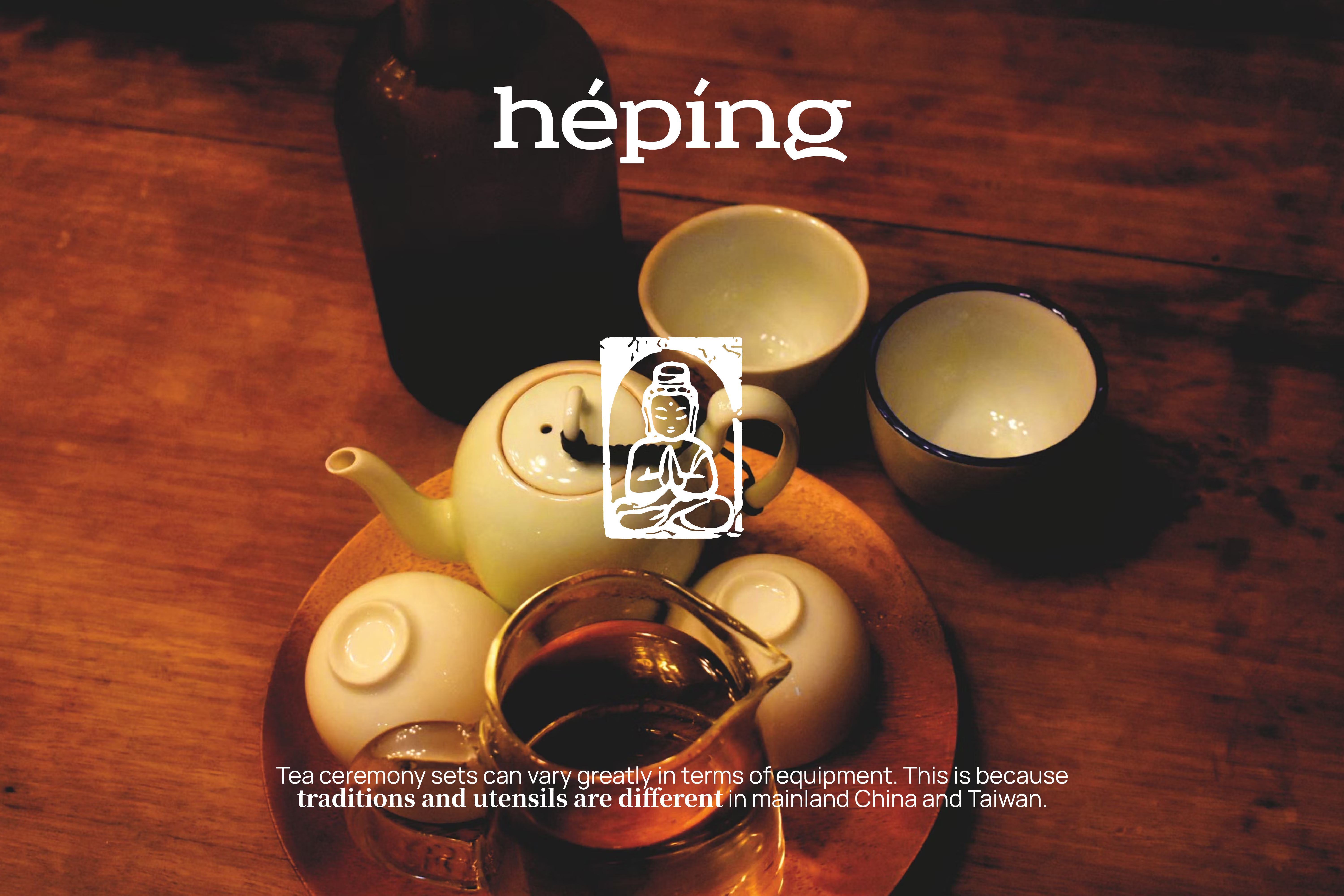
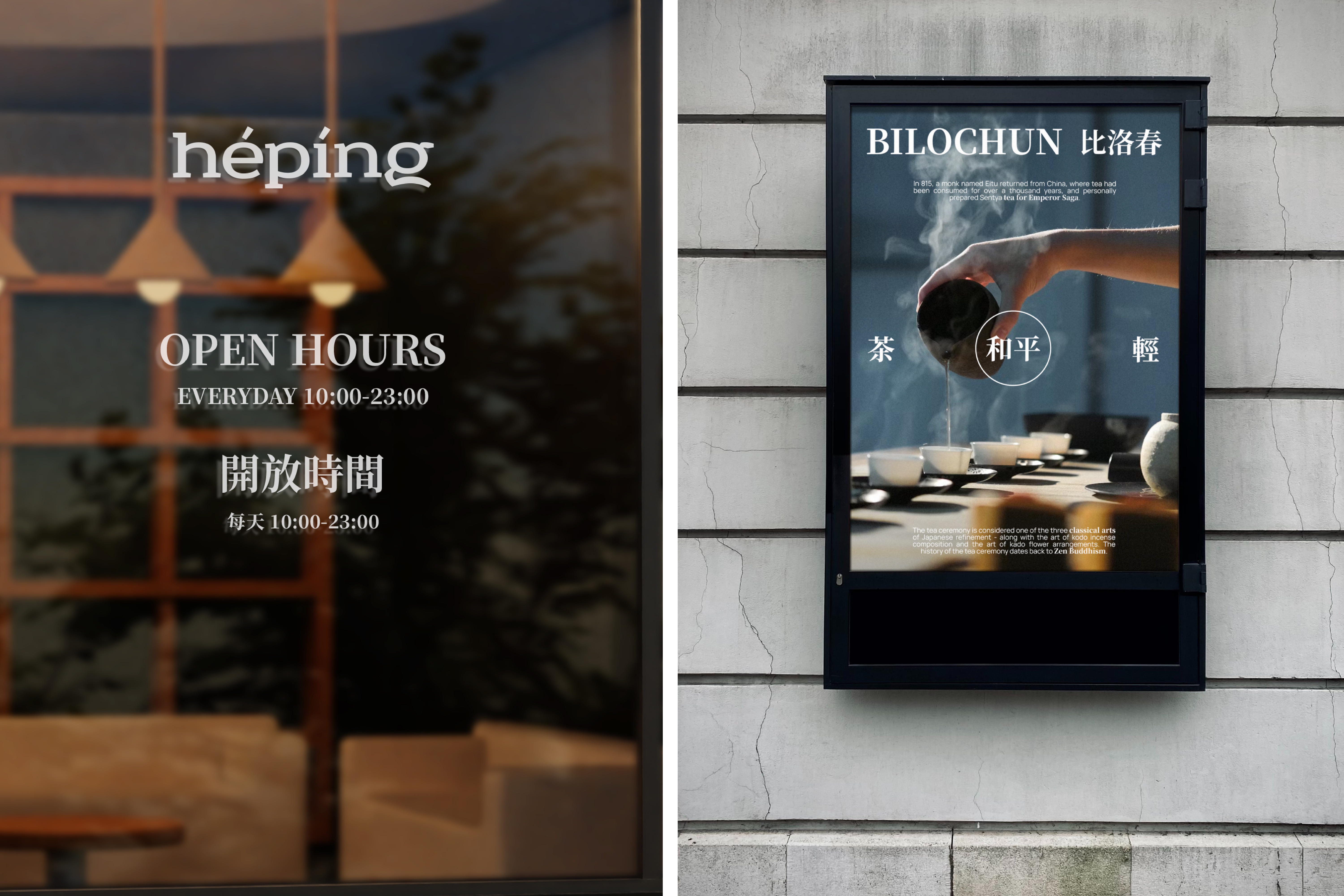
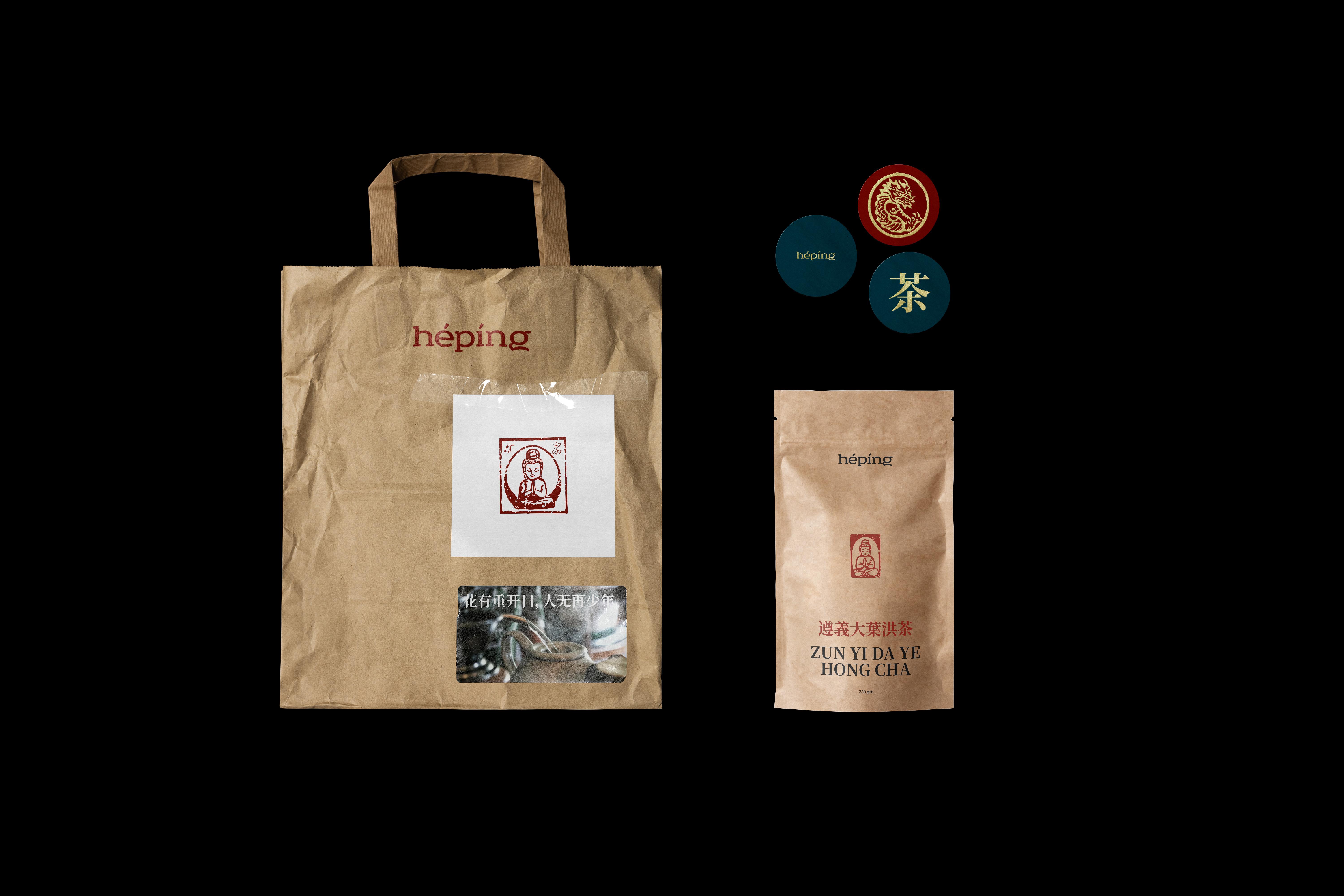
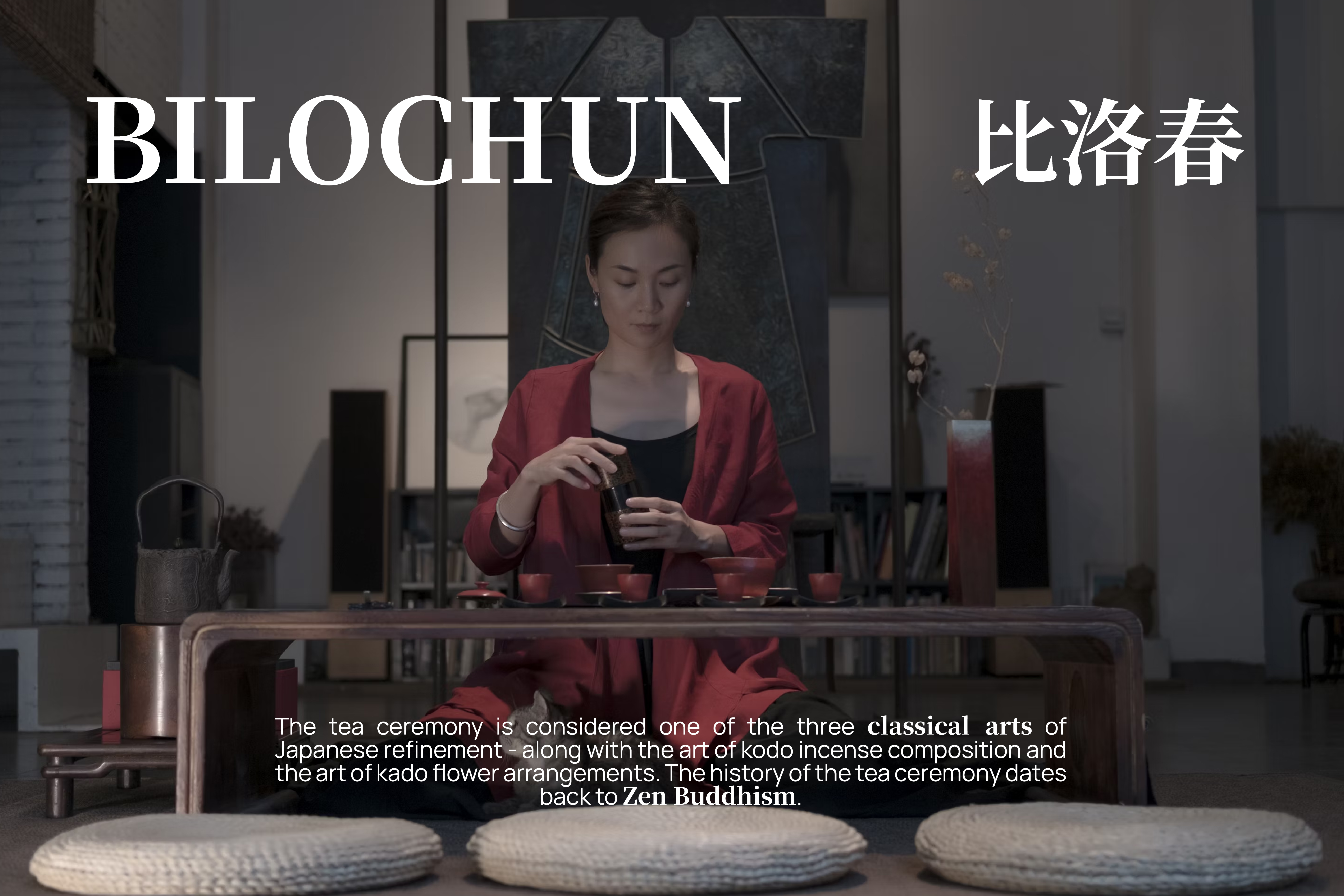
Hépíng - чайная, уютное пространство для церемоний в центре города.
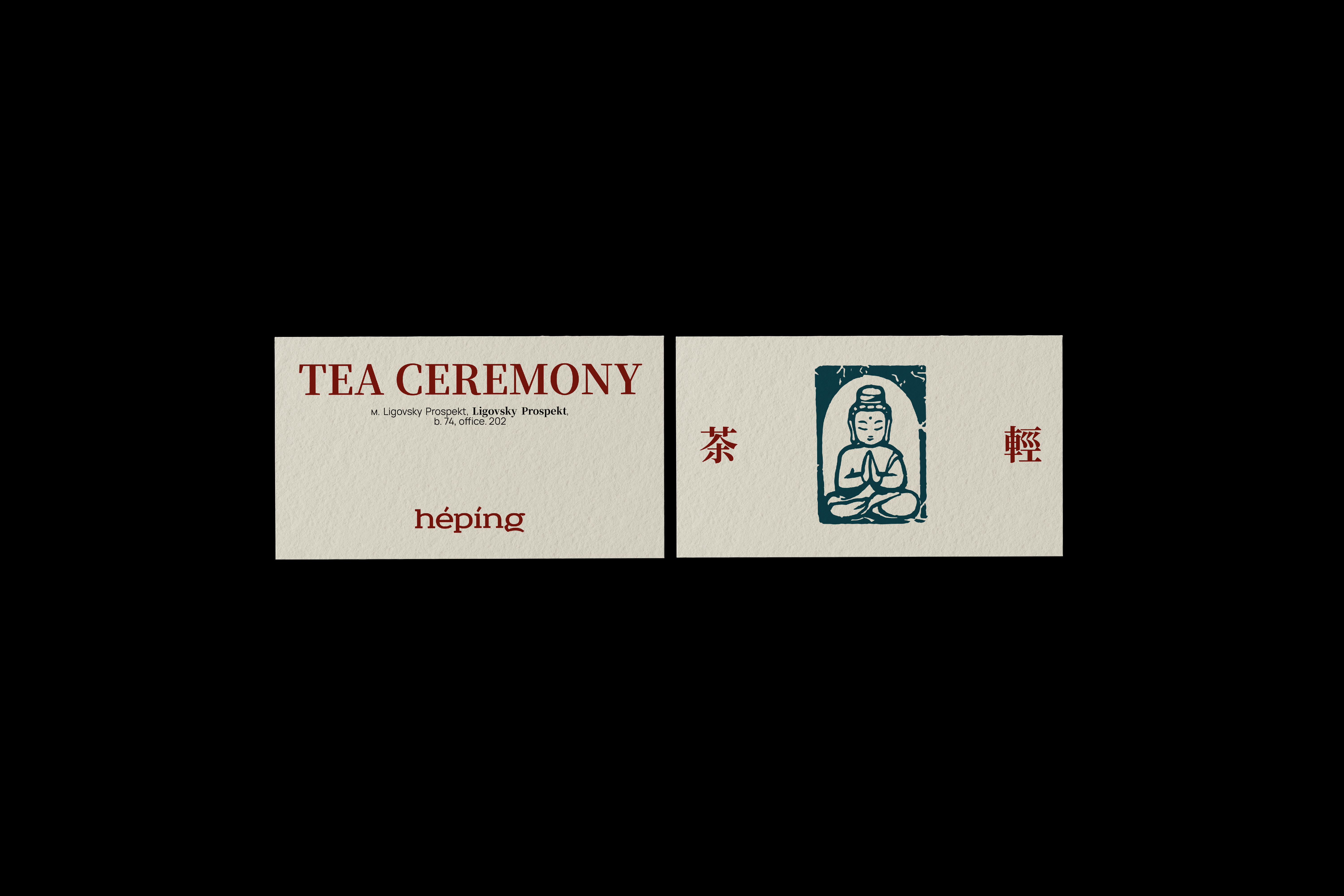
Название «Hépíng» переводится с китайского как «мир», что делает заведение островком спокойствия и гармонии, обозначая главные ценности создателей и посетителей.
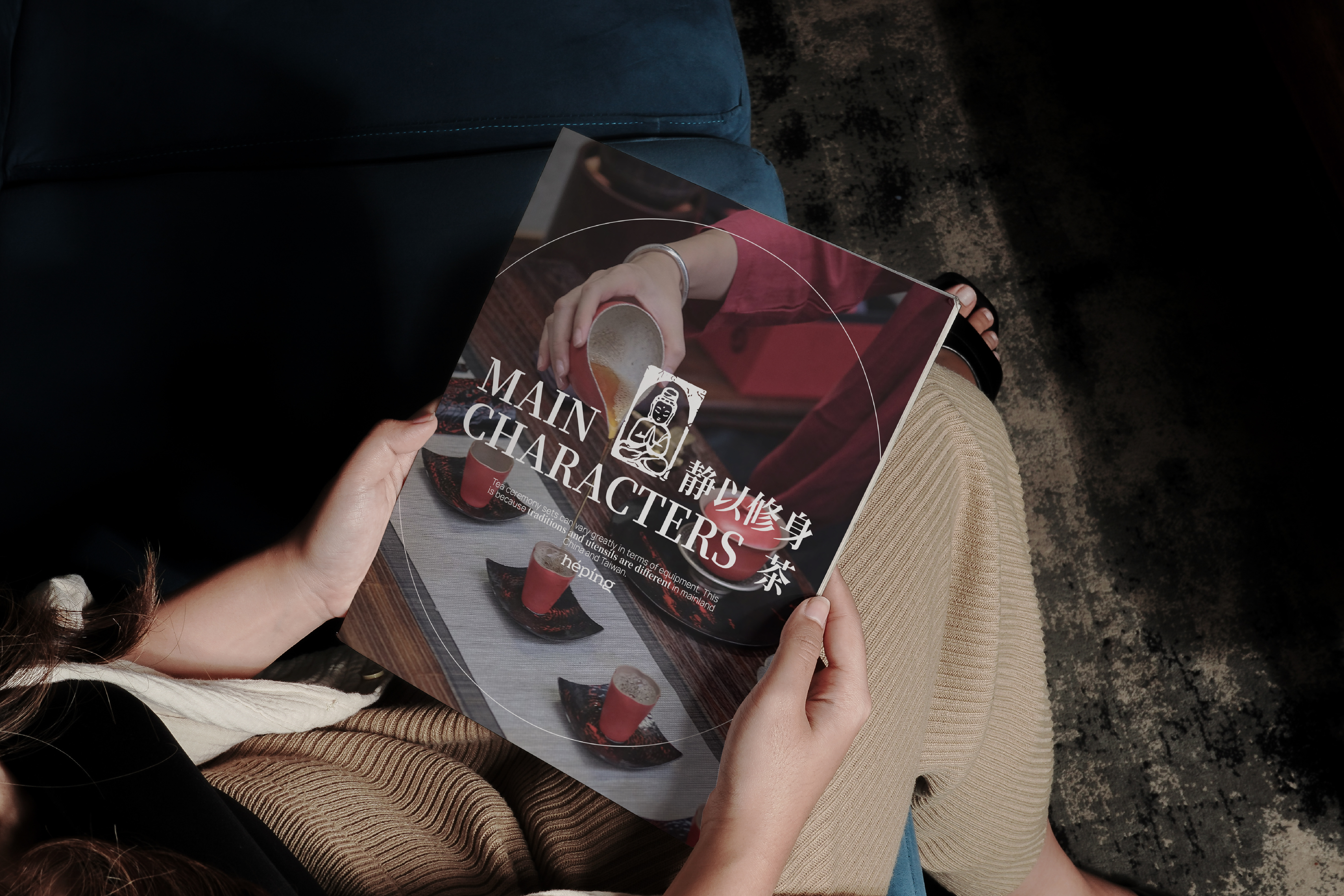
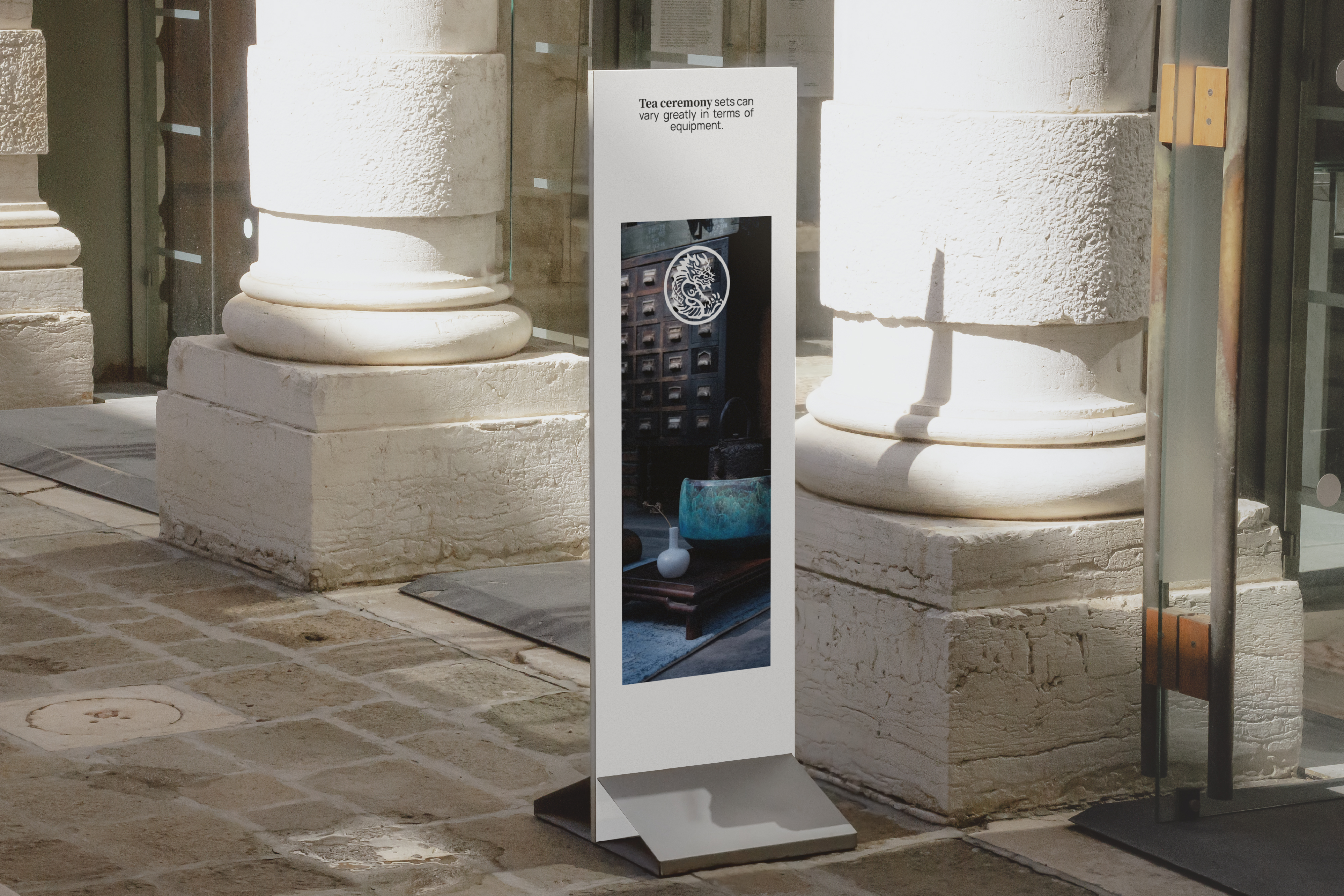
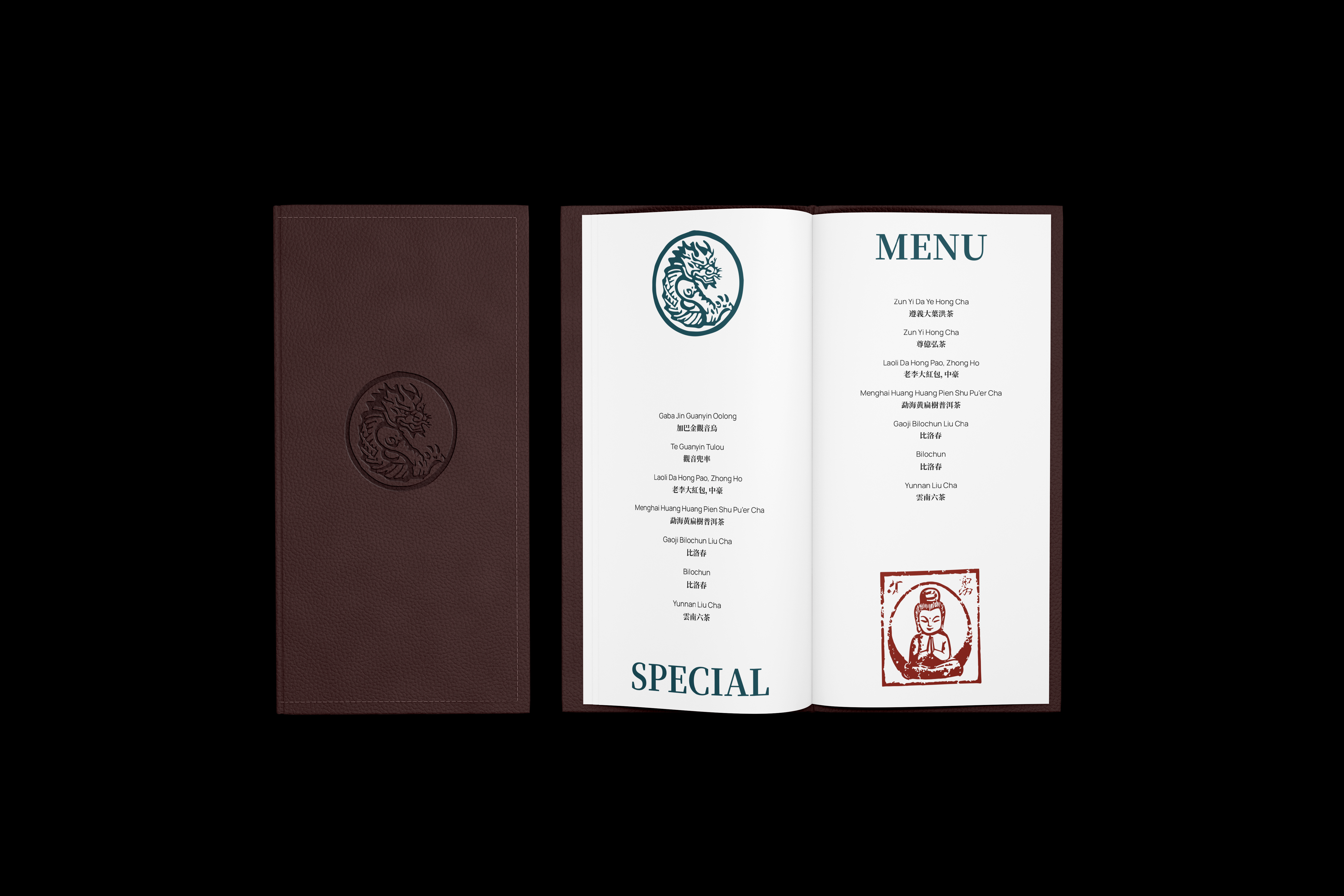
Главная цель пространства - собирать людей на тихие успокаивающие чайные церемонии, рассказывать о чая с разных сторон, их происхождении и роли в жизни каждого присутствующего. Важно сделать это не привычкой/рутиной, а важным мероприятием, которое проводят только с важными и дорогими людьми.
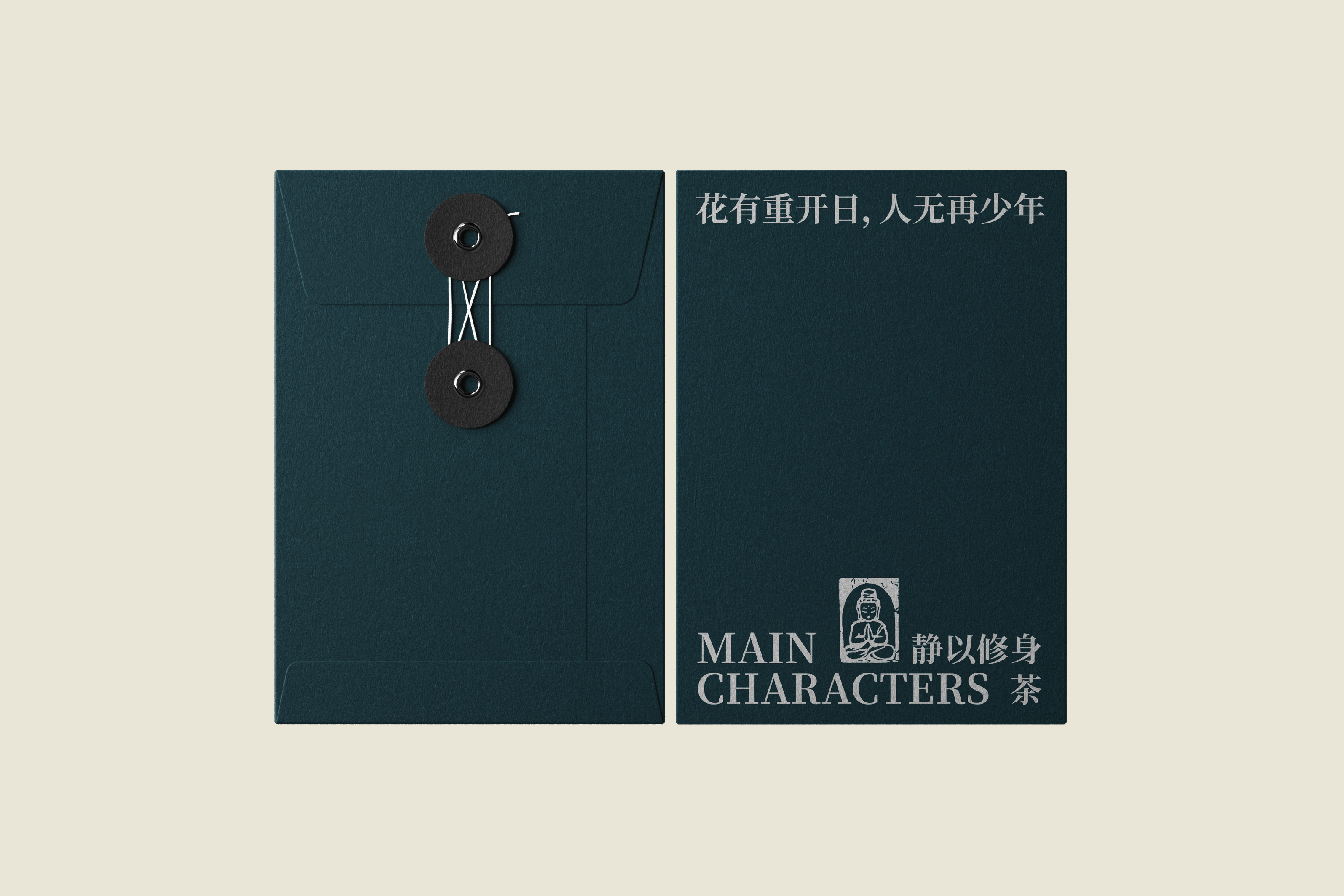
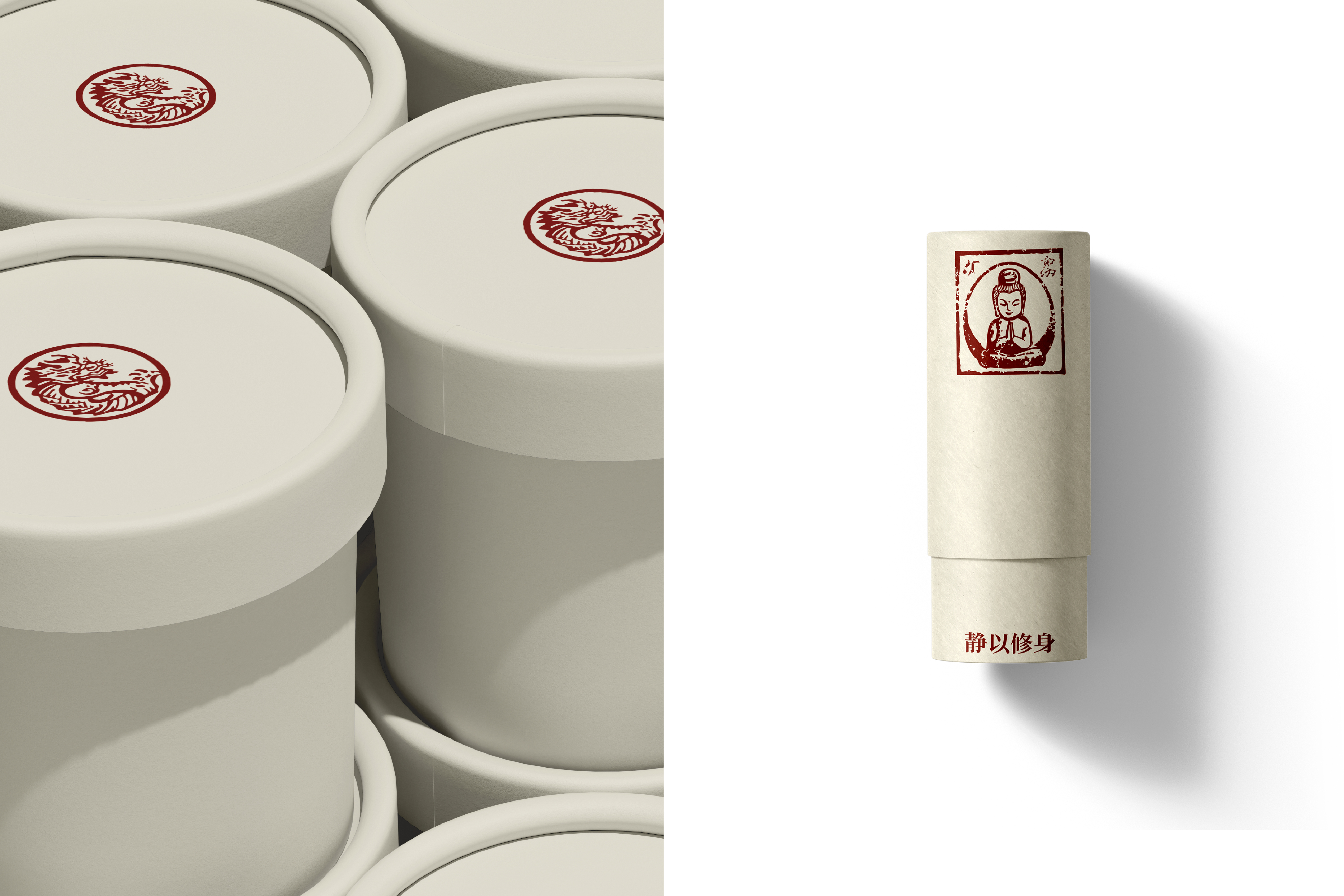
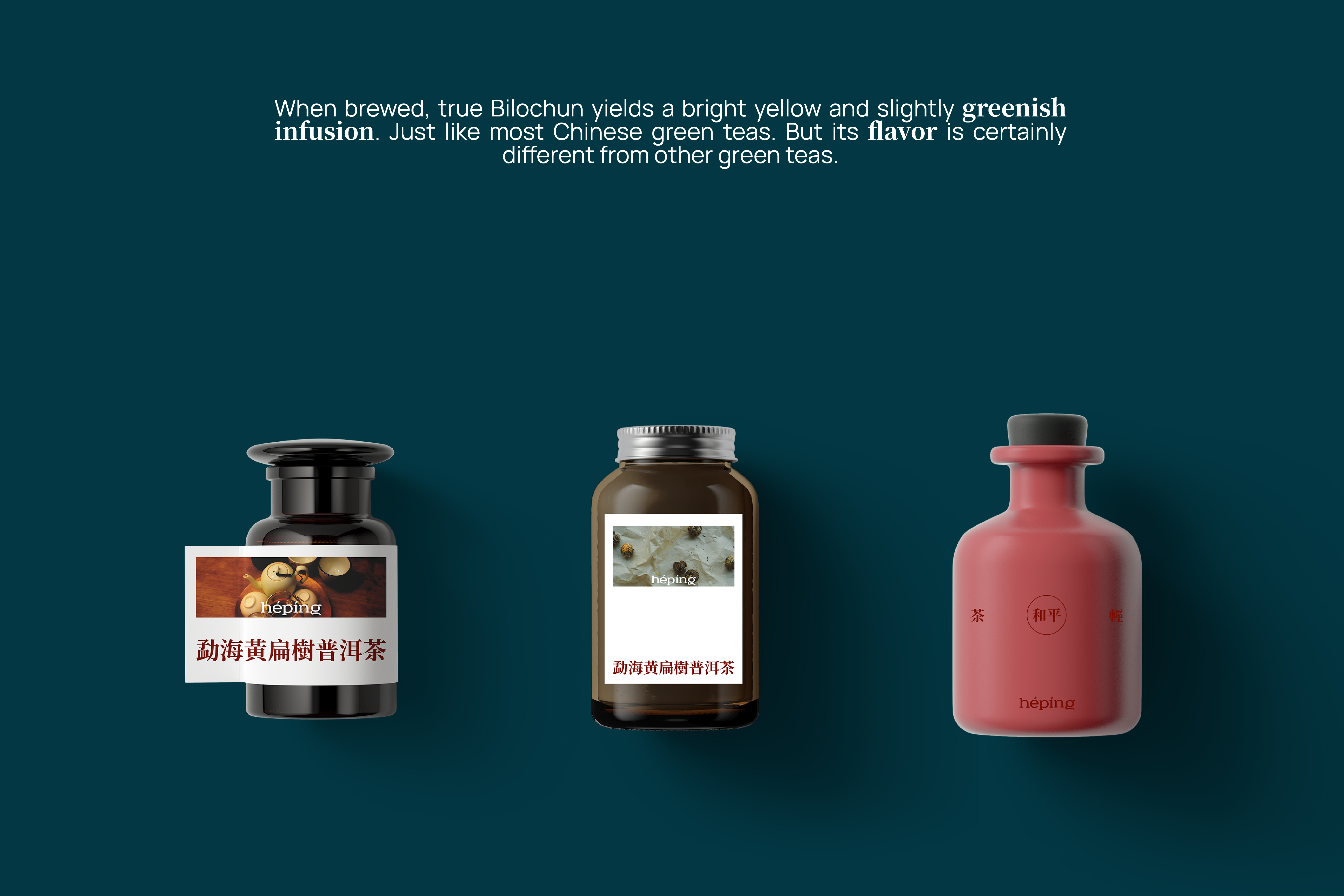
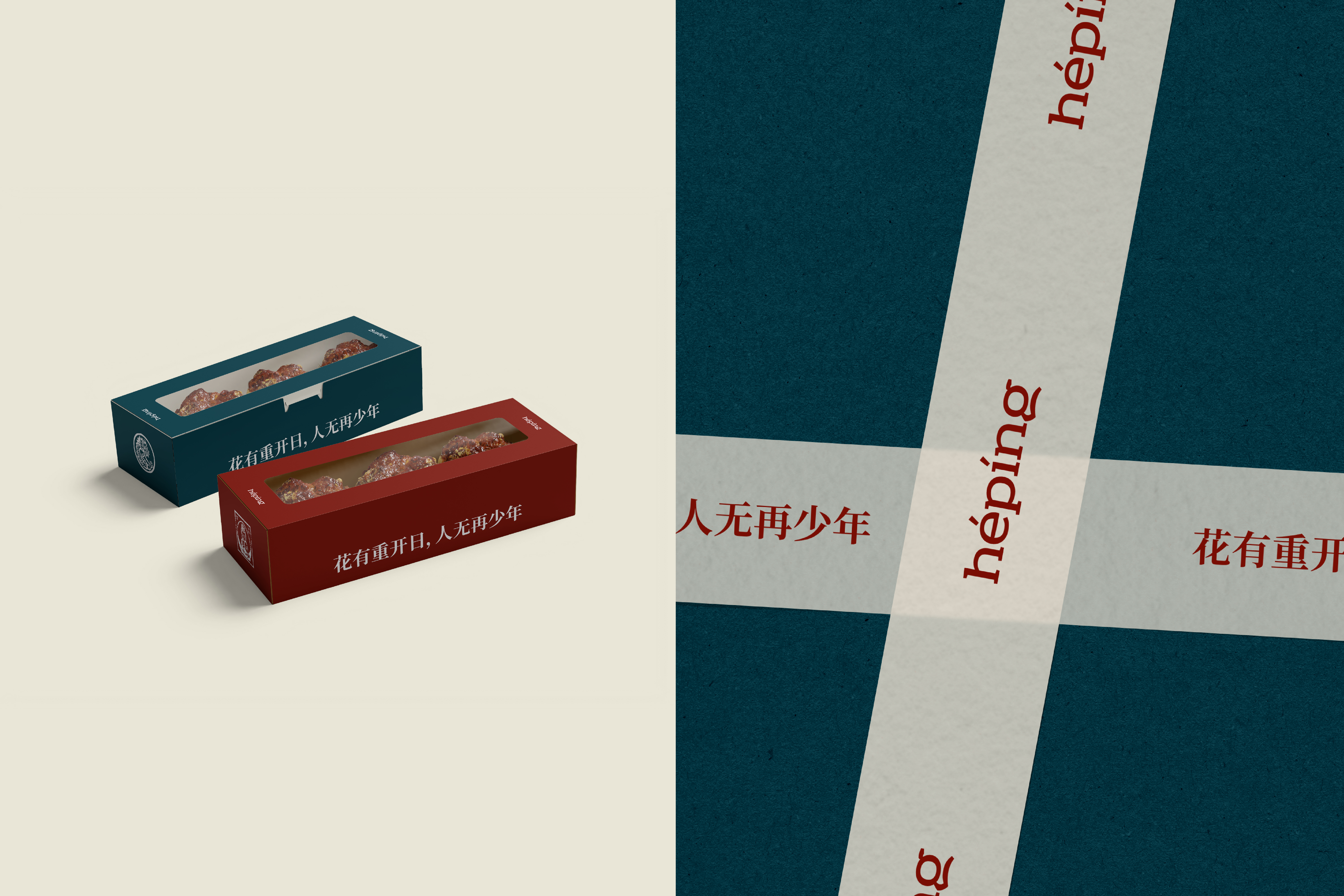
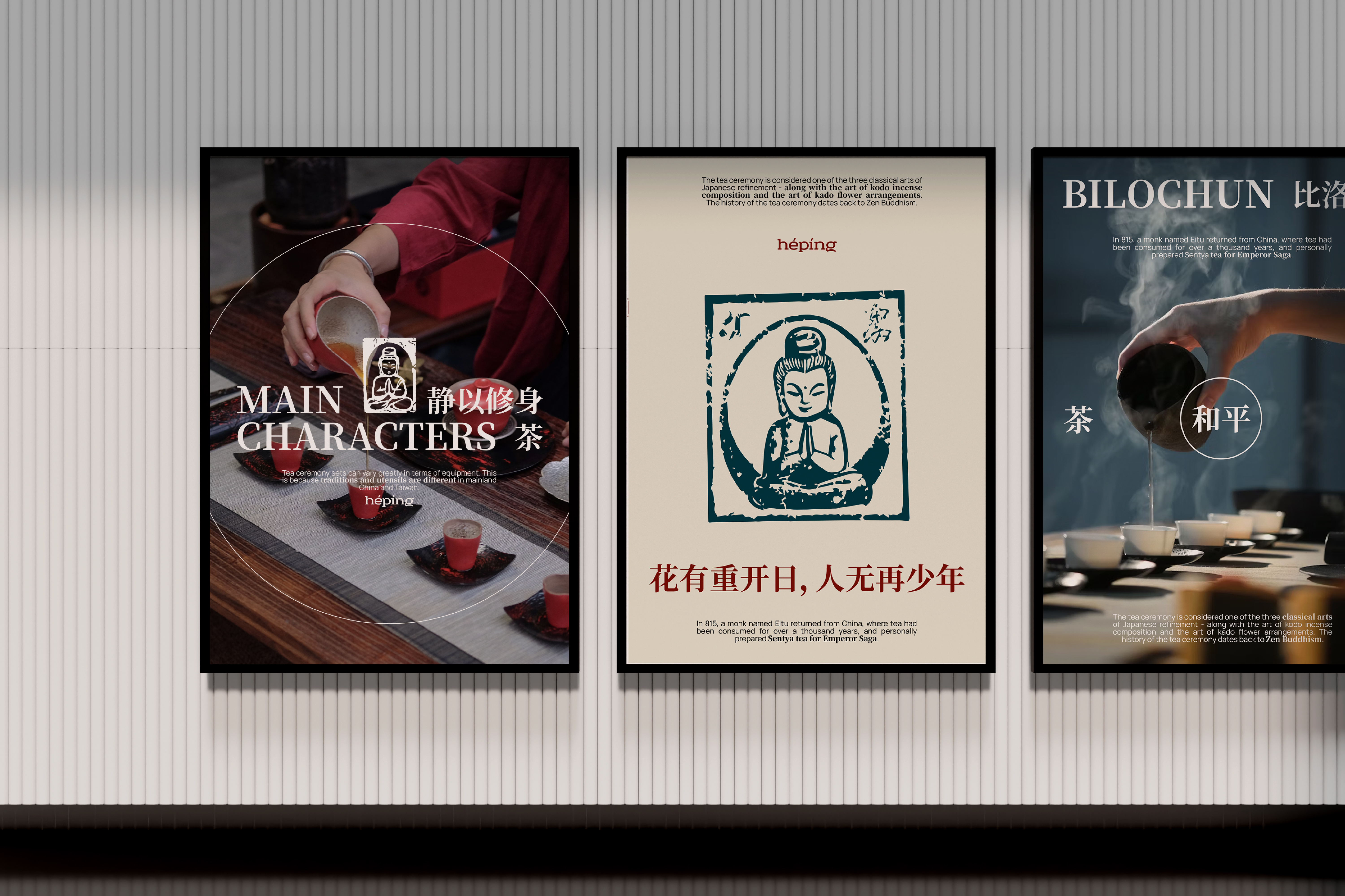
Логотип представляет собой шрифт с брусковыми засечками и округлыми линиями, напоминающие очертания чайника и чаш, главных составляющих церемонии.
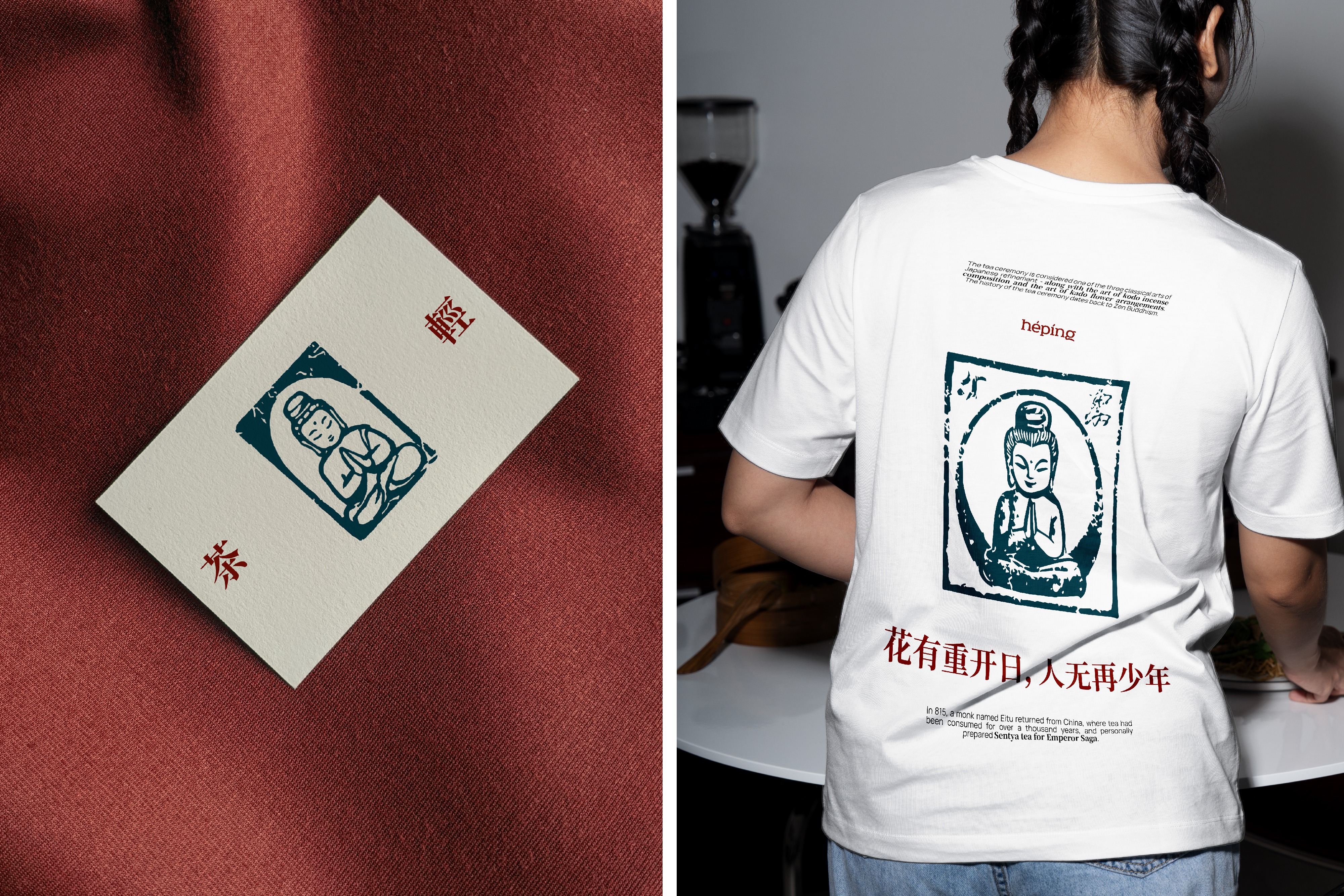
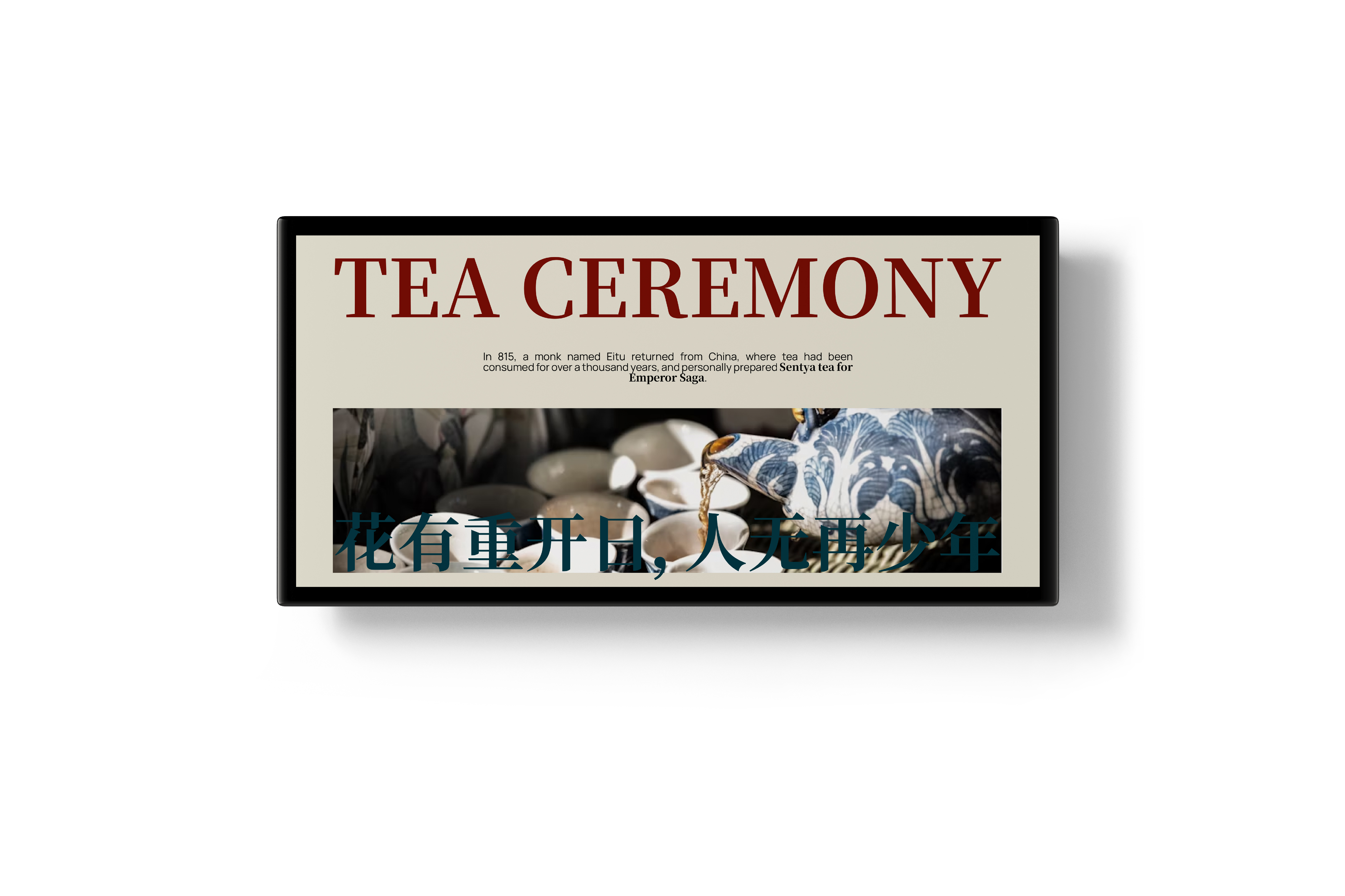
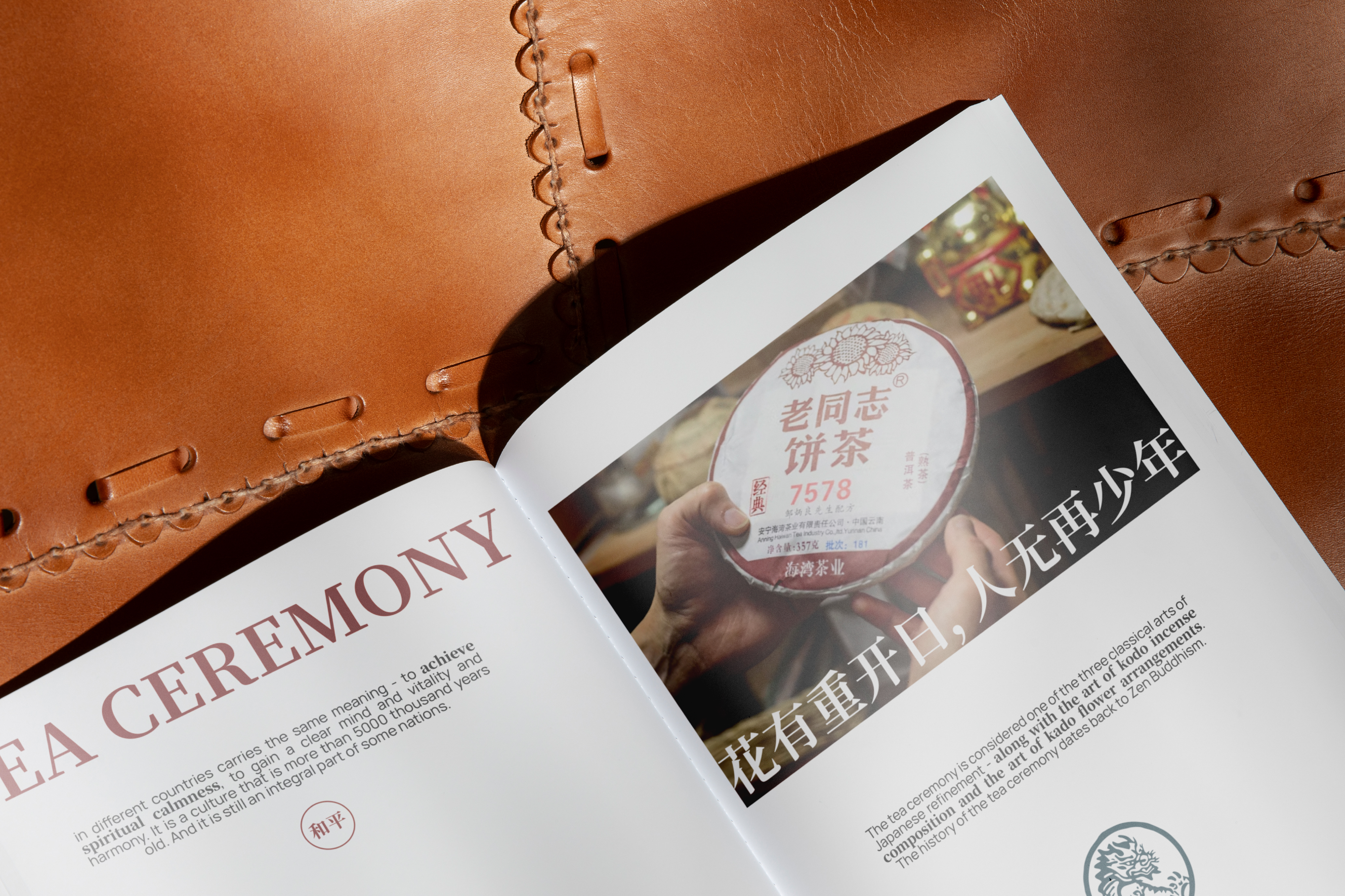
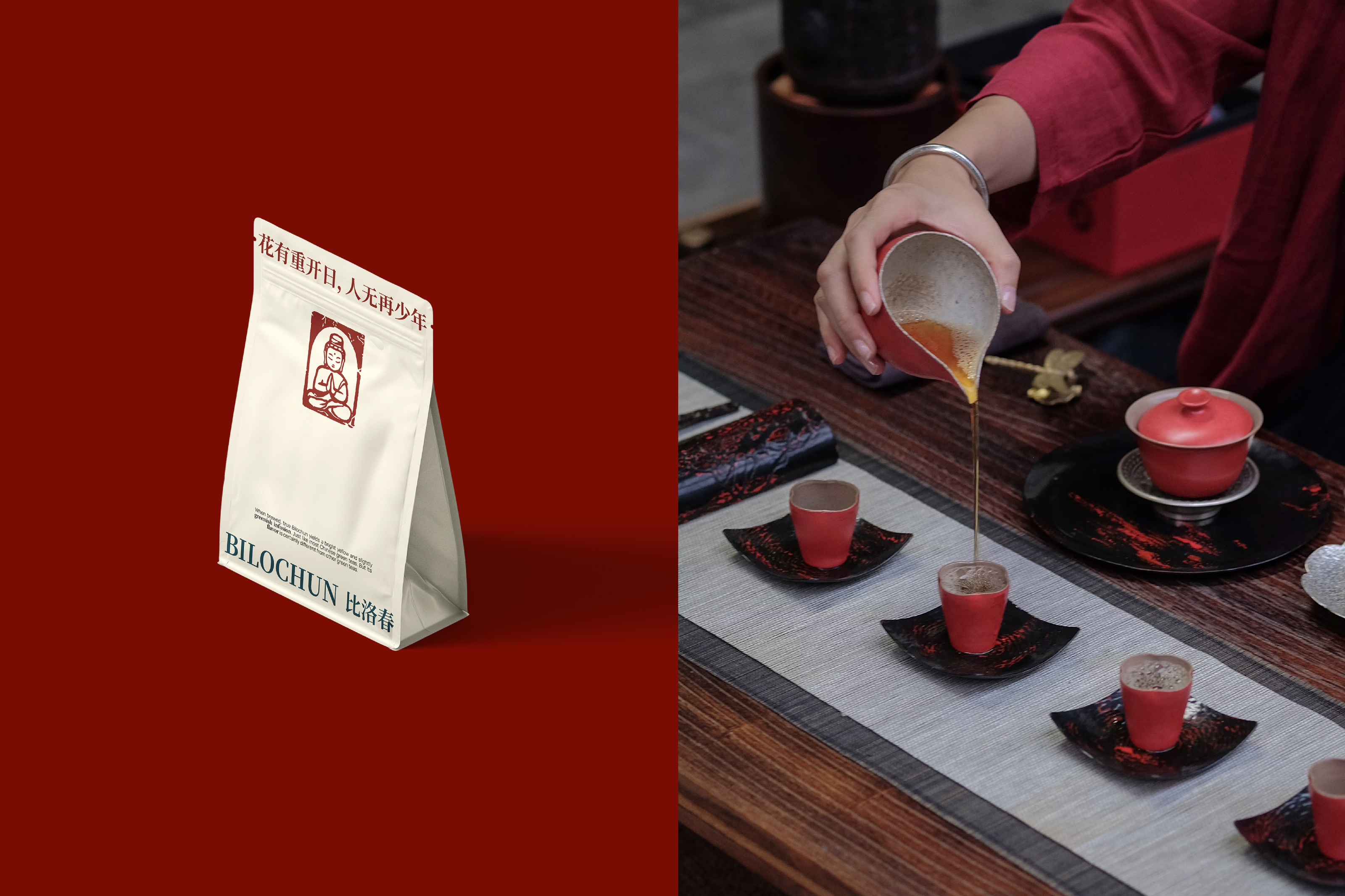
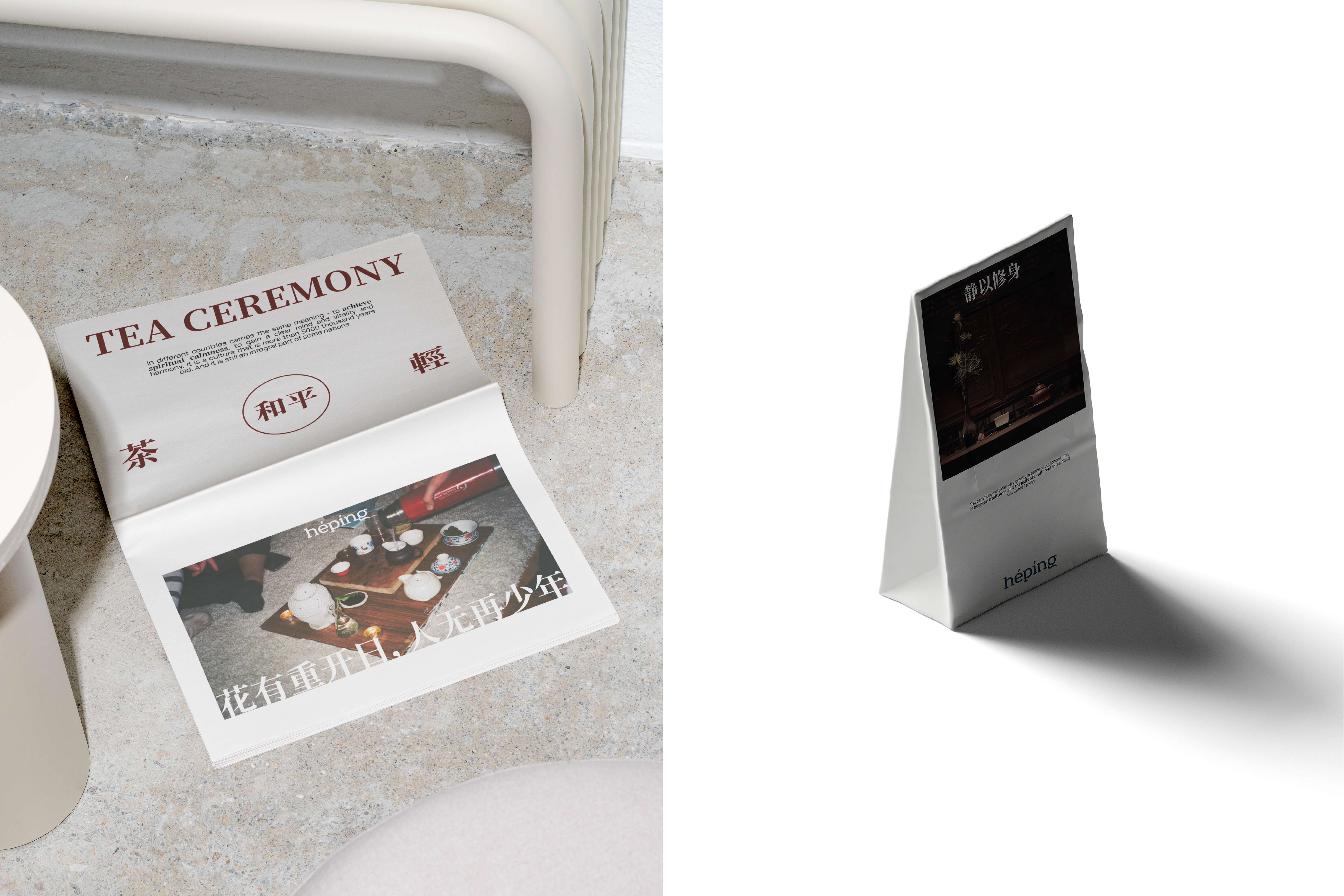
В айдентику так же включены несколько традиционных китайских символов, они передают главные смыслы: благородство, служение, честь. Использование китайских пословиц поддерживает всю историю создания чайной, сохраняет идею мира и гармонии. Верстка текста - отсылка к чашам, если посмотреть на них не сверху, как обычно, а со стороны, держа перед собой. Это метафора говорит «Мы на равне».
ENG
Hépíng is a tea house, a cozy space for ceremonies in the city center.
The name “Hépíng” translates from Chinese as “peace”, which makes the institution an island of tranquility and harmony, signifying the core values of the creators and visitors.
The main goal of the space is to gather people for quiet soothing tea ceremonies, to tell about tea from different sides, its origin and role in the life of everyone present. It is important to make it not a habit/routine, but an important activity that is only spent with important and dear people.
The logo is a font with bar serifs and rounded lines, reminiscent of the outline of the teapot and bowls, the main components of the ceremony.
The identity also includes several traditional Chinese symbols, they convey the main meanings: nobility, service, honor. The use of Chinese proverbs supports the whole history of the tea house, preserves the idea of peace and harmony. The layout of the text is a reference to the bowls, if you look at them not from above, as usual, but from the side, holding them in front of you. It is a metaphor saying, “We are on equal footing.”
DESIGNER: Anastasiia Zhitukha