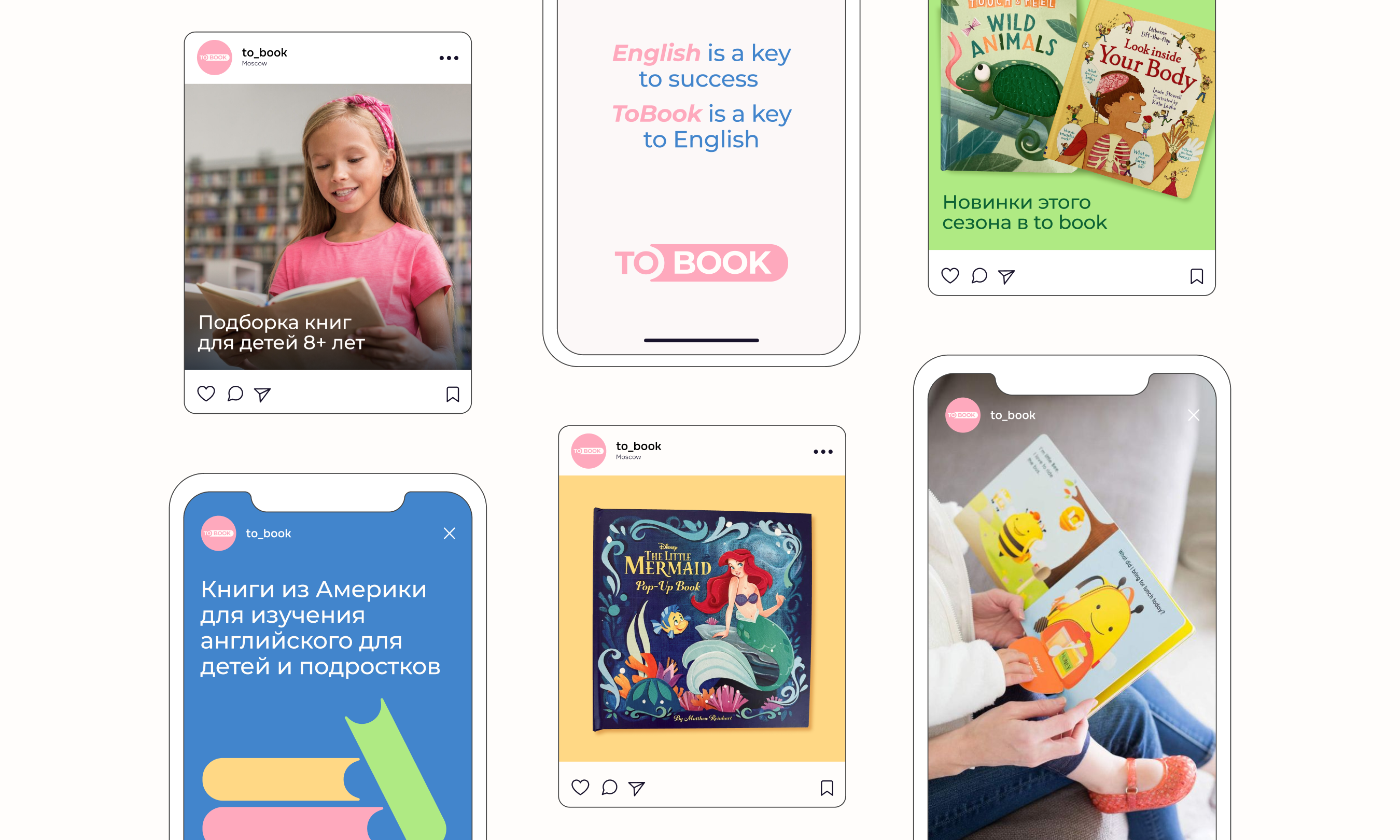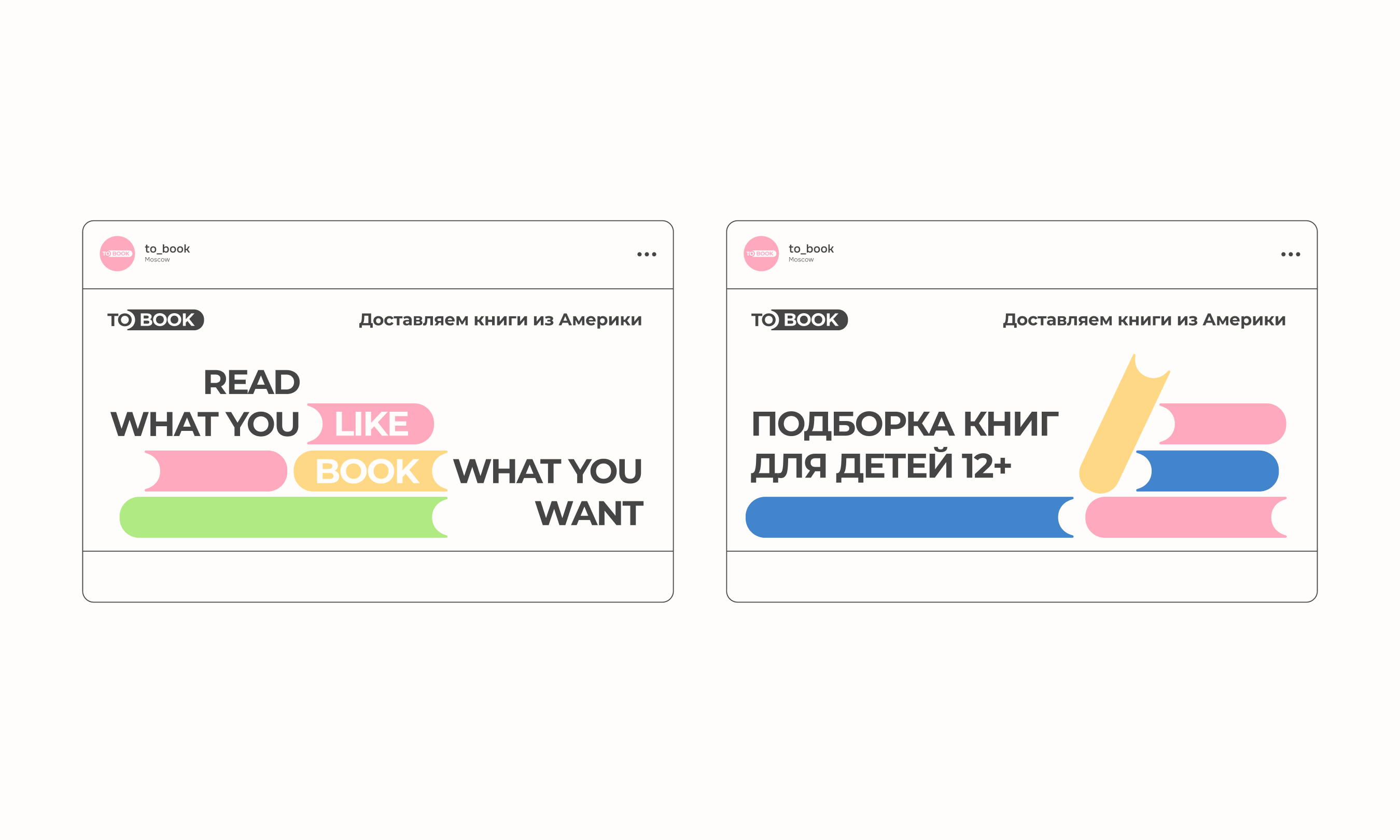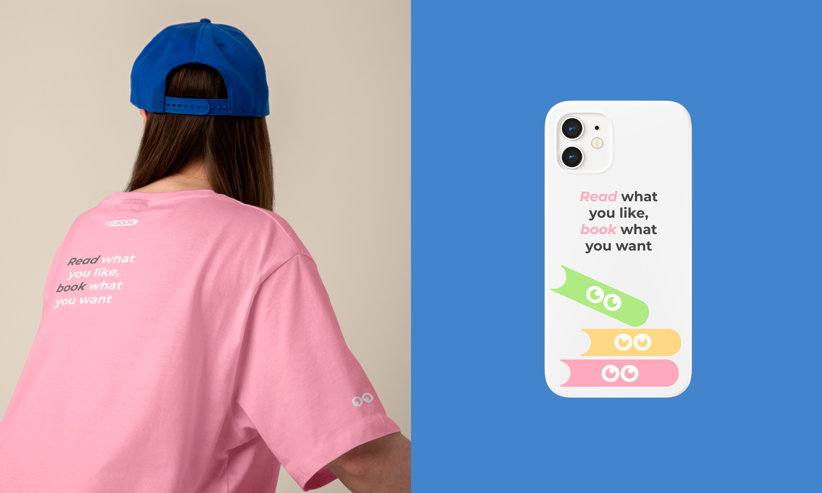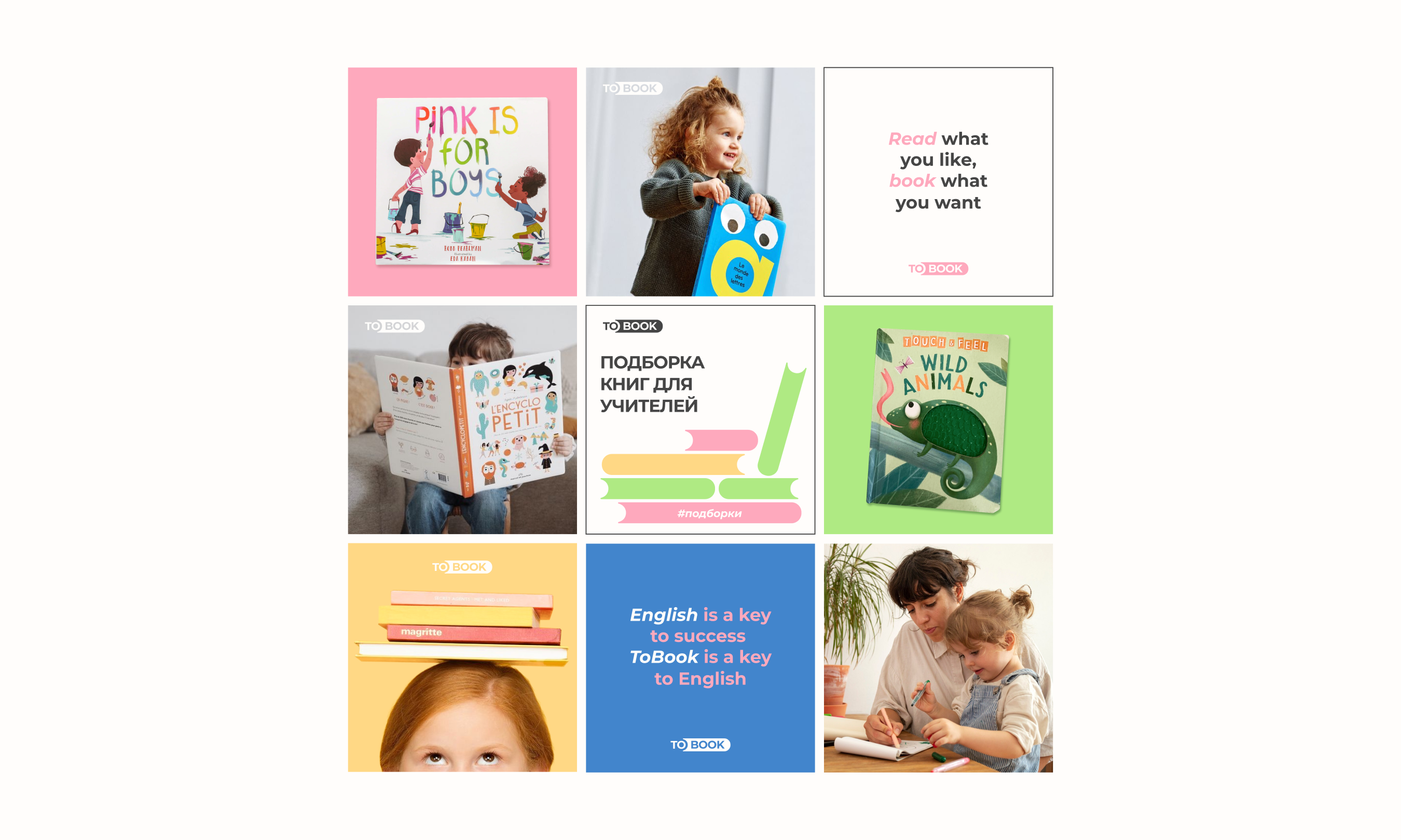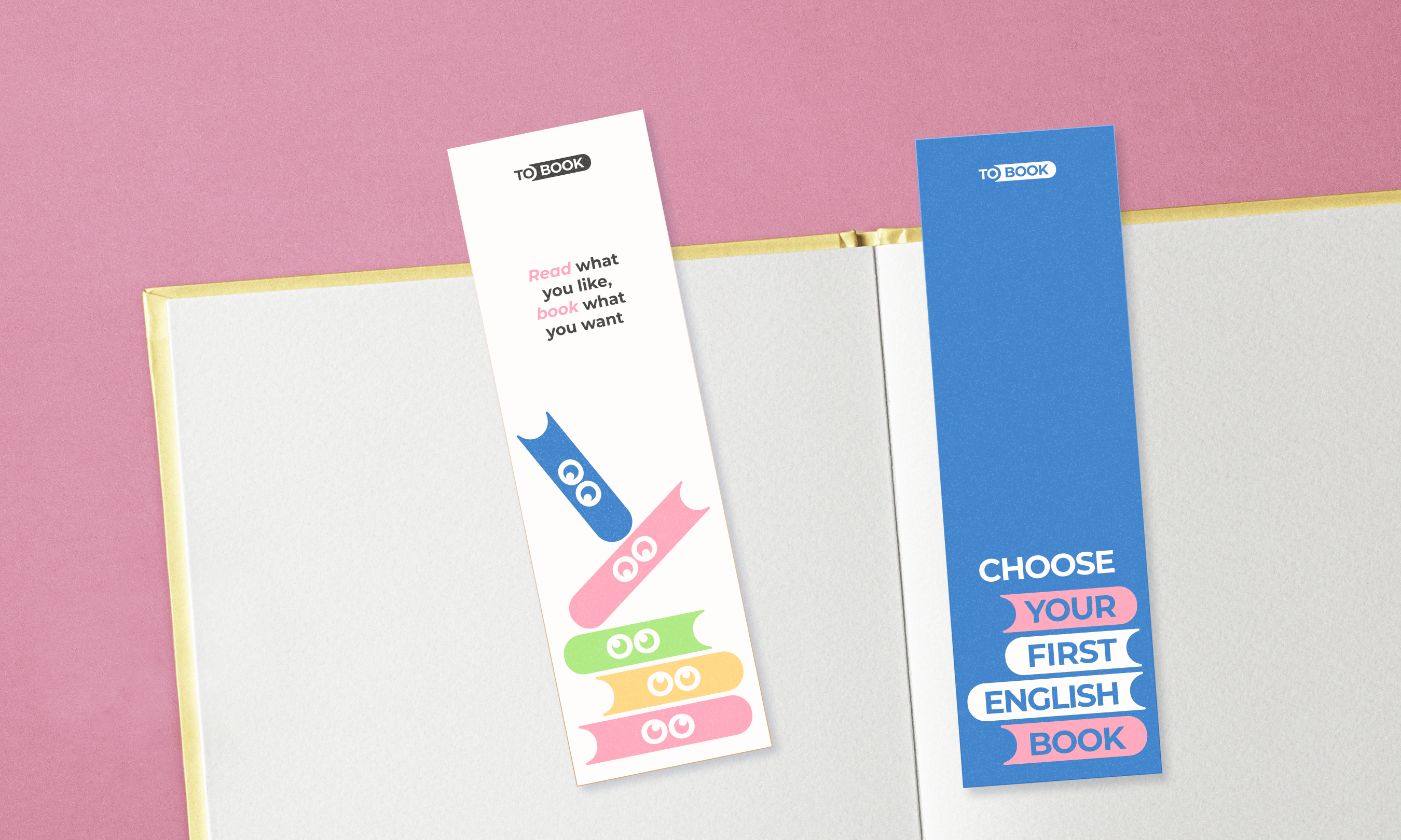
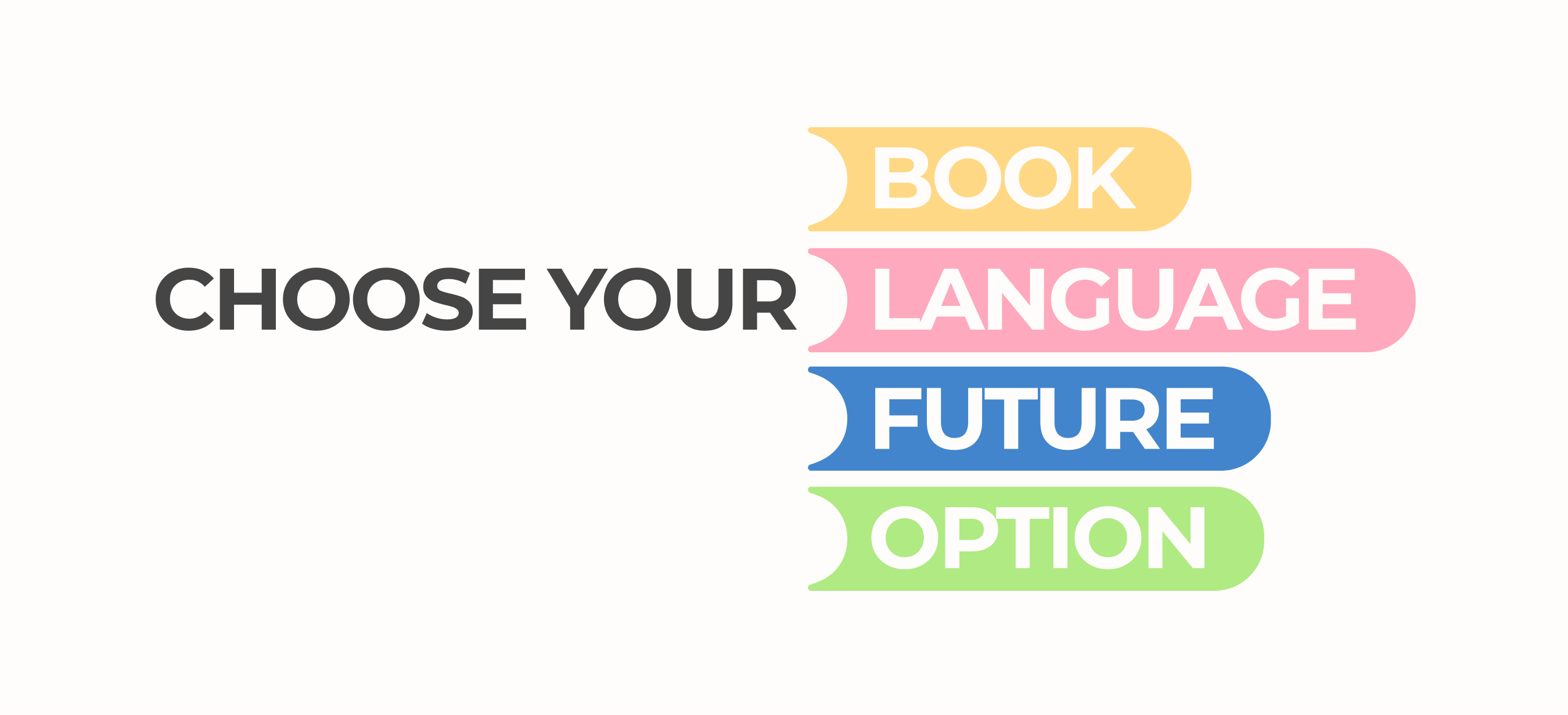
"To book" is a bookshop featuring American books for children and teenagers to learn English. The branding is based on a visual familiar to everyone learning the English language: the image of a game from a language learning app. The essence of the game is to insert missing words into sentences. In this case, to insert a word equals to book (to reserve) space.
The naming idea plays on words: we encourage to book a book in our store.

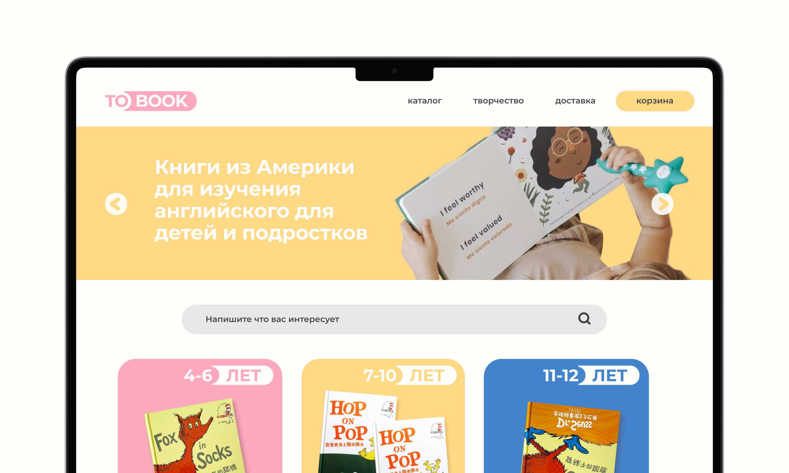

The store's target audience is parents and teenagers, so the branding needs to be friendly, yet not overly child-oriented.
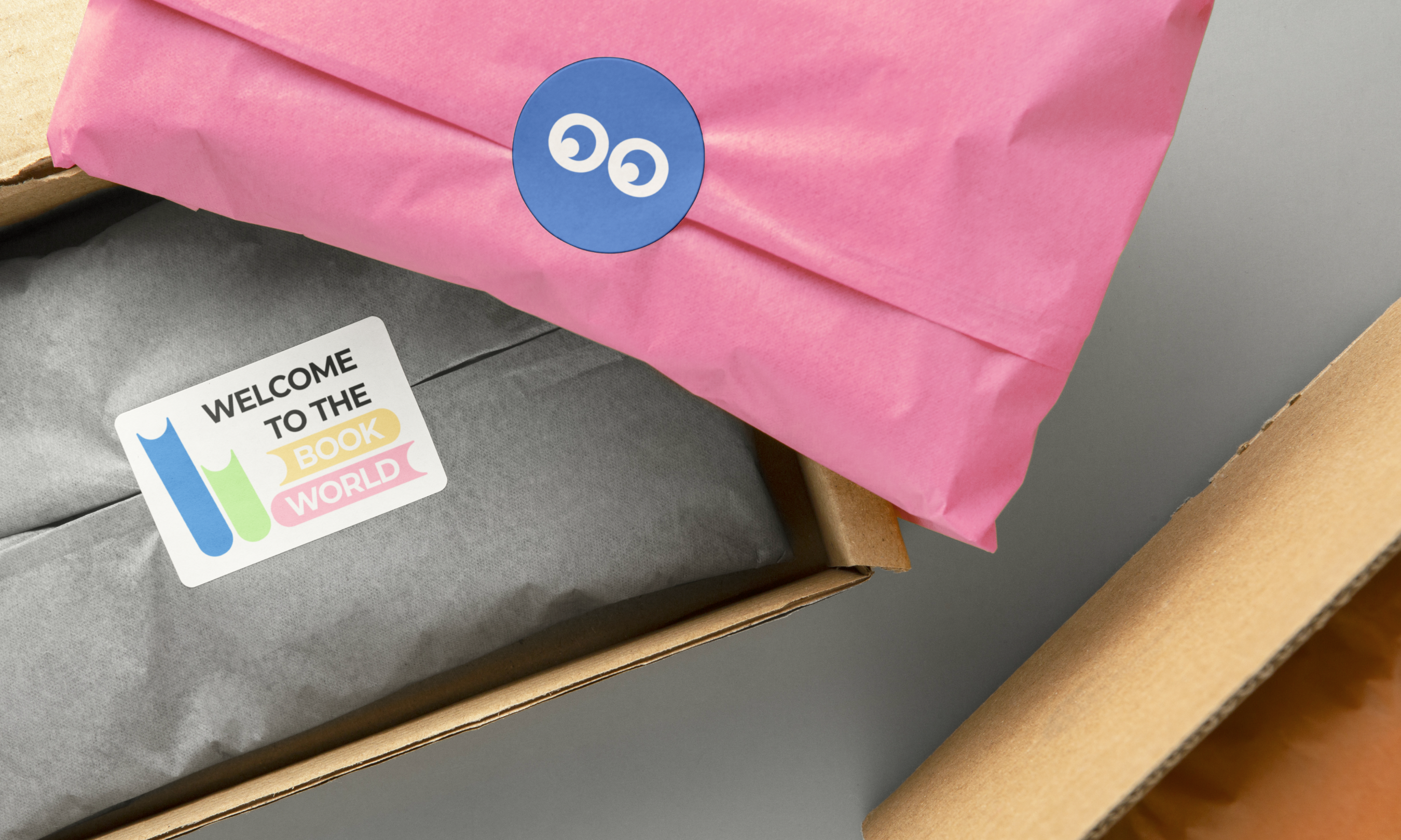
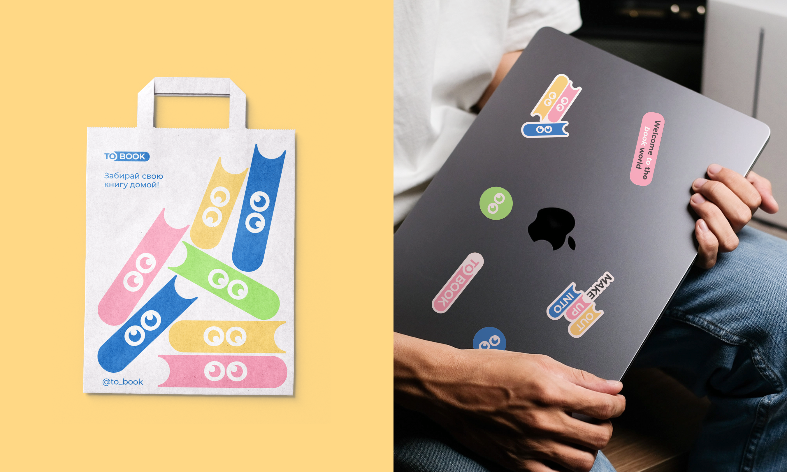
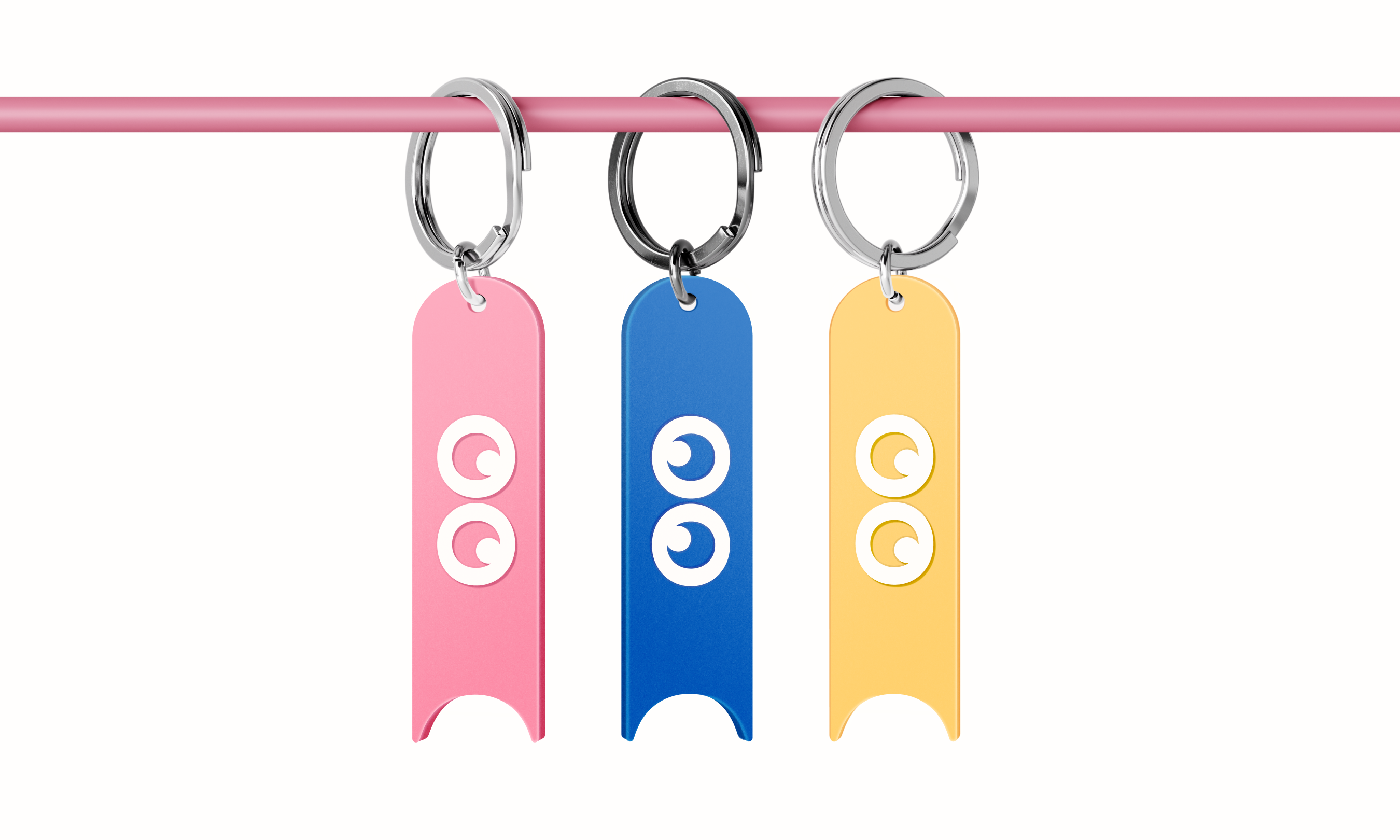
The books fill gaps in English language learning, hence the "book" part of the logo is shaped like a book. For the children's content, "eyes" are incorporated into the book to create a character. These "eyes" correspond with the letters "oo" in the logo. The pupils can look in different directions, allowing the characters to glance at each other.