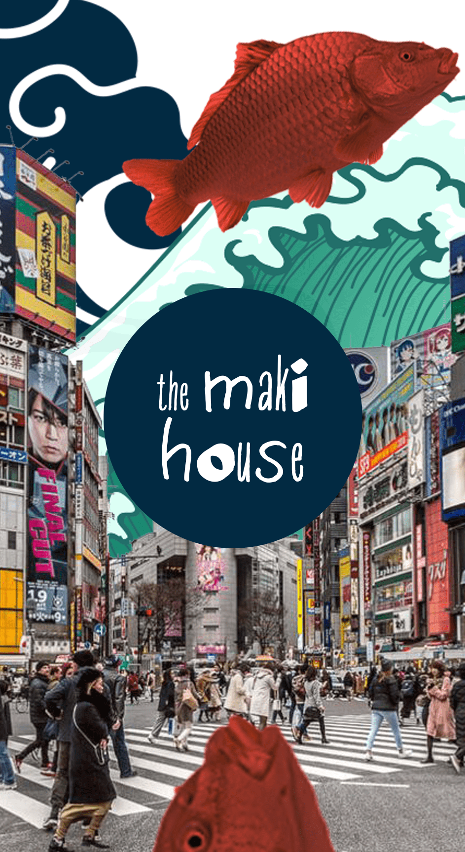
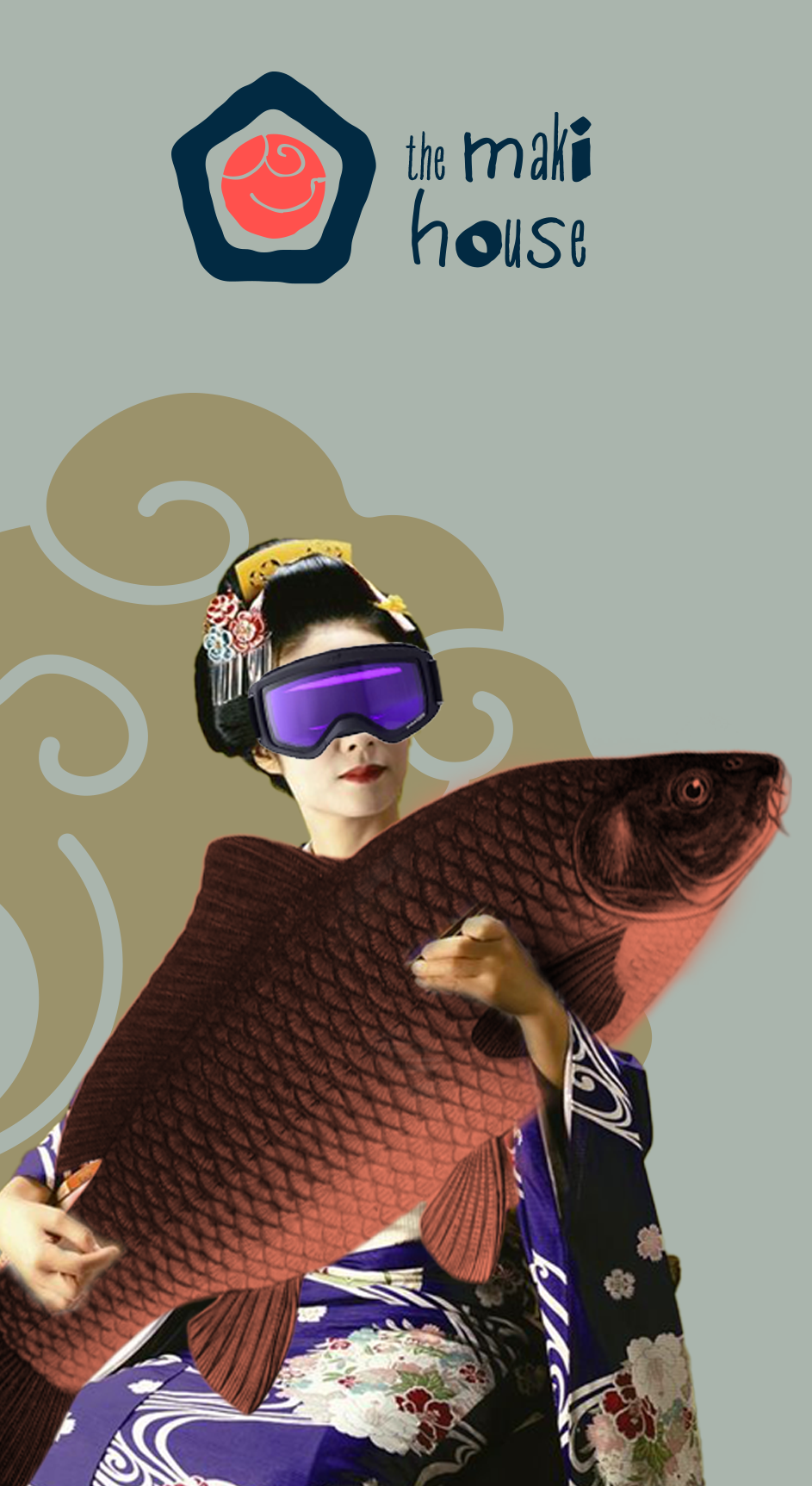
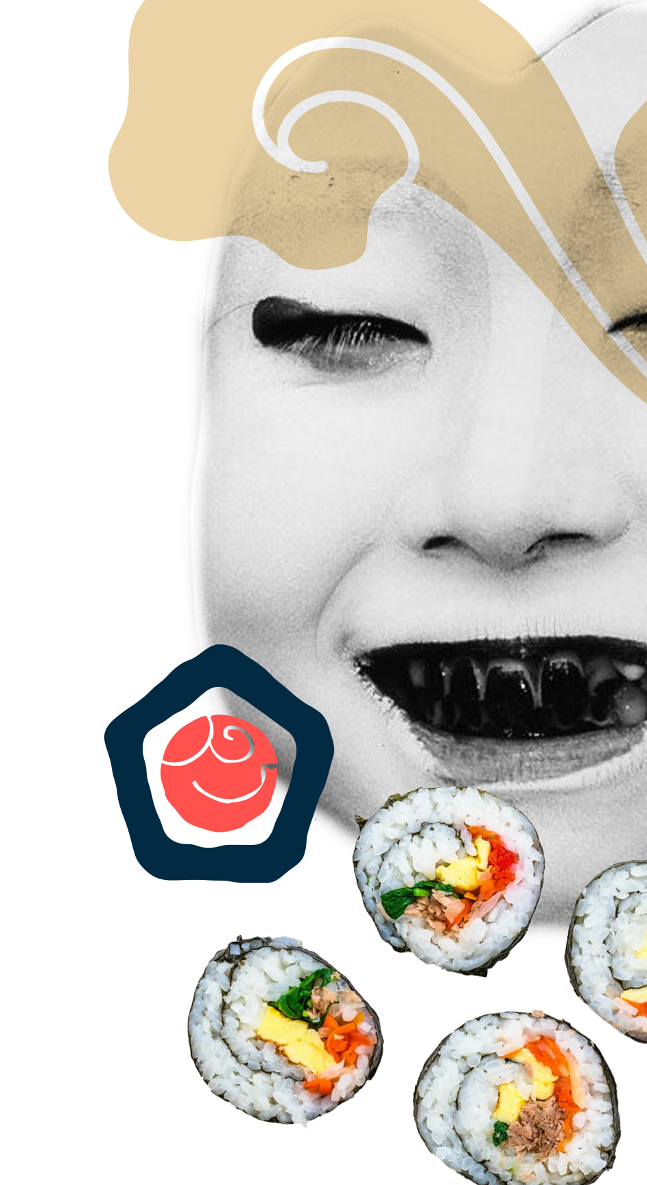
Branding concept The Maki House

Branding concept:
The Maki House

Branding concept The Maki House — Изображение №1 — Брендинг на Dprofile

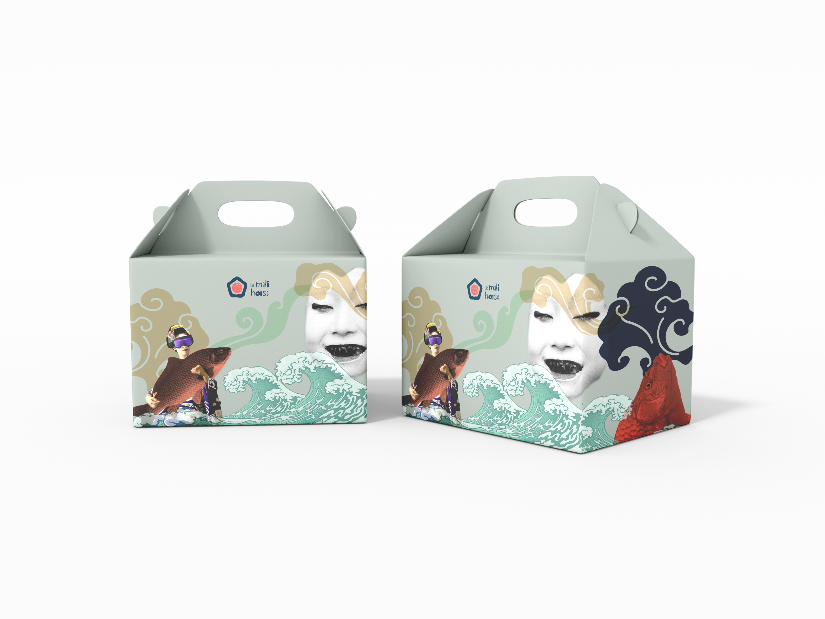
Branding concept The Maki House, the best sushi in town.

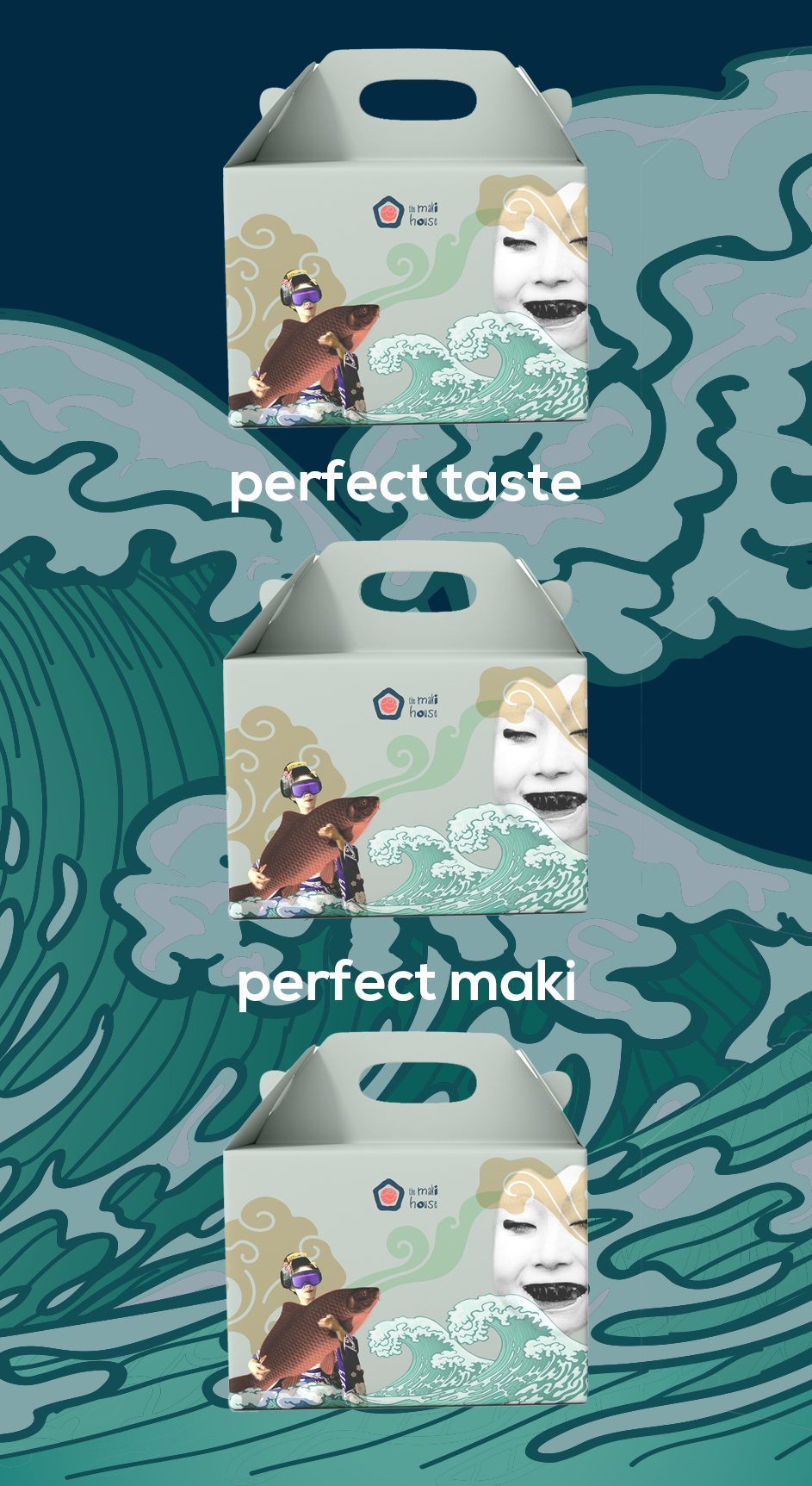
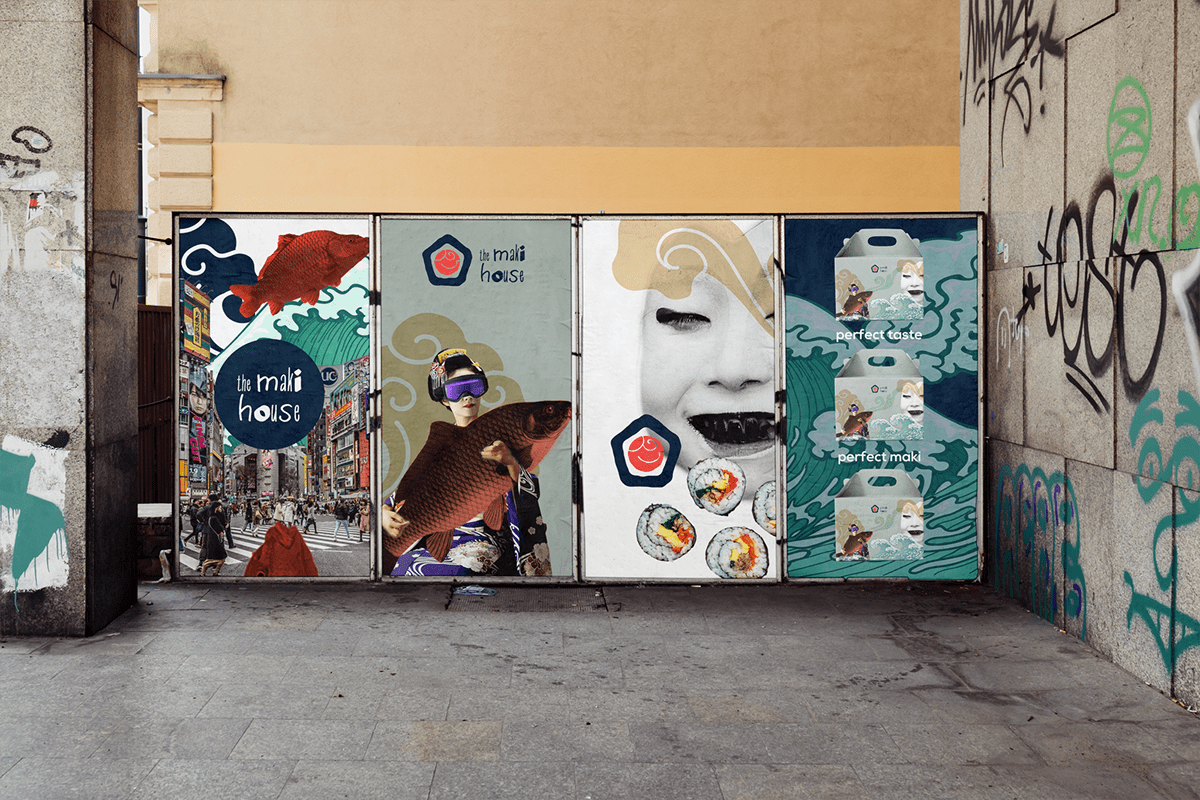
The logotype represents a hand-drawn house-"maki" with the fish texture referencing the traditional Japanese illustration element. The package is a paper box with geisha and fish as main characters to build a connection
to the country of origin. I wanted some fun and surreal for the new branding.

Branding concept The Maki House — Изображение №2 — Брендинг на Dprofile
Branding concept The Maki House — Изображение №3 — Брендинг на Dprofile
Branding concept The Maki House — Изображение №4 — Брендинг на Dprofile
Branding concept The Maki House — Изображение №5 — Брендинг на Dprofile
Branding concept The Maki House — Изображение №6 — Брендинг на Dprofile
Branding concept The Maki House — Изображение №7 — Брендинг на Dprofile
Branding concept The Maki House — Изображение №8 — Брендинг на Dprofile
Branding concept The Maki House — Изображение №9 — Брендинг на Dprofile

Designed by Yanina Utemova
All rights reserved ®


Email: Yanina.Utemova@gmail.com
Behance | Dribbble

Оценить

Добавить в коллекции...

От автора