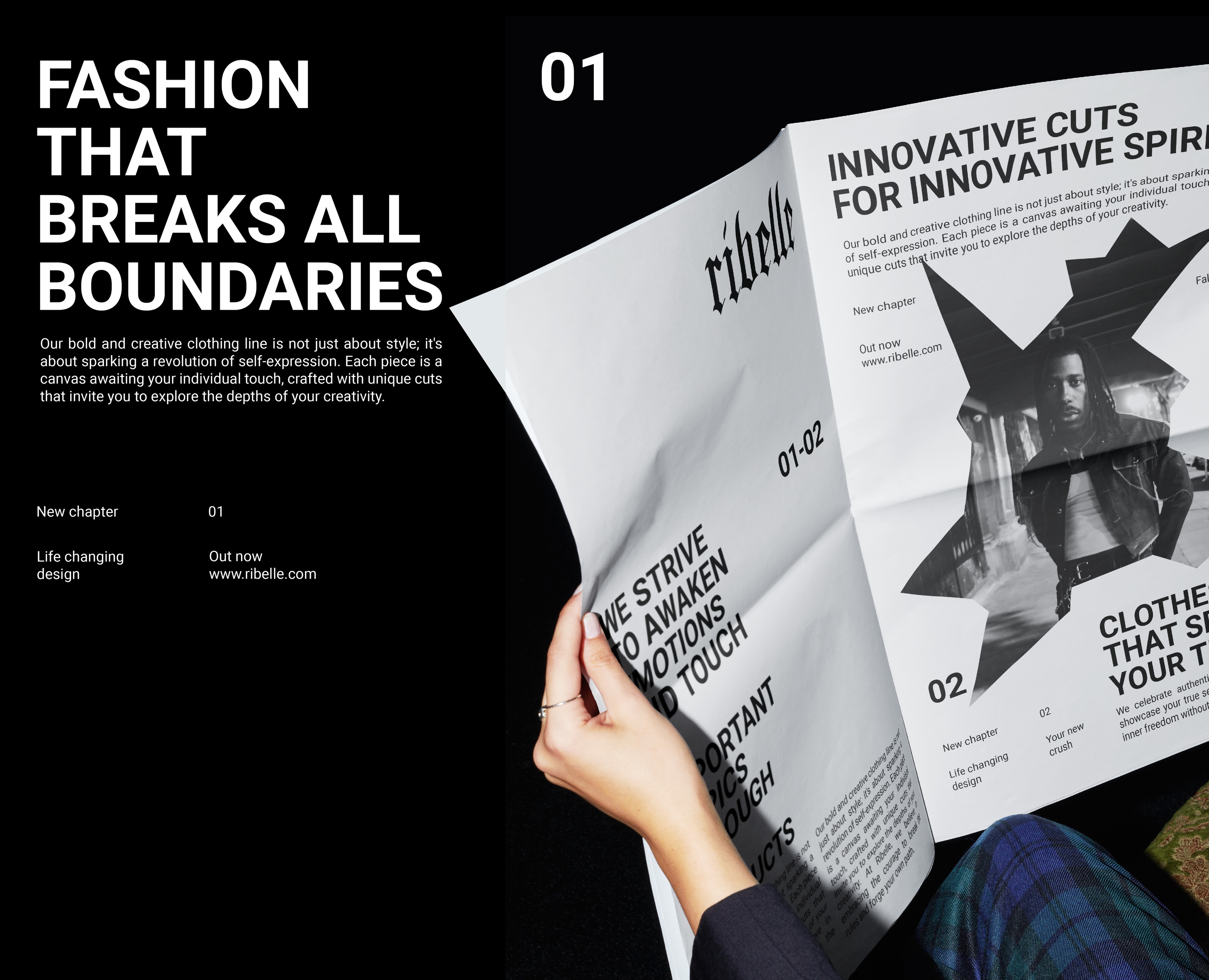
(eng)
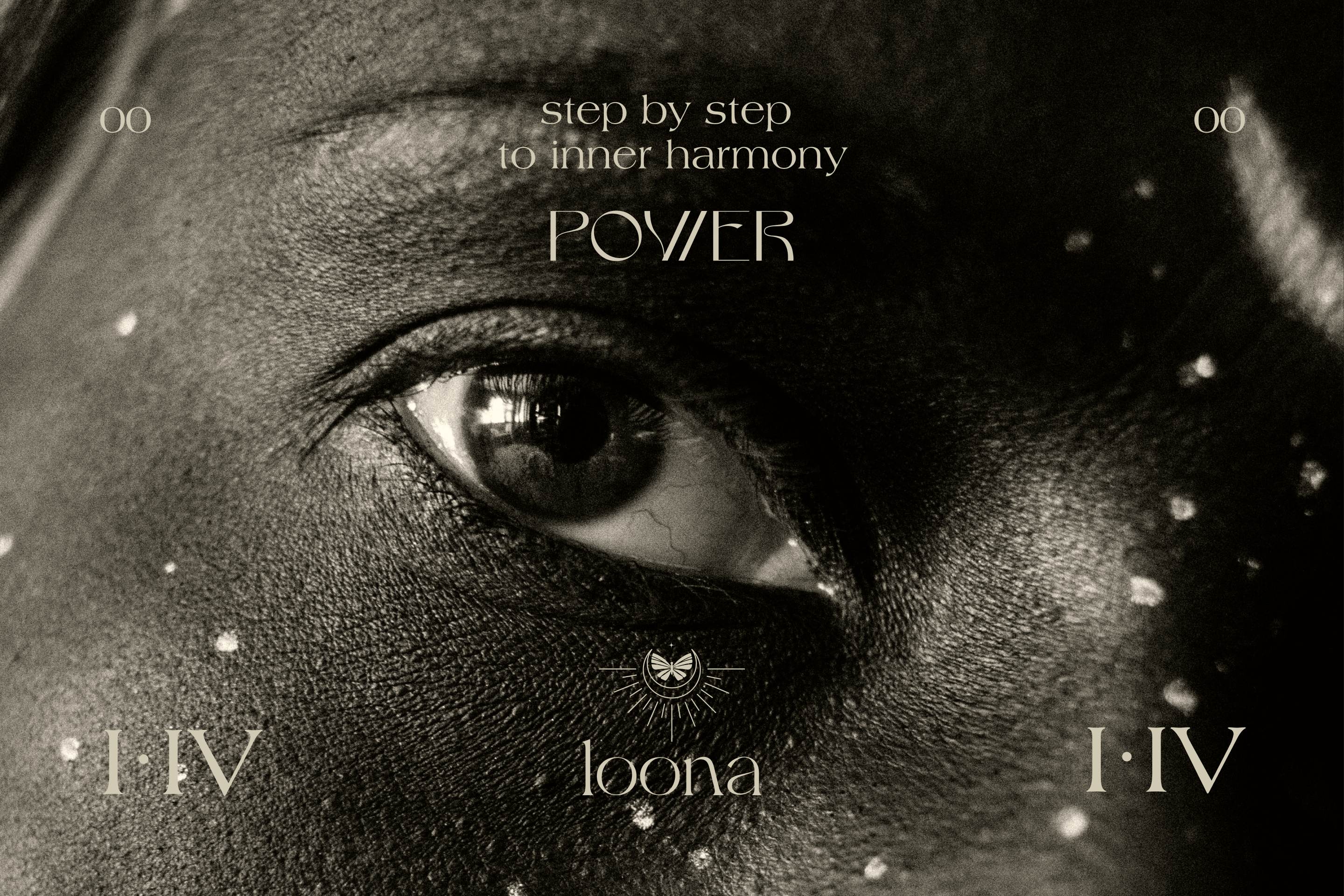
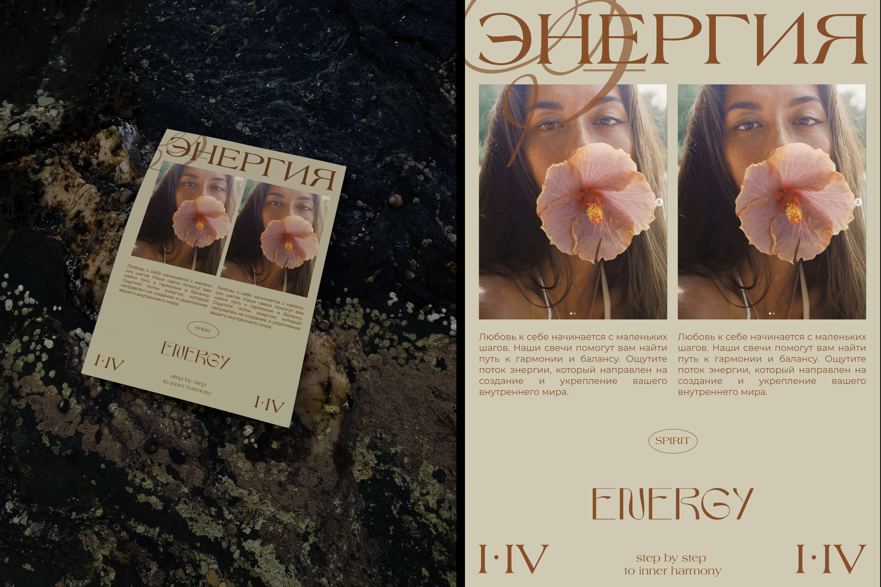
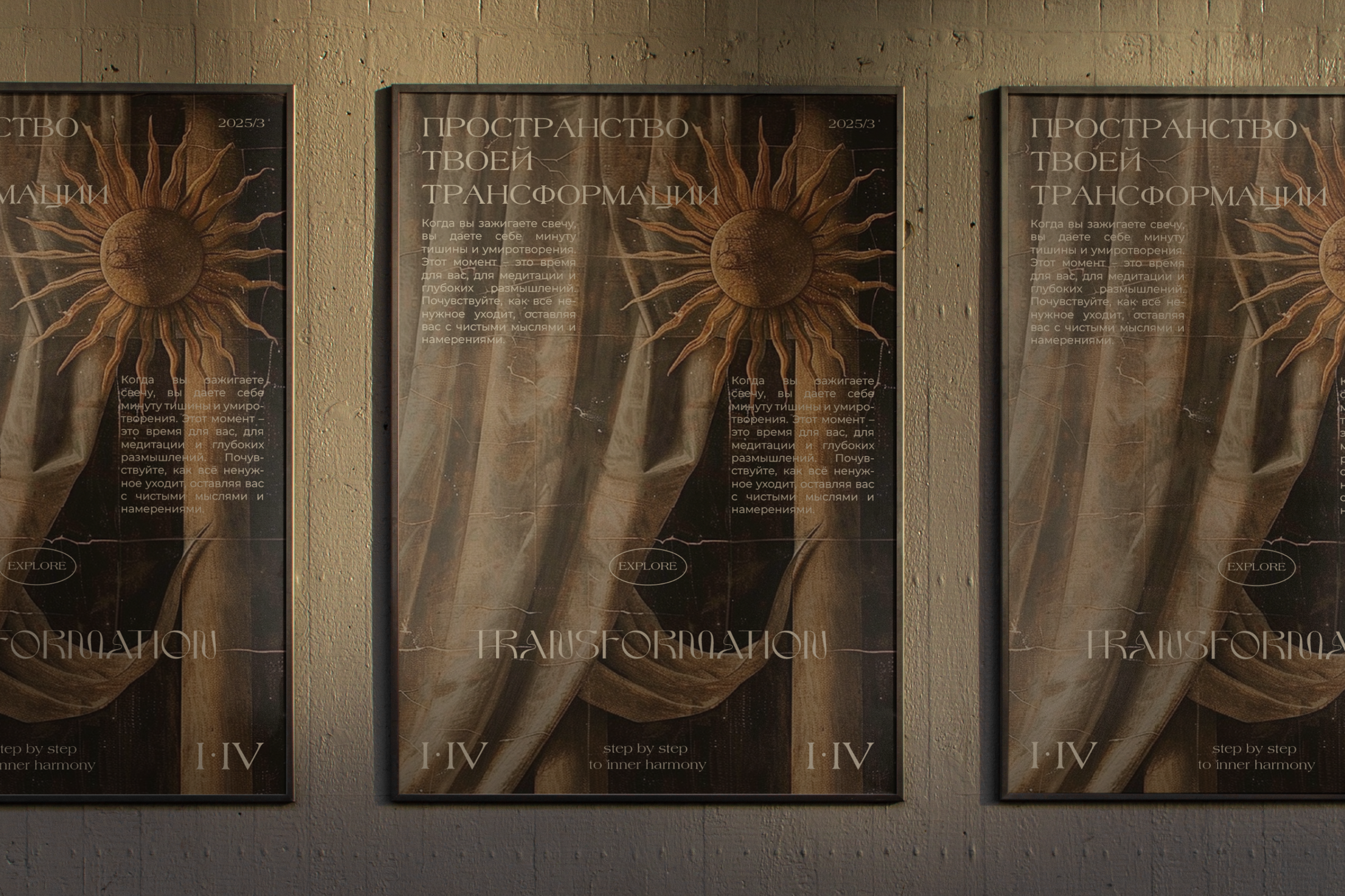
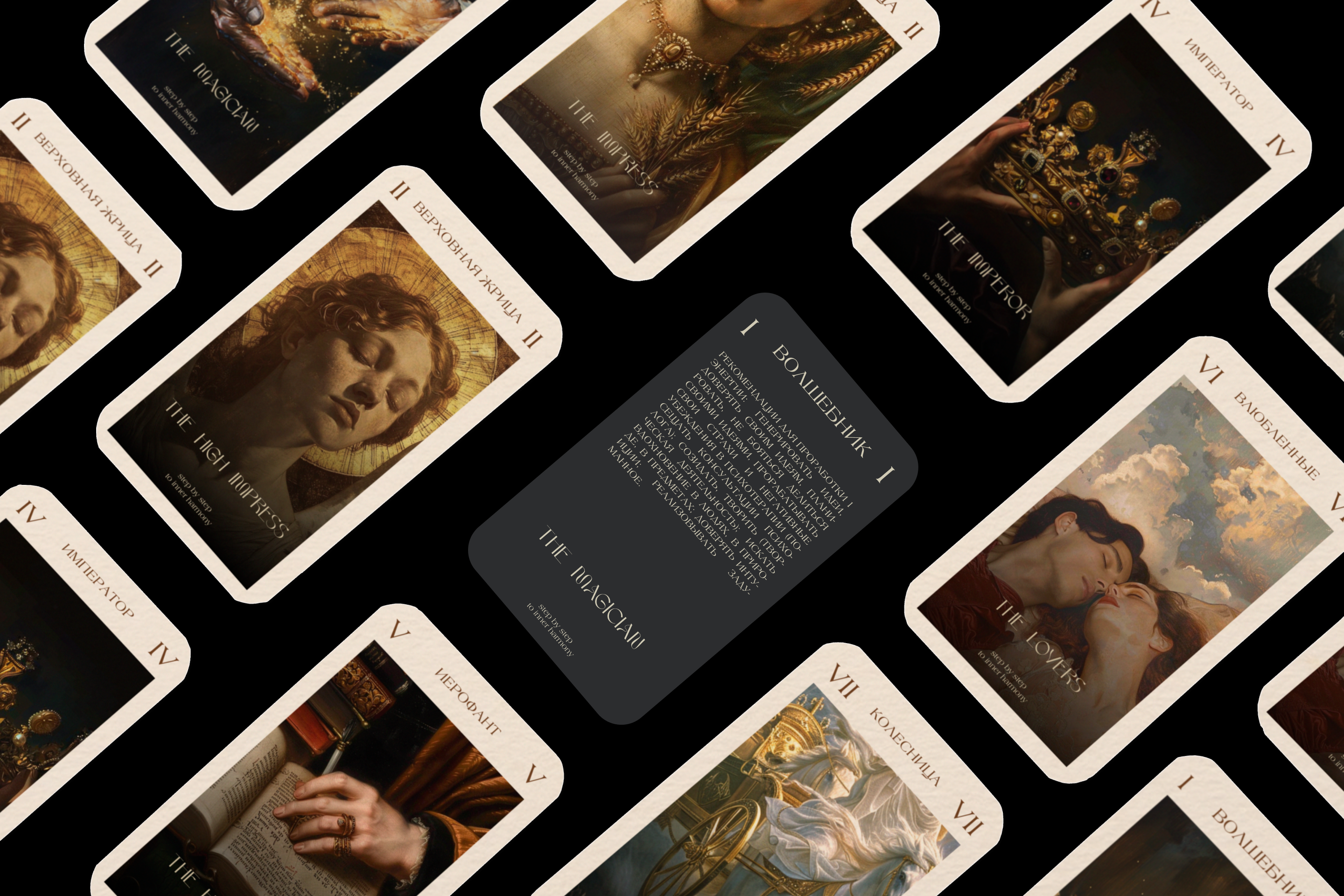
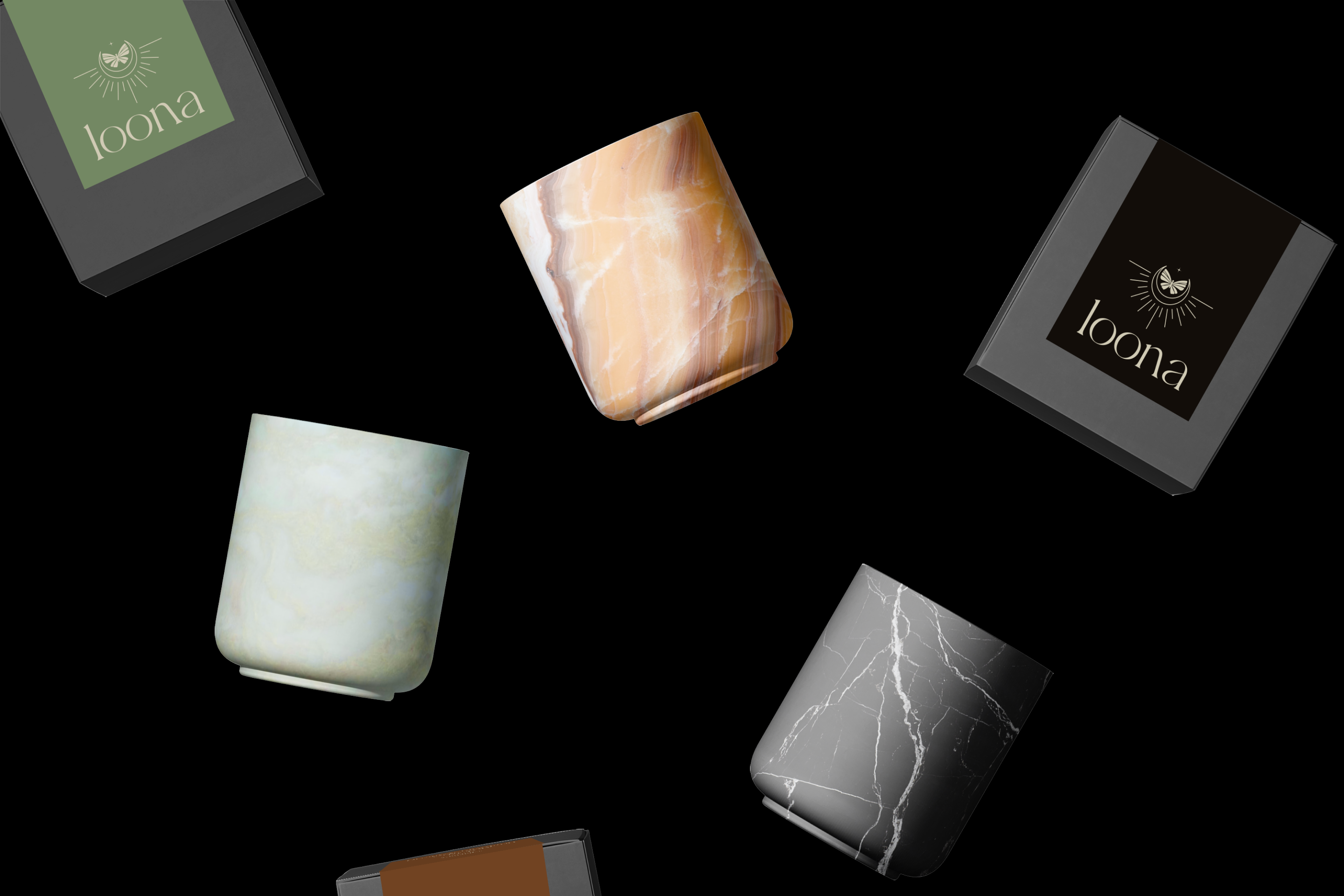
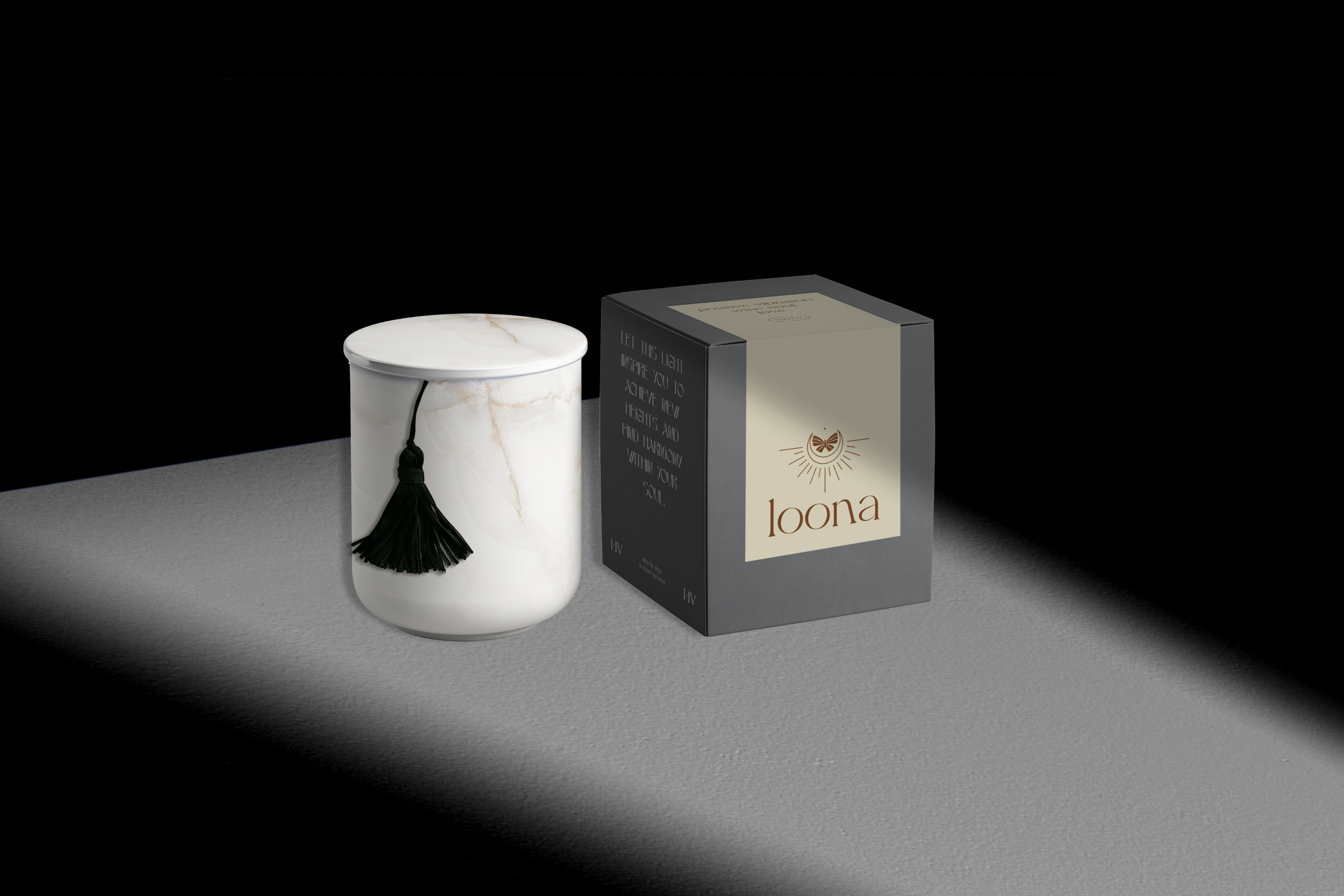
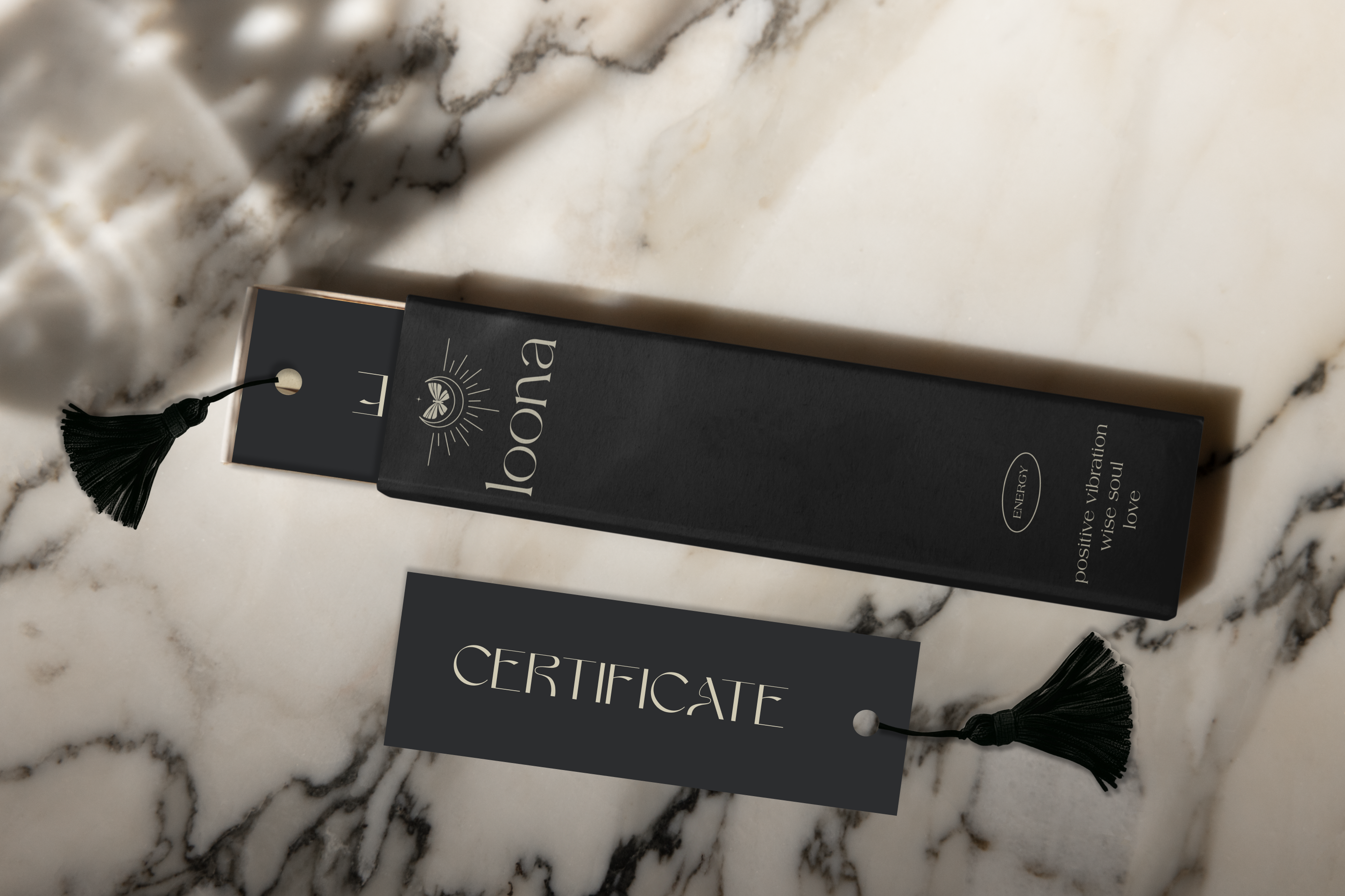
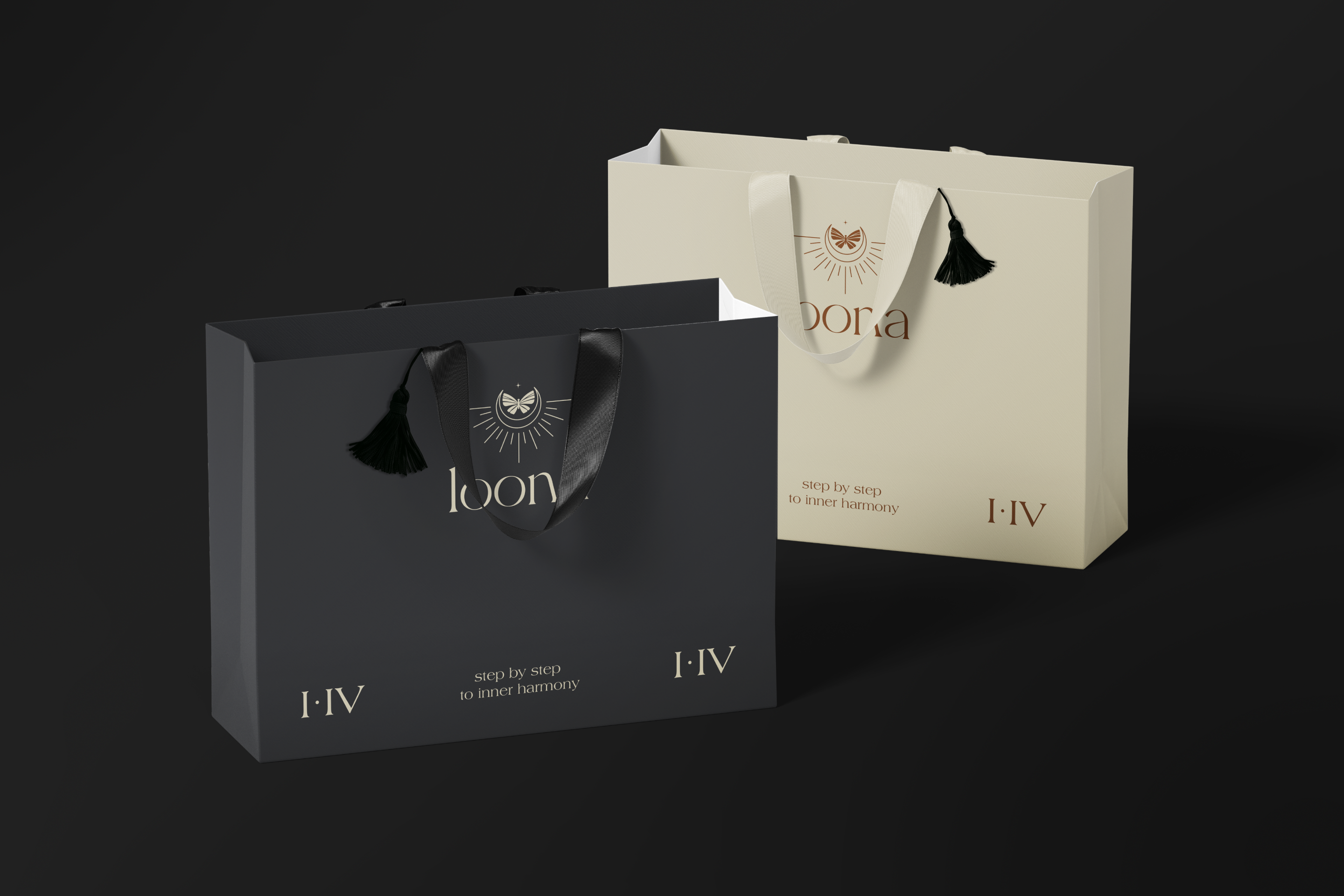
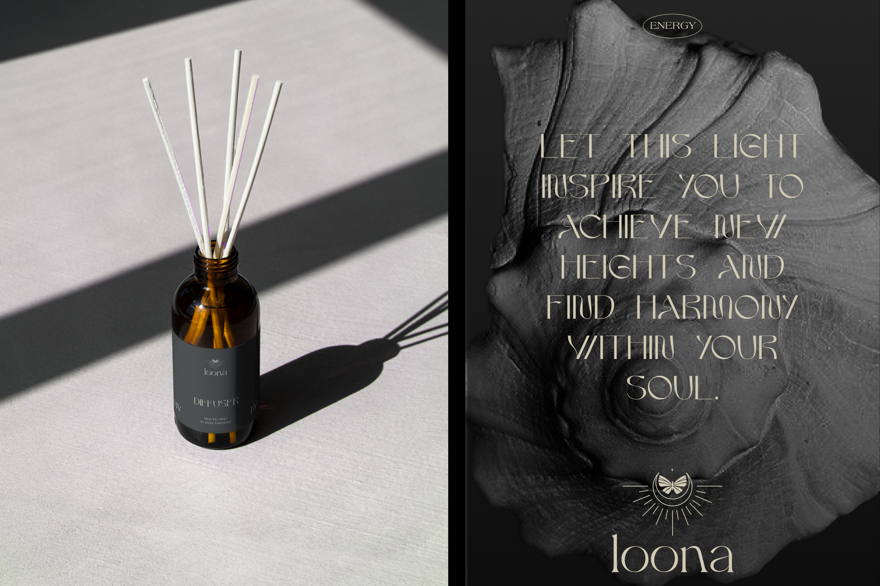
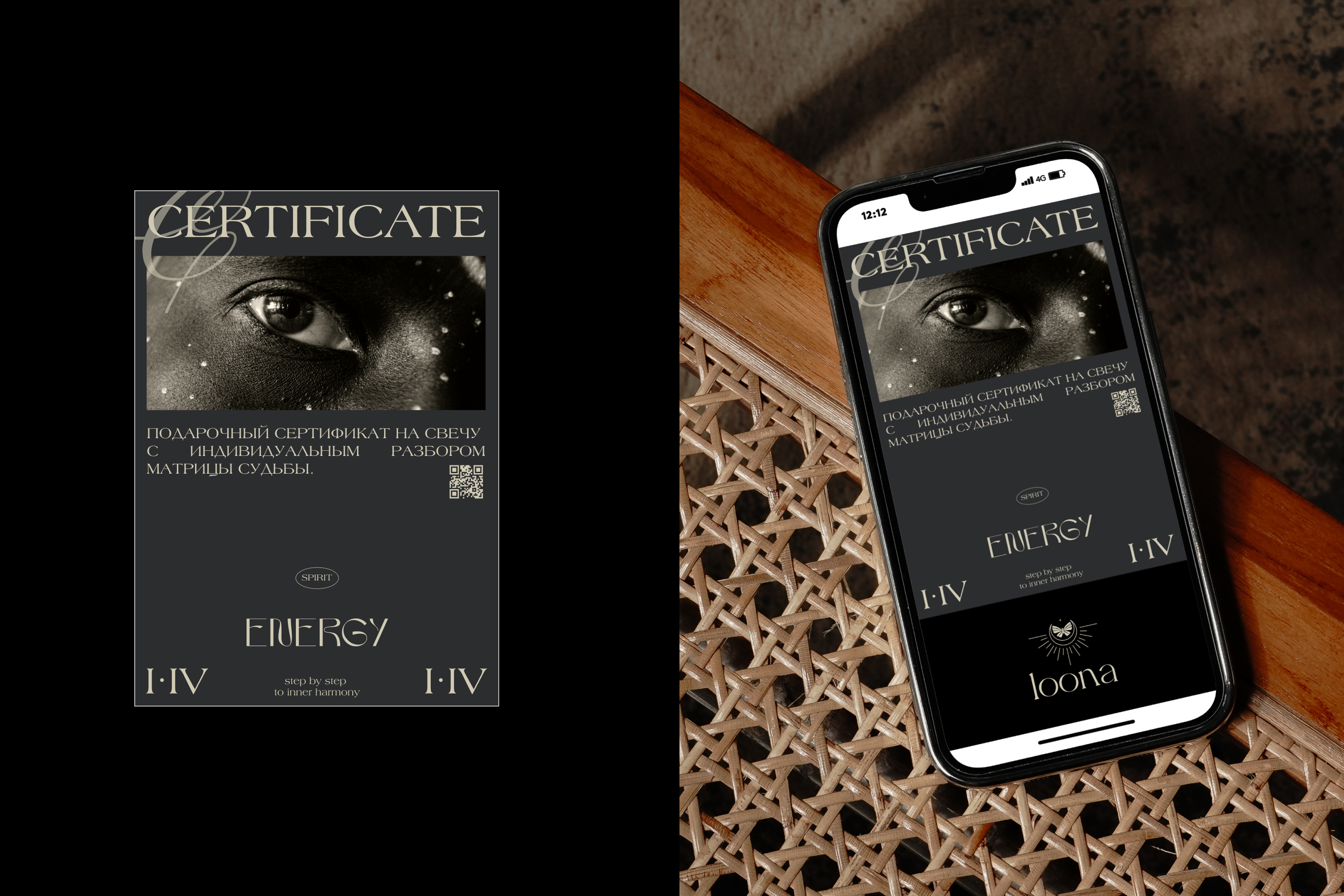
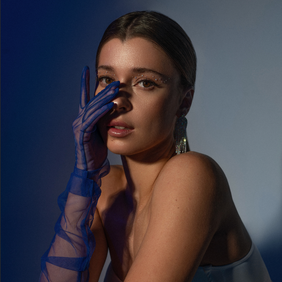
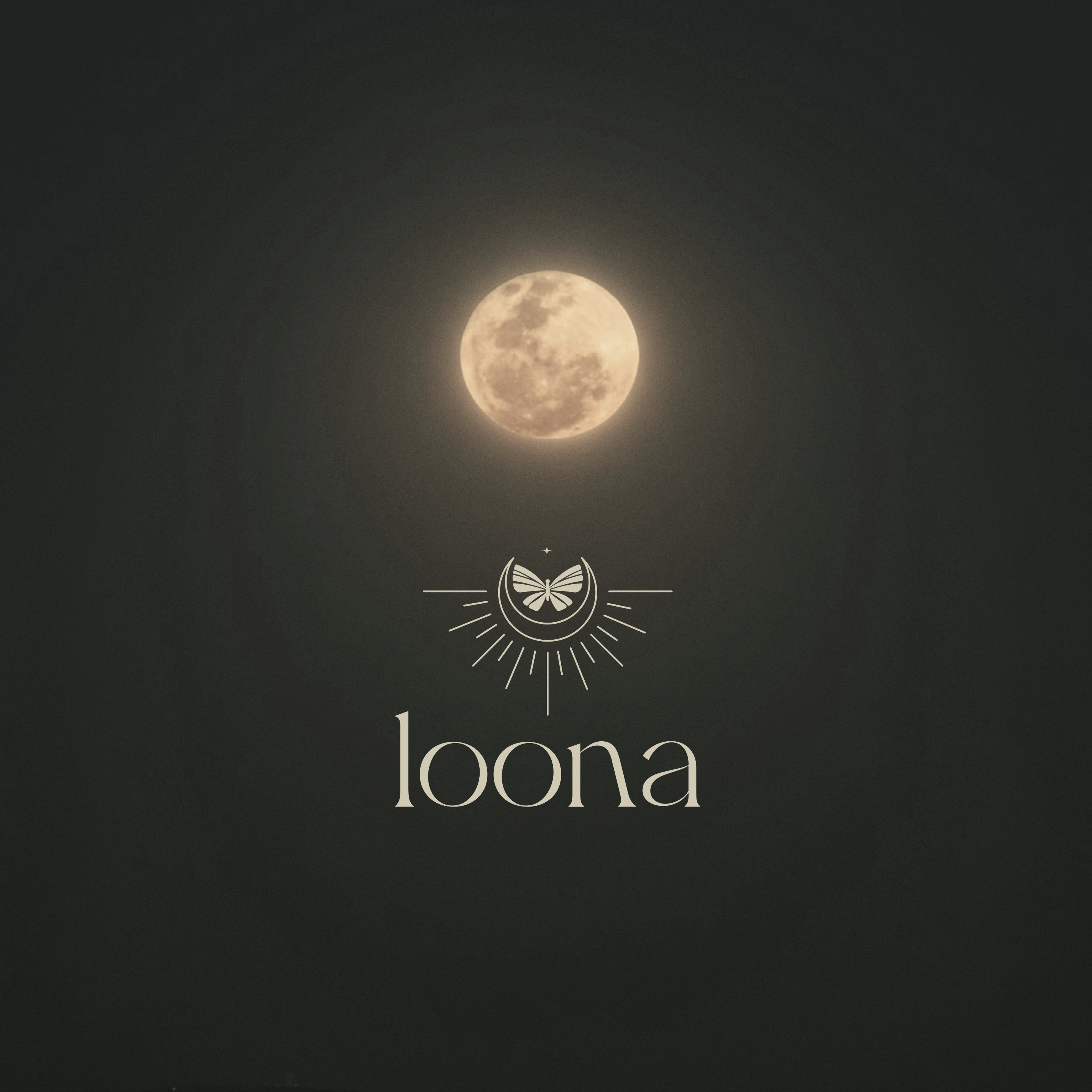
loona is a brand of candles based on the matrix of fate. The candle consists of a marble glass and a refill. Each customer receives an analysis of the fate matrix and a card with a description of the key energy. The main task was to develop a brand identity, preserving the existing logo, and create packaging that reflects the brand's character and takes into account the product's features.
The main metaphor of the brand is the phases of the moon. Graphically, it is expressed in the harmony and symmetry of layouts, the layering of typography, the addition of details, color navigation of the phases of the moon, soft shapes, meanings embedded in photographs and illustrations. In this way, we achieve the effect of mystery, cyclicity, wisdom that has passed through the ages, natural power and duality.
(ru)
loona — бренд свечей на основе матрицы судьбы. Свеча состоит из мраморного стакана и рефила. Каждый покупатель получает разбор матрицы судьбы и карточку с описанием ключевой энергии. Главной задачей было разработать фирменный стиль, сохранив уже существующий логотип, создать упаковку, отражающую характер бренда и учитывающую особенности продукта.
Основная метафора бренда — фазы луны. Графически она выражается в гармонии и симметрии макетов, многослойности типографики, добавлении деталей, цветовой навигации по фазам луны, мягких формах, смыслах, заложенных в фотографии и иллюстрации. Таким образом мы добиваемся эффекта загадочности, цикличности, мудрости, прошедшей через века, природной силы и дуальности.
designer: Alexandra Pavlova