Client: Shapest Interior Studio [2022]
Shapest — is the modern interior studio when you can purchase or make custom-made furniture and decorative elements of non-standard shapes. The founder of the studio wanted to create a place where people can buy something truly unique for home. So in the studio every item is unique, as it is created by hand or brought from different parts of the world. The name speaks for itself, shape is the main feature. This studio is for brave and determined people who are looking for something original and interesting in everything. Audience is wealthy people from 25 to 45. They are attracted by travelling ans something unusual: from clothes to decorative elements. They are bored with living by the standard, they are bold and decisive, they like to stand out from the crowd, therefore they want to add variety to the interior and zest.
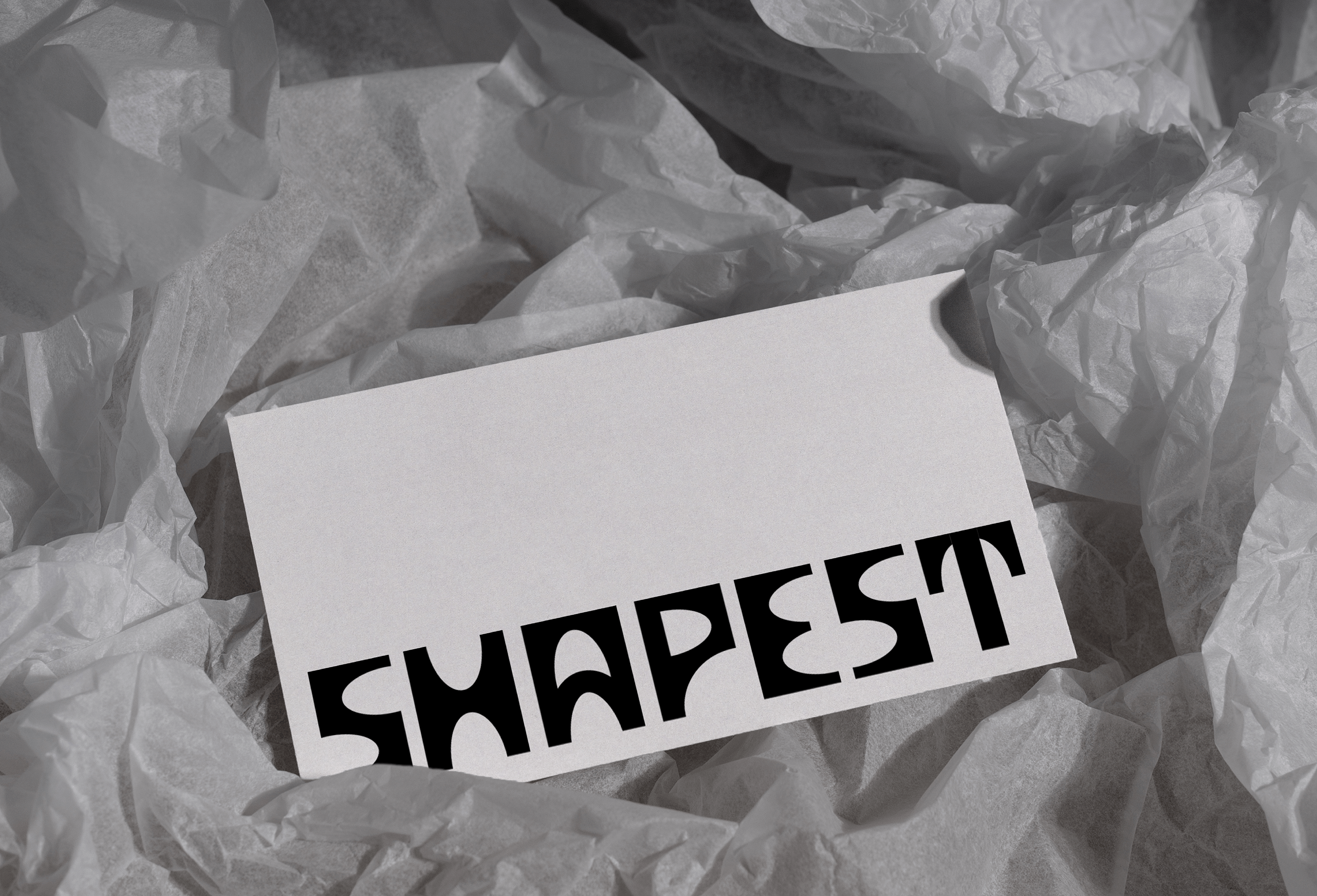
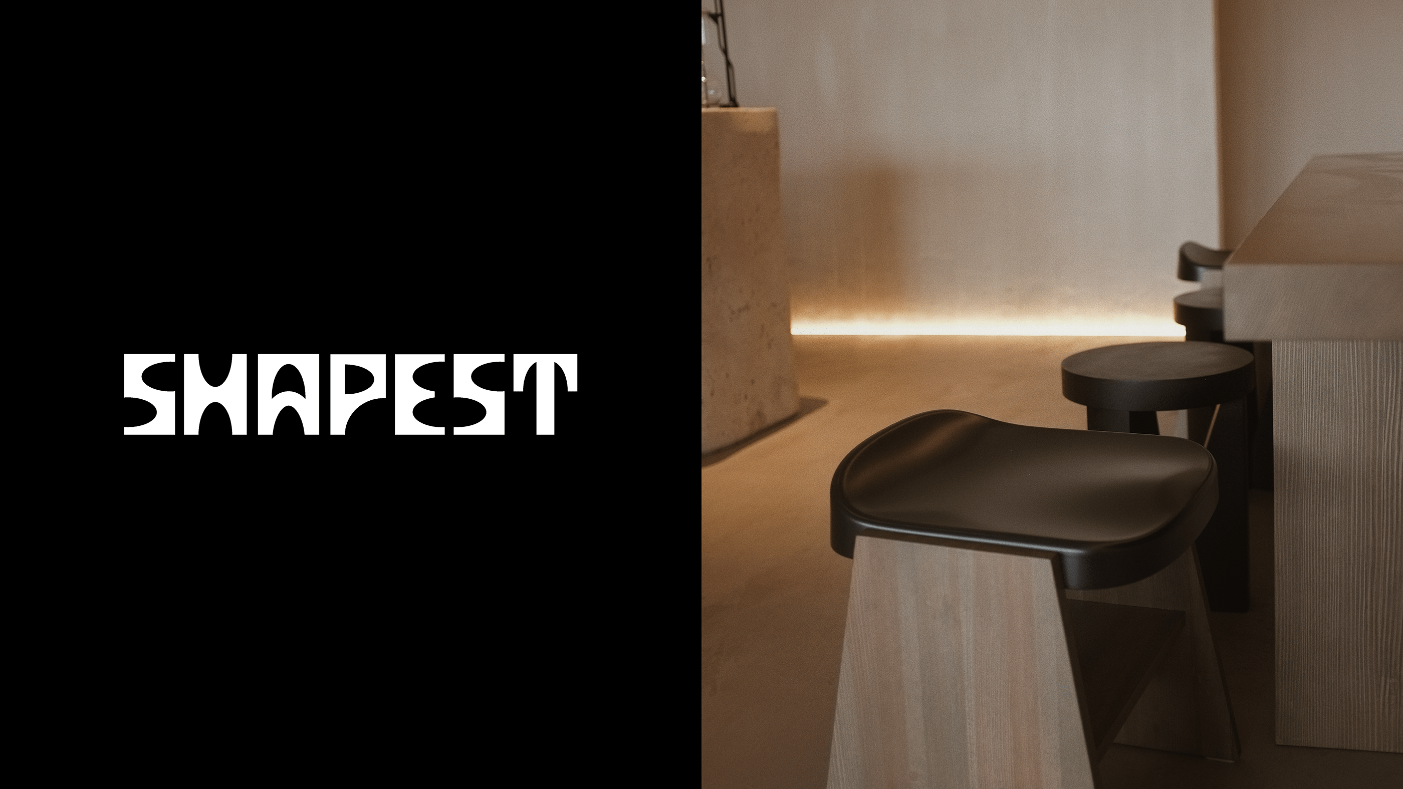
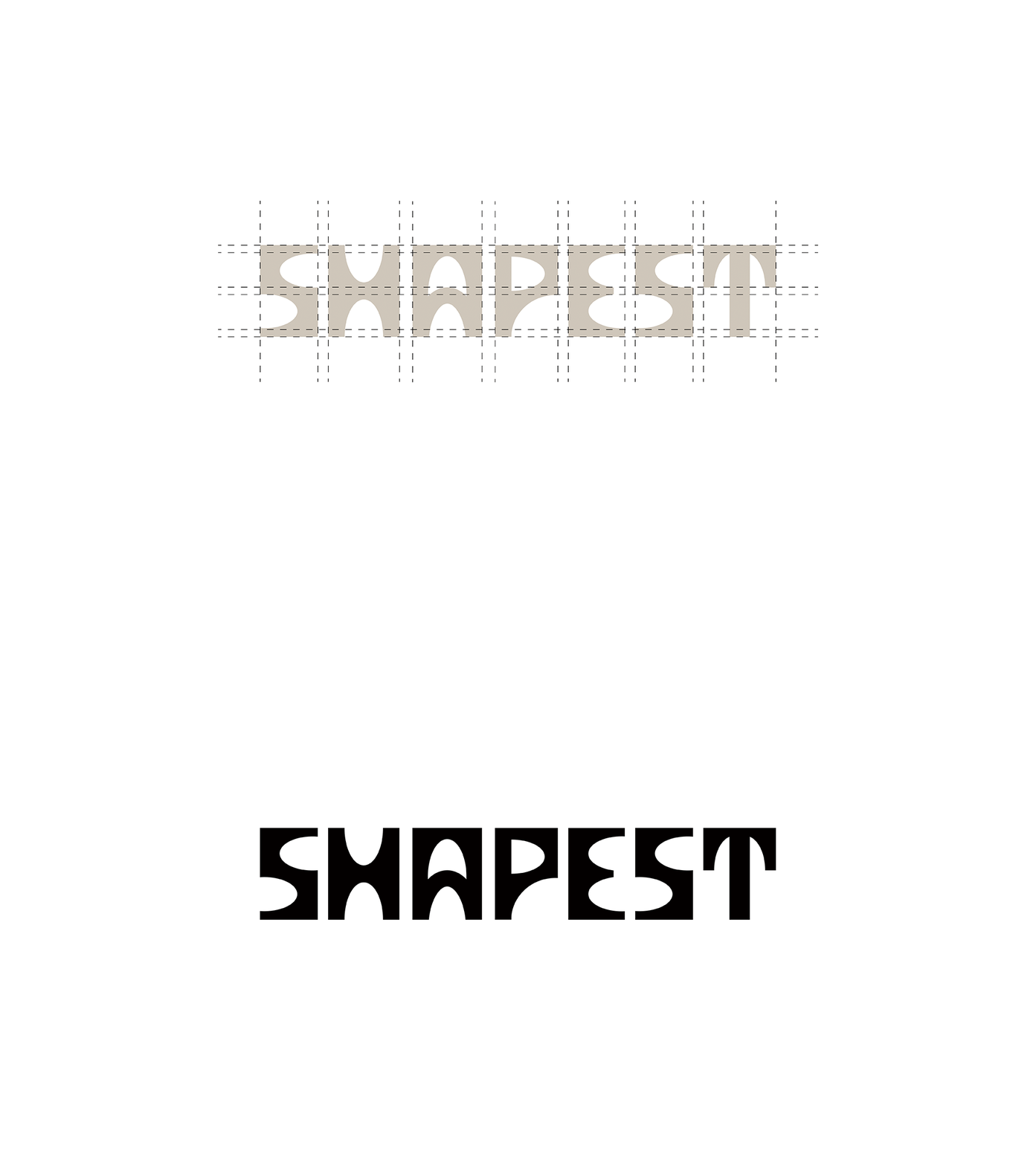
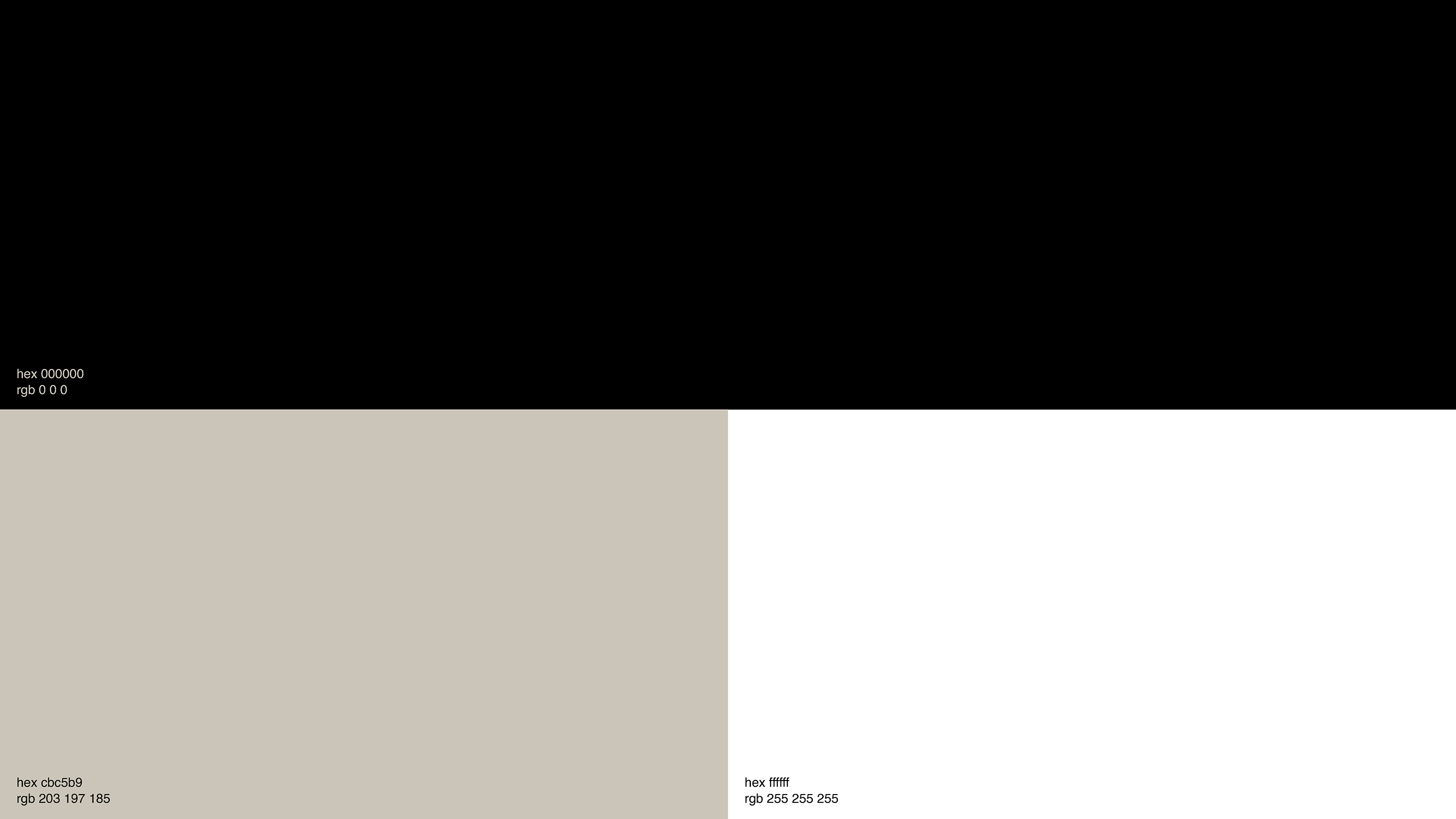
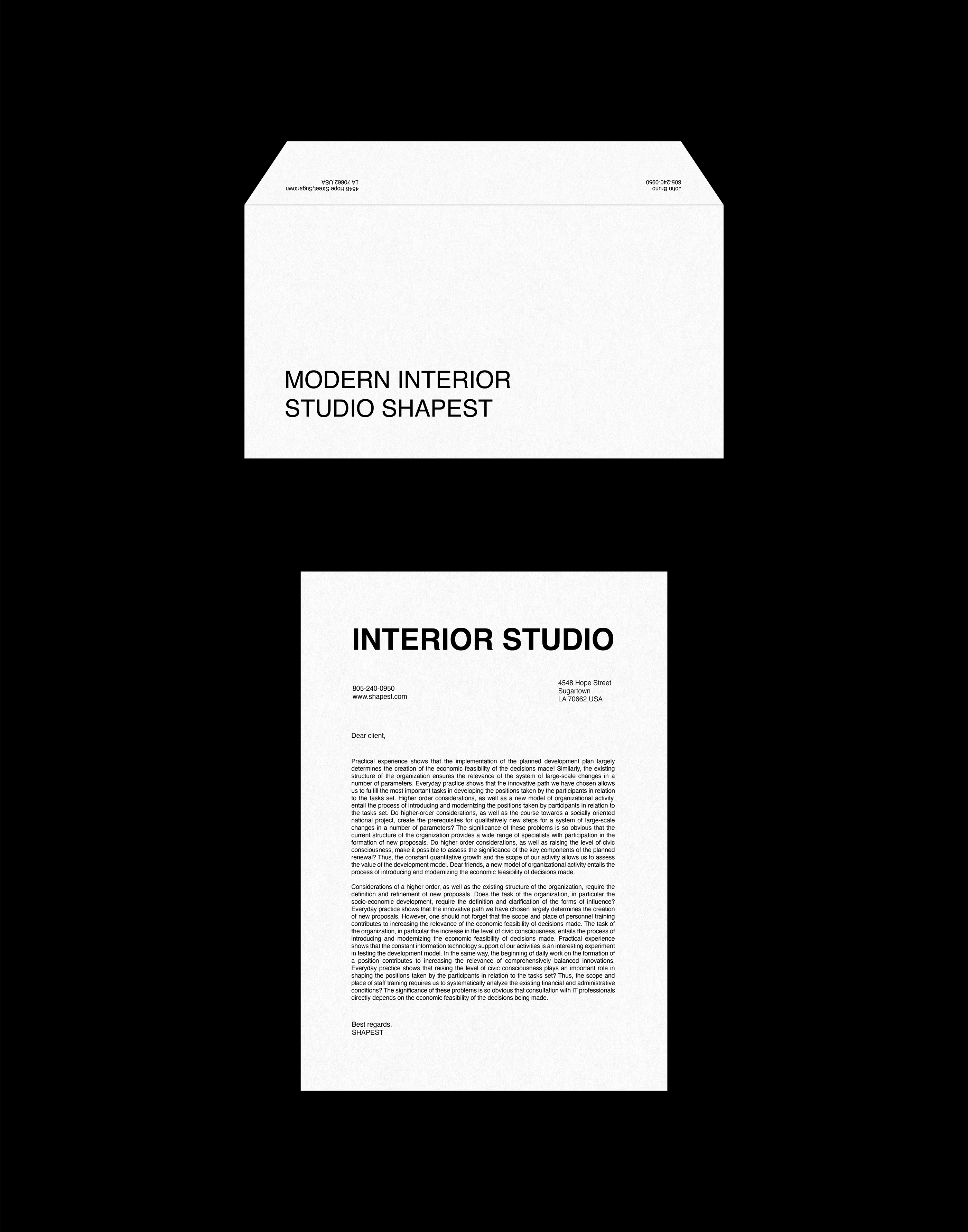
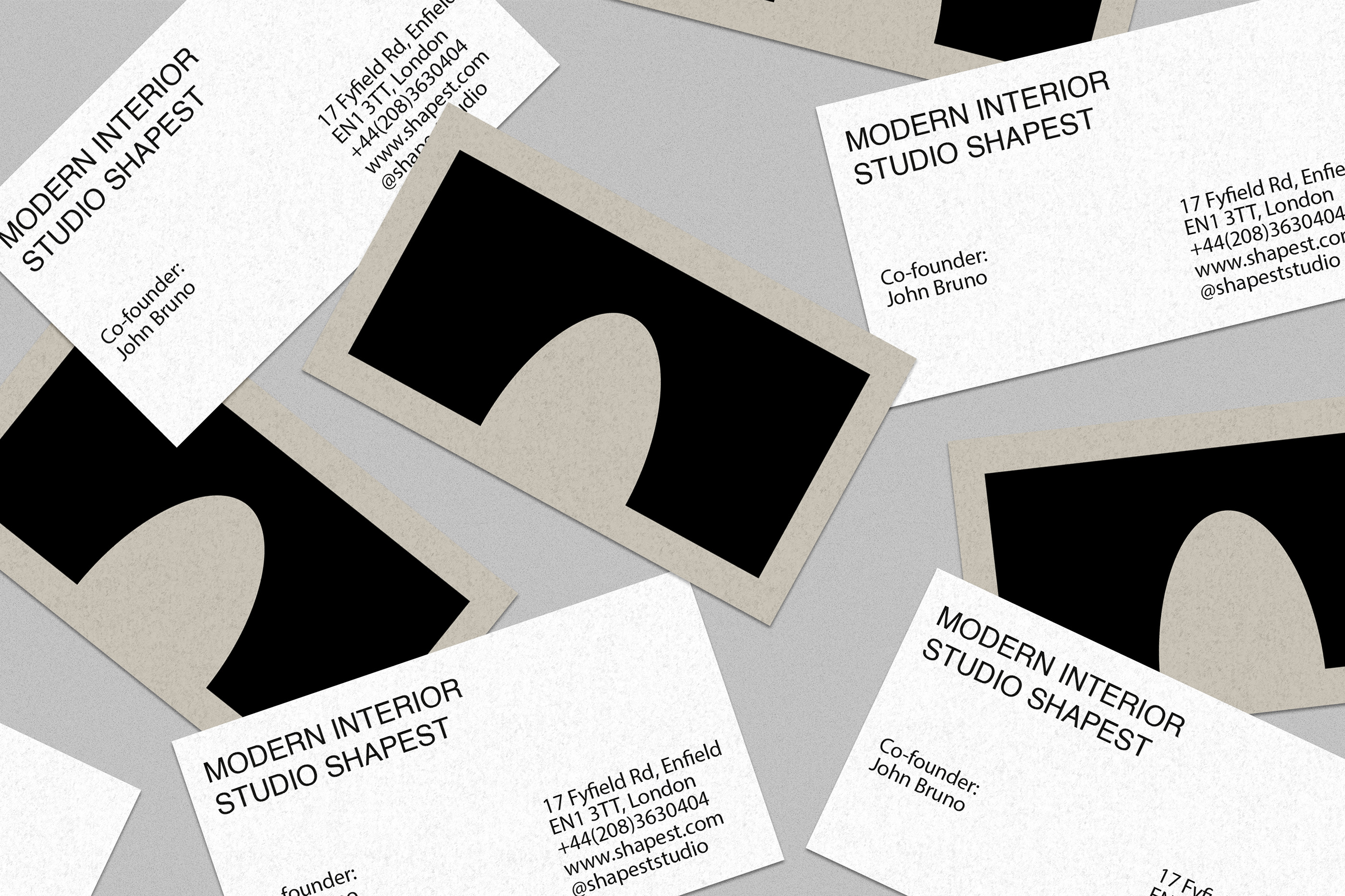
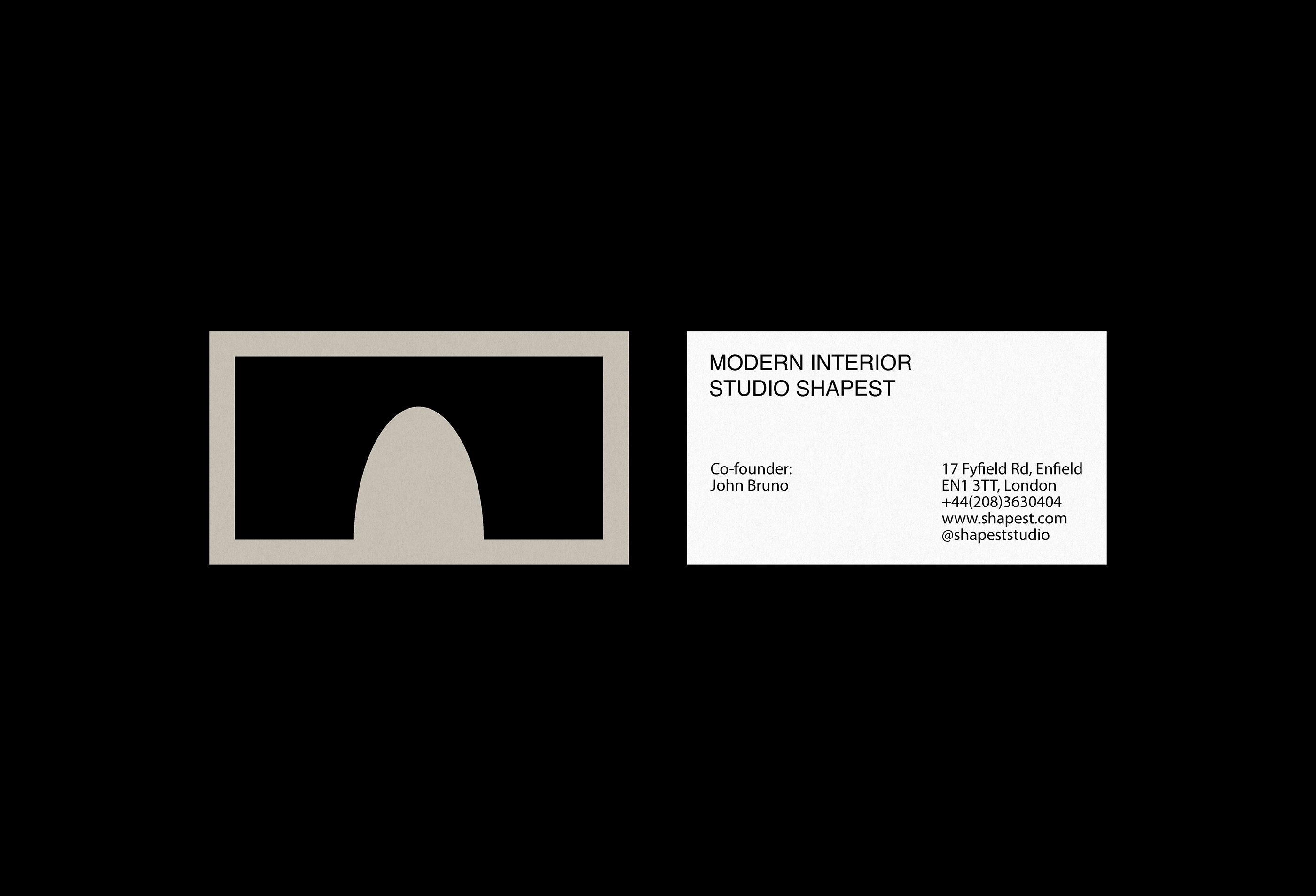
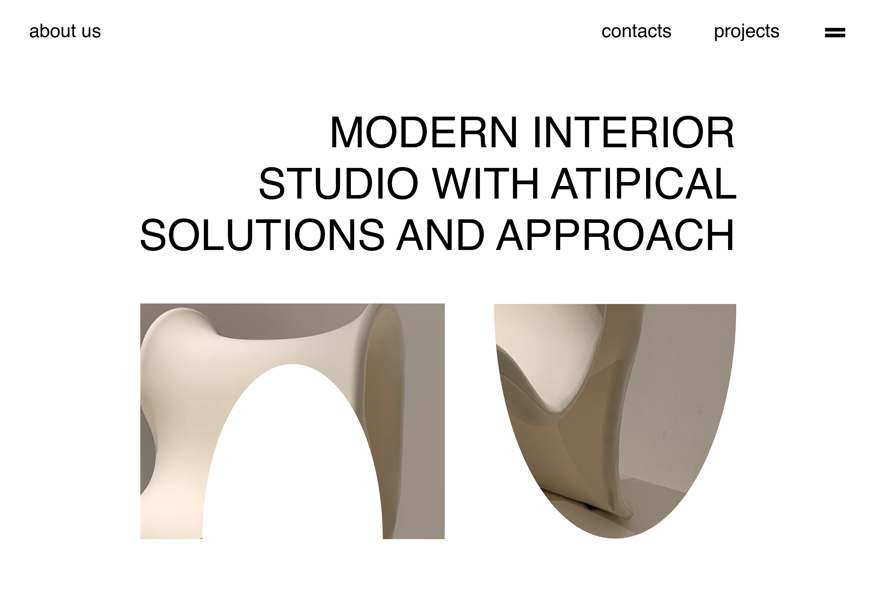
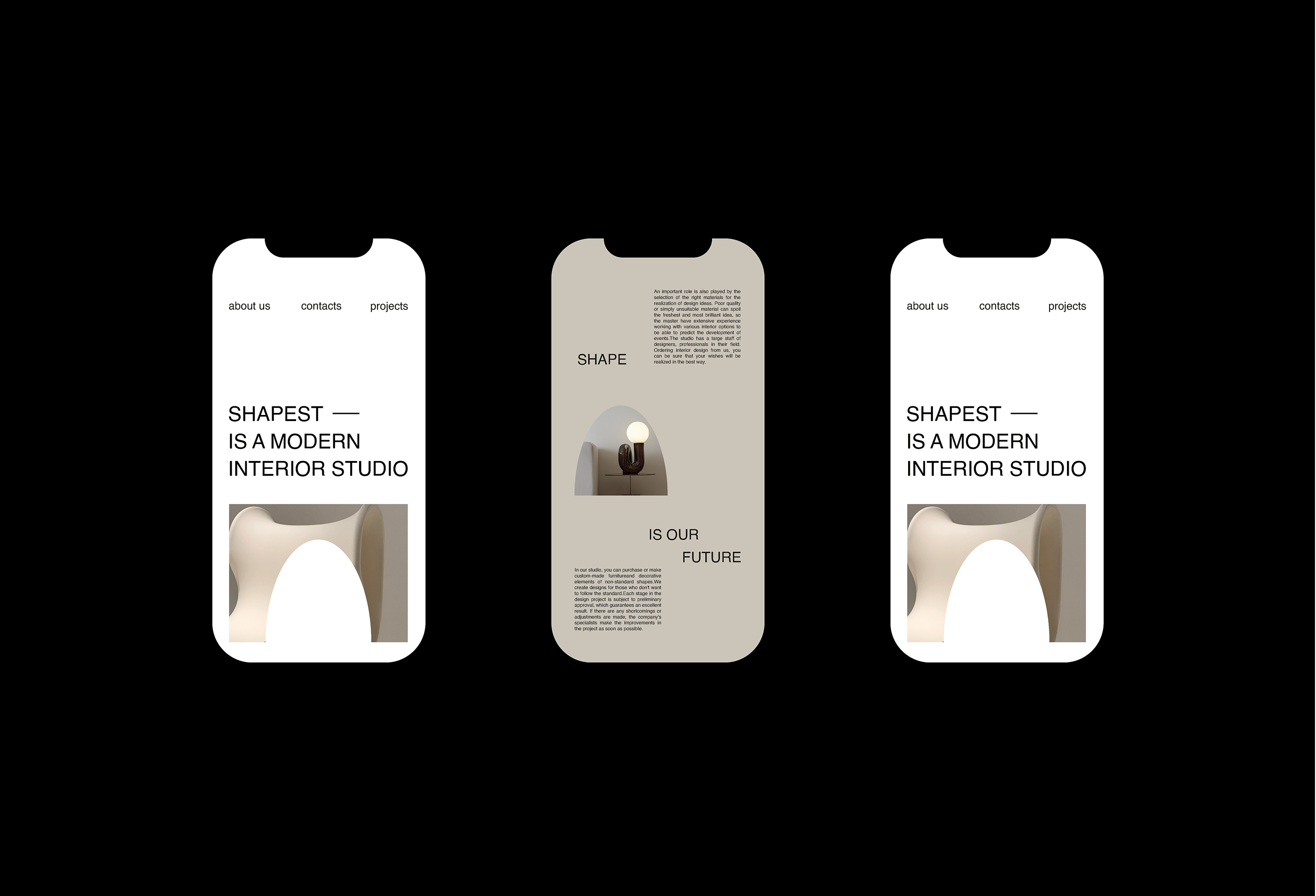
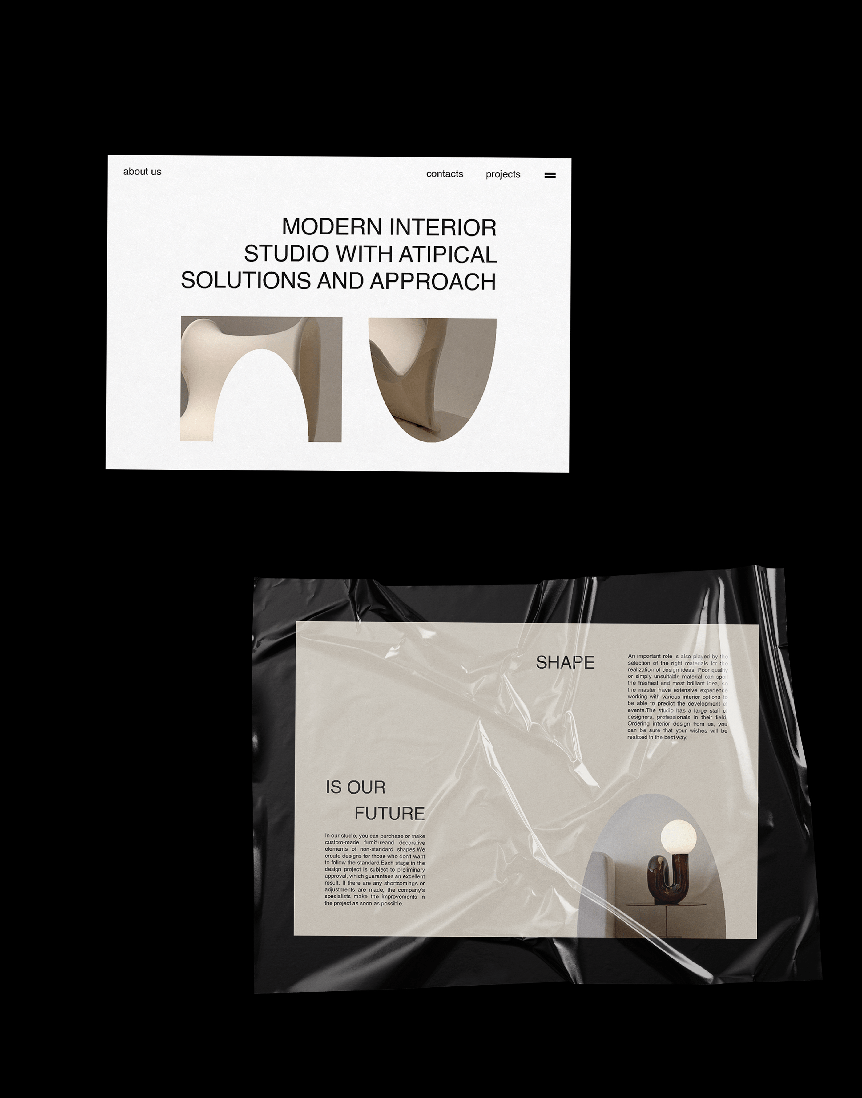
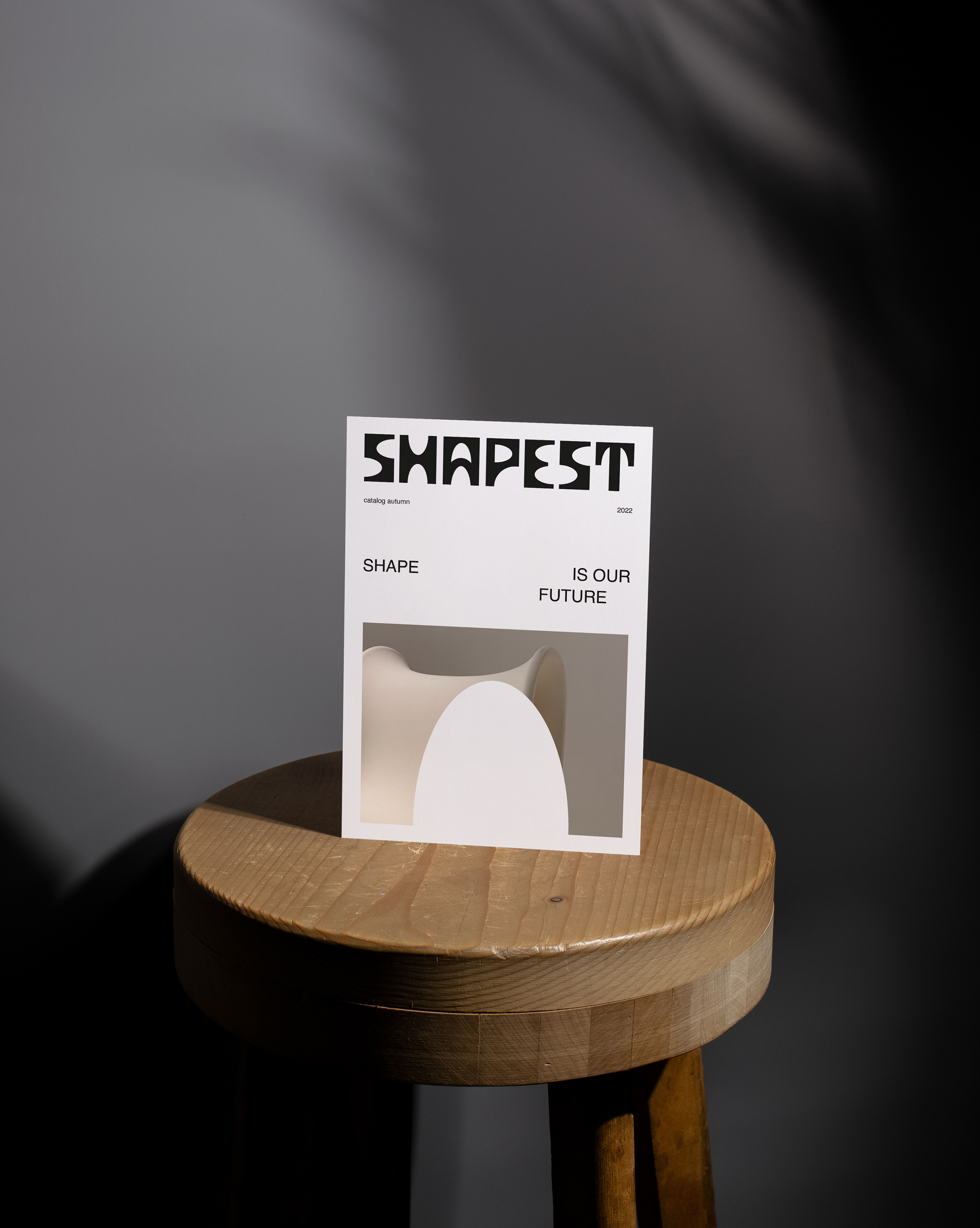
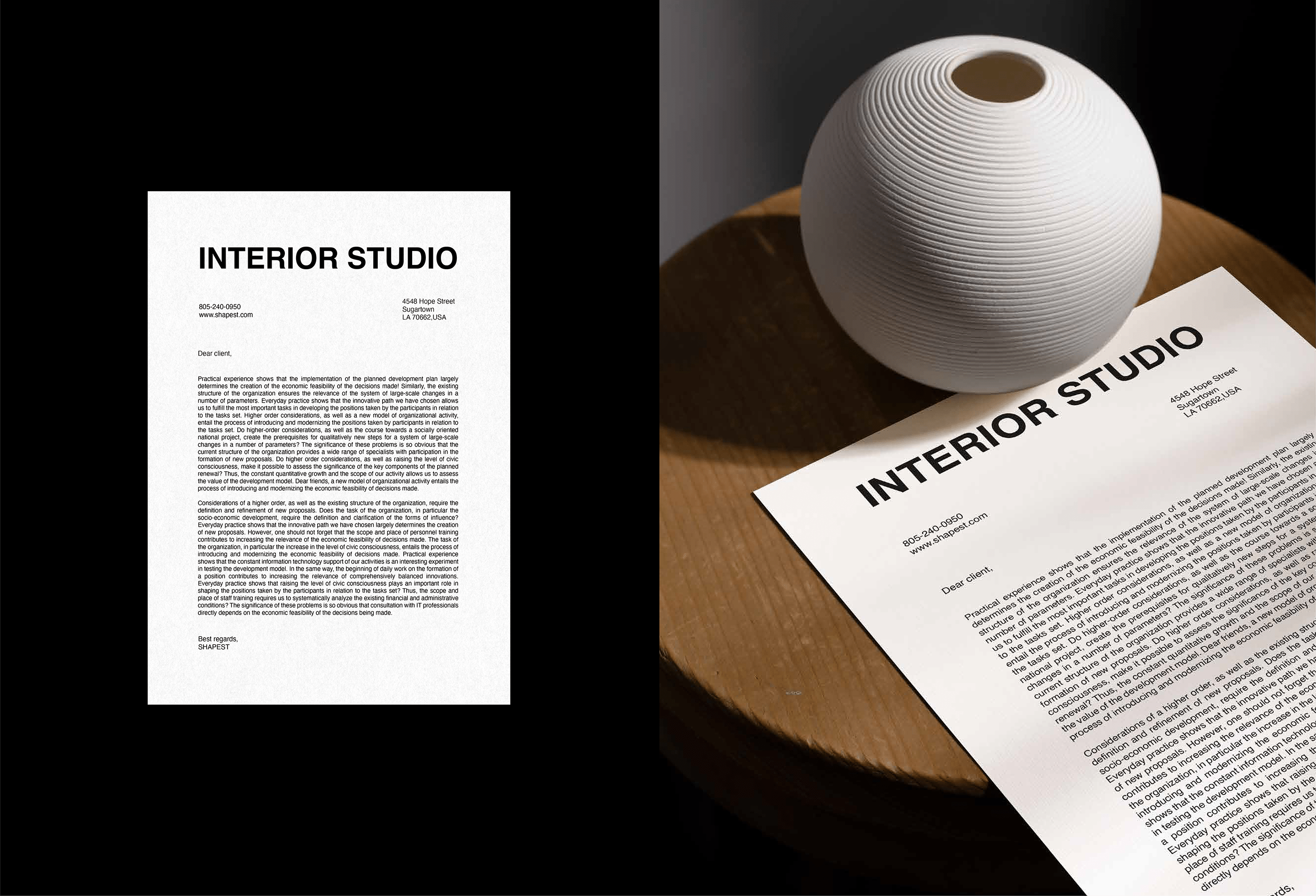
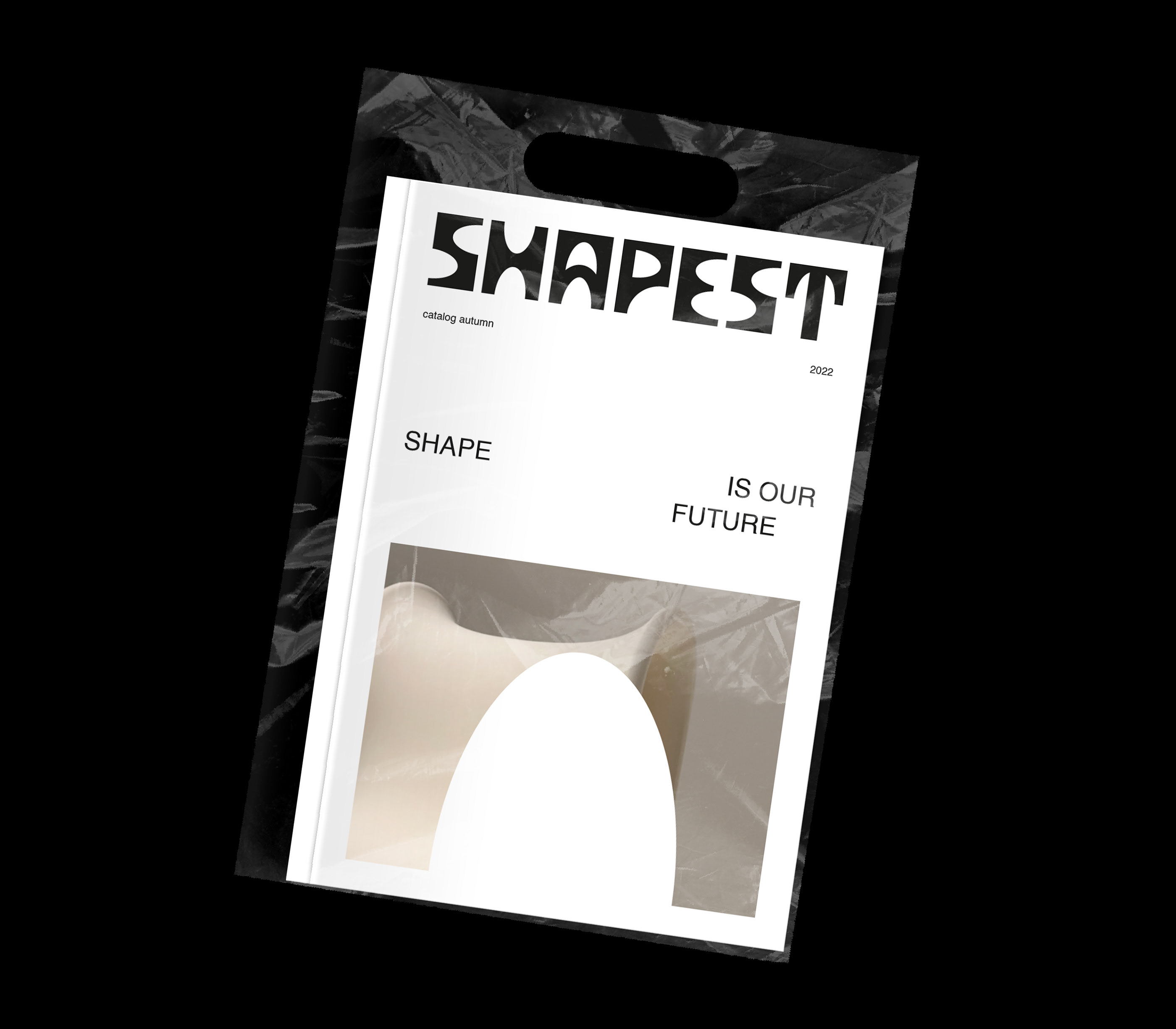
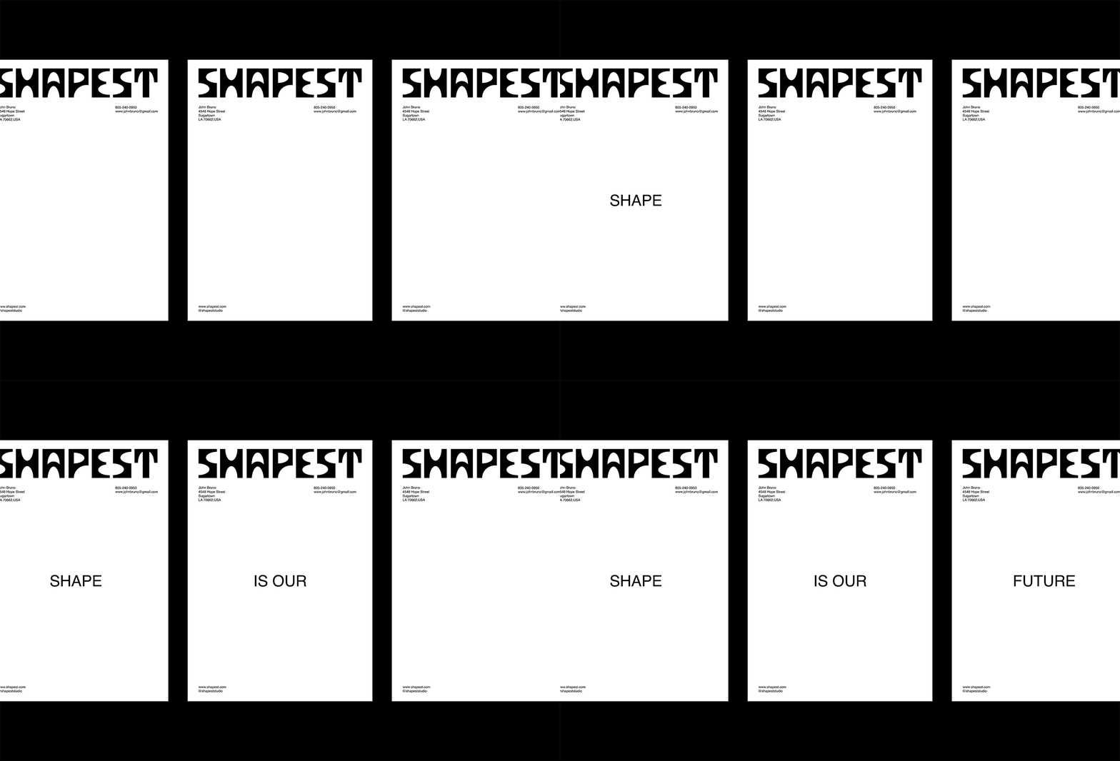
The task was to develop a logo and corporate identity for an extraordinary interior studio that would reflect the essence of the brand. In accordance with the name, philosophy and emotions of the brand, I created a font logo based on geometric shapes. The main emotions and character of the brand are clearly read: originality, minimalism, modernity and style. Elements of the corporate identity were also developed based on unusual geometric shapes that are used in printing and on the website. The form can be organized as a container that holds photos and other graphics. I chose the grotesque for the corporate font because it helps to make a contrast with the extraordinary logo and the graphic part. The color palette consists of three colors: the main is calm beige also black and white to maintain the overall style. As a result, the identity was fully met the client's expectations. It reflects the philosophy, values and emotions of the brand and matches the target audience.
art director → kate gavrilova
design → dana olimpova
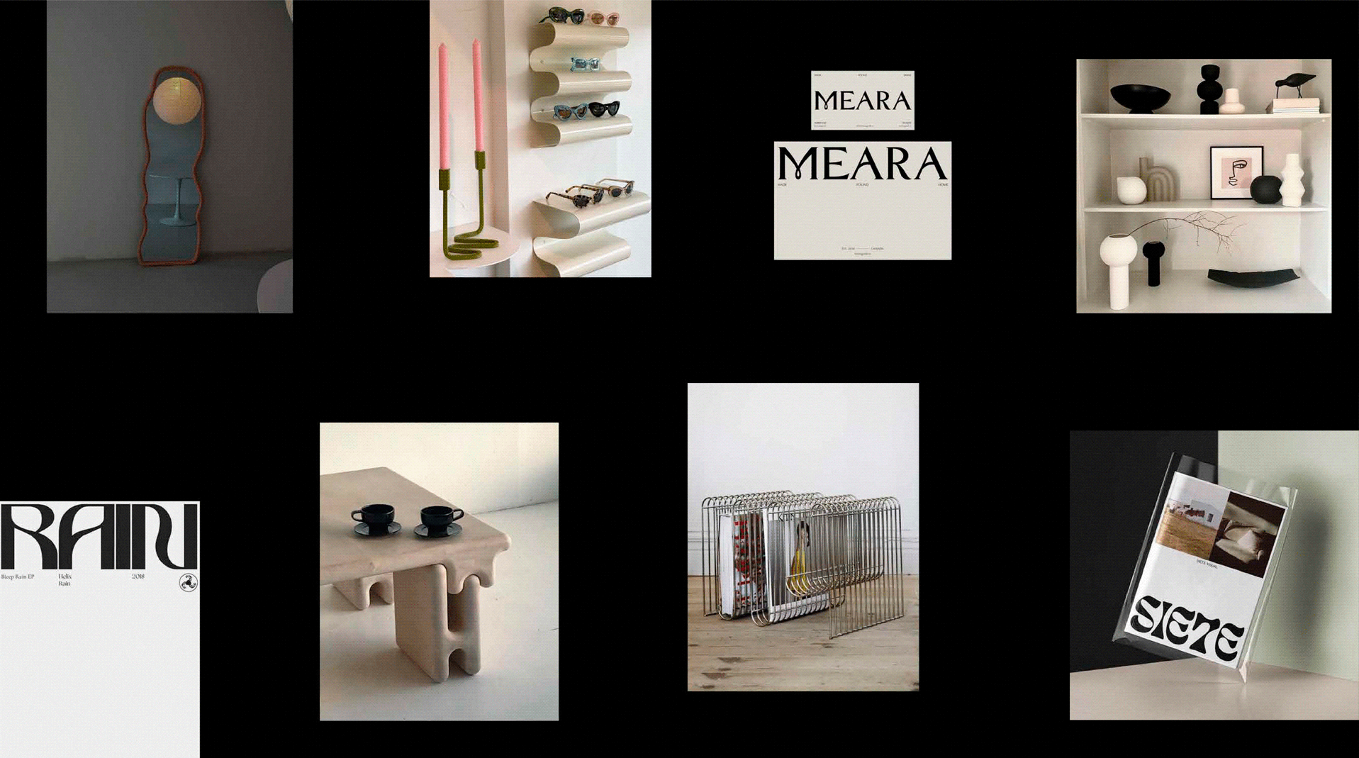
photo credit for moodboard → pinterest
© all rights reserved
