(RUS)
Clome — бренд женской одежды в ценовом сегменте «средний +». Это одежда про чувство, когда тебя ждут. Это тепло рук, запах чистого белья и солнце, пробивающееся сквозь шторы в выходной день.
Это не просто вещи, которые удобно носить, это вещи, которые ощущаются «своими». Бренд создан для женщин, которые ценят женственность без лишней вычурности.
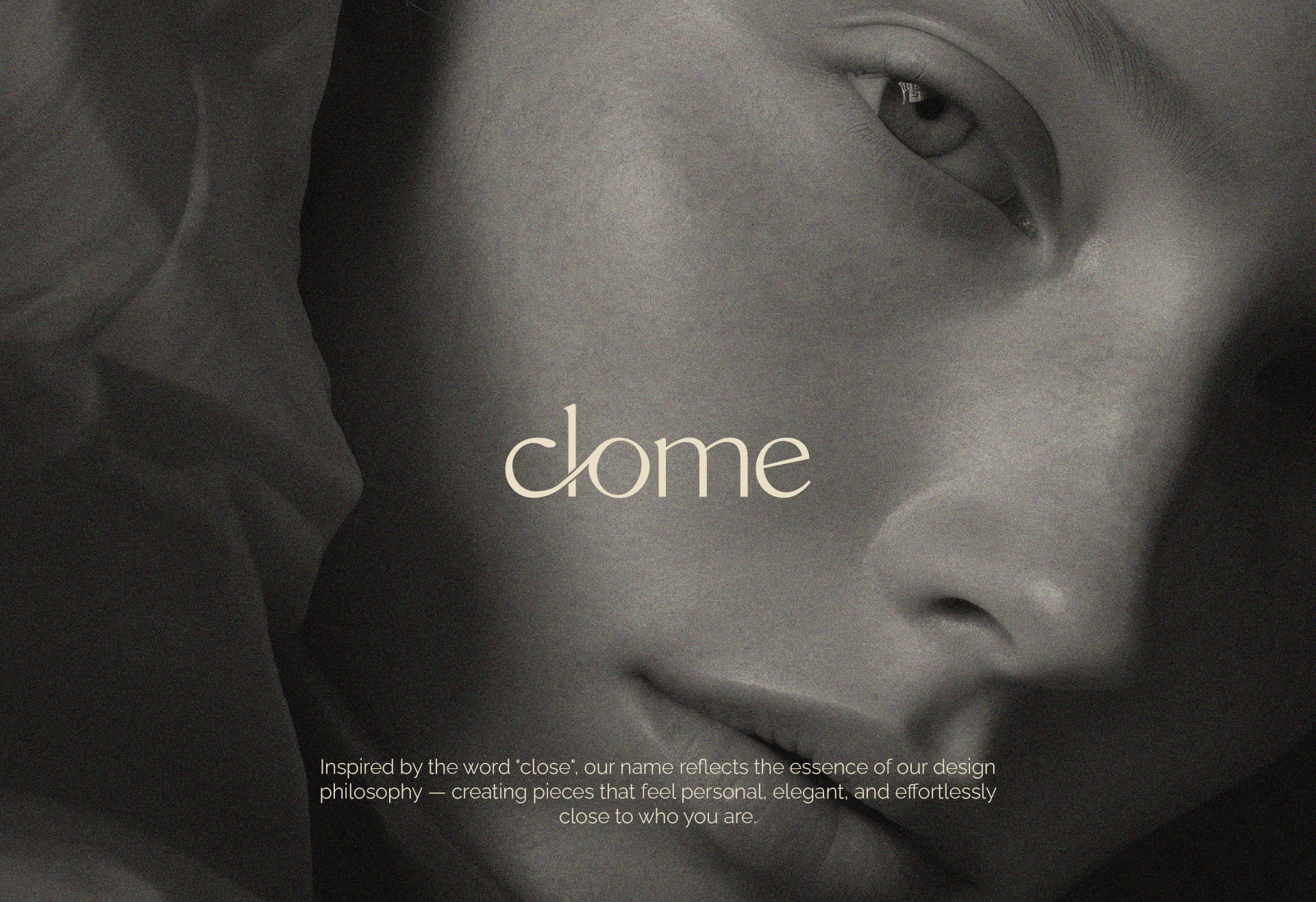
Название бренда происходит от слова «close» (близкий). Это одежда, которая словно была с тобой когда-то, как любимый свитер или платье, в котором случилось что-то важное. Clome создаёт эмоциональную связь между вещью и её обладательницей. Она как друг, который всегда рядом.
(ENG)
Clome is brand of women's clothing in the price segment "medium +". It's about the feeling of being waited for. It's about the warmth of hands, the smell of clean linen and the sun through the curtains on a day off.
These aren't just things that are comfortable to wear - these are things that feel "yours". The brand is created for women who value femininity without unnecessary pretentiousness.
The brand name comes from the word close. These are clothes that seem to have been with you before, like a favorite sweater or dress in which something important happened. Clome creates an emotional connection between the item and its owner. It is like a friend who is always there.
(RUS)
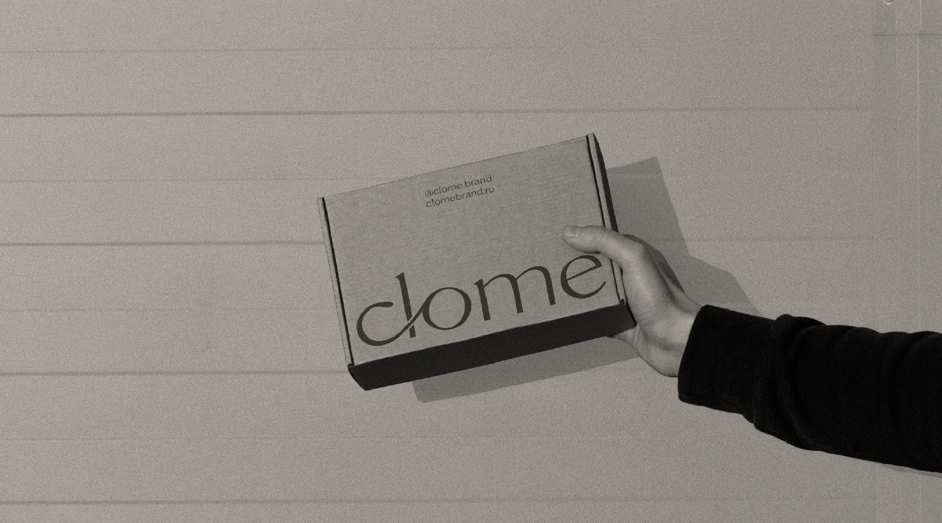
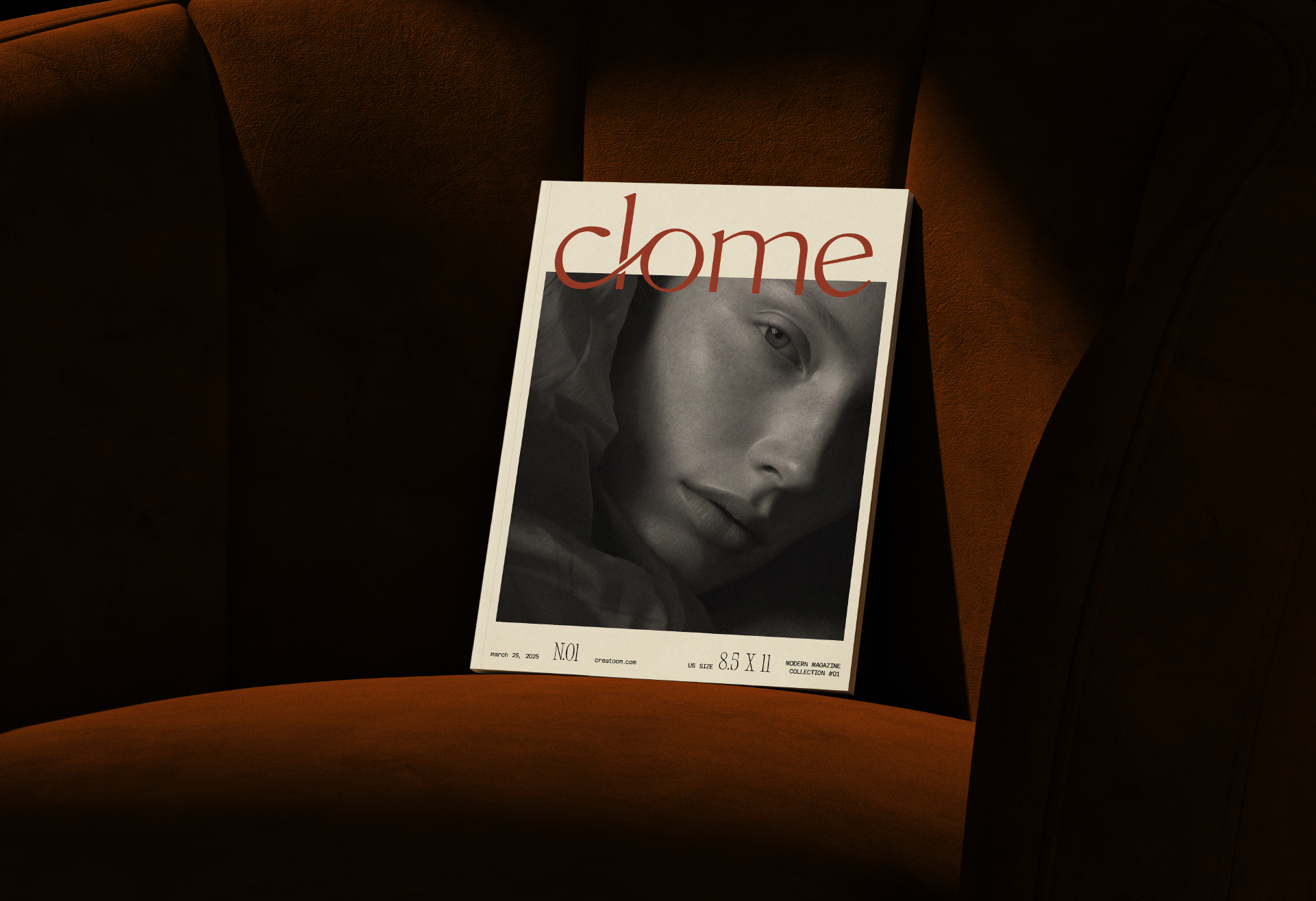
Логотип Clome — это изящная типографическая конструкция, в которой буквы c, l и o соединены между собой плавной линией. Это не просто графический приём — это визуальный символ той самой связи, из которой выросла идея бренда: связи между телом и тканью, женщиной и её внутренним миром, воспоминаниями и настоящим.
Мягкие, тёплые линии букв создают ощущение уюта и лёгкости. Связка «clo» словно охватывает, обнимает, подчеркивая заботу и близость. Остальная часть слова — строгая и лаконичная, создаёт баланс между душевной теплотой и минимализмом современного образа. Логотип построен вручную.
(ENG)
The Clome logo is an elegant typographic design in which the letters c, l and o are connected by a smooth line.
This is not just a graphic device - it is a visual symbol of the very connection from which the idea of the brand grew: the connection between the body and fabric, a woman and her inner world, memories and the present. The soft, warm lines of the letters create a feeling of coziness and lightness. The combination of "clo" seems to embrace, hug, emphasizing care and closeness. The rest of the word is strict and laconic, creating a balance between spiritual warmth and the minimalism of a modern image.
(RUS)
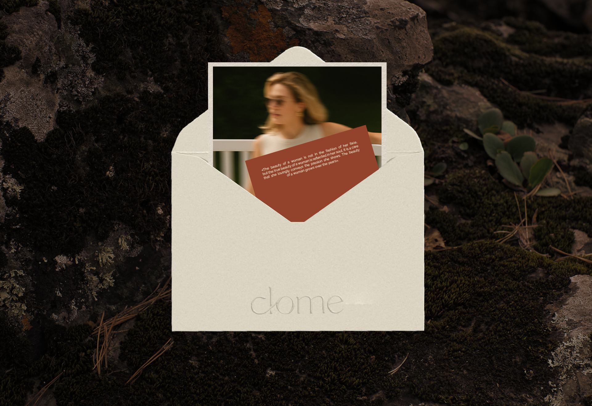
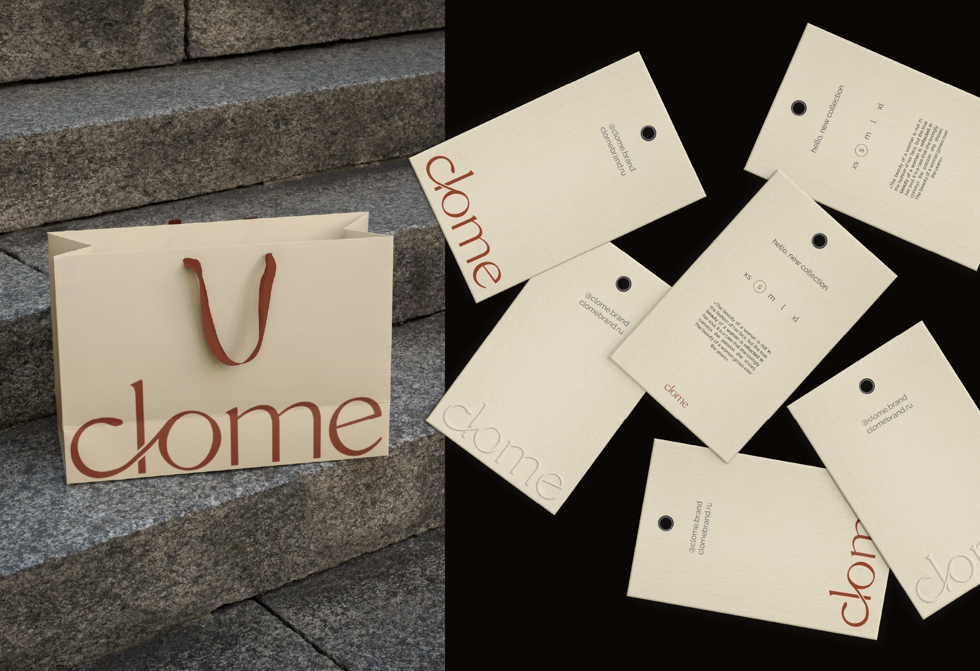
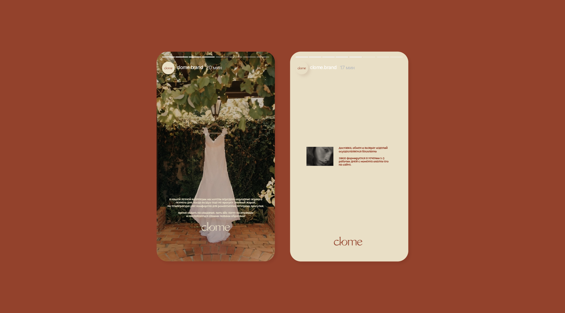
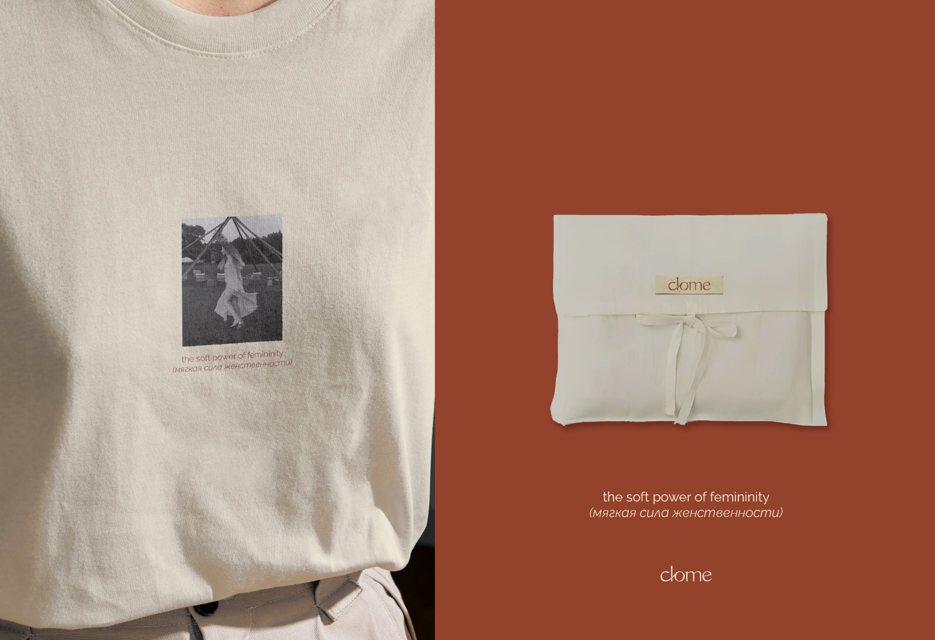
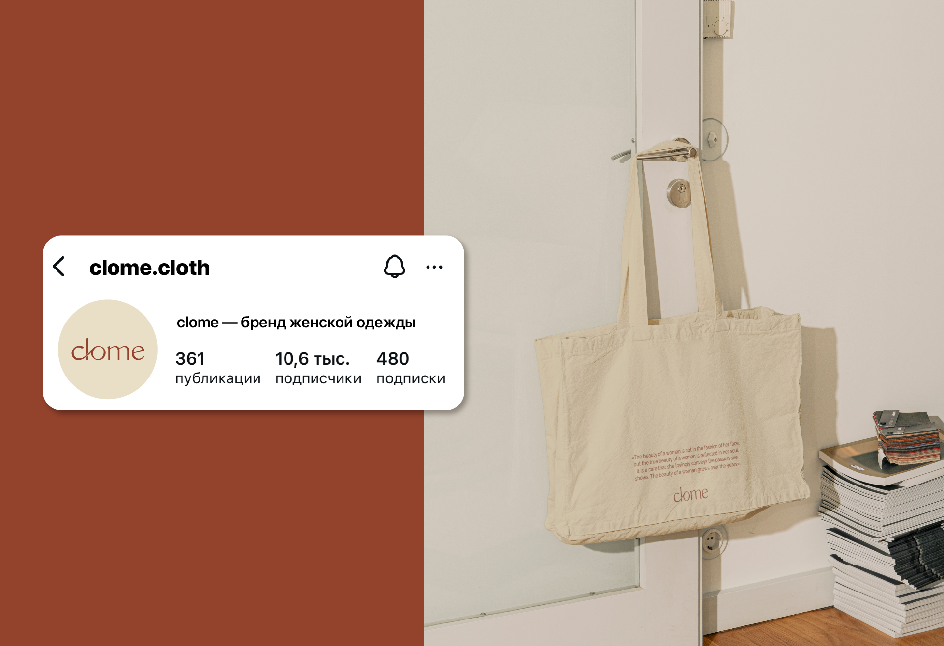
Палитра бренда построена на тёплых, натуральных оттенках: мягкий песочный, терракот. Это цвета летних вечеров, солнца на коже, любимого пледа и тёплого хлеба. Они вызывают чувства уюта, спокойствия, домашнего тепла — именно то, что clome хочет подарить своим клиентам. Такой цветовой выбор работает на эмоциональном уровне: создаёт ассоциации с личным, интимным, настоящим. Одежда clome — как возвращение к себе.
(ENG)
The brand's palette is built on warm, natural shades: soft sand, terracotta. These are the colors of summer evenings, the sun on the skin, a favorite blanket and warm bread. They evoke feelings of coziness, calm, home warmth - exactly what clome wants to give to its customers. This color choice works on an emotional level: it creates associations with the personal, intimate, real. Clome clothes are like a return to yourself.
BRAND DESIGNER: Mariya Valova
follow me: @mari.vall
Contact with me:
Telegram
E-mail