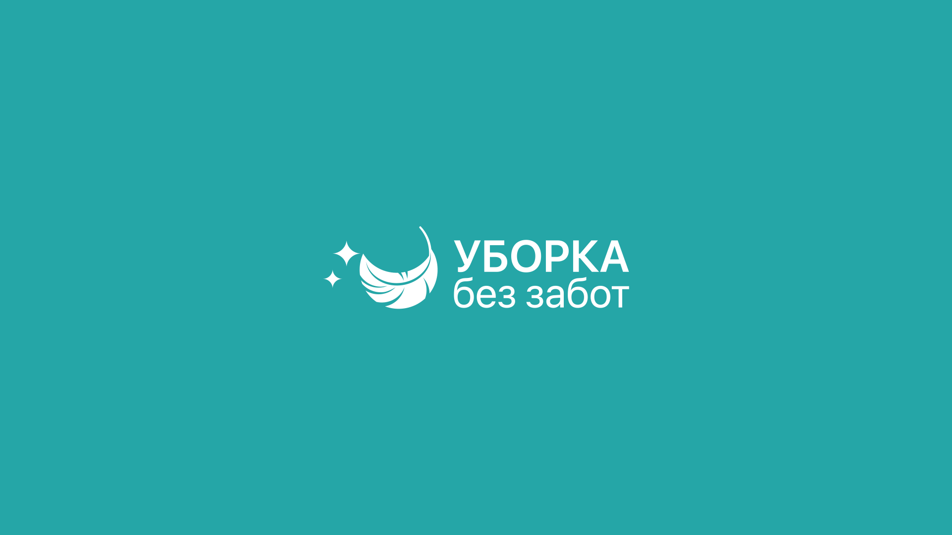
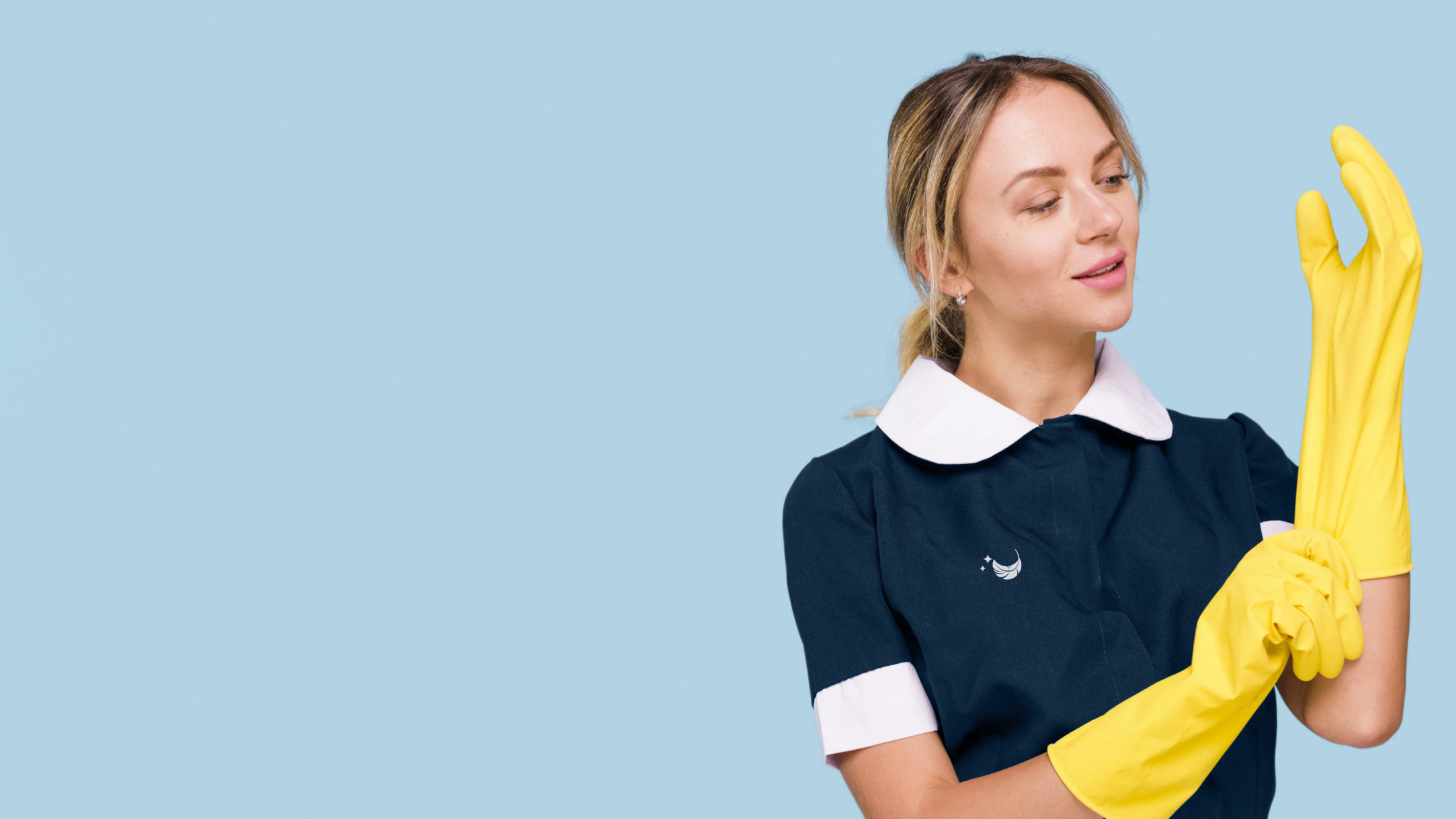
Разработка логотипа для клининговой компании Уборка без забот.
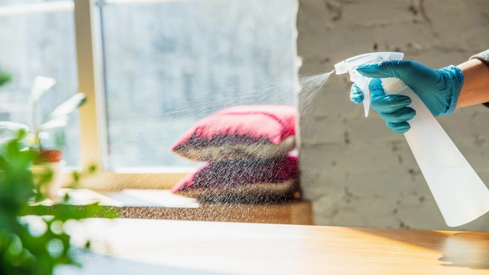
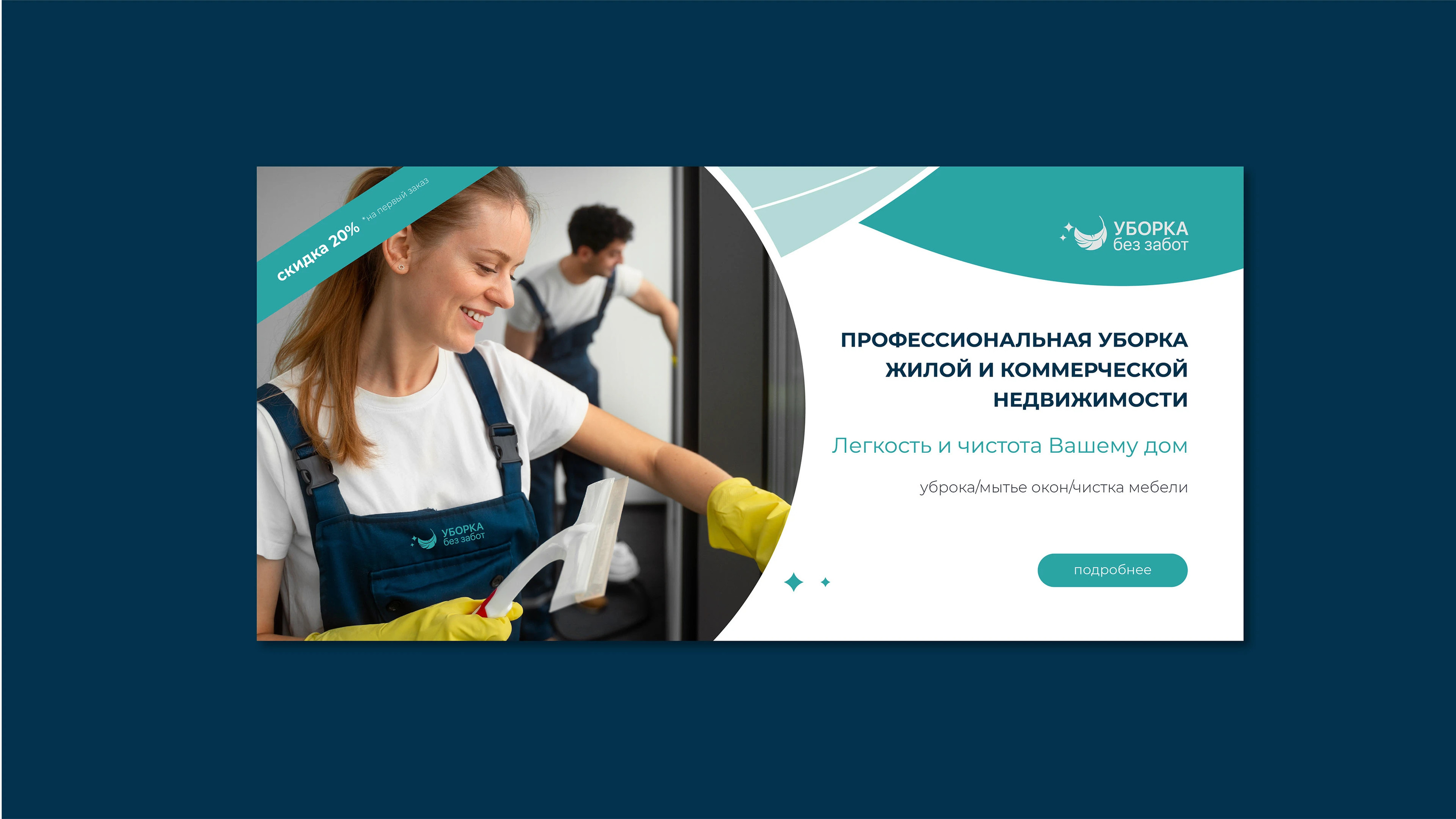
Основной посыл - человек радуется живя в уюте и чистоте. Время тратит на себя и семью, а не на уборку.
Легкость, радость, уют и надежность.
Logo development for a cleaning company Cleaning without worries.
The main message is that a person enjoys living in comfort and cleanliness. He spends time on himself and his family, and not on cleaning.
Ease, joy, comfort and reliability.
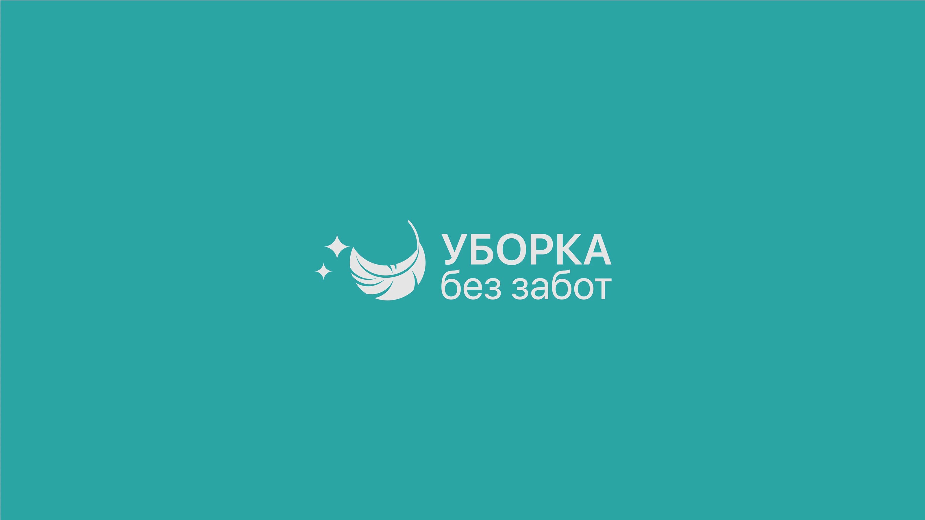
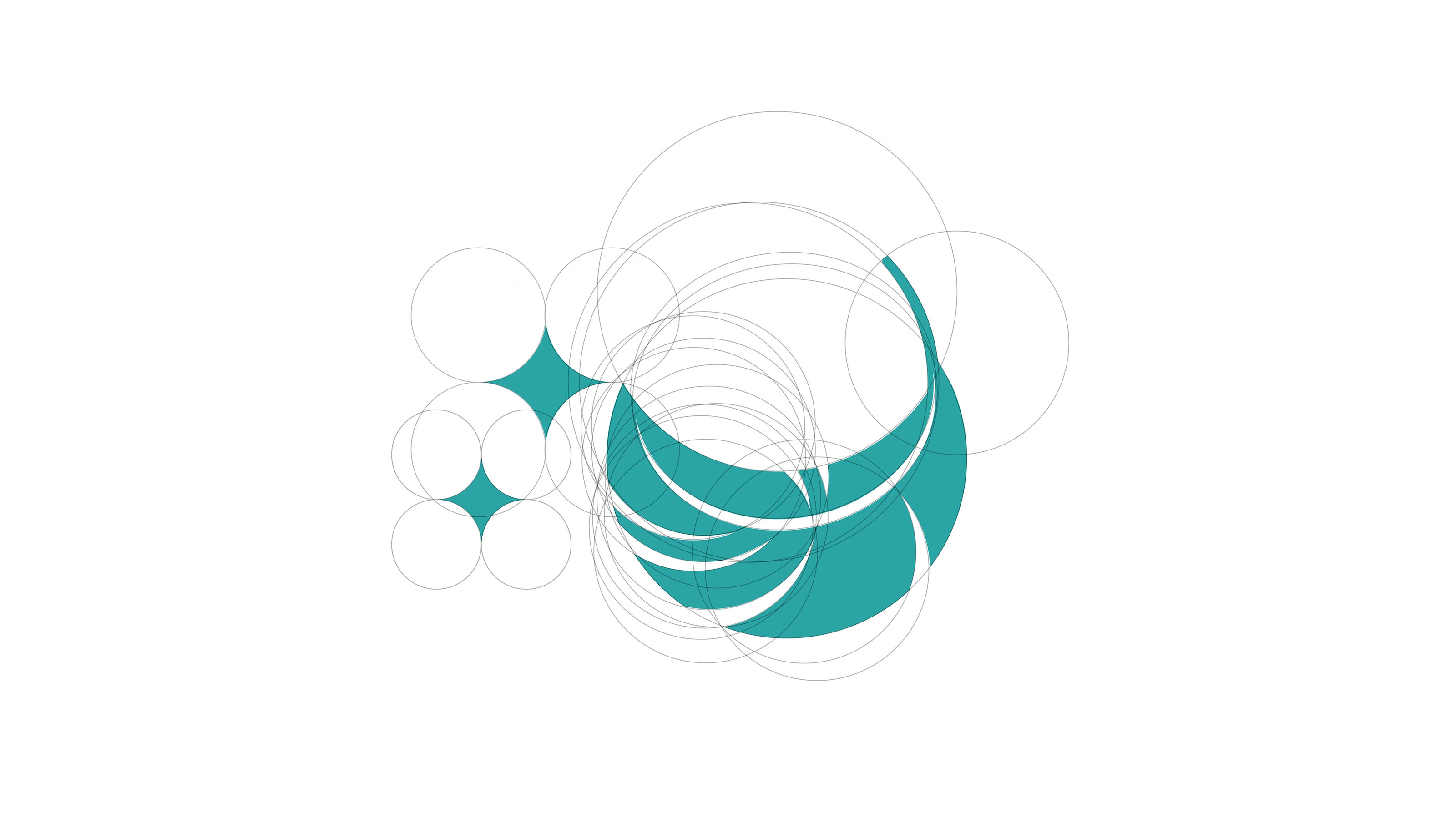
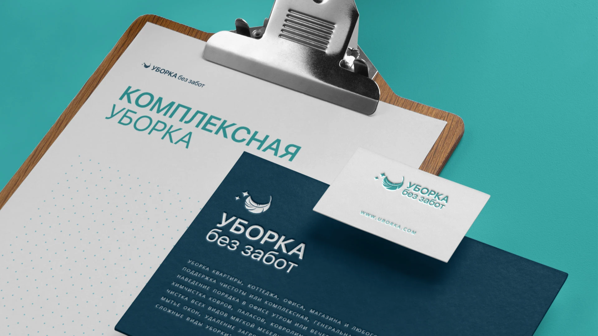
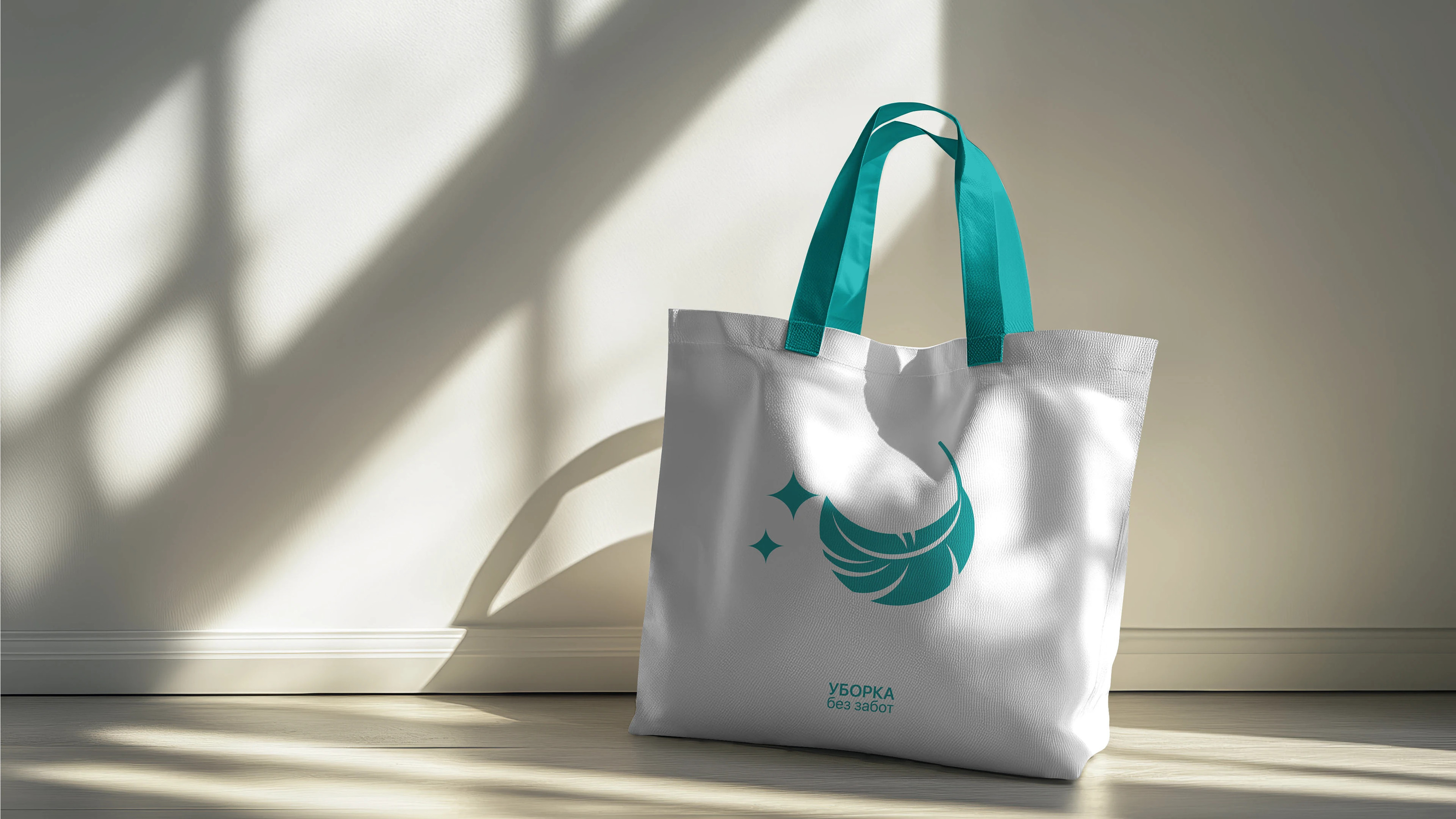
Логотип
Белое, парящее в воздухе перышко, вызывает ощущение легкости и полета. Радость от легкости и уют от мягкого прикосновения к перышку.Легко смахнуть пыль пушистым пером.
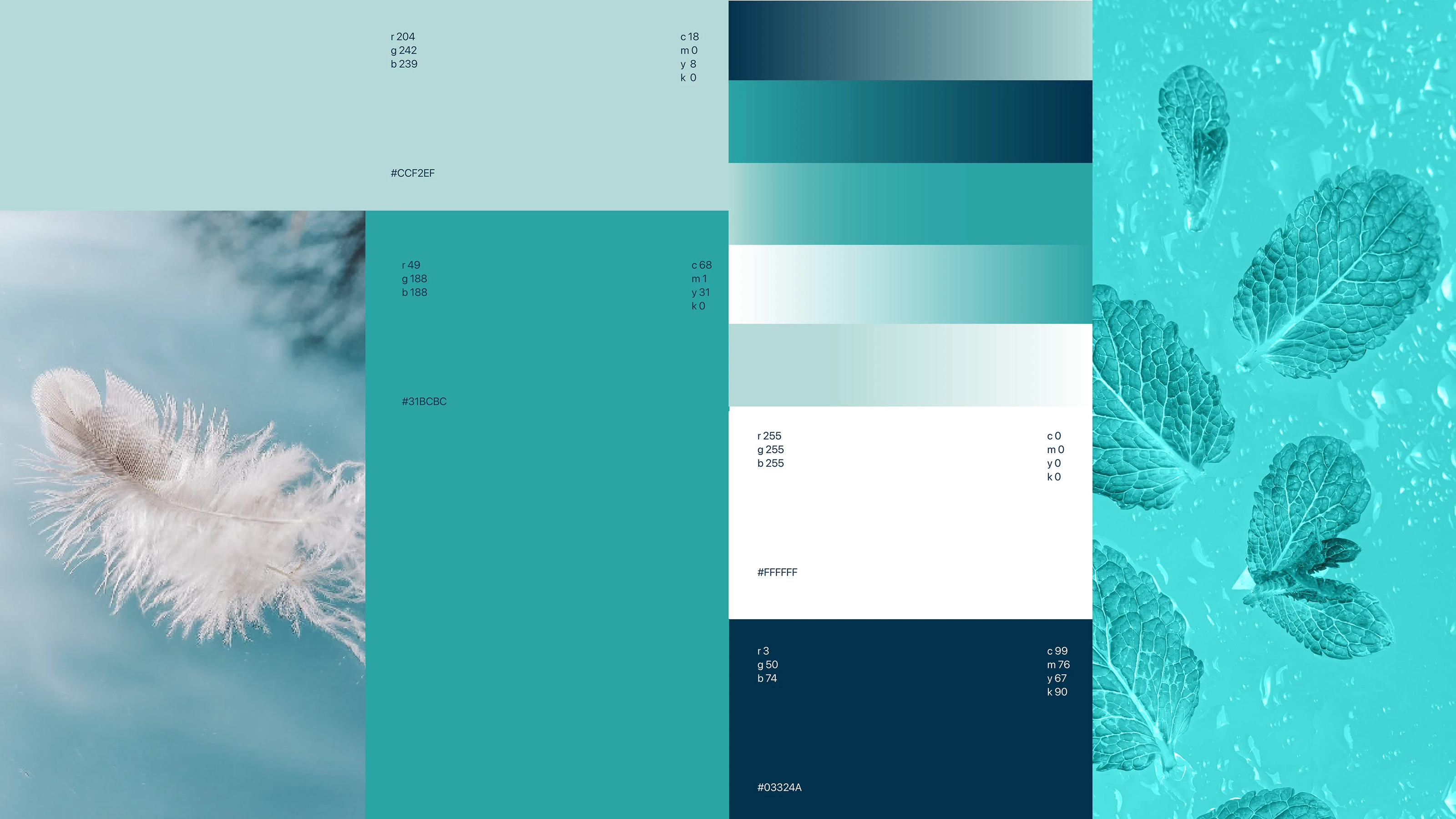
Свежесть и чистота переданы в цветовой гамме - оттенках бирюзового и голубого.
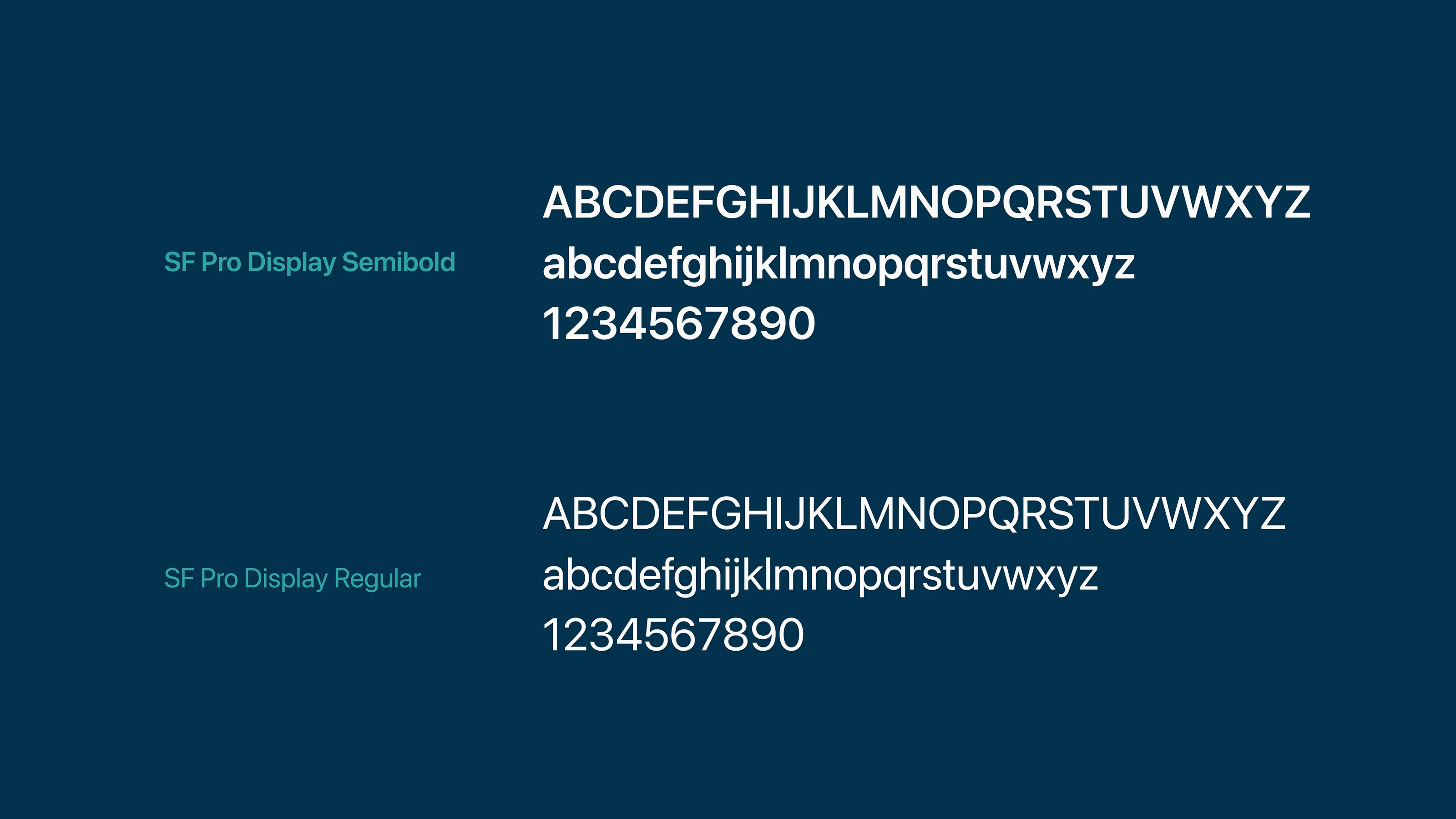
Геометрическое построение сетки знака основано на золотом сечении. Все элементы взаимосвязаны с математической точностью, что облегчает восприятие и вызывает ощущение спокойствия и надежности.
Logo
A white, feather floating in the air evokes a feeling of lightness and flight. Joy from lightness and comfort from a soft touch to the feather. It is easy to brush off dust with a fluffy feather.
Freshness and purity are conveyed in the color scheme - shades of turquoise and blue.
The geometric construction of the grid of the sign is based on the golden section. All elements are interconnected with mathematical precision, which facilitates perception and evokes a feeling of calm and reliability.
всегда рада сотрудничеству ---> open for work and collaboration
contact me ---> welcome:)