En
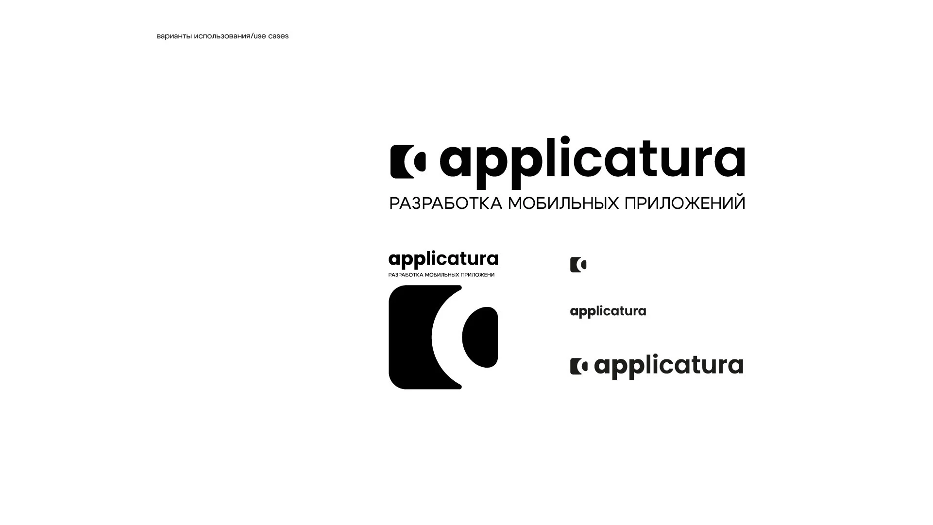
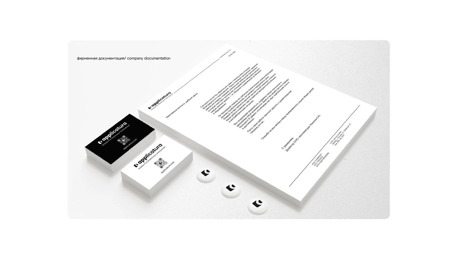
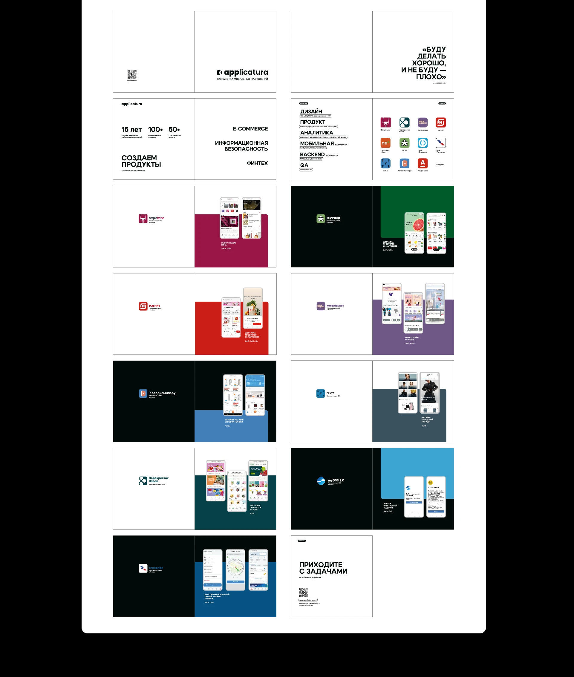
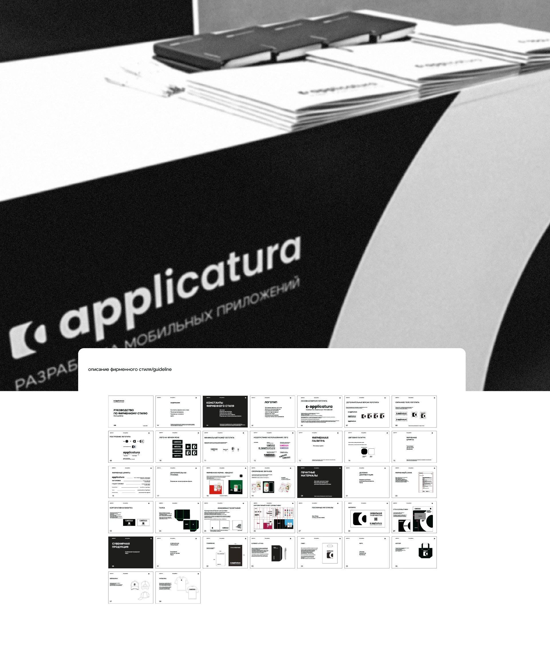
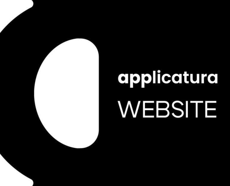
This is a rebranding of the corporate identity of a company developing mobile applications. The brand concept and identity have been revised. The logo and flexible system of corporate identity elements have been updated for use at exhibitions and for promotion at off-line events. The main task was to maintain the style in
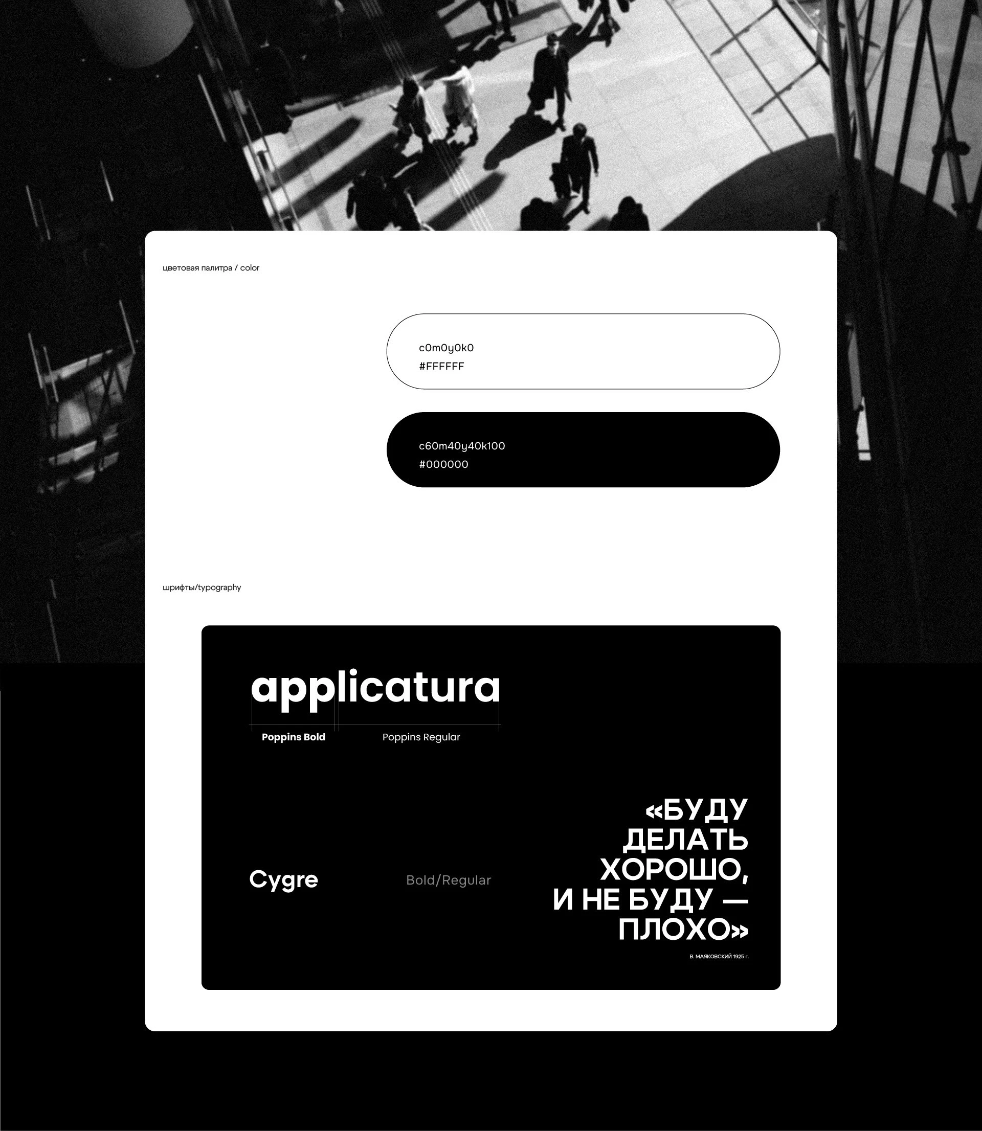
a minimalist black and white combination and preserve brand recognition. I decided to strengthen the fonts, rethink the logo and set a dynamic, strict and reliable character of the style.
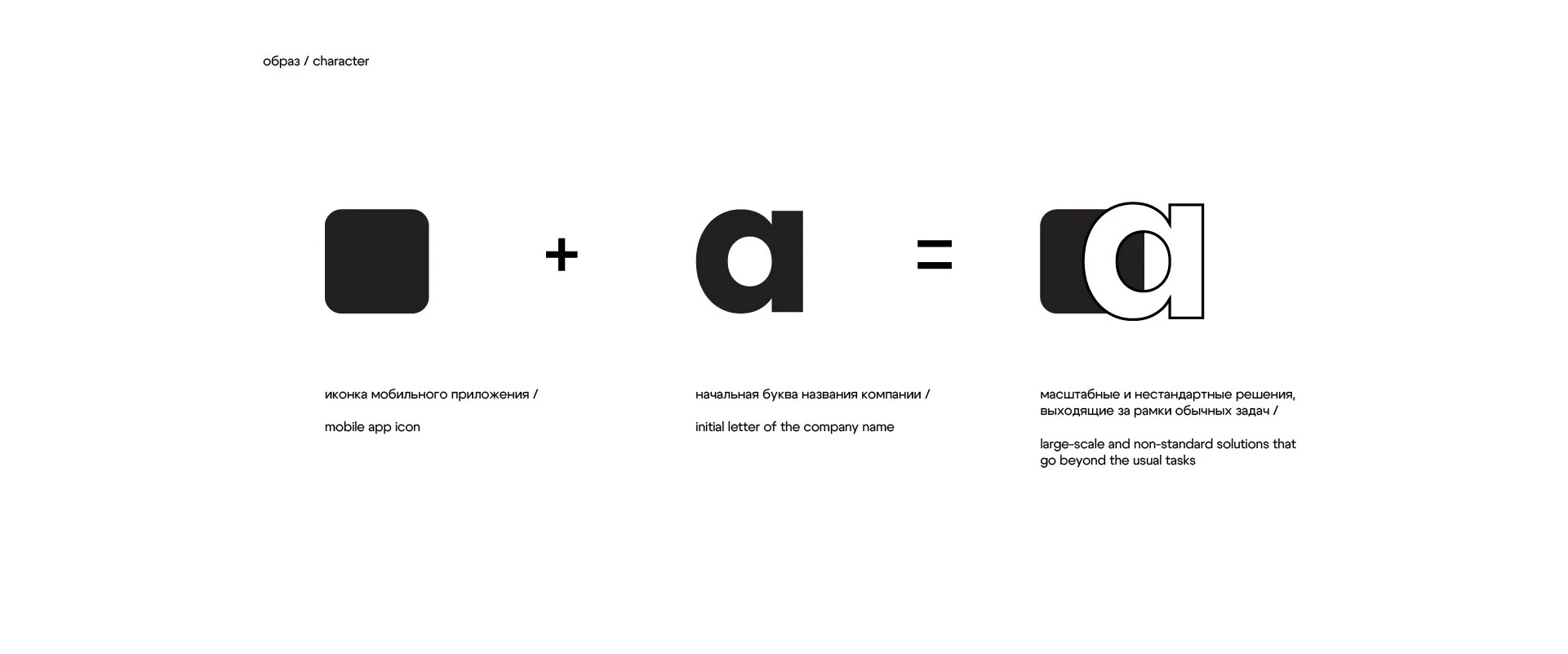
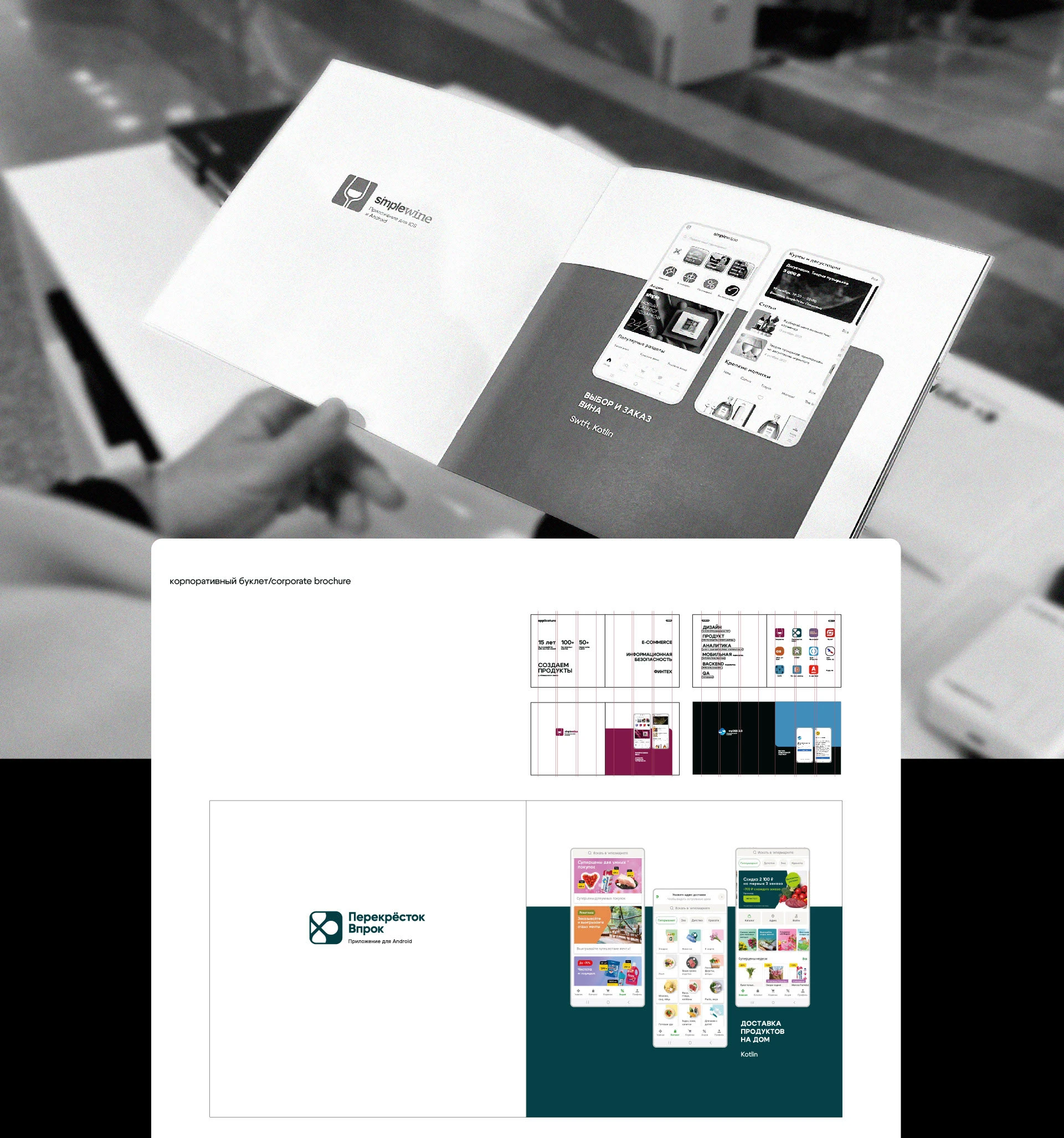
Metaphor: development is a space for creating a business life, where everything is precise, simple, technological The business operates clearly, calmly, structured and confidently. The identity is built on contrasting combinations in typography and composition, graphic elements of the mobile application and
a bright accent on the projects.
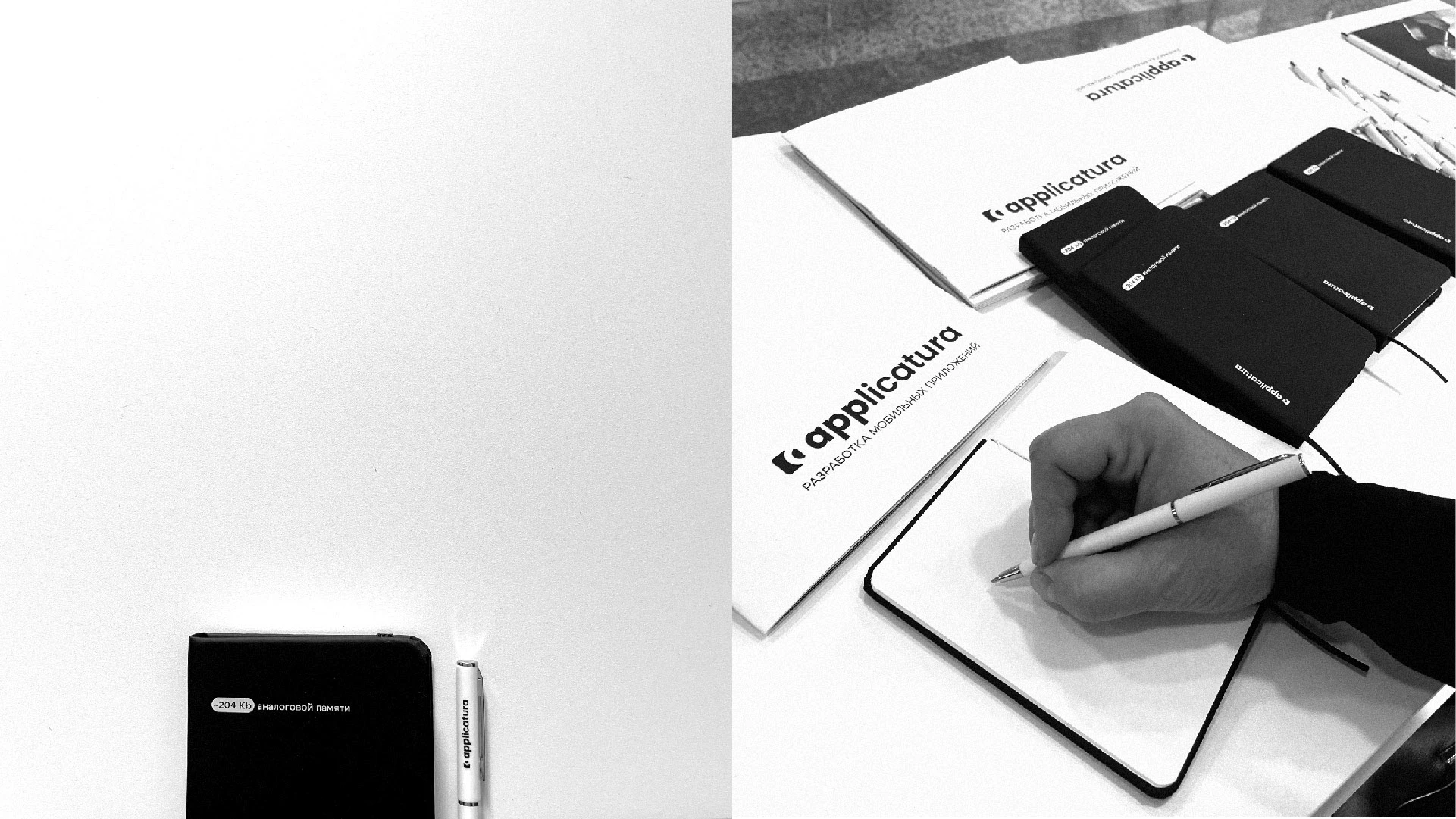
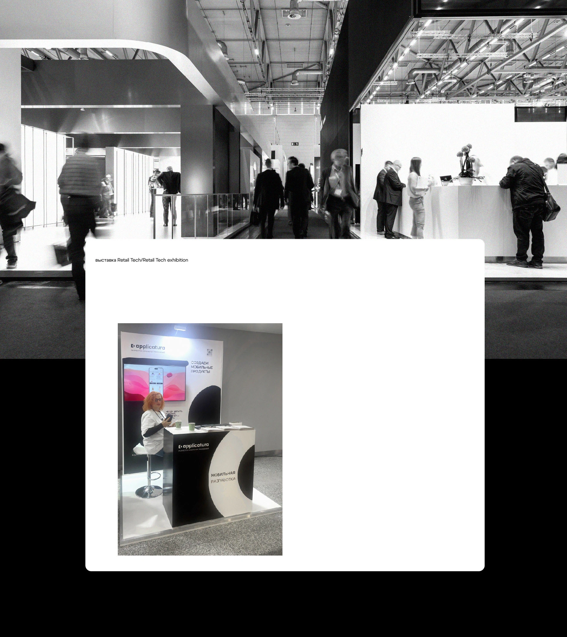
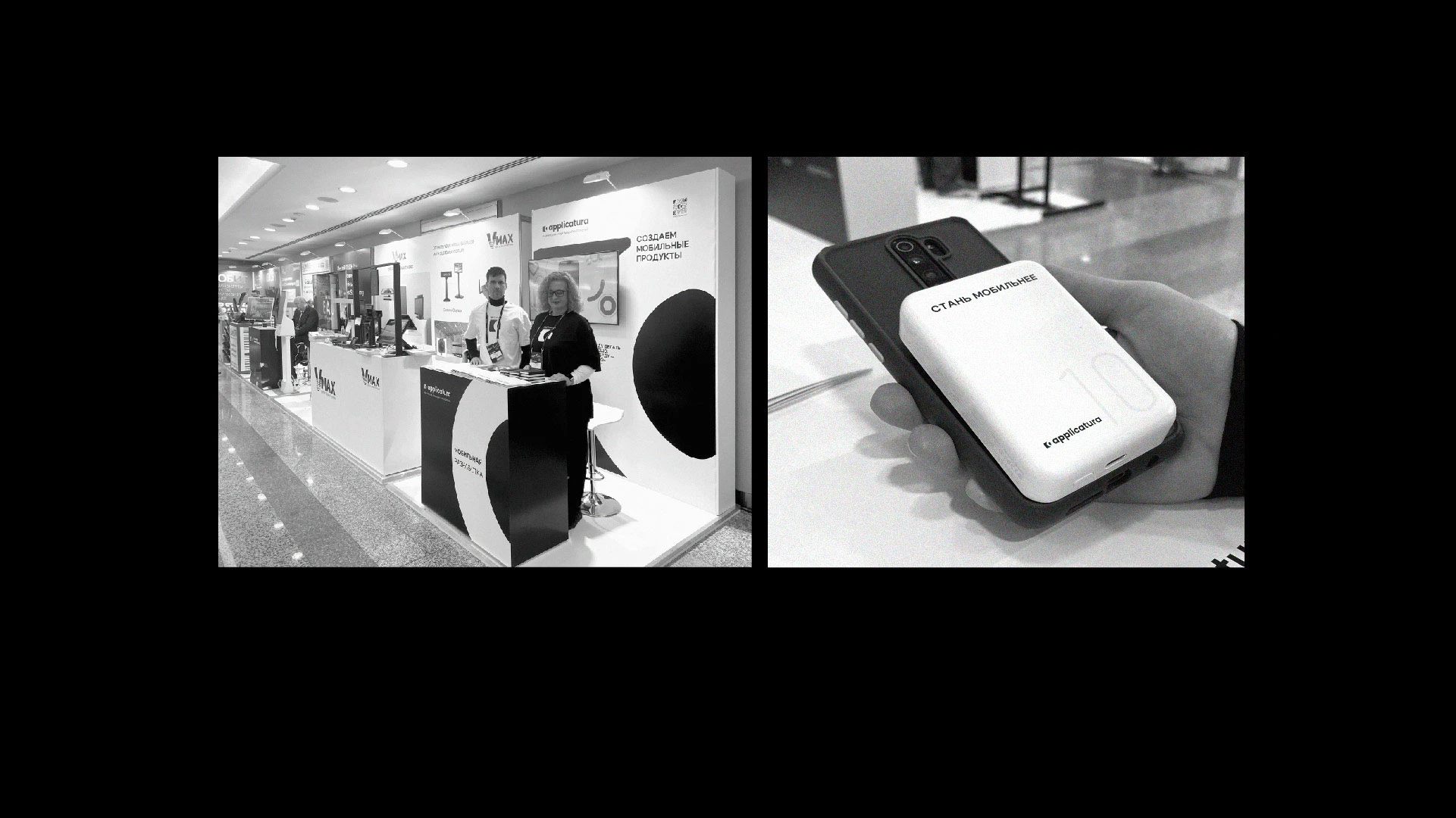
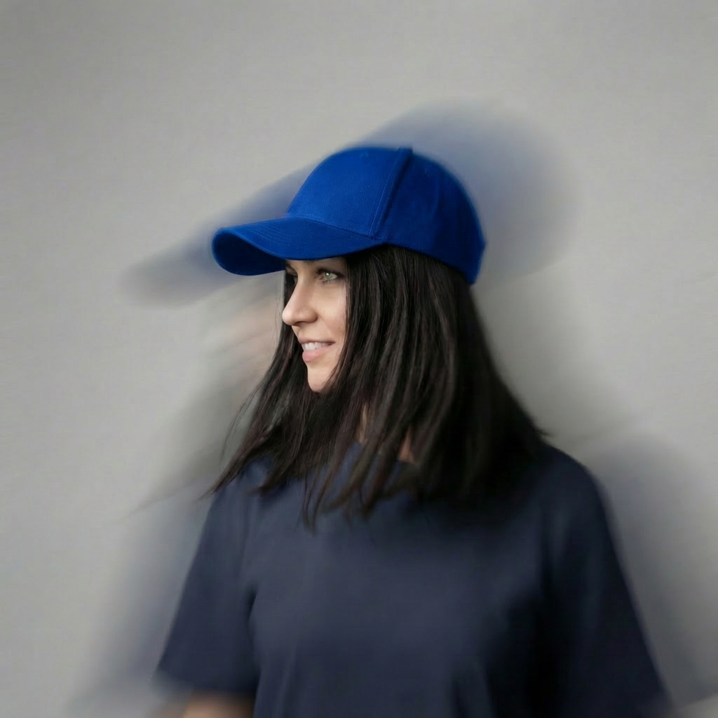
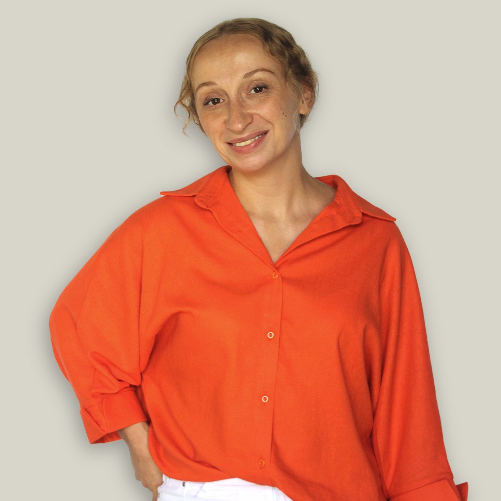
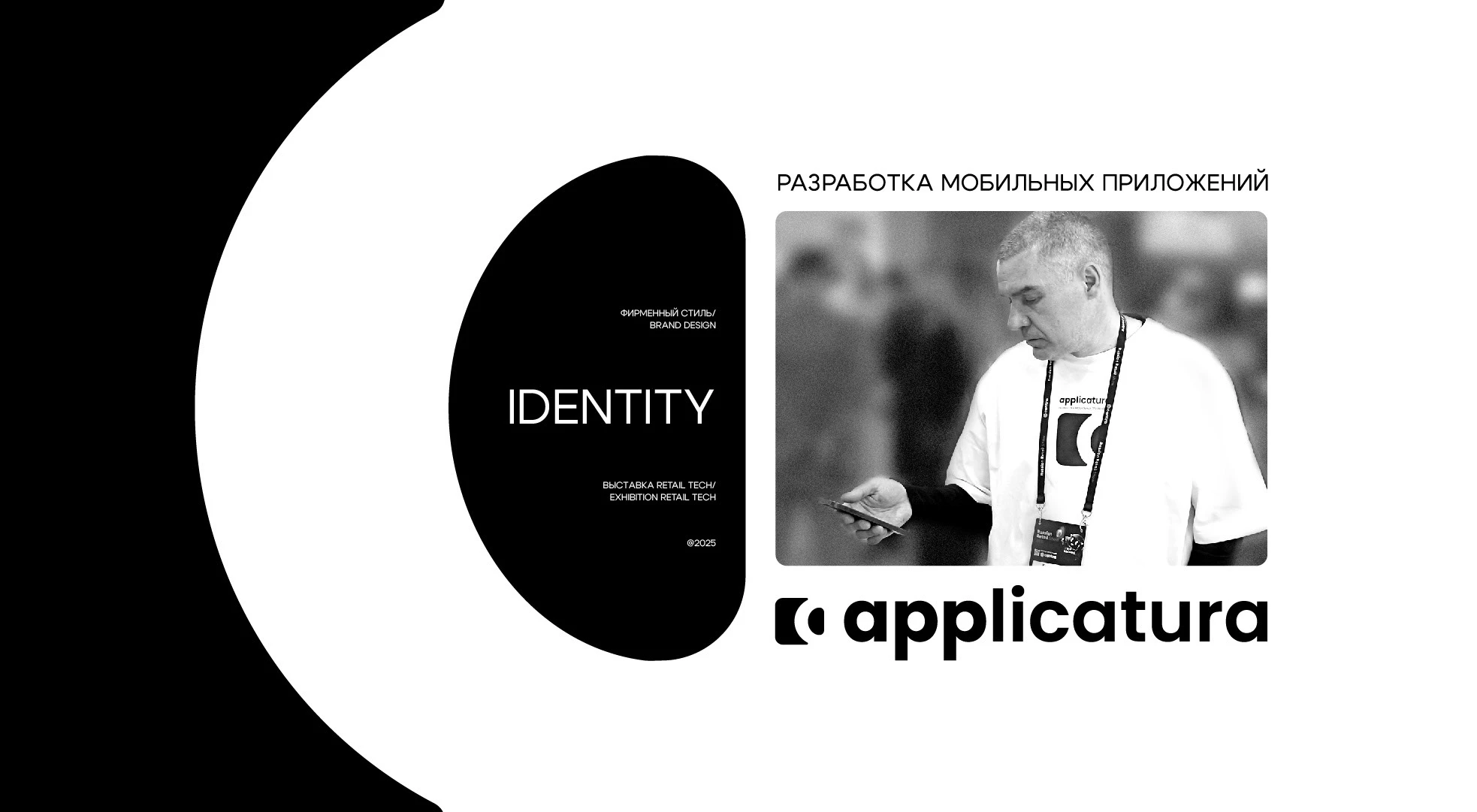
The case is designed as a reportage - the texture of the film, the atmosphere of the exhibition, the movement and the materiality of the event.
Ru
Это ребрендинг фирменного стиля компании по разработке мобильных приложений. Пересмотрена концепция бренда и айдентика. Обновлен логотип и гибкая система элементов фирменного стиля для иcпользования на выставках и продвижения в off-line мероприятиях. Основная задача стояла выдержать стилистику в минималистичном черно-белом сочетании и сохранить узнаваемость бренда. Я решила усилить шрифты, переосмыслить логотип и задать динамичный, строгий и надежный характер стиля.
Метафора: разработка - это пространство для создания жизни бизнеса, где все точно, просто, технологично.
Бизнес работает четко, спокойно, структурировано и уверенно. Айдентика строится
на контрастных сочетаниях в типографике и композиции, графических элементах мобильного приложения и ярком акценте на проектах.
Кейс оформлен как репортаж - фактура съемки на фотопленку, атмосфера выставки, движение и материальность события.