From the very beginning of this project, we knew GRIV wasn’t just another studio. There was a clear, almost architectural philosophy driving everything they did: a quiet confidence, a kind of restraint that didn’t rely on loud gestures but on balance, proportion, and material honesty.
This approach became the foundation of the brand’s visual identity.
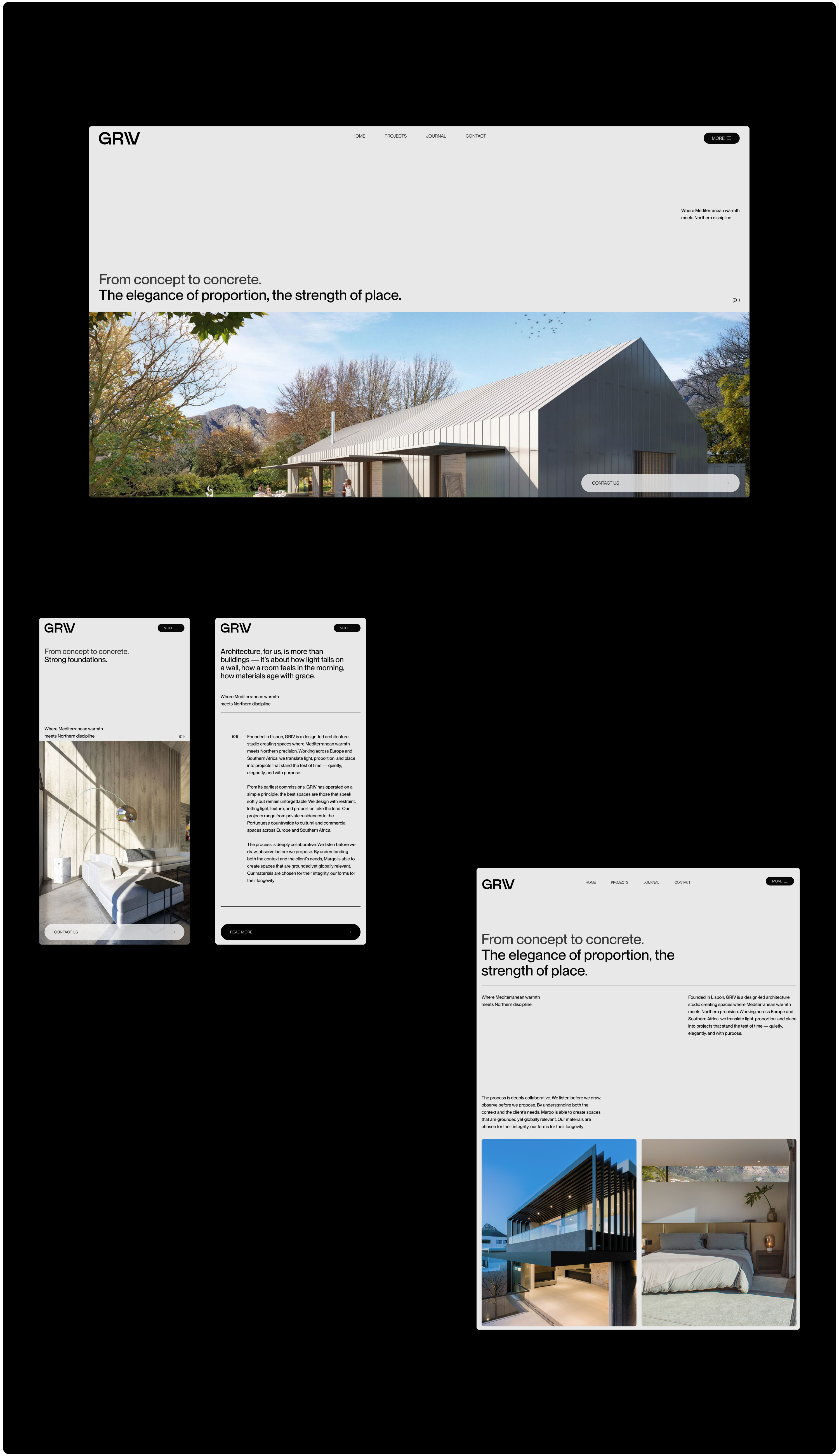
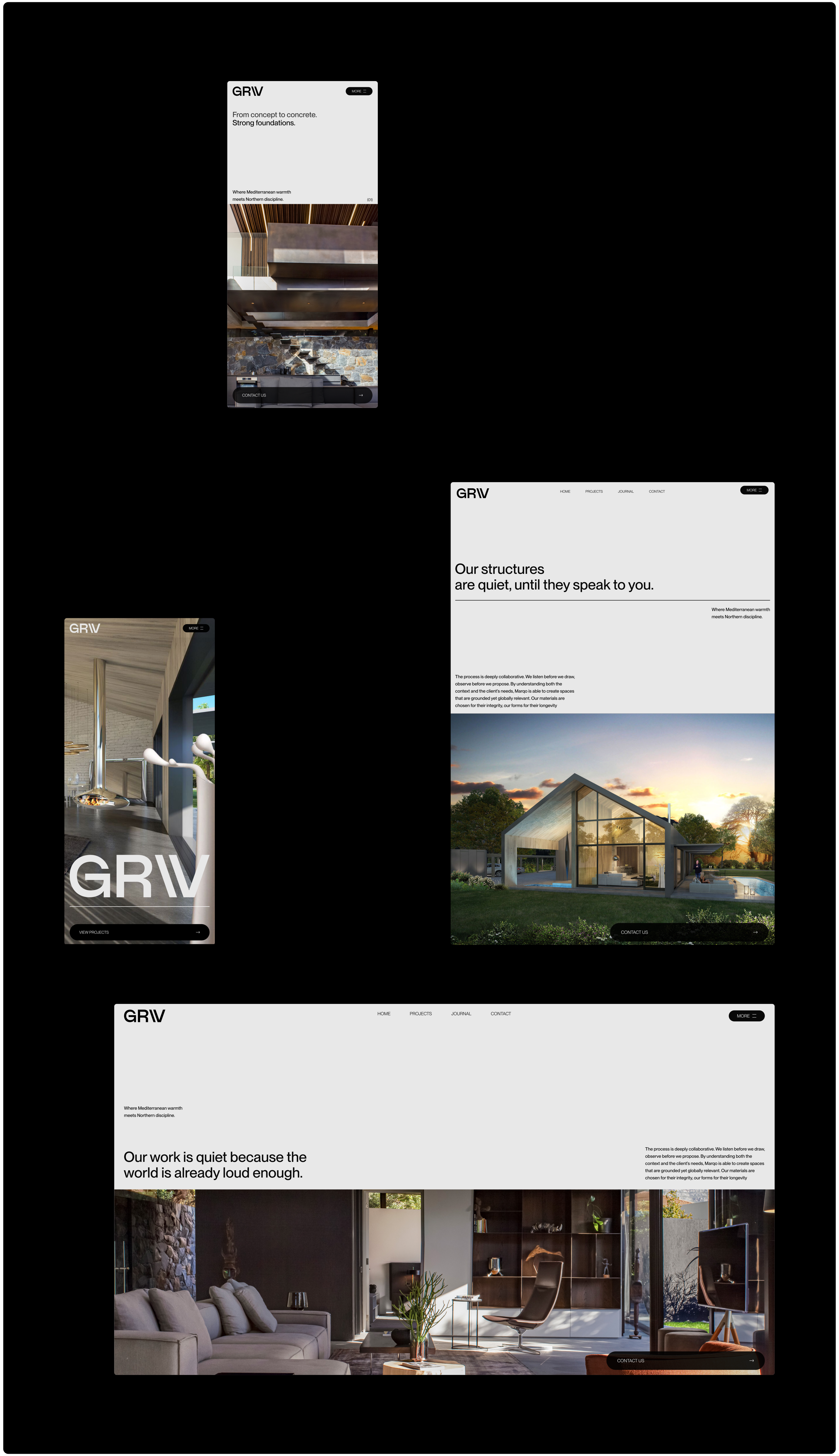
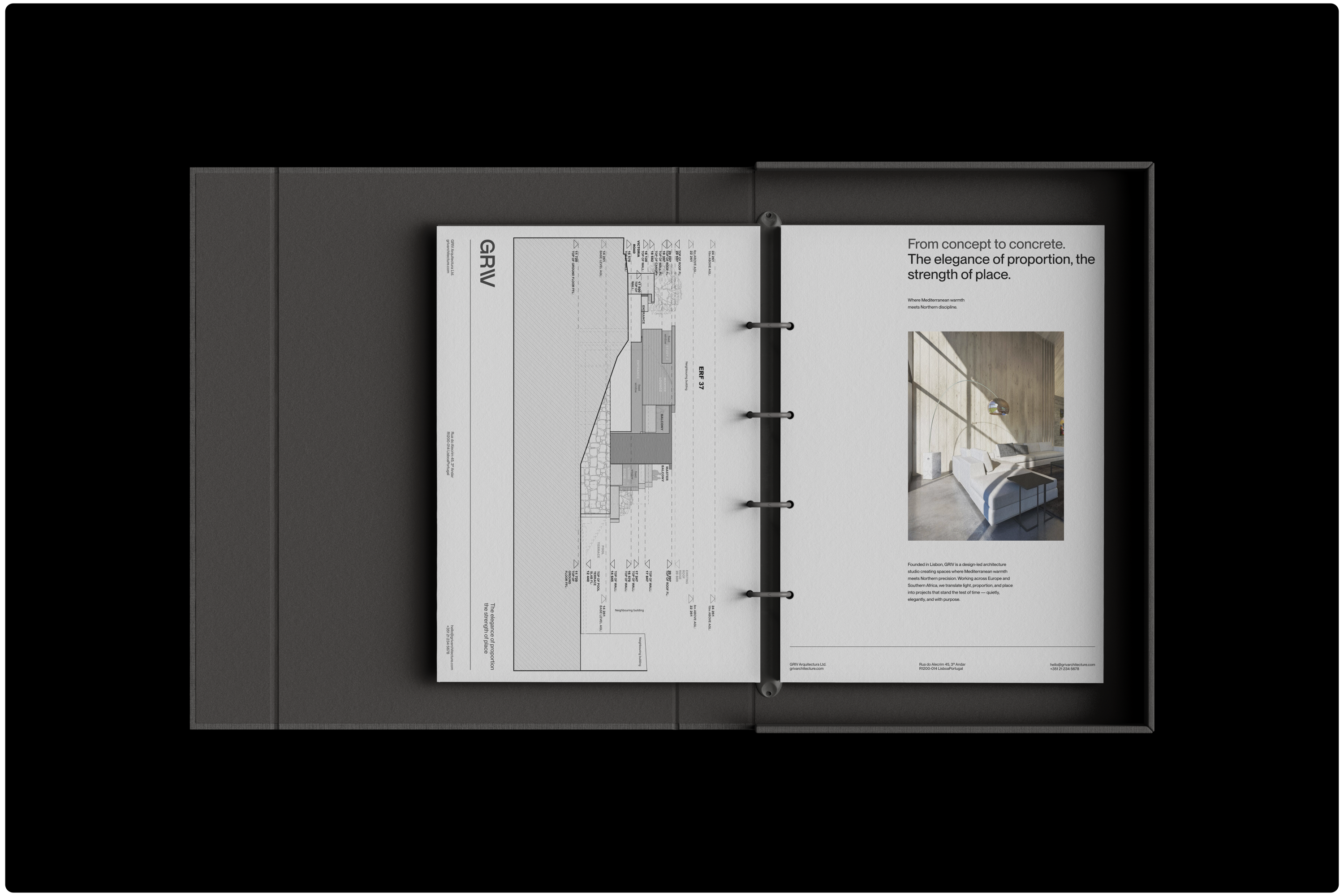
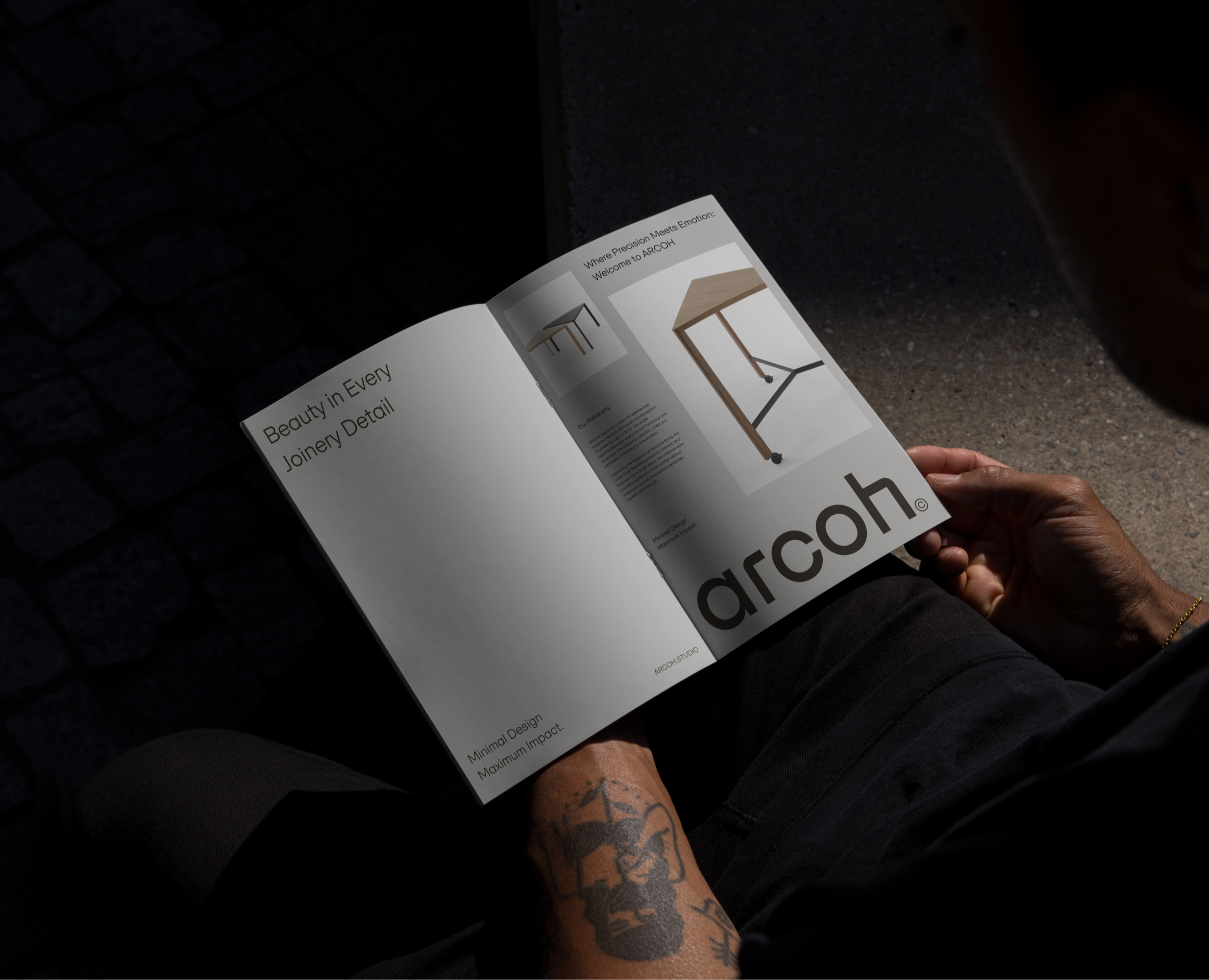
GRIV's body of work spans private residences nestled in the Portuguese countryside to cultural and commercial spaces across Europe and Southern Africa. Each project felt considered, intentional — almost meditative in its silence. We wanted the identity to reflect that same clarity and sense of space.
So before any design work began, the process was intentionally slow. We listened. We sat with their work. We took time to understand not only the physical spaces they design, but also the emotional tone they aim to set. Only then did we start to shape the visual language.
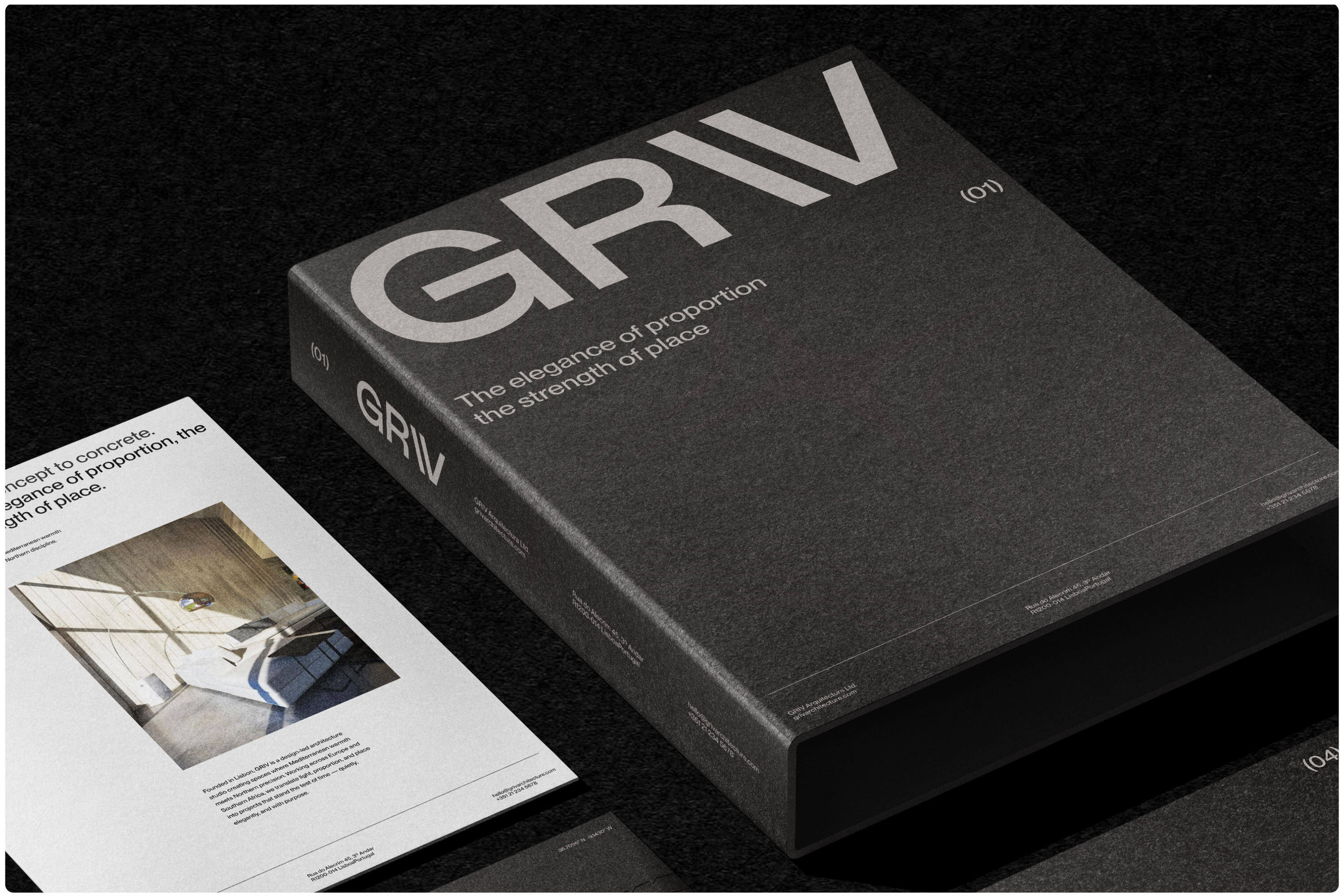
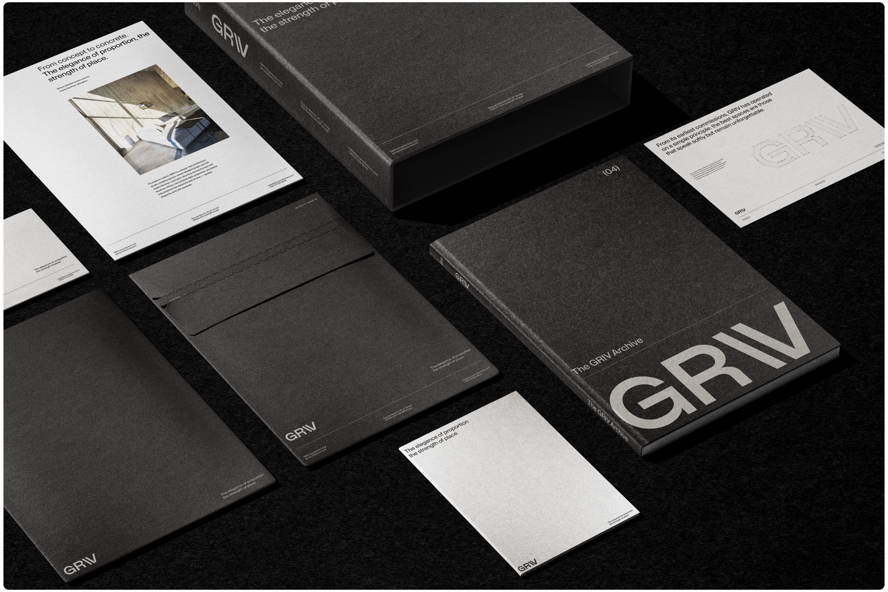
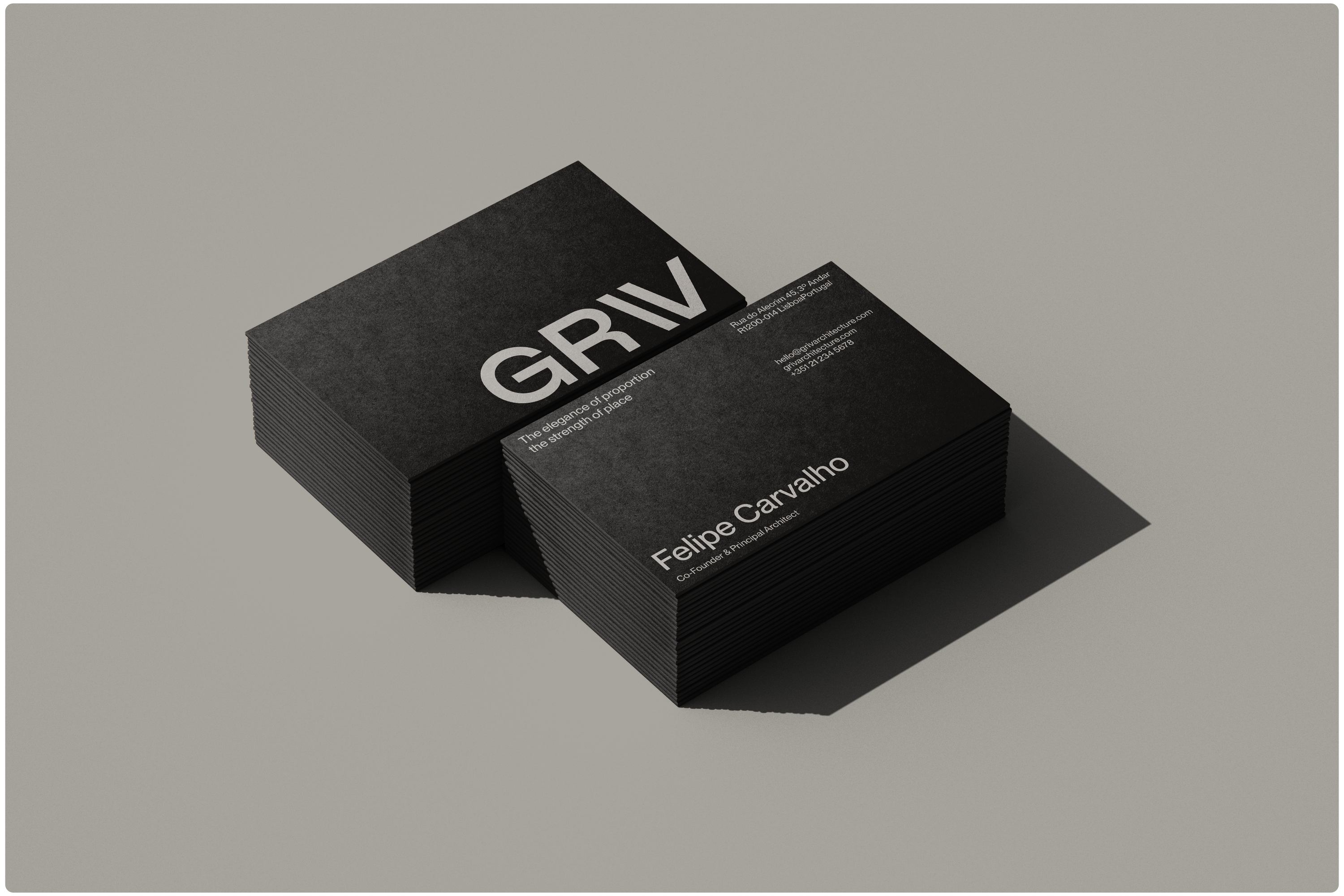
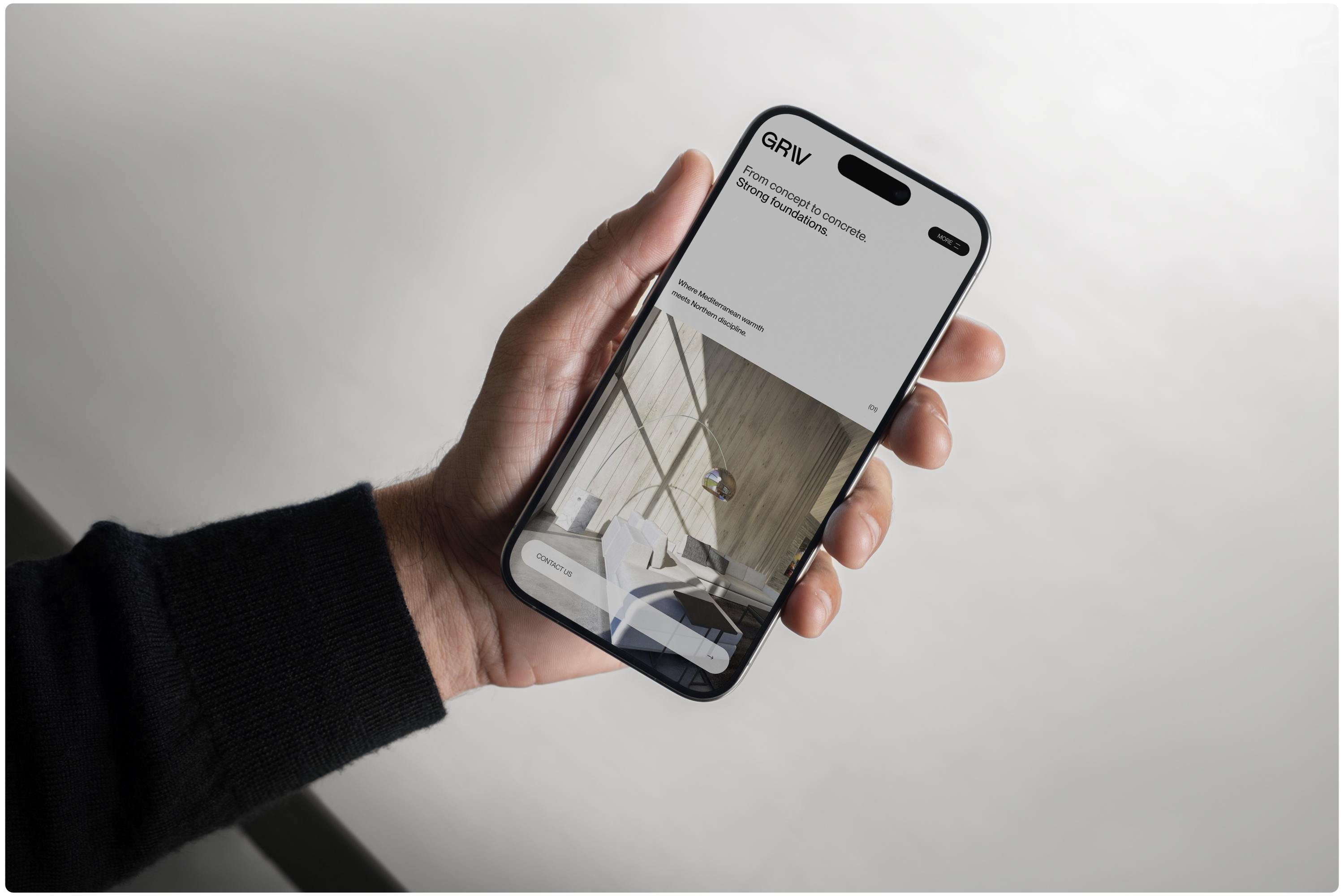
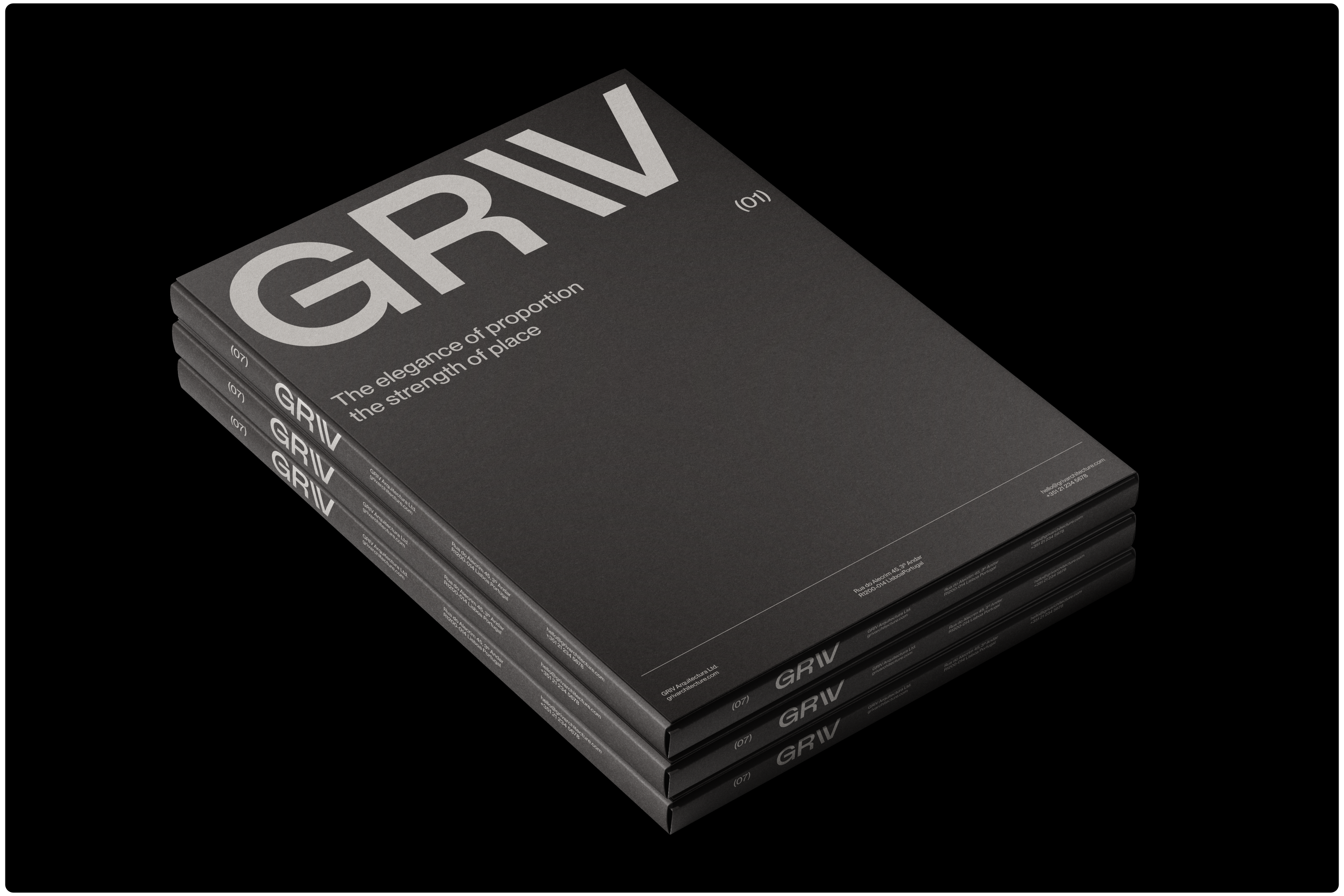
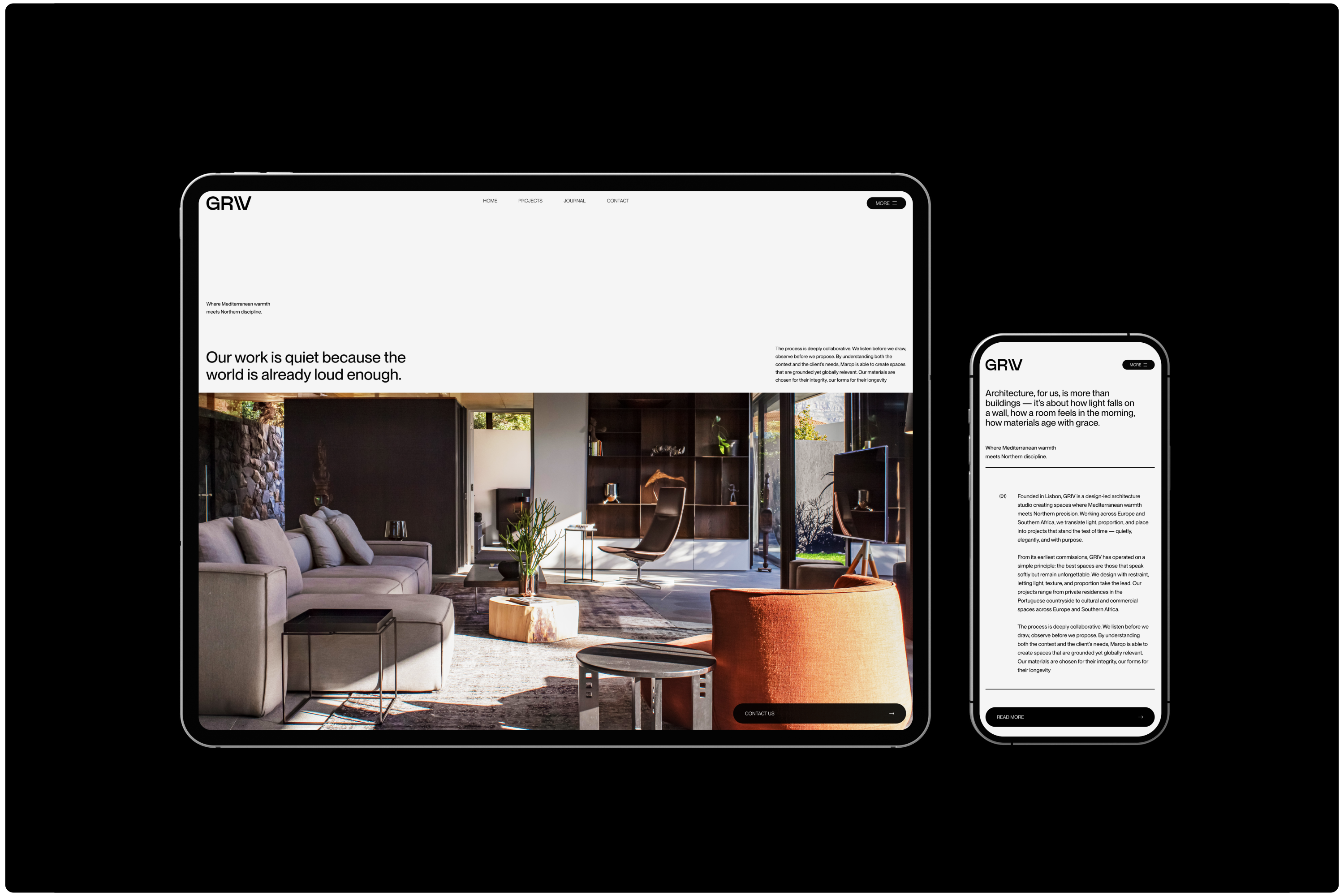
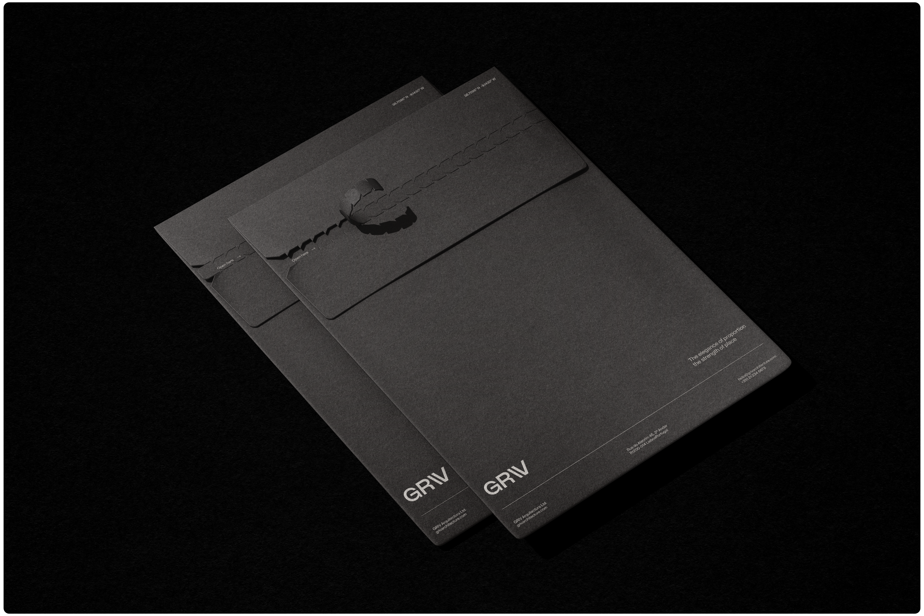
The full identity system relies on rich materials, subtle contrasts, and plenty of negative space.
The color palette is neutral but warm; the textures tactile and authentic. Every decision, from layout systems to typographic rhythm, was made with longevity in mind.
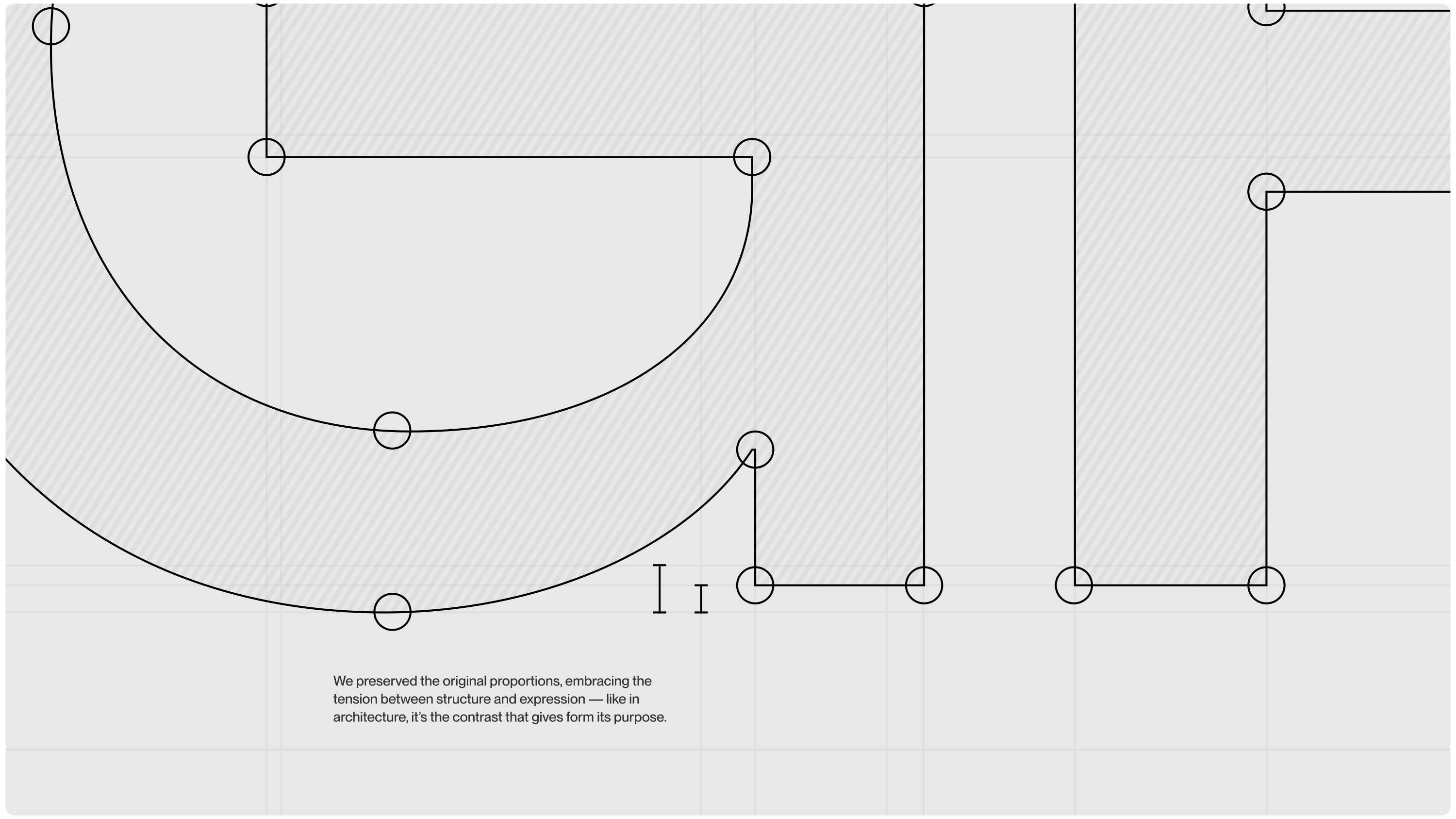
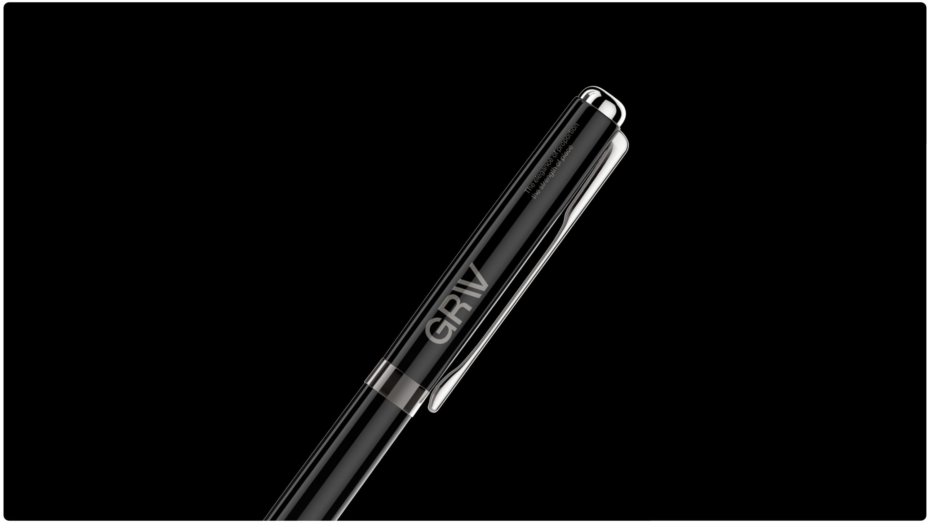
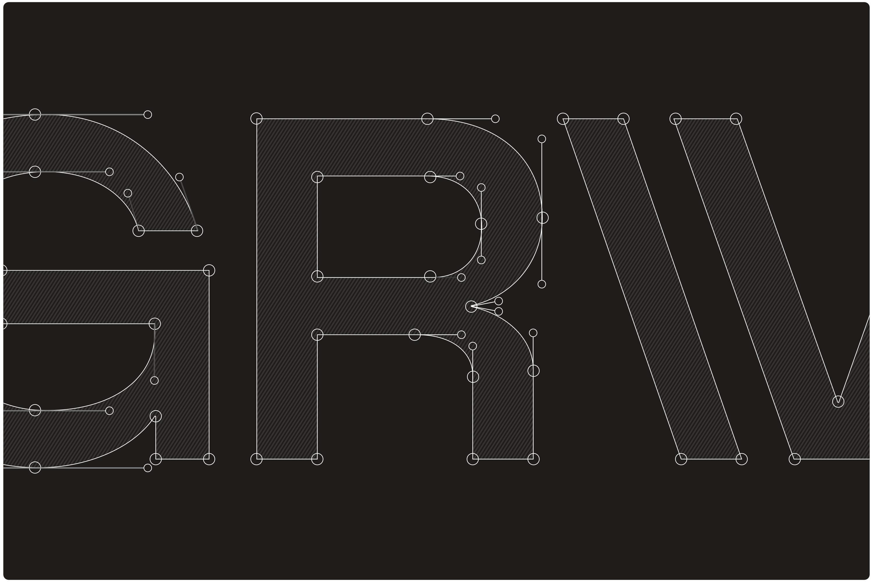
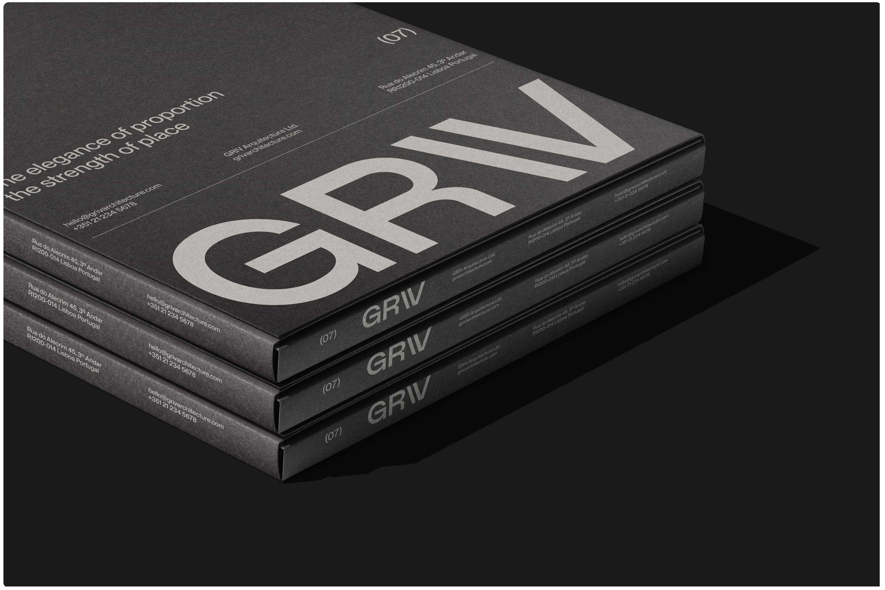
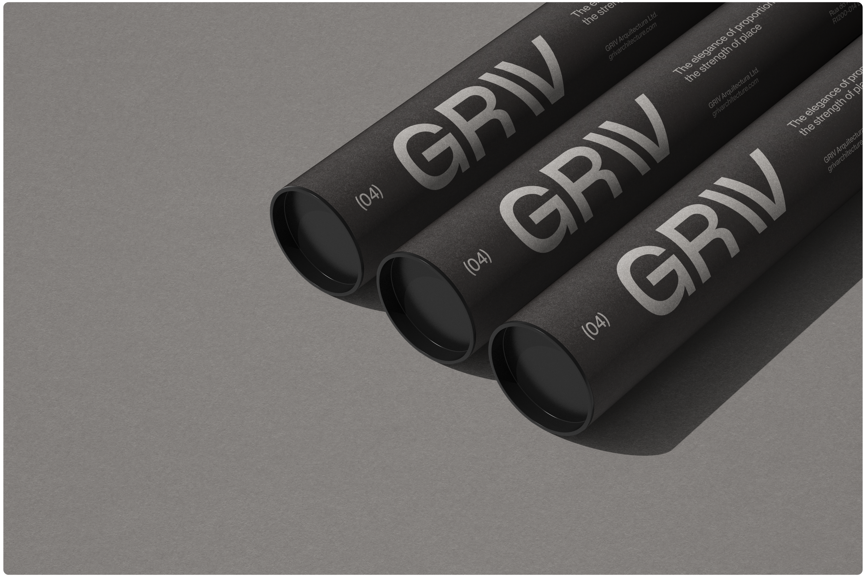
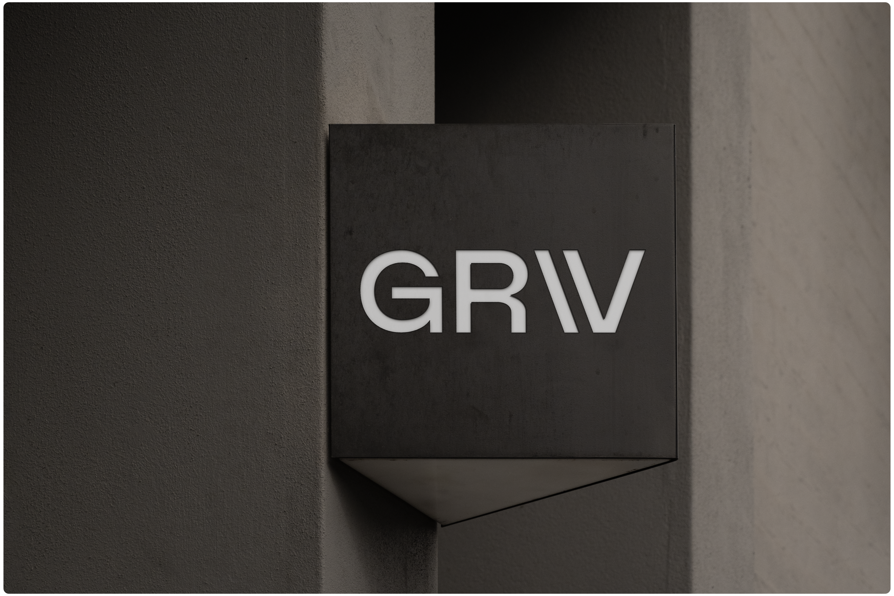
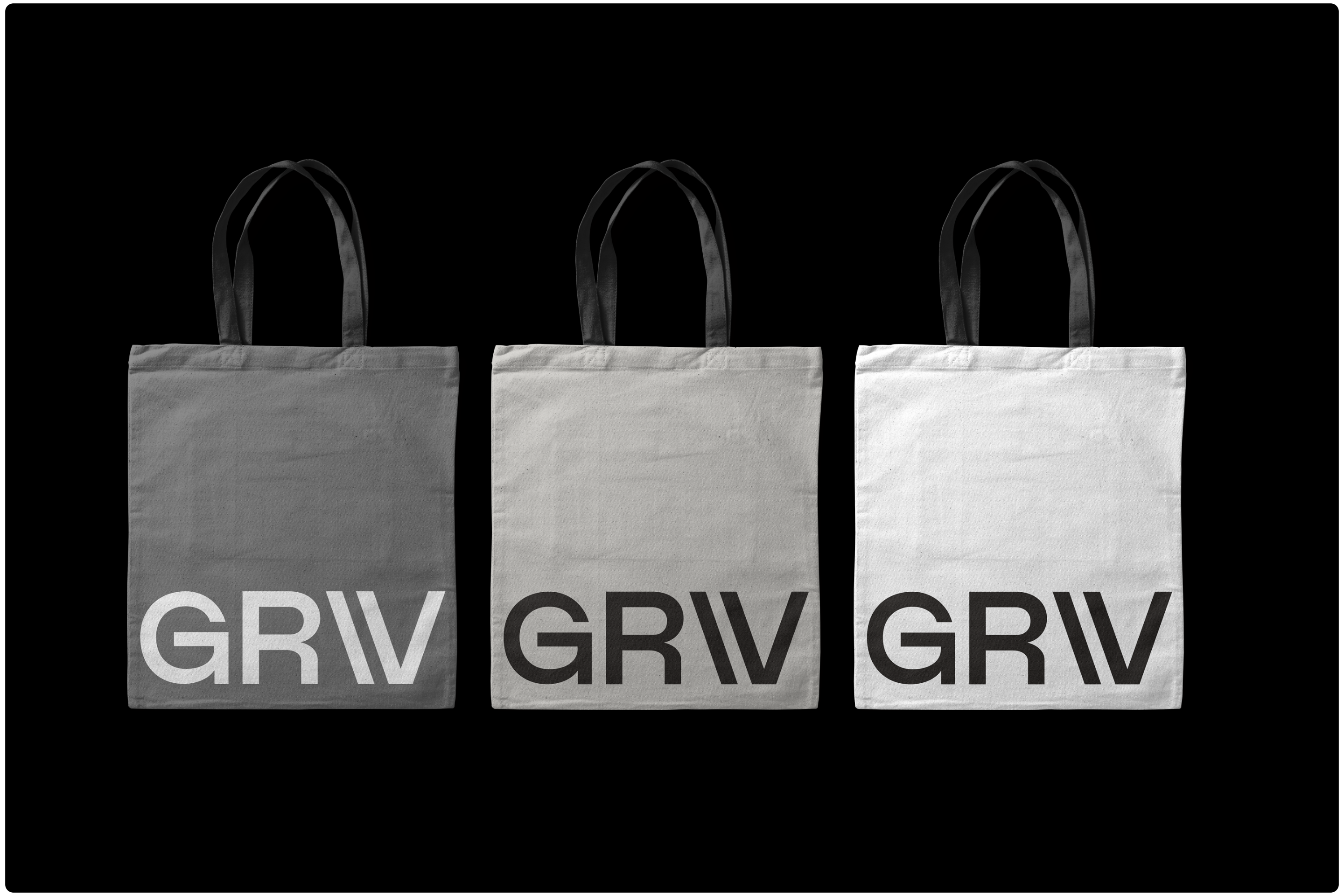
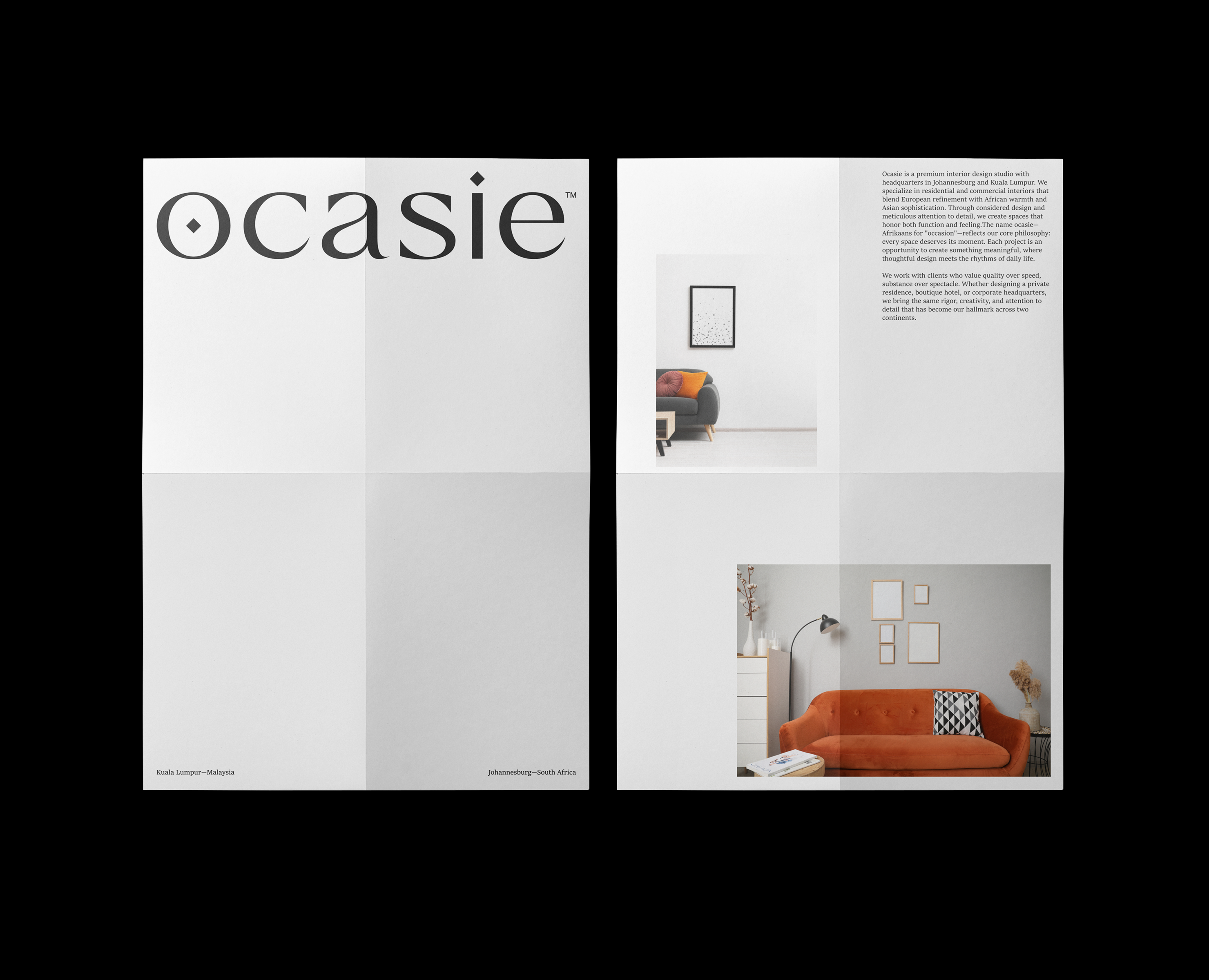
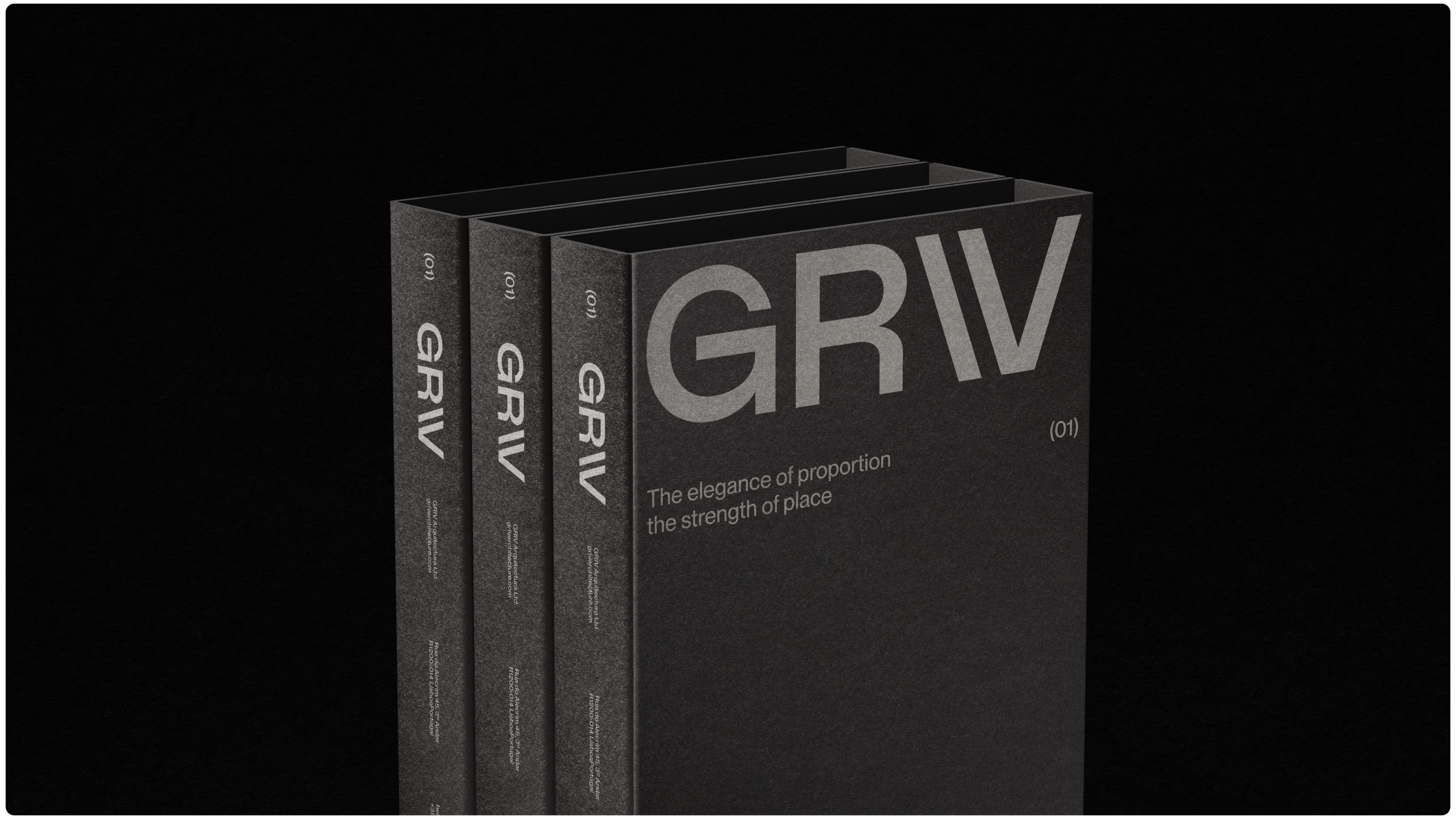
The logotype was a central element. It needed to carry a lot — neutrality, quiet strength, and a timeless, premium feel. But it also had to avoid feeling cold or overly minimal.
We focused on proportions and typographic weight, creating a mark that feels grounded but open. The letterforms were refined to emphasize clarity without losing character. The “V” in particular became a key moment — an architectural gesture that hints at structure and stability.
___
Scope: Naming, Brand Identity, Typography System
Agency: KWIBA Agency® | Instagram | Email
Art Direction & Branding: Gideon Phillip SBE