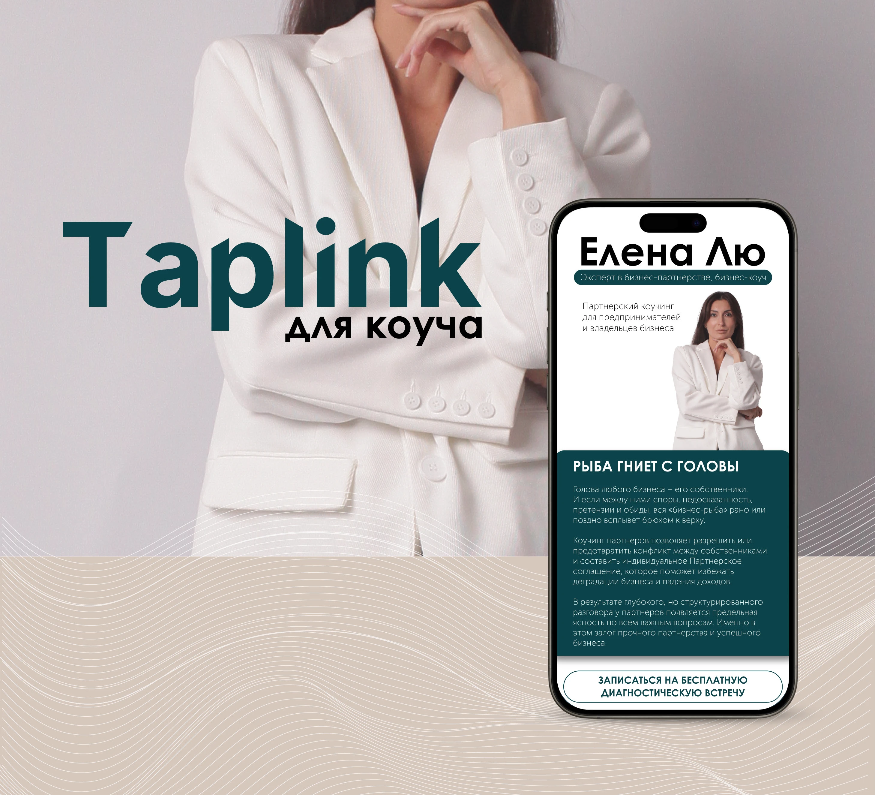
TAPLINK
Design by @julia_chugurova
О ПРОЕКТЕ | ABOUT THE PROJECT
[RU] Taplink был разработан в спокойной цветовой гамме, чтобы передать уверенность и доверие.
Основная цель — структурировать информацию о коуче и его услугах, сделать навигацию и интерфейс интуитивно понятным.
Сайт продуман так, чтобы не перегружать дизайн и создать комфортную для клиента атмосферу для знакомства с услугами специалиста.
[ENG] Taplink was designed in a calm color palette to convey confidence and trust.
The main goal is to structure information about the coach and their services, making navigation and the interface intuitive.
The website is thoughtfully crafted to avoid overwhelming design elements and to create a comfortable atmosphere for clients to get acquainted with the specialist's services.