АЙДЕНТИКА | IDENTITY
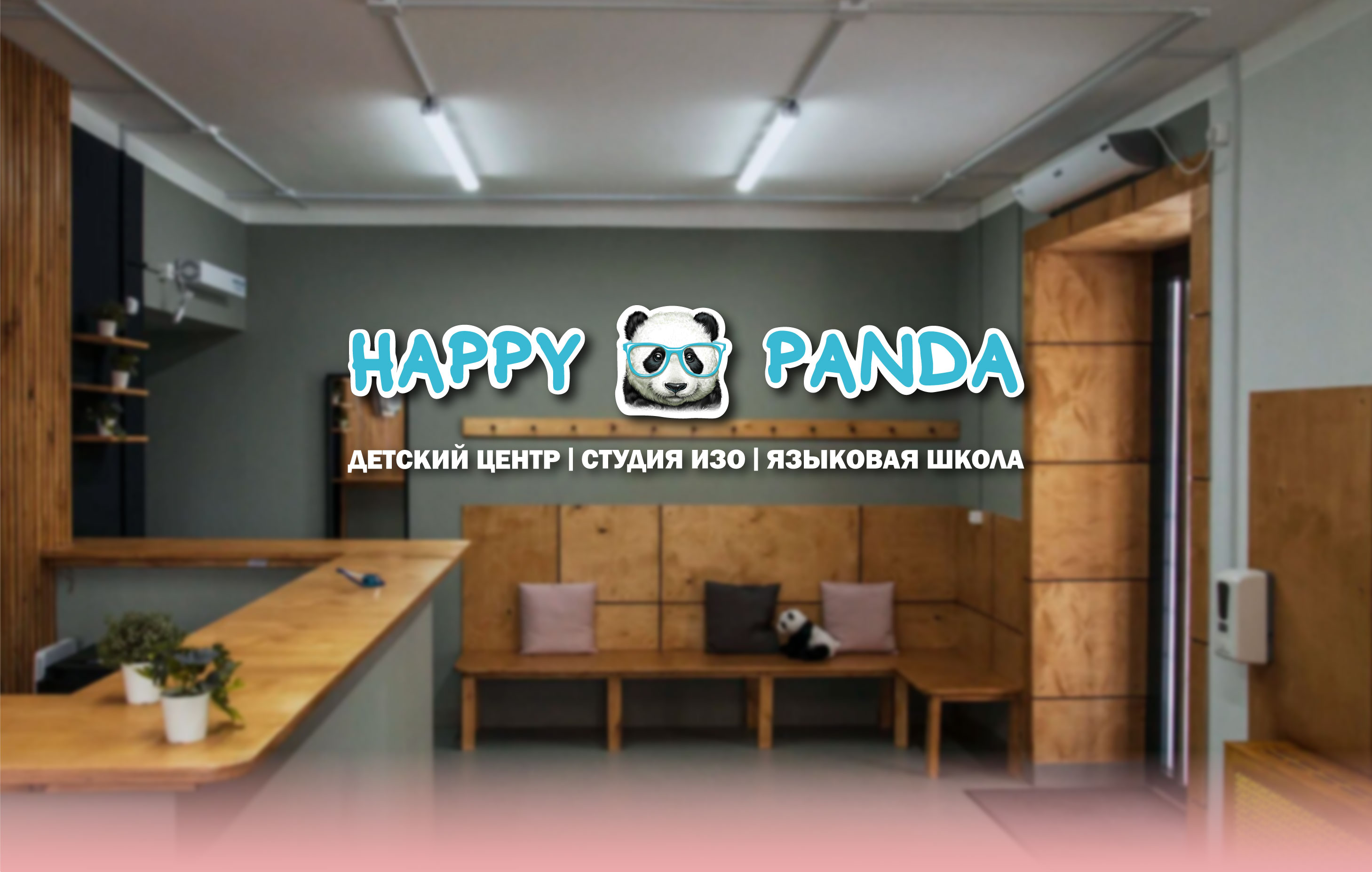
[RU] У клиента не было фирменного стиля, поэтому задача состояла в том, чтобы найти и воссоздать его заново. Единственным условием был бирюзовый цвет и сохранение логотипа.
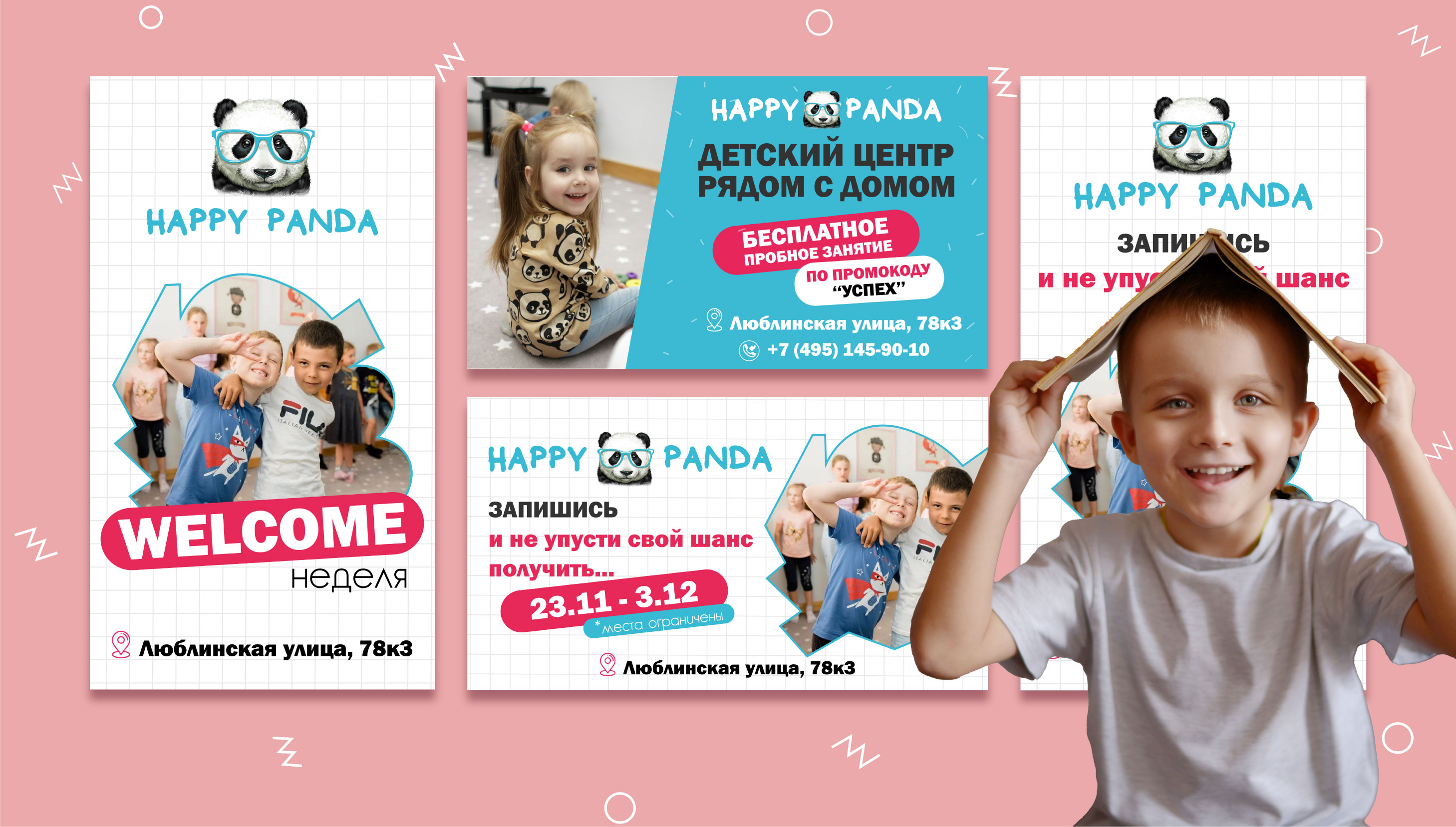
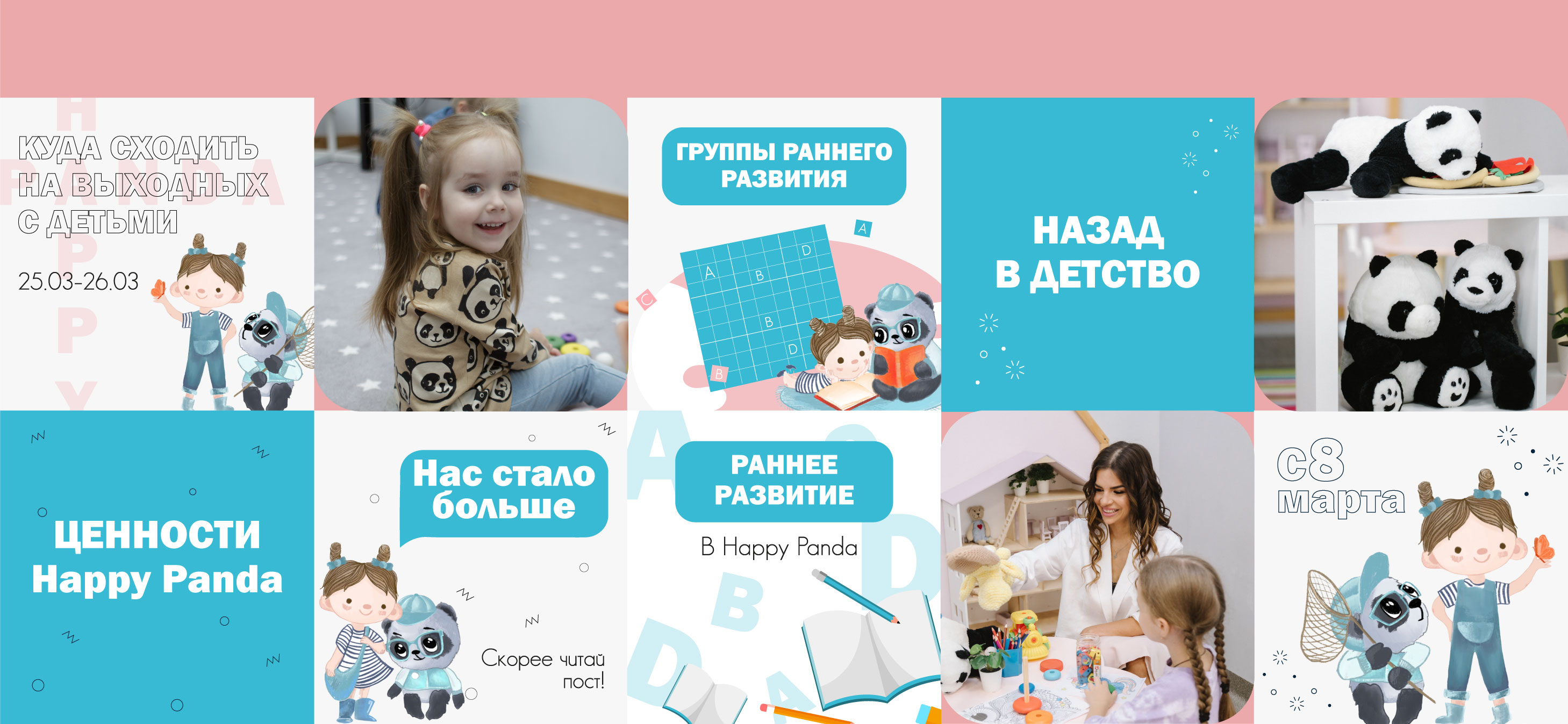
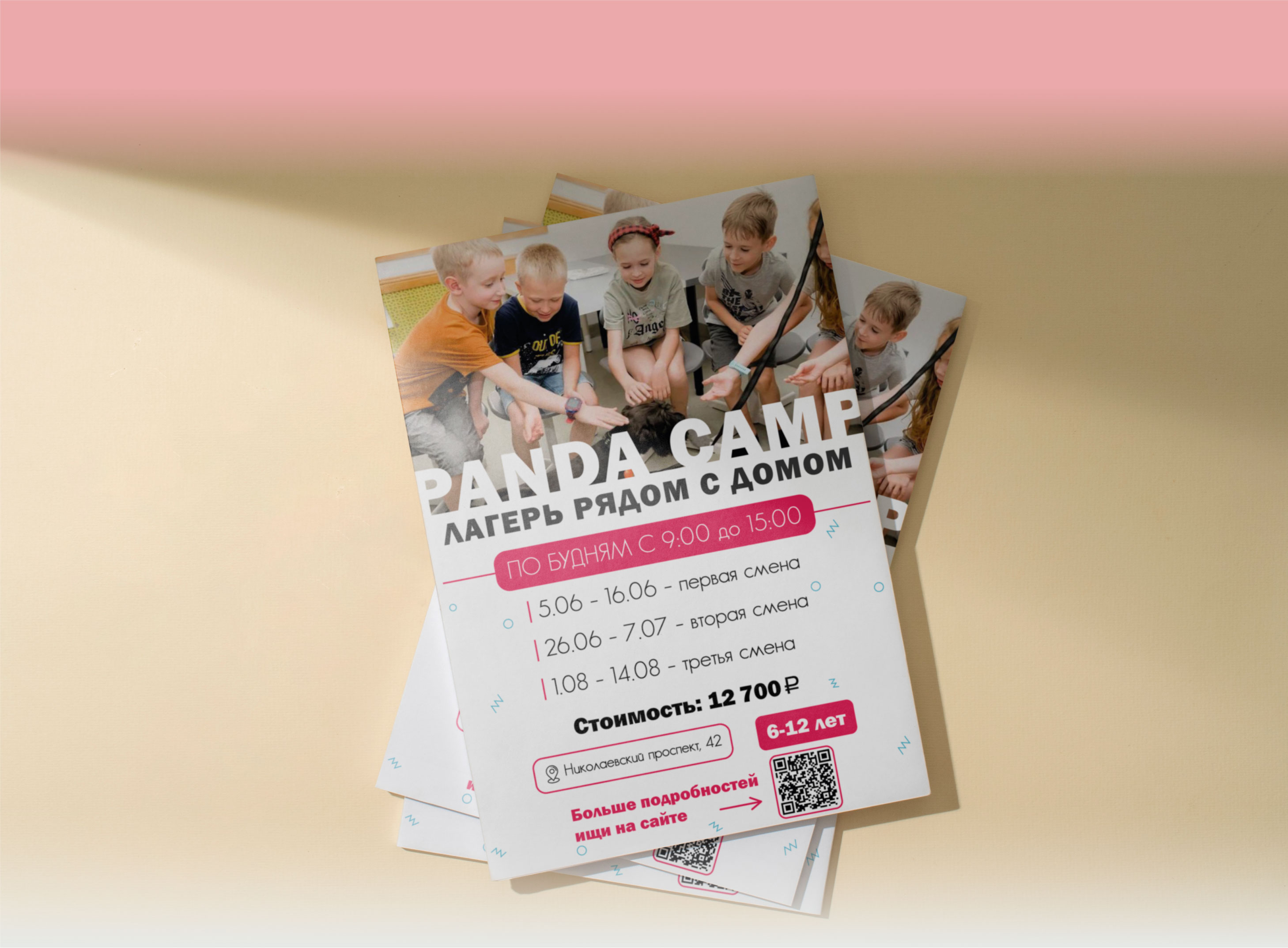
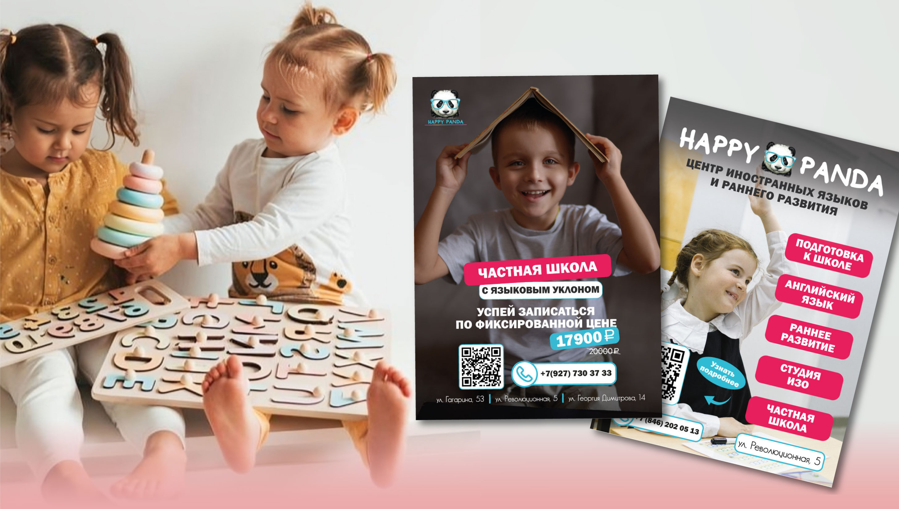
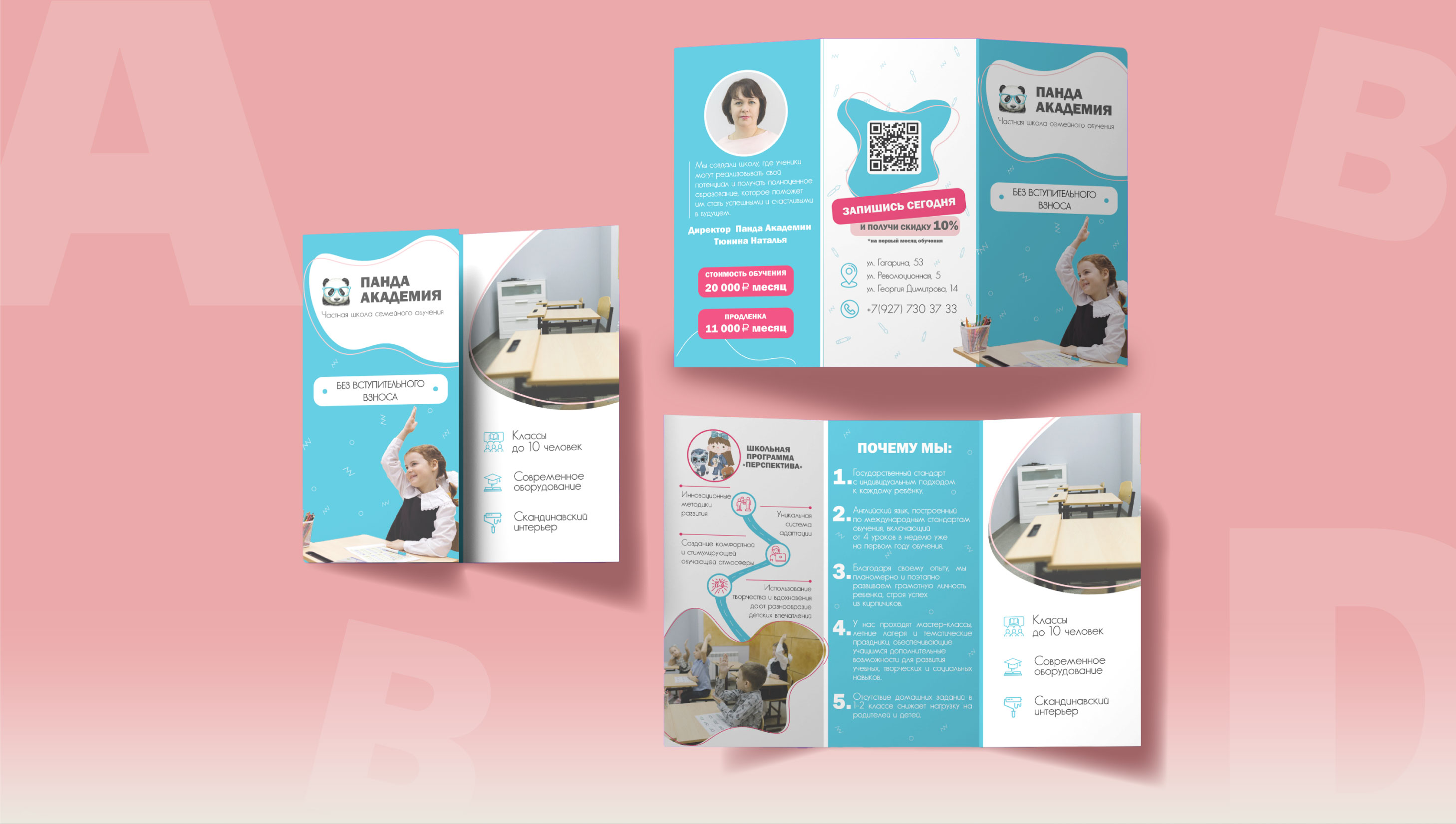
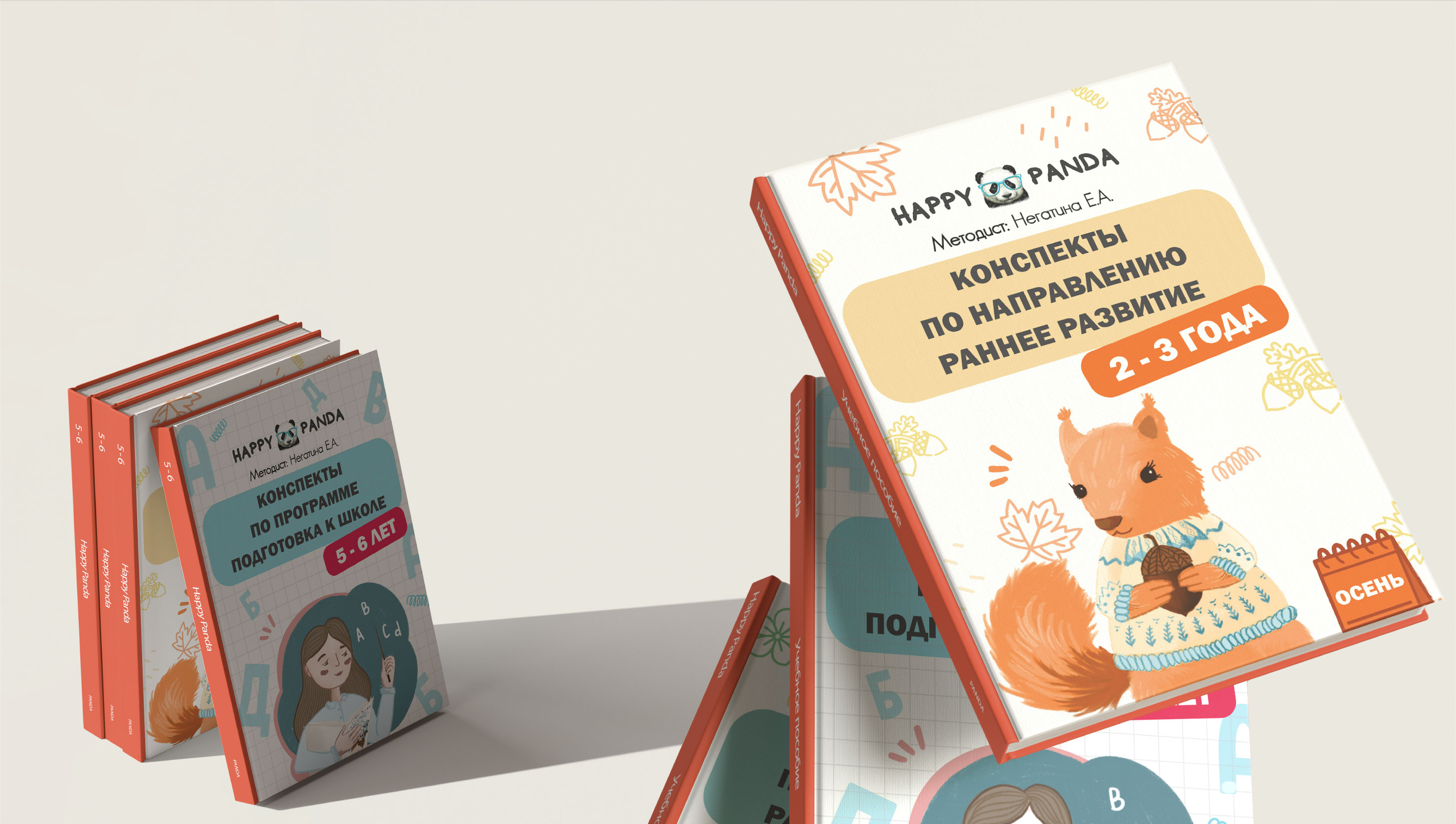
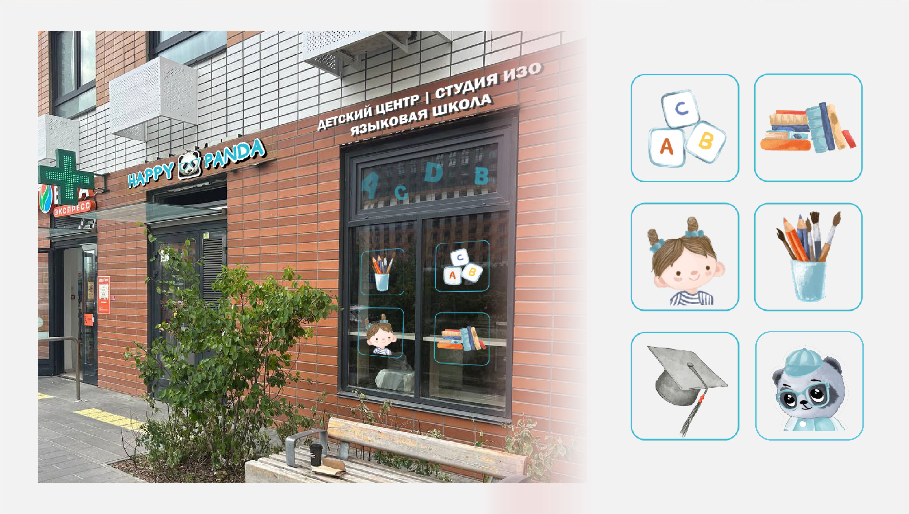
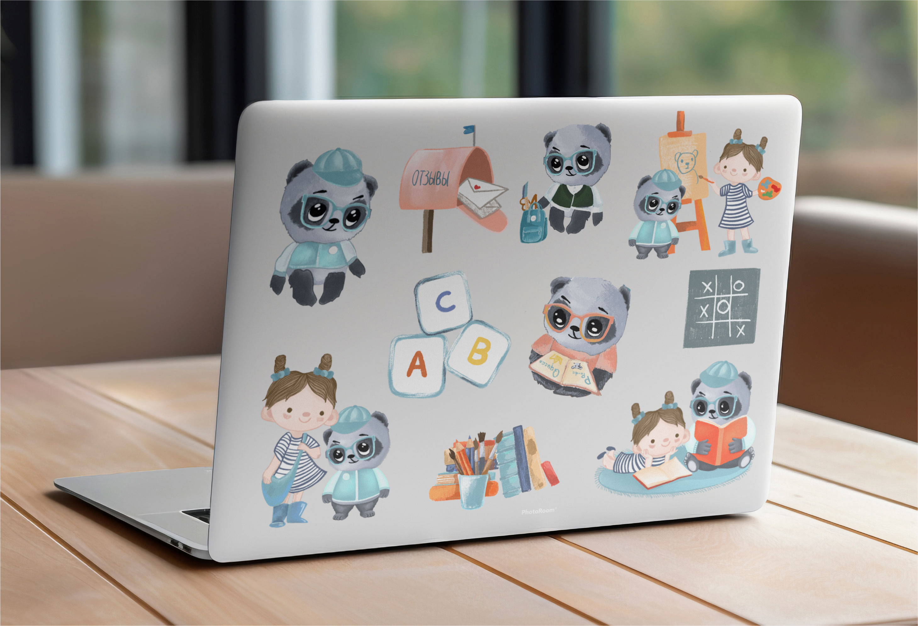
Разработаны фирменные цвета (добавили к бирюзовому пастельных цветов и яркий розовый для акцентов), чтобы клиенты сразу чувствовали, у центра есть общий концепт. Дизайн эстетически приятный, но не очень простой, со вкусом и стилем.
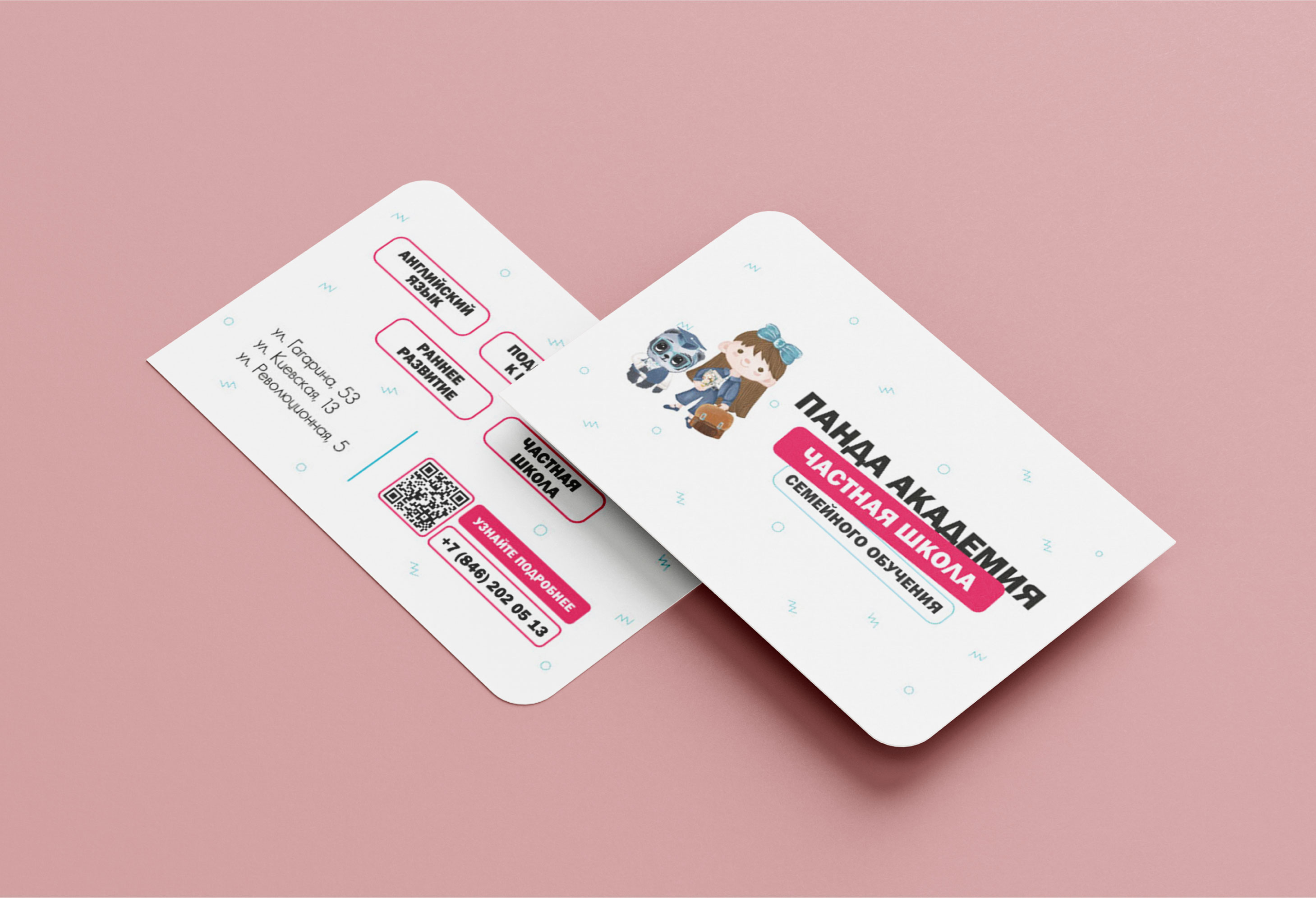
Подобраны шрифты, основной для заголовков и выделения информации, дополнительный для вспомогательного текста.
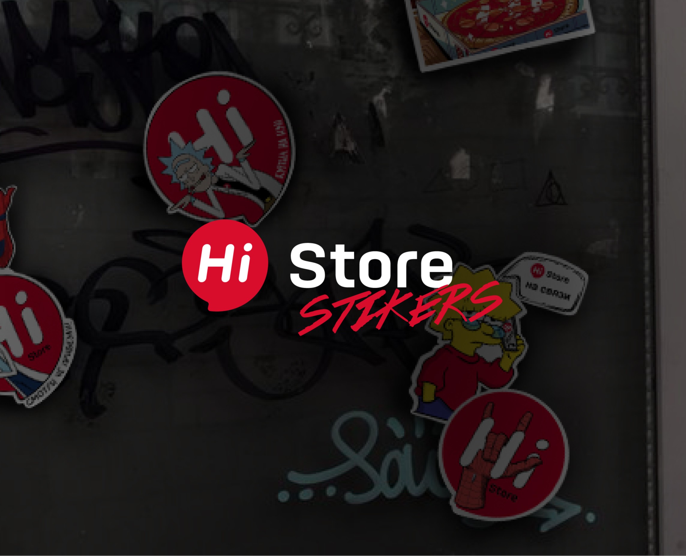
Поработали над вариациями размещения логотипа, придумали дополнительные элементы графики которую в последствии использовали на дизайнах рекламной продукции (листовки, визитки, баннеры, обложки).
[ENG] The client did not have a corporate identity, so the task was to find and recreate it again. The only condition was the turquoise color and the preservation of the logo.
DECISION
Corporate colors have been developed (pastel colors have been added to turquoise and bright pink for accents) so that customers immediately feel that the center has a common concept. The design is aesthetically pleasing, but not very simple, with taste and style.
Fonts have been selected, the main one for headings and highlighting information, and the additional one for auxiliary text.
We worked on variations of the logo placement, came up with additional graphic elements that were later used on the designs of advertising products (flyers, business cards, banners, covers).