
About the Project
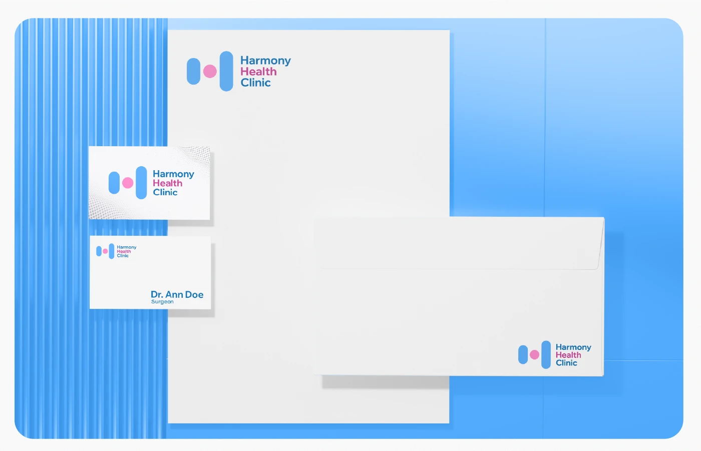
Harmony Health Clinic is a private medical clinic that needed a modern, friendly, and easily recognizable logo.
Task
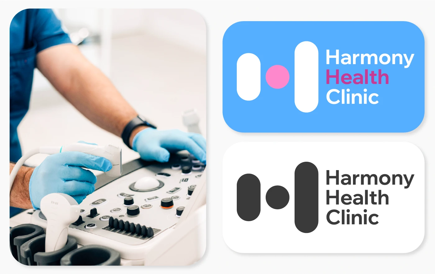
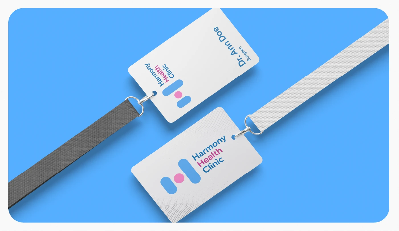
To create a logo that reflects the clinic’s core values: harmony, patient care, and a professional approach. It was important to design a symbol that works well across digital platforms, documentation, signage, and promotional materials.
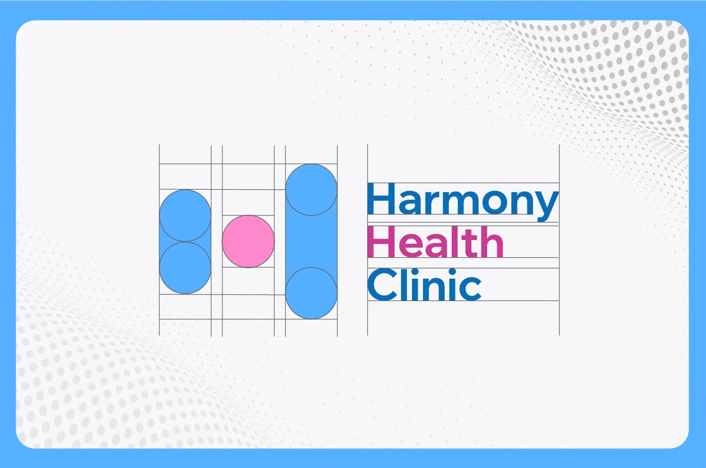
Idea
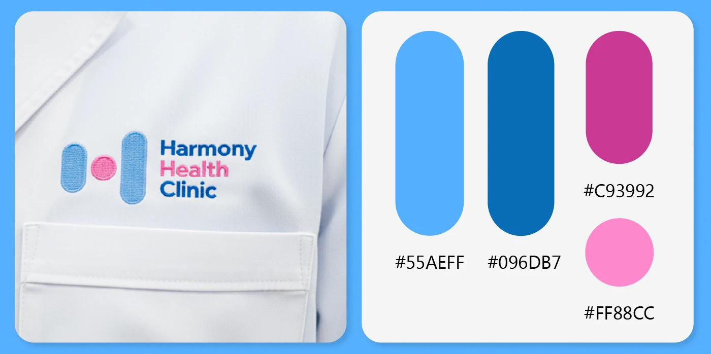
The concept is built on soft, rounded shapes that convey calmness and safety. Two elongated forms and a central circle create an abstract letter H, symbolizing the clinic’s name and the balance between patient and specialist. The combination of blue and pink highlights medical cleanliness and human warmth. The final logo is minimalist, clean, and easily scalable across all formats.