
Task
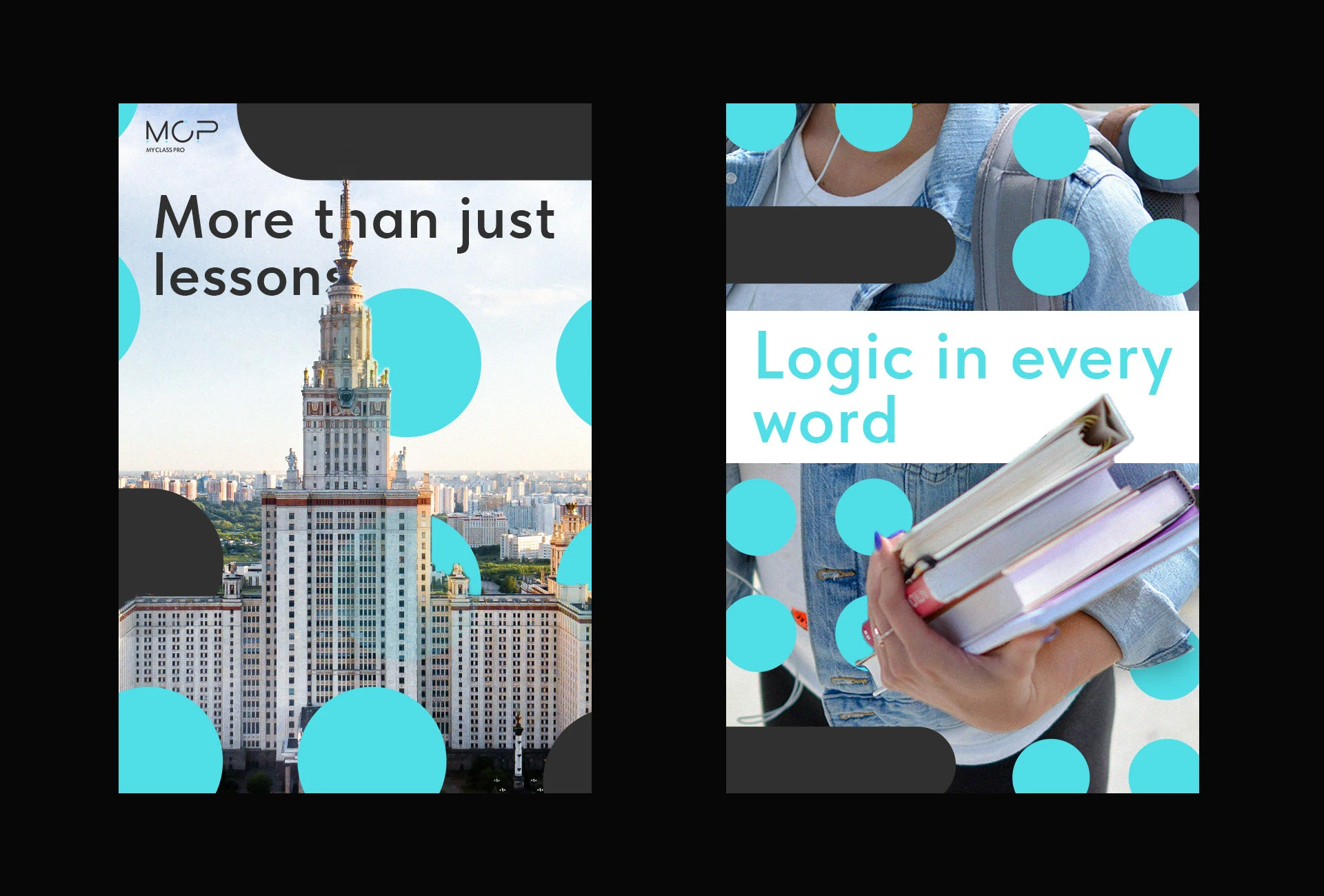
The project involved creating a comprehensive visual identity for "My Class Pro," an educational center specializing in Russian as a Second Language (RSL). The target audience is diverse, including both international business professionals and children. The primary challenge was to find a "middle ground" in the design: it had to be strictly minimalist and professional to command respect from adults, yet modern and dynamic enough to stay engaging. The identity needed to clearly communicate its status as a high-end educational institution without falling into the clichés of traditional language schools
Solution
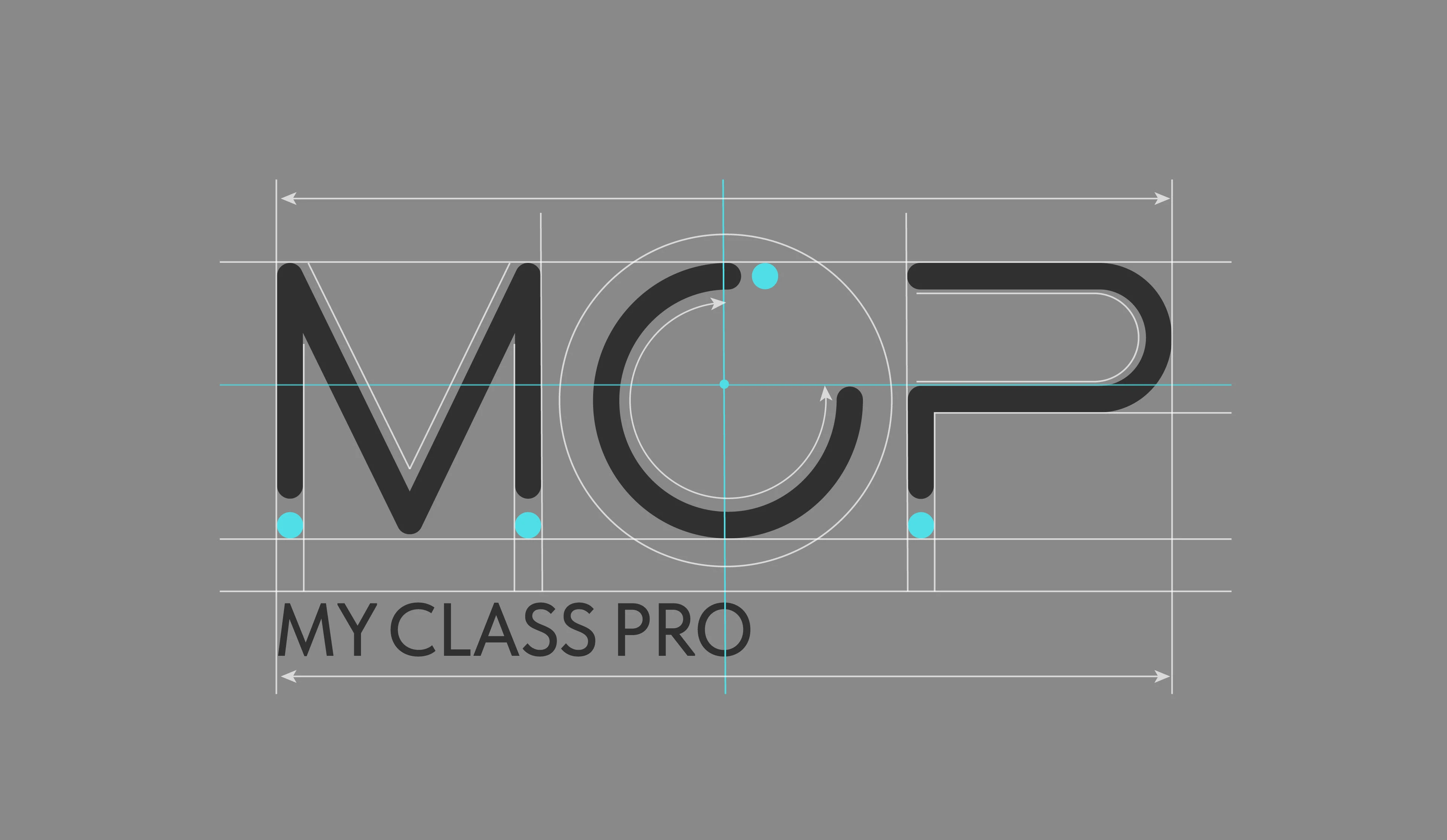
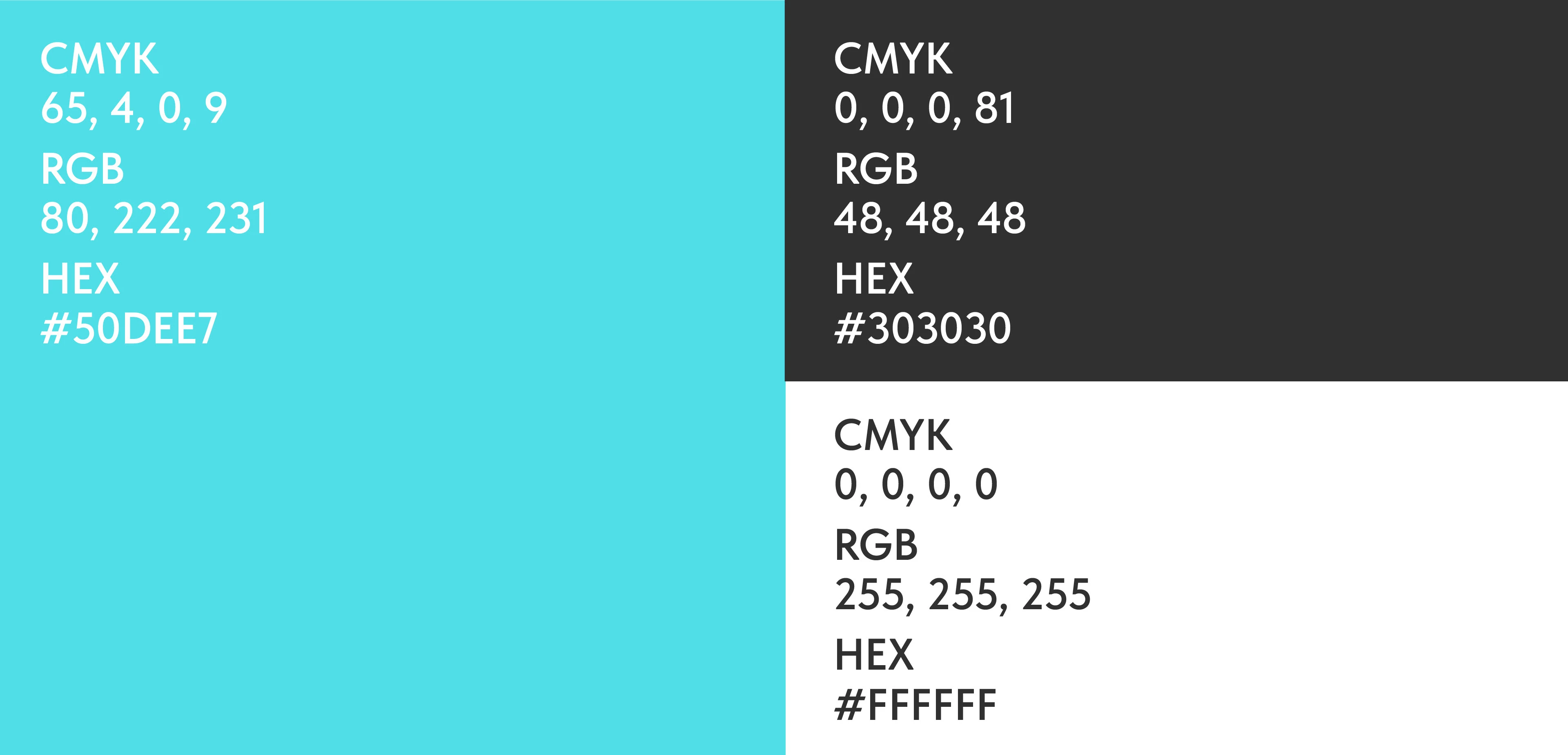
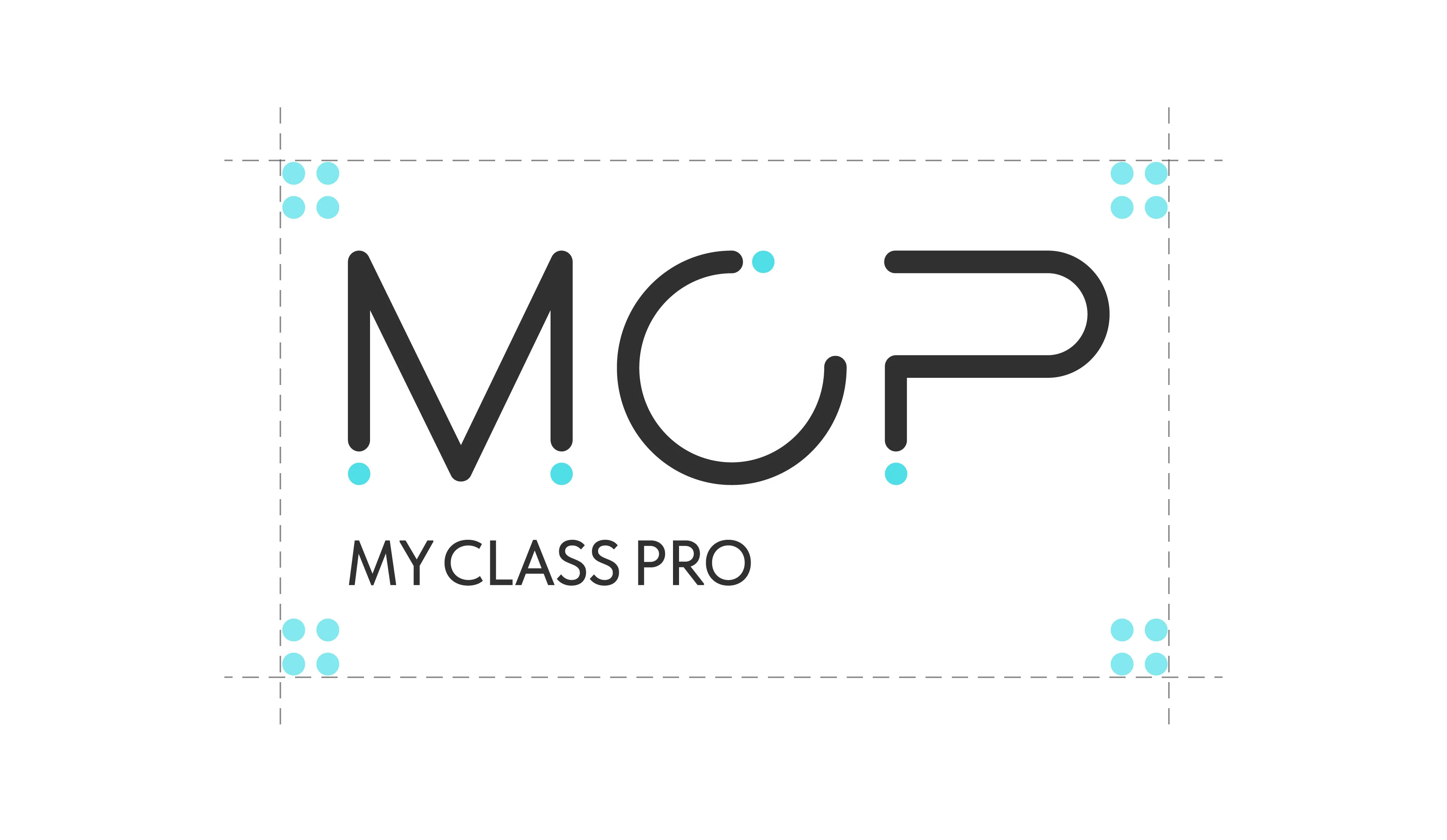
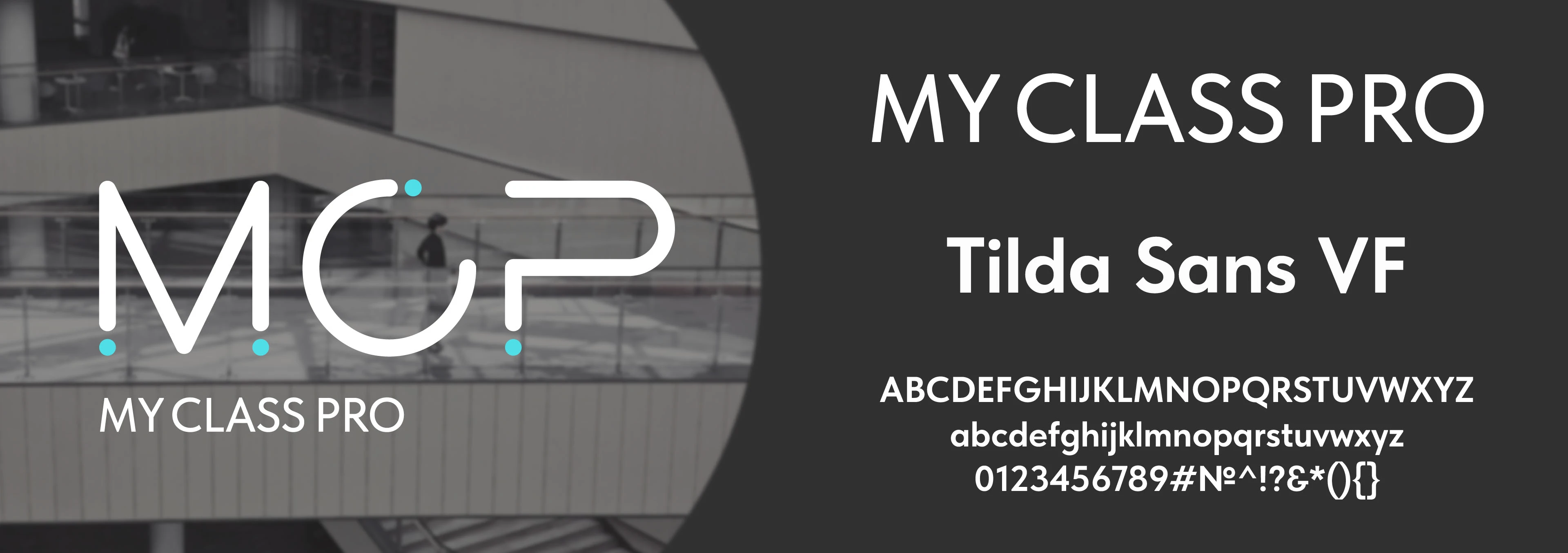
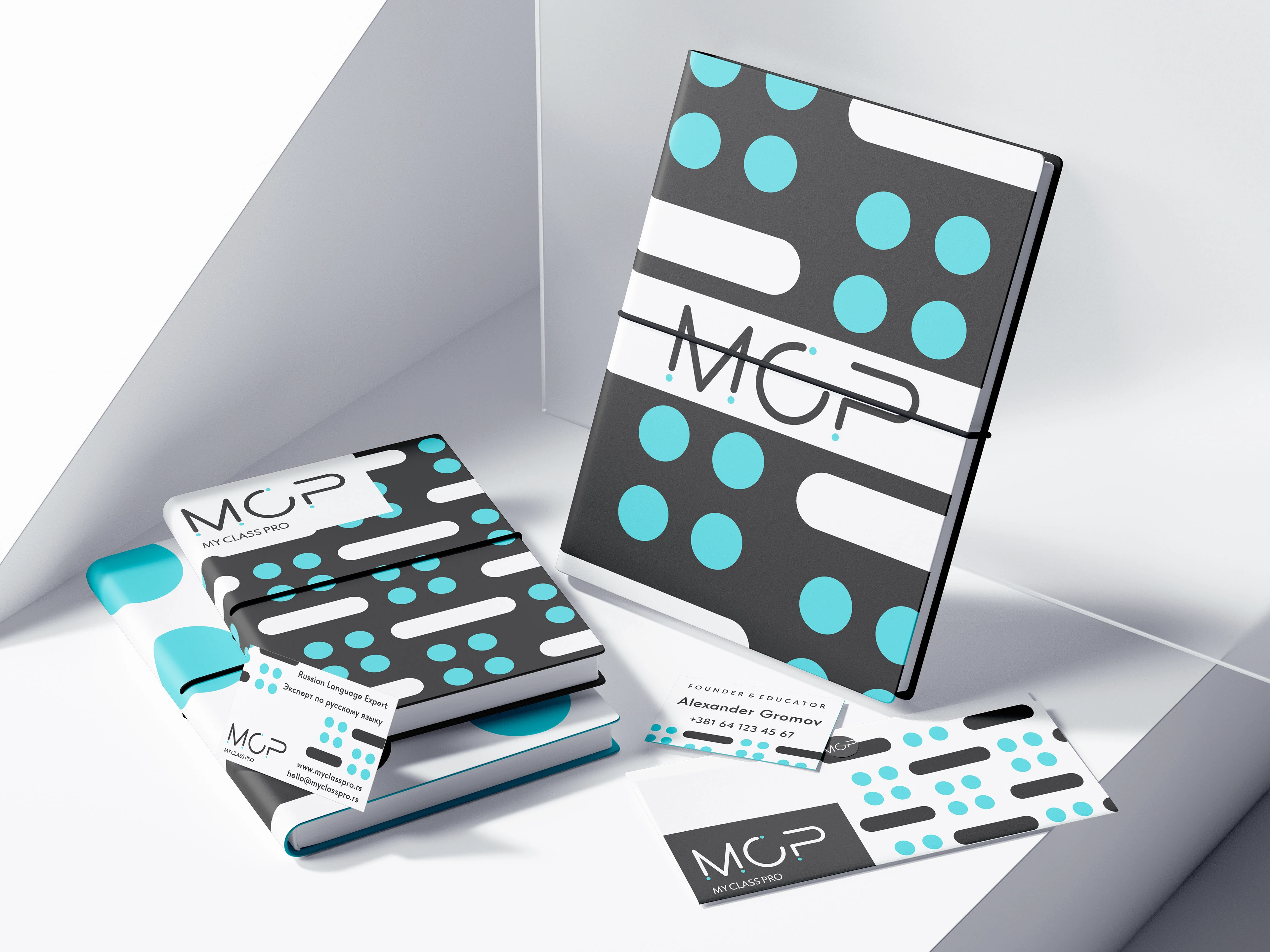
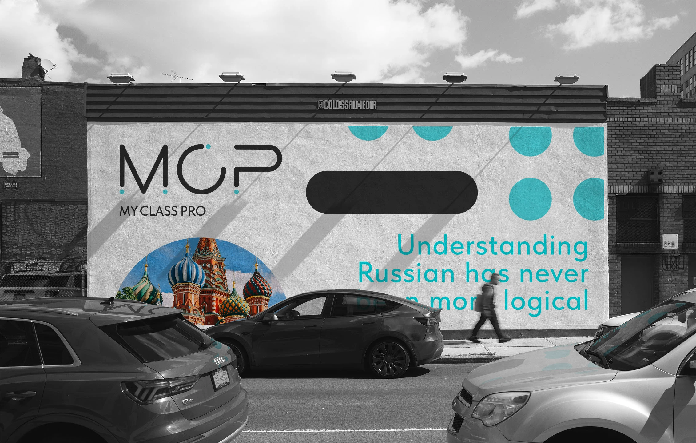
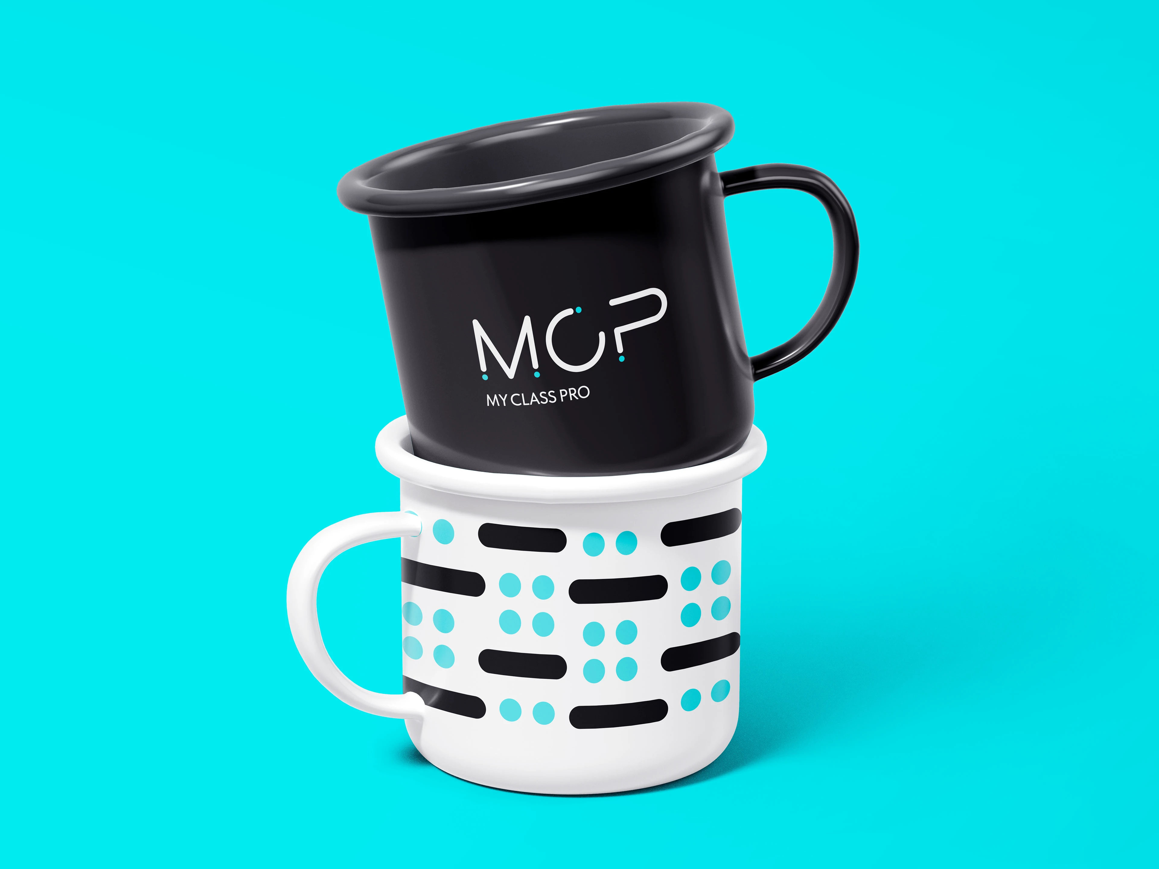
The visual solution is centered around a custom-crafted monogram "MCP". I chose to manually draw each character to ensure a unique geometric balance that couldn't be achieved with a standard font. The conceptual heart of the logo is the punctuation dot. In linguistics, a dot signifies the completion of a thought and the clarity of a message — reflecting the school's mission to help students master complex Russian grammar. To complement the handcrafted monogram, I selected a clean, geometric typeface for the descriptor. This creates a perfect balance between a unique artistic symbol and a clear, readable digital aesthetic, typical for "Pro" level modern platforms