ABOUT BRAND | О БРЕНДЕ
RUS
MESTO - мастерская мебели, в которой разрабатывается и изготавливается нестандартная мебель. Отличительной чертой компании является способность превращать даже самые сложные идеи клиентов в функциональную, качественную, и эстетичную мебель. Благодаря своему опыту и таланту, команда профессионалов стремится не только удовлетворить все потребности заказчика, но и превзойти его ожидания, создавая неповторимую мебель.
ENG
MESTO is a furniture workshop that designs and manufactures custom furniture. A distinctive feature of the company is the ability to transform even the most complex ideas of clients into functional, high-quality, and aesthetic furniture. Thanks to their experience and talent, the professional team strives not only to meet all the needs of the customer, but also to exceed his expectations by creating unique furniture.
TASK | ЗАДАЧА
RUS
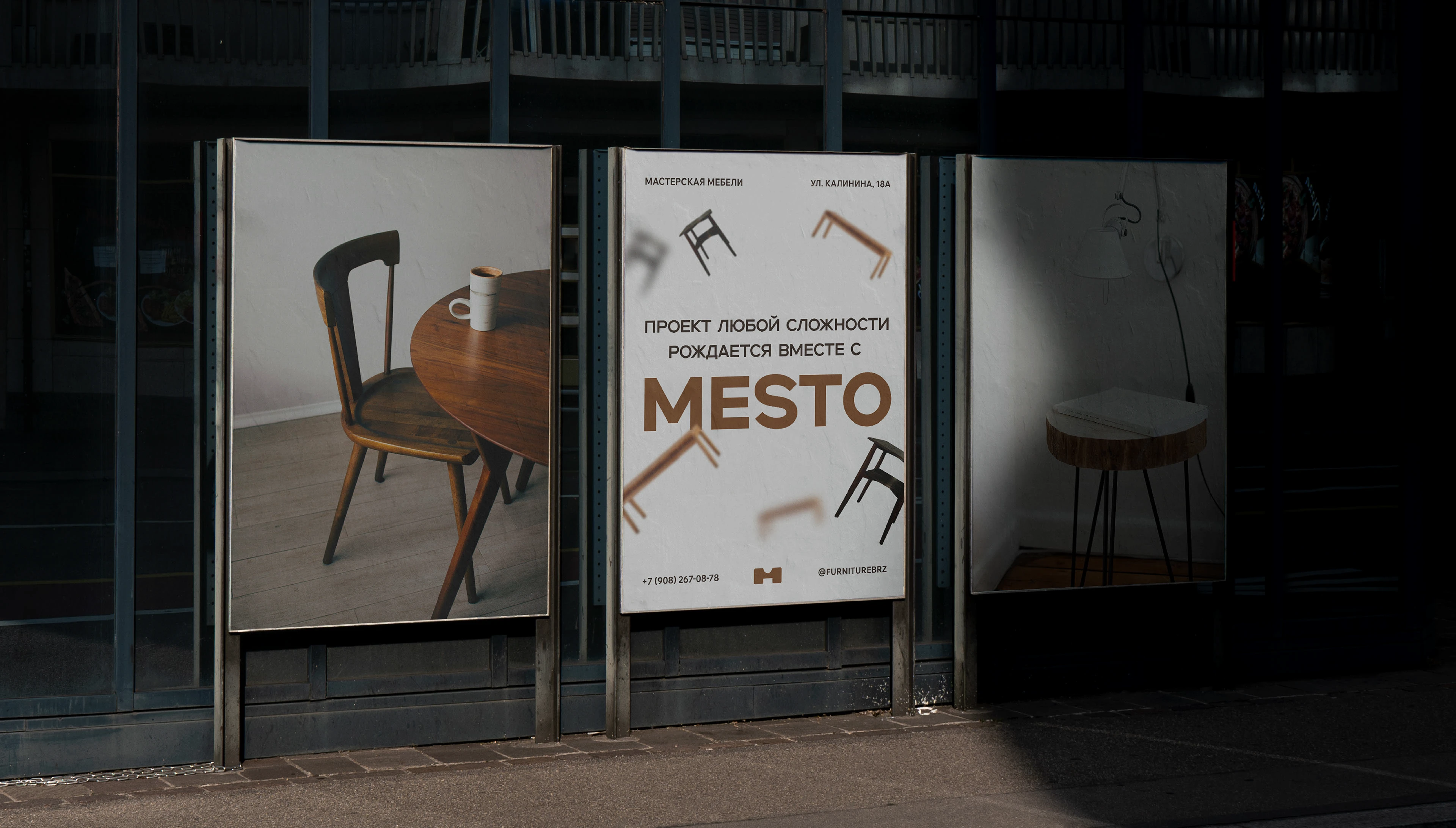
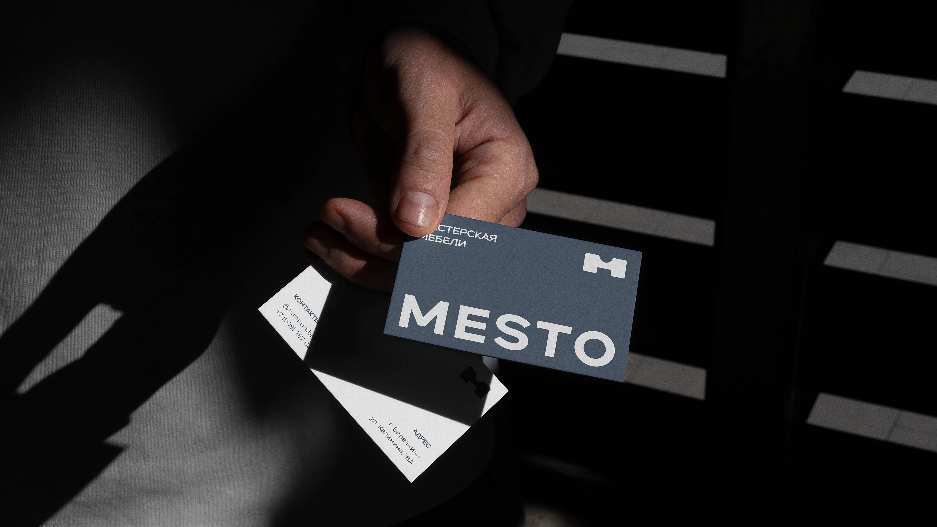
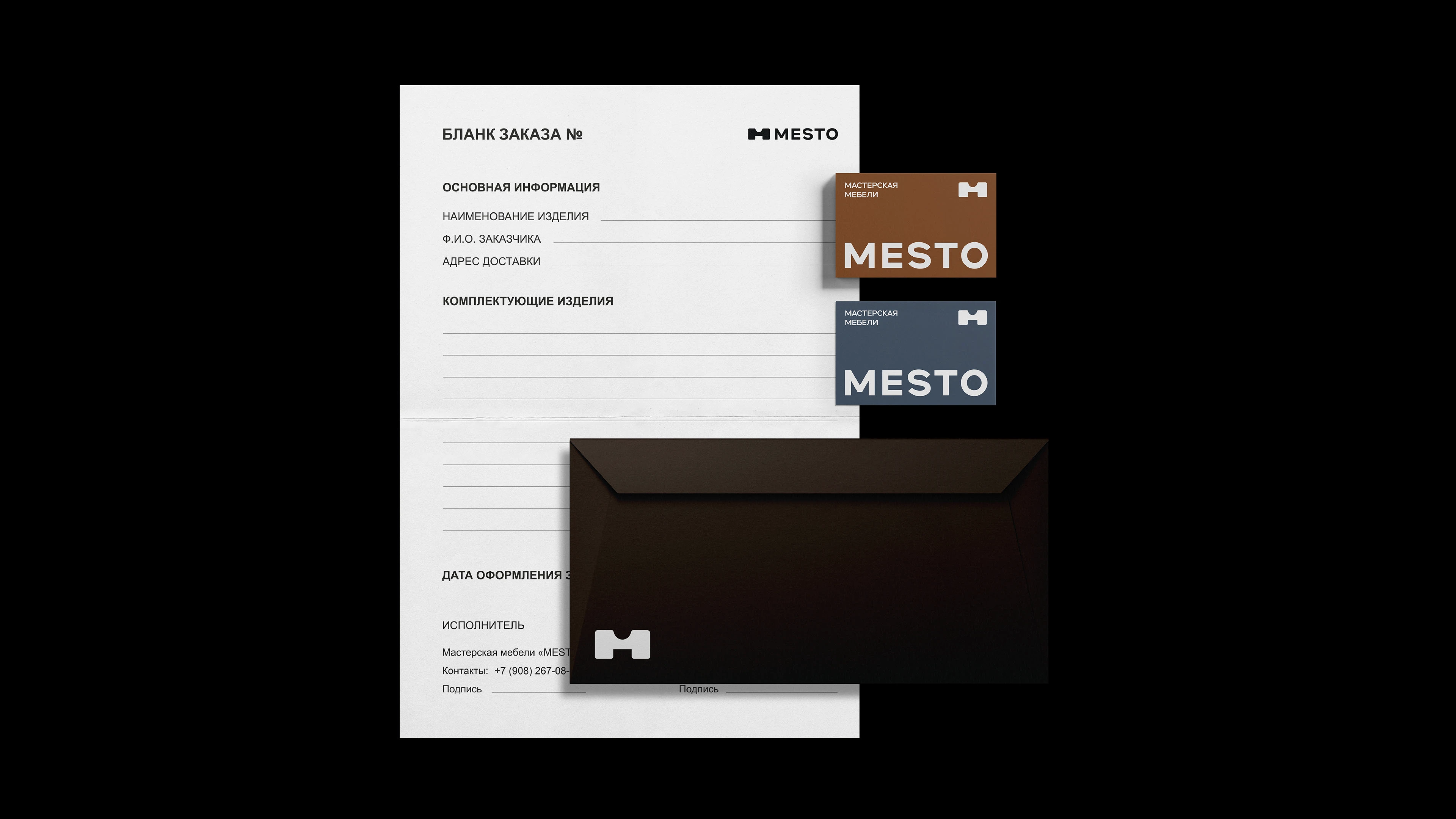
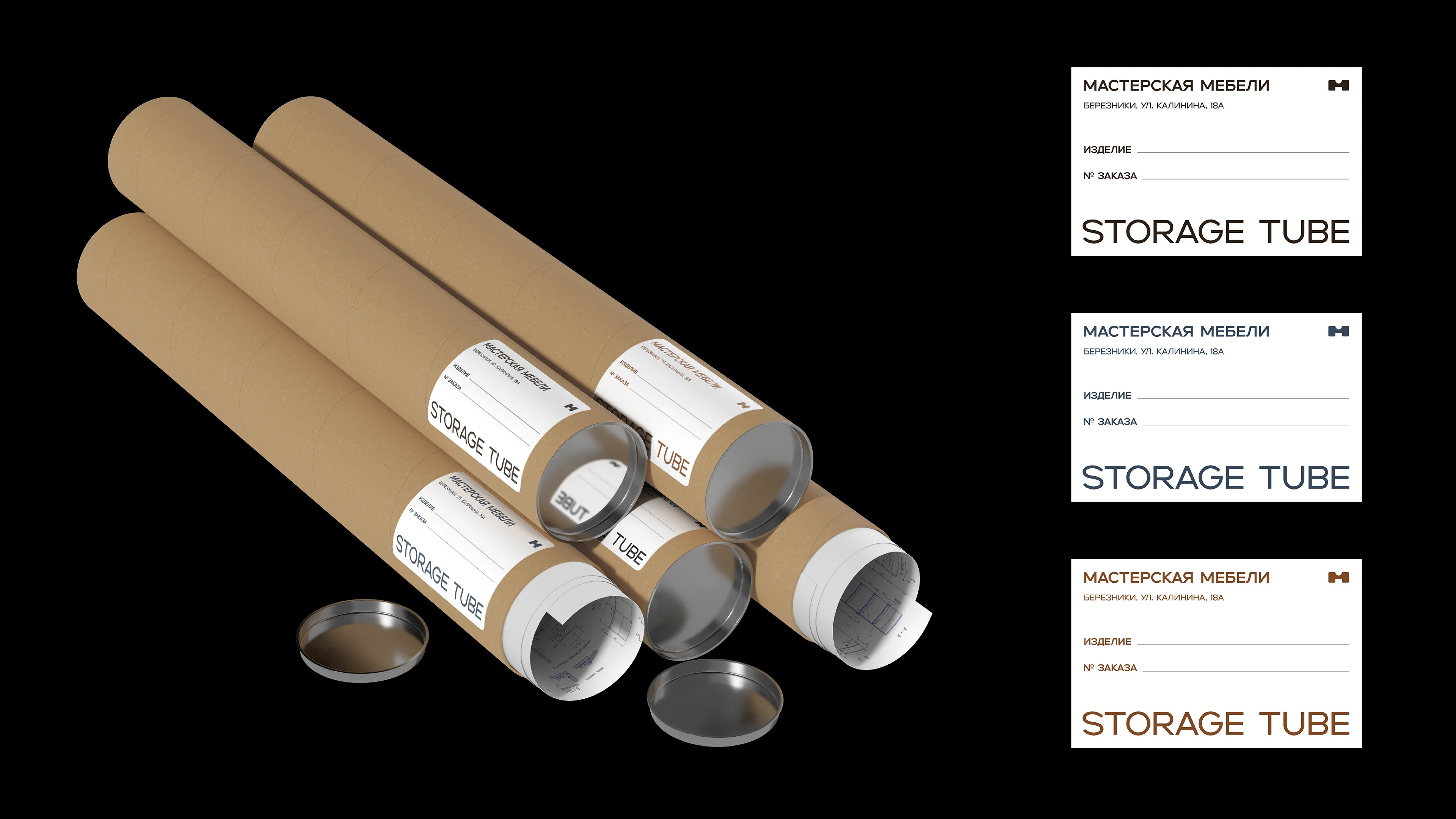
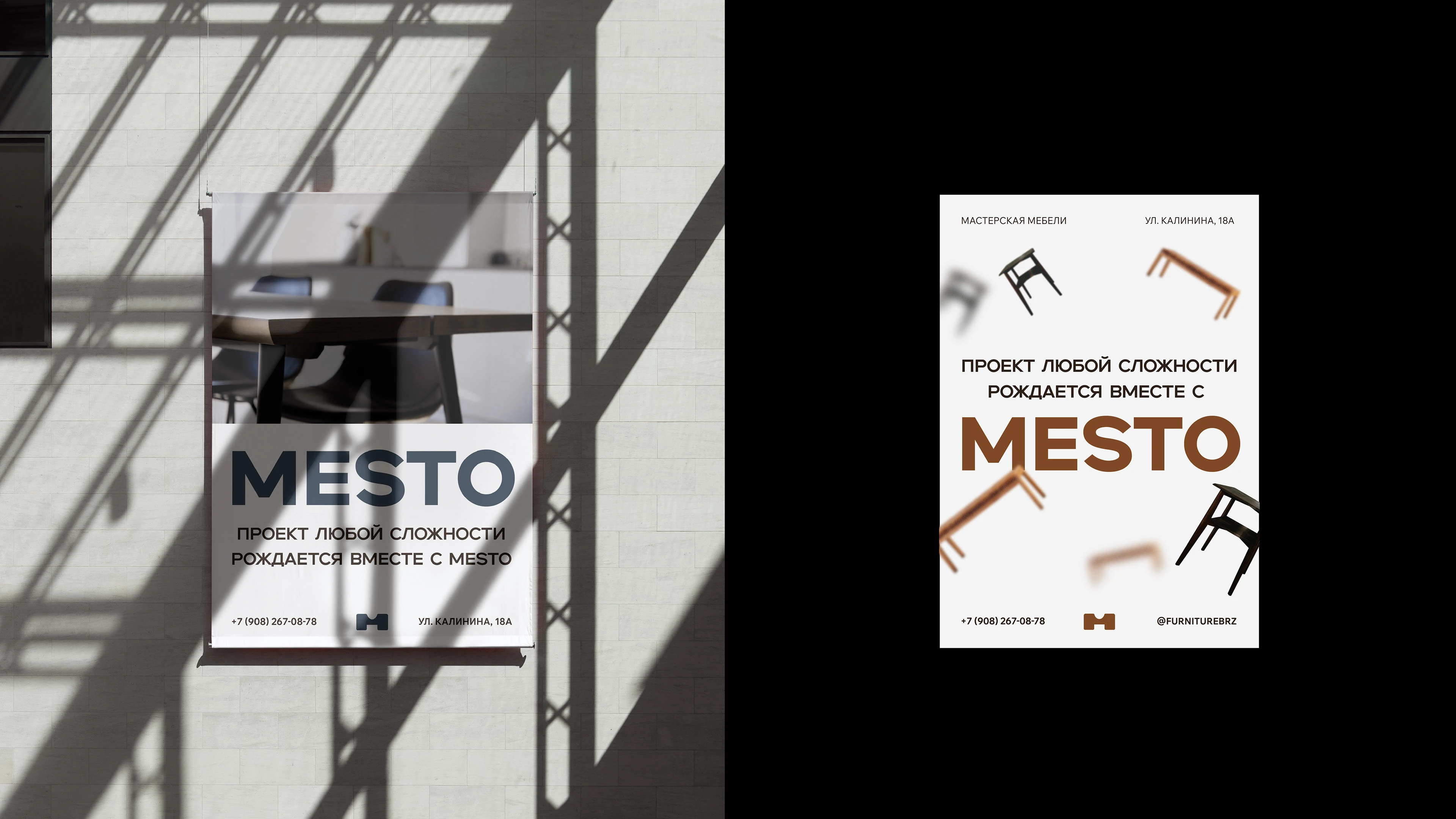
Задачами работы являлись разработка логотипа и фирменного стиля, который должен отражать ключевые особенности бренда, вследствие чего выделять его среди конкурентов. В соответствии с разработанной айдентикой создать носители фирменного стиля, которые наиболее часто используются в сфере изготовления мебели.
ENG
The objectives of the work were to develop a logo and corporate identity that should reflect the key features of the brand, thereby distinguishing it from competitors. In accordance with the developed identity, create corporate identity media, which are most often used in the field of furniture manufacturing.

ABOUT CONCEPT | О КОНЦЕПЦИИ
RUS
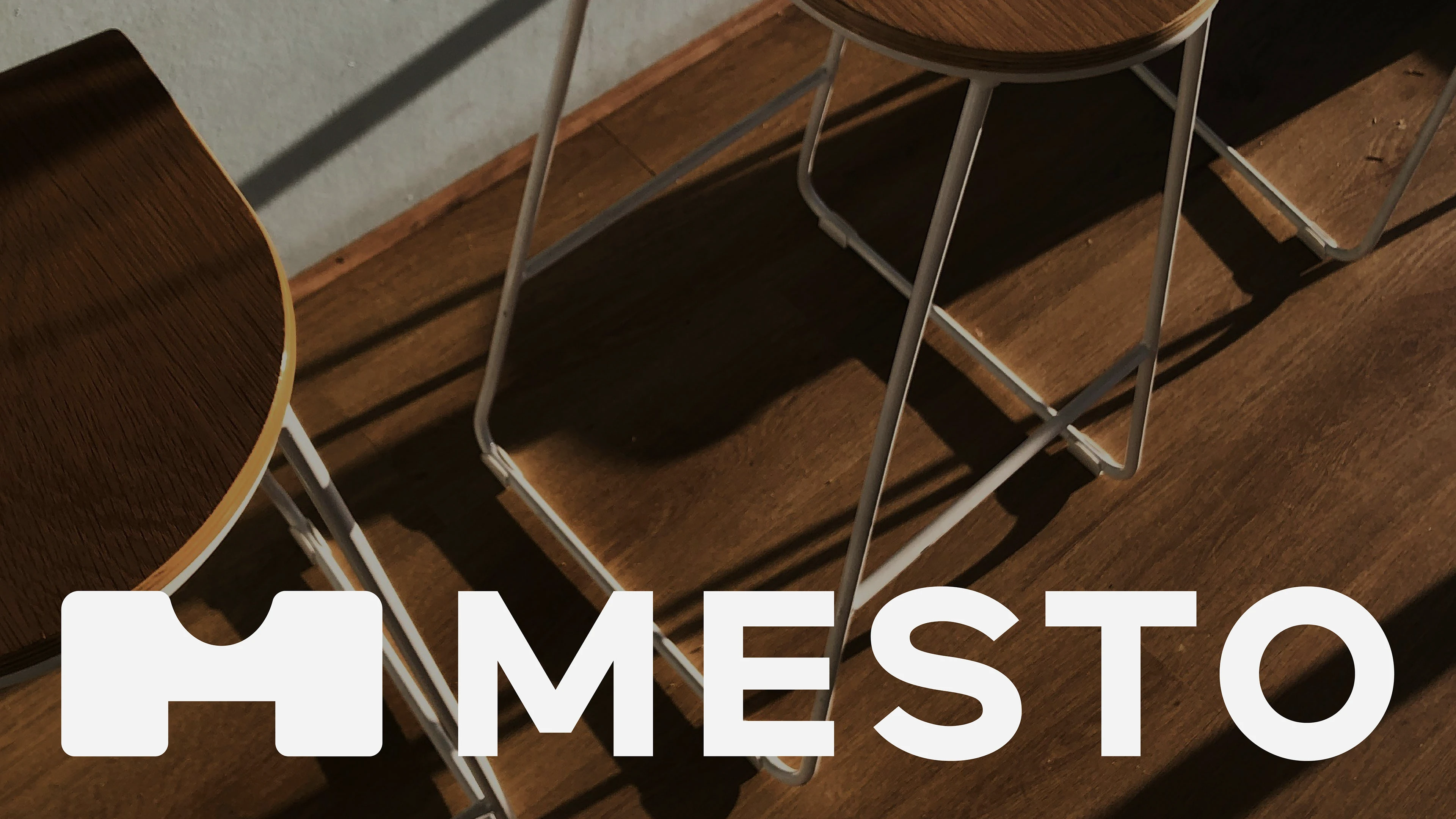
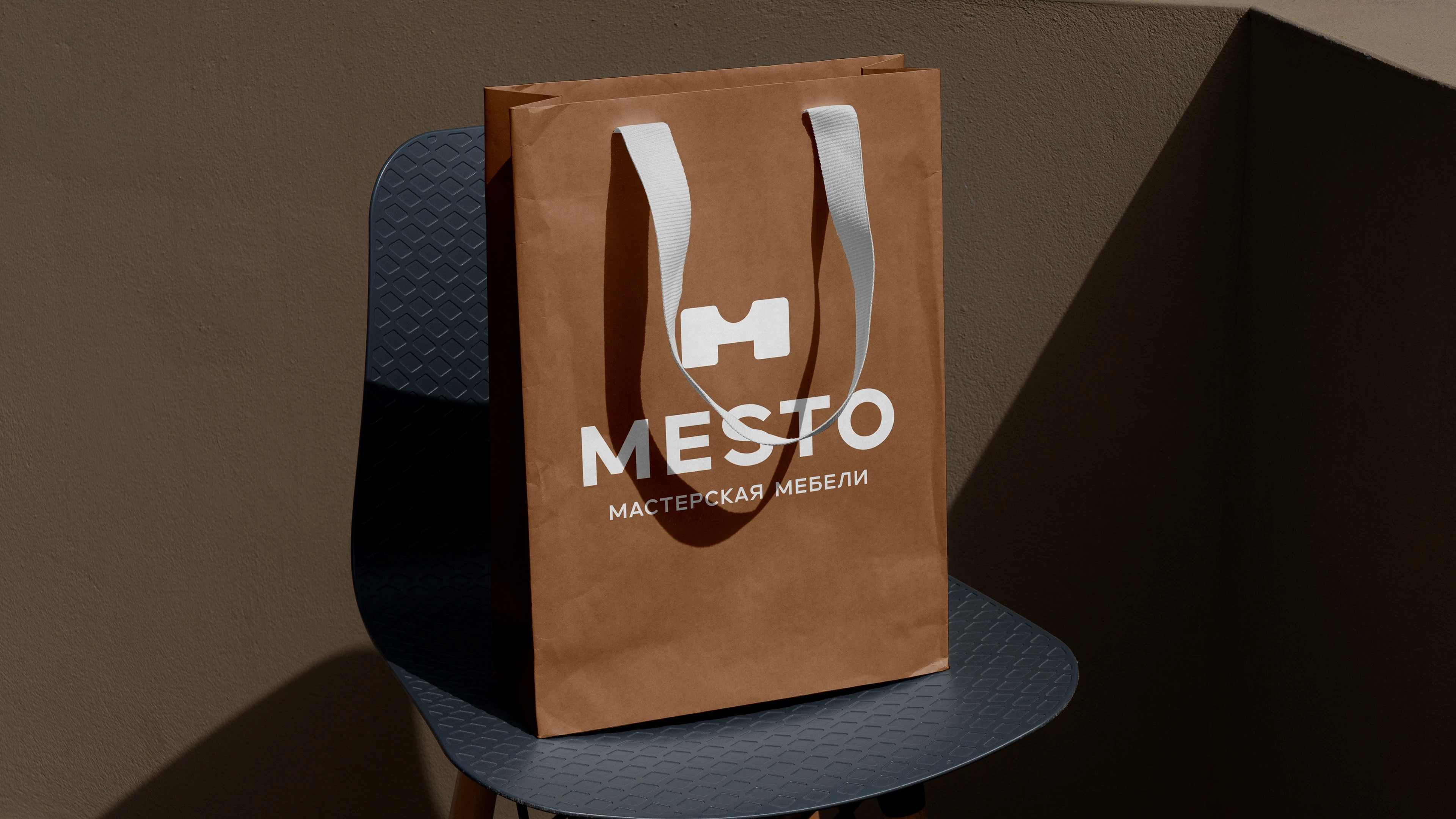
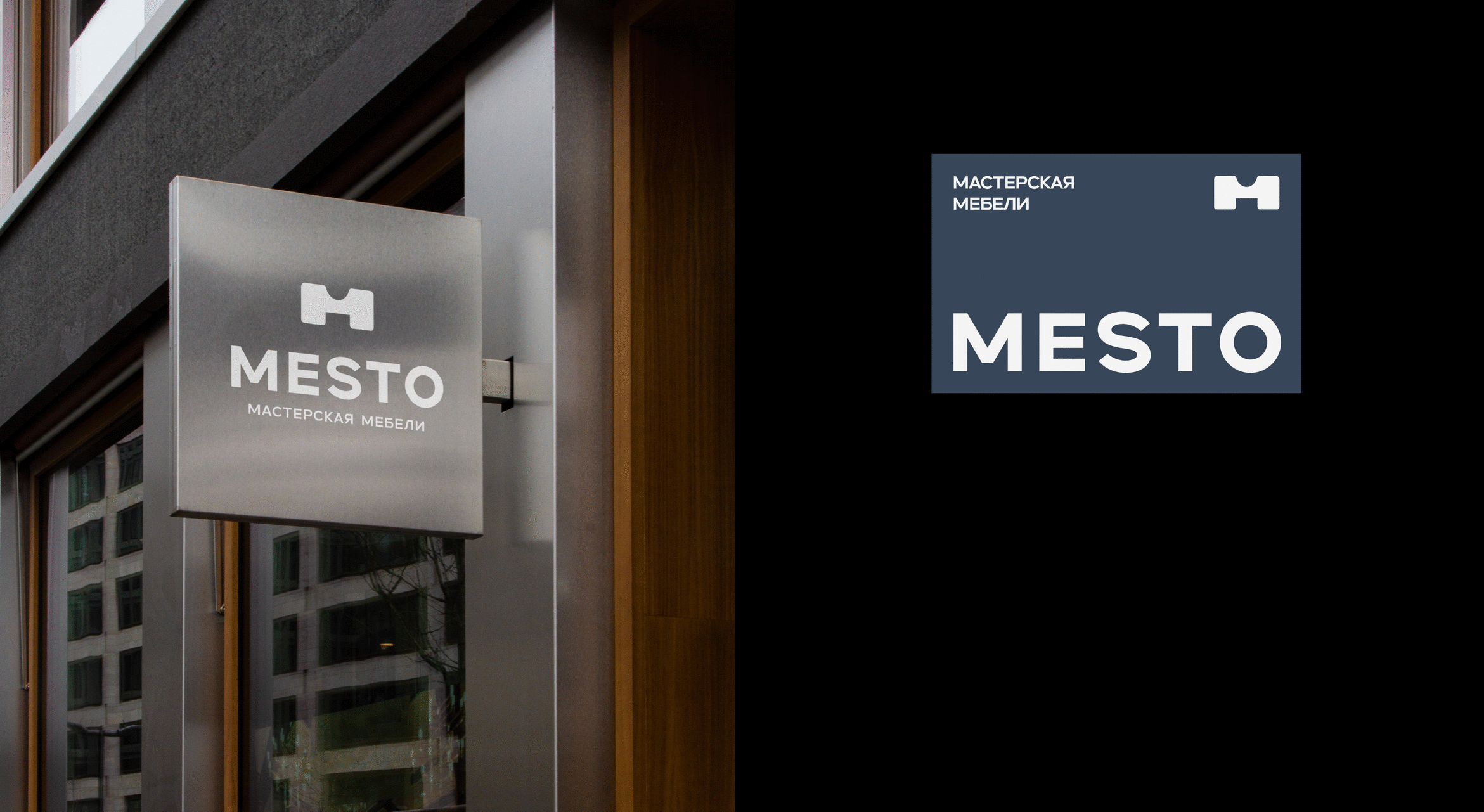
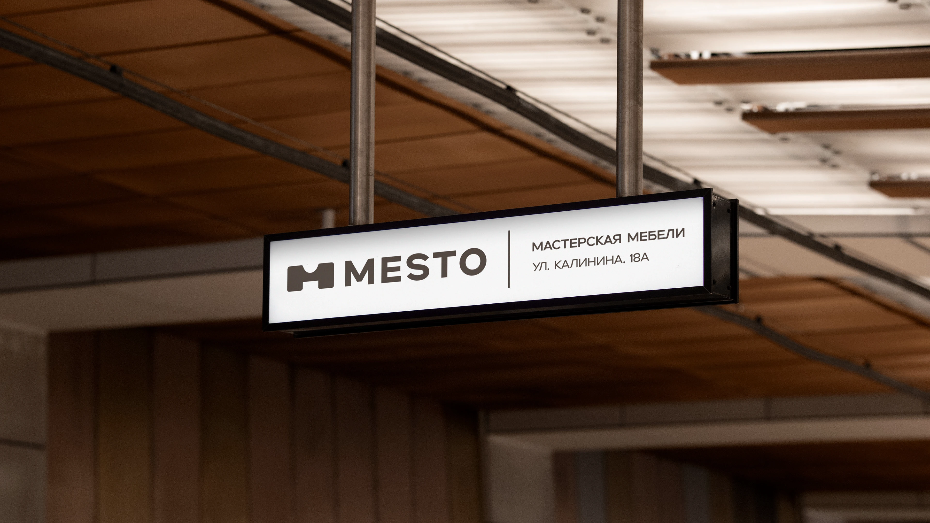
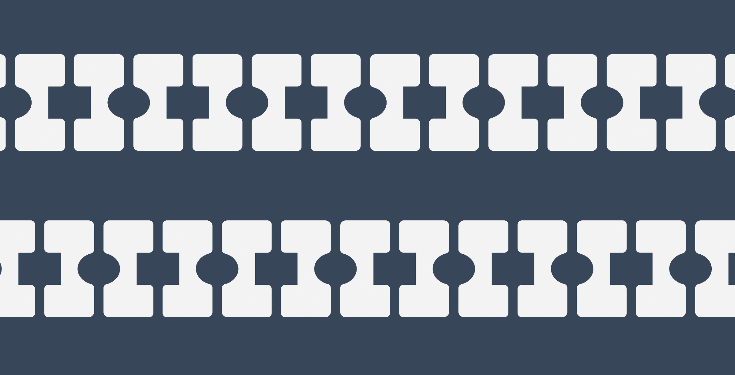
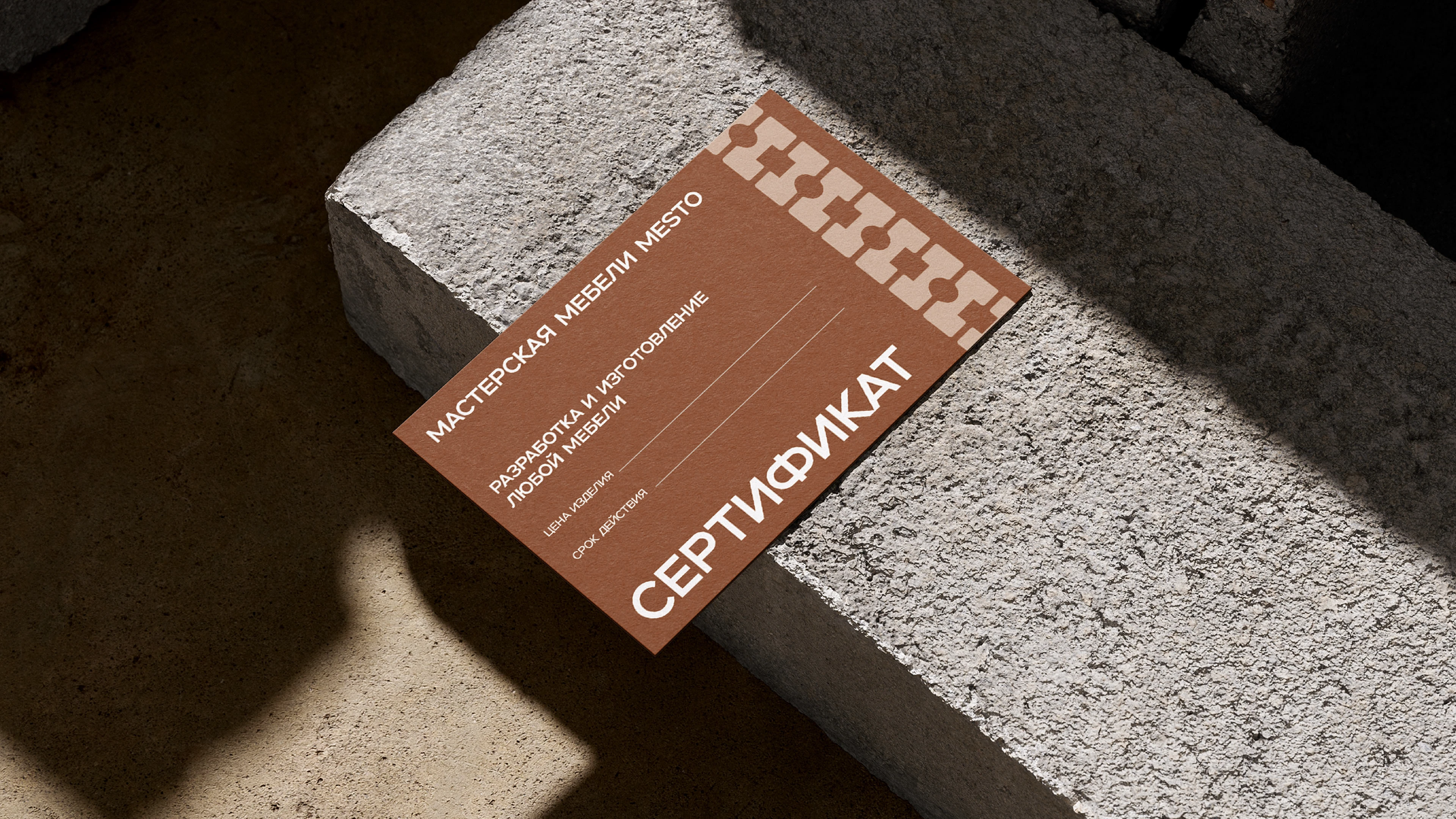
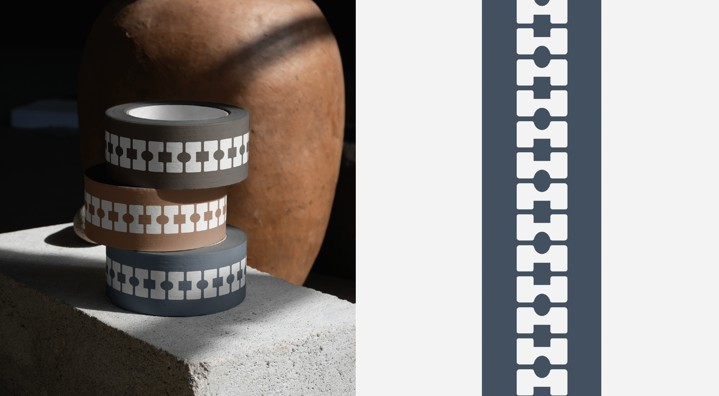
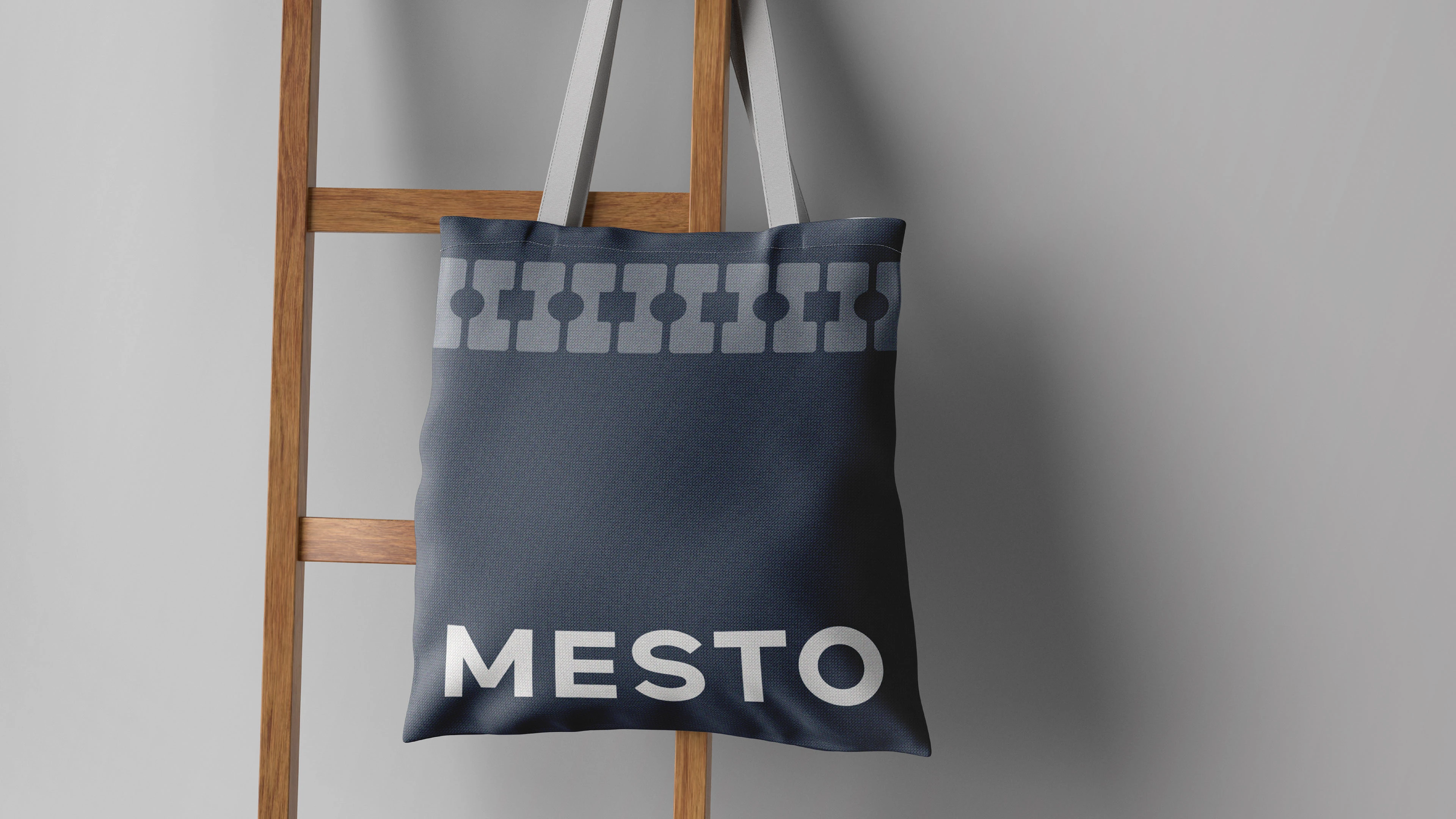
Основная версия логотипа сочетает в себе графический знак, шрифтовую часть, и дескриптор. У логотипа есть дополнительные версии: горизонтальная, эмблема и шрифтовая часть. Графический знак разработан на основе буквы "М", первой буквы в названии бренда, а также сочетает в себе силуэт мебельного изделия. Форма знака имеет вытянутую форму, разработанную по чётким, идеально ровным пропорциям, что отражает строгость и серьёзность сферы бренда. Скруглённые края символизируют креативность и отхождение от чётких рамок производства.
ENG
The main version of the logo combines a graphic sign, a font part, and a descriptor. The logo has additional versions: horizontal, logo, and font part. The graphic sign is based on the letter "M", the first letter in the brand name, and also combines the silhouette of a furniture product. The shape of the sign has an elongated shape, designed according to clear, perfectly even proportions, which reflects the rigor and seriousness of the brand's field. Rounded edges symbolize creativity and departure from the clear production framework.


СПАСИБО ЗА ПРОСМОТР!
THANK YOU FOR WATCHING!
RUS
Занимаюсь разработкой логотипа, фирменного стиля, а также любых видов полиграфии. Создаю дизайн, в который закладываю смысл, ваши пожелания и частичку себя. С удовольствием поработаю с вашим брендом.
—
Будашева Диана, бренд-дизайнер.
Открыта для новых проектов, свяжитесь со мной любым удобным способом:
ENG
I’m engaged in the development of a logo, corporate identity, as well as any type of printing. I create a design in which I put meaning, your wishes and a part of myself. I'd love to work with your brand.
—
Budasheva Diana, brand designer.
I'm open for new projects, please contact me in all convenient way: