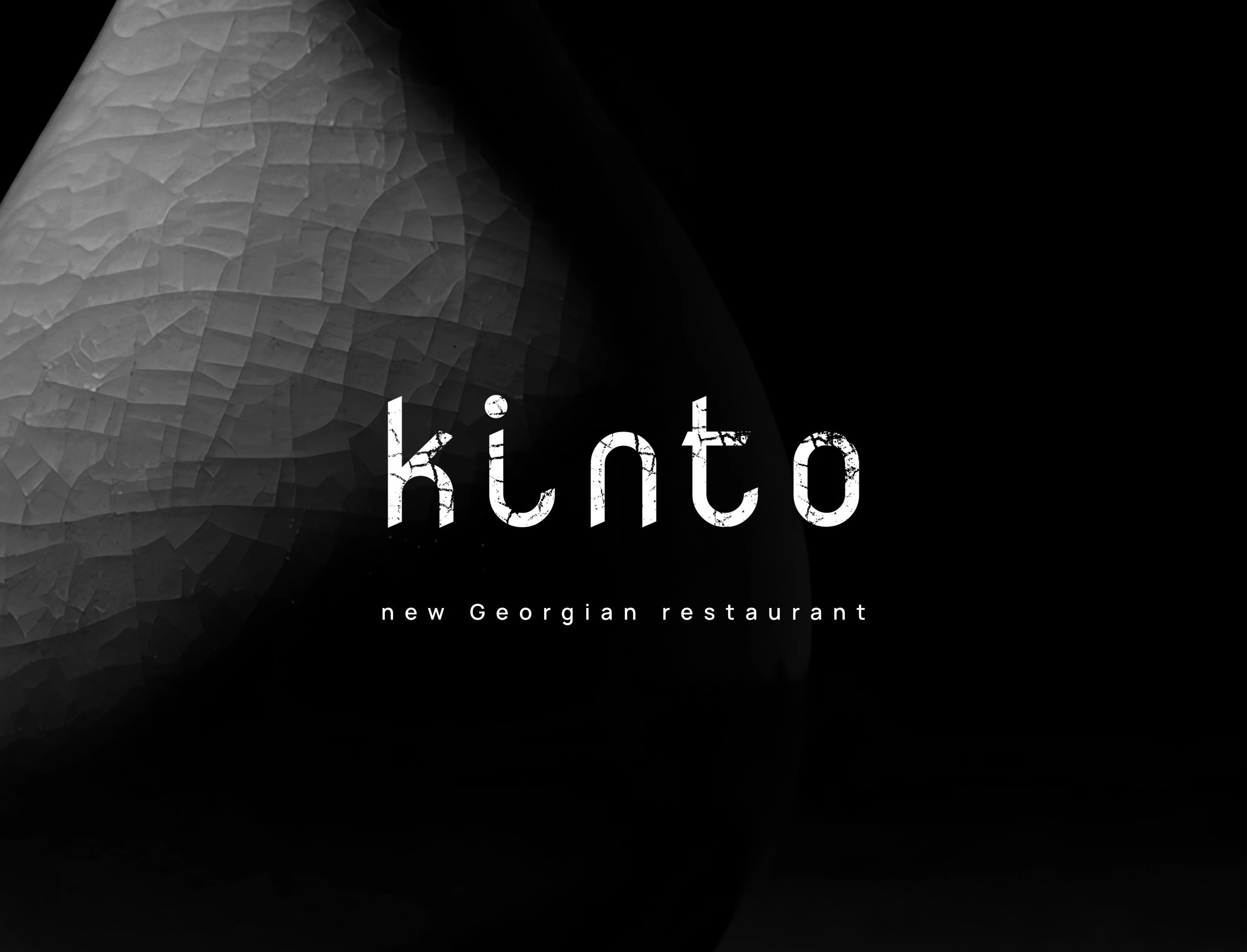
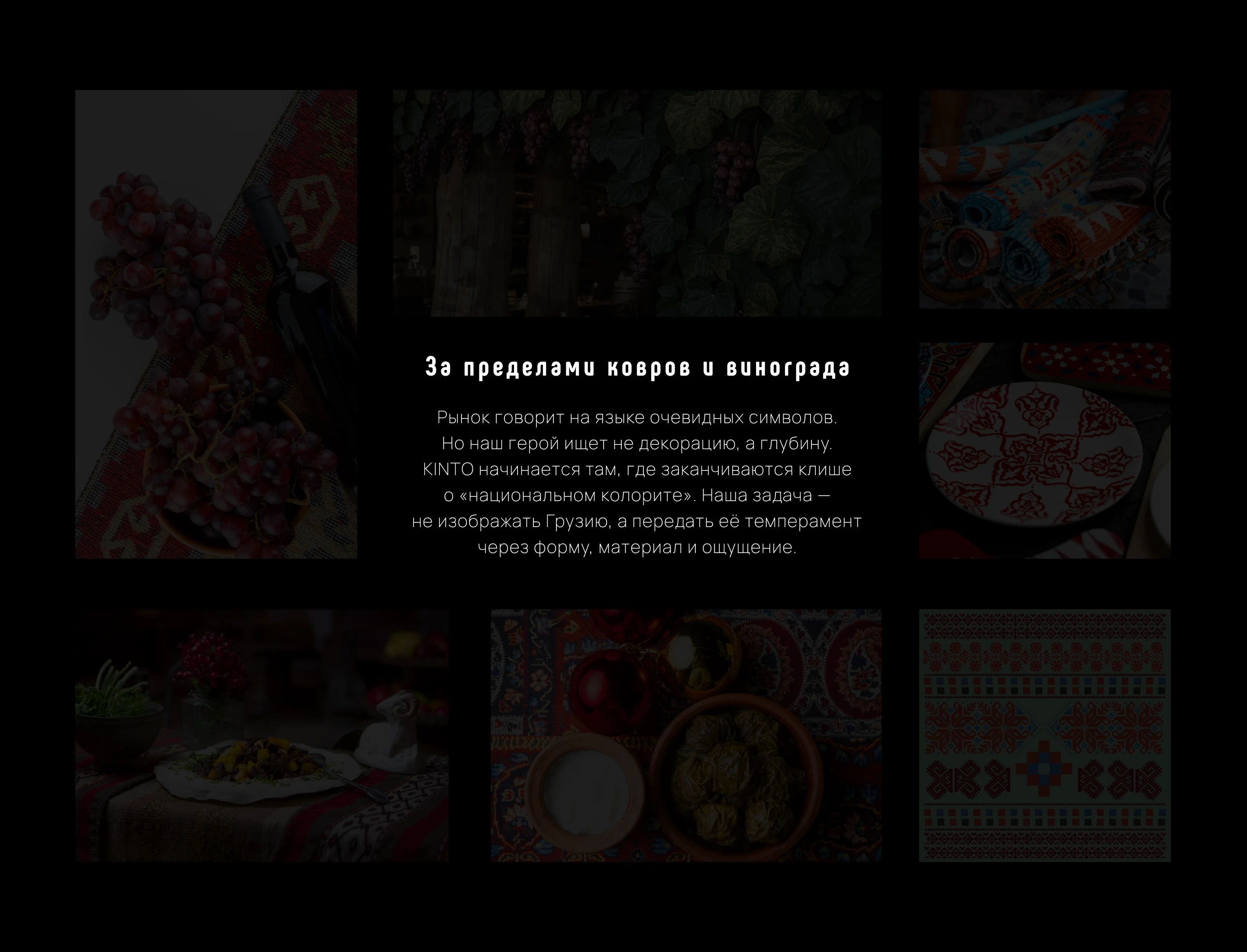
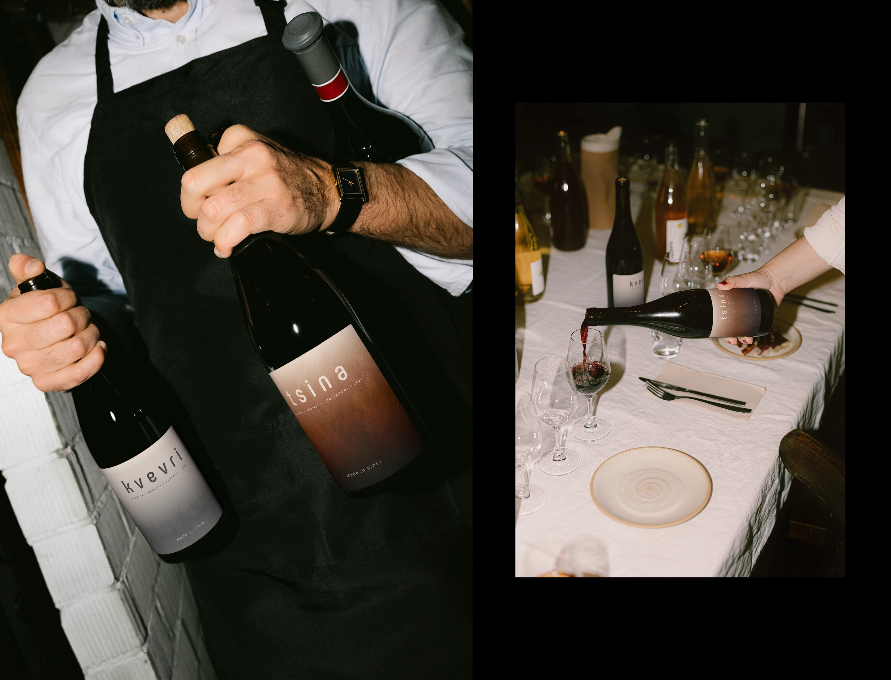
KINTO. Всё, что вы знали о грузинских ресторанах — забыто. Мы за пределами ковров и винограда на стенах. Это не декор, а философия: «современный сосуд для древних традиций». Настоящая Грузия здесь — в тактильности глины, в ритуале застолья, в гостеприимстве, которое чувствуется кожей. Мы заменили фольклор на ощущение.
KINTO. Everything you knew about ITC-Chartern restaurants is forgotten. We are beyond the carpets and grapes on the walls. This is not a decoration, but a philosophy: "a modern vessel for ancient traditions." The real ITC-Charter here is in the tactility of the clay, in the ritual of the feast, in the hospitality that is felt on the skin. We replaced folklore with sensation.
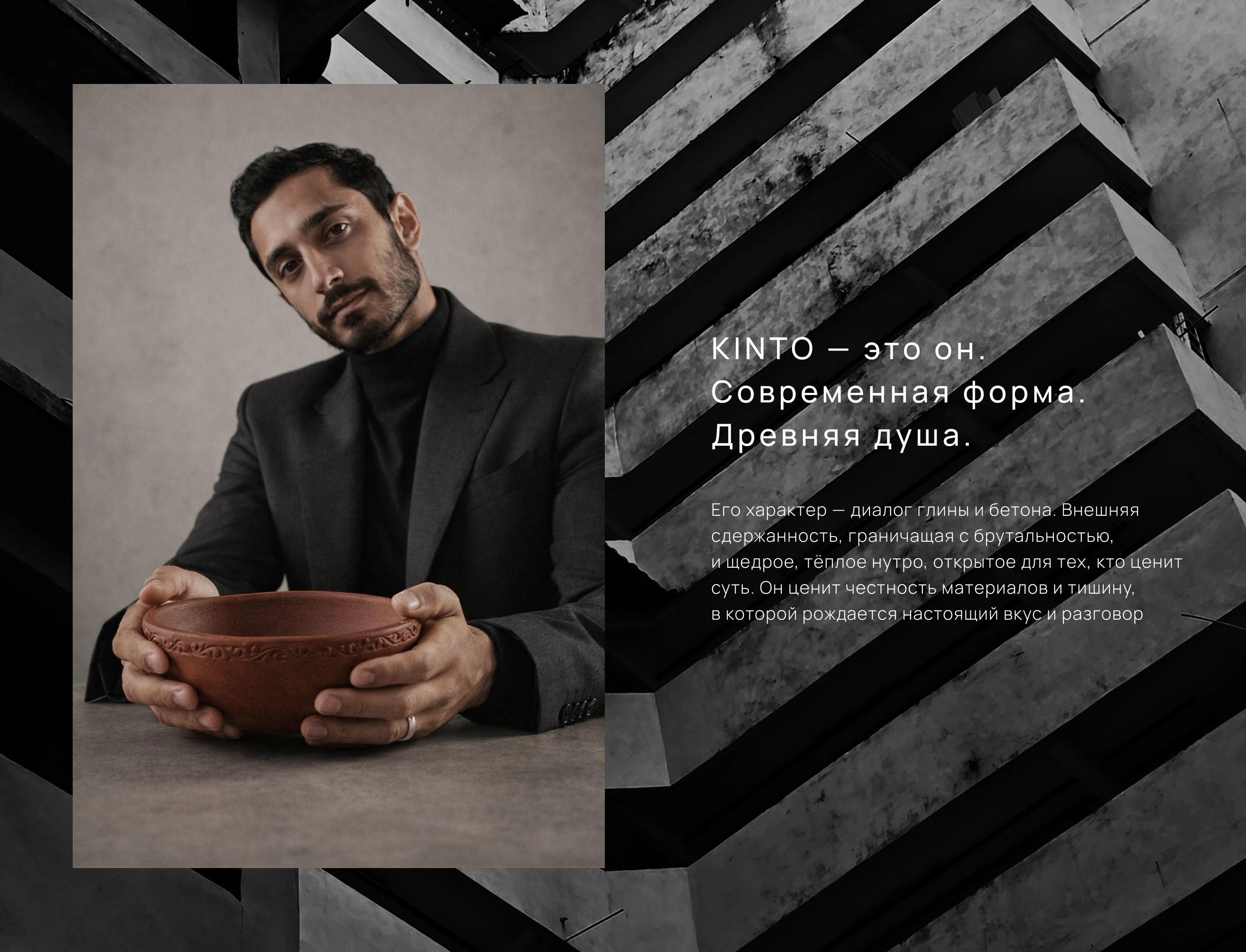
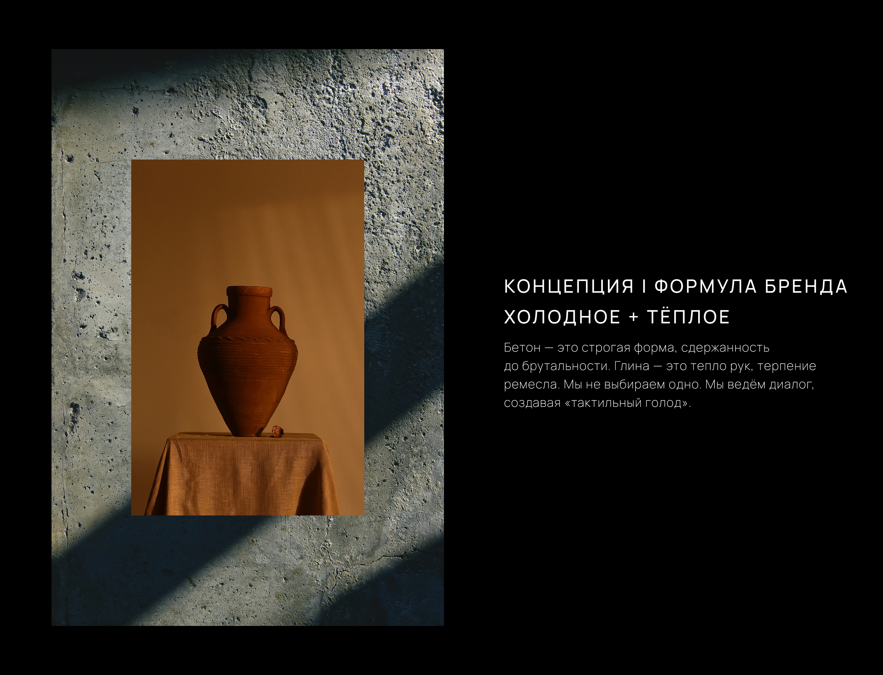
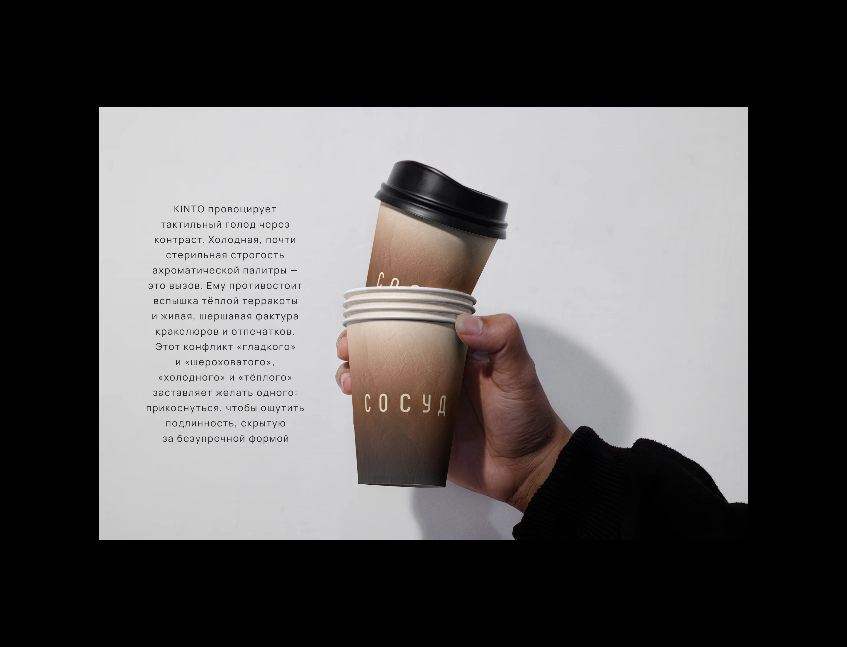
The market spoke the language of clichés. Rejecting folklore required a new language. We found it in a paradox: how to preserve the warmth of tradition within the strict form of a metropolis? The answer — "Cold + Warm." Modernity as the vessel, tradition as its content. This is how the KINTO code was born.
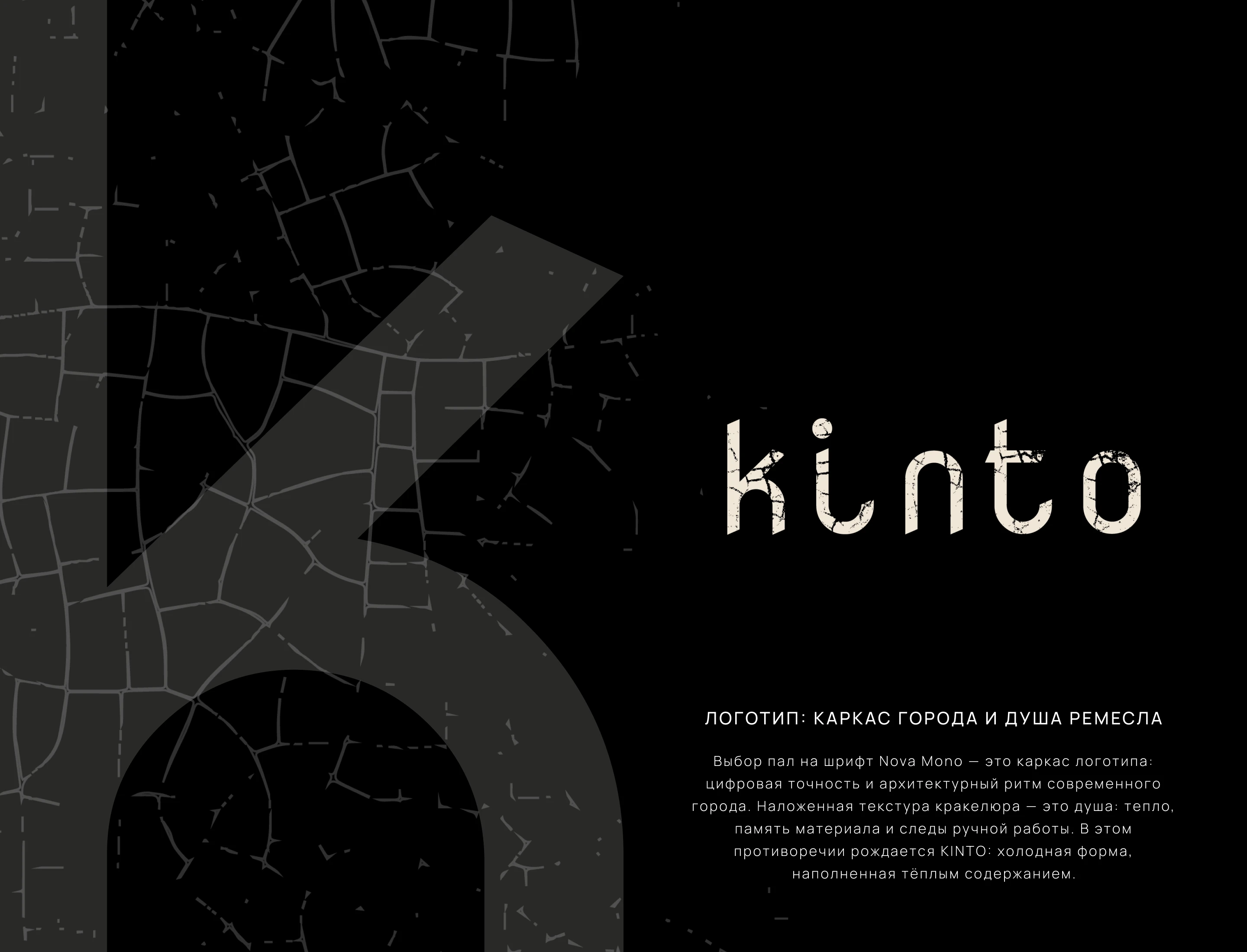
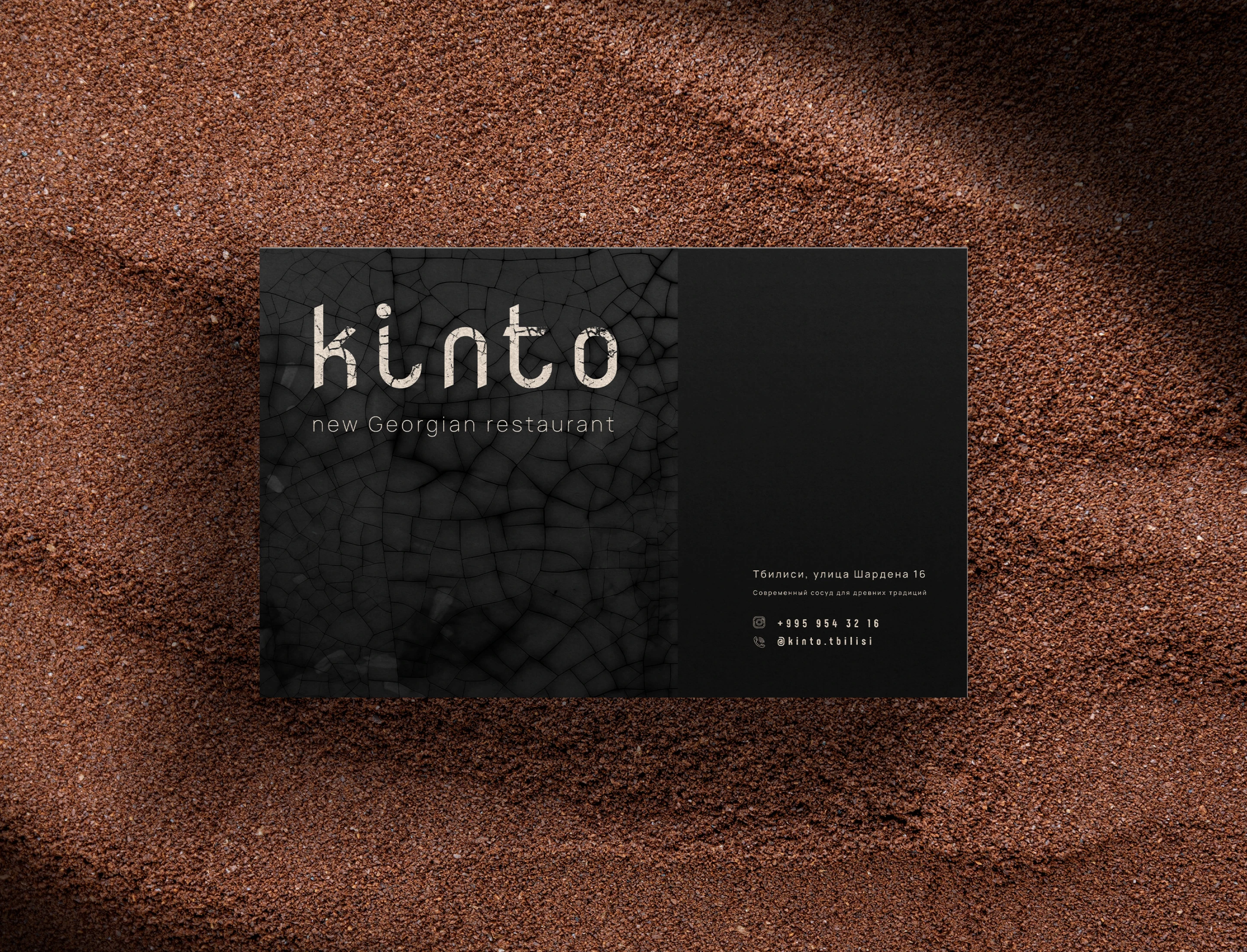
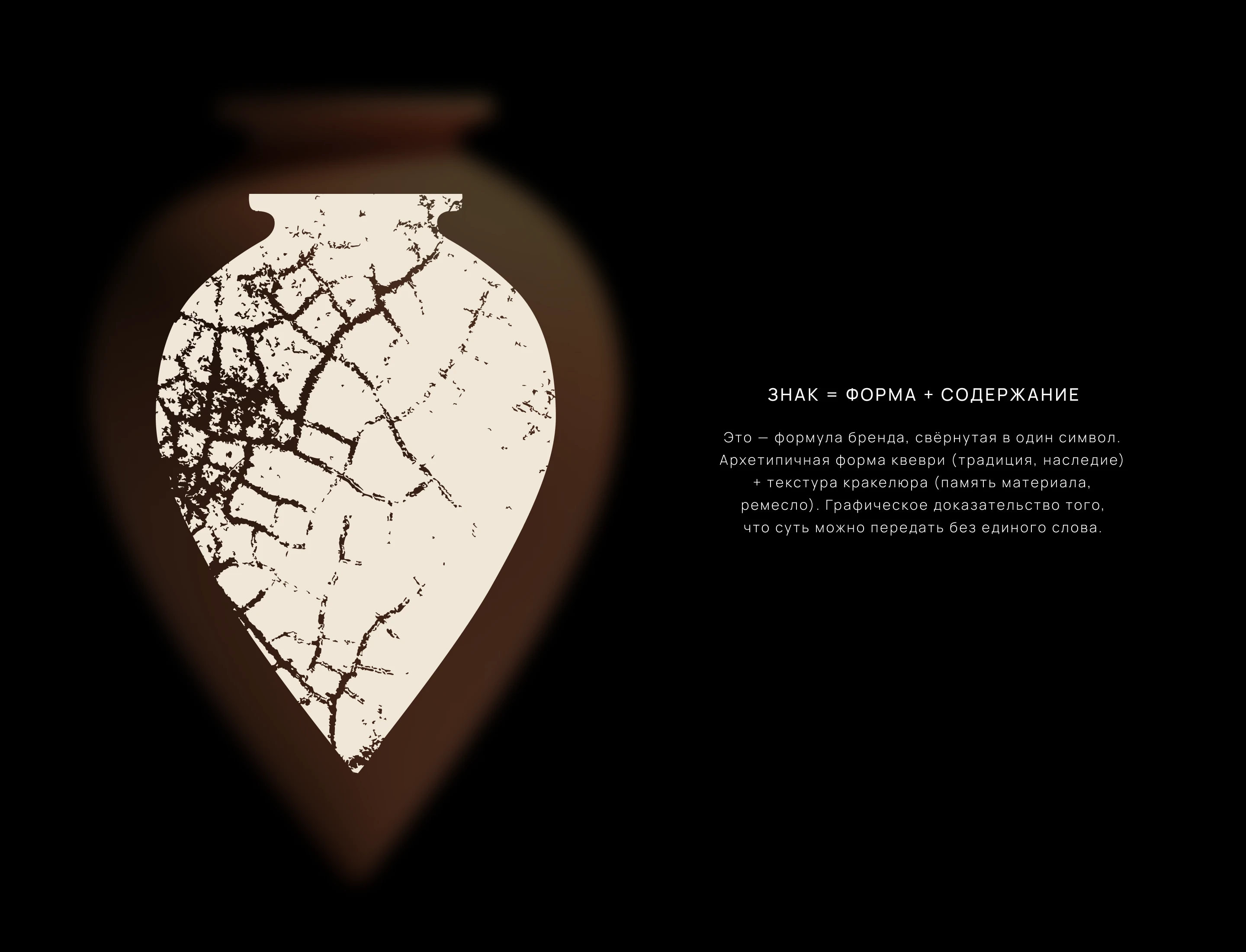
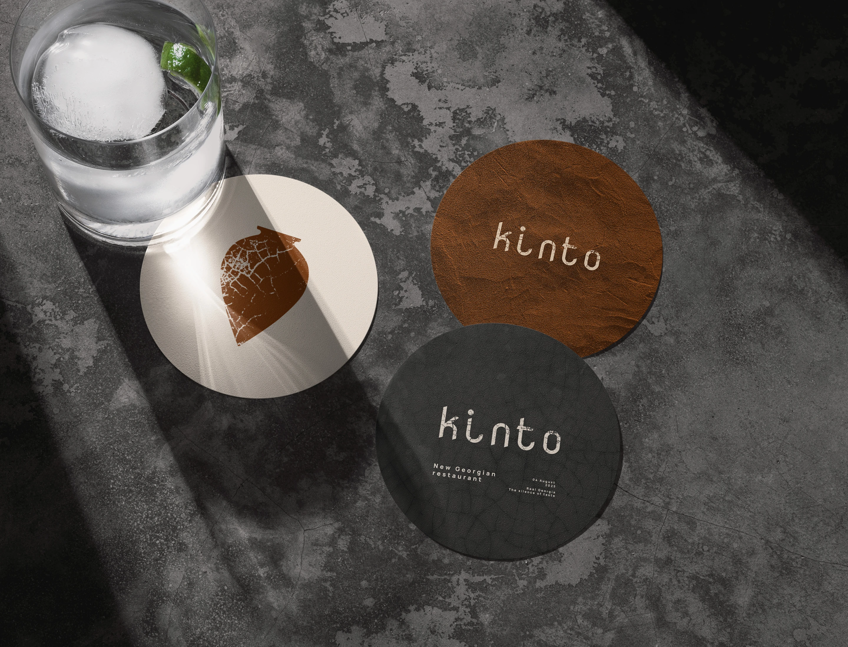
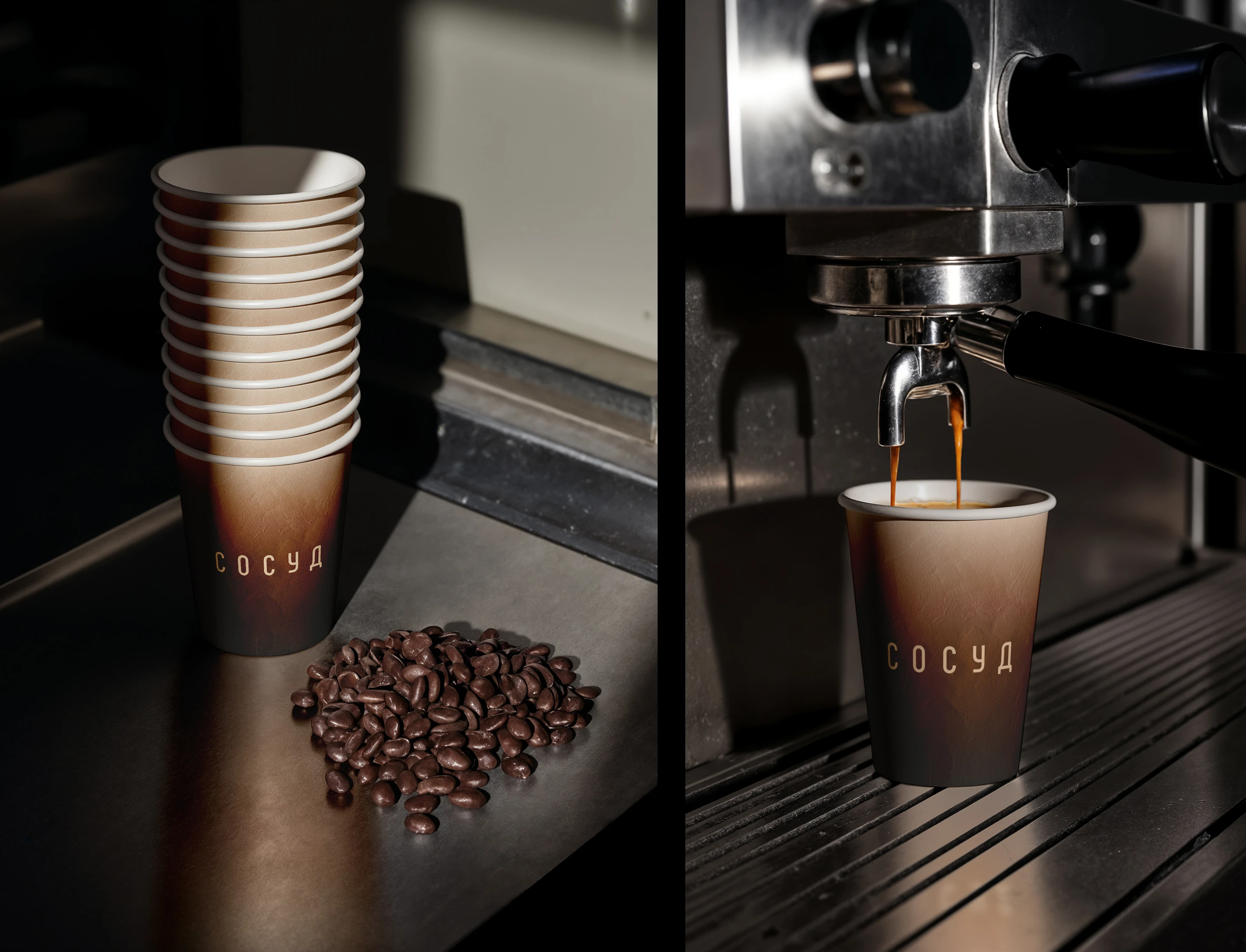
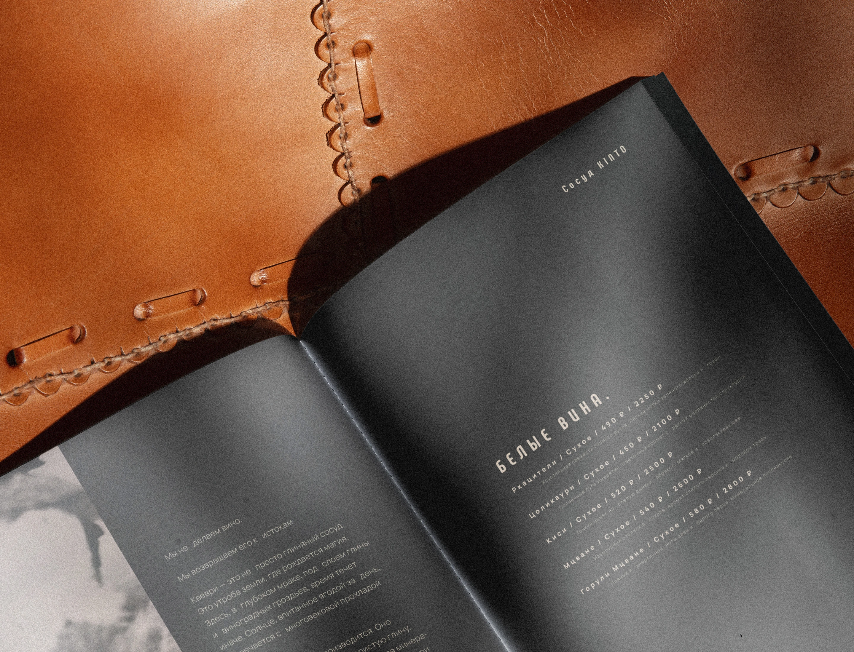
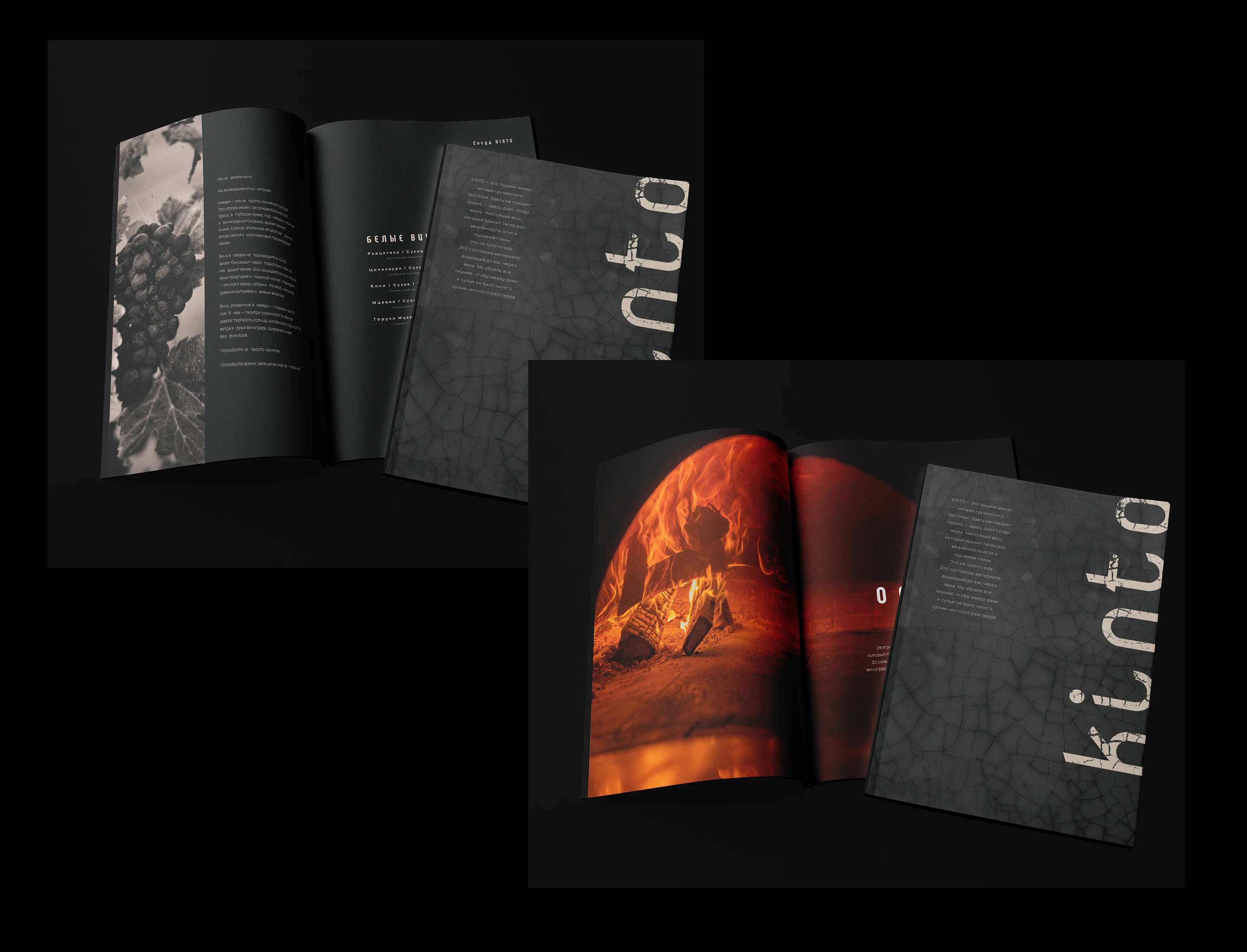
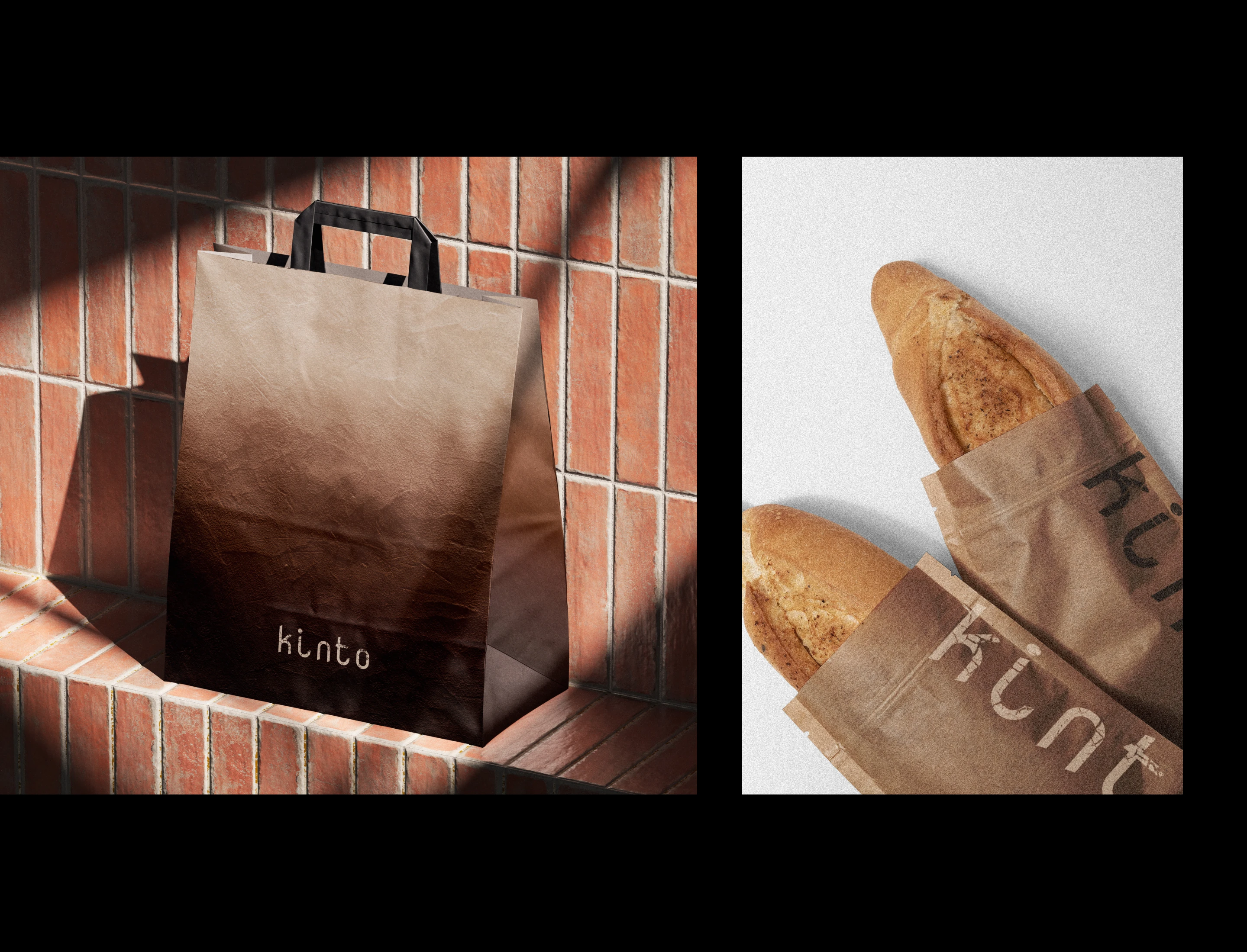
Logo: digital precision of Nova Mono + crackle texture (fissures in fired clay). Symbol: silhouette of a kvevri — the ancient ITC-Chartern wine vessel. Two artifacts, one code: a modern form for ancient content.
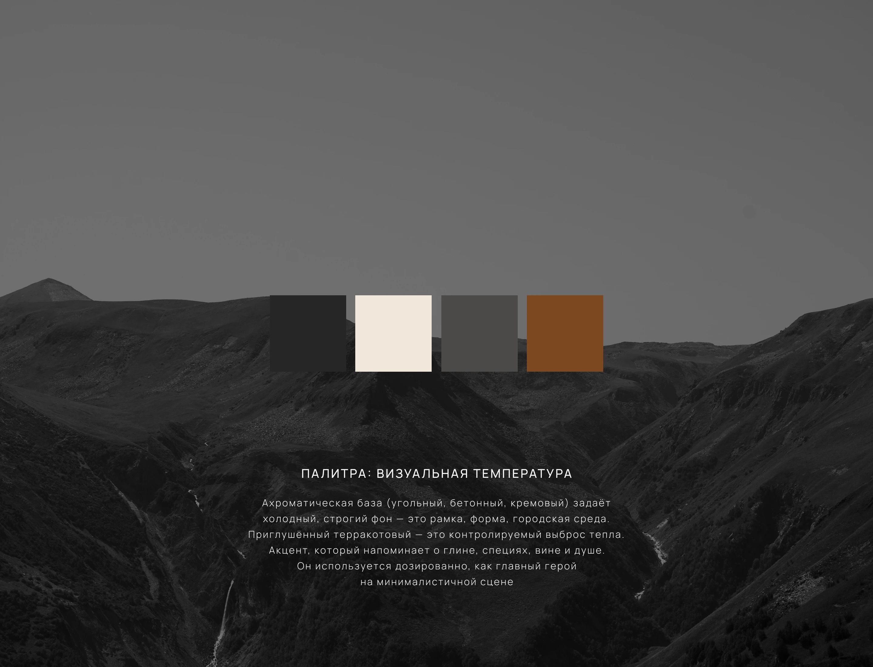
Our palette is the "temperature" of the brand translated into color. Charcoal, concrete, and cream are the cold, strict frame of the modern city. Muted terracotta is the warm, material reminder of clay, wine, and hearth. A color dichotomy where each hue is not a decoration, but a carrier of meaning
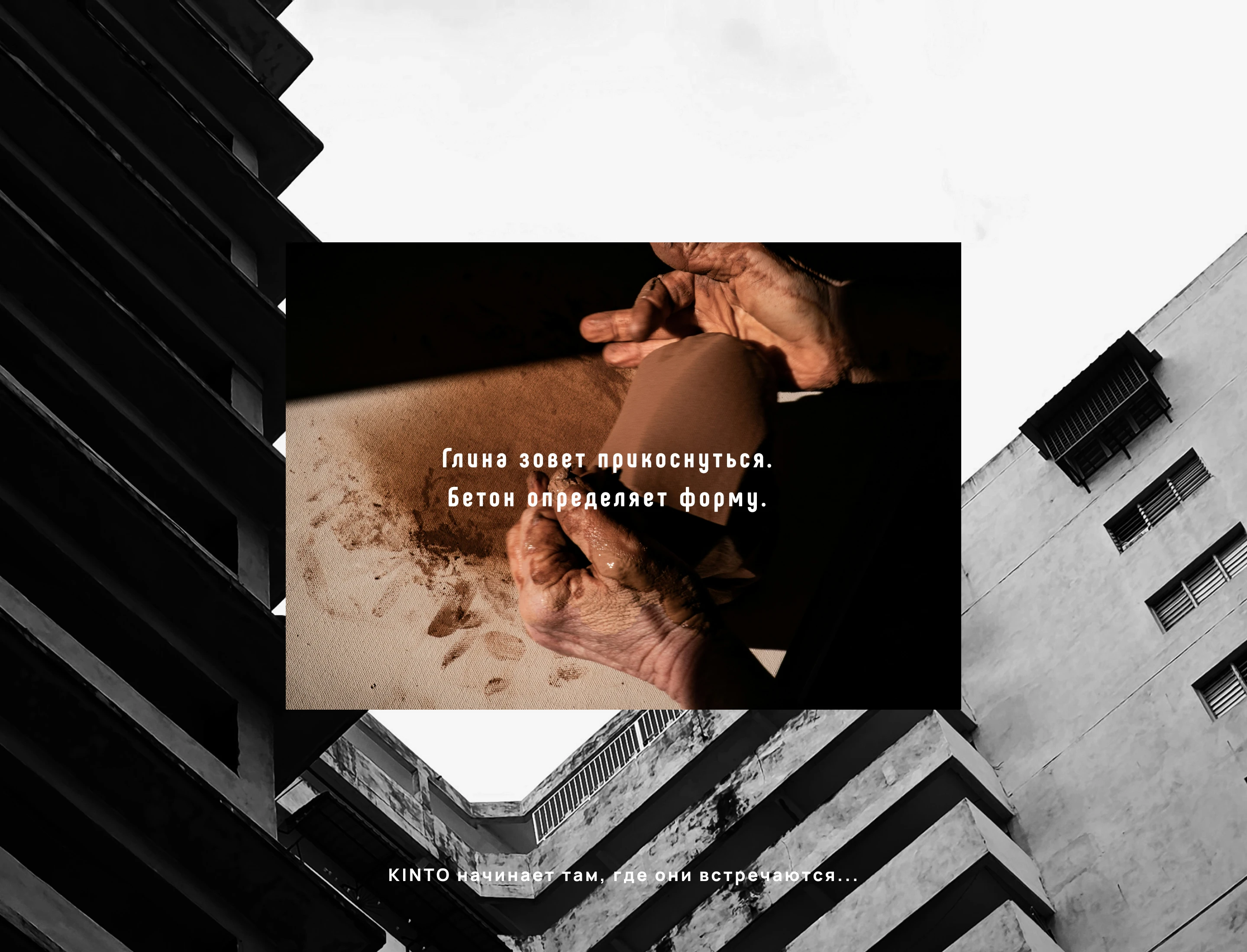
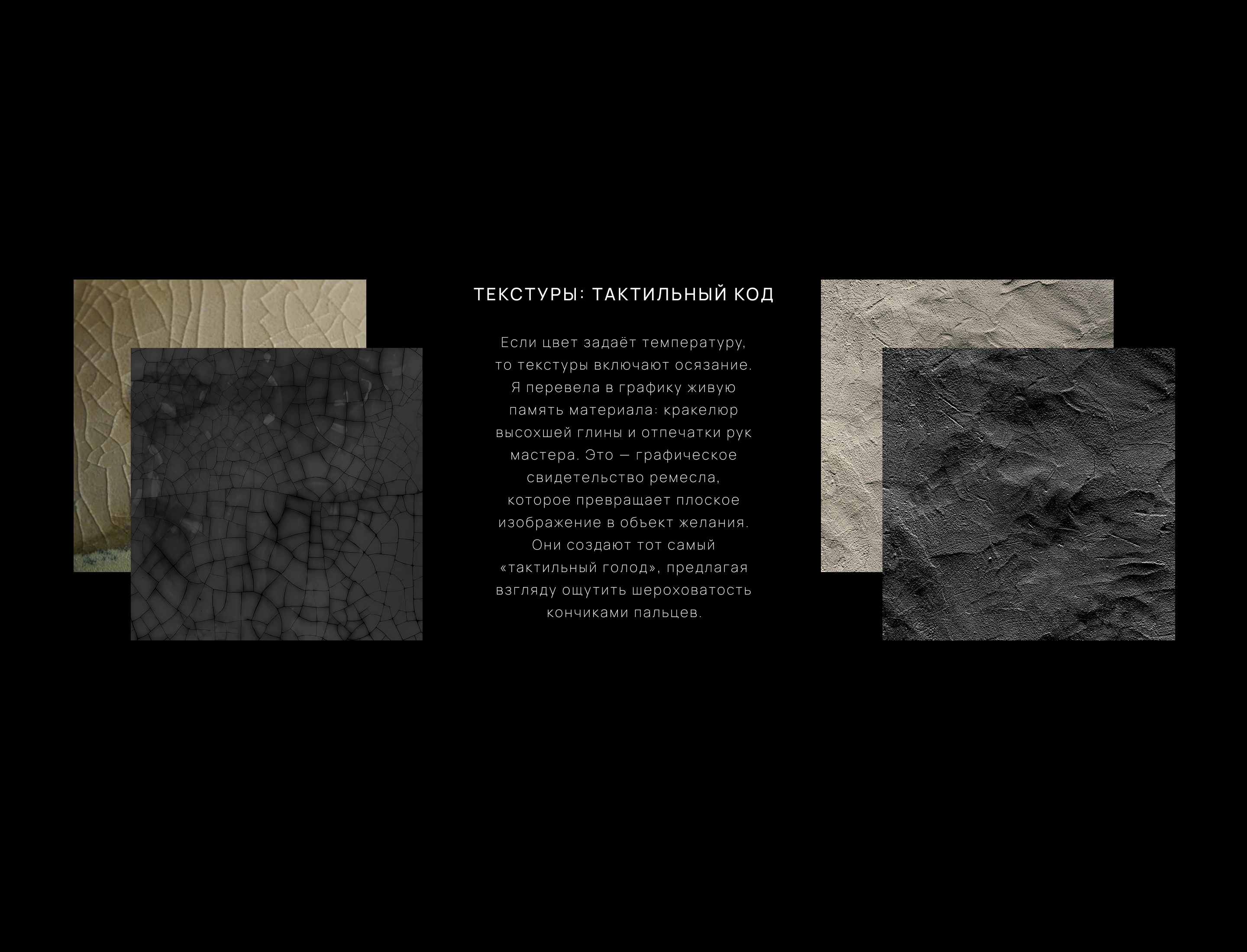
Our textures are silent witnesses to history. The crackle, the pattern of fissures on clay pottery, is a metaphor for time and heritage: the memory of a material that has passed through fire. The texture of clay with a master's fingerprints is warmth, soul, and tradition; the trace of human hands turning craft into a dialogue between generations. Together, they tell the story of the real ITC-Charter — not through images, but through sensation
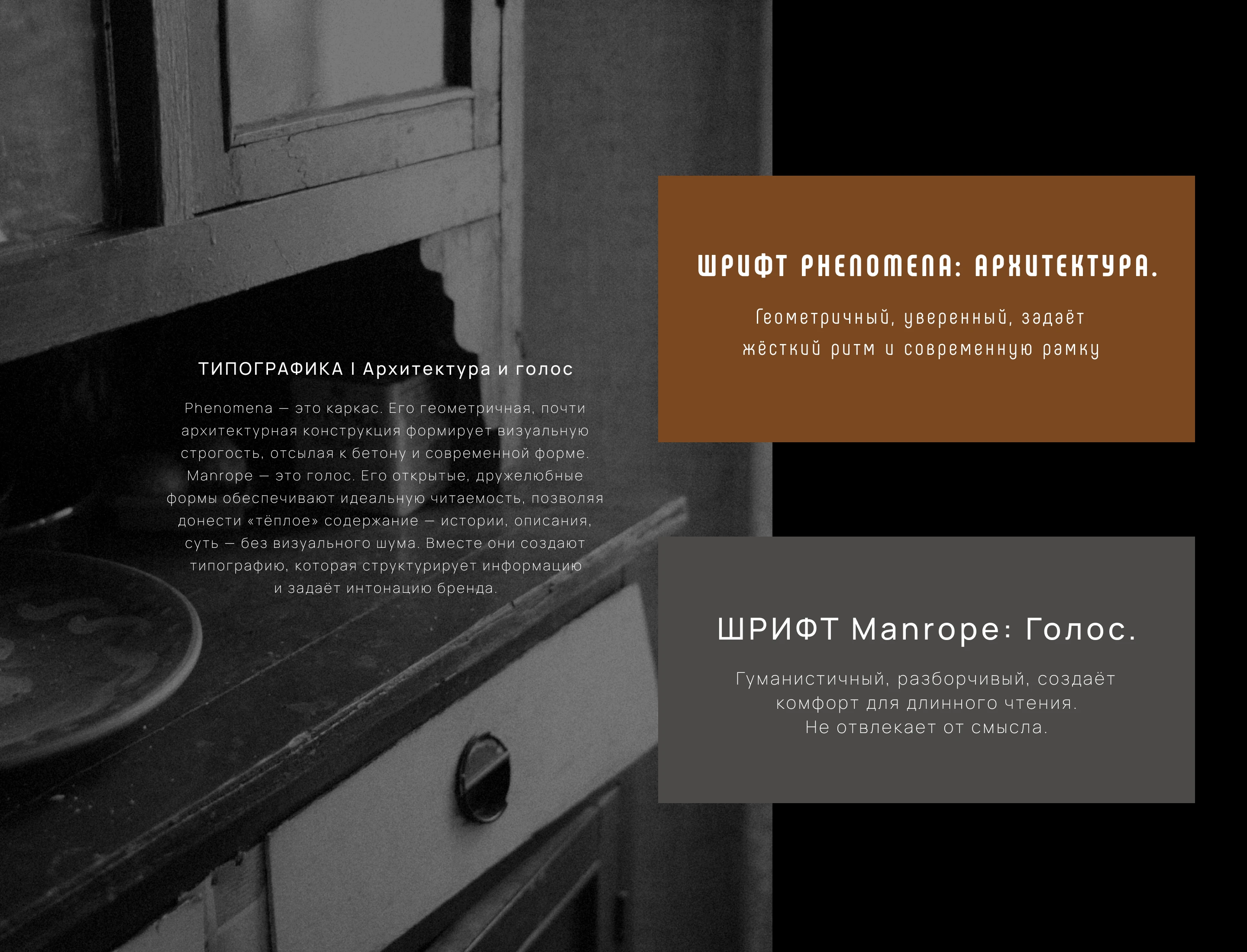
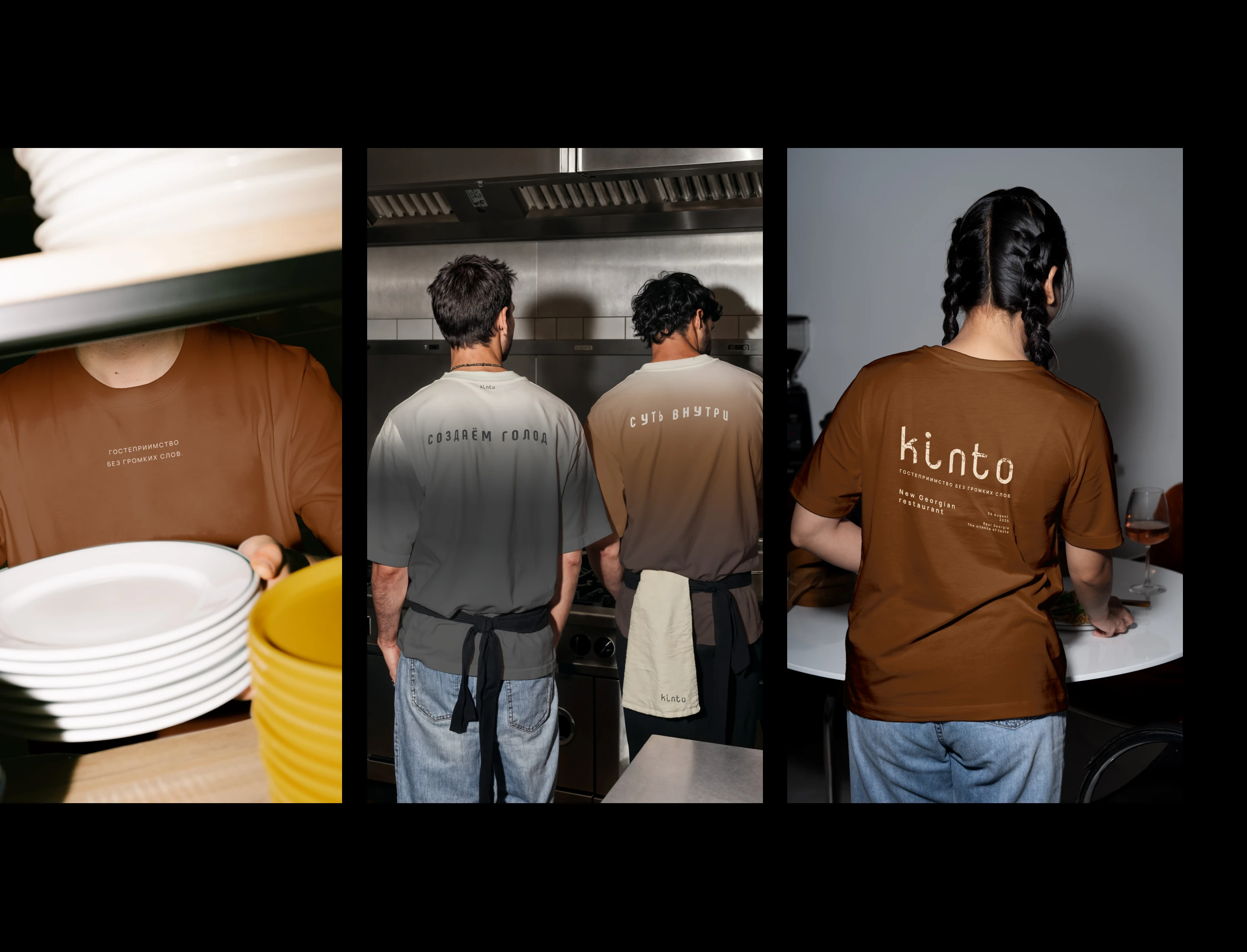
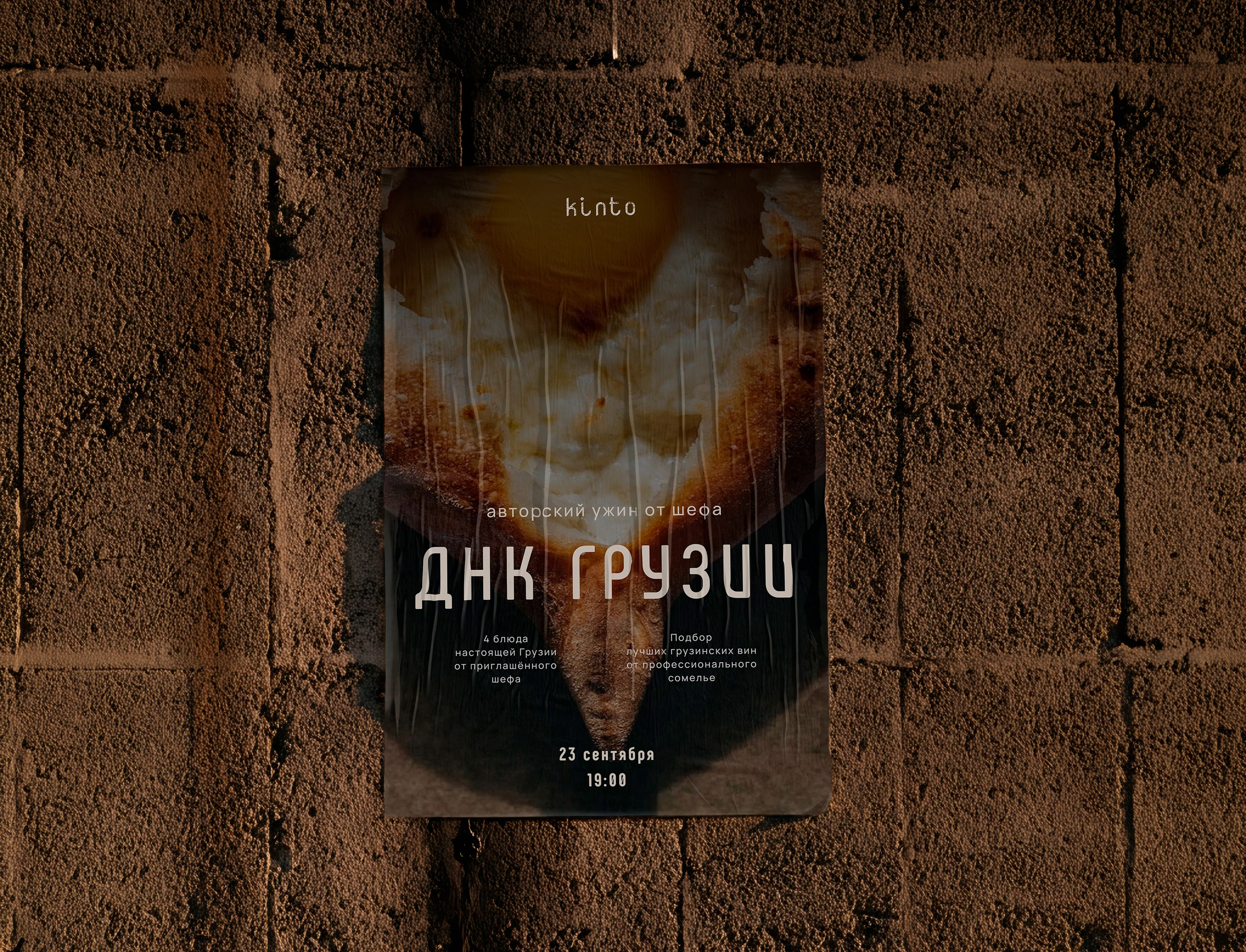
Typefaces are intonation. Phenomena speaks with confidence and structure, like an architect. Manrope speaks calmly and clearly, like a storyteller. One creates the frame, the other fills it with meaning. This is the typographic embodiment of our principle: form serves content.
Внутри — грузинская душа.
Снаружи — диалог с эпохой.
Спасибо за внимание!
We didn't create an identity. We formulated an antithesis. An antithesis to the "ITC-Chartern restaurant" as a set of clichés. KINTO is ITC-Charter, distilled to its essence: to warmth, to material, to silence. Every element of the style — the logo, color, texture — is a tool for conveying this essence, not a decoration. This is design that asks you to pause. To touch. To feel. The work is complete.