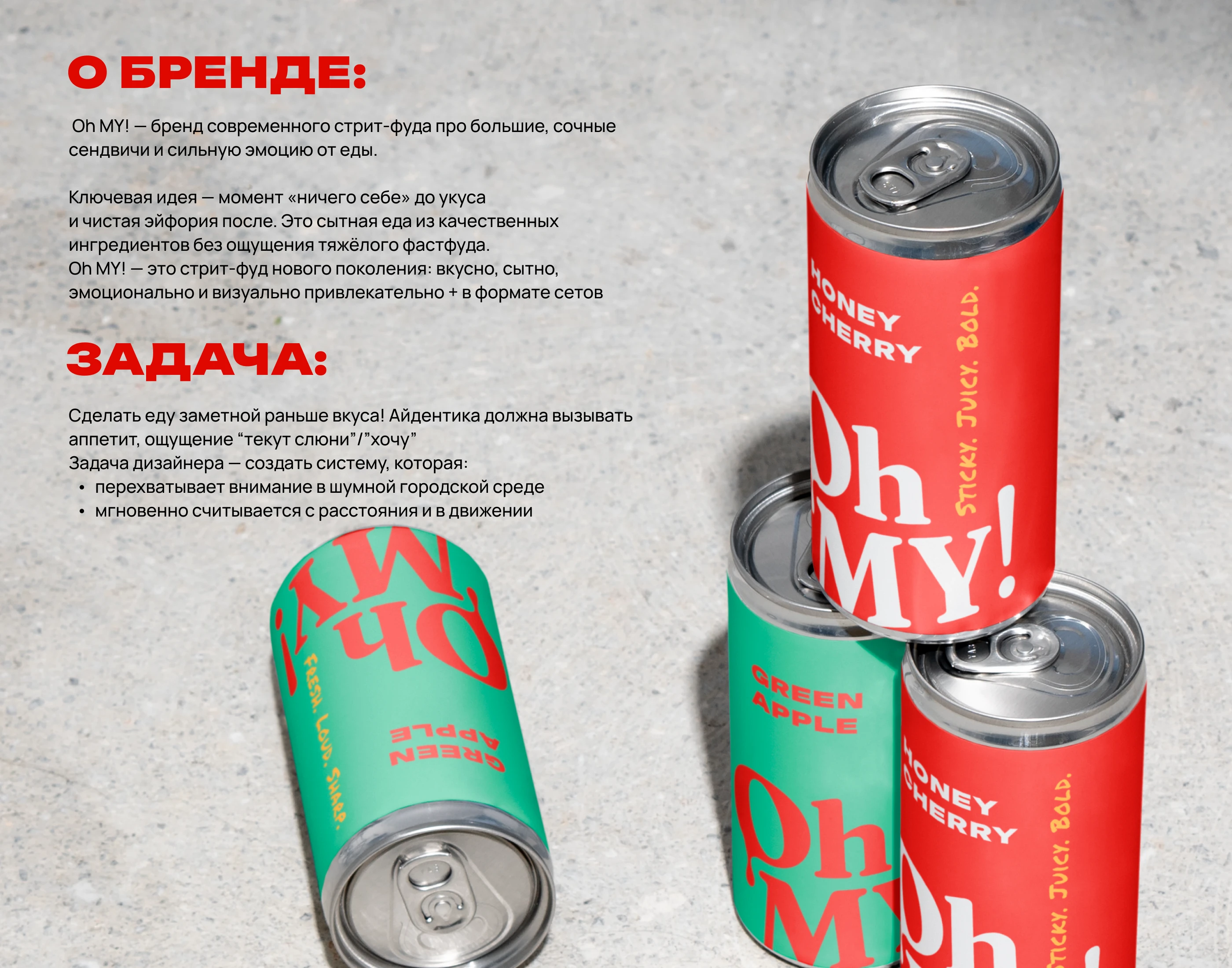
Oh MY! is a street food brand built around a single instant reaction —
“Oh my!” — the moment you see the food and want it before the first bite.
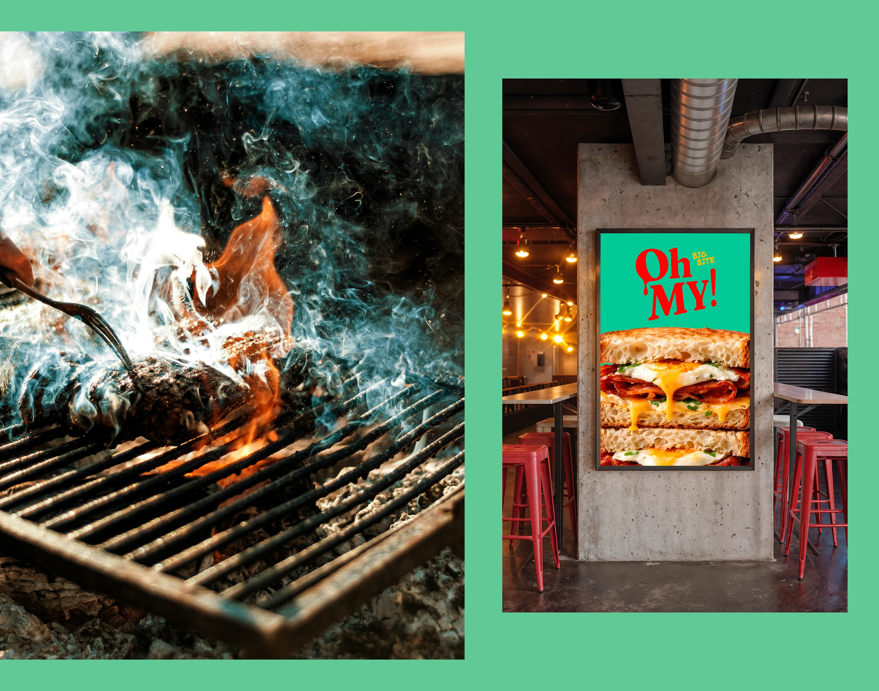
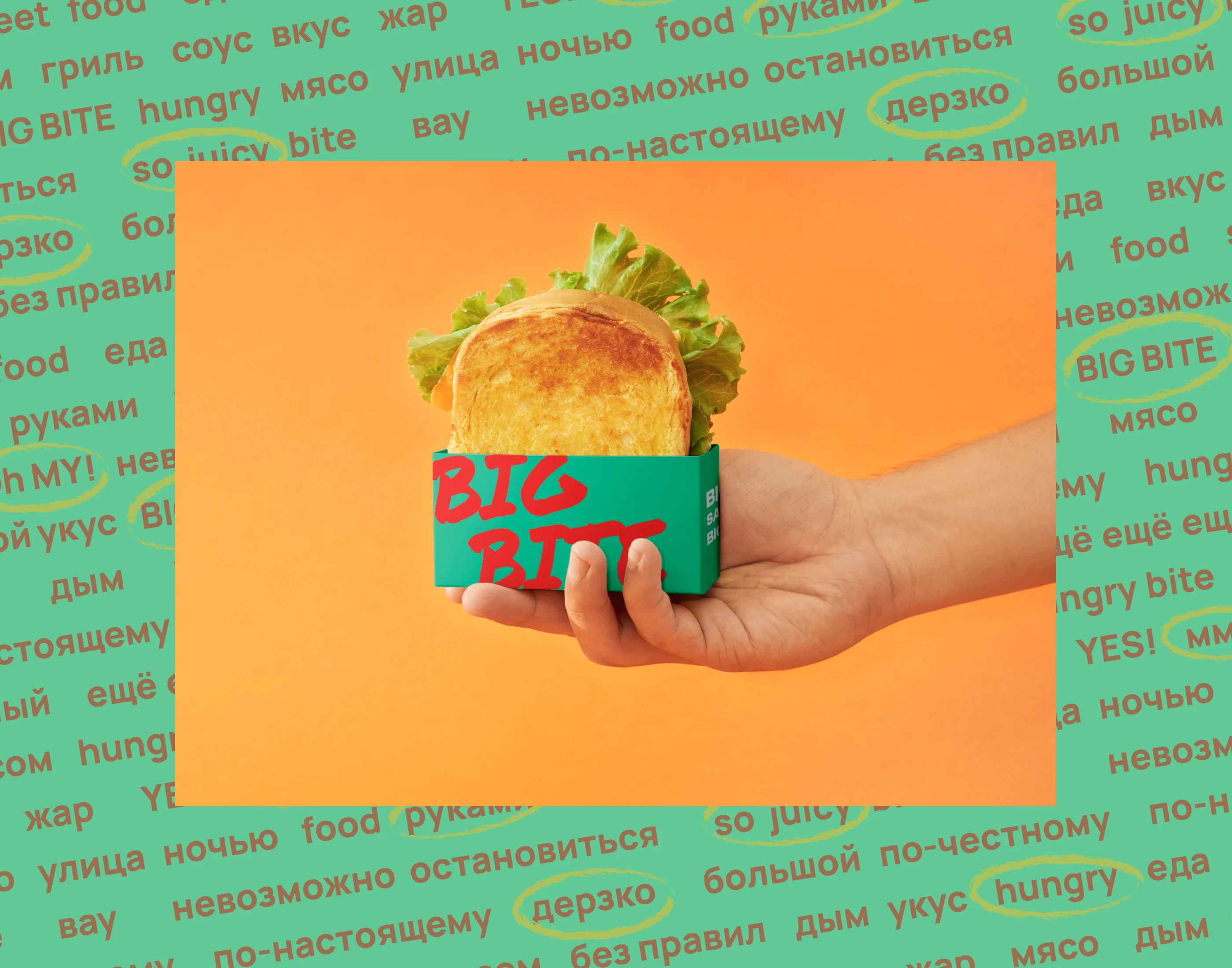
The brand focuses on big, juicy sandwiches made with fresh ingredients: grilled meat, vegetables, lots of cheese and bold yet light sauces. It’s not greasy fast food, but street food that looks indulgent, feels fresh and instantly craveable.
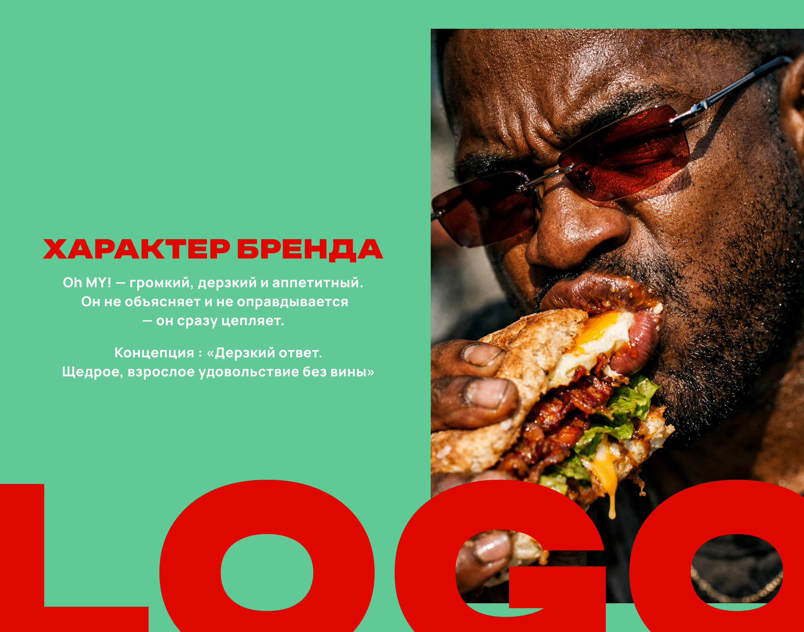
Oh MY! is loud, emotional and mouth-watering.
Designer’s Challenge: Make food noticeable before the taste!
The visual identity must trigger appetite and an instant “mouth-watering / I want this” reaction — before the first bite.
The designer’s task was to create a system that:
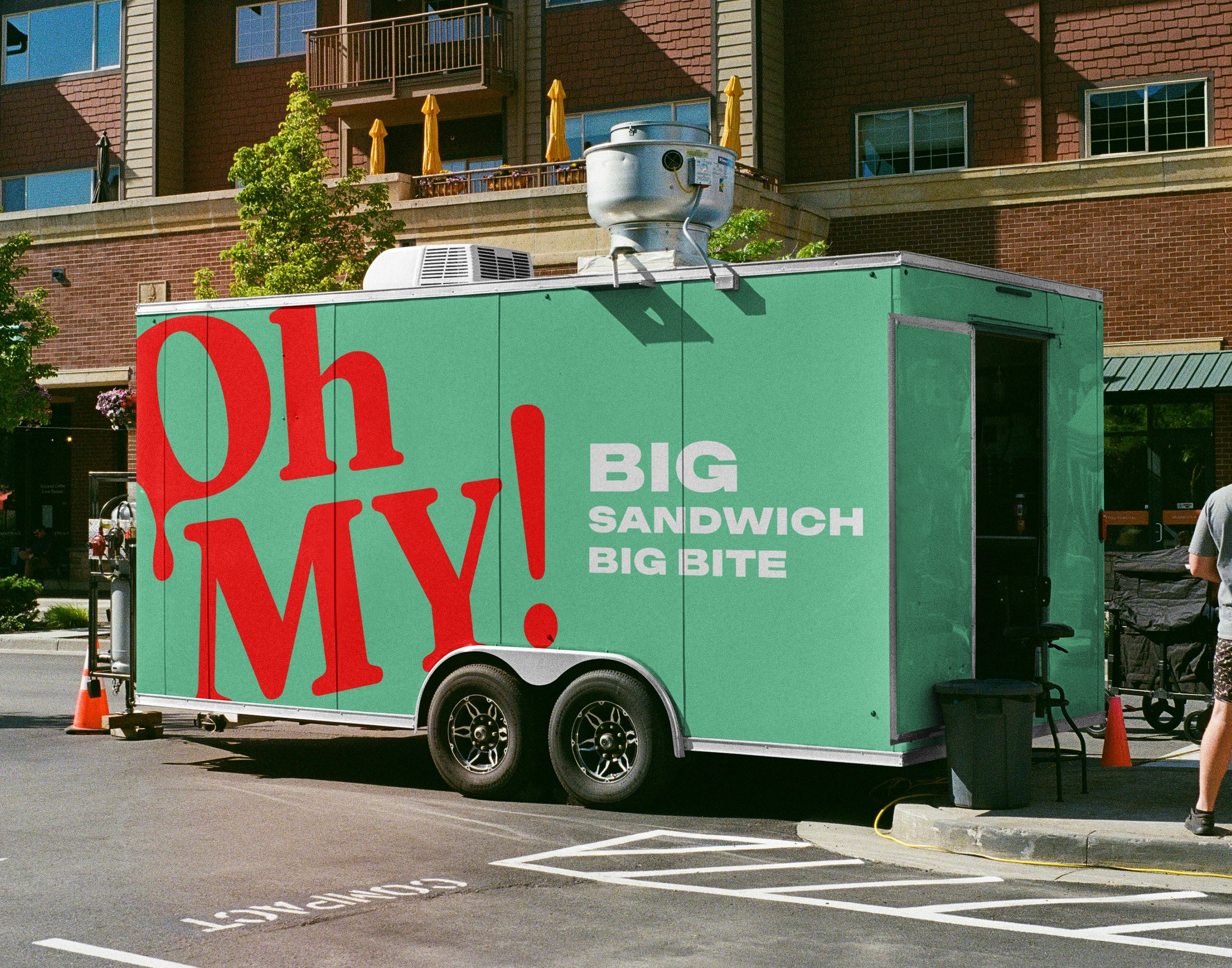
- captures attention in a noisy urban environment
- is instantly readable from a distance and on the move
- visually communicates juiciness, volume and freshness
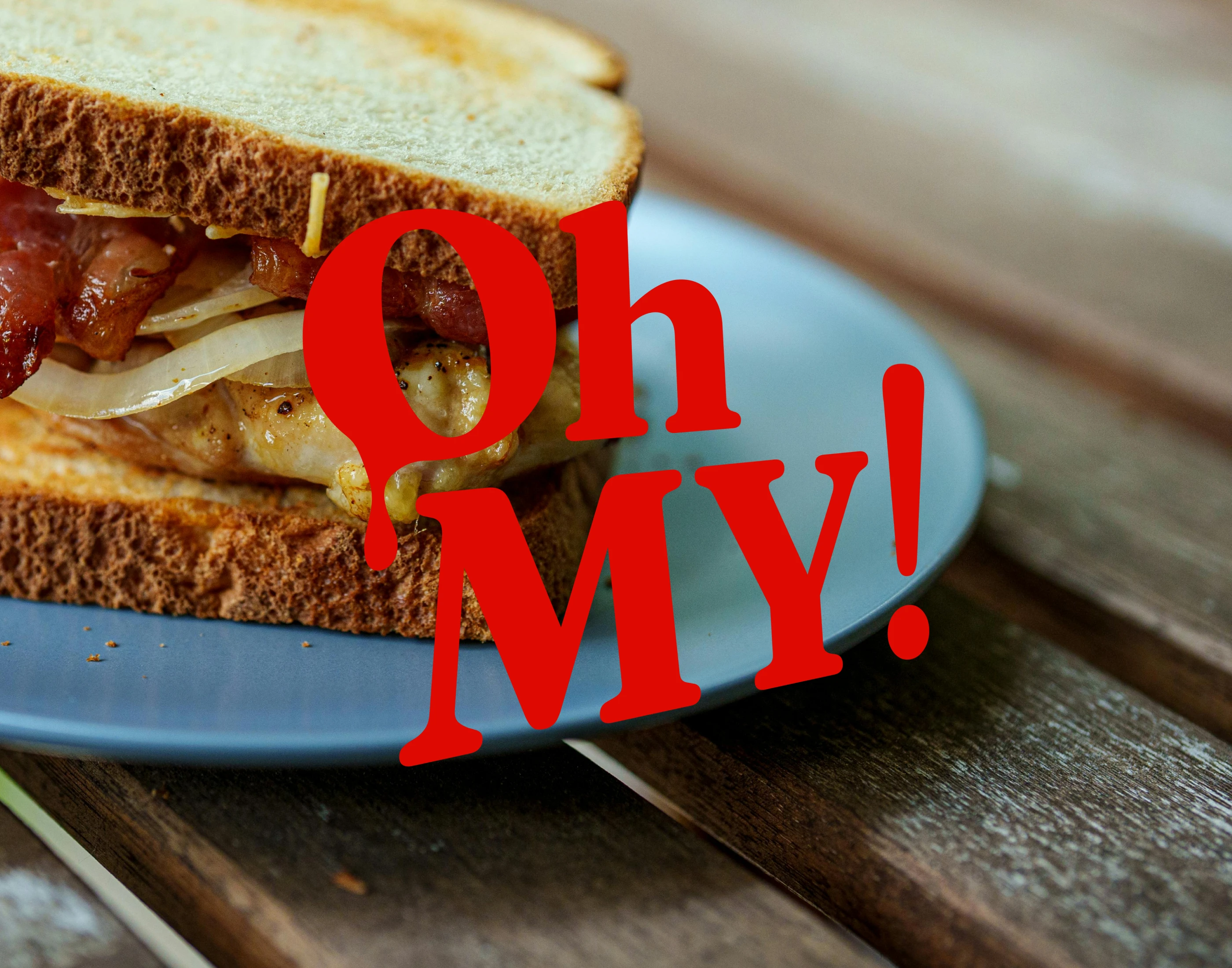
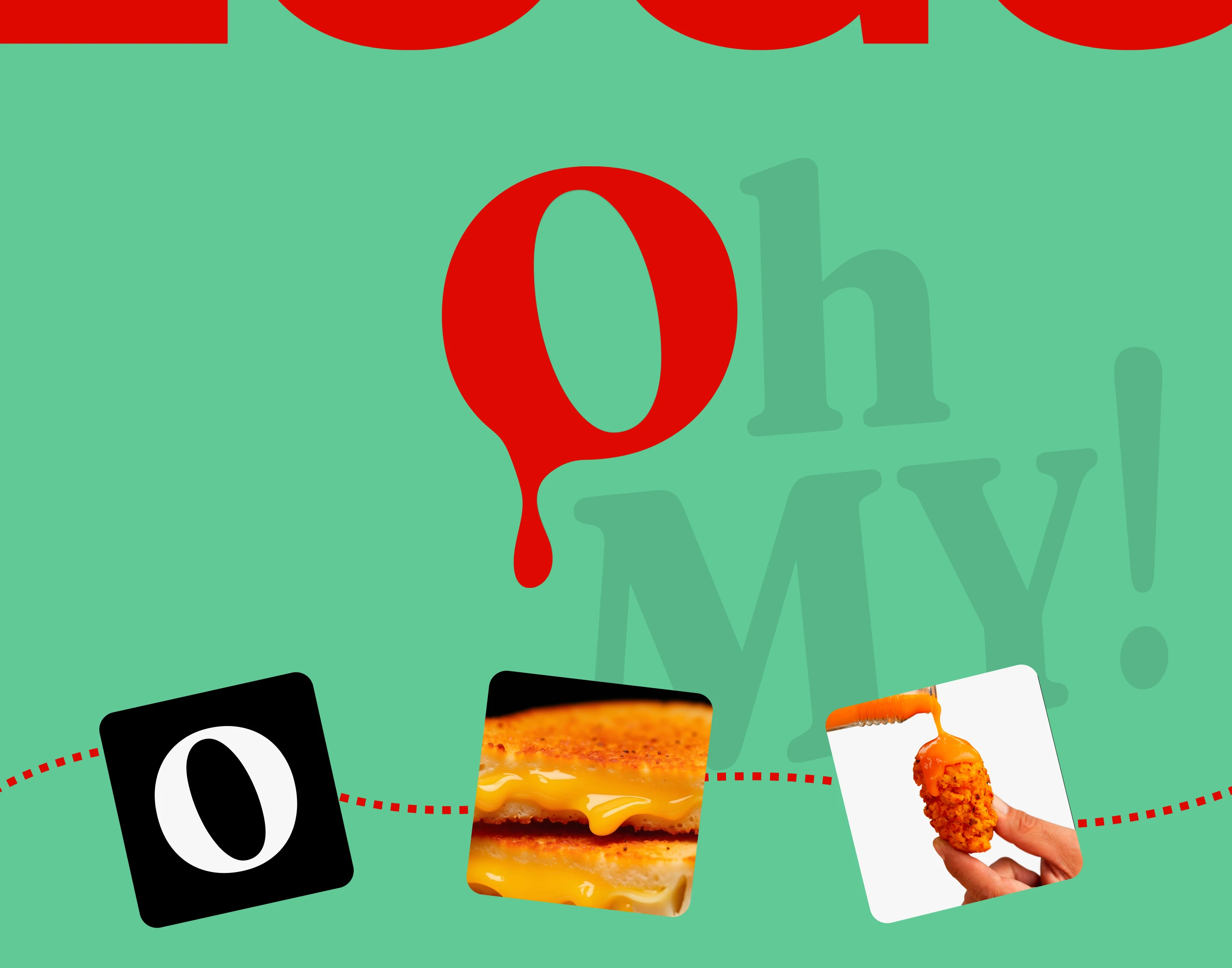
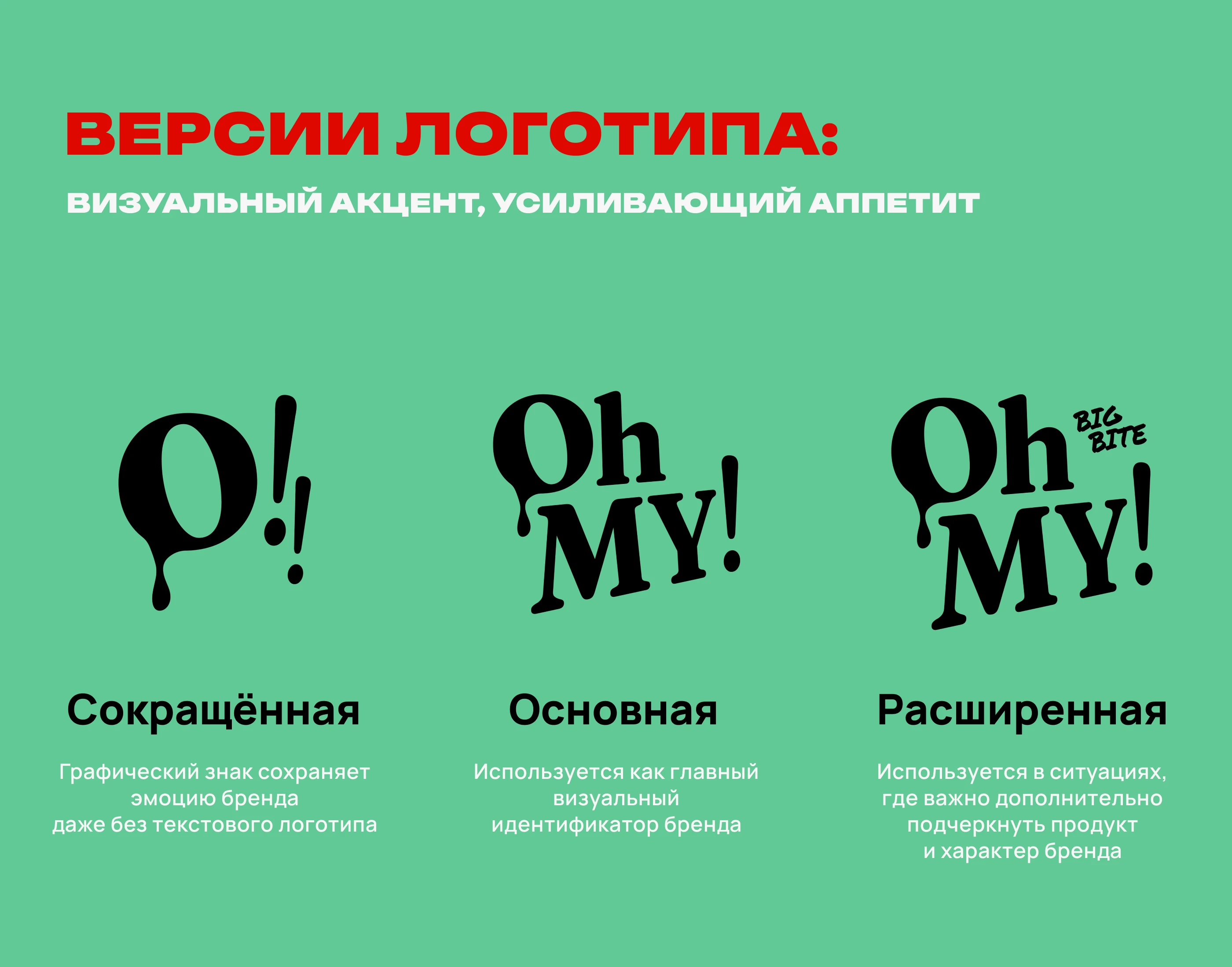
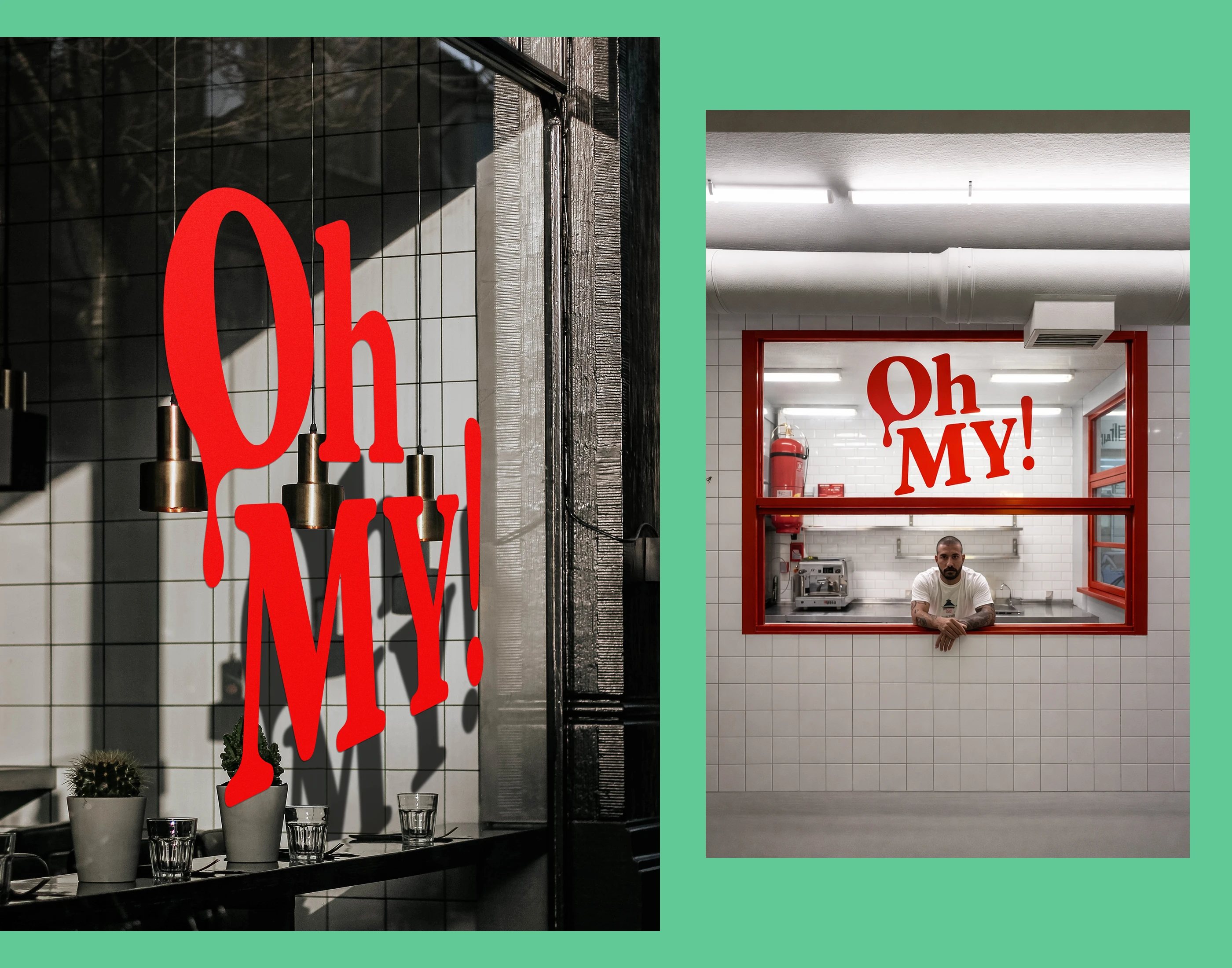
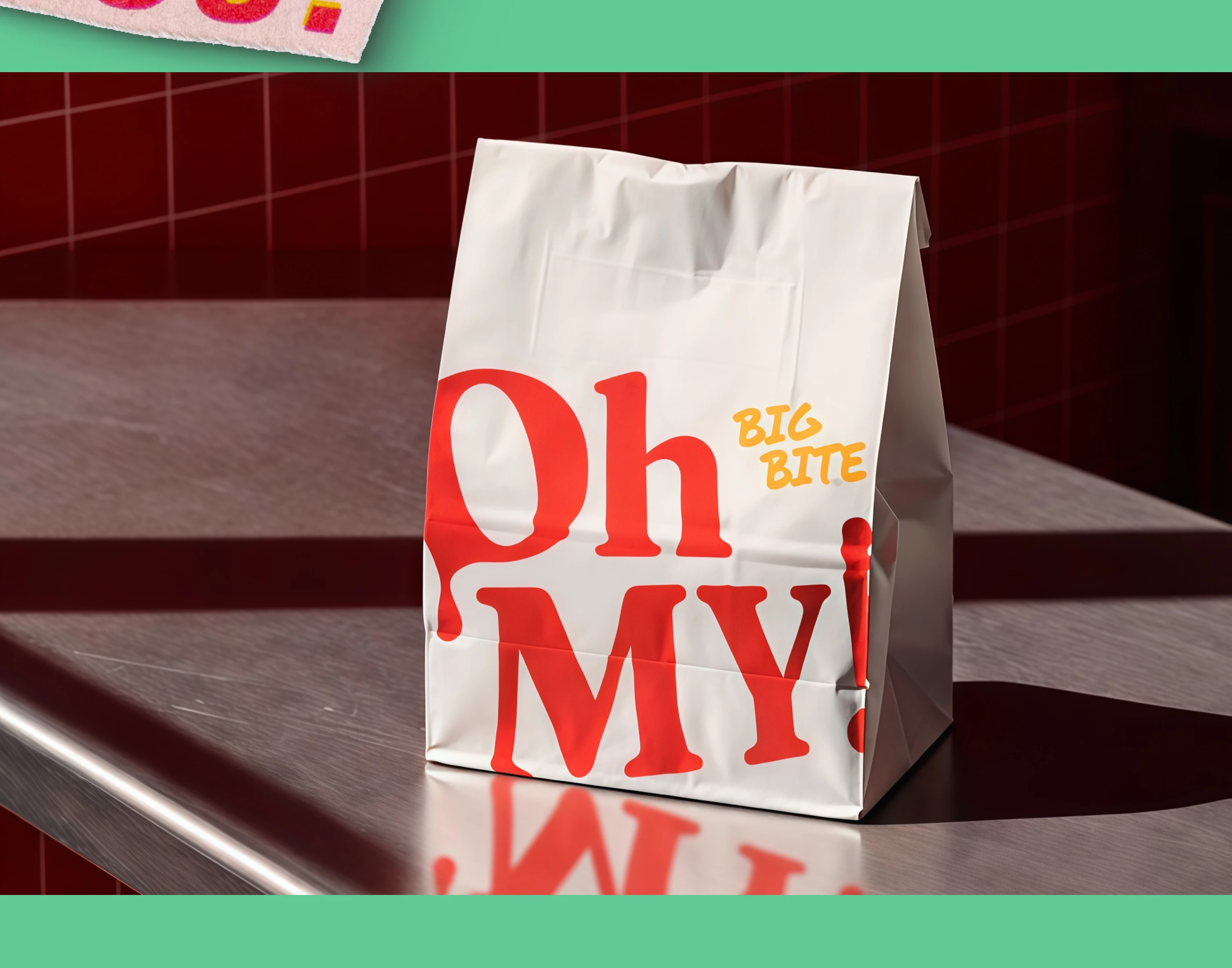
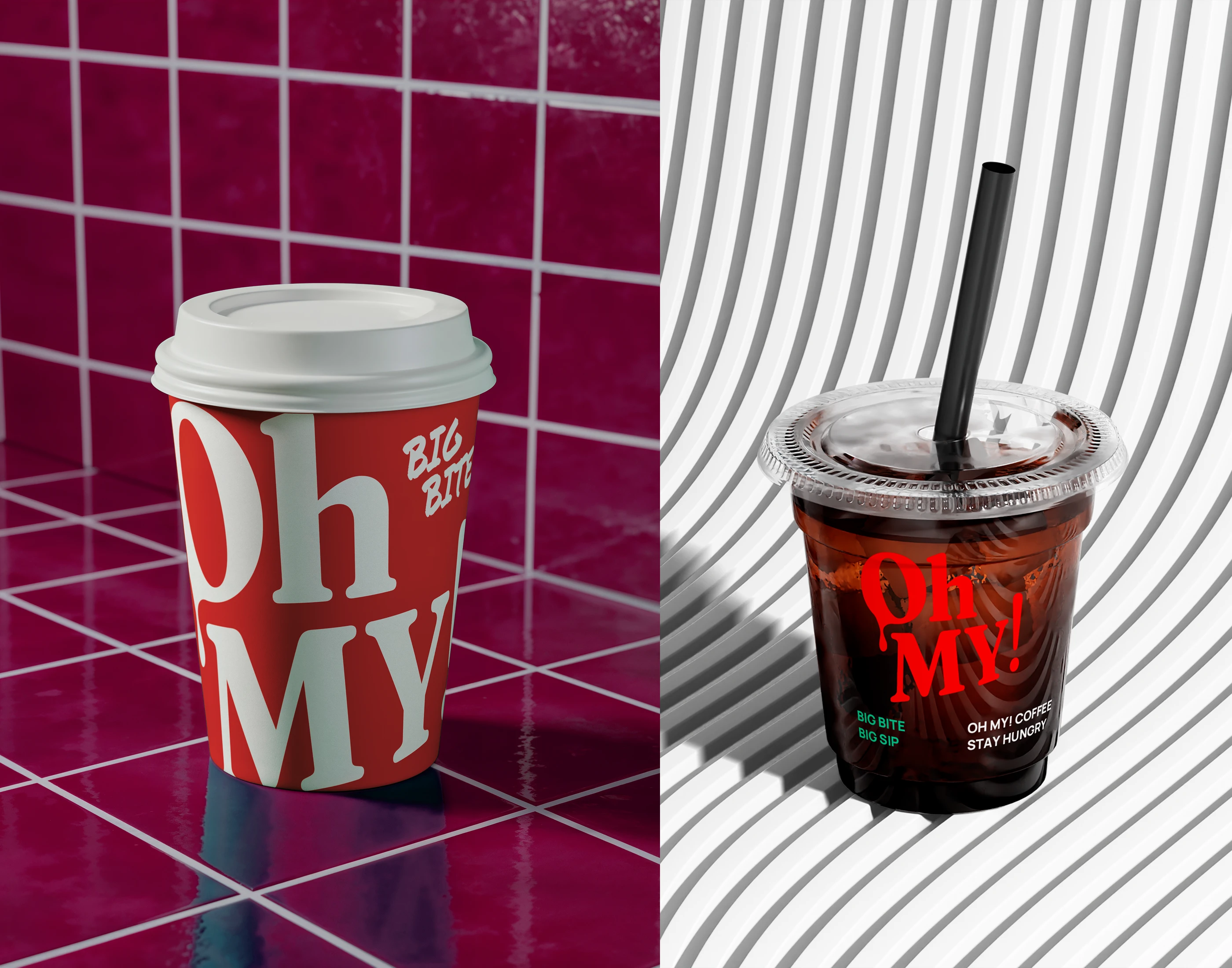
The Oh MY! logo is built around emotion and taste. The “O” represents surprise — the “Oh!” moment before the first bite, while the drop inside refers to sauce, juice and melted cheese. The mark creates mouth-watering associations with hot, juicy food —
dripping sauce, stretchy cheese and instant craving. It feels appetizing and emotional, yet remains clean, bold and highly functional across graphic applications.
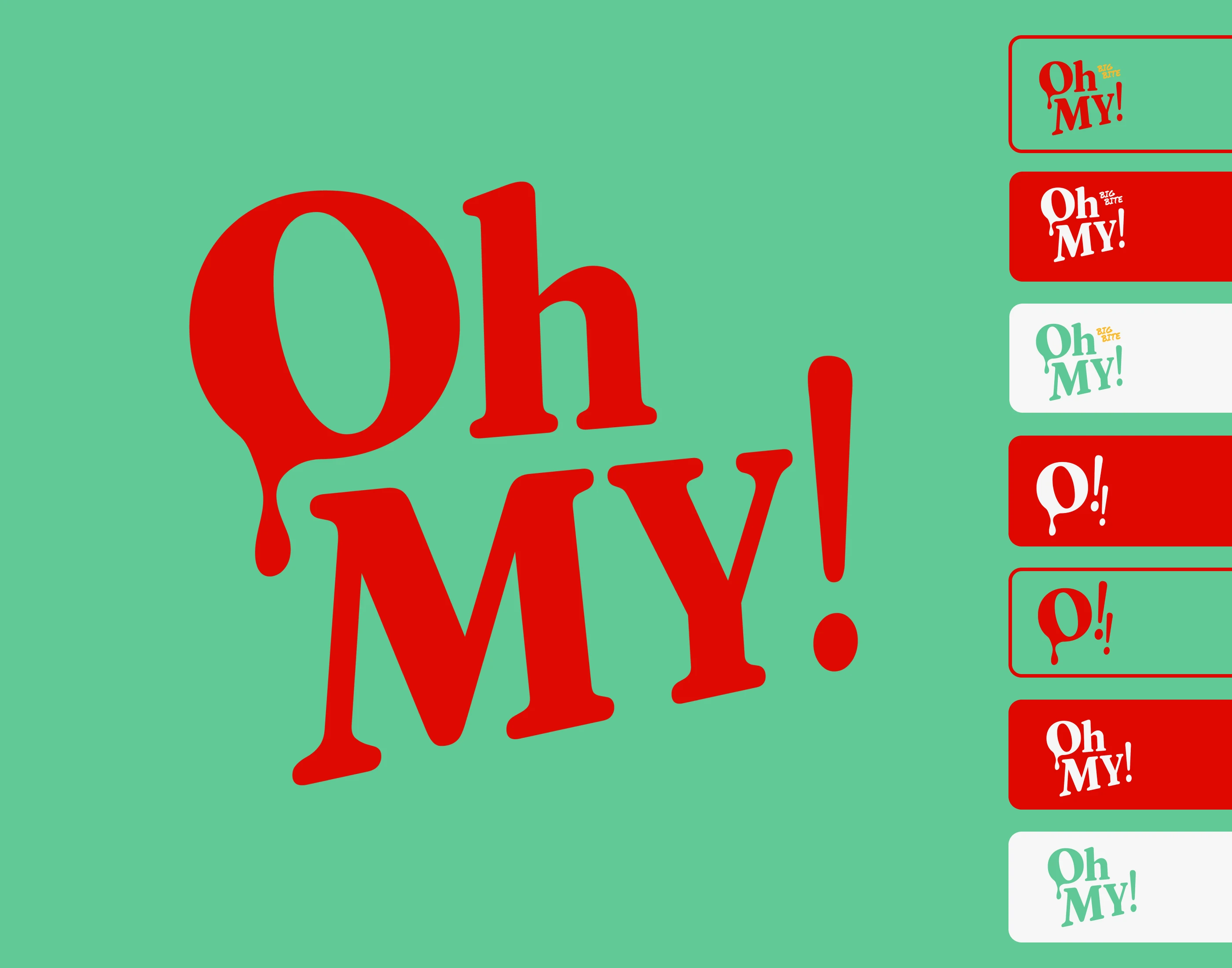
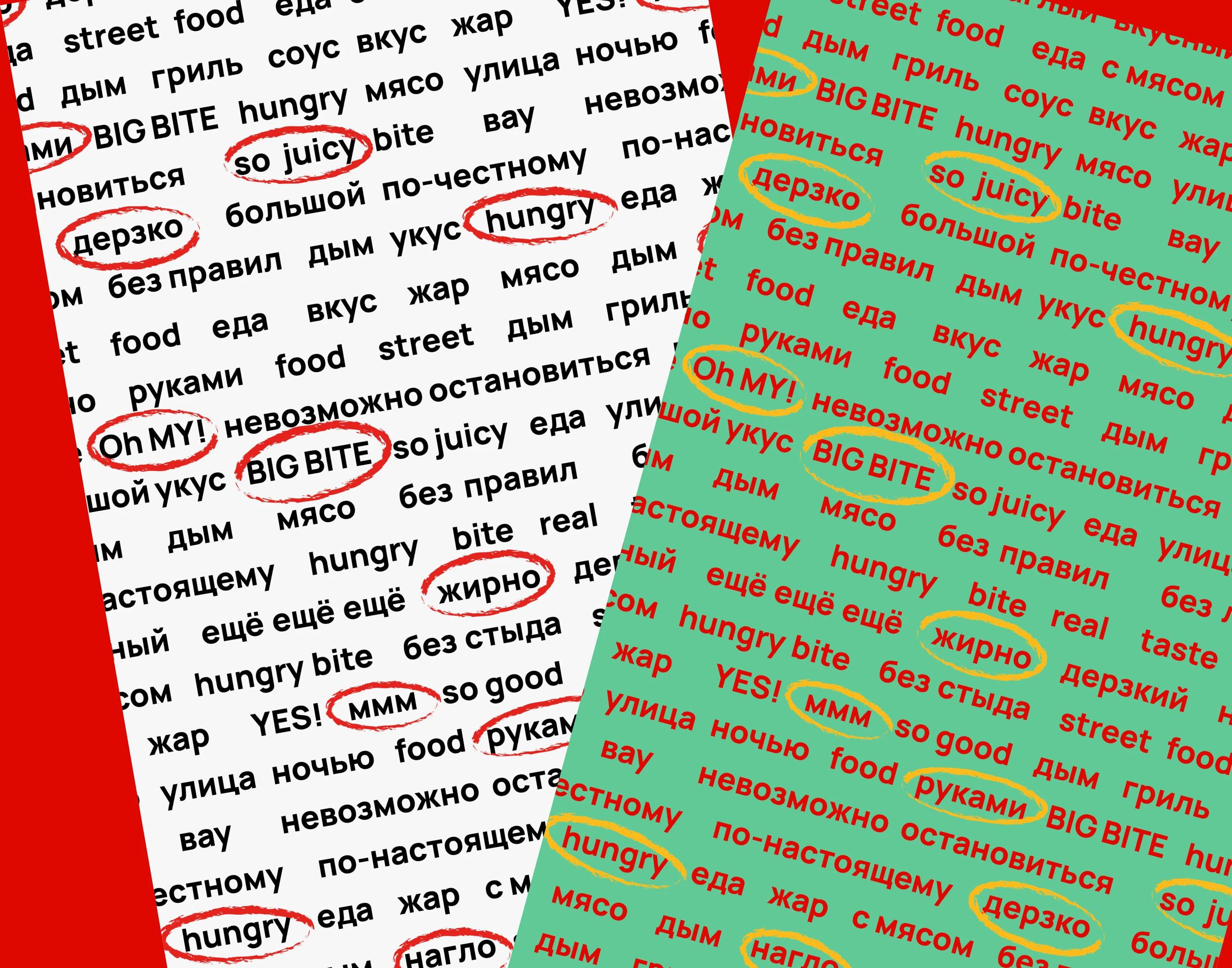
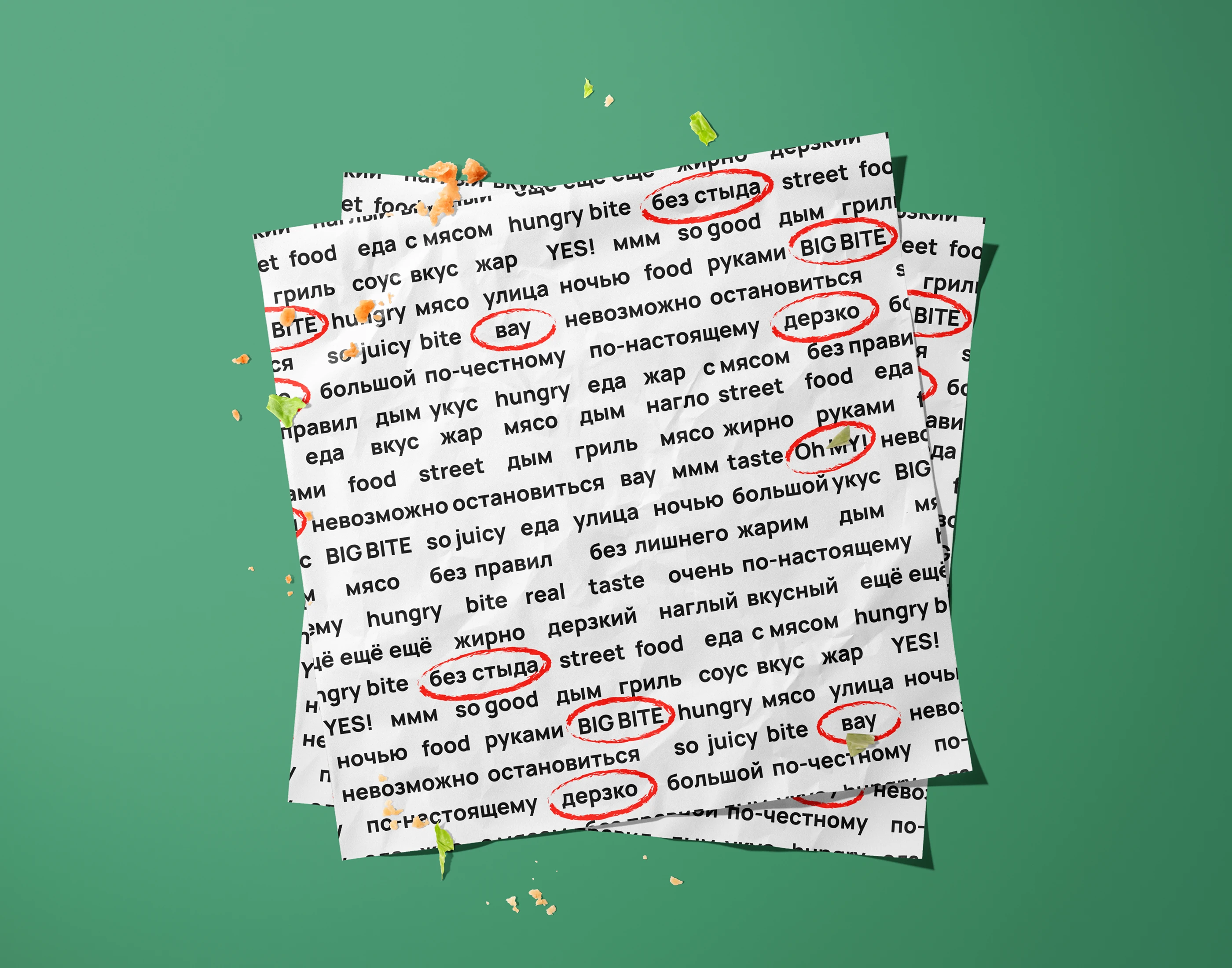
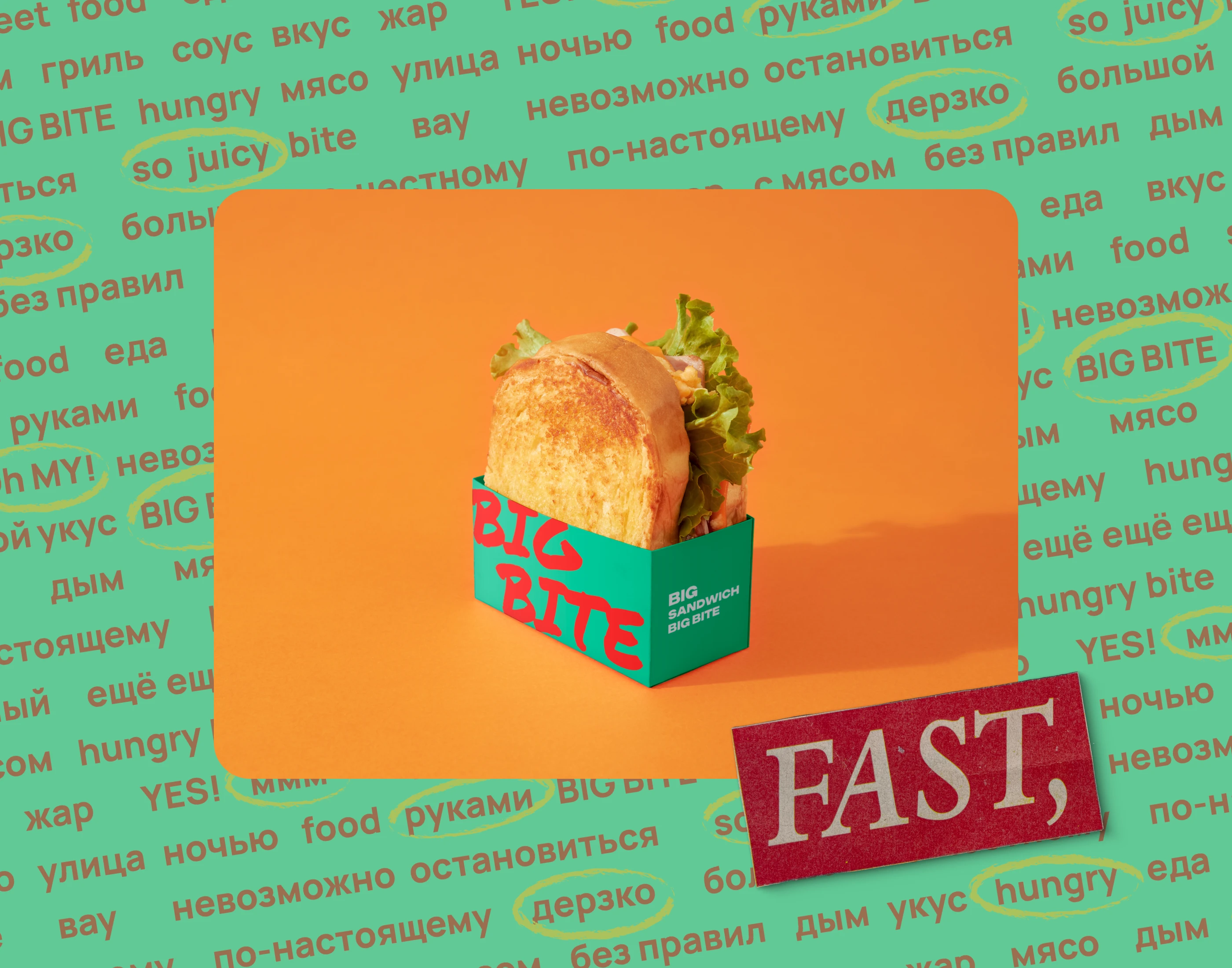
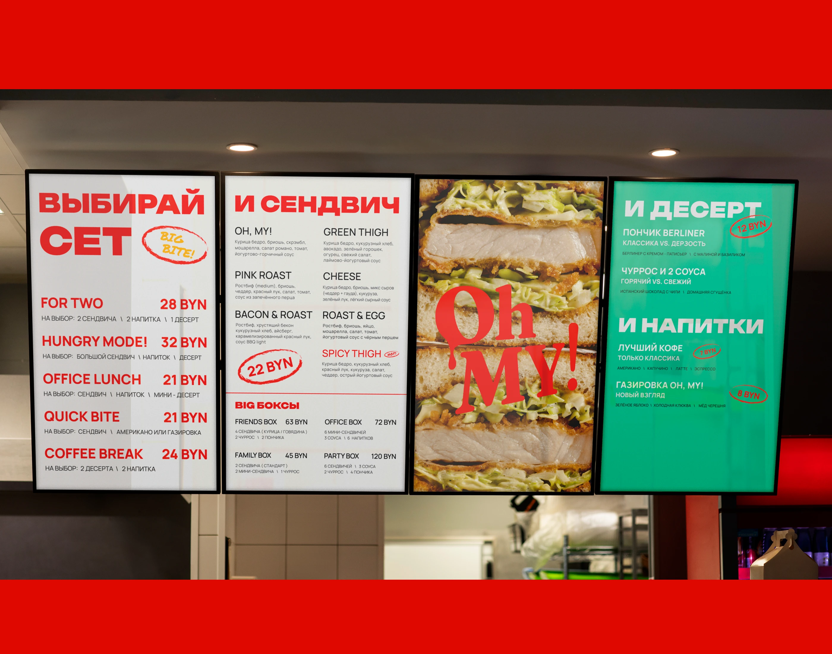
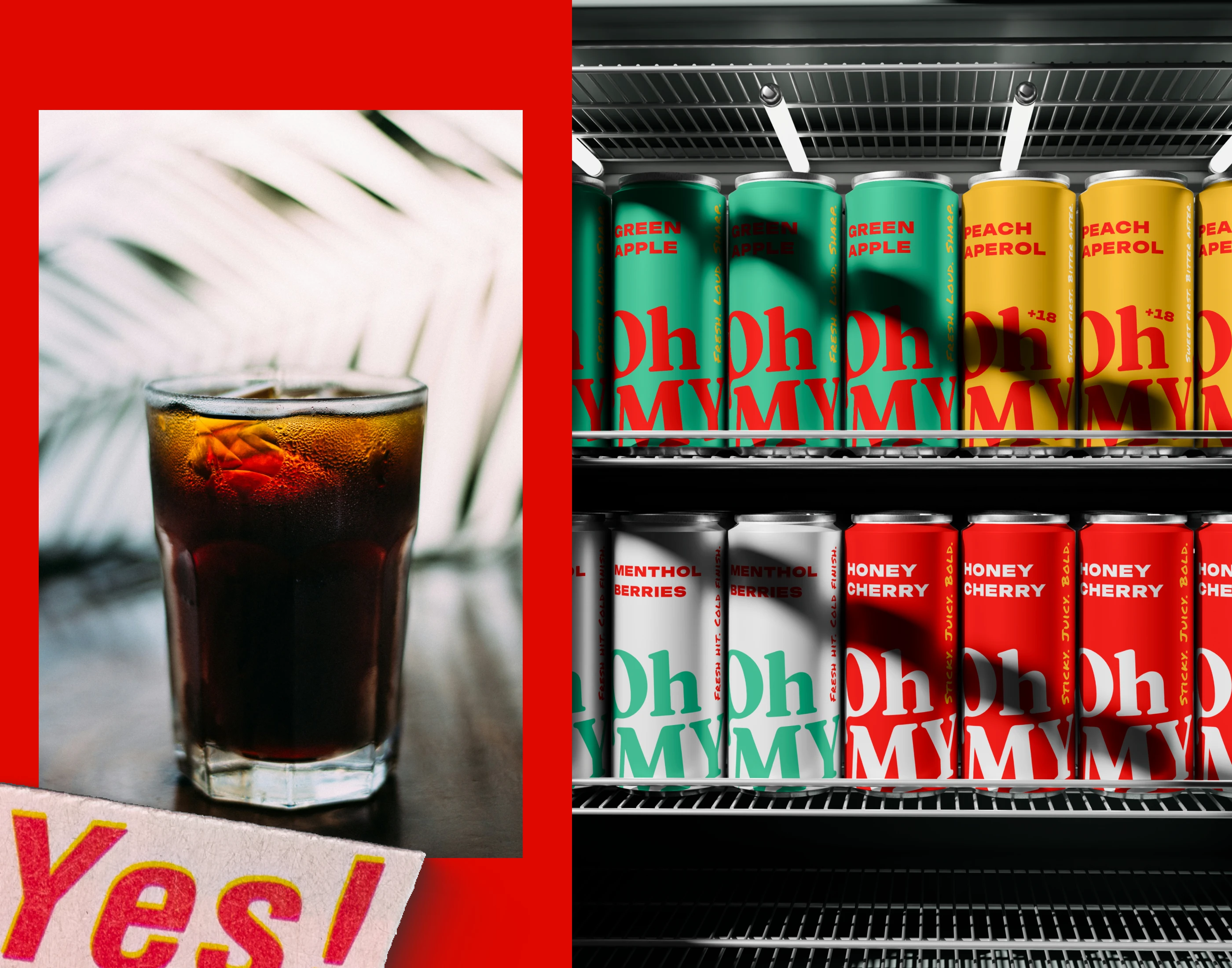
Oh MY! is a cohesive visual system where color, typography, graphics and logo work together to trigger one emotion — “I want this.”
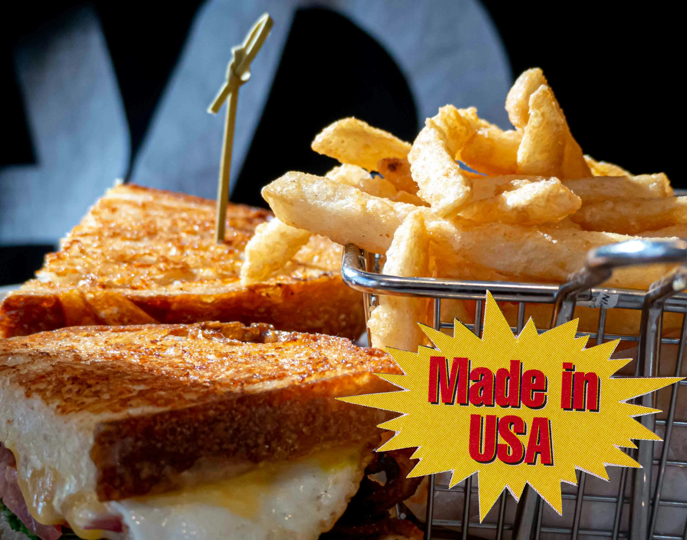
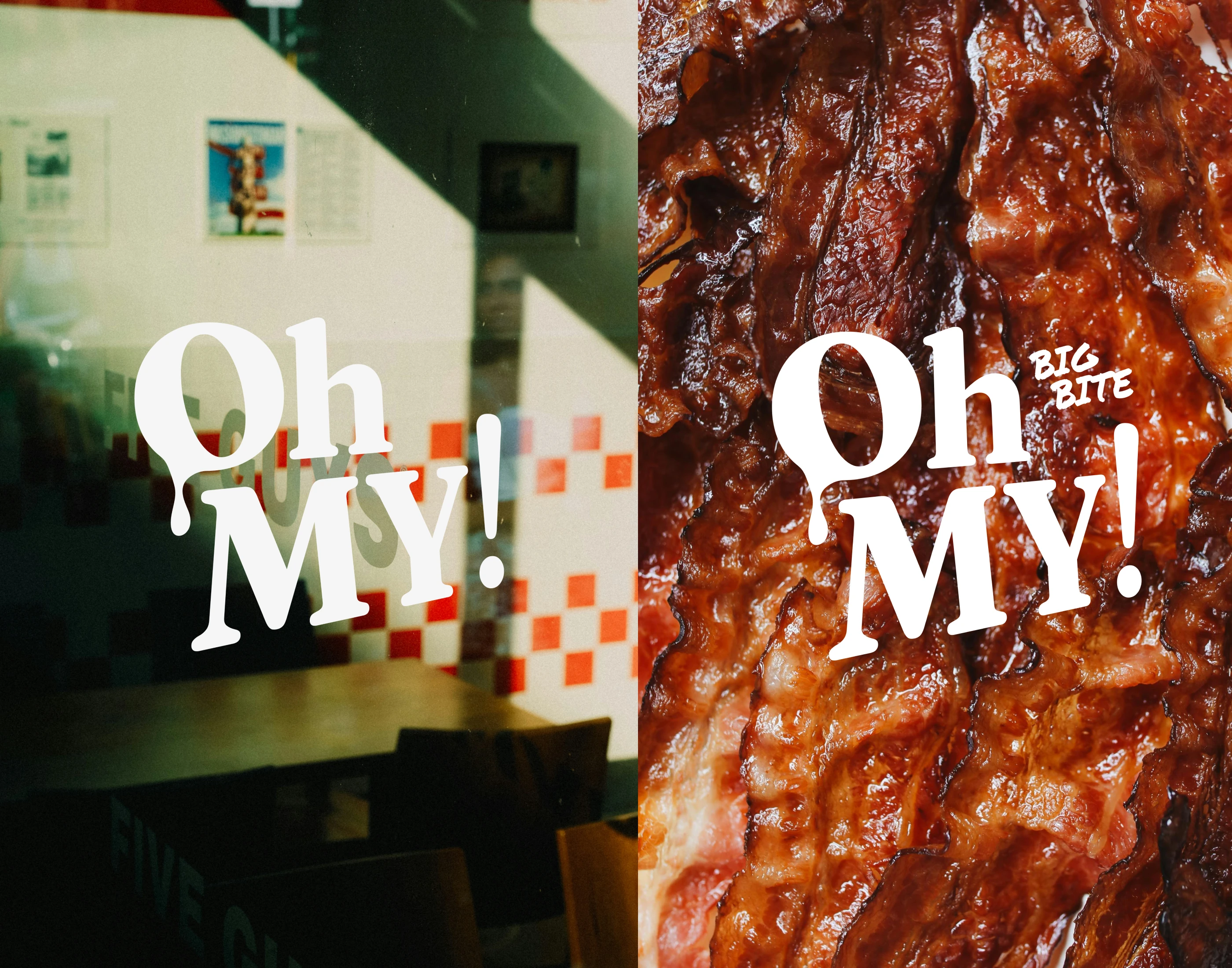
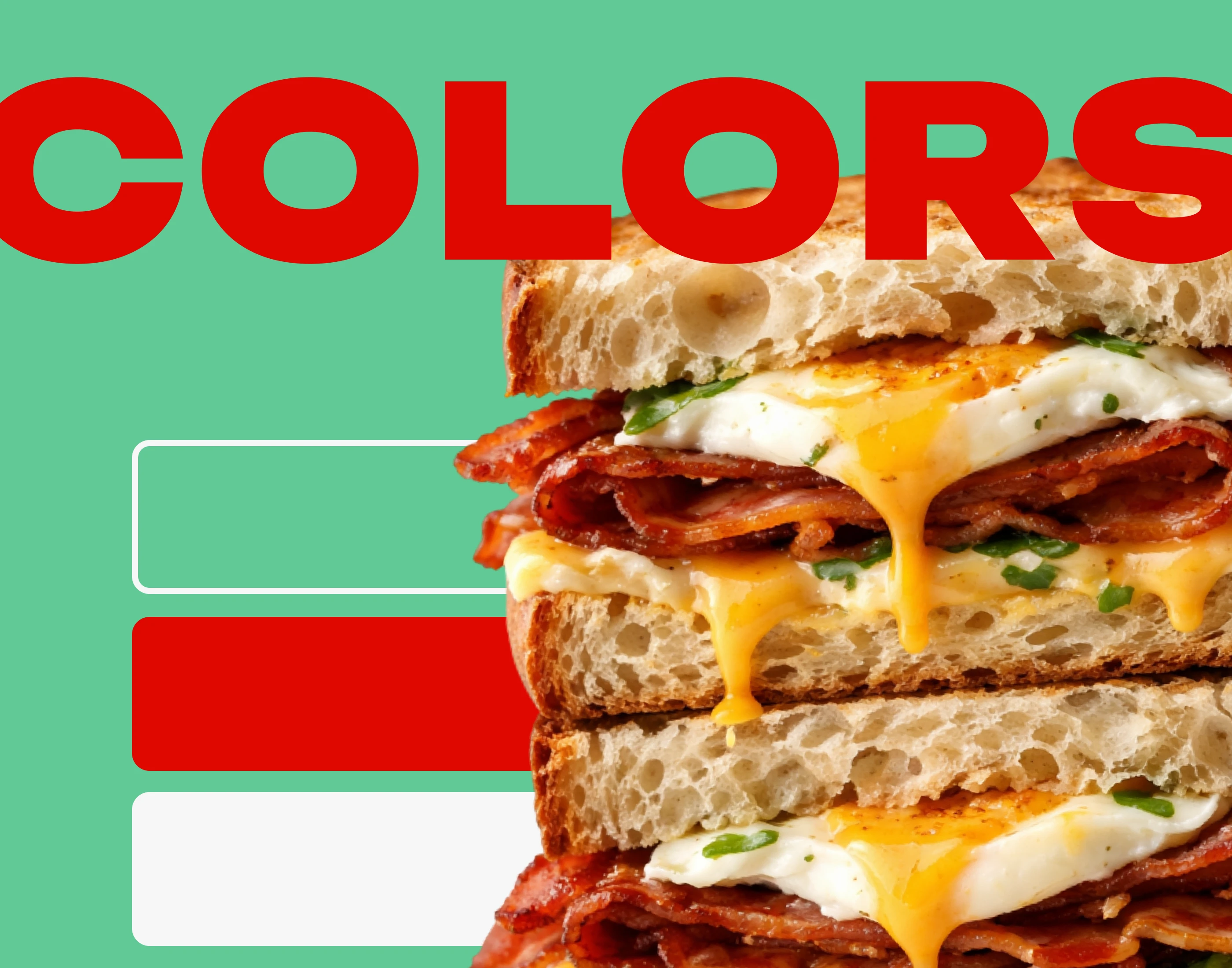
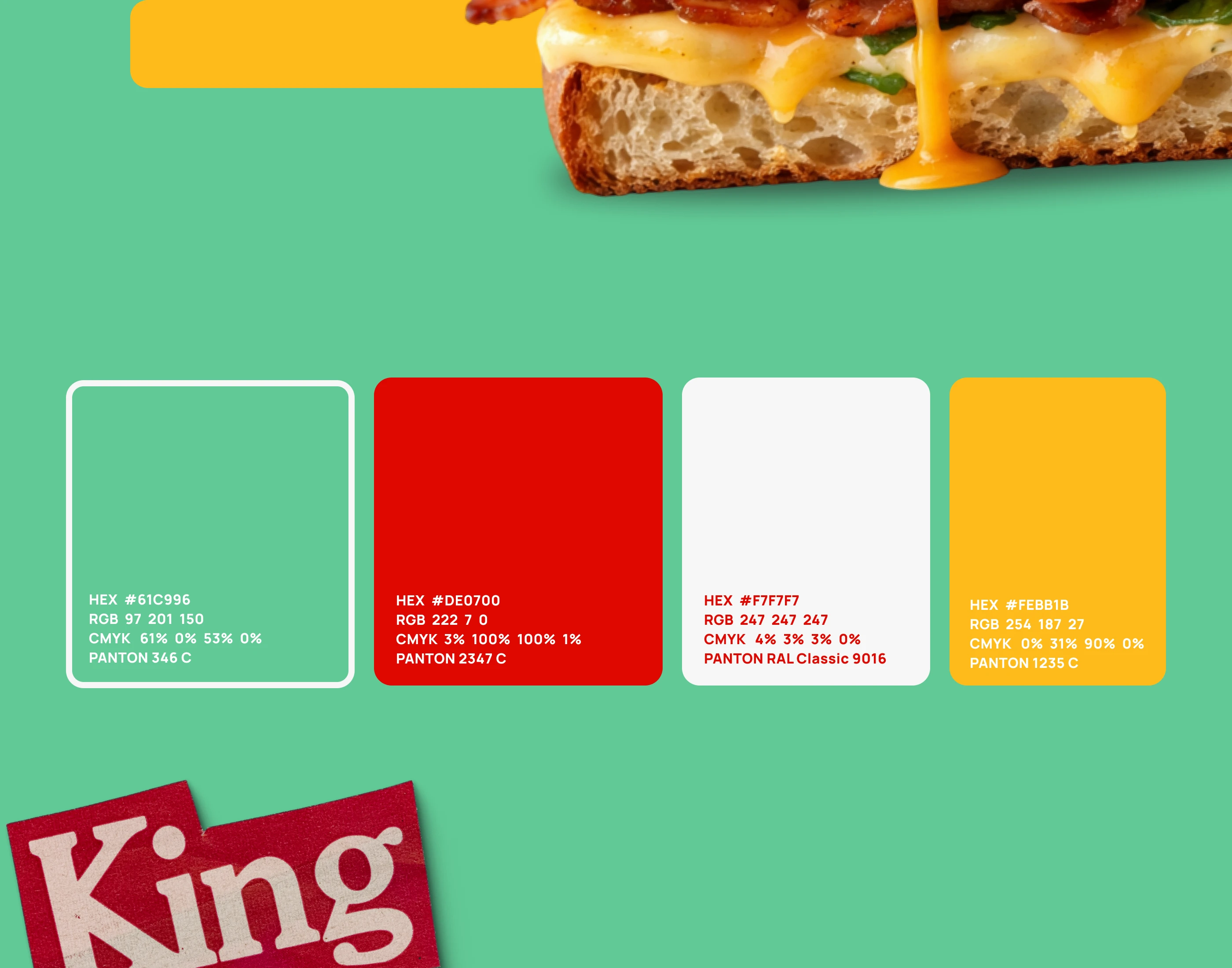
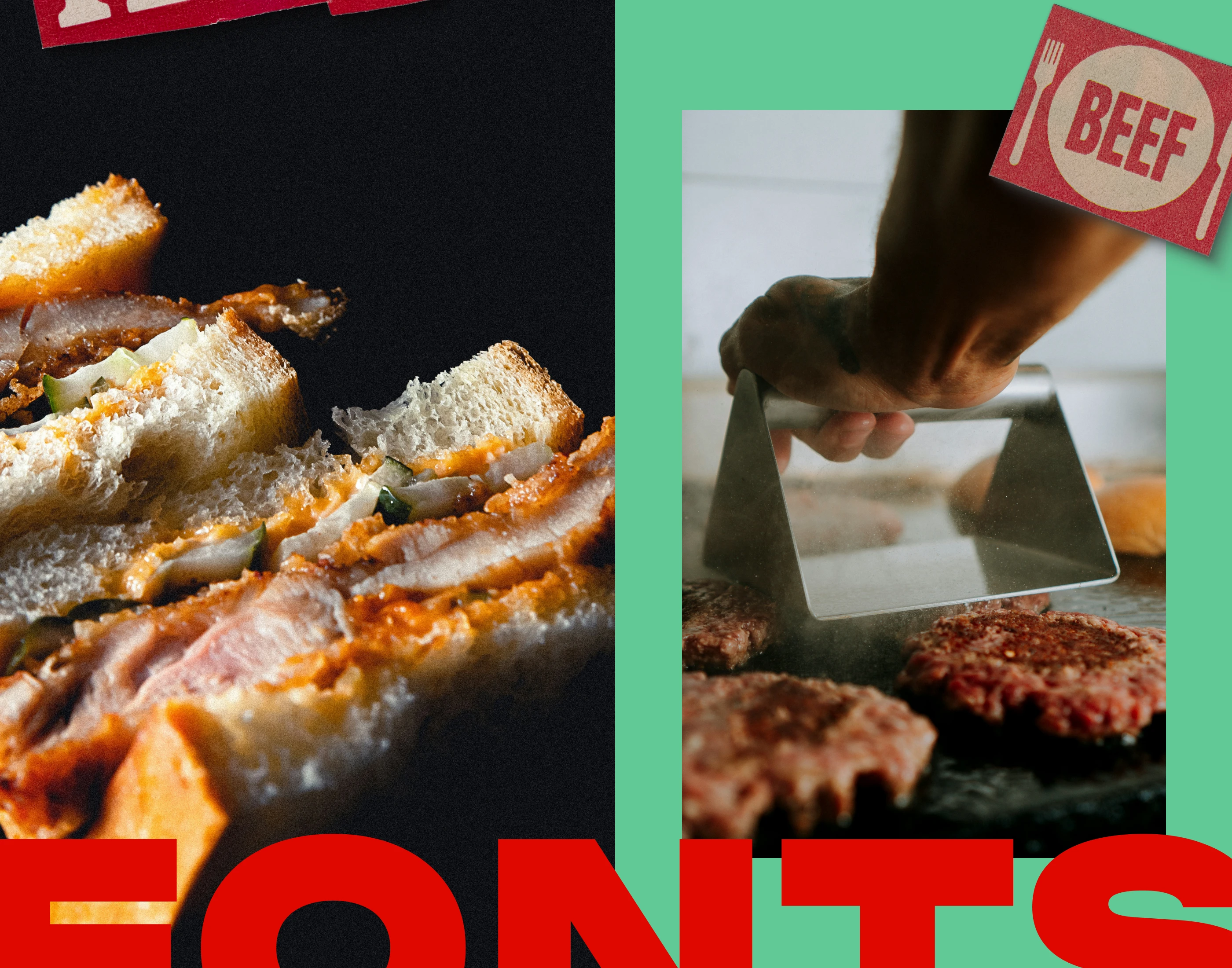
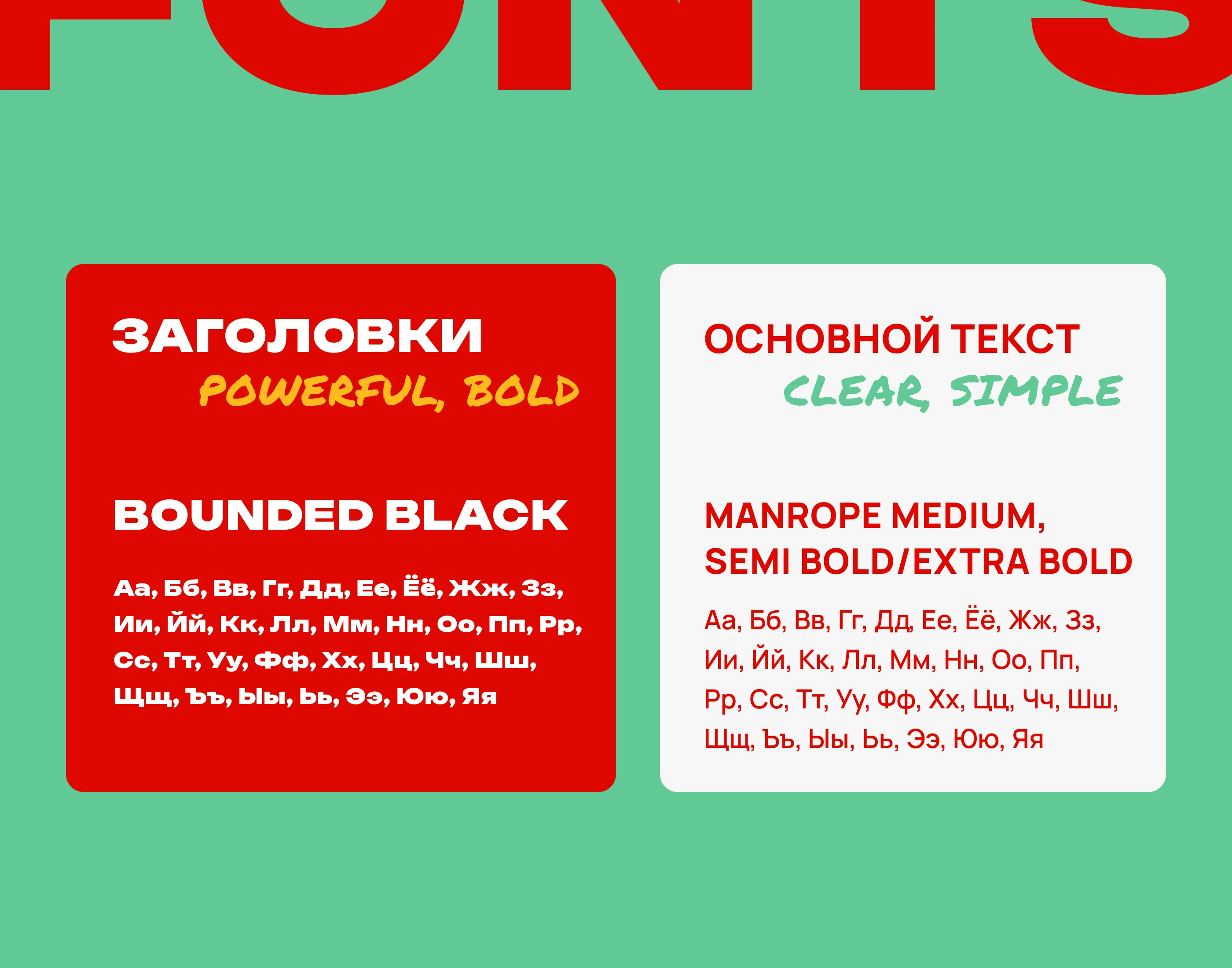
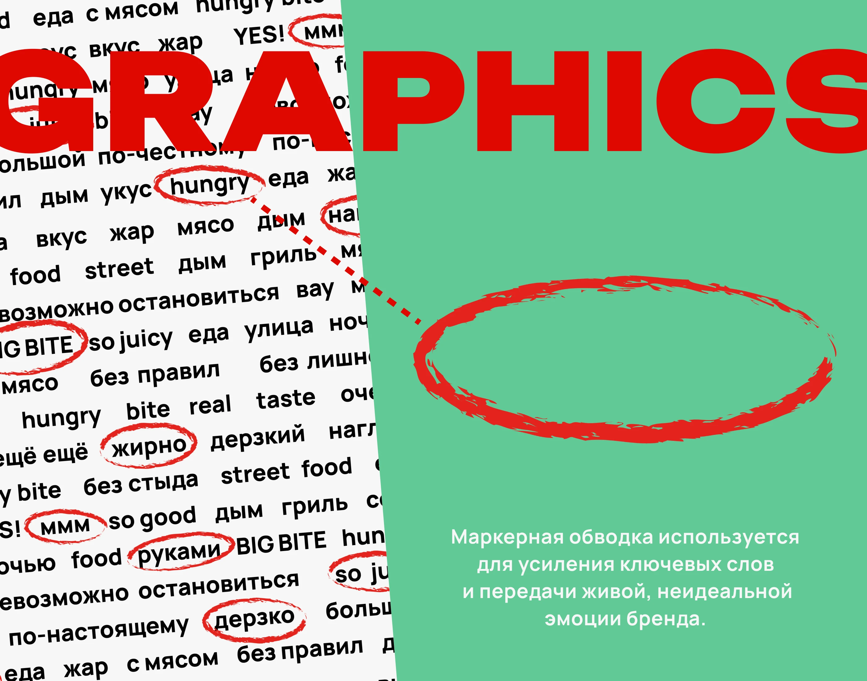
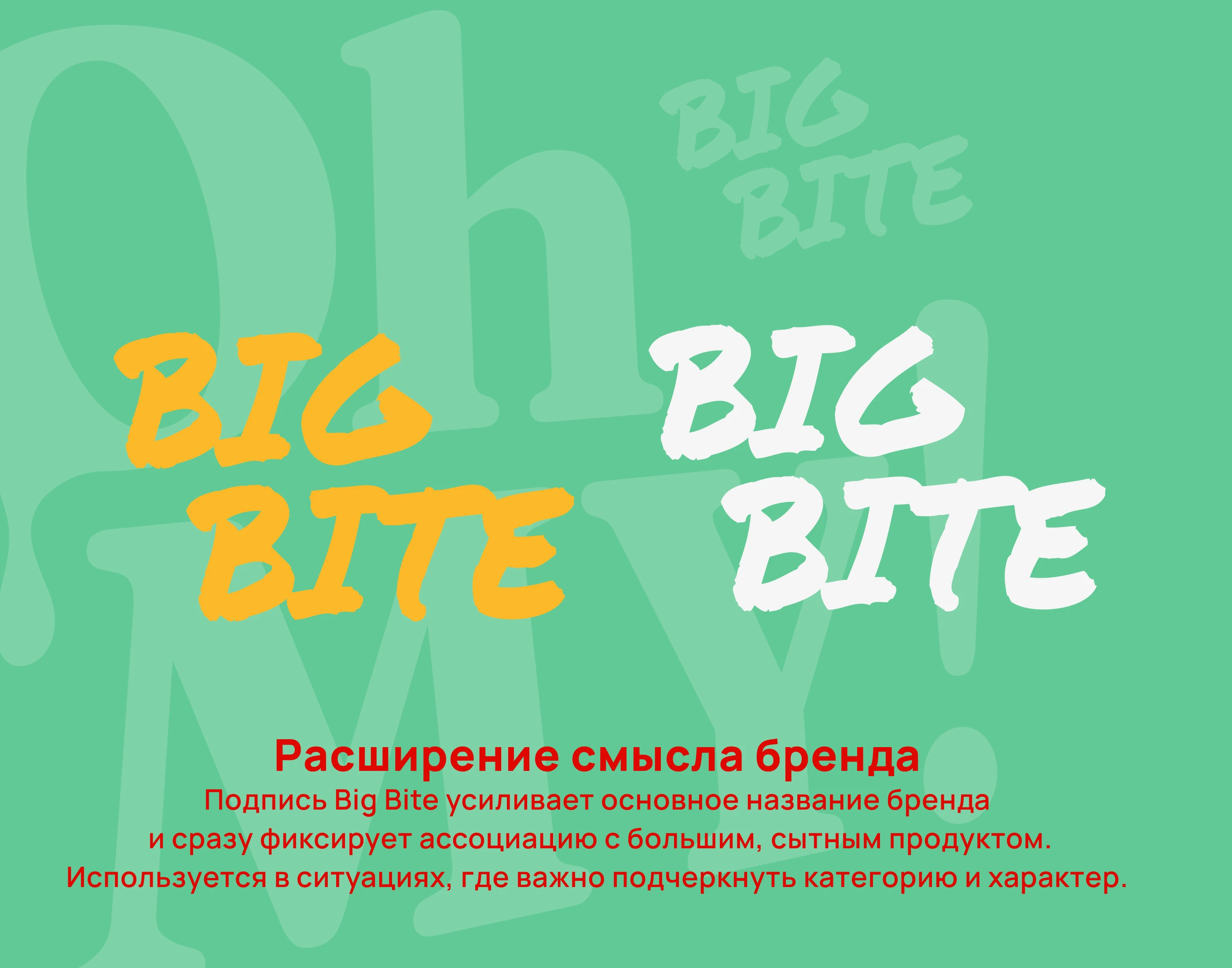
The high-contrast palette ensures visibility in the urban environment, bold typography communicates volume and indulgence, while graphic accents add energy and emotion. The logo captures juiciness and surprise, remaining both appetizing and functional across all formats.
The result is a contemporary street food identity for an audience that chooses with their eyes and reacts instantly.

