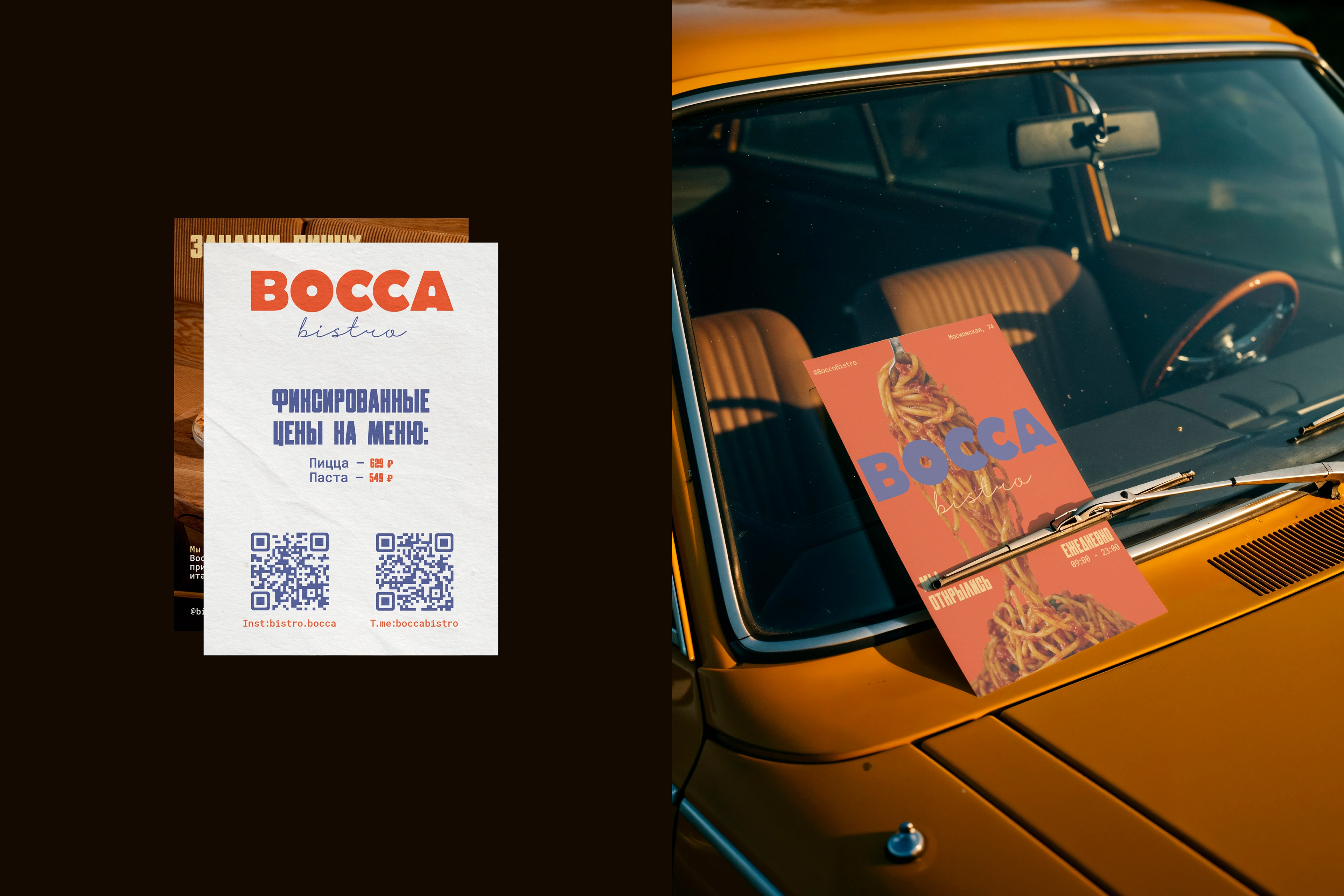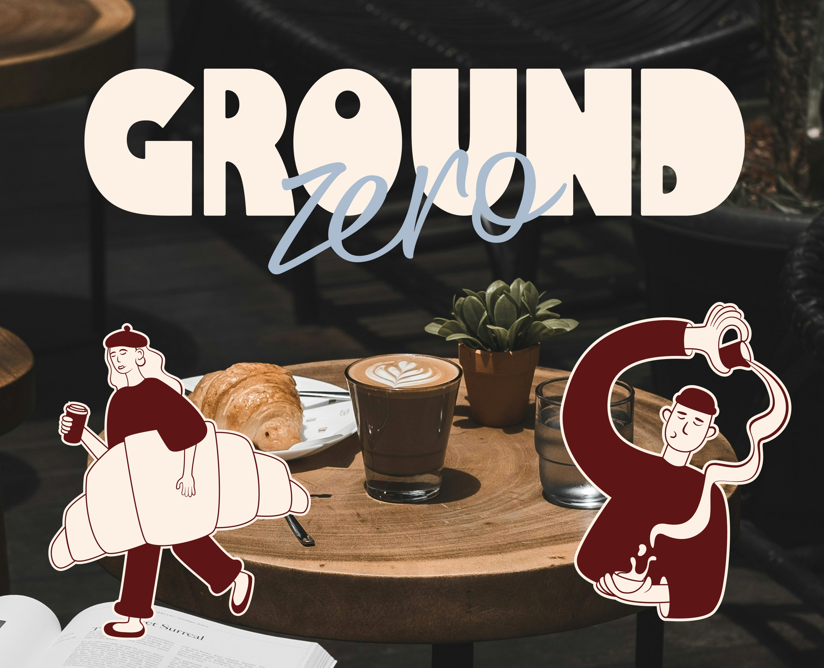
Objective:
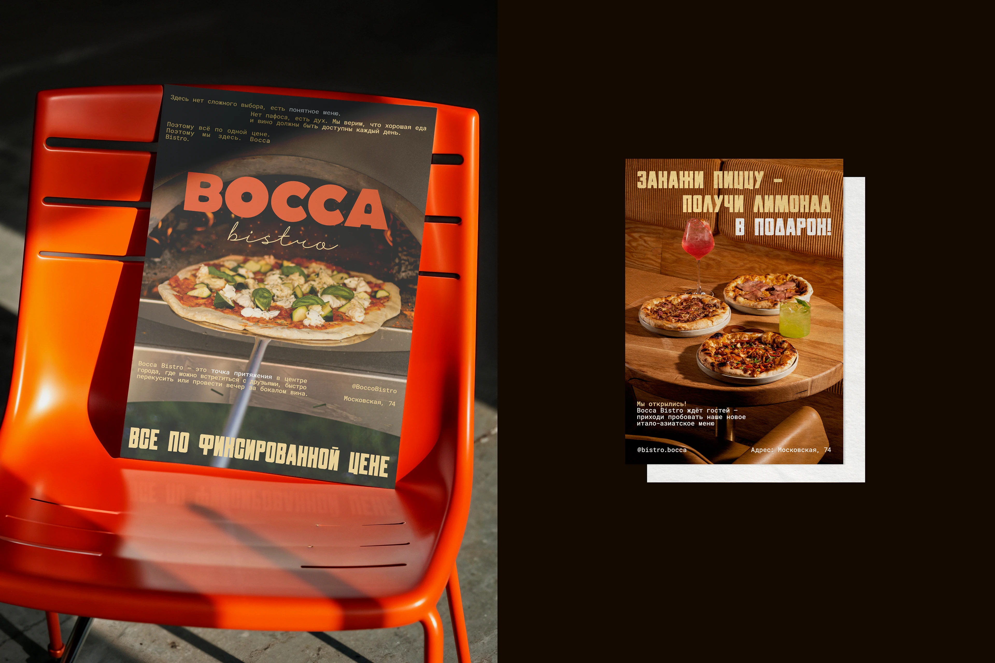
To create a visual language for an urban bistro — a place that becomes an anchor point in the rhythm of the city. The brand must communicate with an active, open-minded audience, avoiding pretension and clichés, and convey its core value: a fixed price for the entire menu.
Concept:
"Urban energy with an Italian spirit." A focus on honesty, simplicity, and authentic character. The identity is built on contrast — between the industrial charm of brick walls and the warmth of lively typography.
Key Solution:
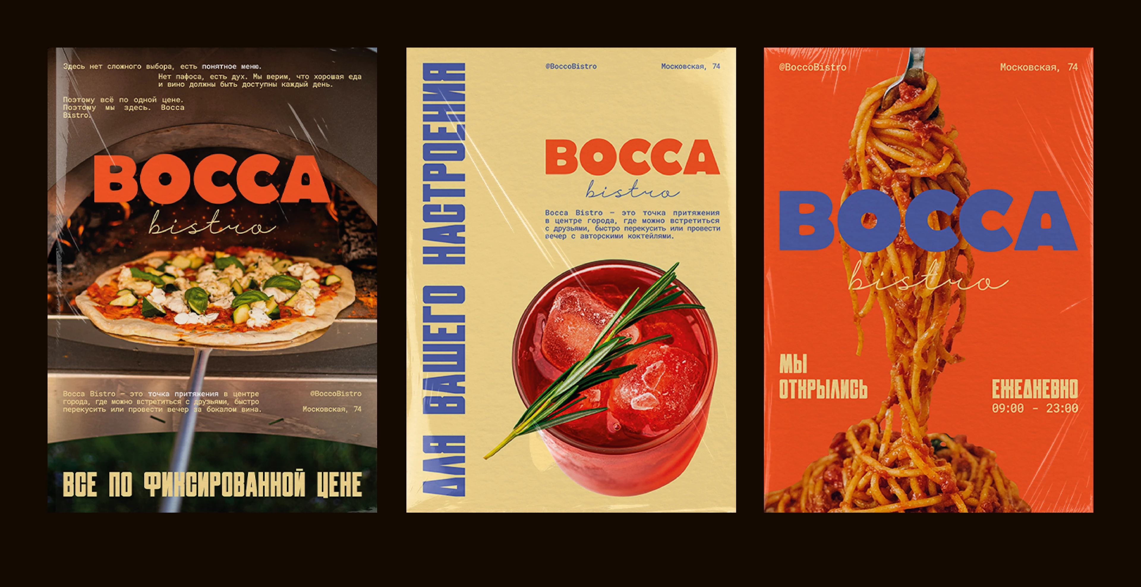
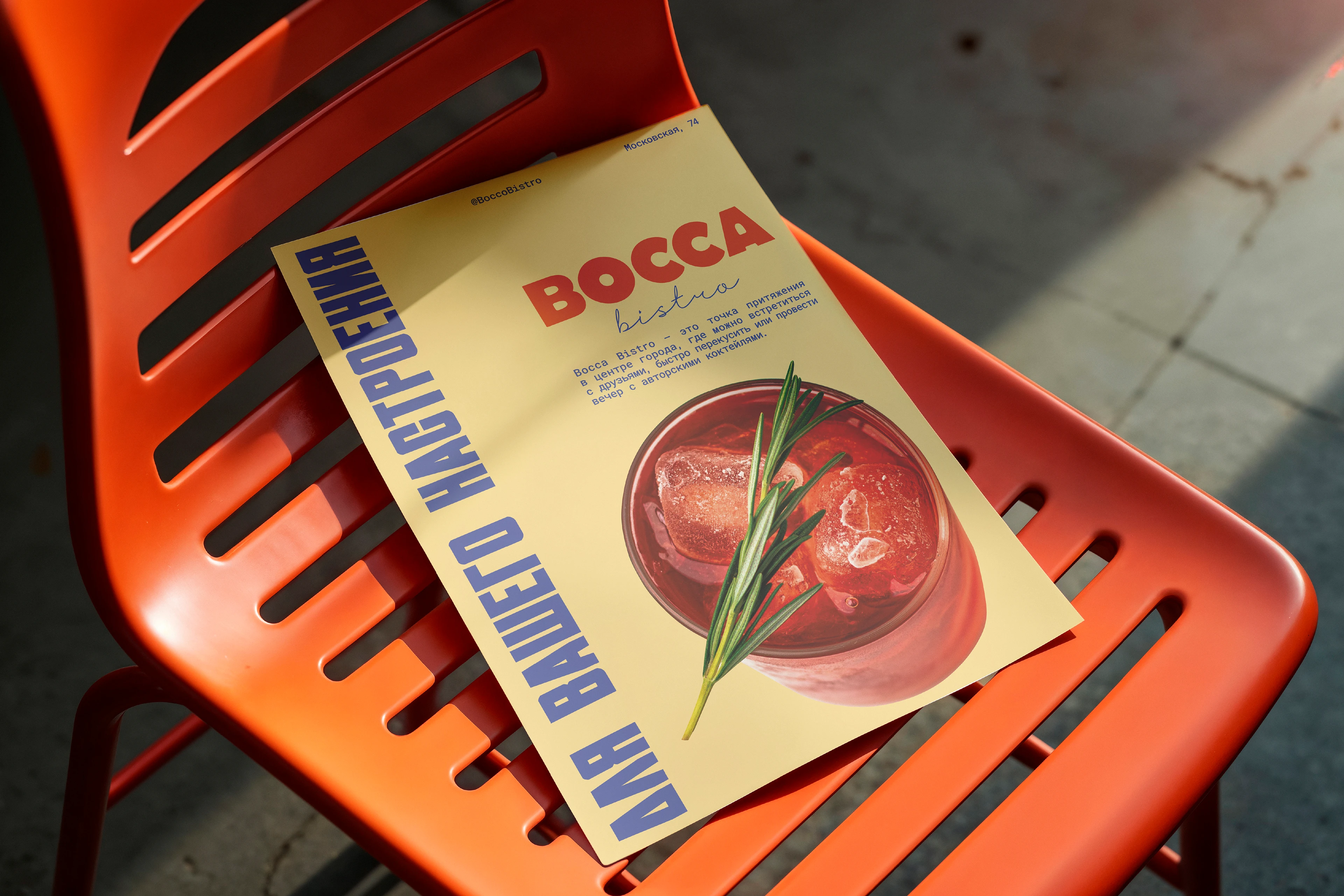
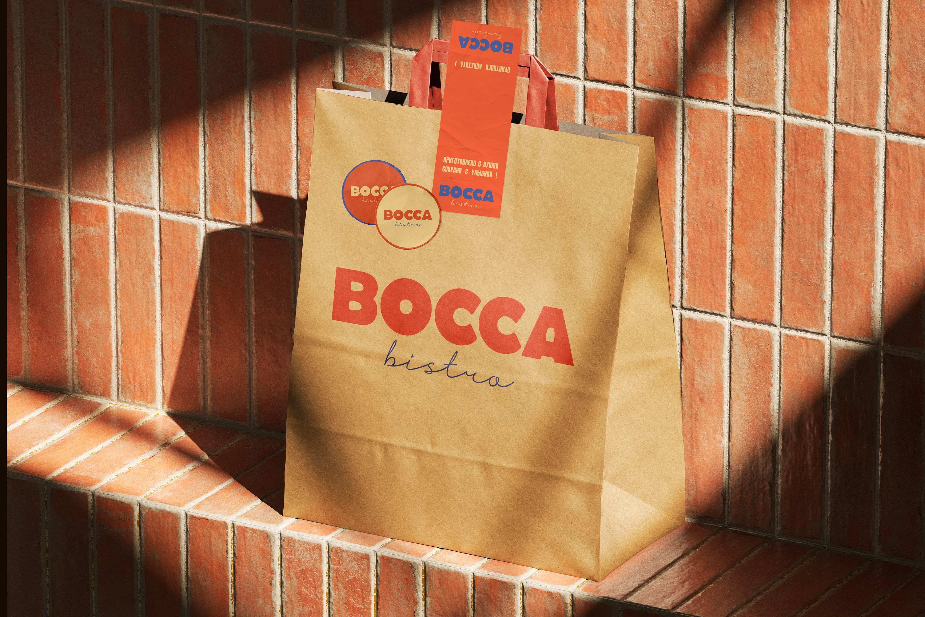
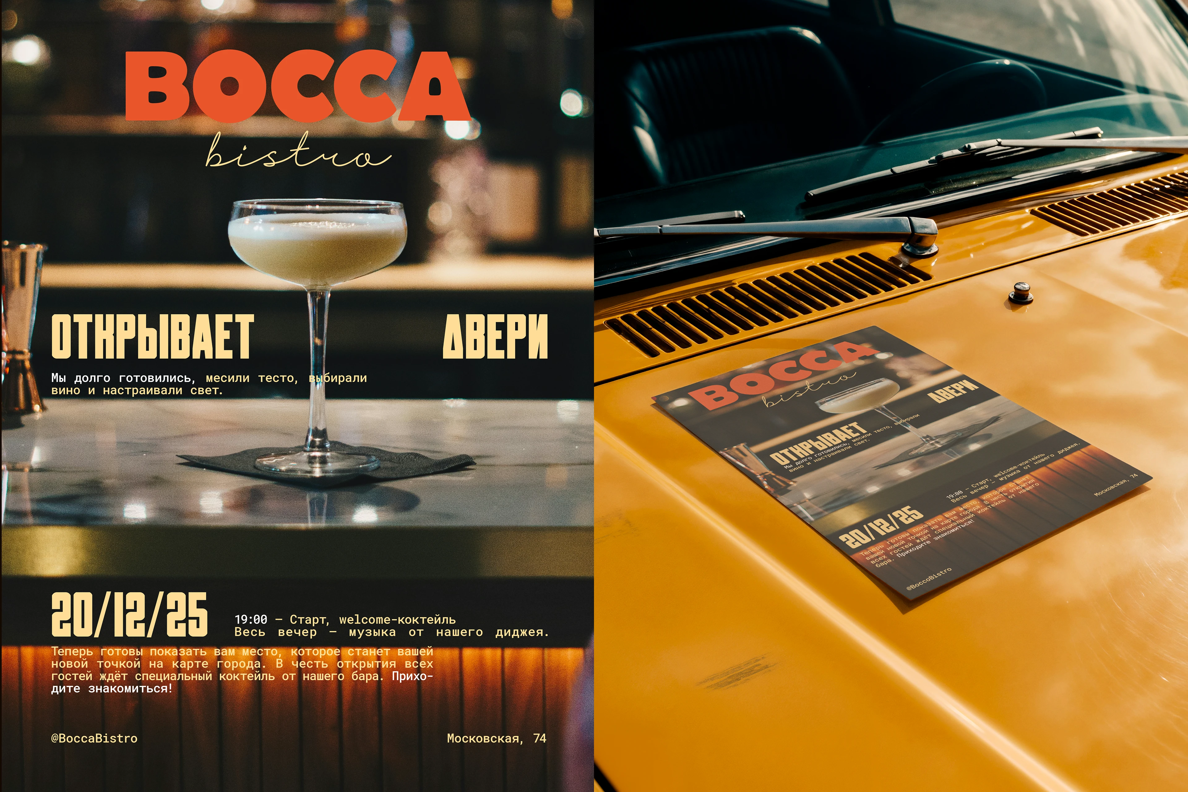
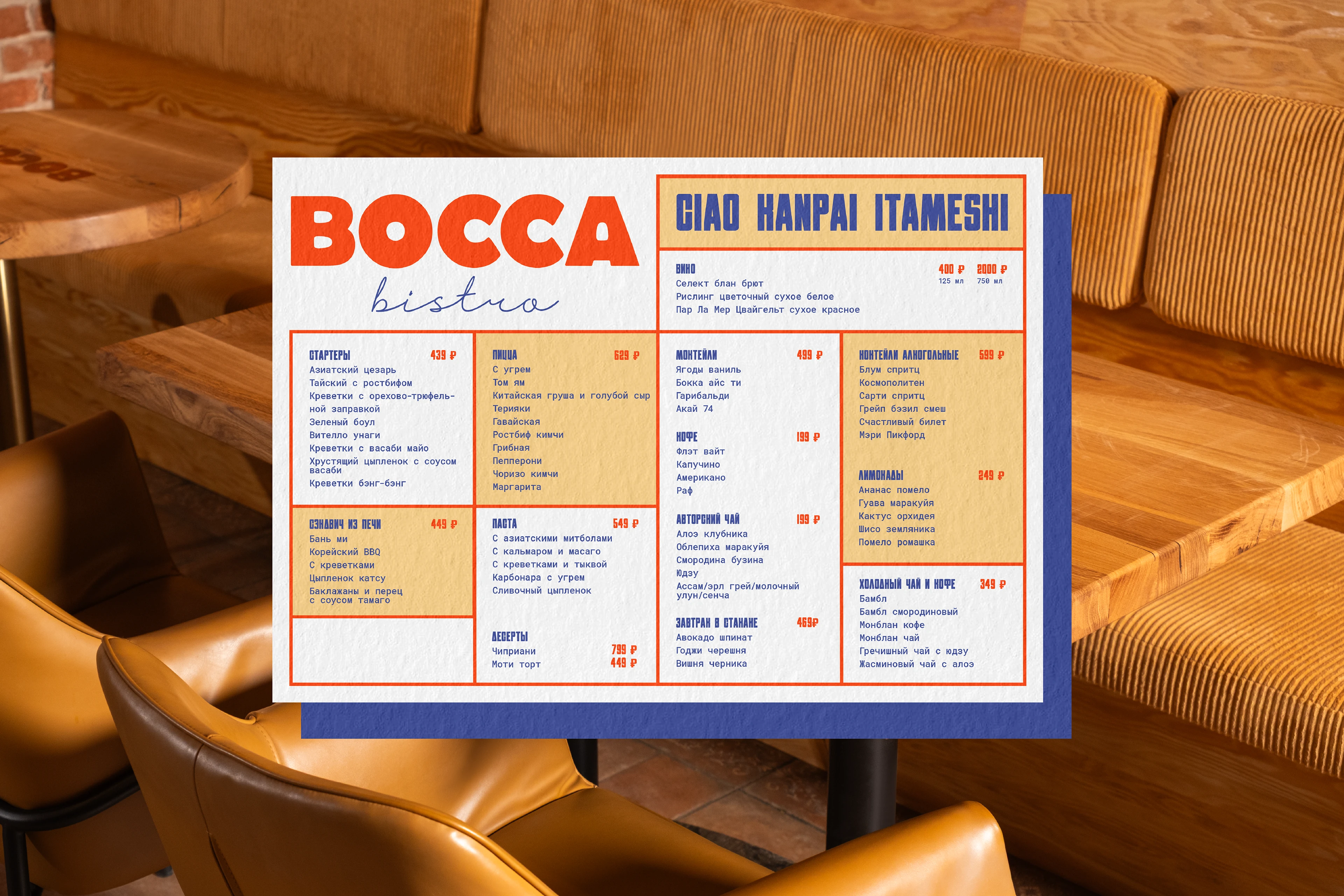
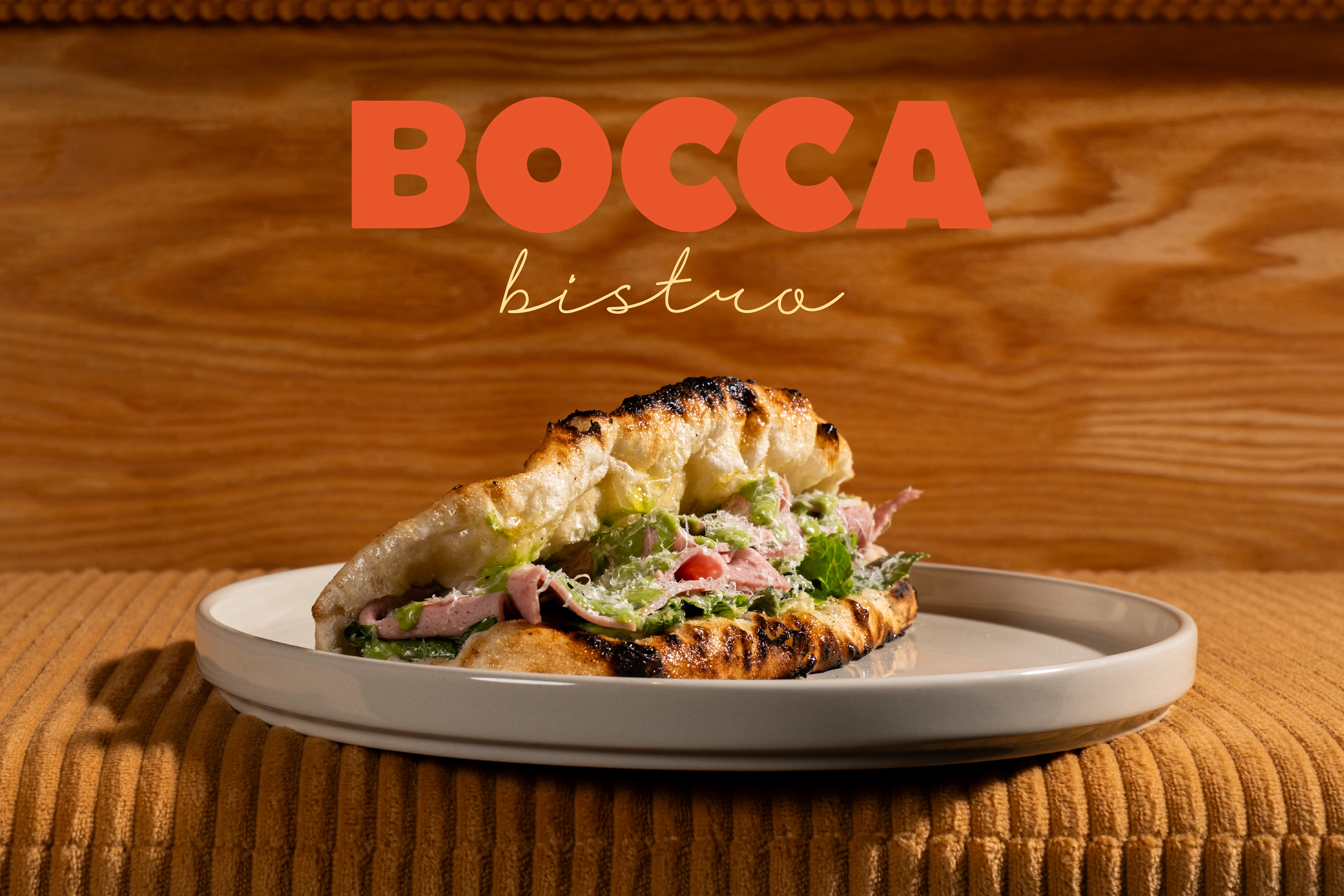
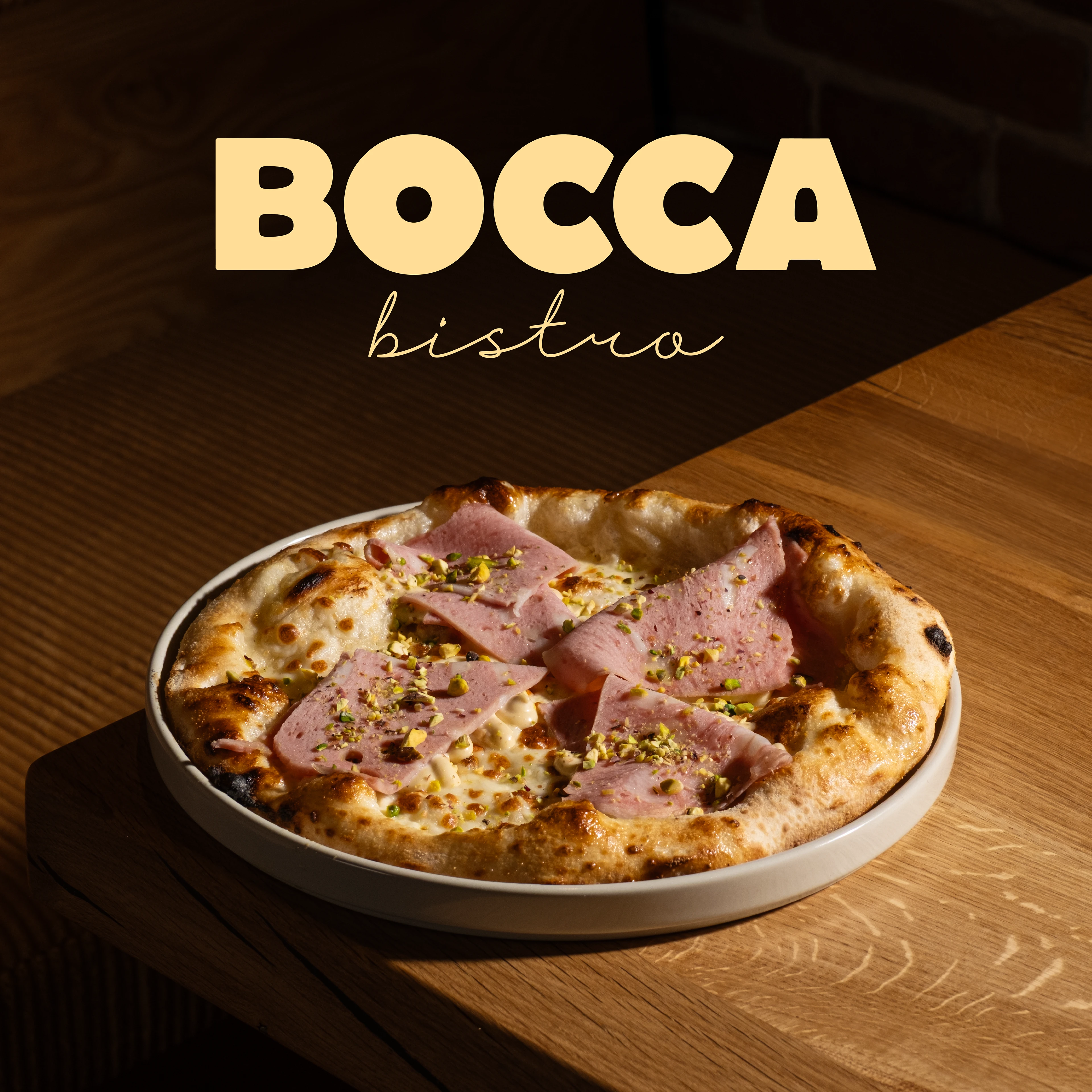
At the heart of the system is a custom soft grotesque typeface, which adds tactility and a handmade feel to the letterforms. This approach created a unique balance between a vintage flair and contemporary energy. A vivid contrast with a lively handwritten descriptor completed the image, making it both friendly and memorable.
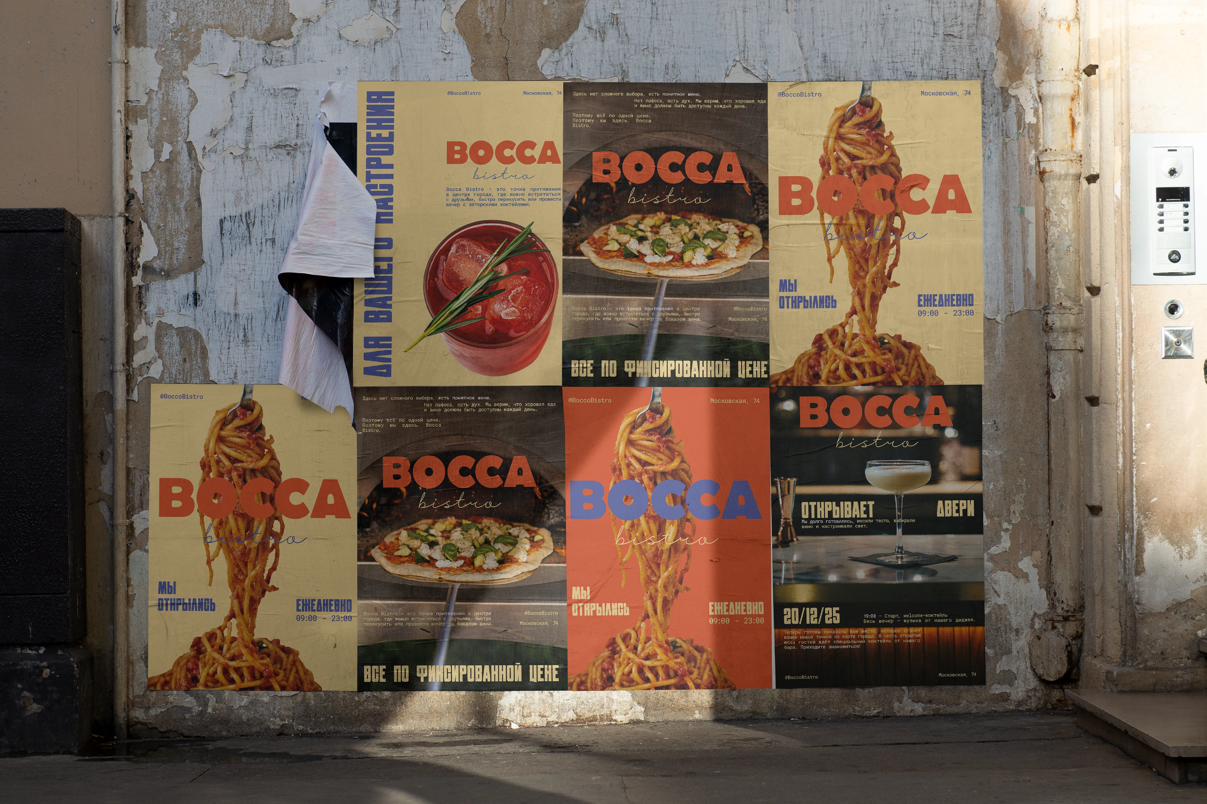
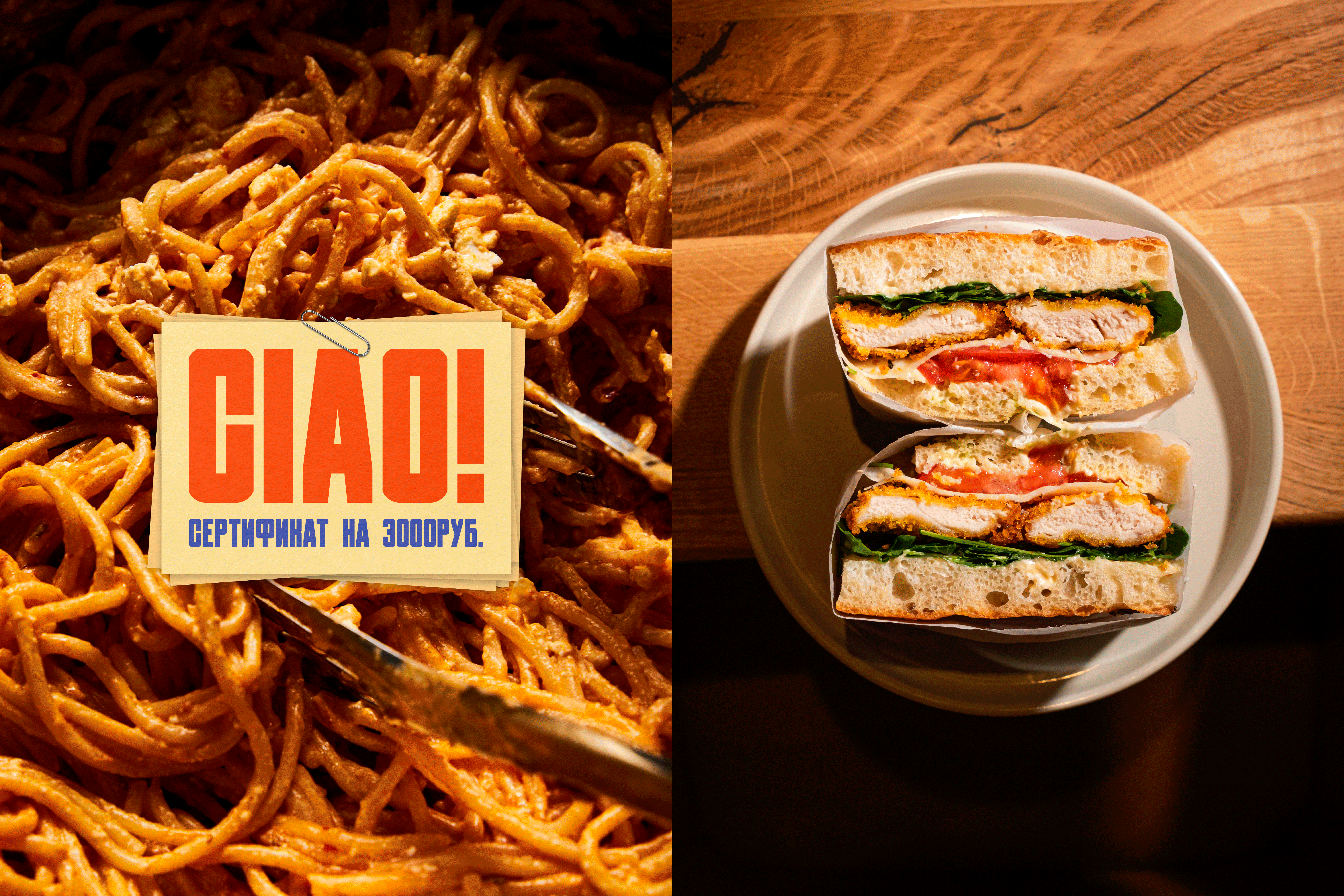
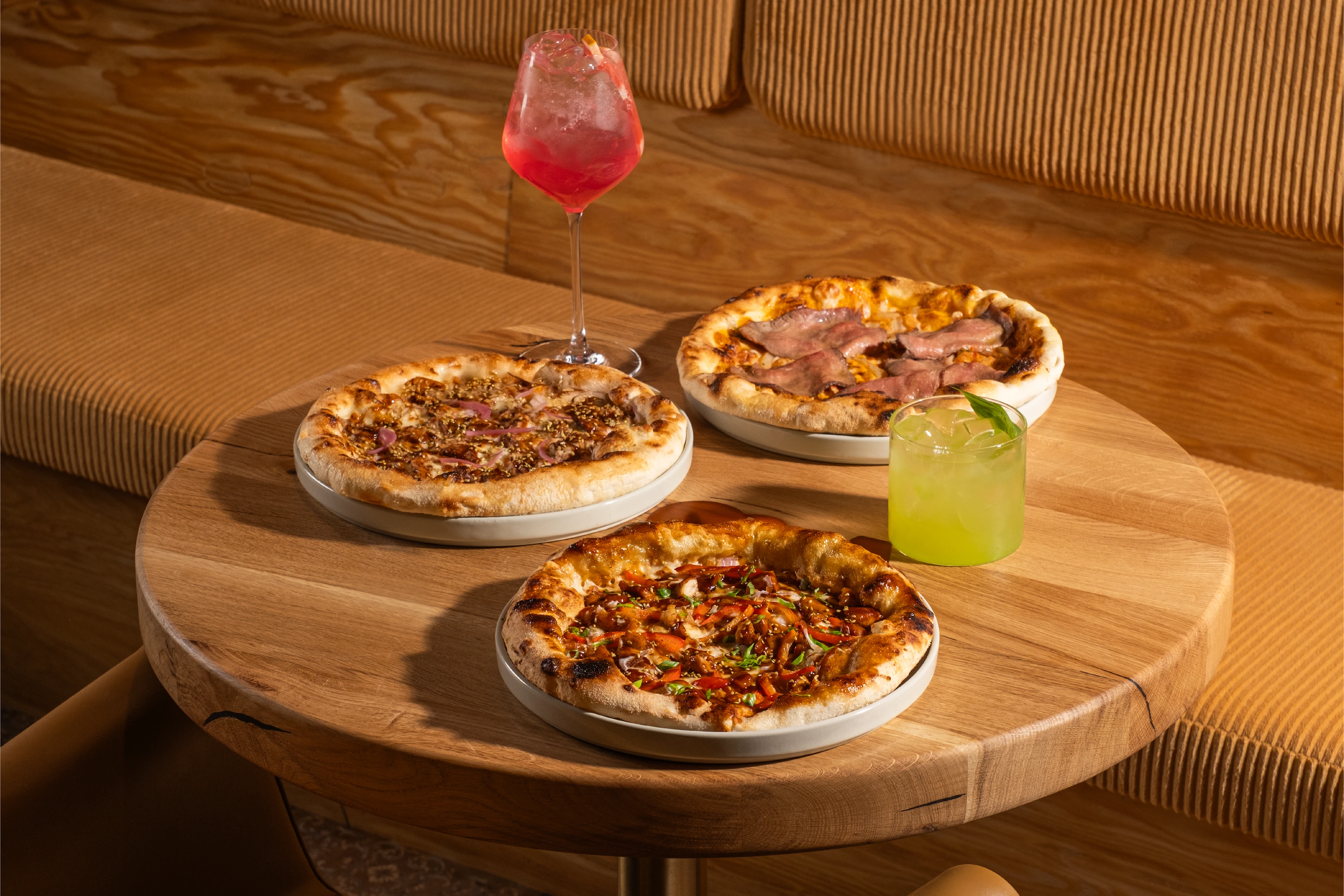
The developed typography became the foundation of the entire system: from the logo and menu to a series of posters. Each touchpoint is a dialogue with the guest, where graphics work to build atmosphere, not just decoration. The menu design, with clear navigation and brand accents, turns choosing a dish into an intuitive and stylish experience.
The Bocca Bistro identity is more than just a set of elements. It's a cohesive environment where the typeface "smells" of fresh pizza and the posters convey the rhythm of the evening. The system is designed to make the brand feel "like your own" from the very first glance.
designer: Elena Korobkina