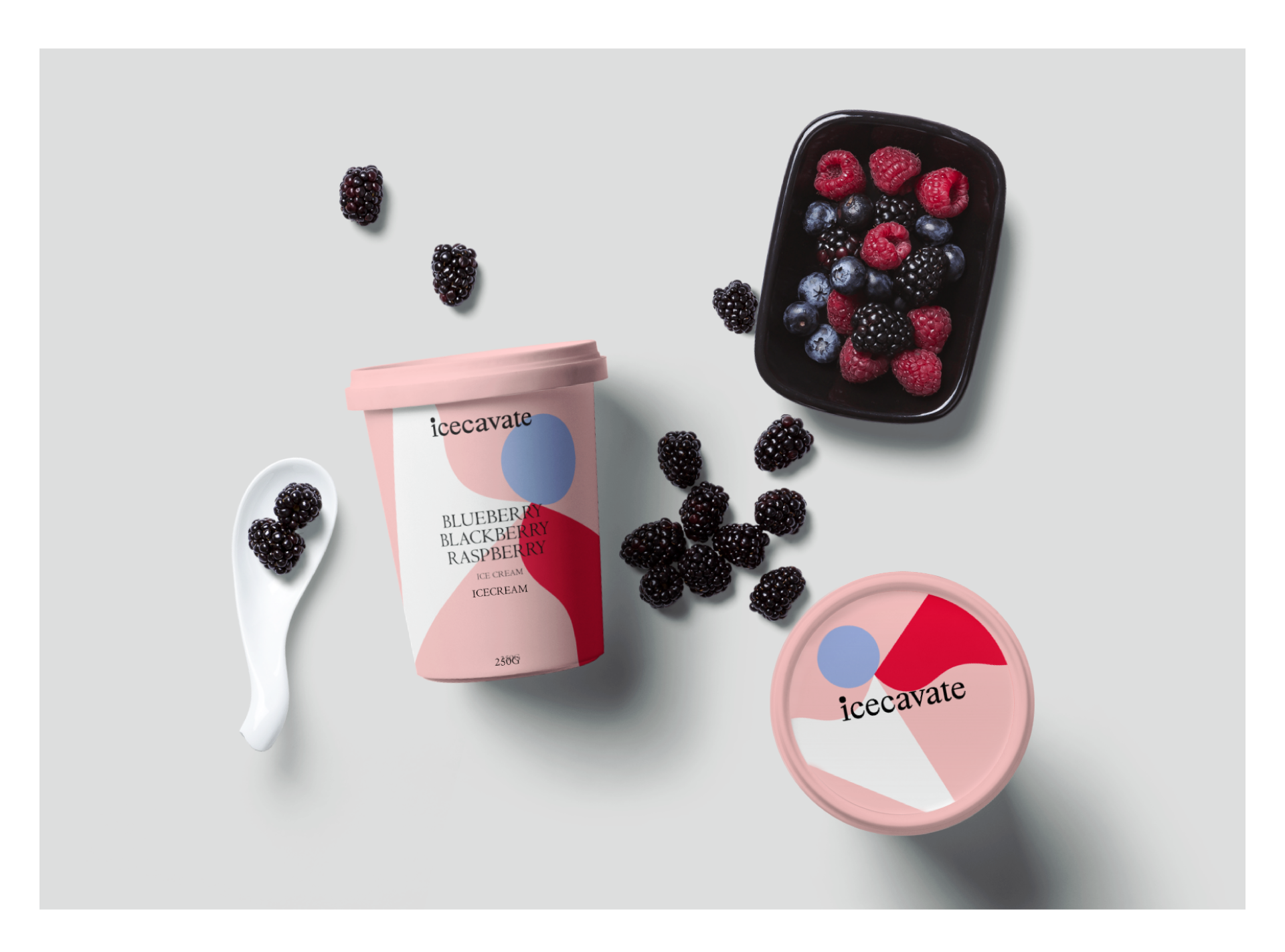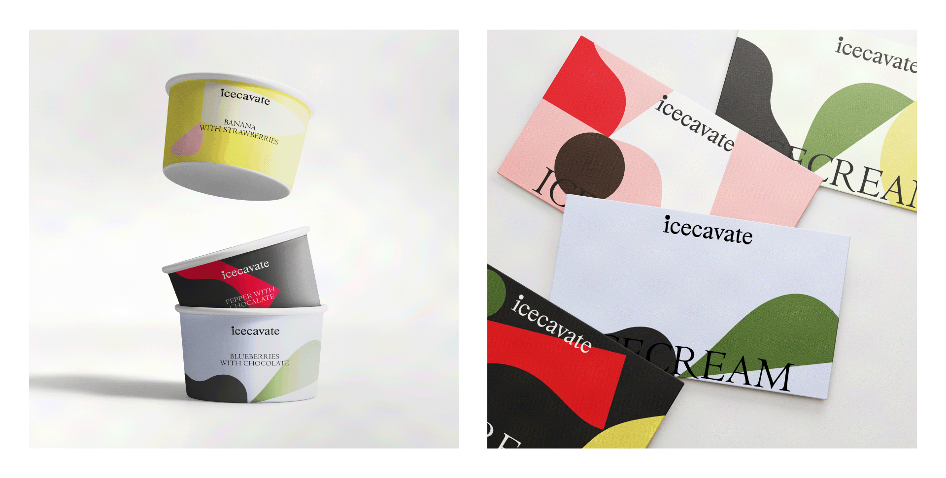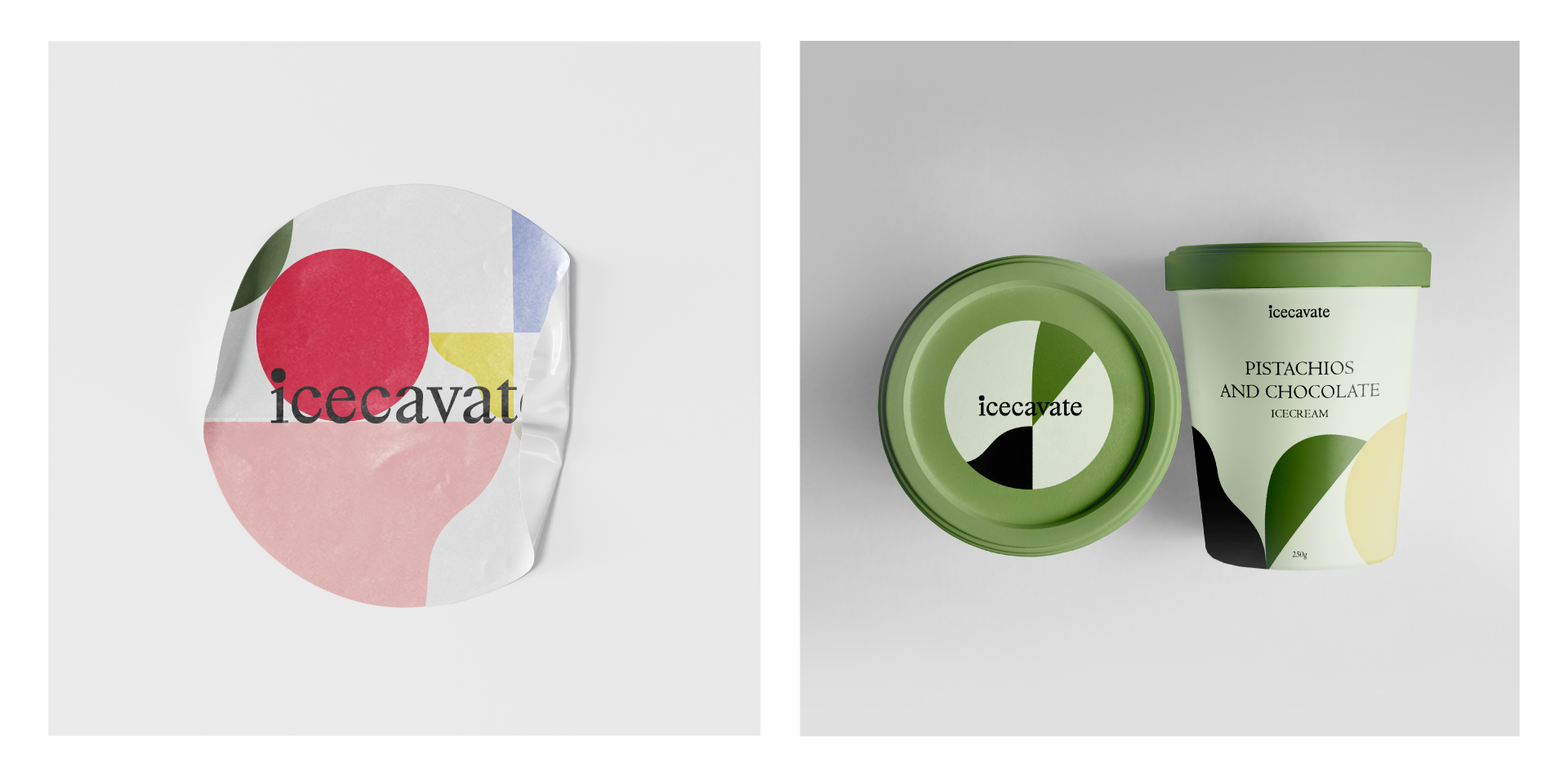


The brand name consists of two words, ice and excavation. In the first letter(i) the dot represents a scoop of ice cream, which is slightly irregular in shape to show the naturalness of the ingredients and to associate the shapes with the signature pattern.
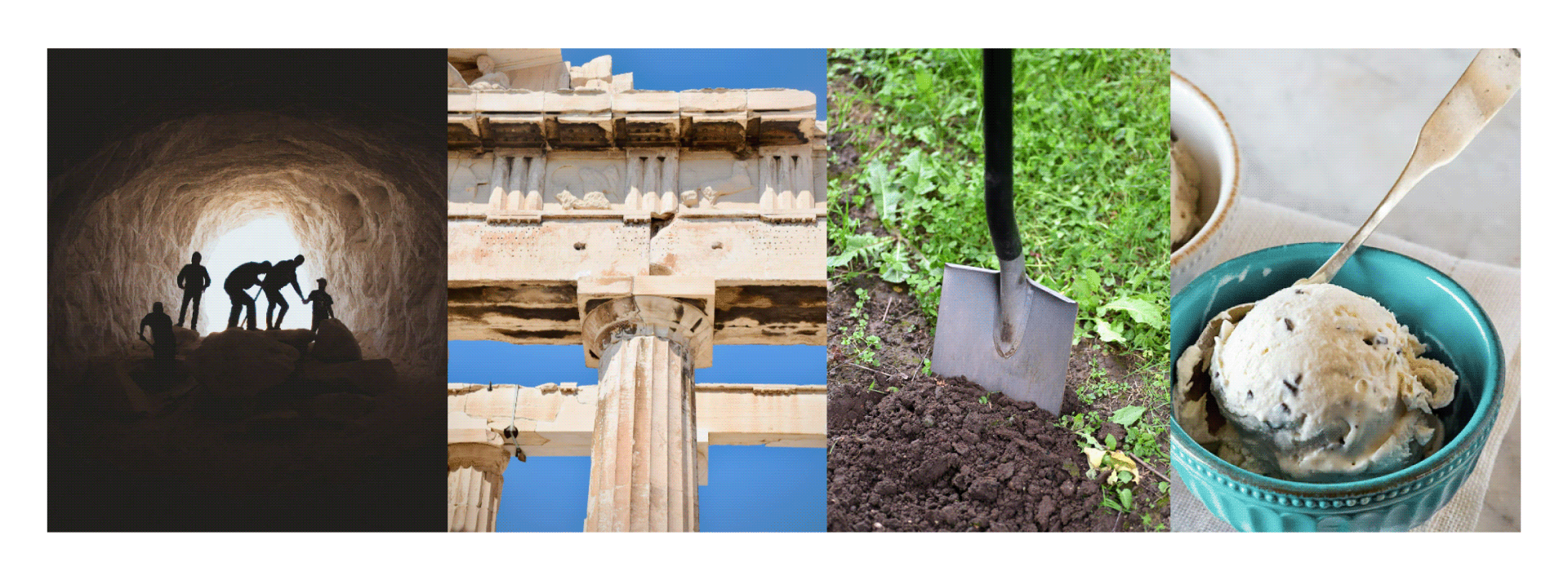
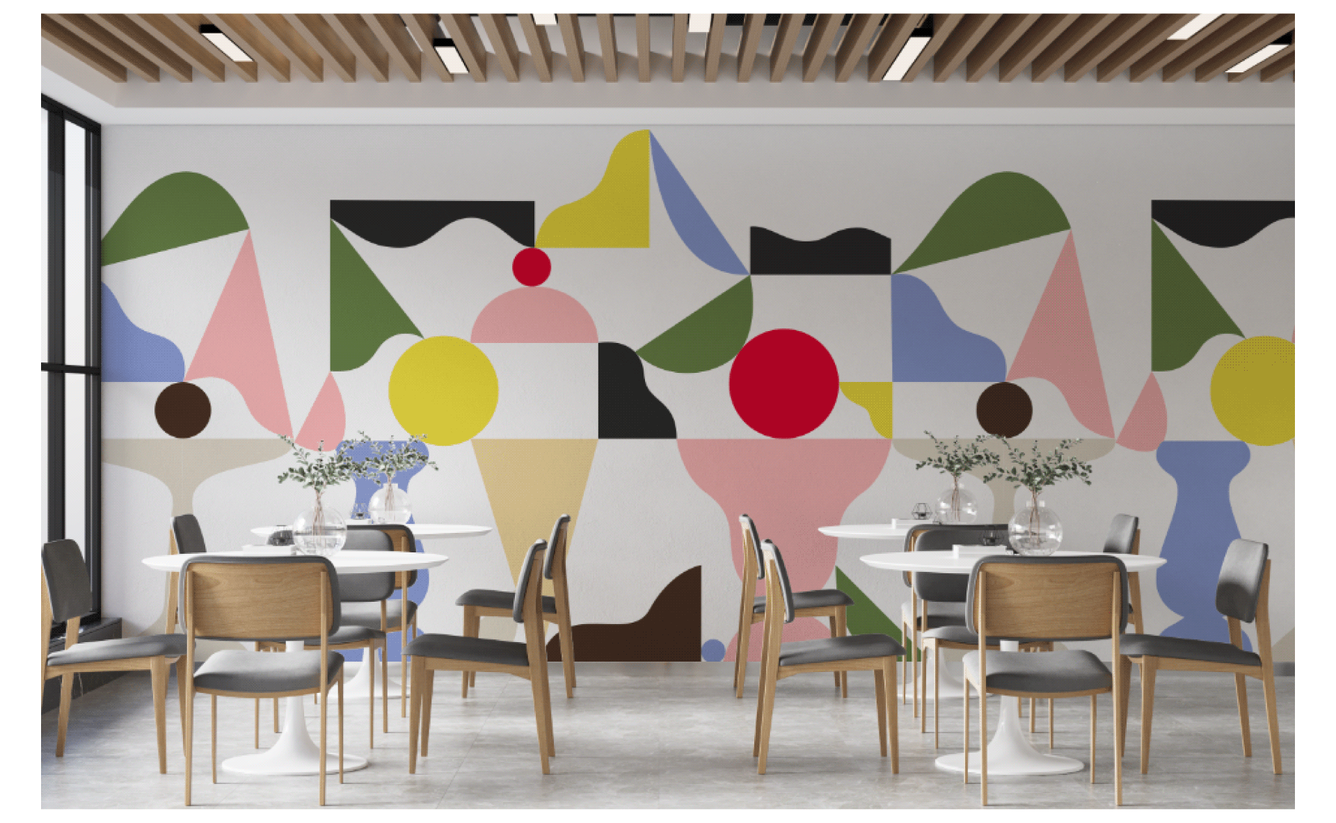
The patter itself consists of pieces of ice cream, ingredients and plastic forms of various utensils. The idea of the excavation had come after eating ice cream with topping, which you tried to find in white ice cream.