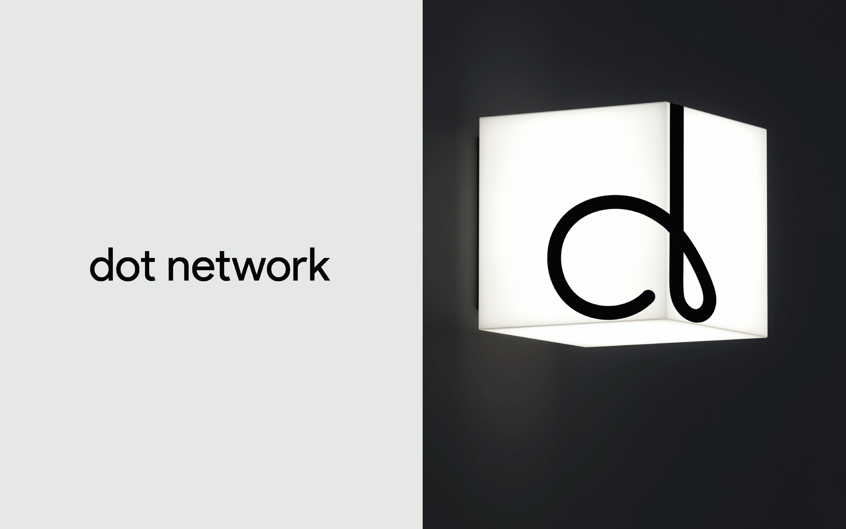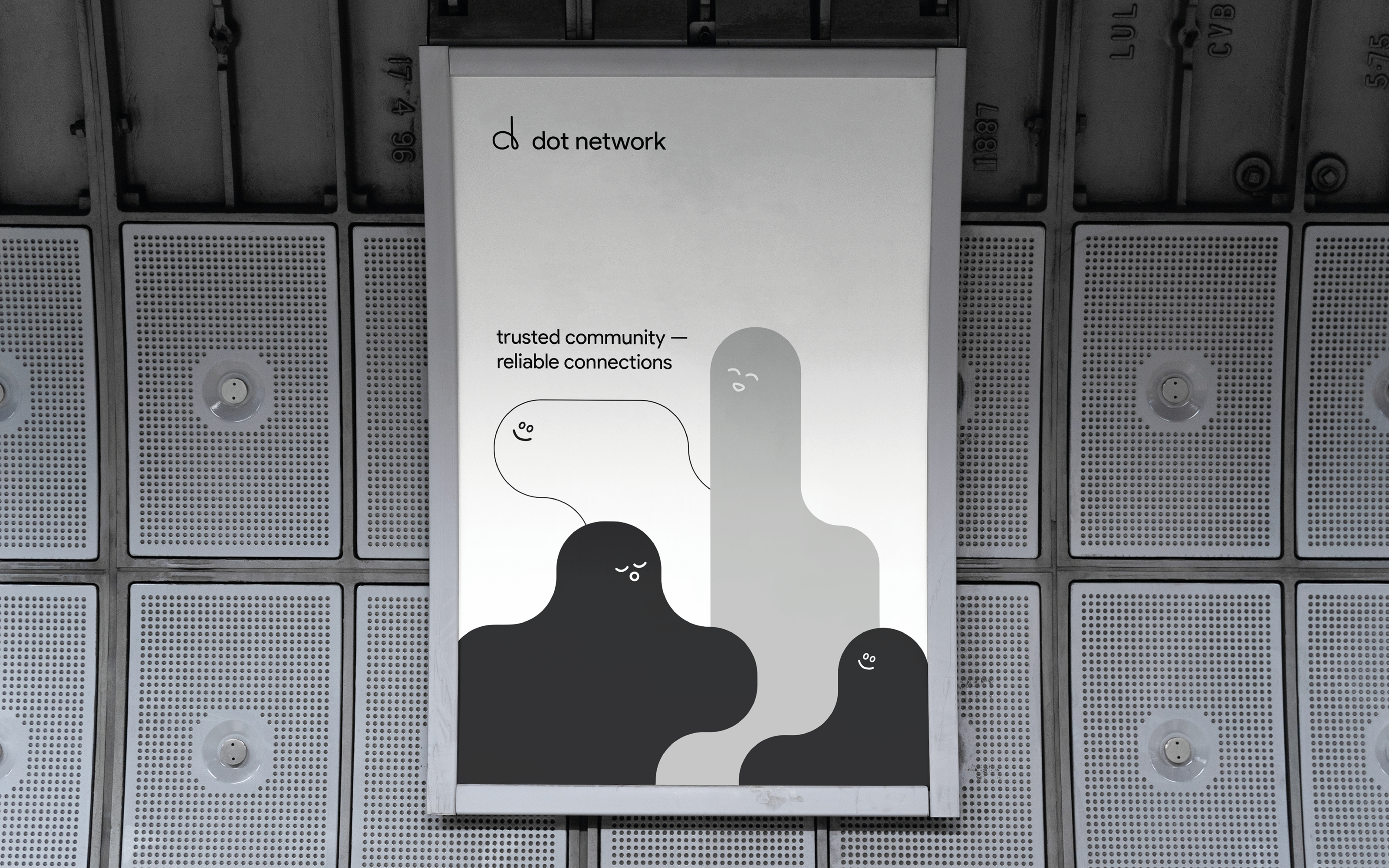
Dot network®
identity
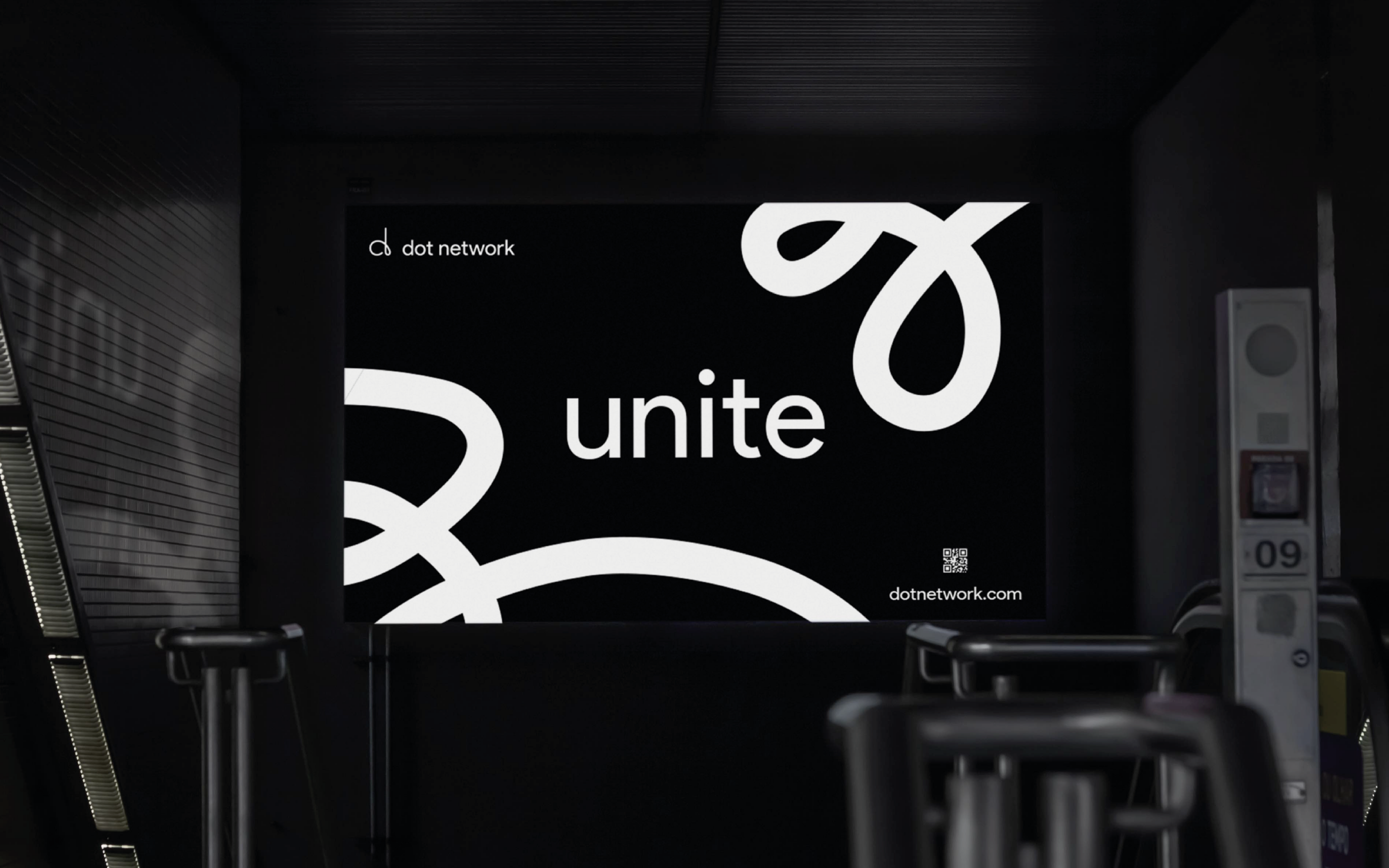
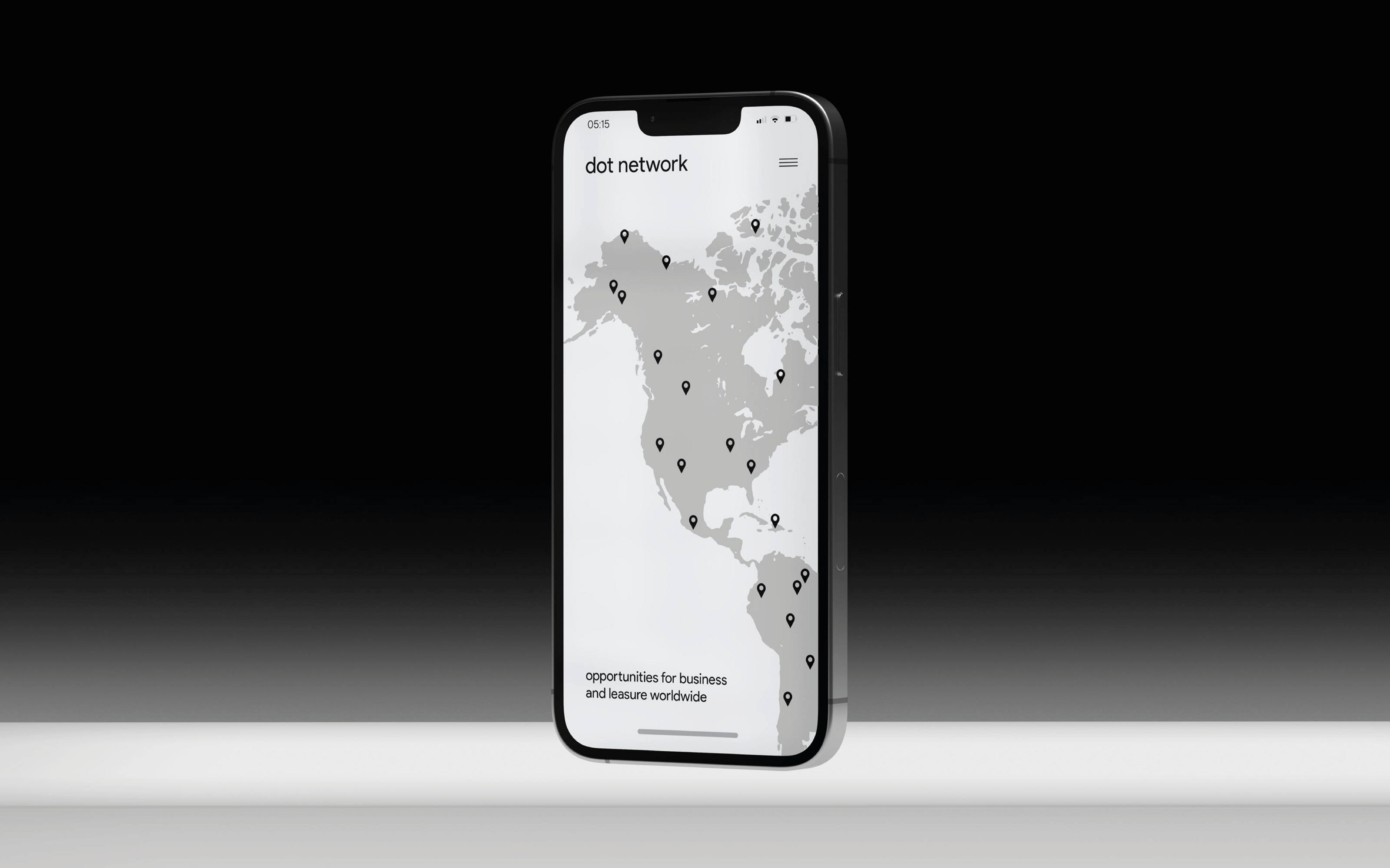
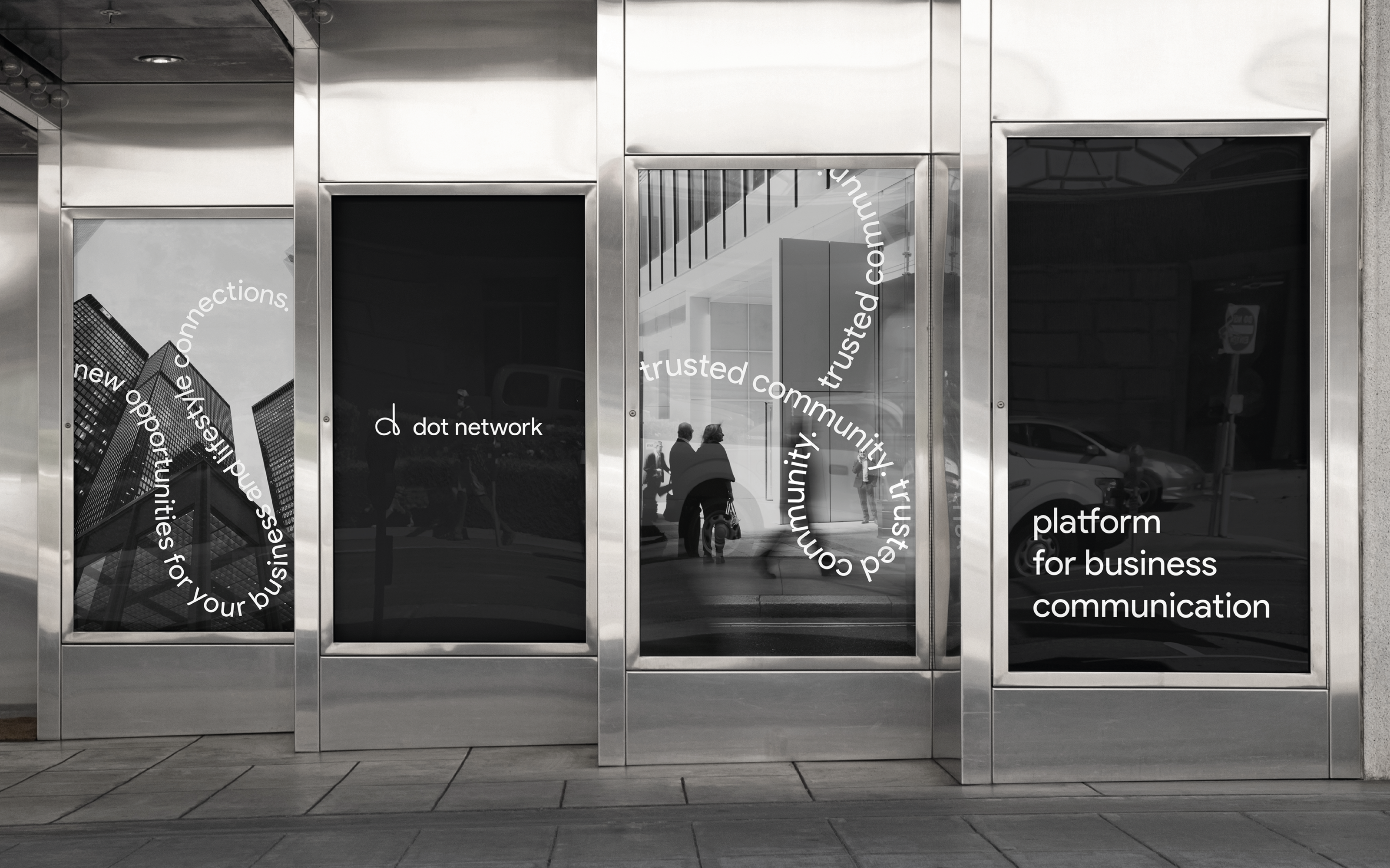
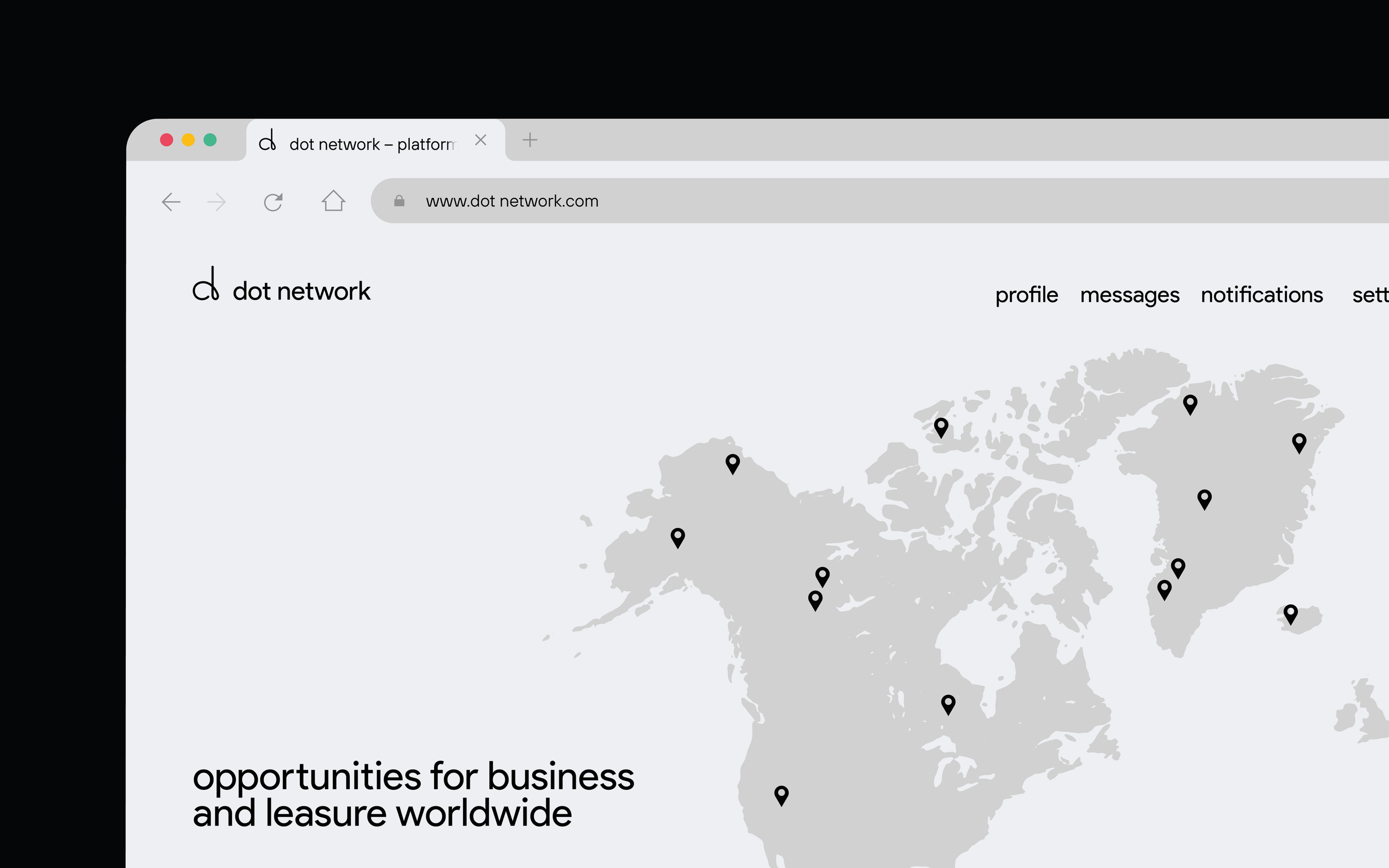
Development of a logo and corporate identity for an innovative platform for establishing links between people around the world.
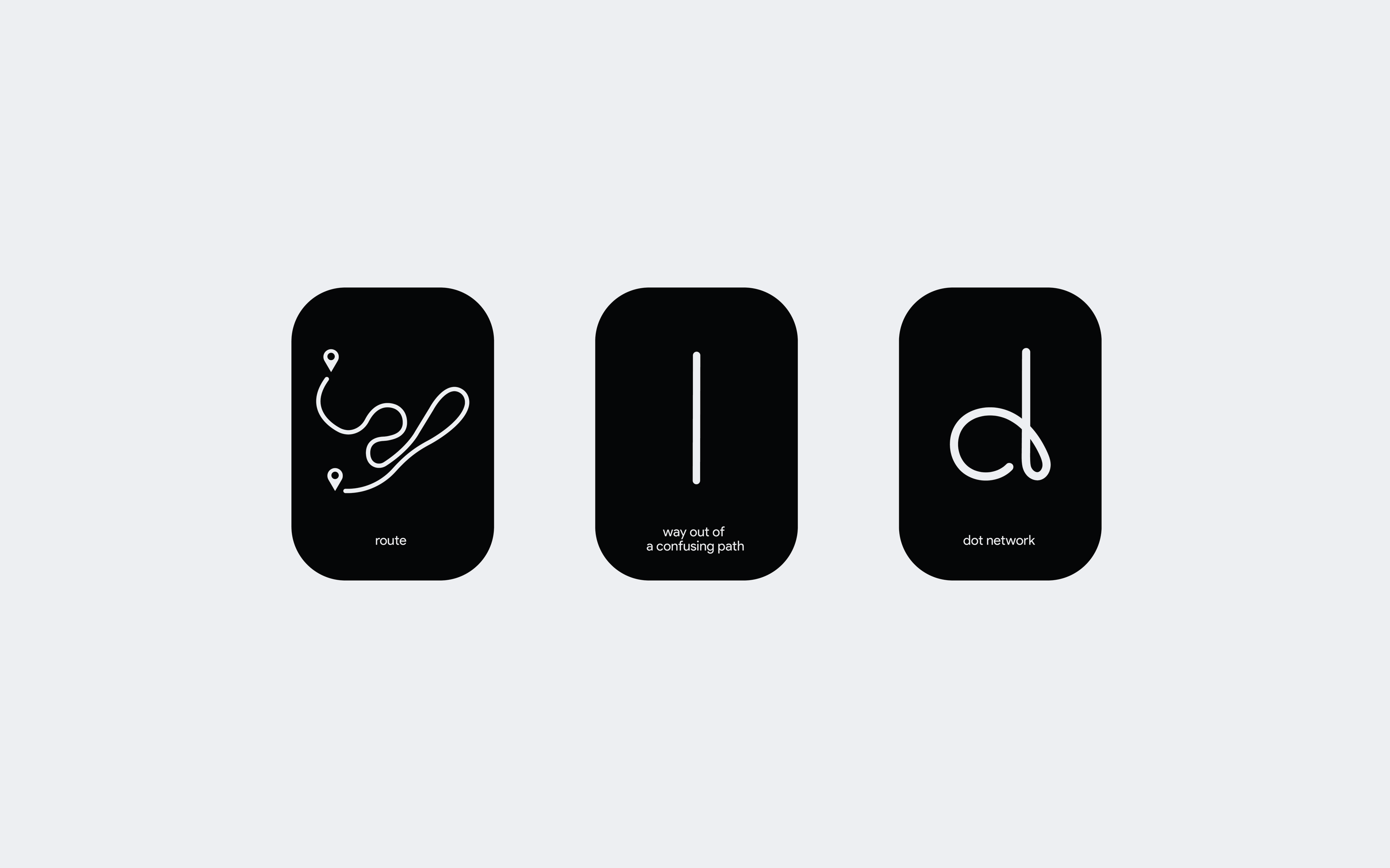
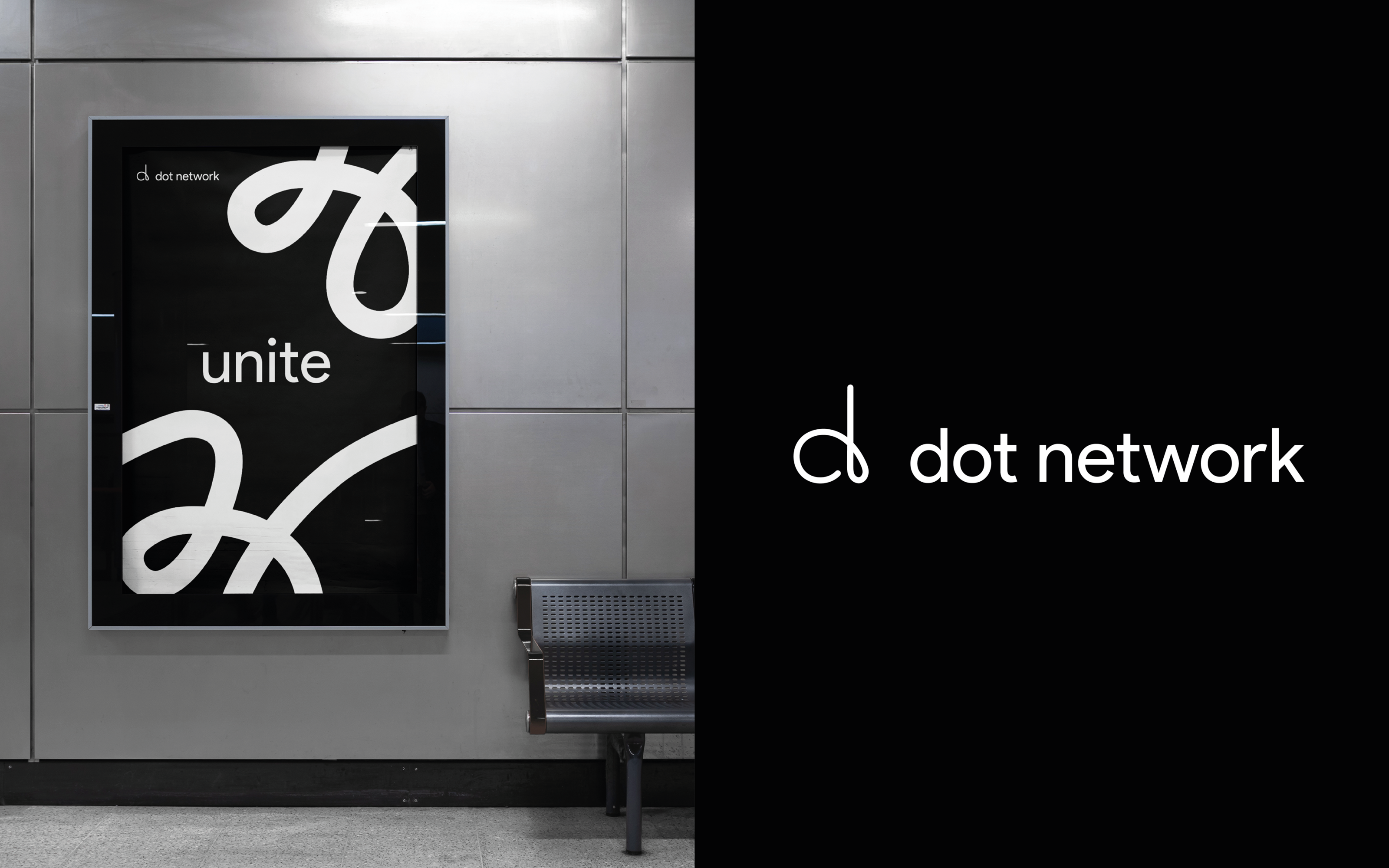
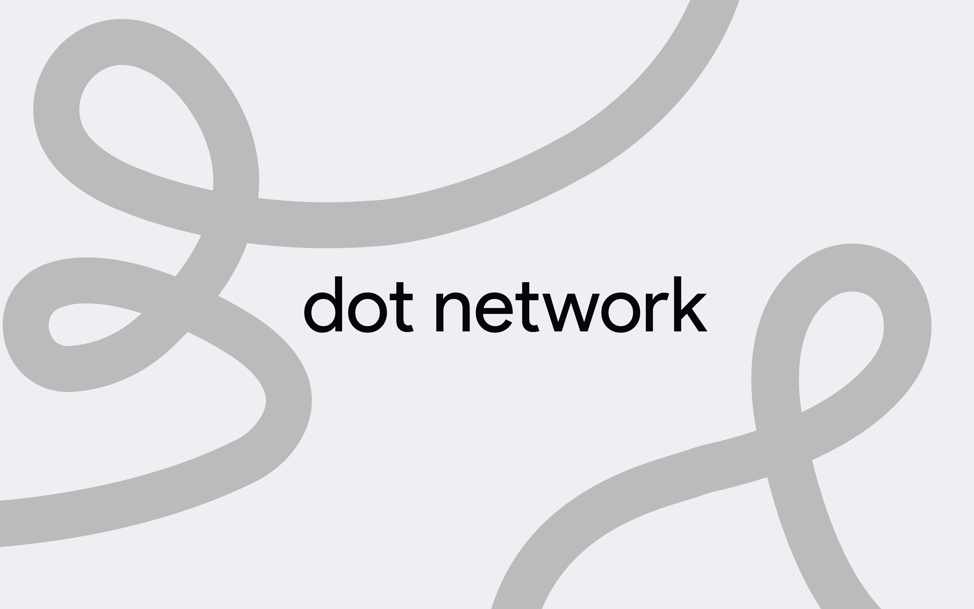
The concept of the logo is built around the image of the road, the confusing path faced by both business people and travelers.
The sign is based on the image of a winding route, which is reflected in the curves of the logo and corporate illustrations.
The direct orientation of the sign in the upper part symbolizes the way out of the confusing path, the solution to the problem. Through this technique, the idea of the dot network is revealed - a platform for entrepreneurs and travelers who can get help from other people around the world and find a way out of a difficult life situation.