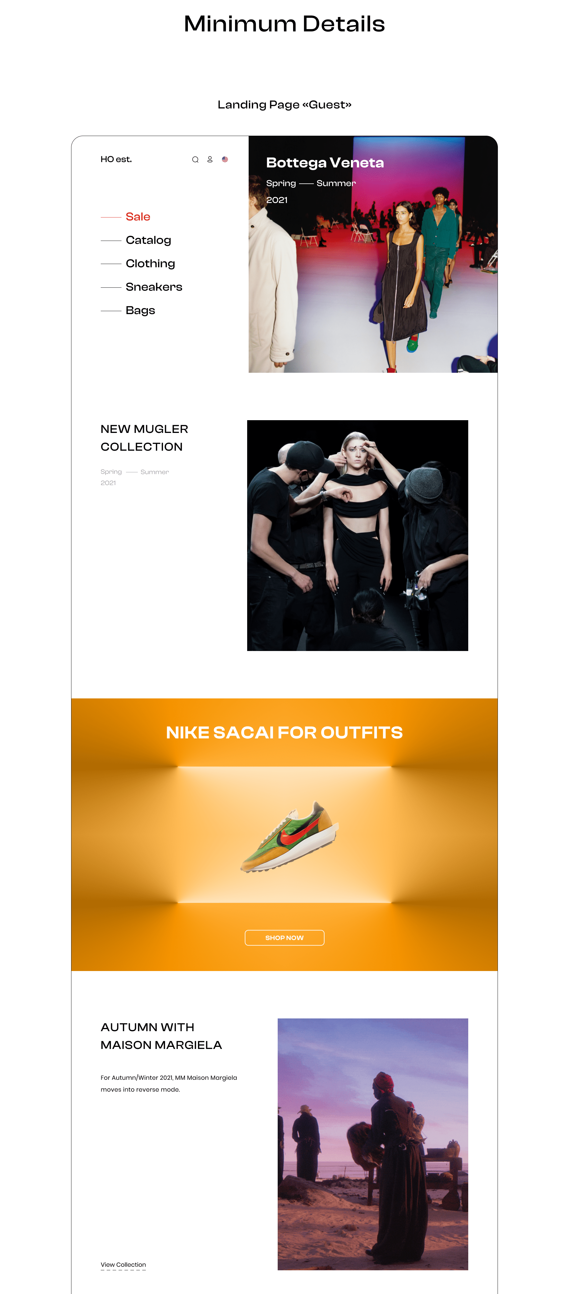
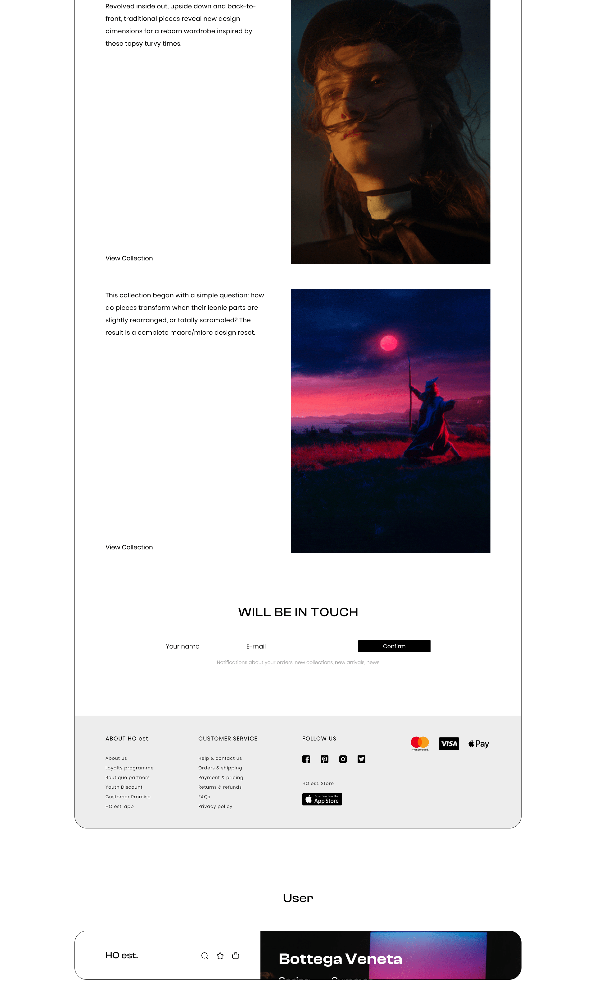
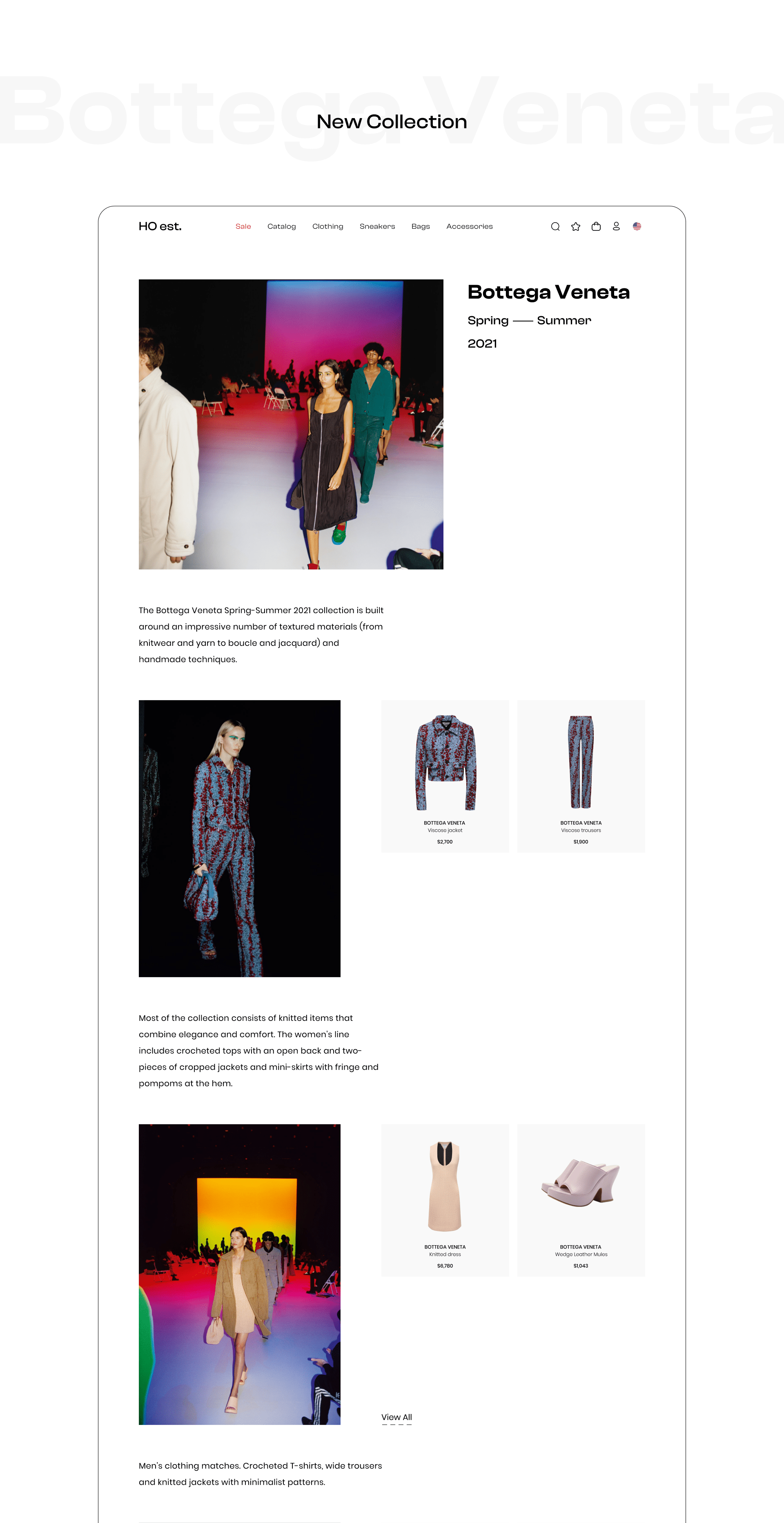
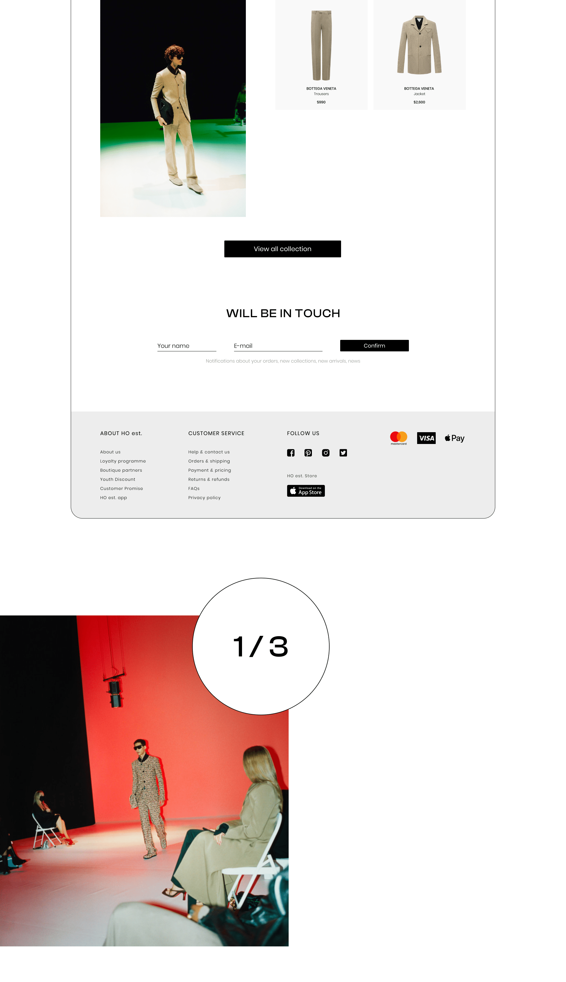
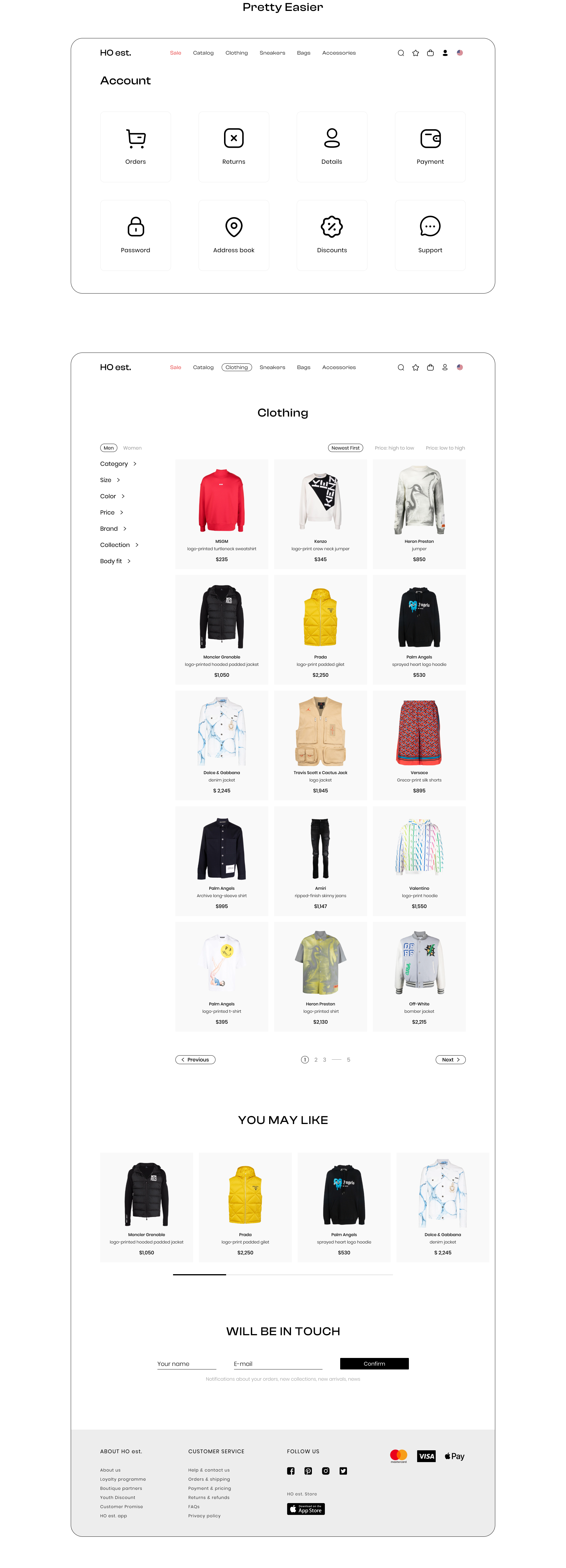
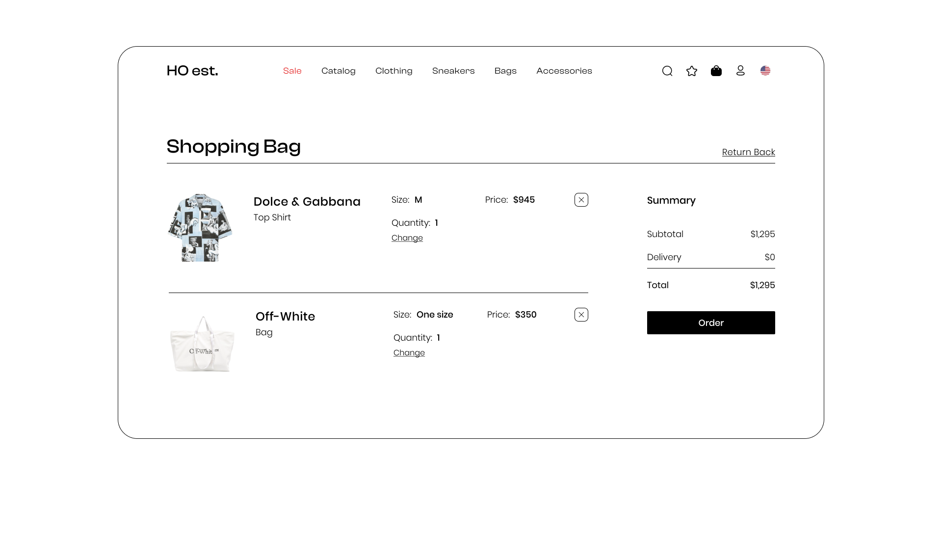
This design may make you feel that somewhere you have already seen it, the design of online stores has already been practically brought to the ideal user convenience in navigating the site and buying clothes, but nothing is perfect and for me some sites are quite outdated, somewhere navigation will let you down, somewhere the design itself will not be intuitive.
In my case, the site was made not "I like it so much and I will do it", but rather "I reviewed a lot of designs from online stores and realized where there are mistakes, what needs to be corrected, where something needs to be removed, and where to add.
Surveys were conducted about this design, 89% out of 100% said that the site is clearer, the elements on the site are perfect in size and do not strain the eyes. At the same time, the site has not lost the target action - the purchase of goods.
Thank you for watching, I appreciate your time!


![[playground] — 'Heroes & Villains' by Metro Boomin — Интерфейсы, Графика на Dprofile](https://cdn.dprofile.ru/public/4109/57879/71a4d1e11ec81eae95343919fecf5491d6b22d77.png)