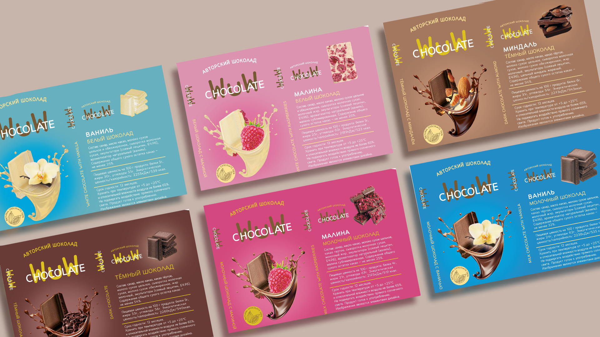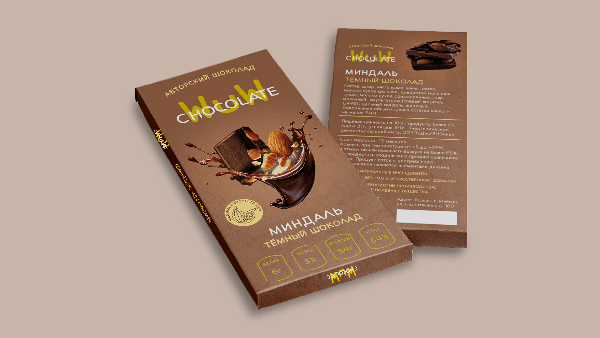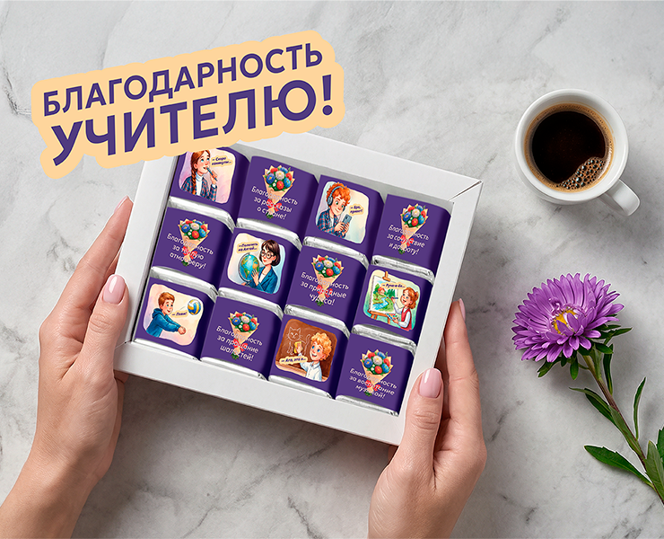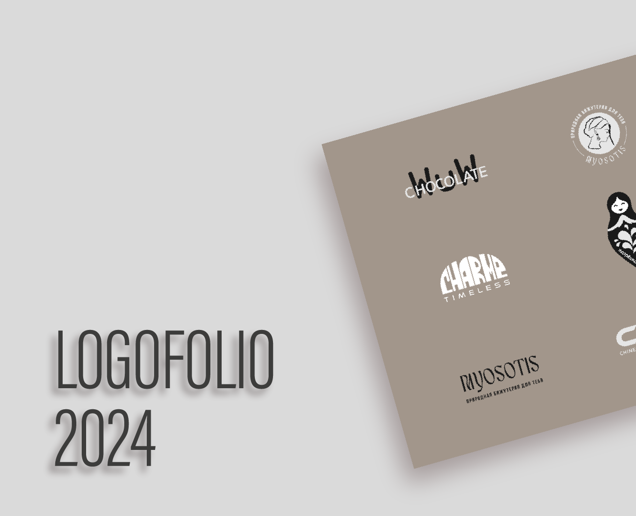
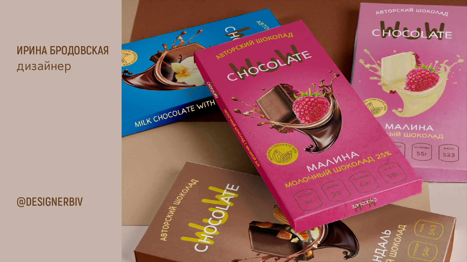
Задача: создать дизайн упаковки
авторского шоколада из нескольких вкусов.
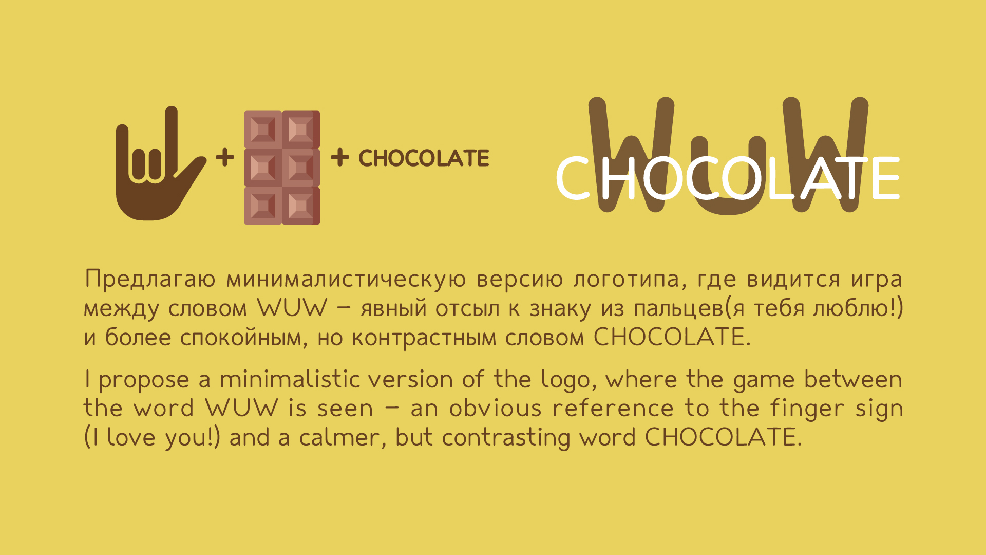
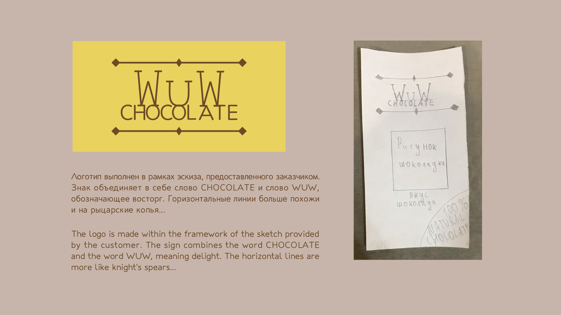
Заказчик предоставил эскиз логотипа
и схему лицевой стороны.
Но при отрисовке логотип, за счёт тонких
линий, оказался невыразительным.
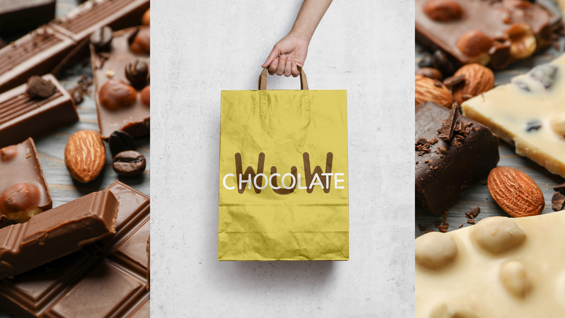
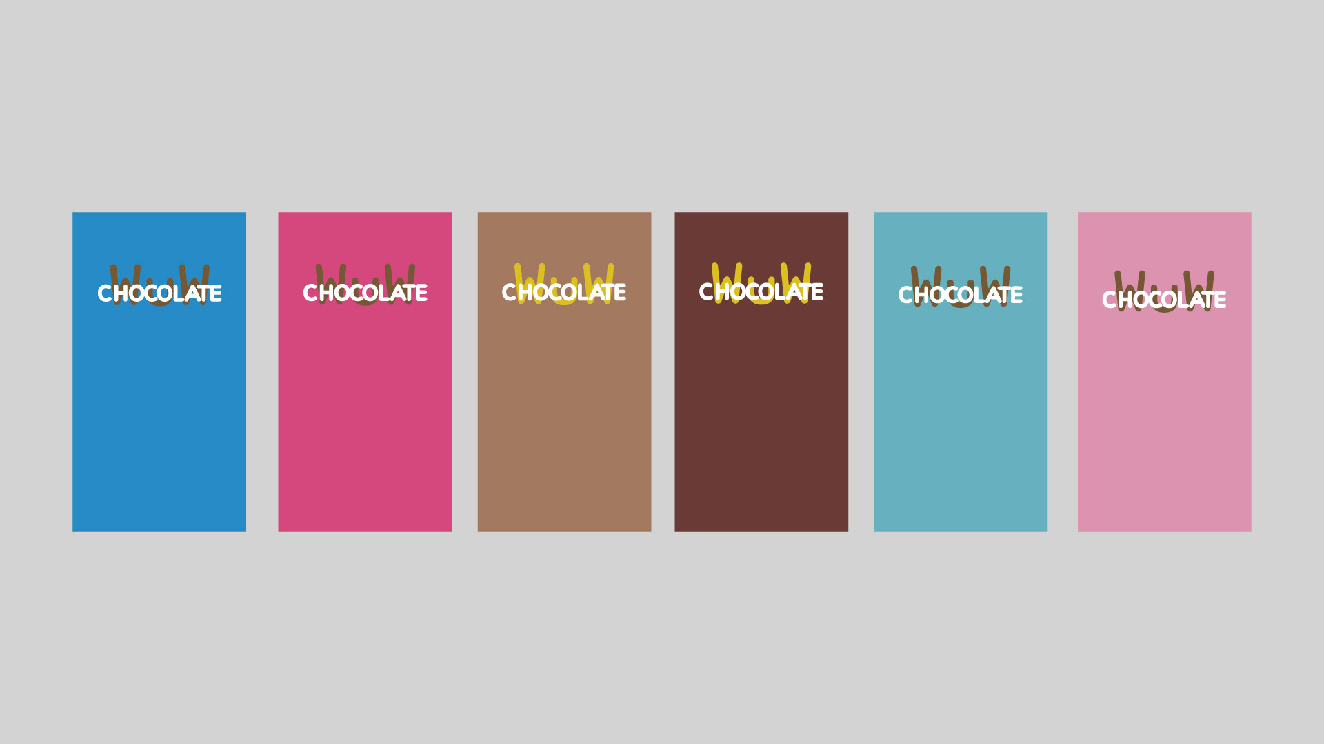
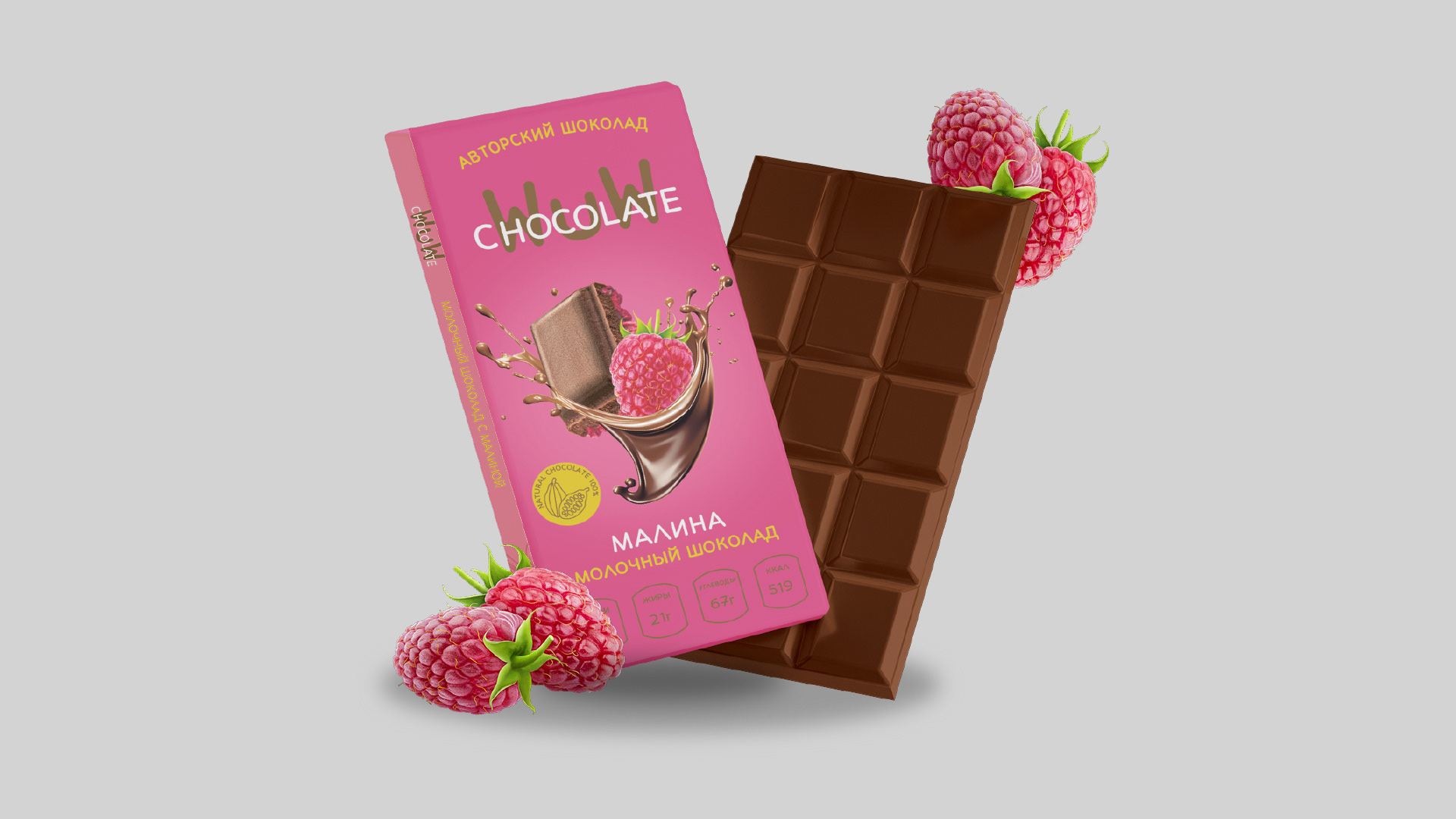
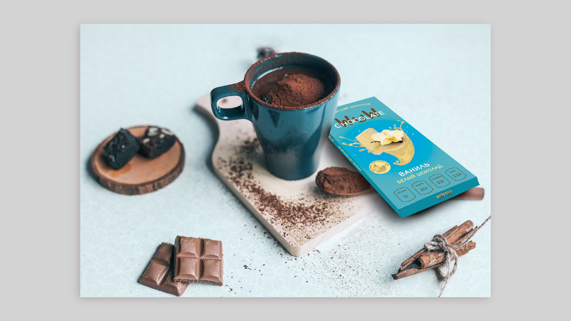
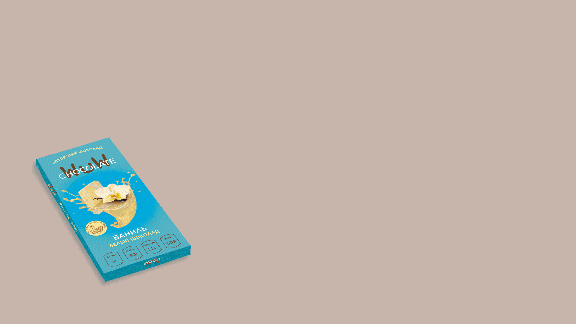
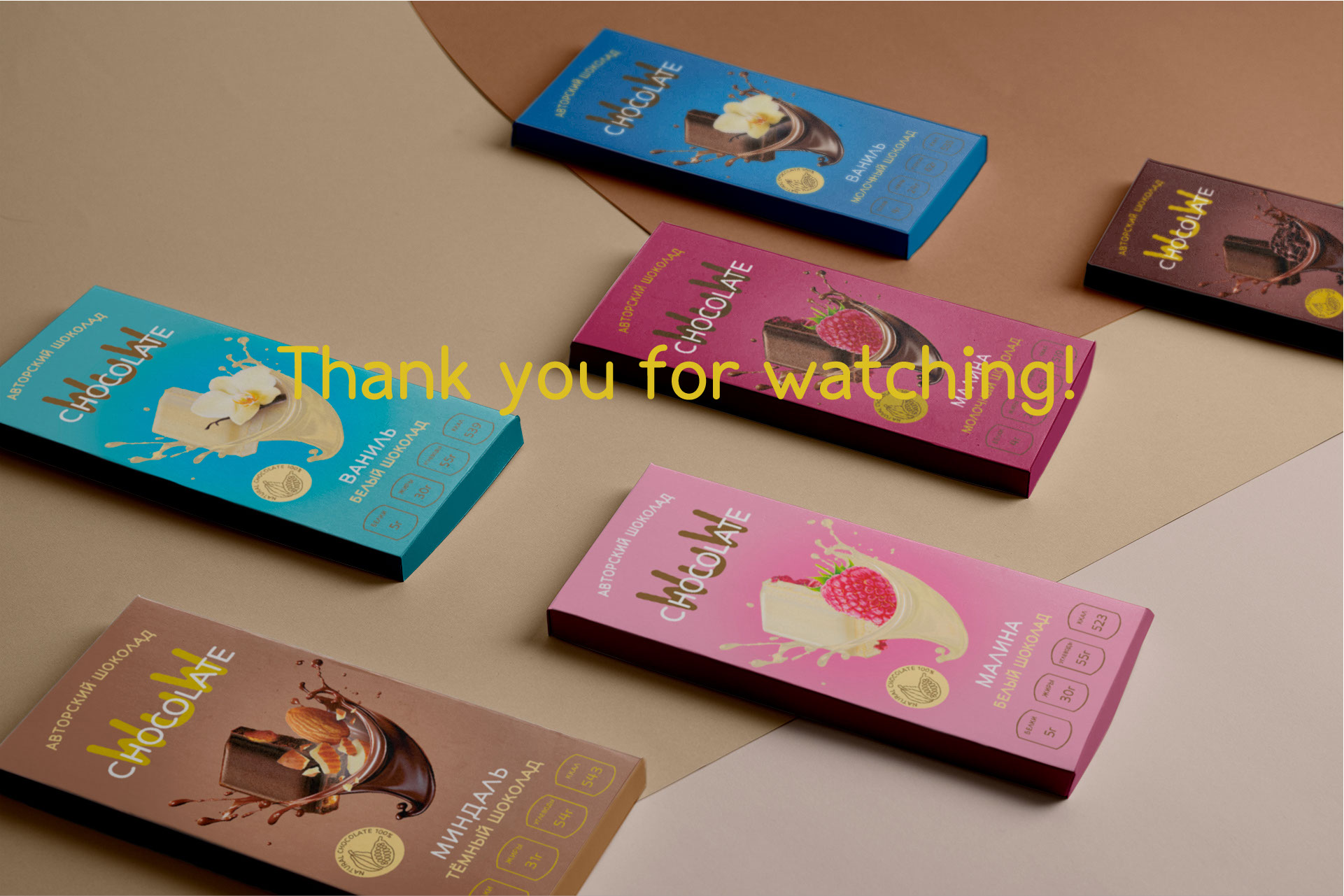
Решение: пришла идея соединить слово
WUW и слово CHOCOLATE, выделив их
при этом контрастным цветом.
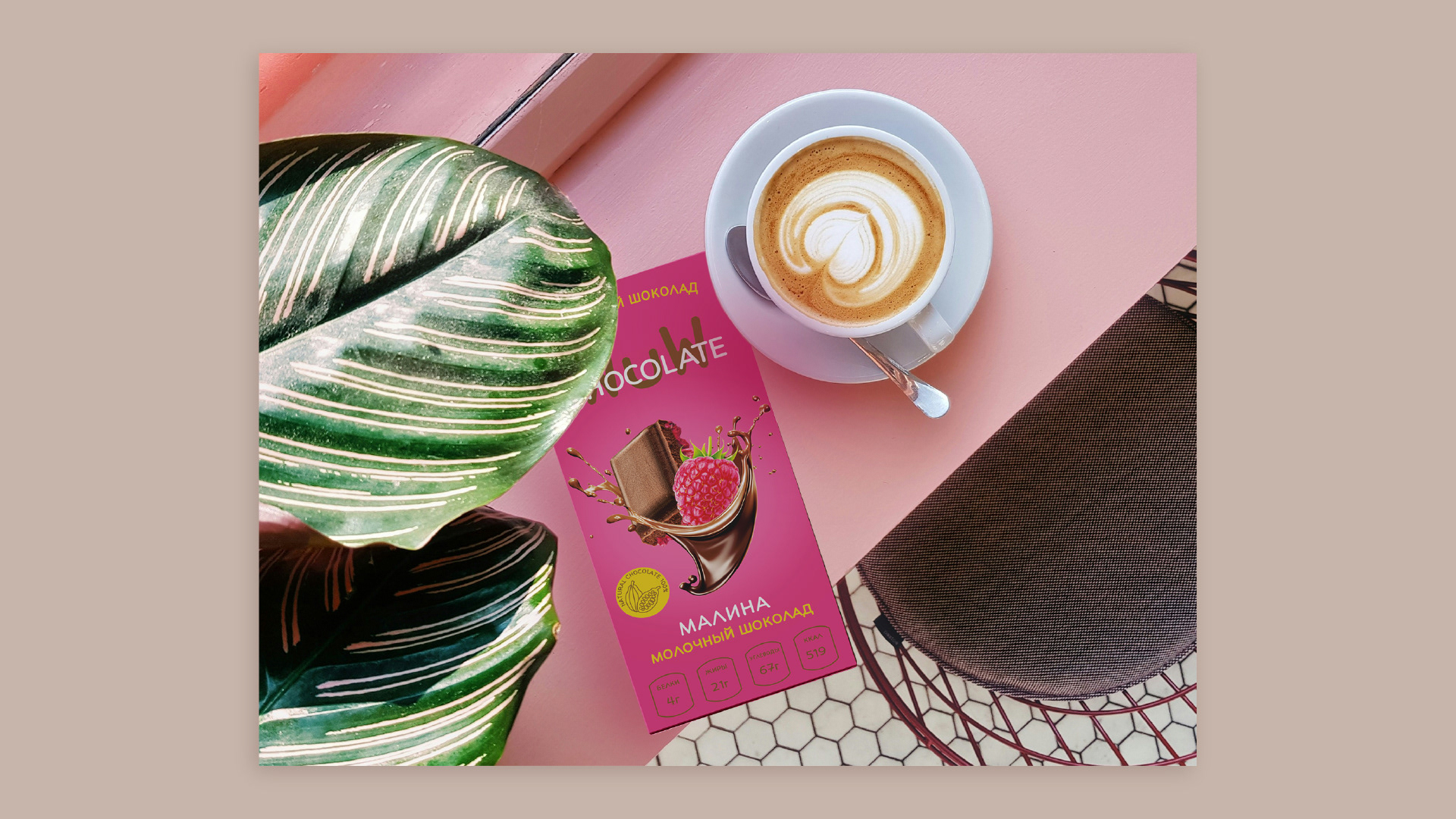
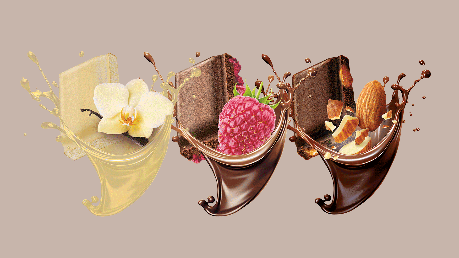
Фуд-зона поэтому продолжила идею
буквы W - в виде шоколадного всплеска
плюс натуральные ингредиенты.
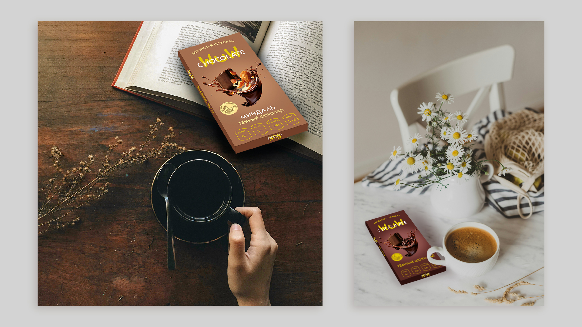
Шоколад при этом приобрёл выразительный,
праздничный вид.
Task: to create a packaging design for designer
chocolate from several flavors.
The customer provided a sketch of the logo
and a diagram of the front side.
But when drawing the logo, due to the thin lines,
it turned out to be inexpressive.
Solution: the idea came to combine the word
WUW and the word CHOCOLATE, highlighting
them with a contrasting color.
The food zone therefore continued the idea
of the letter W - in the form of a chocolate
splash plus natural ingredients.
At the same time, chocolate acquired
an expressive, festive look.