[RUS]
О ПРОЕКТЕ:
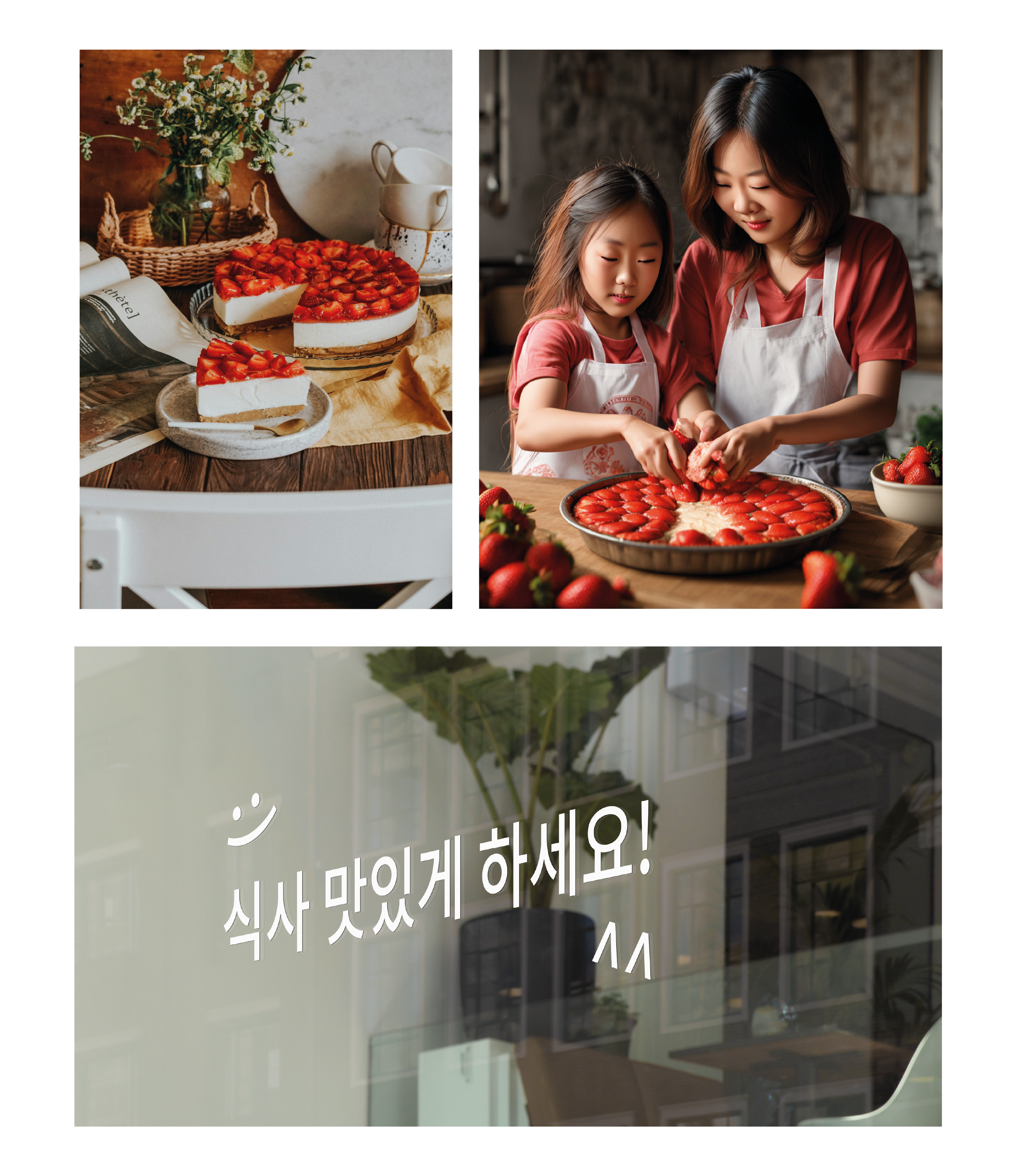
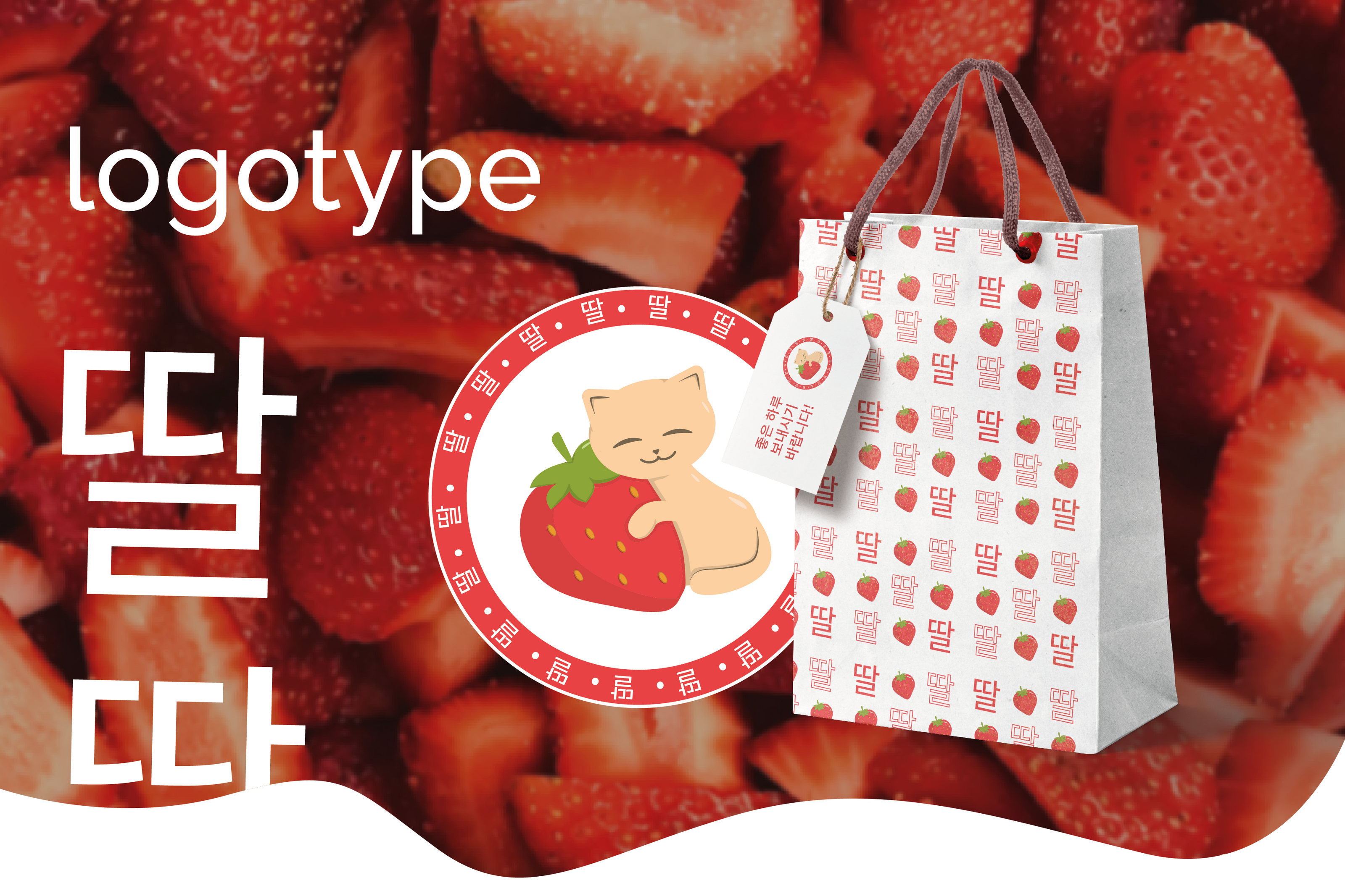
Необходимо было разработать логотип для корейского кафе. Кафе позиционирует себя, как "клубничное" место - здесь идет акцент на напитках с добавлением свежей клубники, а также здесь продается выпечка и десерты с клубничным вкусом.
Название "딸기" (Ттальги) с корейского языка переводится "Клубника".
ЗНАКОВАЯ ЧАСТЬ ЛОГОТИПА:
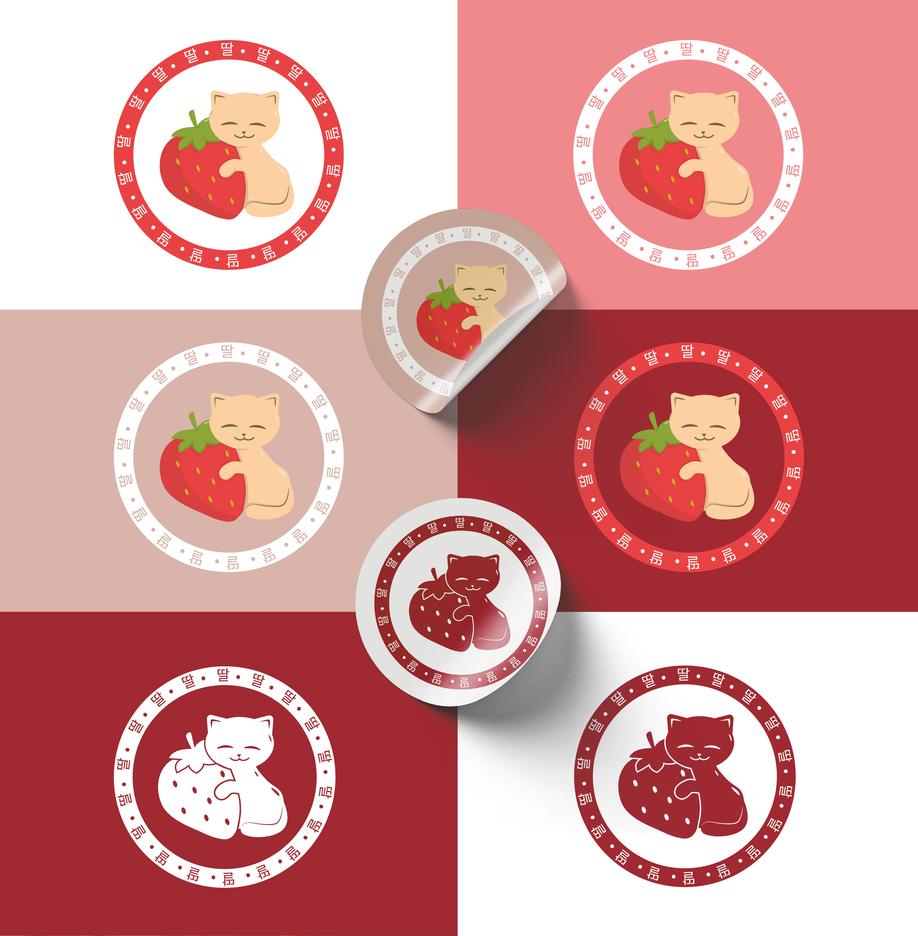
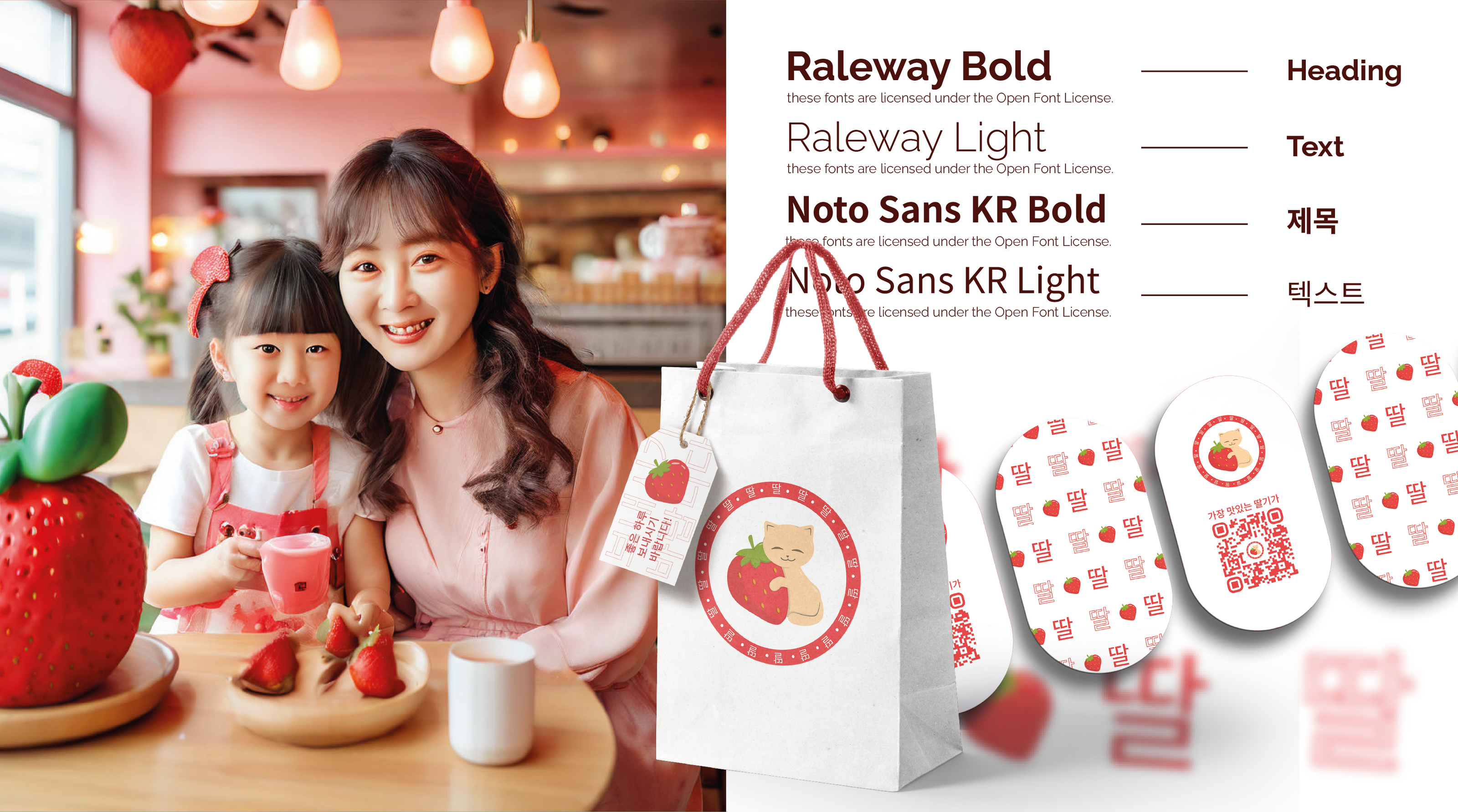
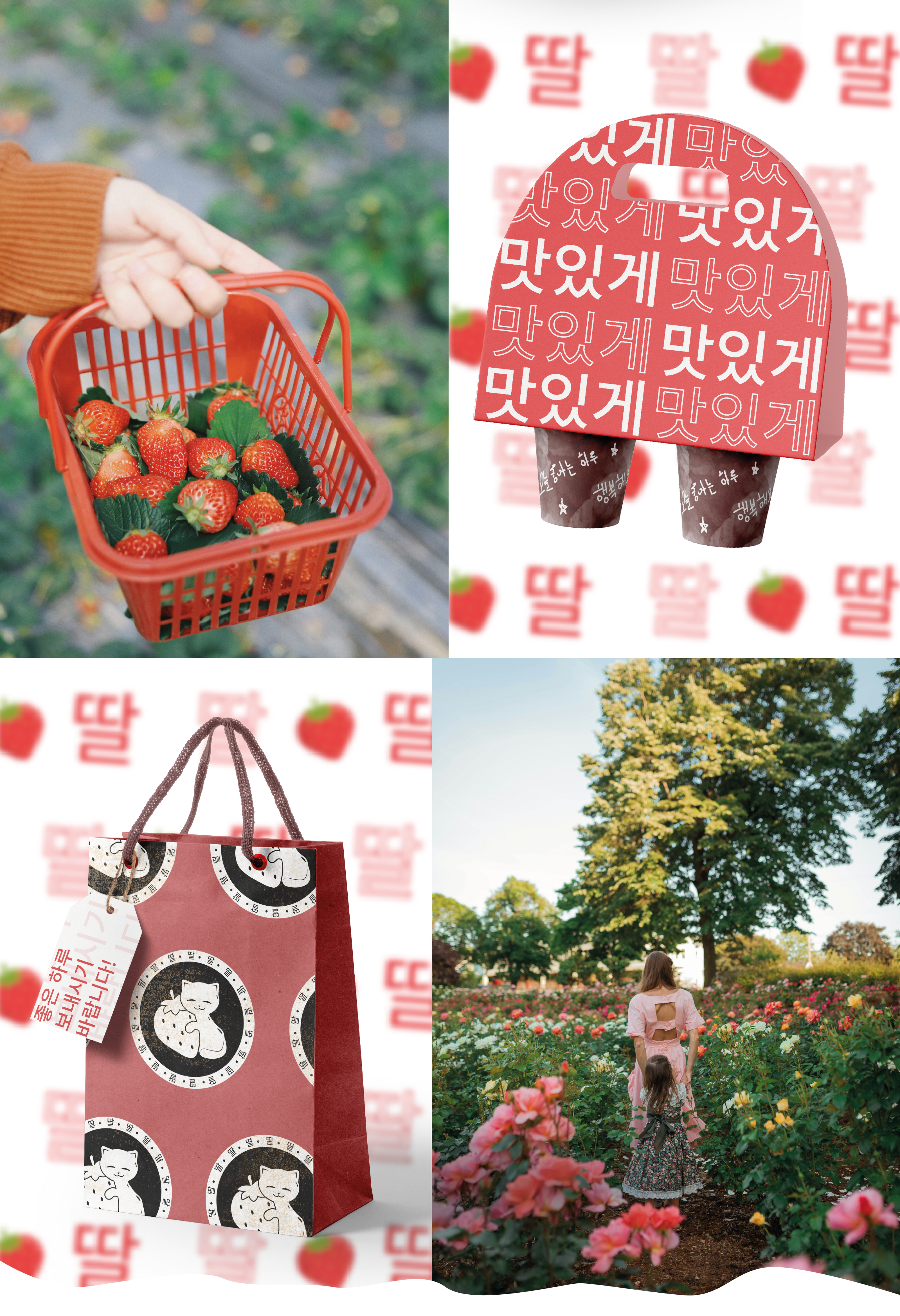
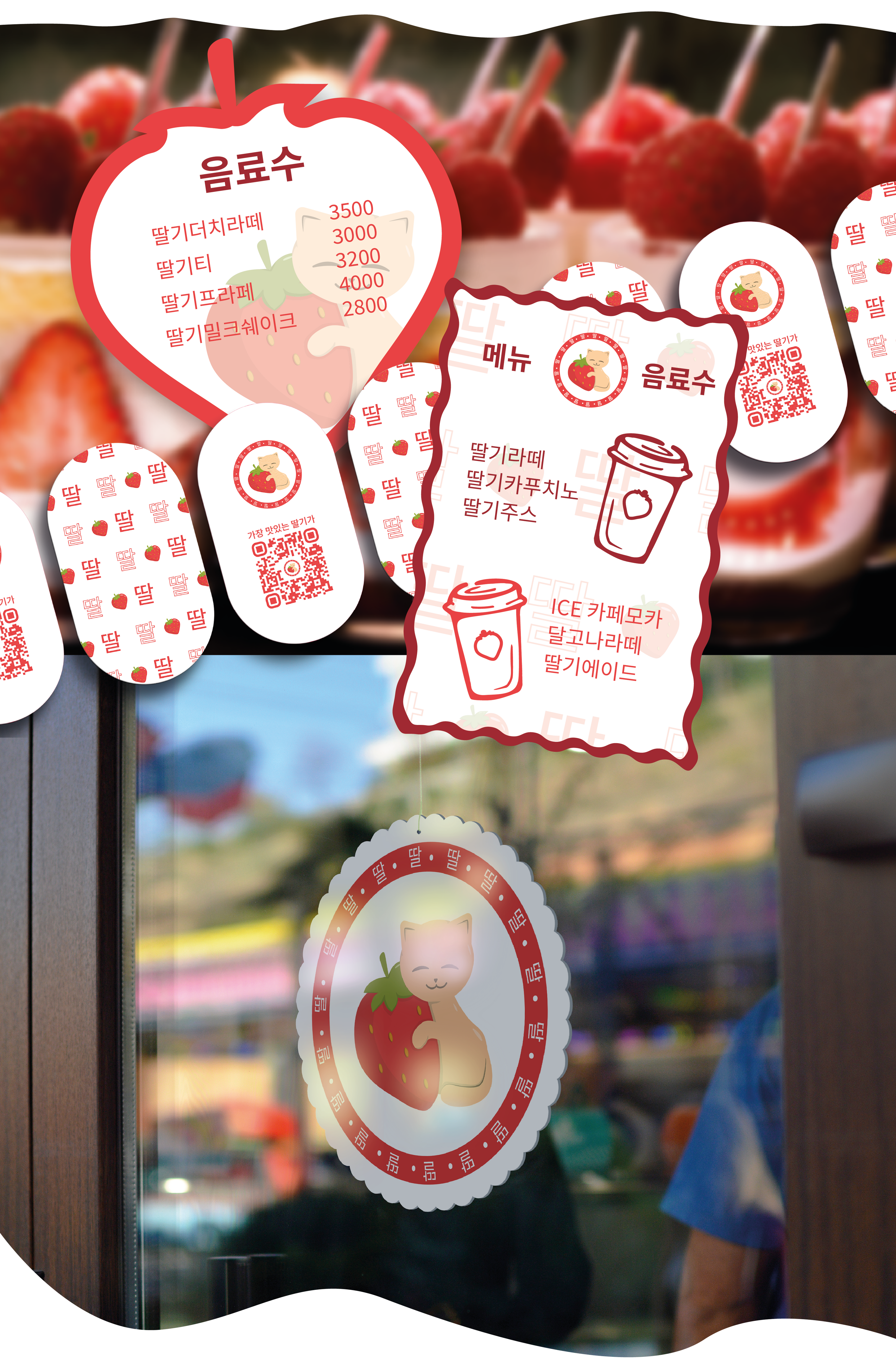
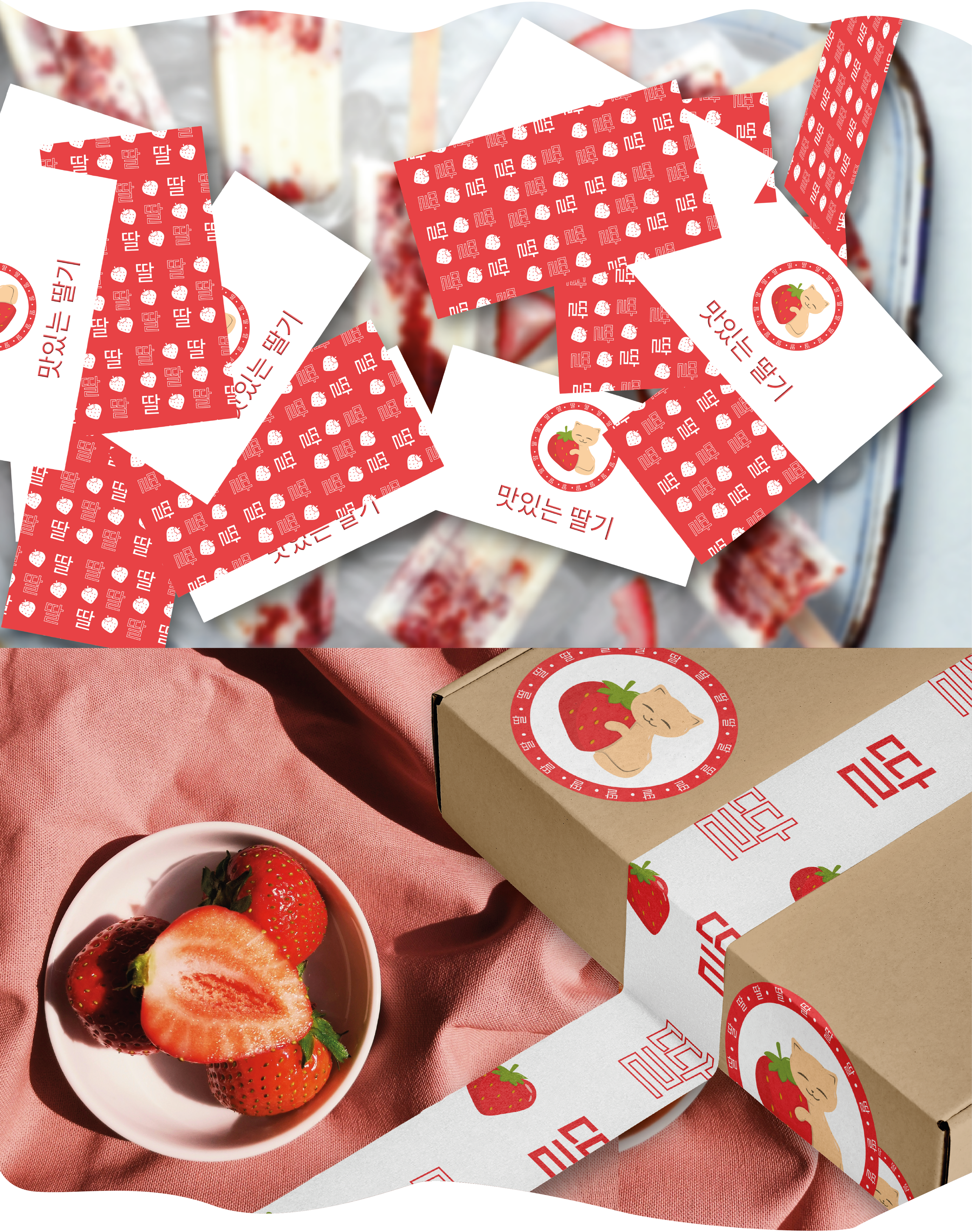
Владелица кафе всегда любила готовить клубничные пироги в компании своей любимой кошки Наоми. Именно поэтому образ котенка в обнимку с клубникой был взят за основу логотипа. Логотип выполнен в знаковом решении, чтобы у потребителя была легко запоминающаяся ассоциация с кафе. Данная иллюстрация была разработана с нуля. Для лучшего восприятия были созданы несколько вариантов в разных цветах, в т.ч. монохромные варианты
СВЯЗАТЬСЯ СО МНОЙ ДЛЯ РАЗРАБОТКИ ДИЗАЙНА:
WHATSAPP, TELEGRAM, VK, INST
(ссылки кликабельны)
[ENG]
ABOUT THE PROJECT:
It was necessary to design a logo for a Korean cafe. The cafe positions itself as a "strawberry" place - there is an emphasis on drinks with the addition of fresh strawberries, as well as pastries and desserts with strawberry flavor are sold here.
The name "딸기" (Ttalgi) is translated from Korean as "Strawberry". The cafe positions itself as a family-run one, but it is also aimed at a target audience under 50 years old.
THE ICONIC PART OF THE LOGO:
The owner of the cafe has always loved to cook strawberry pies in the company of her beloved cat Naomi. That is why the image of a kitten hugging a strawberry was taken as the basis for the logo. The logo is made in a landmark solution so that the consumer has an easy-to-remember association with the cafe. This illustration was developed by me on my own. For a better perception, several options have been created in different colors, including monochrome options
CONTACT ME TO DEVELOP A DESIGN:
(links are clickable)