[RUS]
О ПРОЕКТЕ:
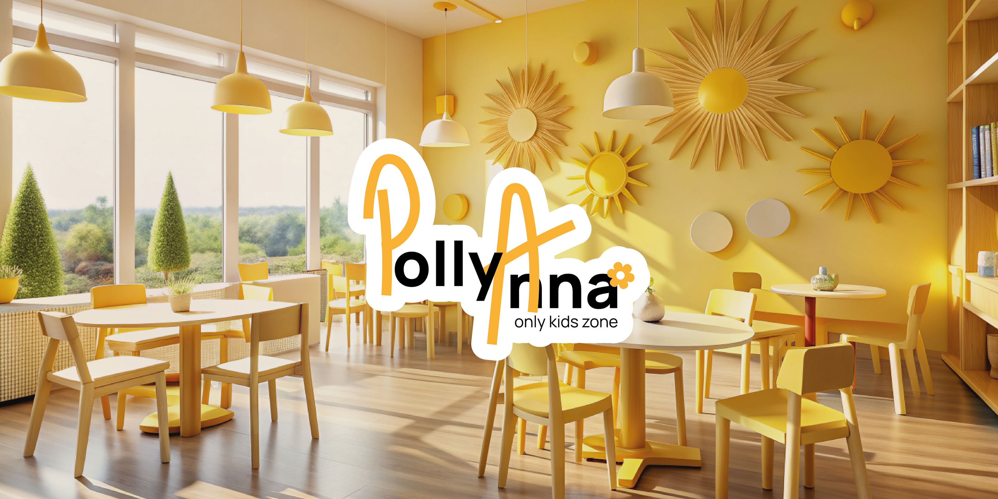
Необходимо было разработать фирменный стиль для компании по организации детских мероприятий "PollyAnna". Компания стремится радовать детей, организовывая для них праздники с самыми интересными сюжетами!
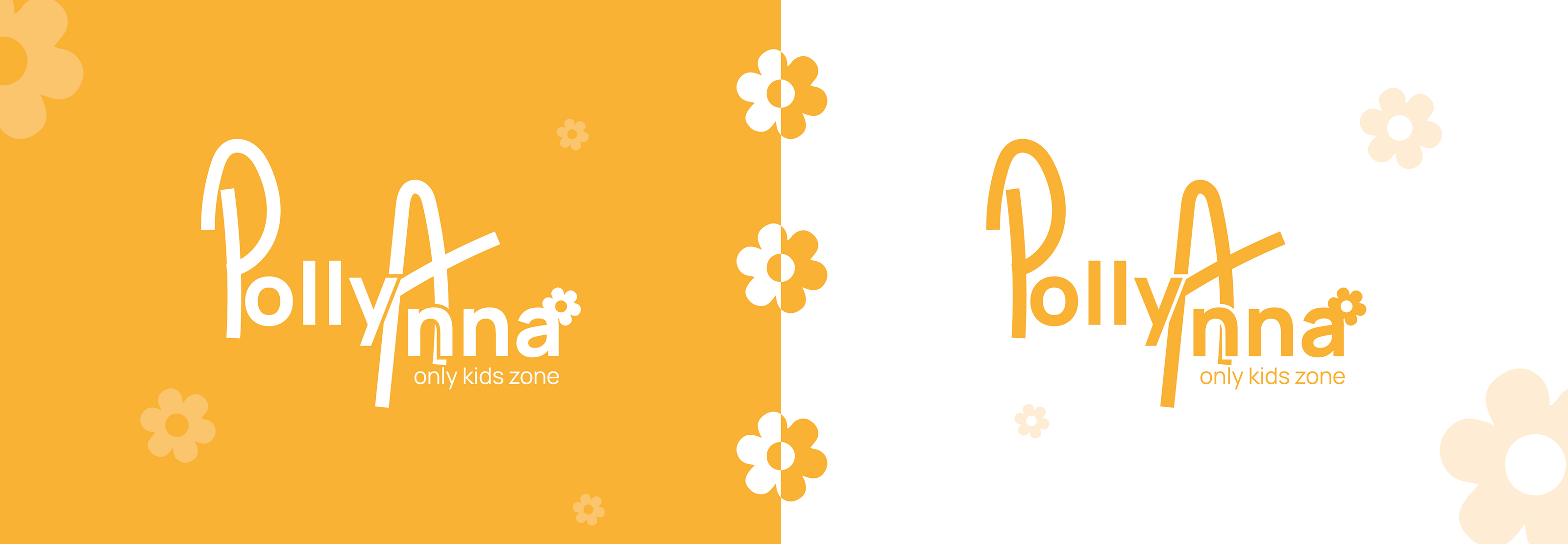
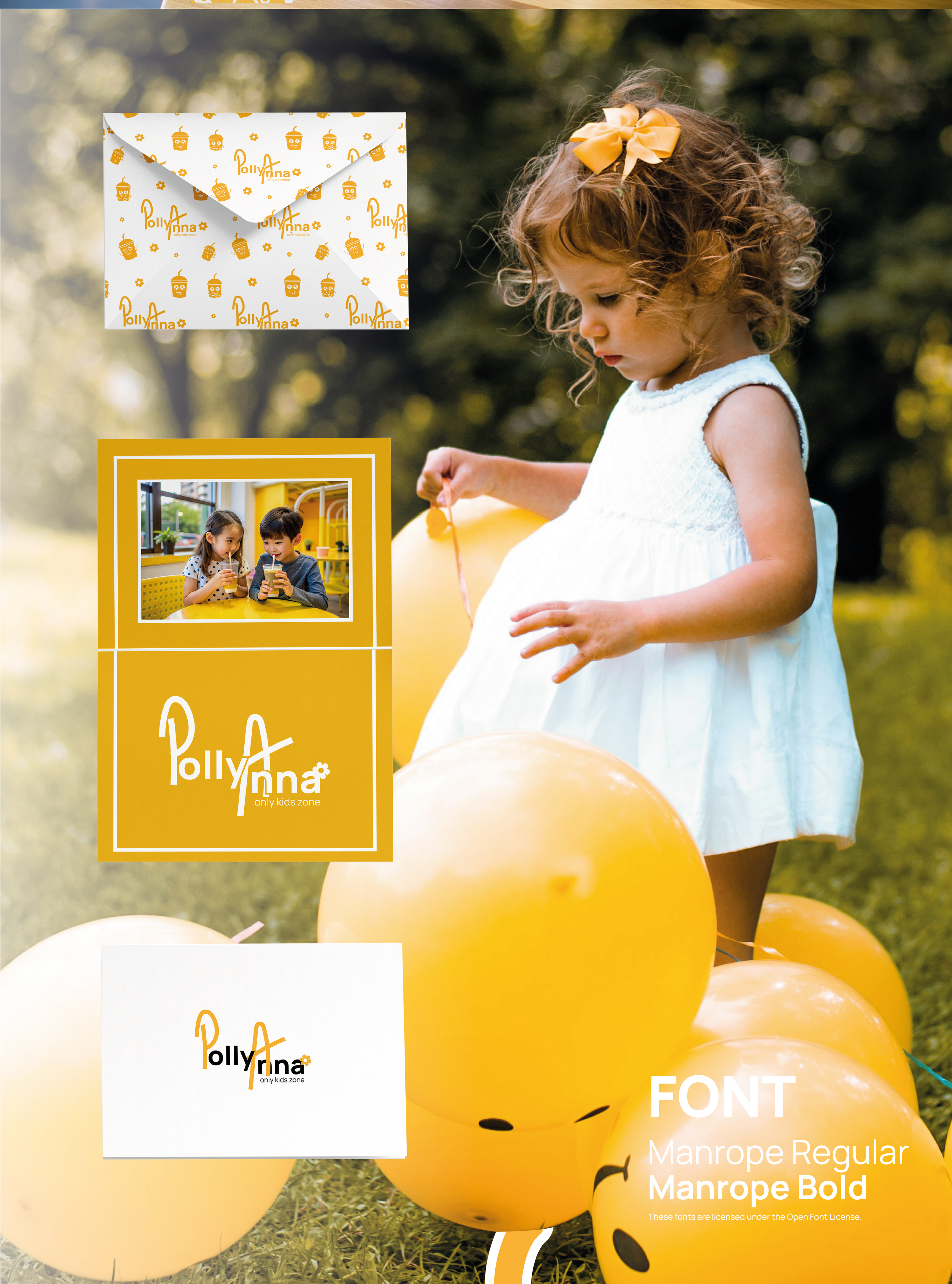
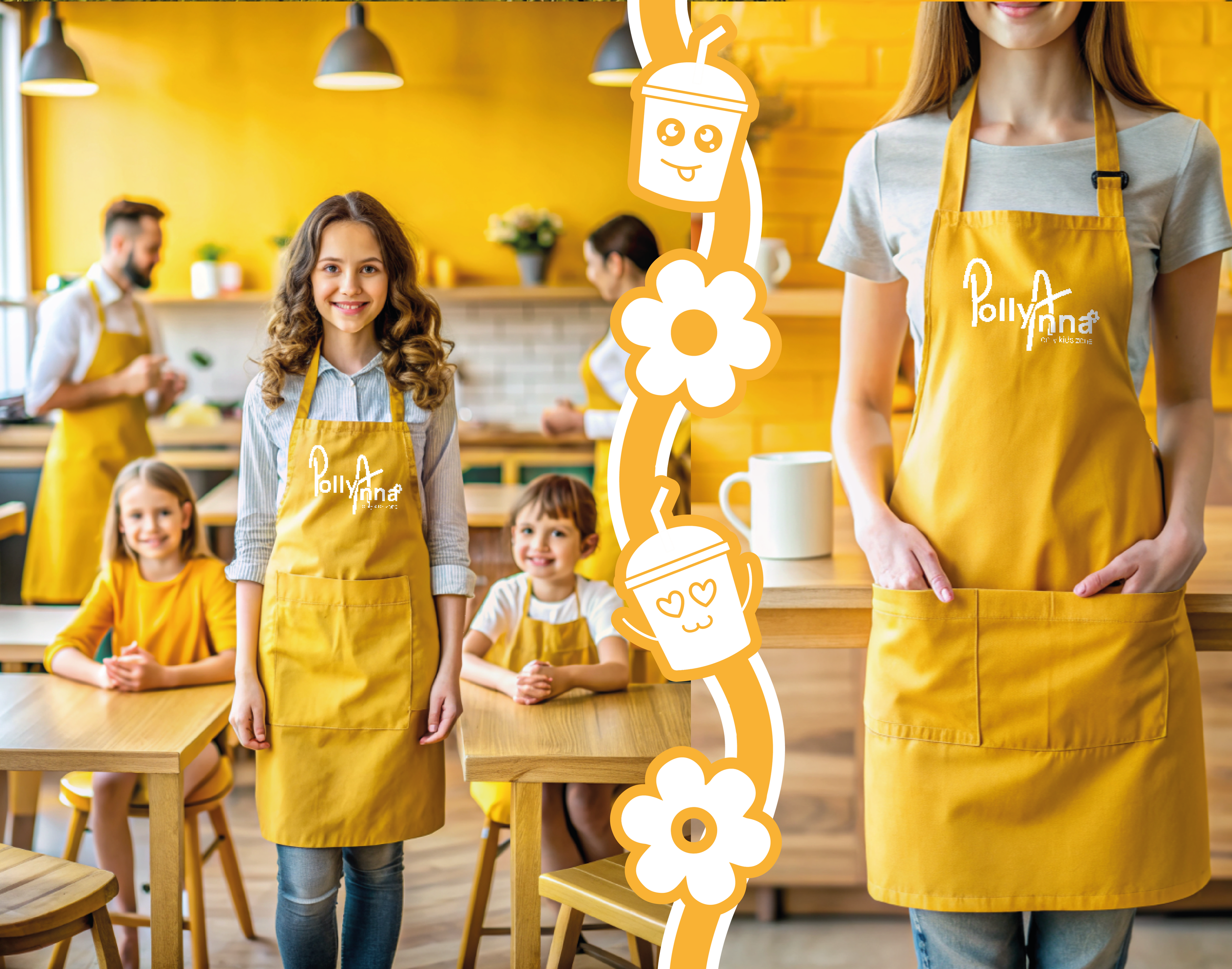
Логотип выполнен с жизнерадостным настроением, которое усиливают озорные буквы "P" и "А", милый цветочек стал неотъемлемой частью лого, подчеркивая легкость, нежность, детскость.
Фирменным цветом проекта стал солнечный желтый, который ассоциируется с детской лучезарной улыбкой! =) Фирменной типографикой выступает шрифт Manrope (OFL), который отлично подчеркивает детскую простоту, но волшебность!
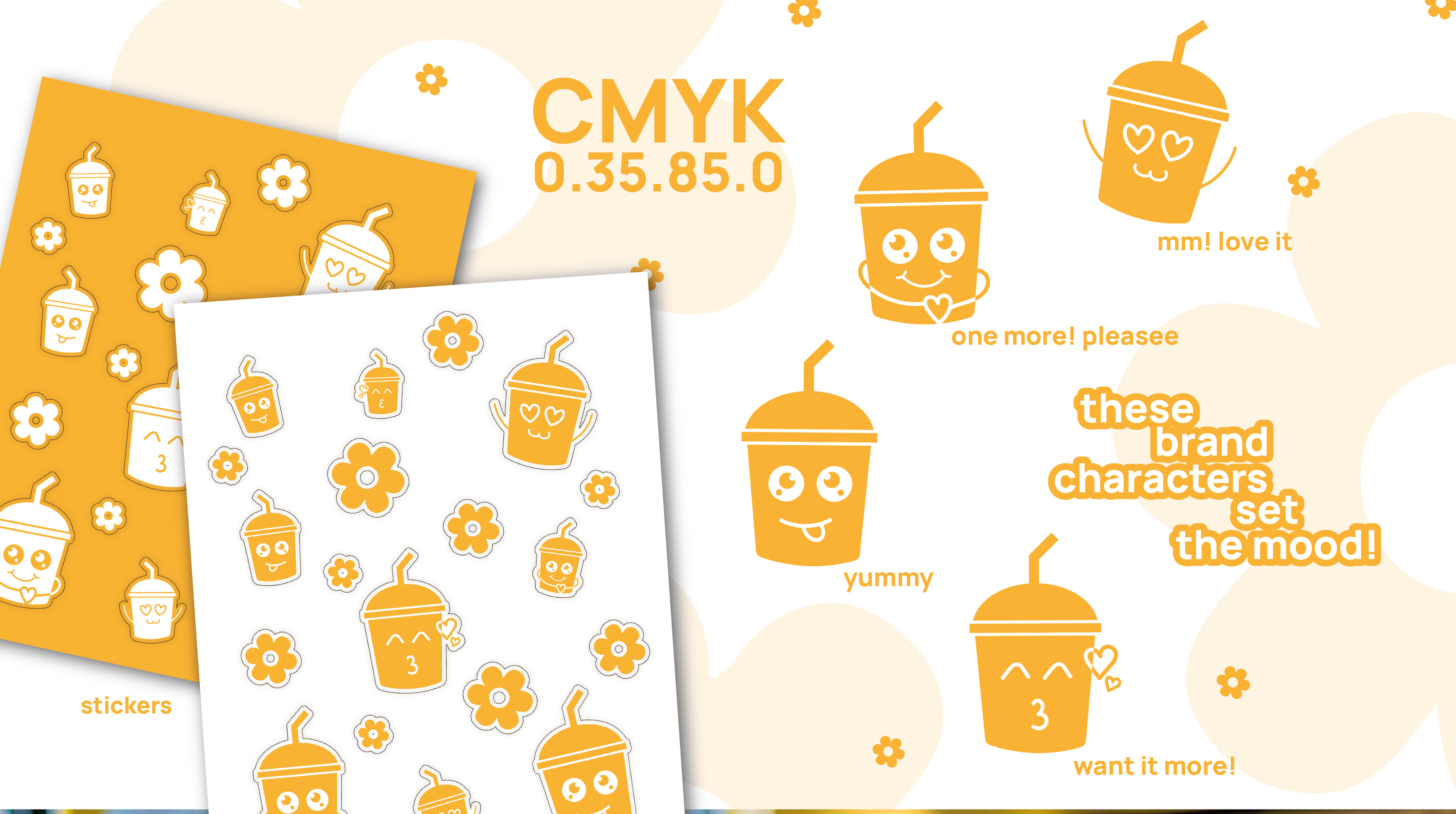
ФИРМЕННАЯ ГРАФИКА:
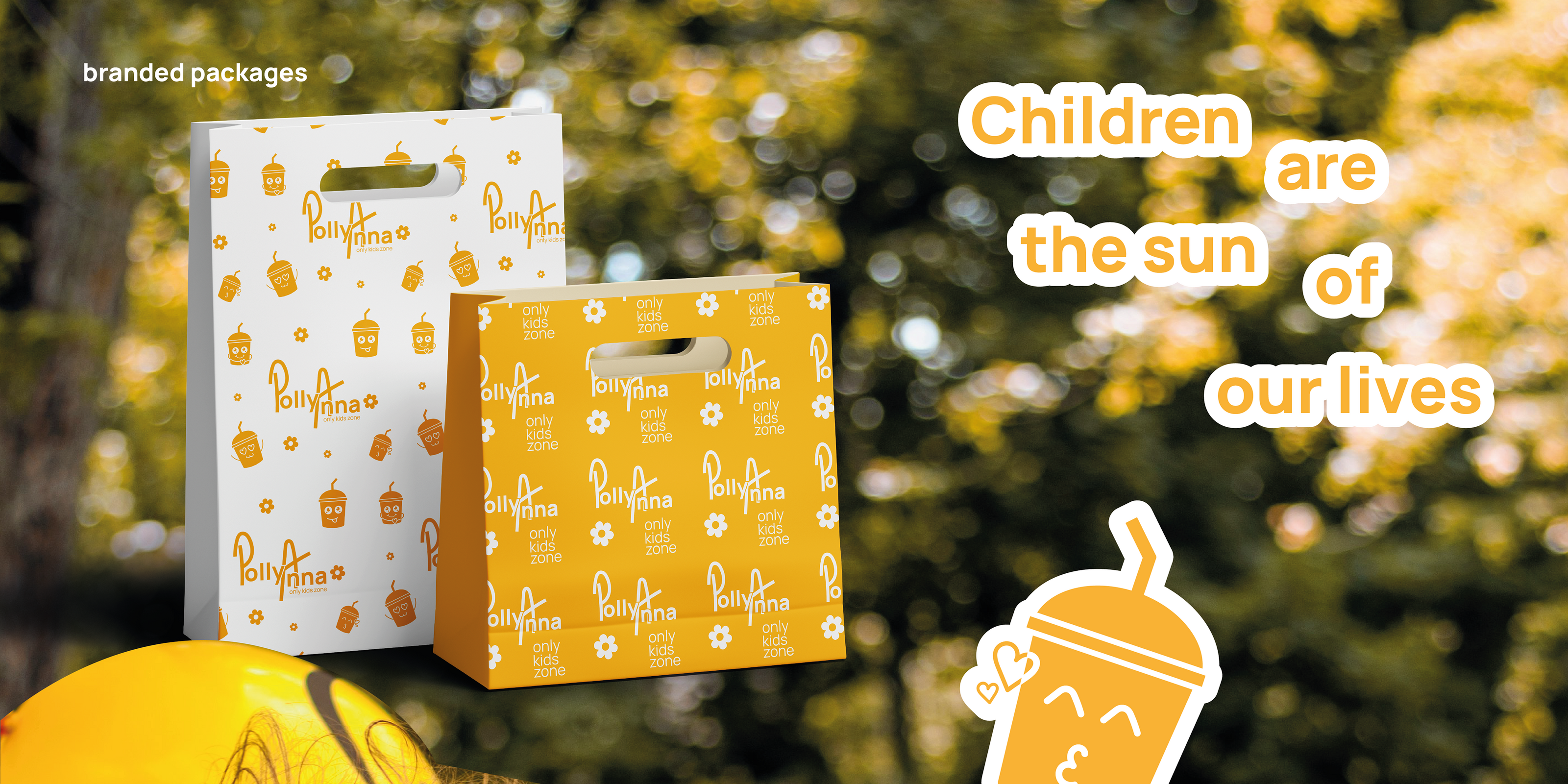
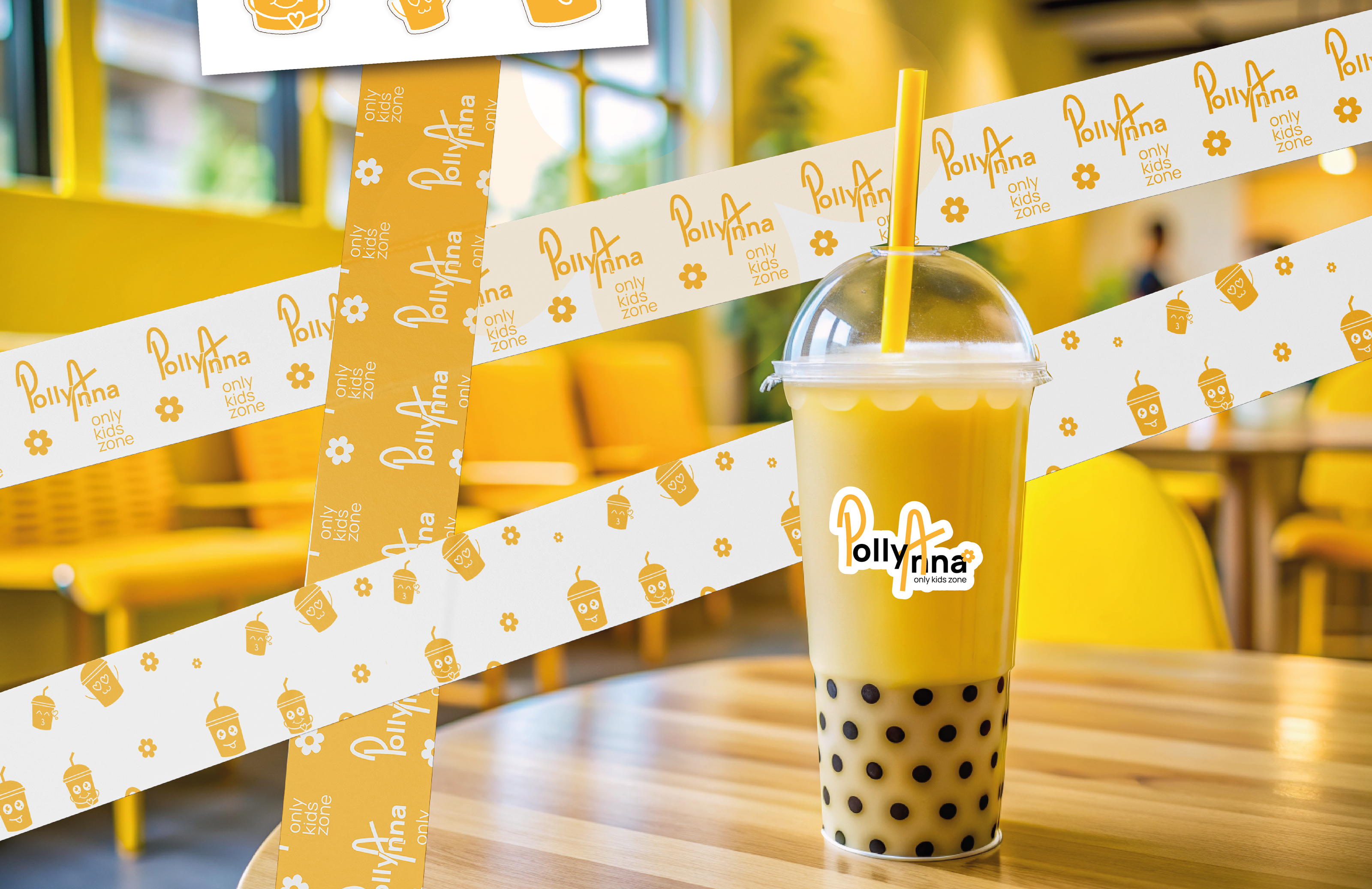
В качестве фирменной графики используются специально разработанные иллюстрации озорных стаканчиков, которые станут отличными друзьями для детей, радуя их своим дружелюбием на картинках (стикерах) и вкусными десертами в жизни! Данные иллюстрации являются частью фирменной графики и дополняют образ бренда.
Также были разработаны фирменные паттерны - с использованием логотипа, а также иллюстраций стаканчиков. Дополнительно фирменный стиль усиливается белой/солнечно-желтой рамкой по краям, не закрываясь с нижней стороны. Все это создает сильный образ бренда и является прочной базой для его узнаваемости.
СВЯЗАТЬСЯ СО МНОЙ ДЛЯ РАЗРАБОТКИ ДИЗАЙНА:
WHATSAPP, TELEGRAM, VK, INST
(ссылки кликабельны)
[ENG]
ABOUT THE PROJECT:
It was necessary to develop a brand design for a company organizing children's events, "PollyAnna". The company strives to delight children by organizing holidays for them with the most interesting stories!
The logo is made with a cheerful mood, which is reinforced by the mischievous letters “P” and “A”; the cute flower has become an integral part of the logo, emphasizing the lightness and tenderness of childhood.
The signature color of the project is sunny yellow, which is associated with a child’s radiant smile! =) The signature typography is the Manrope (OFL) font, which perfectly emphasizes childish simplicity, but magic!
BRAND GRAPHICS:
Specially designed illustrations of mischievous cups are used as branded graphics, which will become excellent friends for children, delighting them with their friendliness in pictures (stickers) and delicious desserts in life! These illustrations are part of the corporate graphics and complement the brand image.
Branded patterns were also developed - using the logo, as well as illustrations of the cups. Additionally, the branding is enhanced by a white/solar yellow frame around the edges, without being covered at the bottom. All this creates a strong brand image and is a solid basis for its recognition.
CONTACT ME TO DEVELOP A DESIGN:
(links are clickable)