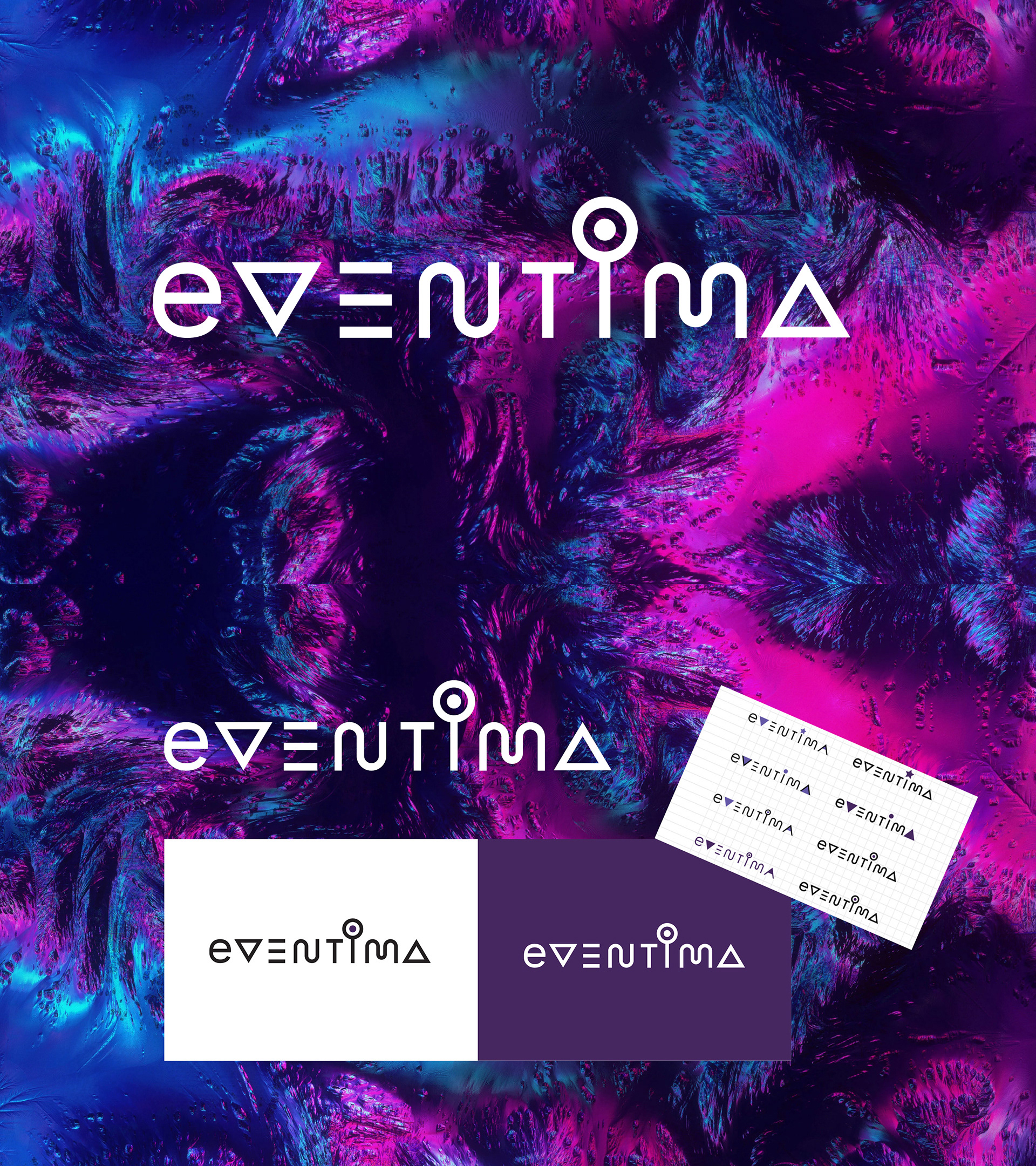
This logotype was created for an event agency located in Moscow.
The task was to create a modern logo that would transfer a creative spirit of the agency.
I tested different shapes that could somehow be associated with an event industry, trying to visualise what event agencies give to their clients. And suddenly I came up with an idea of a magic wand that also reminded me of a radio or TV antenna, and it also looked like a lollipop, so it was a perfect variant of a shape that involved many kinds of meanings that could be assosiated wit entertainment. I used the wand for "i" and also added a little bit of character to other letters so that the whole logo looked special. The "wand" could also be used in the brand identity.