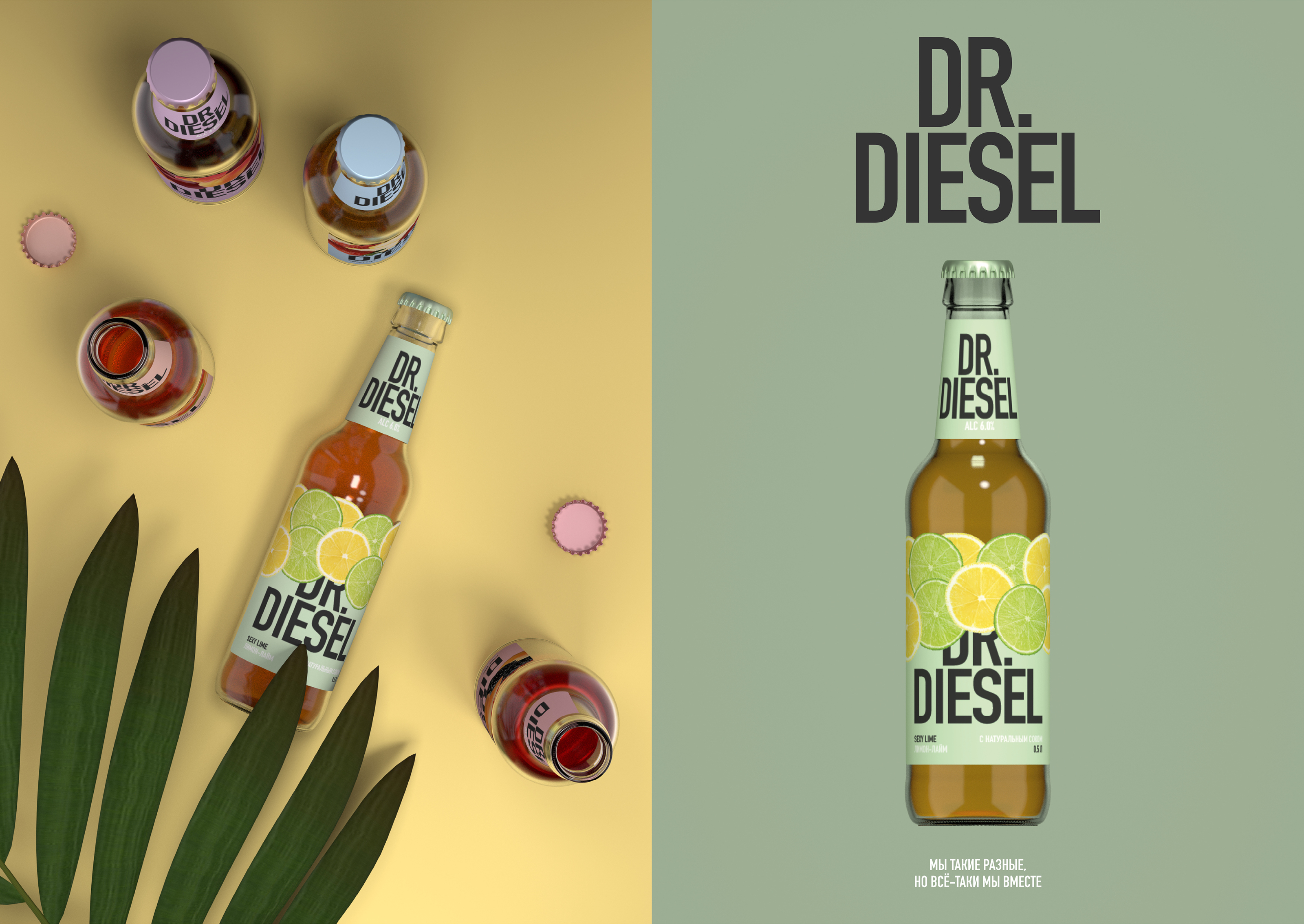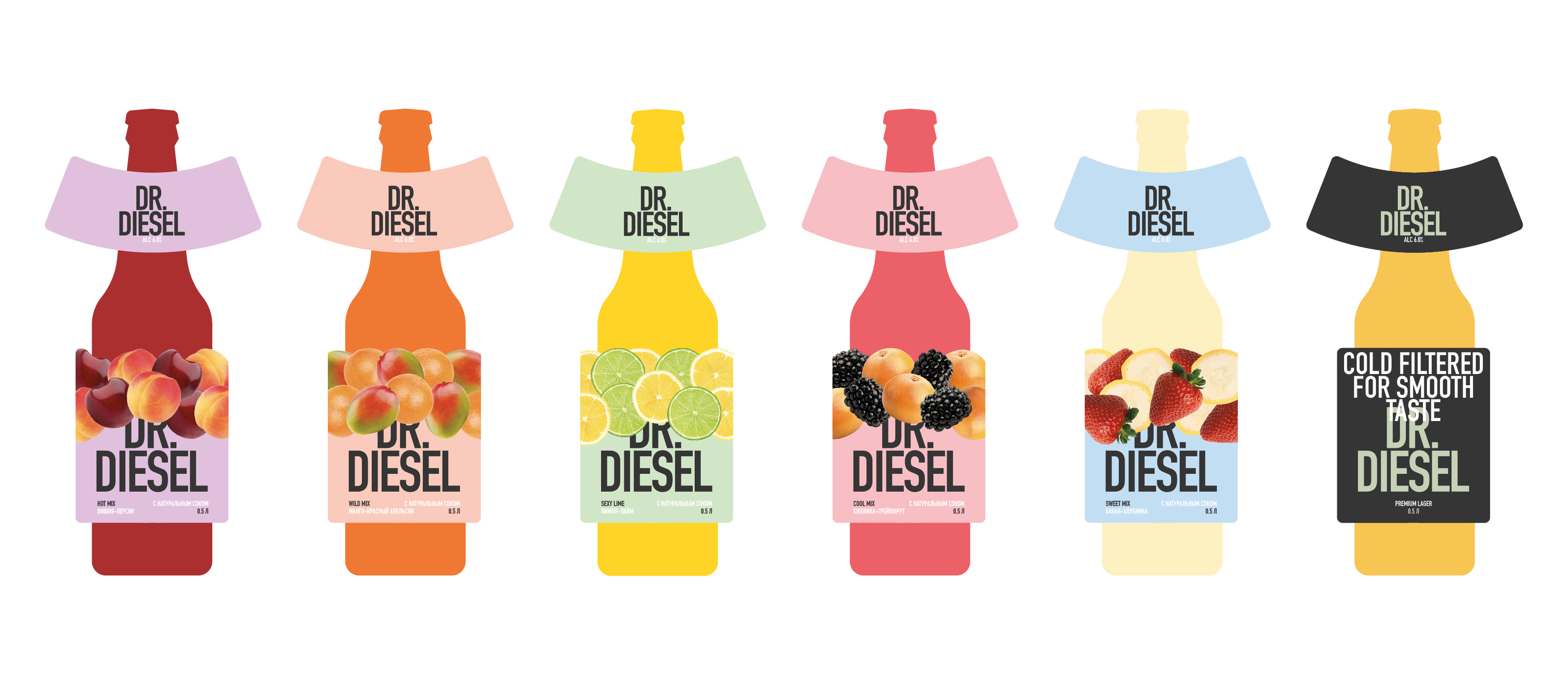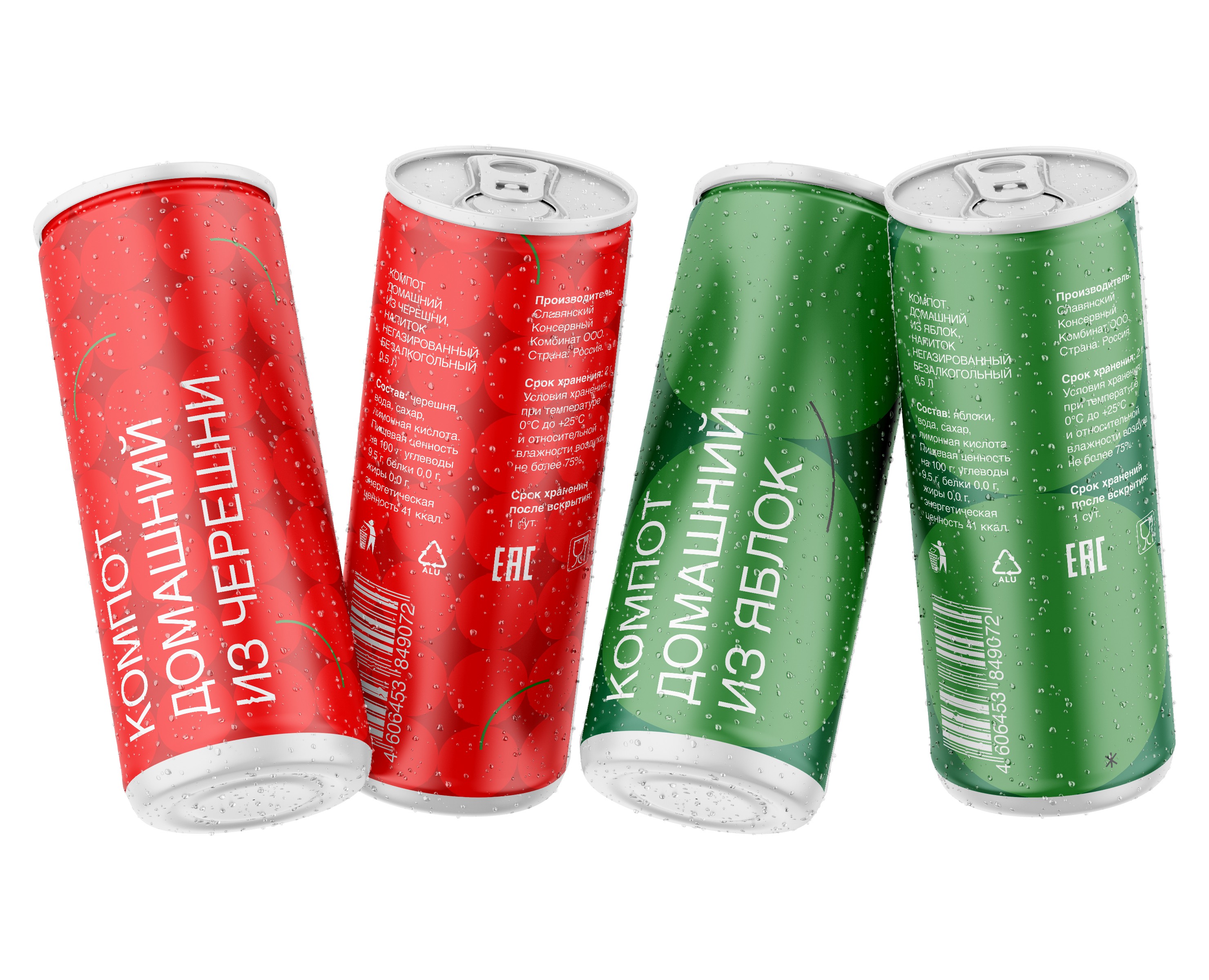
The goal of the Dr.Diesel redesign is to bring new meanings to the packaging and become closer to the target audience.
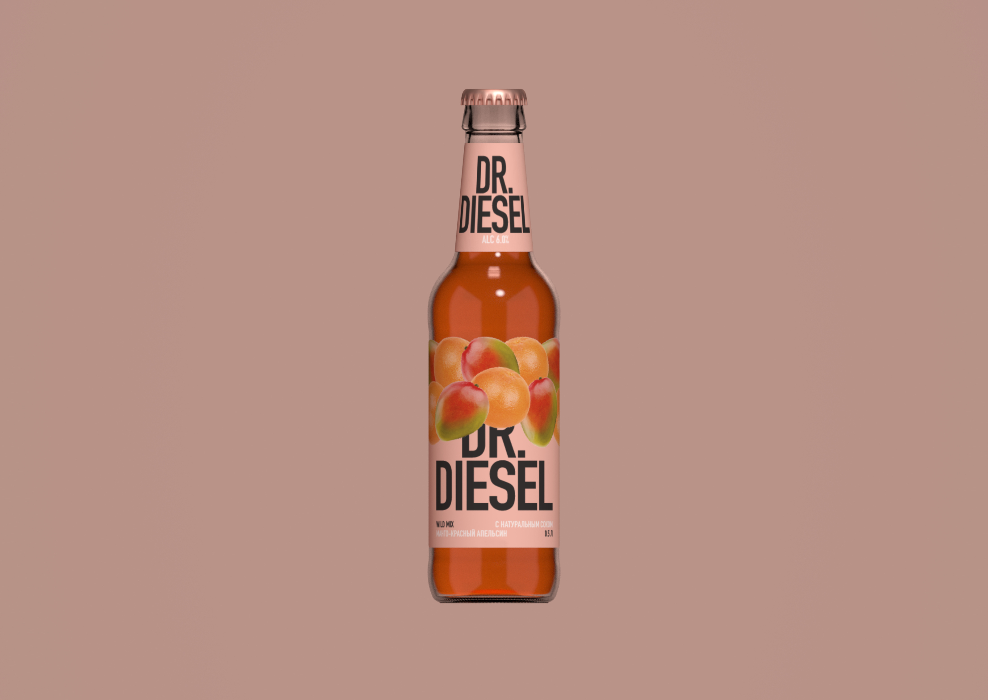
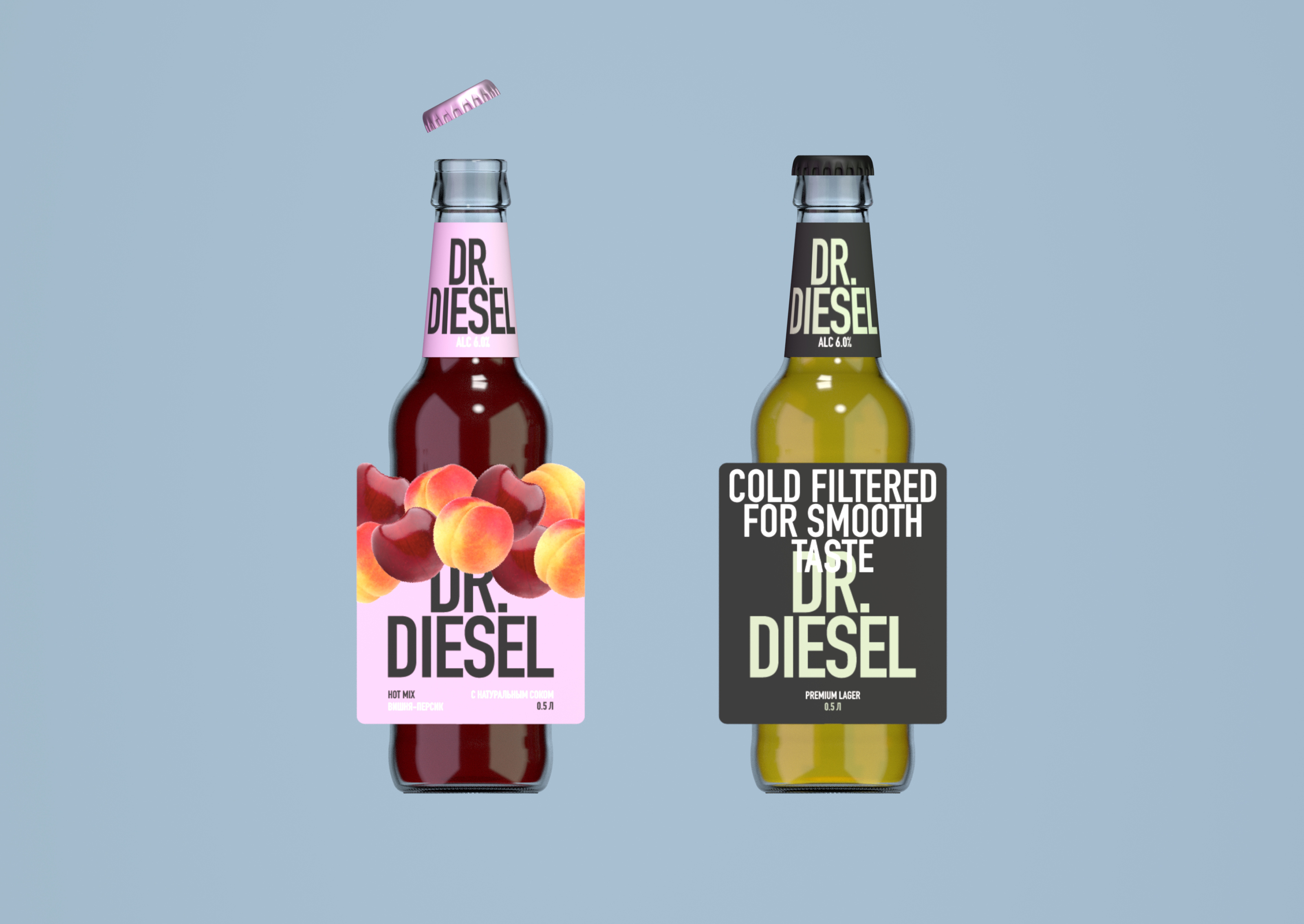
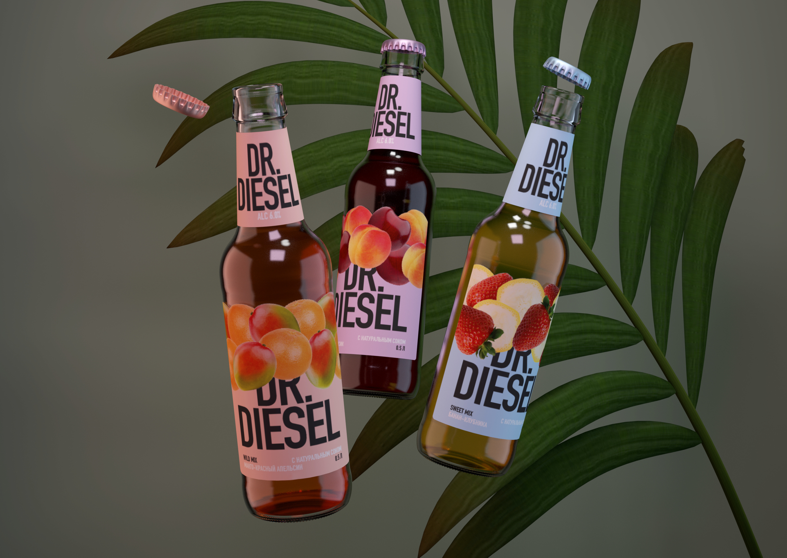
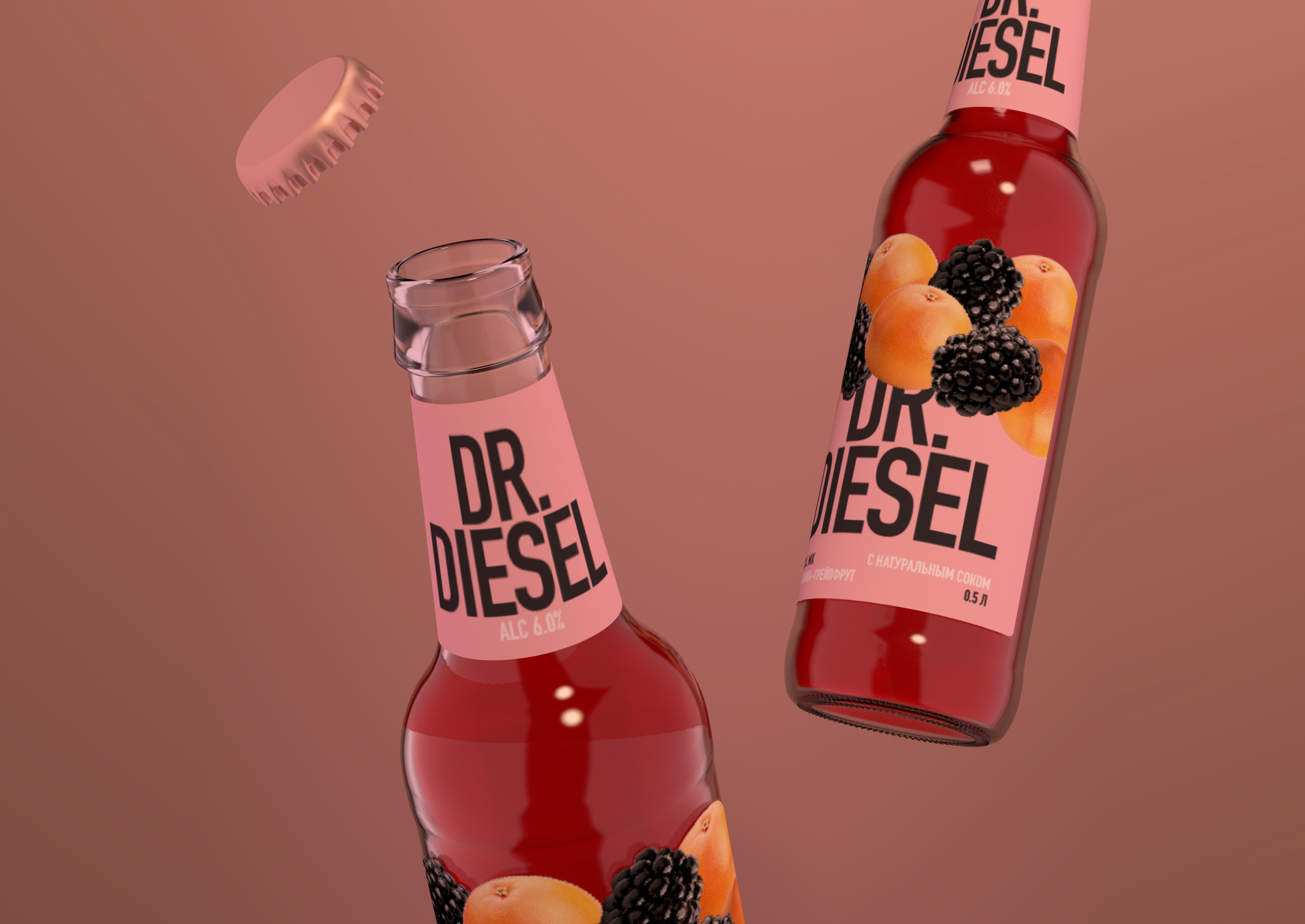
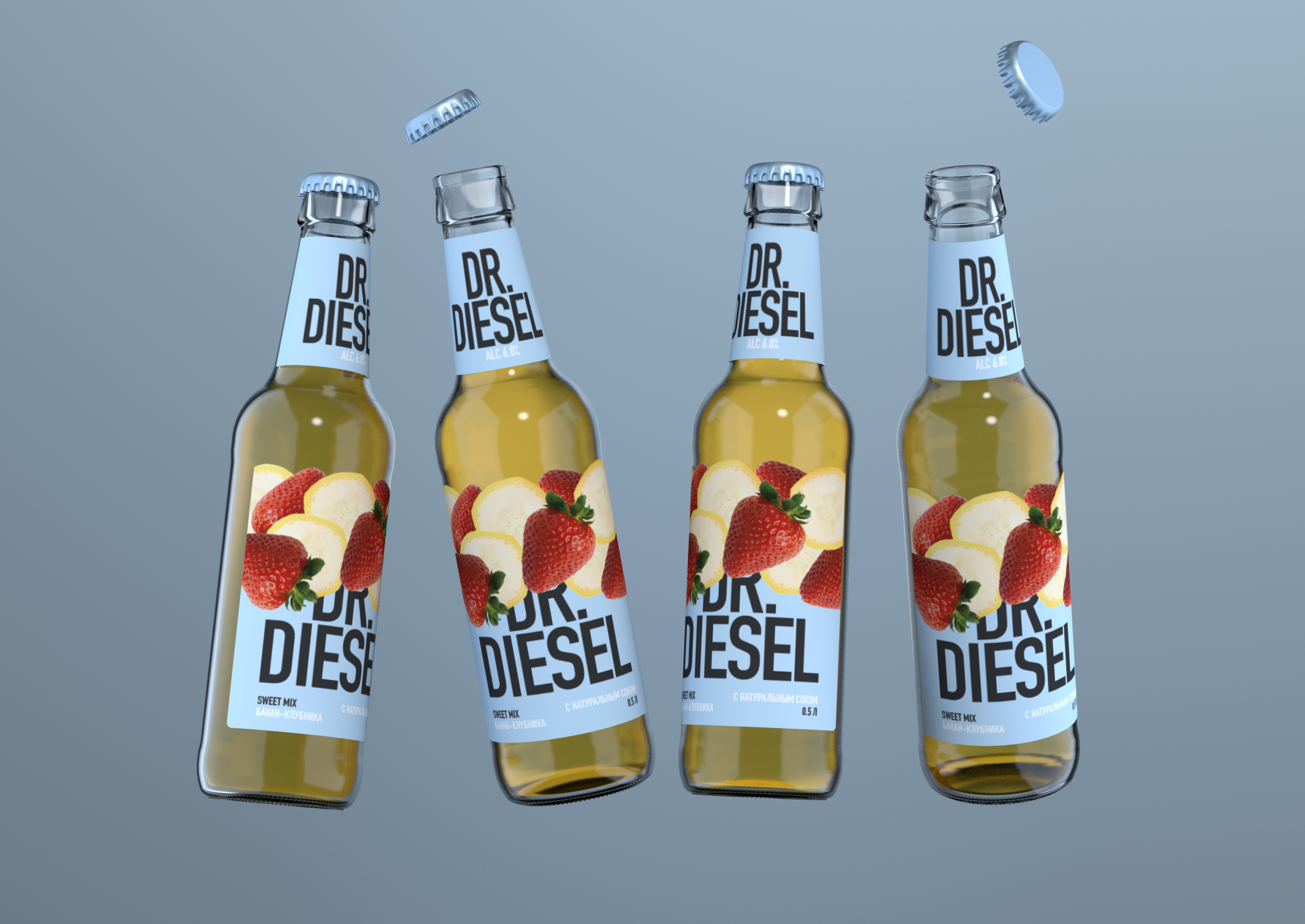
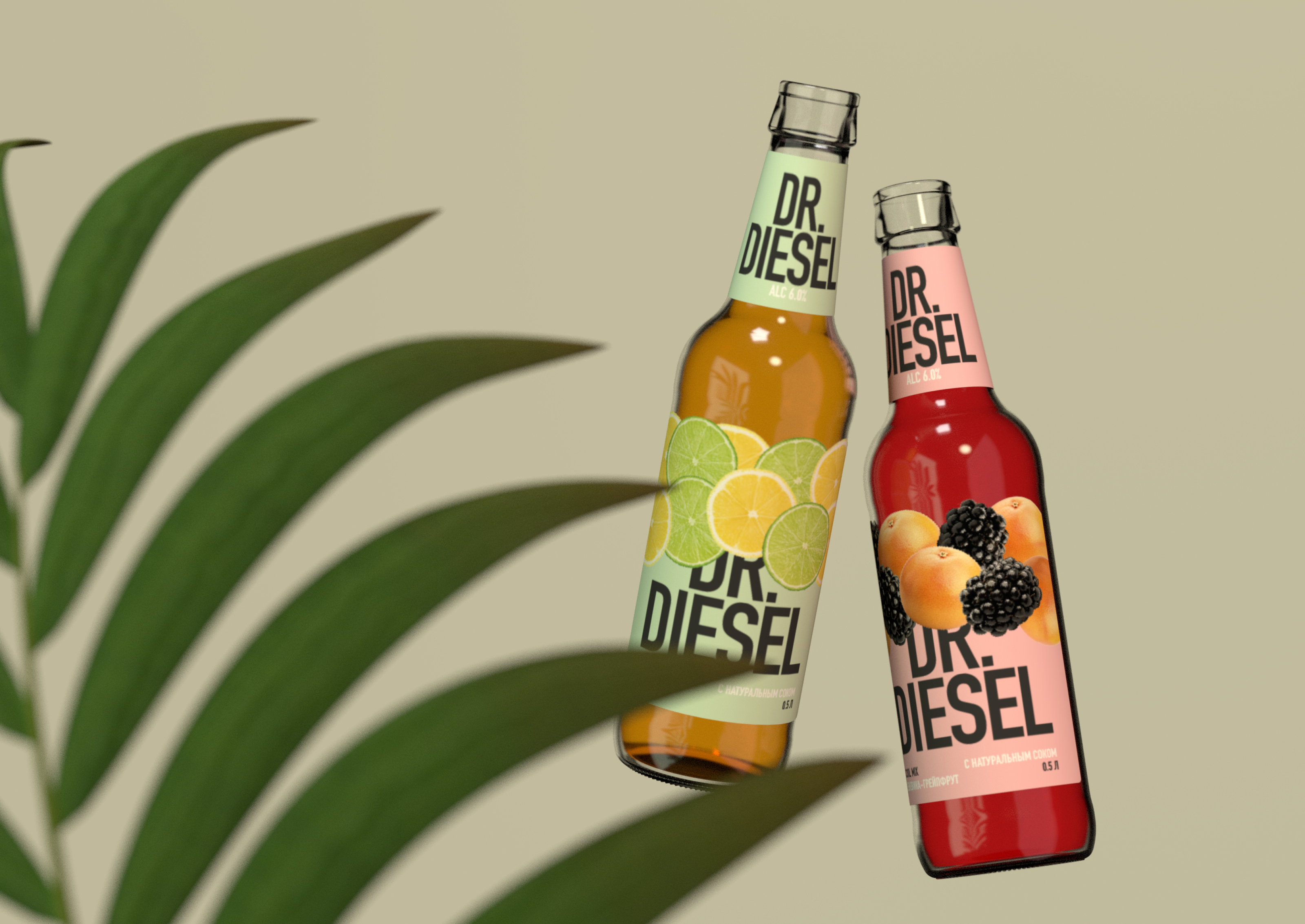
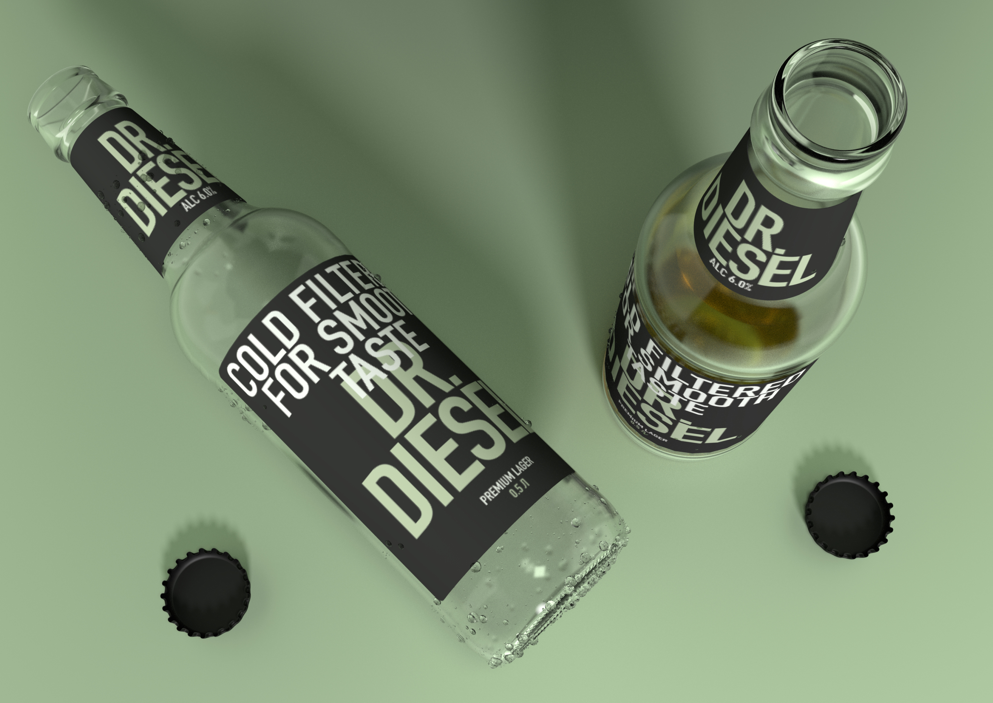
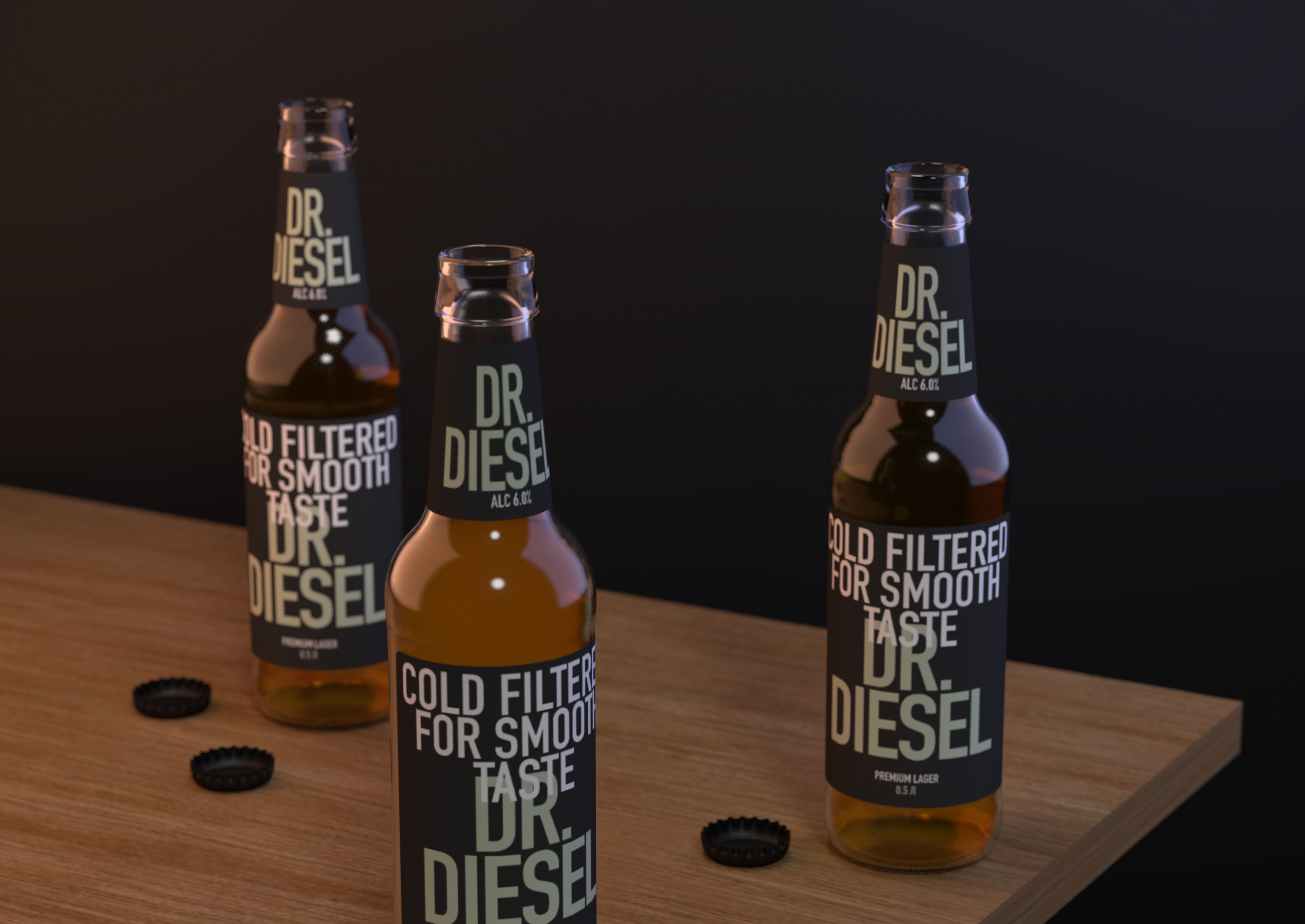
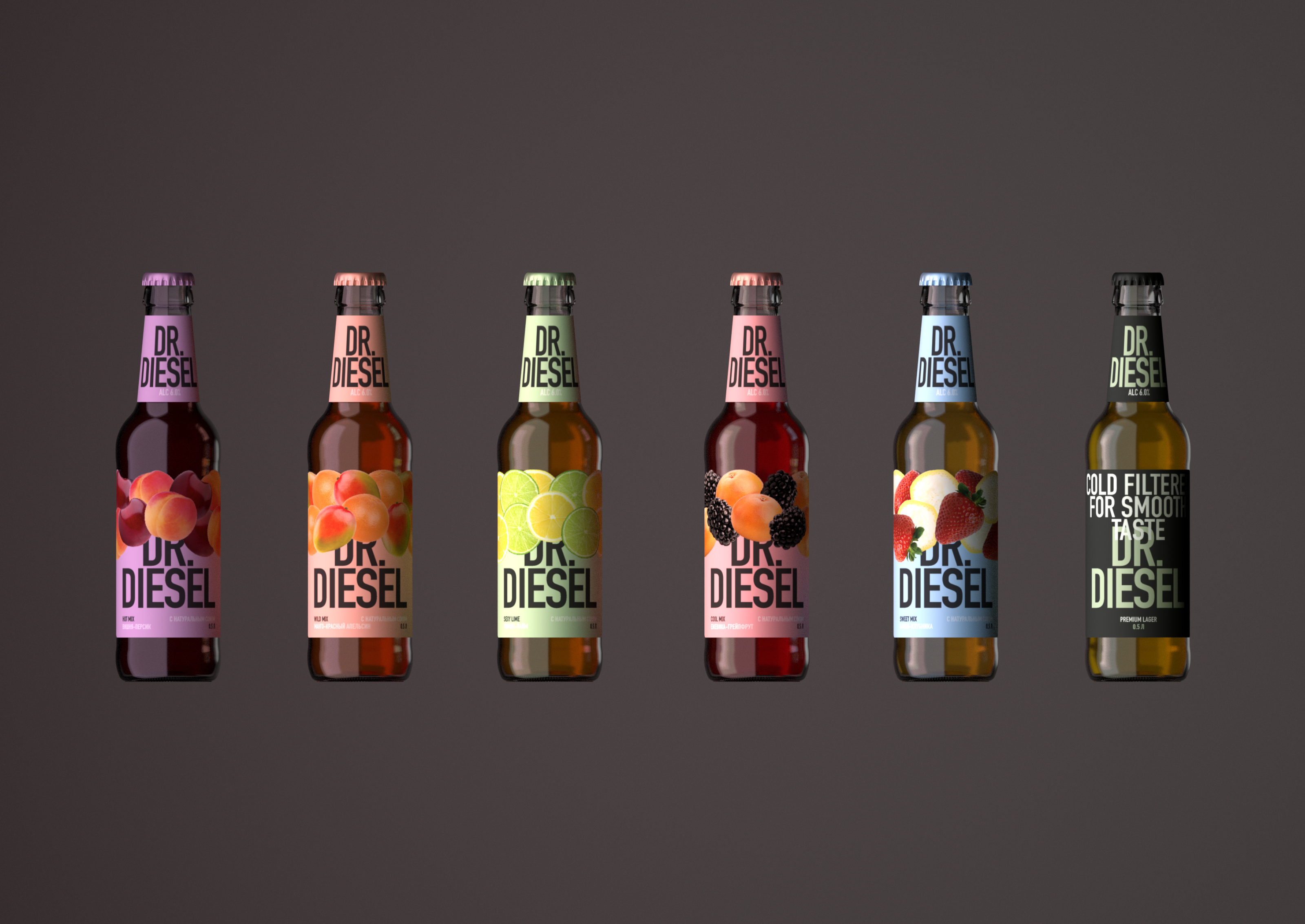
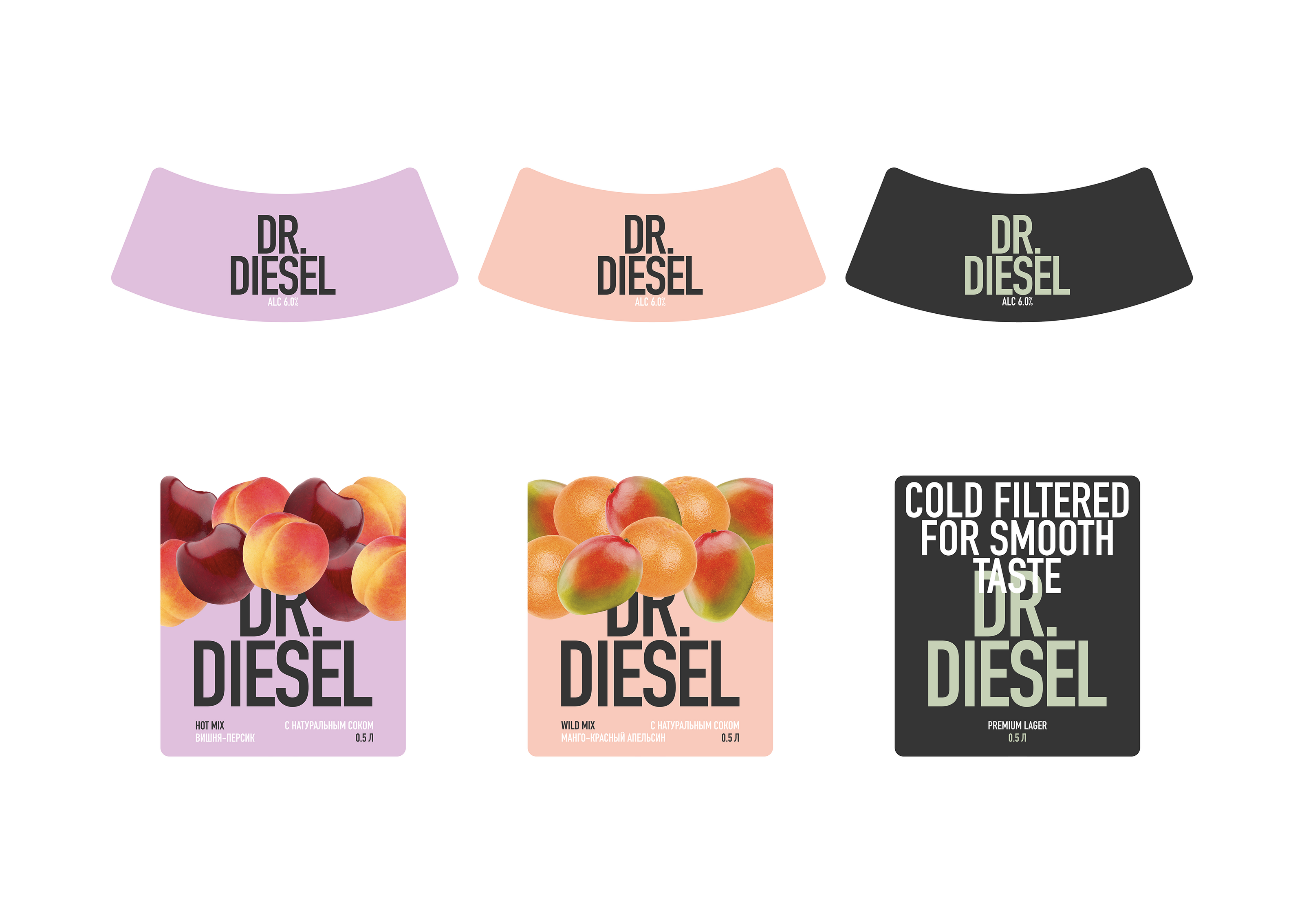
The new packaging design (labels for the bottle) is laconic, neat thanks to muted colors, calm typography, and at the same time bright, juicy, multi-layered thanks to the abundance of fruits representing the SKU. The updated lager has the same characteristics, but is based on typography and features colored text on a black background (fruit beers have black text on a colored background).
Like any young man who can be reserved in some situations and reckless in others, Dr. Diesel combines opposite traits. This is how the brand becomes emotionally closer to young people.