

LANNCY
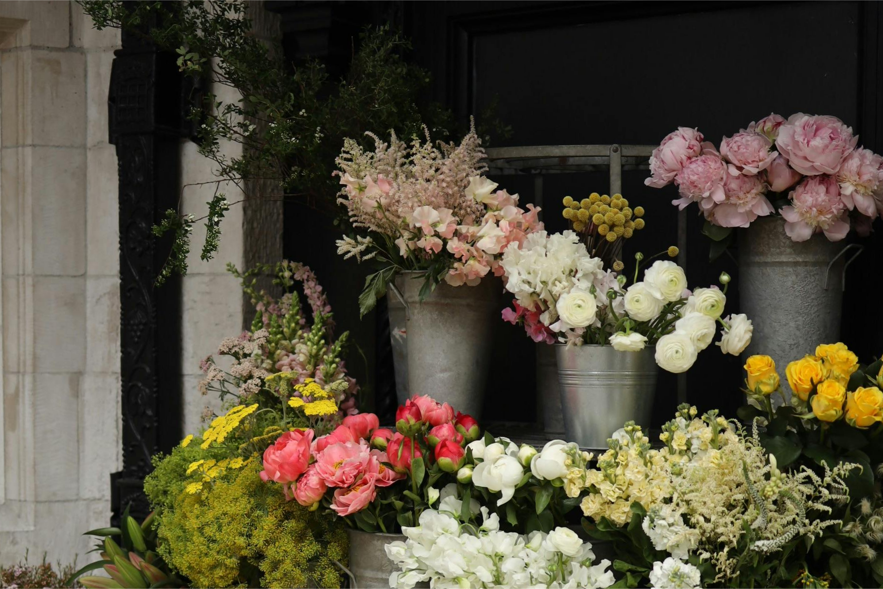
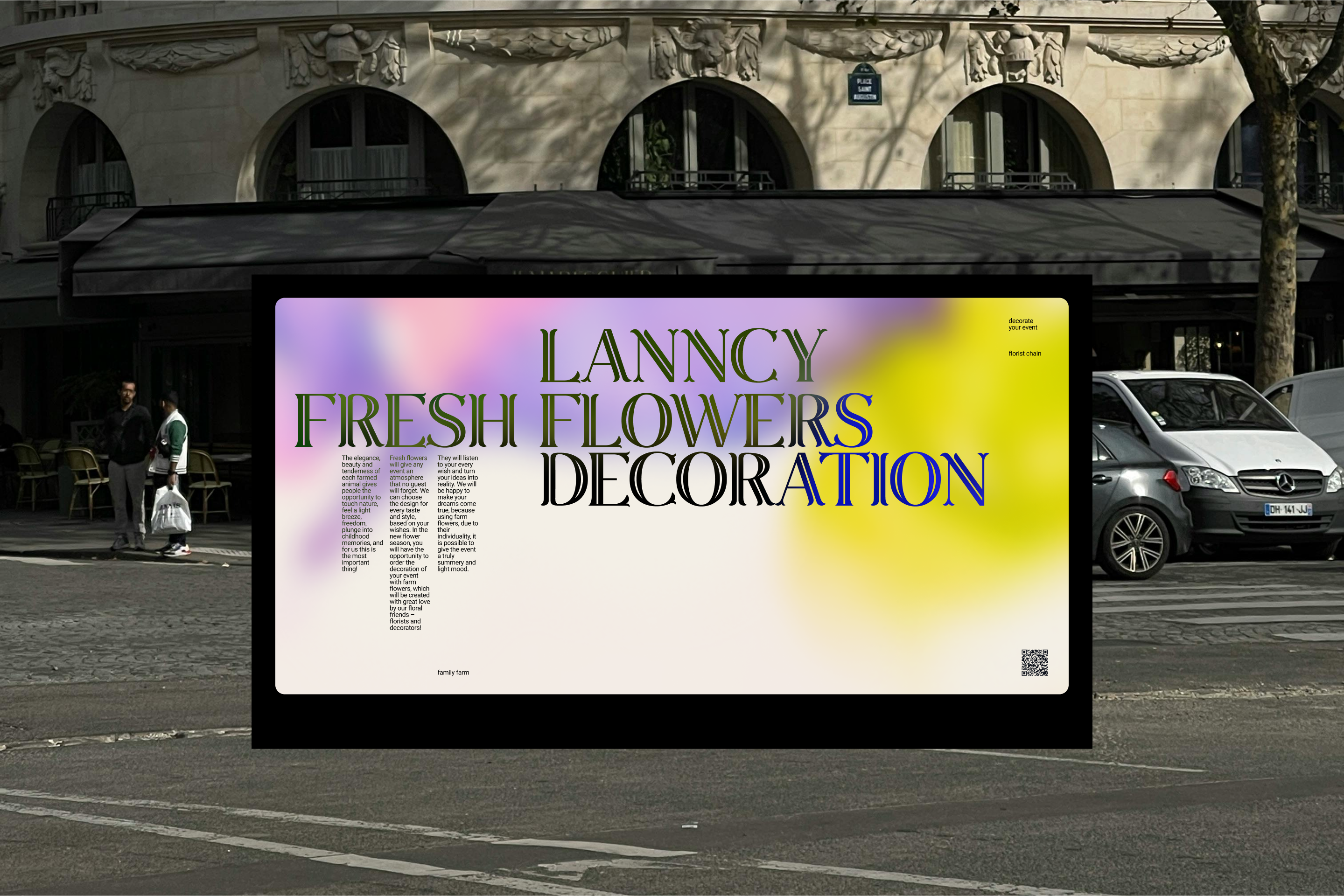
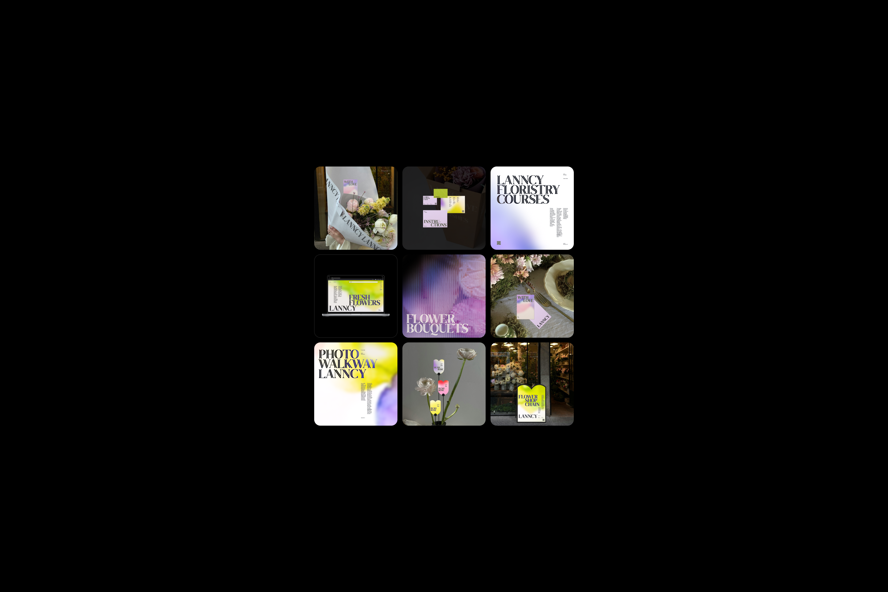
LANNCY — это семейная ферма со своей сетью цветочных магазинов. В продаже есть как готовые букеты, клубни для посадки, так и возможность самим собрать букет. Работа фермы построена на принципах бережного отношения к природе и человеку, открытости к совместному творчеству, а также любви к традициям, что стало опорой для развития бренда.
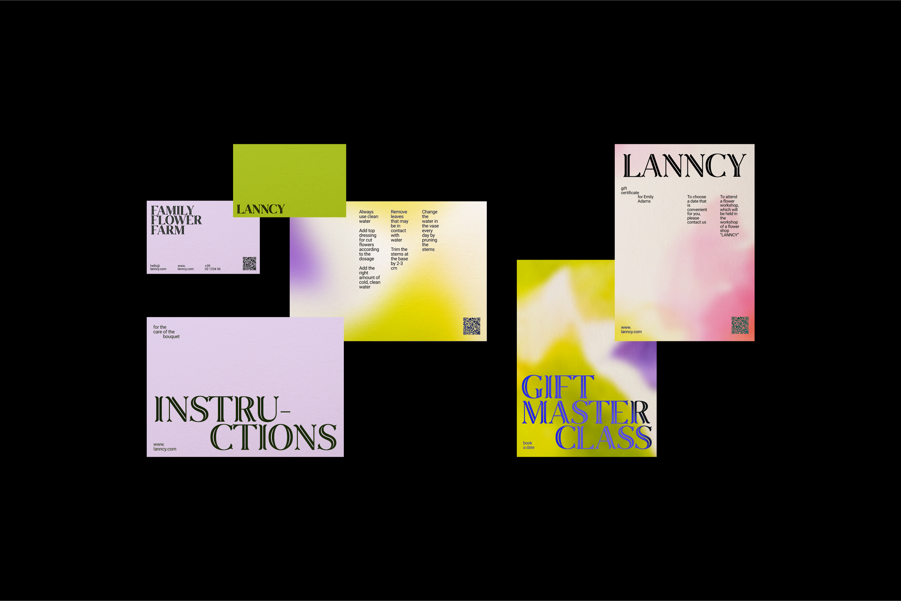
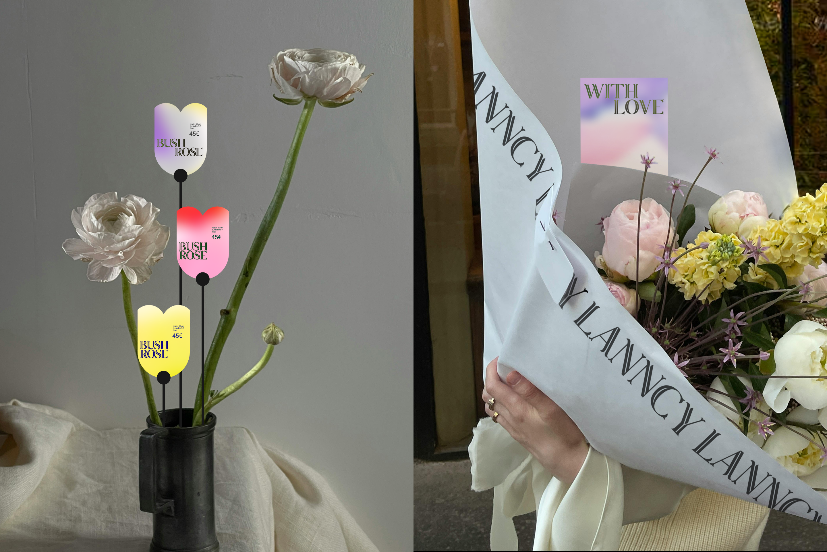
Для фермы LANNCY был разработан нейминг. Название бренда представляет собой сочетание слов Legacy — наследние, Lace — кружево, которое вяжет бабушка, что ассоциируется с уютом и семейным очагом, и Anna — имя основательницы сети цветочных магазинов. Также в названии есть привязка к цветку-символу семьи «Кружево королевы Анны». Сам цветок напоминает по форме зонт, что отсылает нас к знаменитой фразе «Главней всего — погода в доме...». Когда цветок увядает, то словно сворачивается в форму птичьего гнезда — семейного гнездышка.
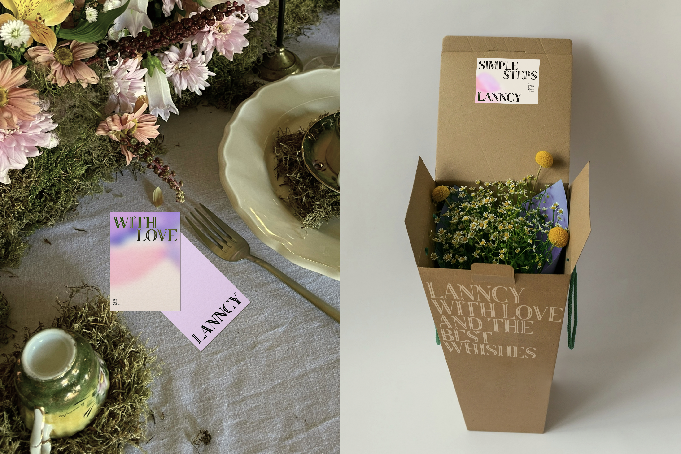
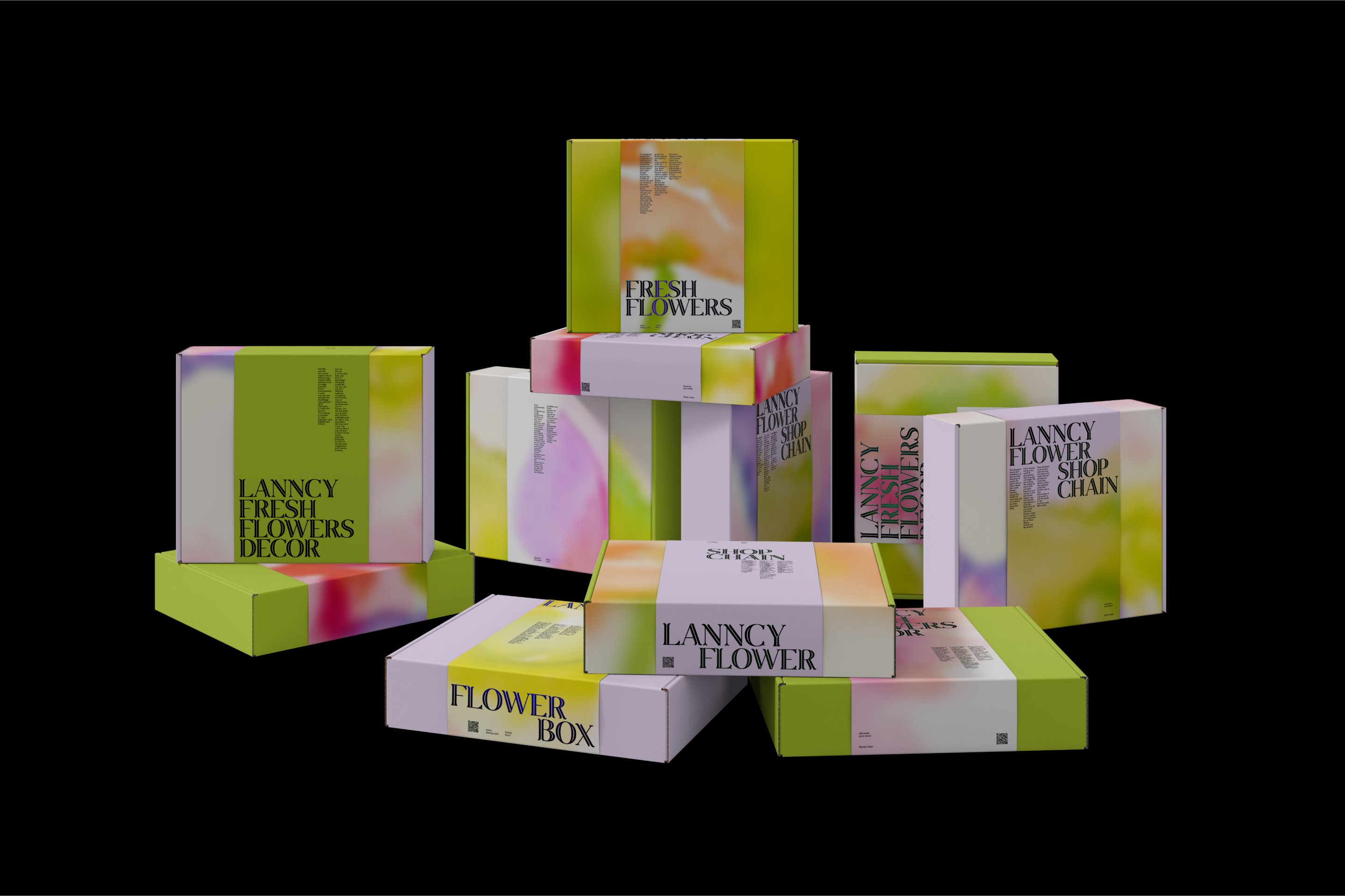
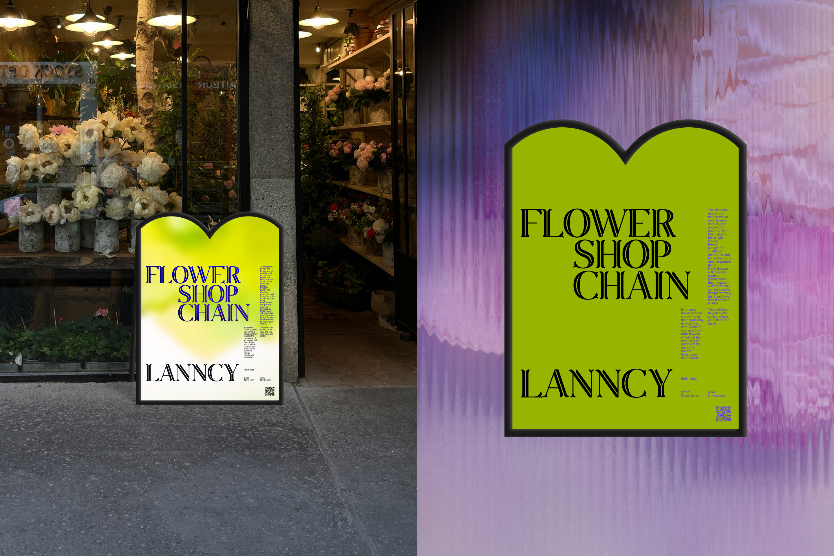
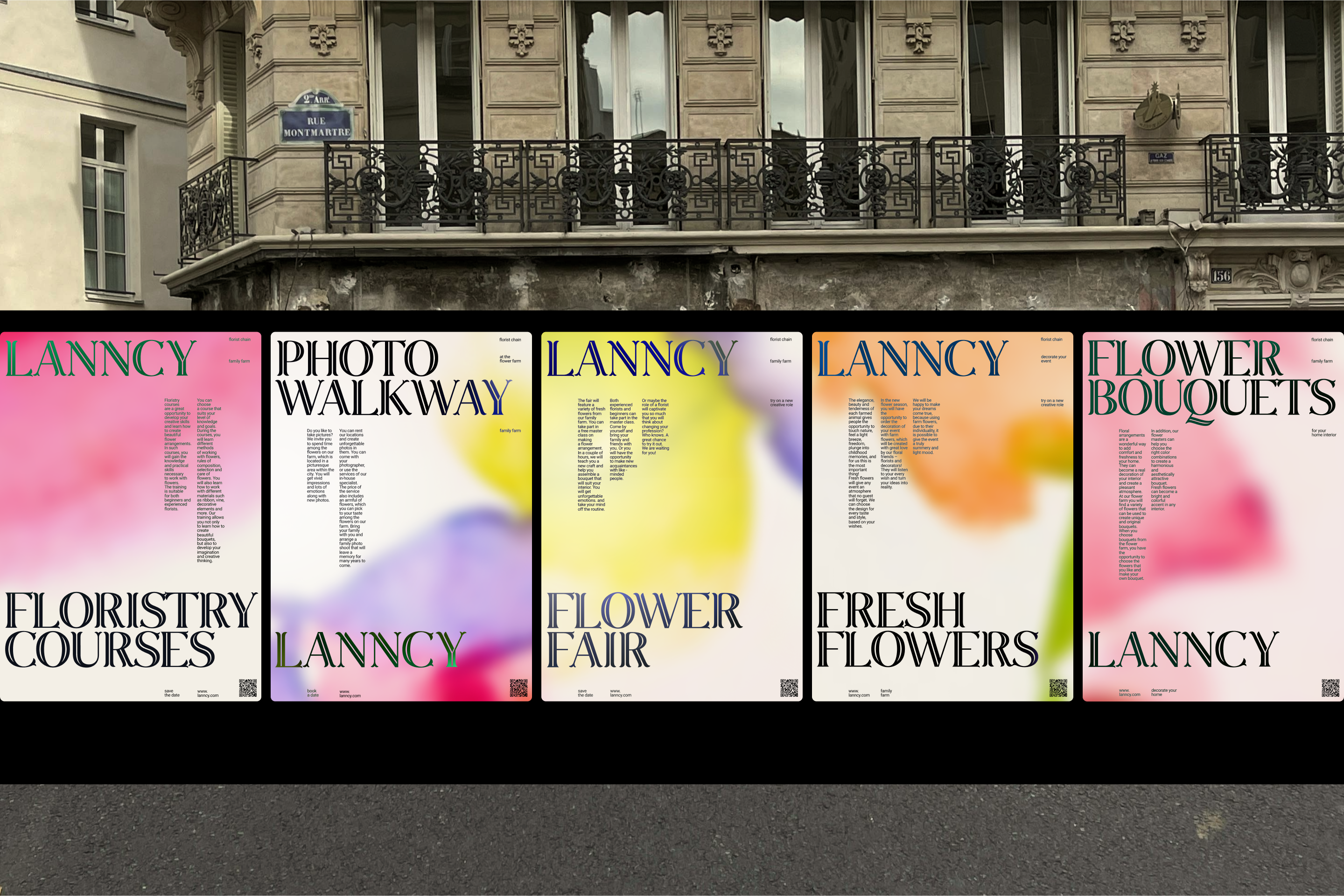
Центральным визуальным элементом айдентики для бренда стал разработанный фирменный шрифт, характер которого напрямую передает связь с цветочной тематикой. В нем использованы формы лепестков и стеблей, пронизывающих каждую букву. Метафорой бренда, которая помогла нащупать визуальную концепцию стала «погода в доме» — мимолетное настроение всей семьи, зависящее от женщины. Чтобы это показать, для бренда была отрисована флора акварелью на холстах, а после переведена в диджитал и заблюрена. Таким образом, бренд акцентирует внимание на творчестве и свободе, настроении героини бренда — женщины, создательницы семейного очага.
LANNCY is a family farm with its own chain of flower shops. There are ready-made bouquets, tubers for planting, and the opportunity to assemble a bouquet yourself. The work of the farm is based on the principles of respect for nature and man, openness to joint creativity, as well as love for traditions, which has become a pillar for the development of the brand.
Naming has been developed for the LANNCY farm. The brand name is a combination of the words Legacy — legacy, Lace — lace, which is knitted by grandmother, which is associated with comfort and family hearth, and Anna — the name of the founder of a chain of flower shops. Also in the name there is a link to the flower-the symbol of the family "Queen Anne's Lace". The flower itself resembles an umbrella in shape, which refers us to the famous phrase "The most important thing is the weather in the house ...". When the flower withers, it seems to curl up into the shape of a bird's nest — a family nest.
The central visual element of the brand's identity is the developed corporate font, the nature of which directly conveys the connection with the floral theme. It uses the shapes of petals and stems that permeate each letter. The metaphor of the brand, which helped to find the visual concept, was "the weather in the house" — the fleeting mood of the whole family, depending on the woman. To show this, flora was painted in watercolor on canvases for the brand, and then transferred to digital and overlooked. Thus, the brand focuses on creativity and freedom, the mood of the heroine of the brand — a woman, the creator of the family hearth.
Дизайнер: Джубуева Мадина