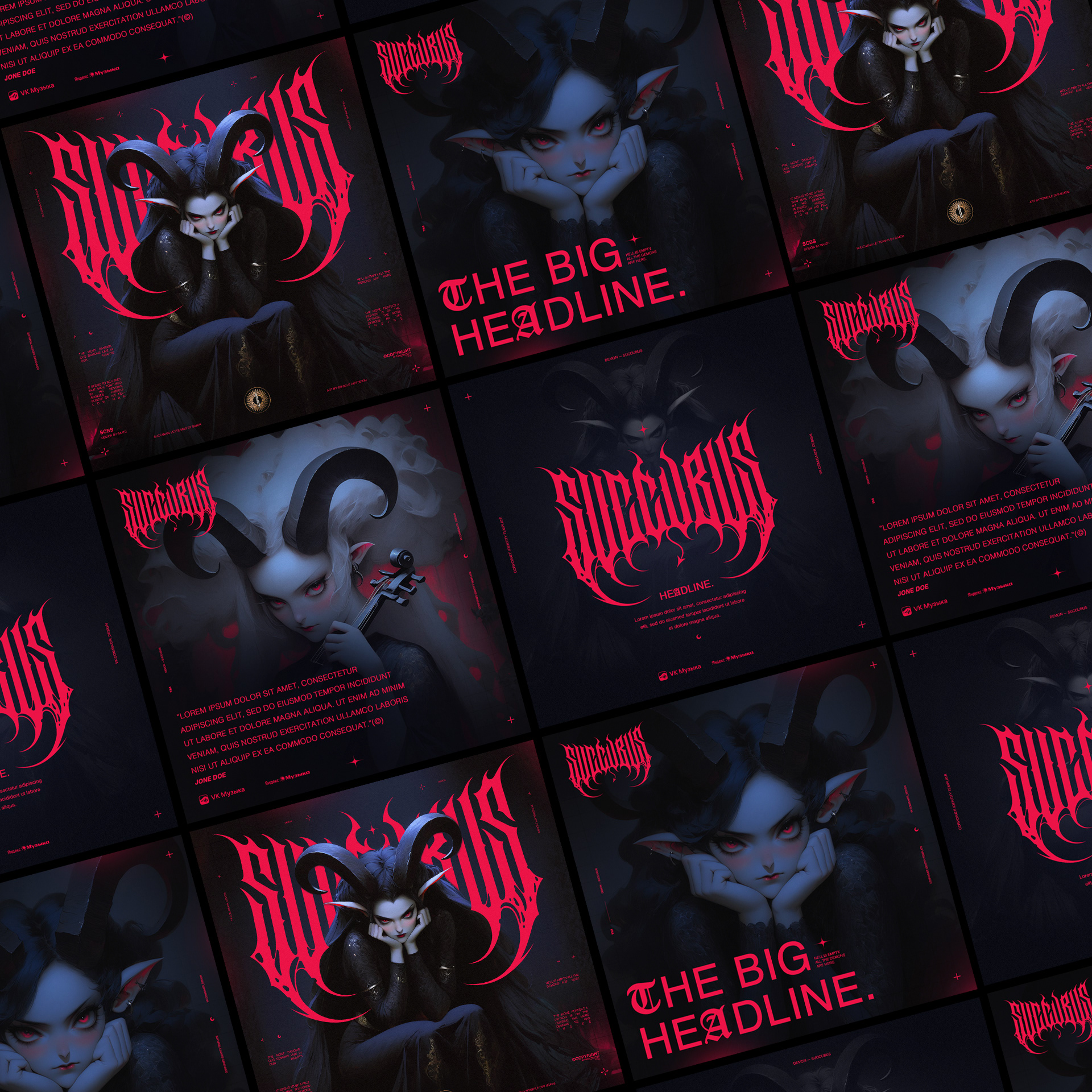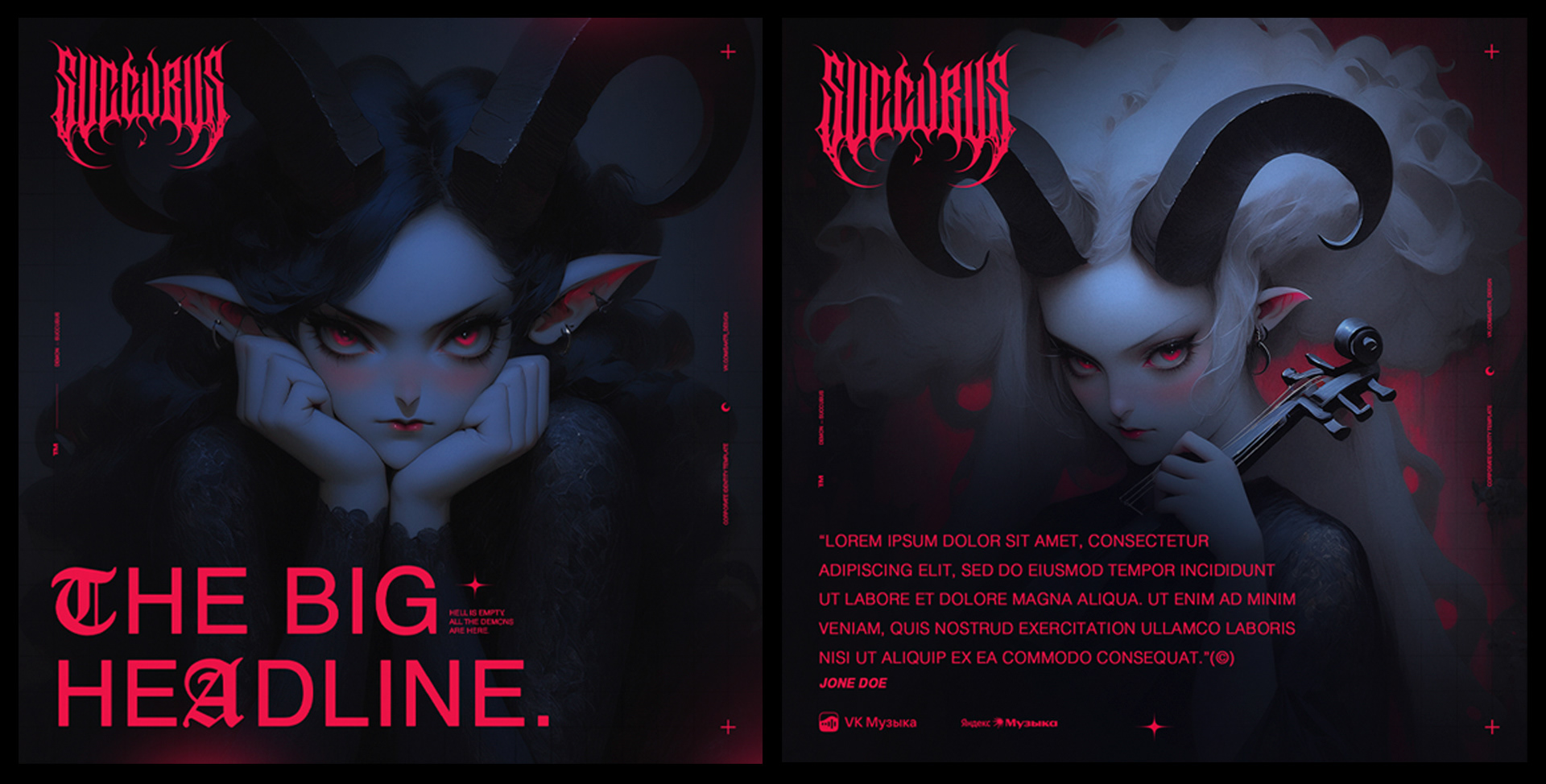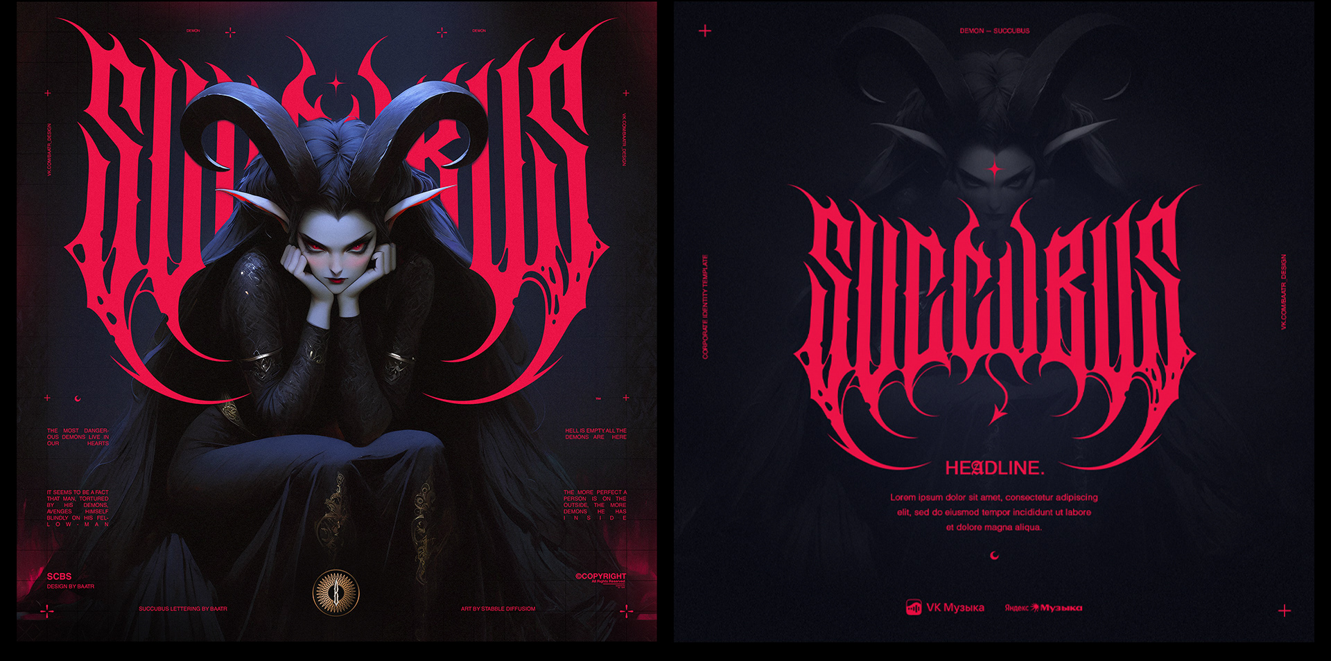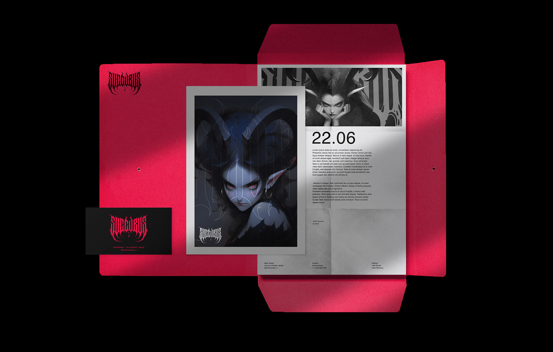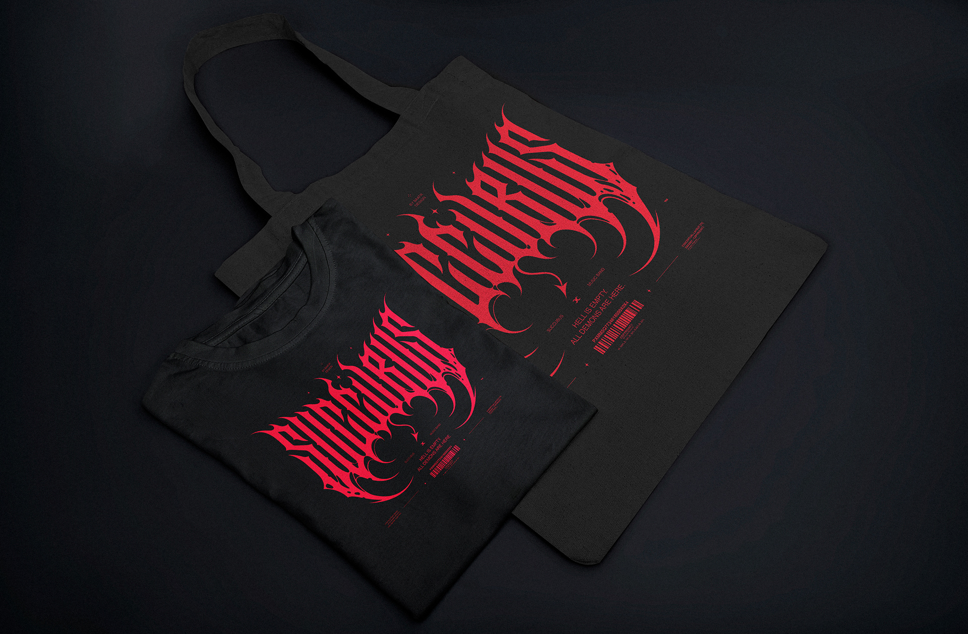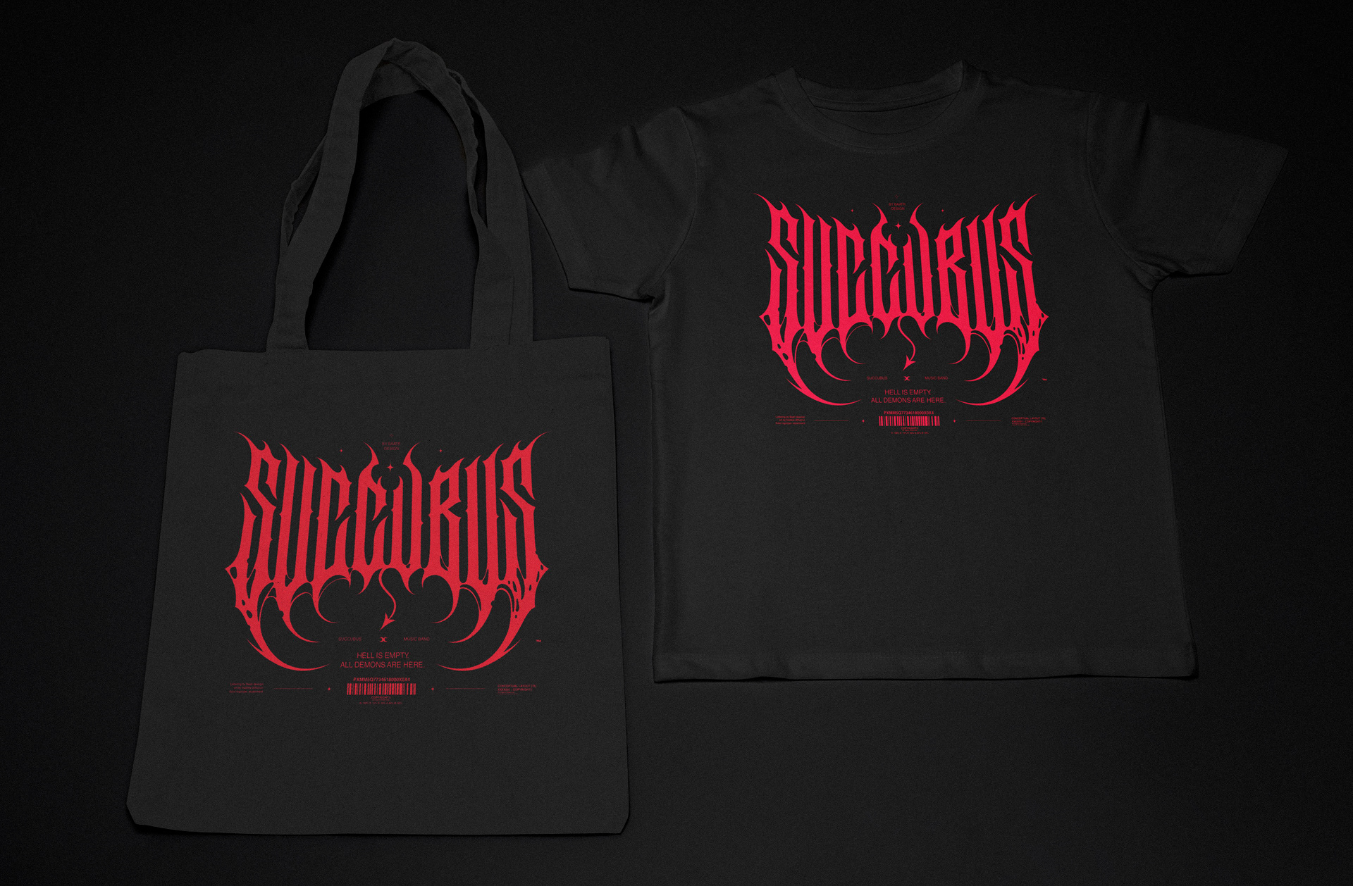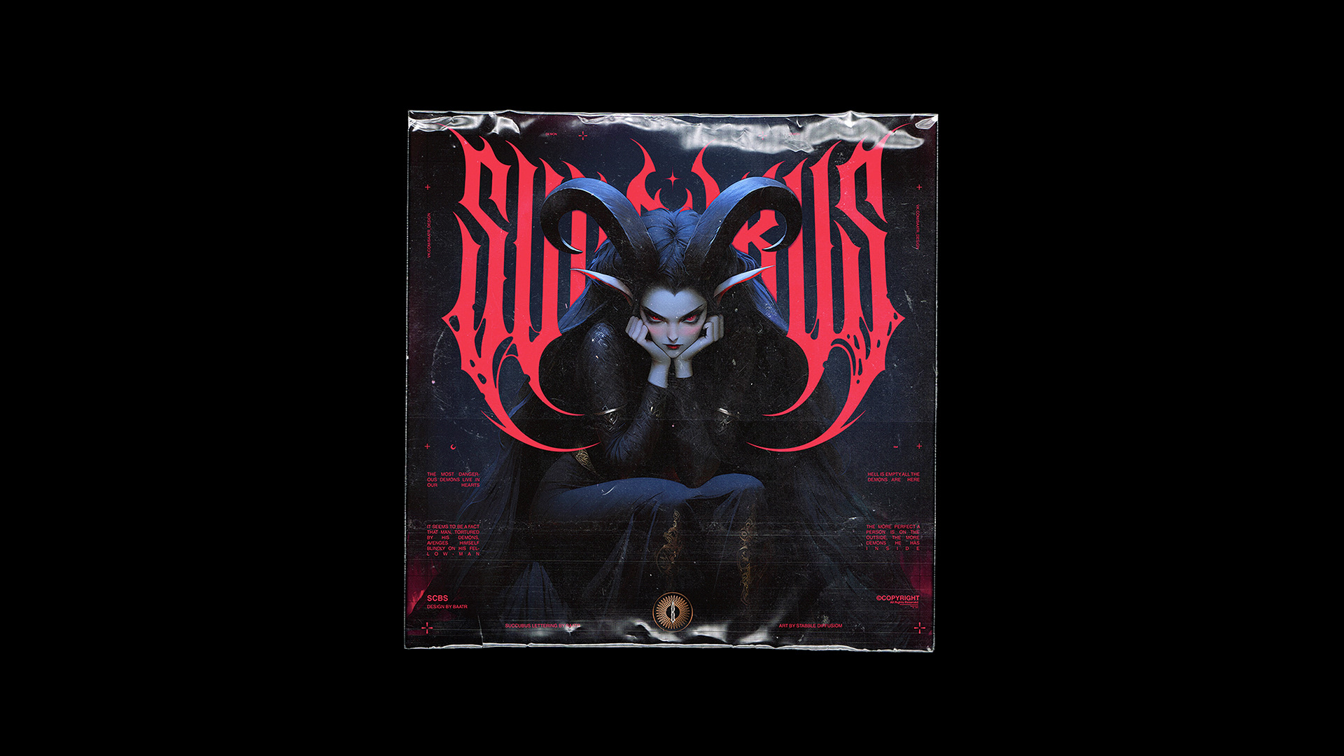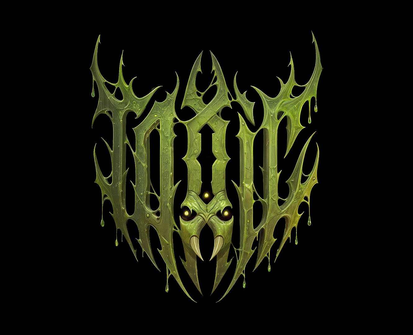
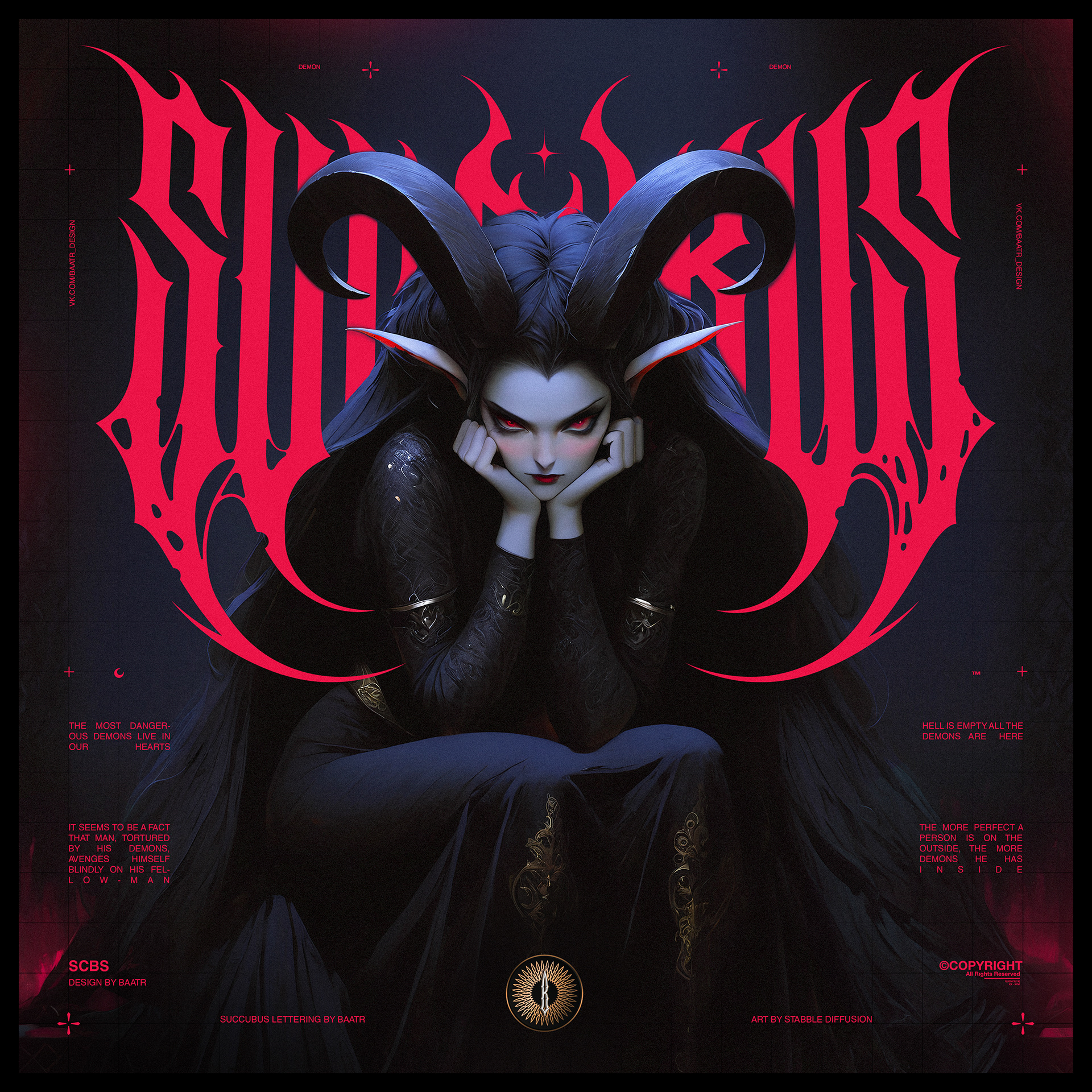
Логотип и фирменный стиль для музыкальной группы Succubus.
Succubus is a music project born in darkness. Their sound is a blend of modern gothic, industrial metal, and demonic sensuality. The identity created for the band had to convey the same energy — dark, seductive, and aggressive.
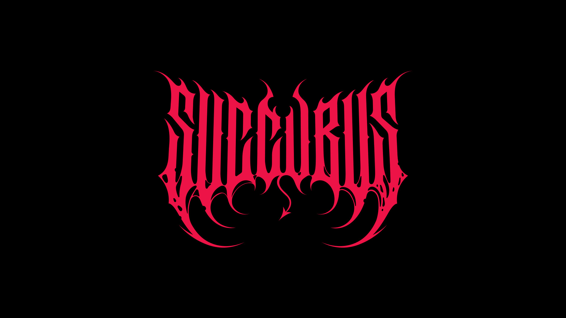
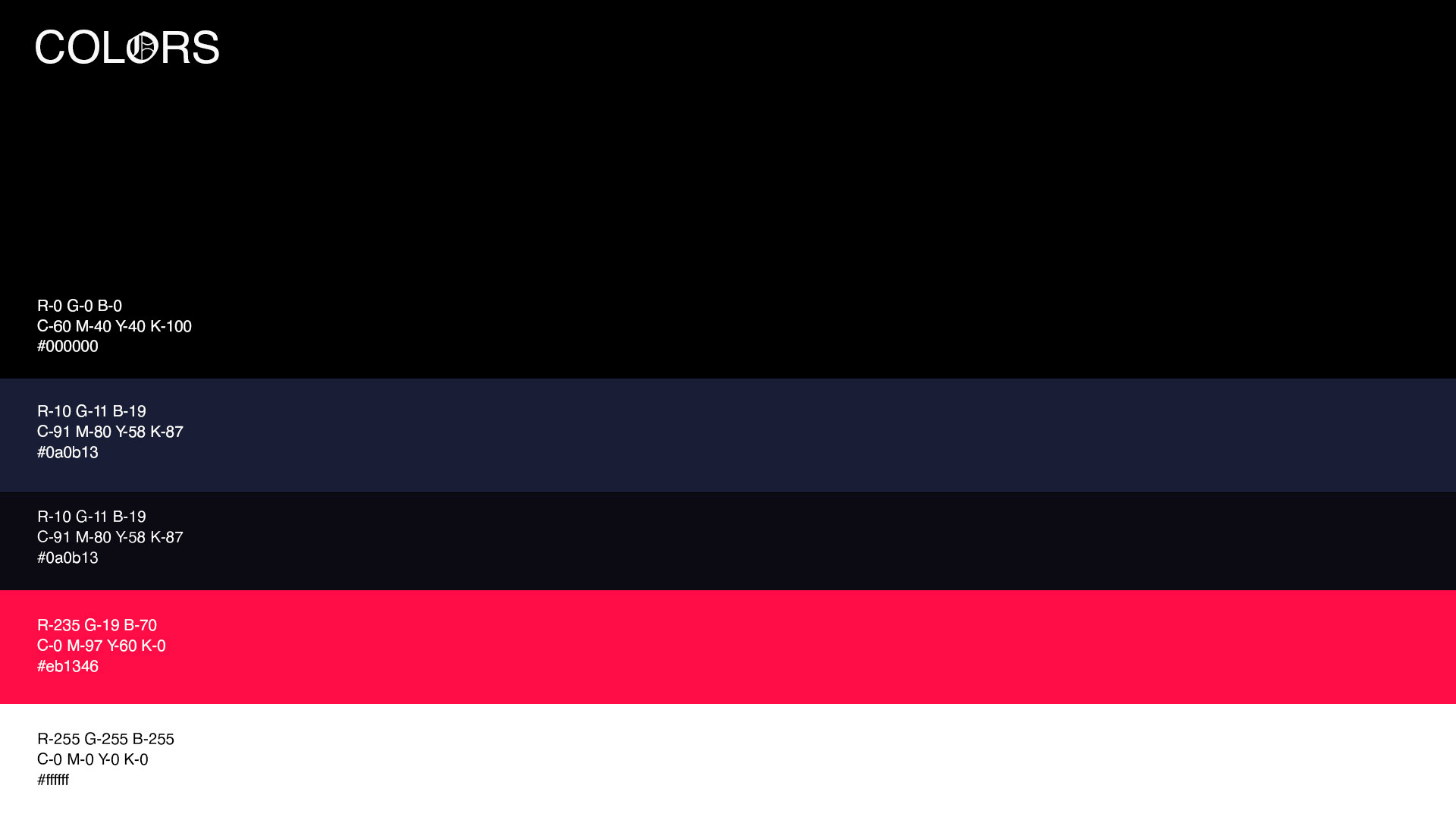
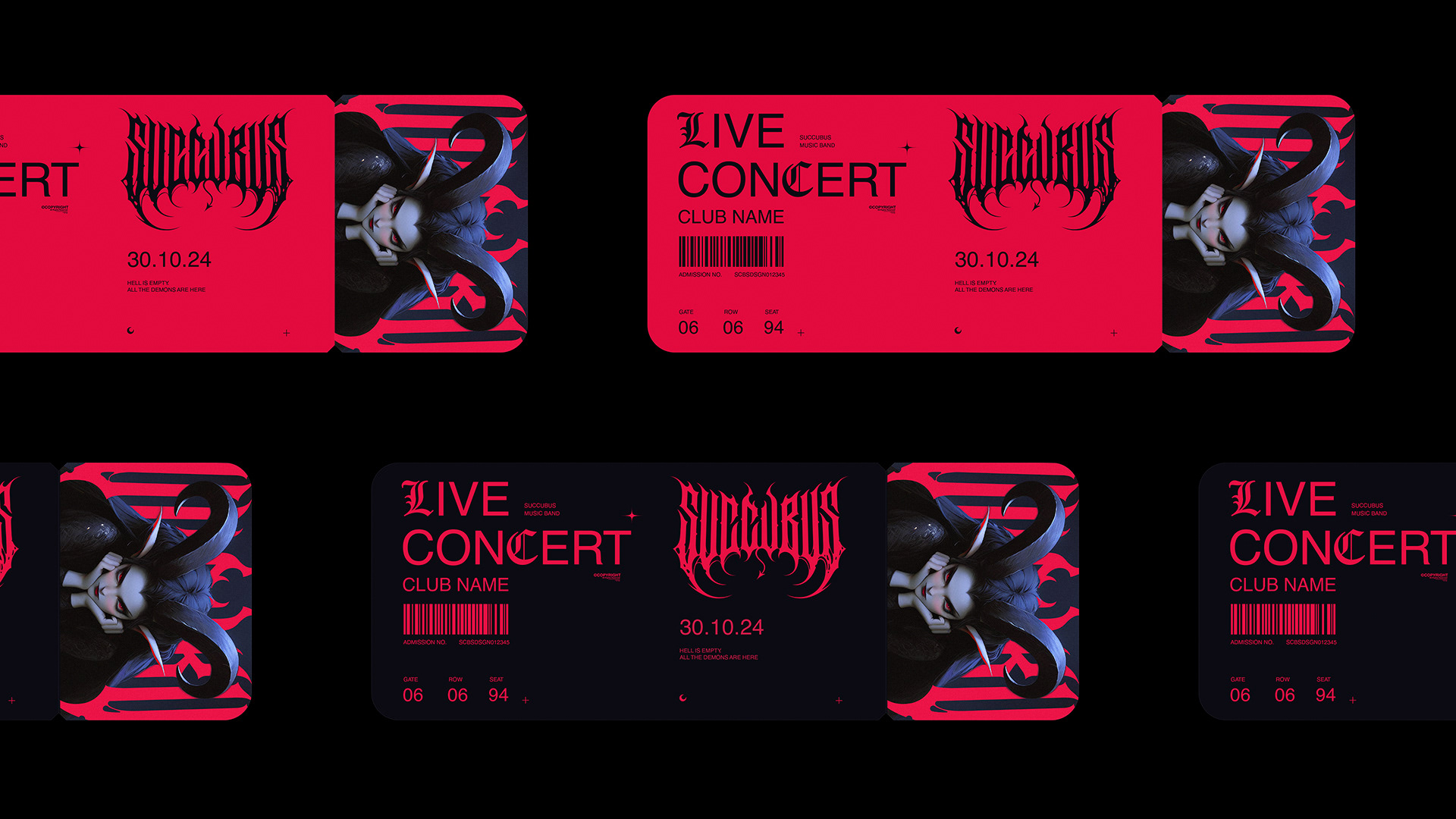
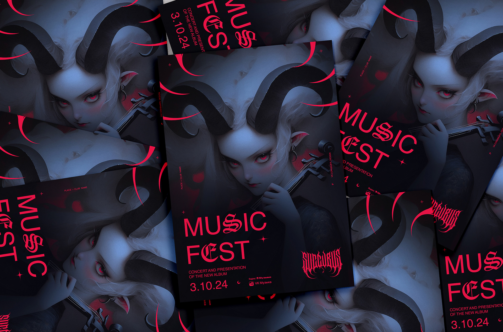
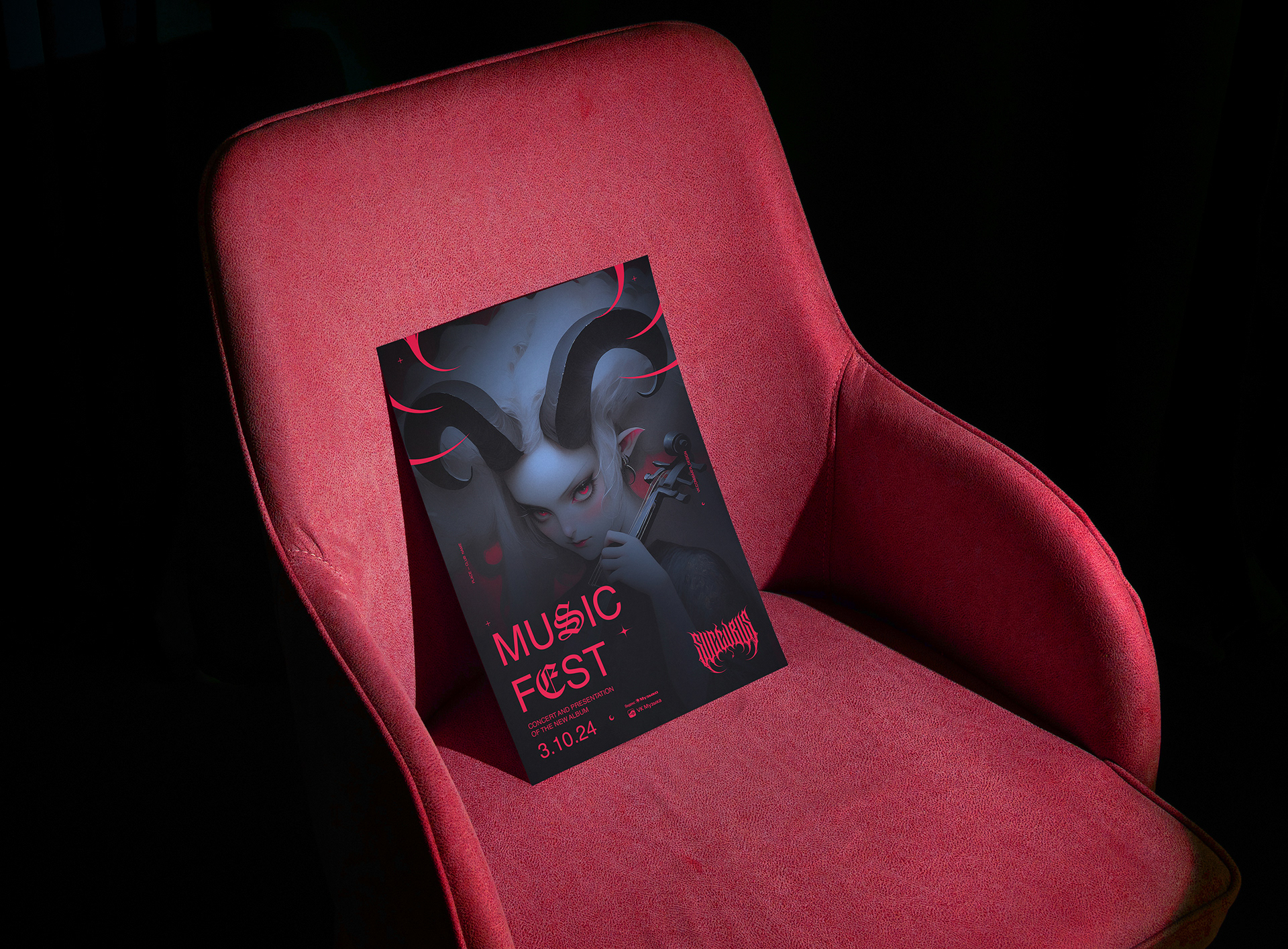
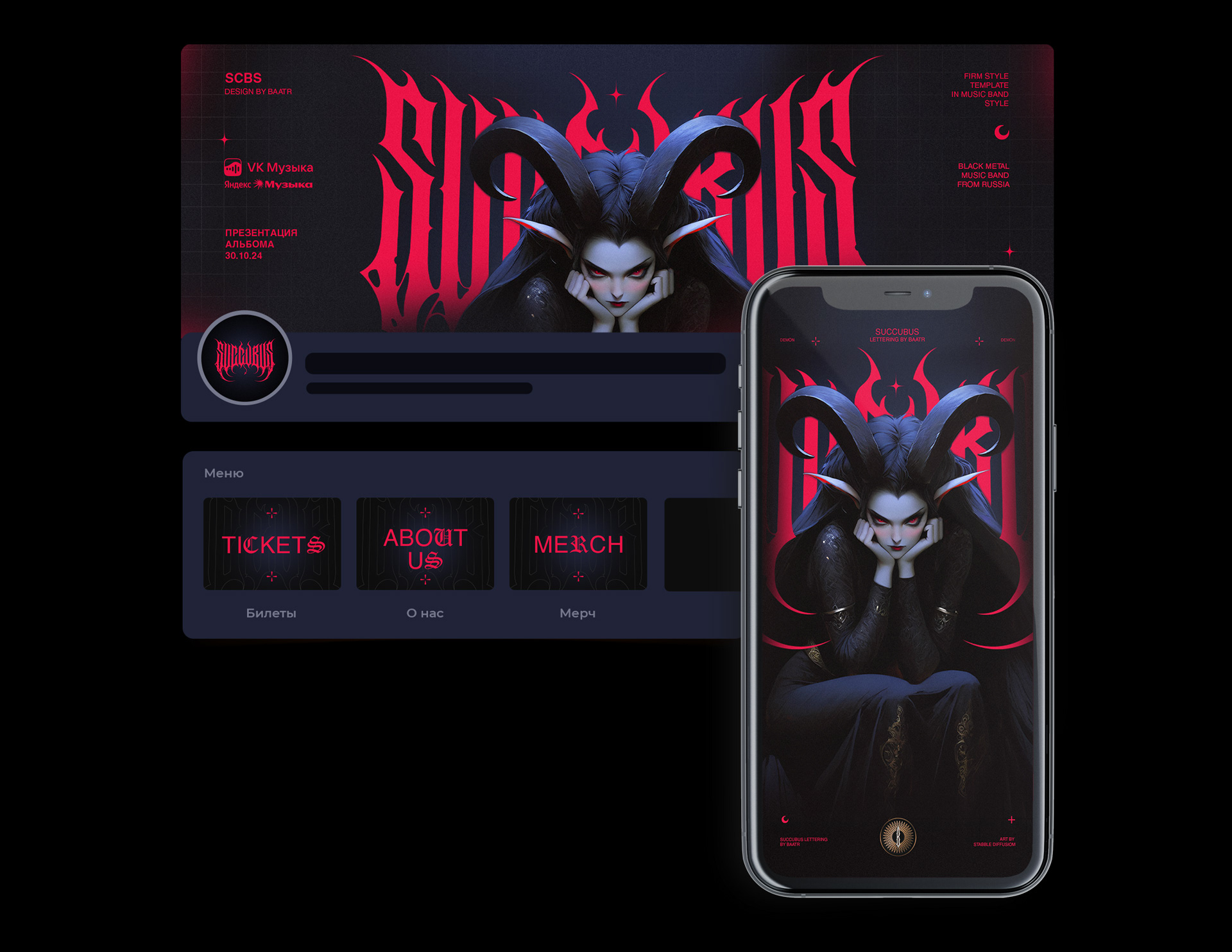
At the heart of the visual system is a custom logo, as if carved from shadows and flame. Its shape is symmetrical and sharp, like a ritual symbol. Legibility gives way to feeling — the logo is perceived more as a sign, a presence. The neon carmine color on a black background heightens the tension, creating the sensation of a visual scream.
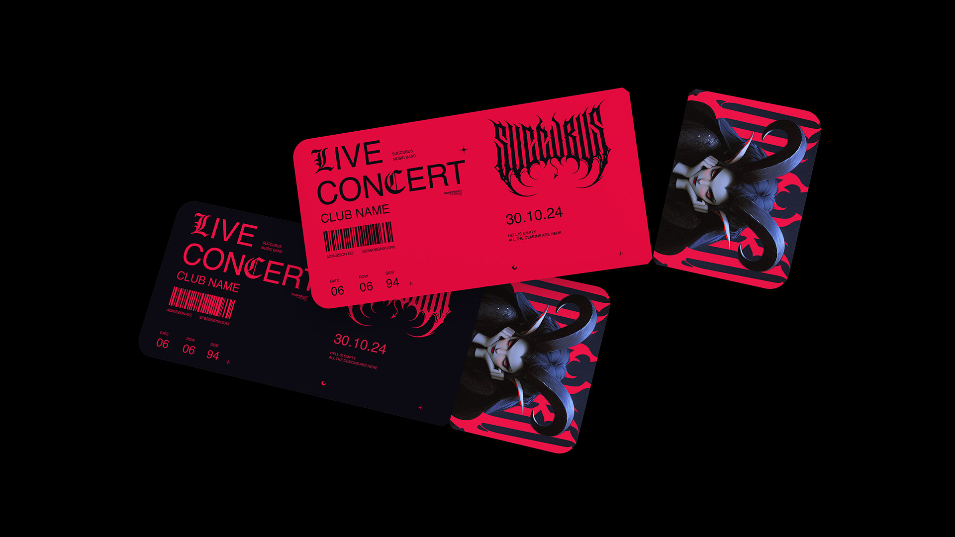
The entire graphic system is built on this contrast — between the sinister and the seductive. The identity doesn’t act as packaging, but as an extension of the music itself: unsettling, beautiful, and dangerous. Succubus is not just a band. It’s an incantation, and the branding speaks its language.
-
Succubus — это музыкальный проект, рожденный во тьме. Их звучание — смесь современной готики, индустриального металла и демонической чувственности. Айдентика, созданная для группы, передает ту же энергию — мрачную, манящую, агрессивную.
В центре визуальной системы — кастомный логотип, будто вырезанный из теней и пламени. Его форма — симметричная, острая, как ритуальный символ. Читаемость уступает месту ощущению: логотип воспринимается как знак, как сущность. Неоново-карминовый цвет на чёрном фоне усиливает напряжение, создавая ощущение визуального крика.
Вся графика построена на этом контрасте — между зловещим и притягательным. Айдентика работает не как упаковка, а как продолжение самой музыки: тревожная, красивая и опасная. Succubus — это не просто группа. Это заклинание, и брендинг говорит на её языке.
-
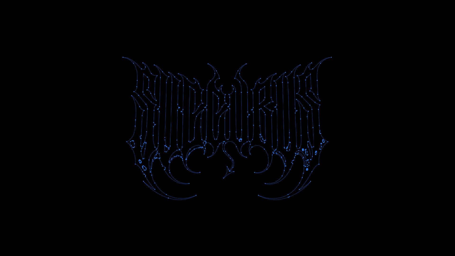
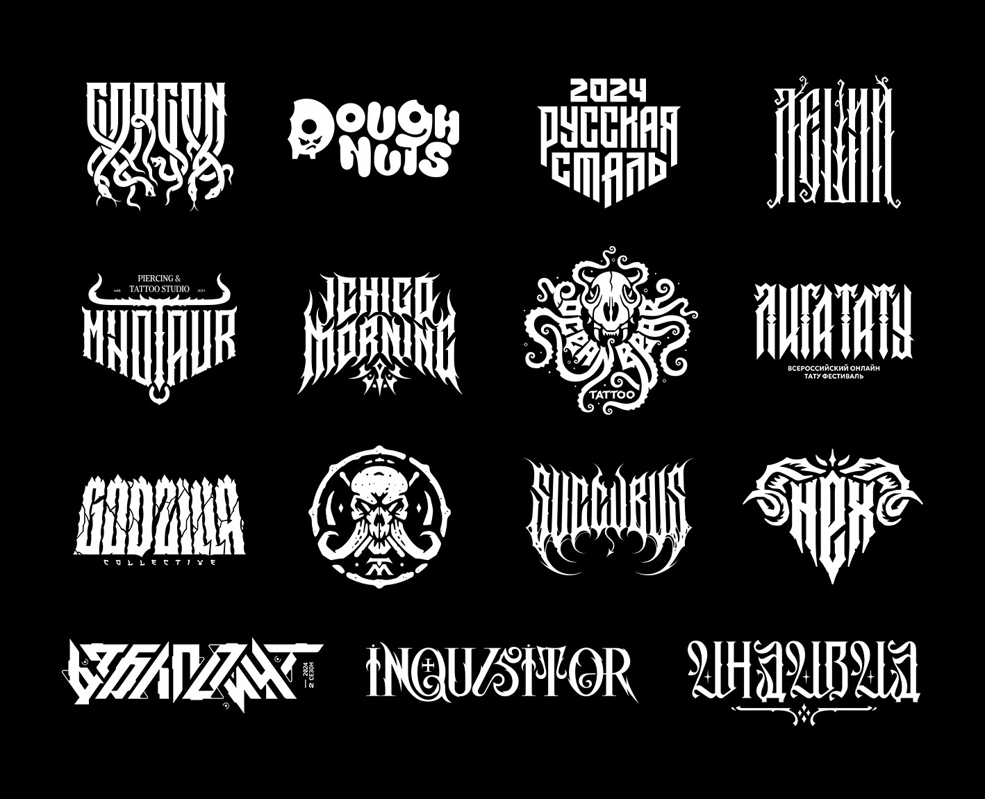
The logo is drawn from scratch and does not use a ready-made font. The images are generated using Stabble diffusion.
Design by Baatr
2024.