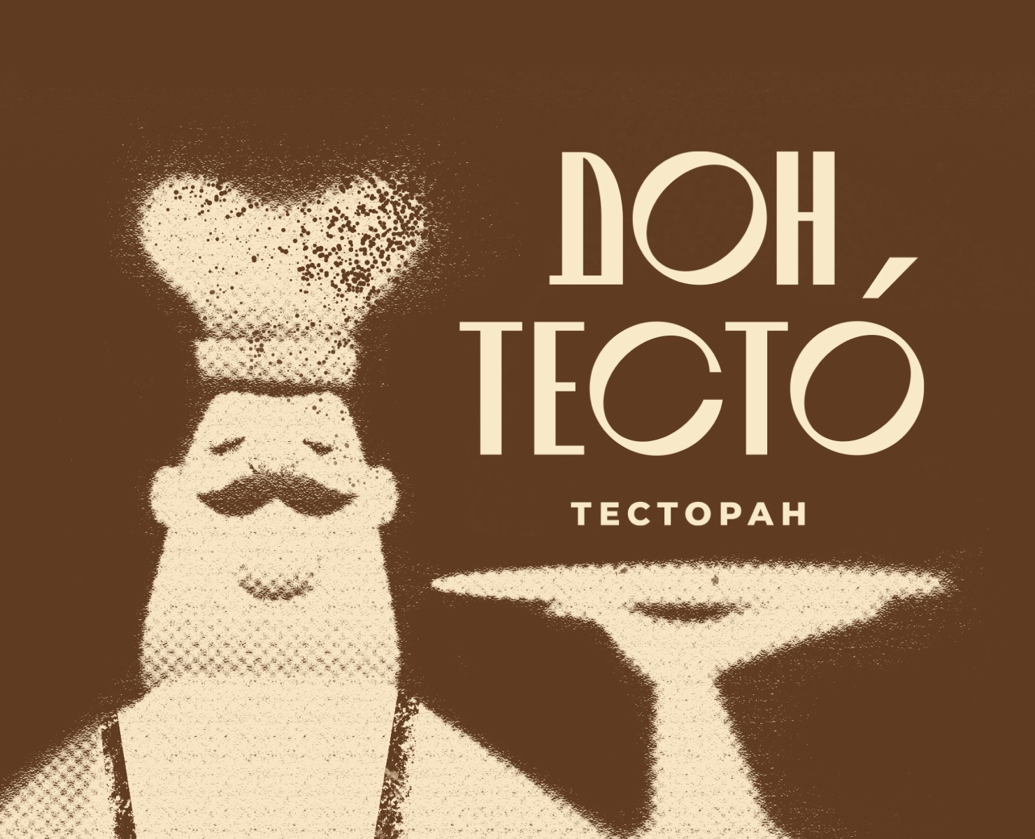
проект брендингового агентства Artsdelka, 2024 г
RU
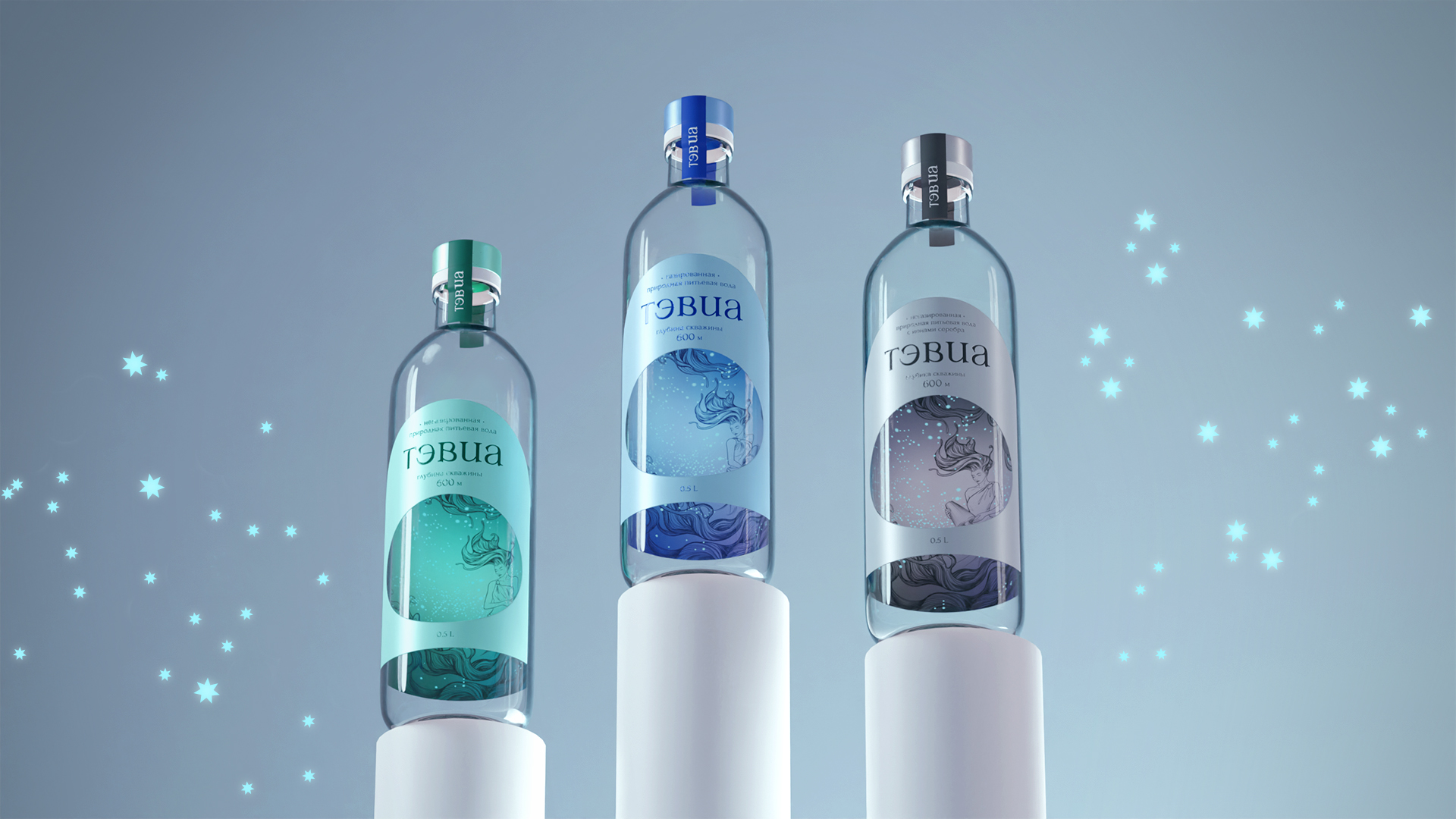
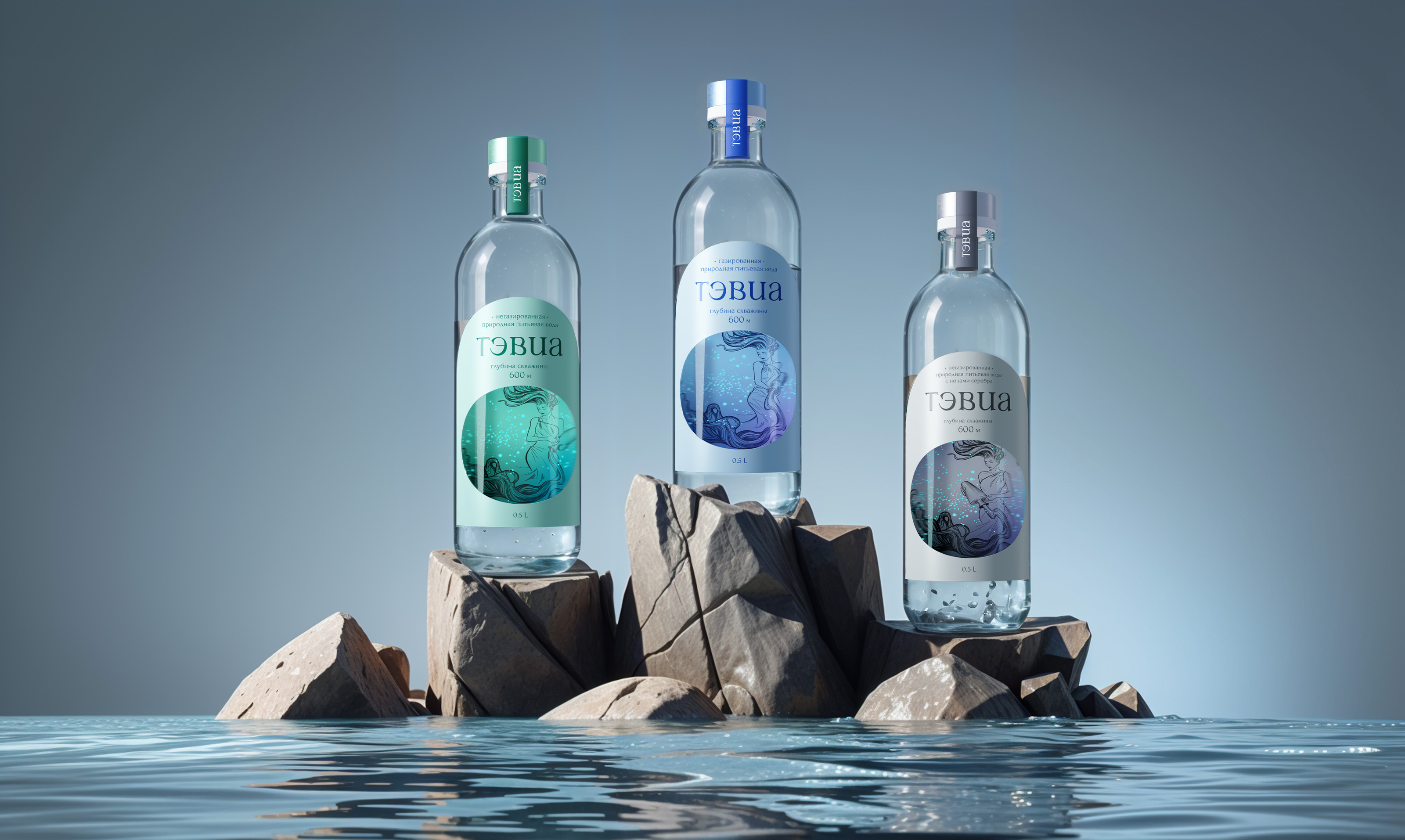
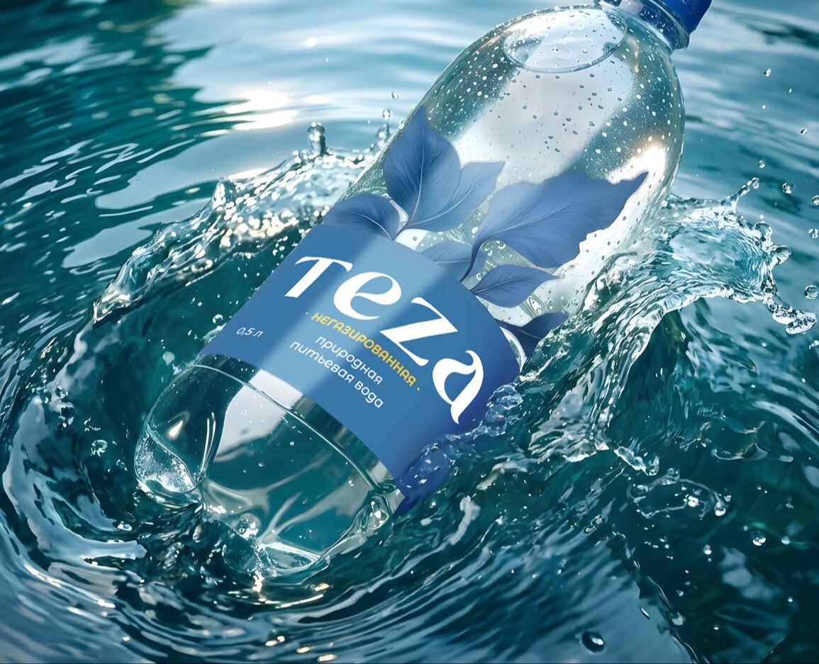
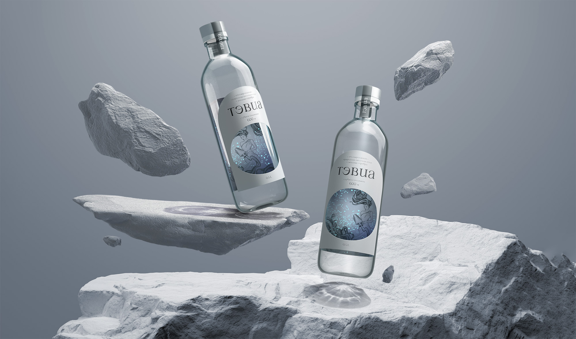
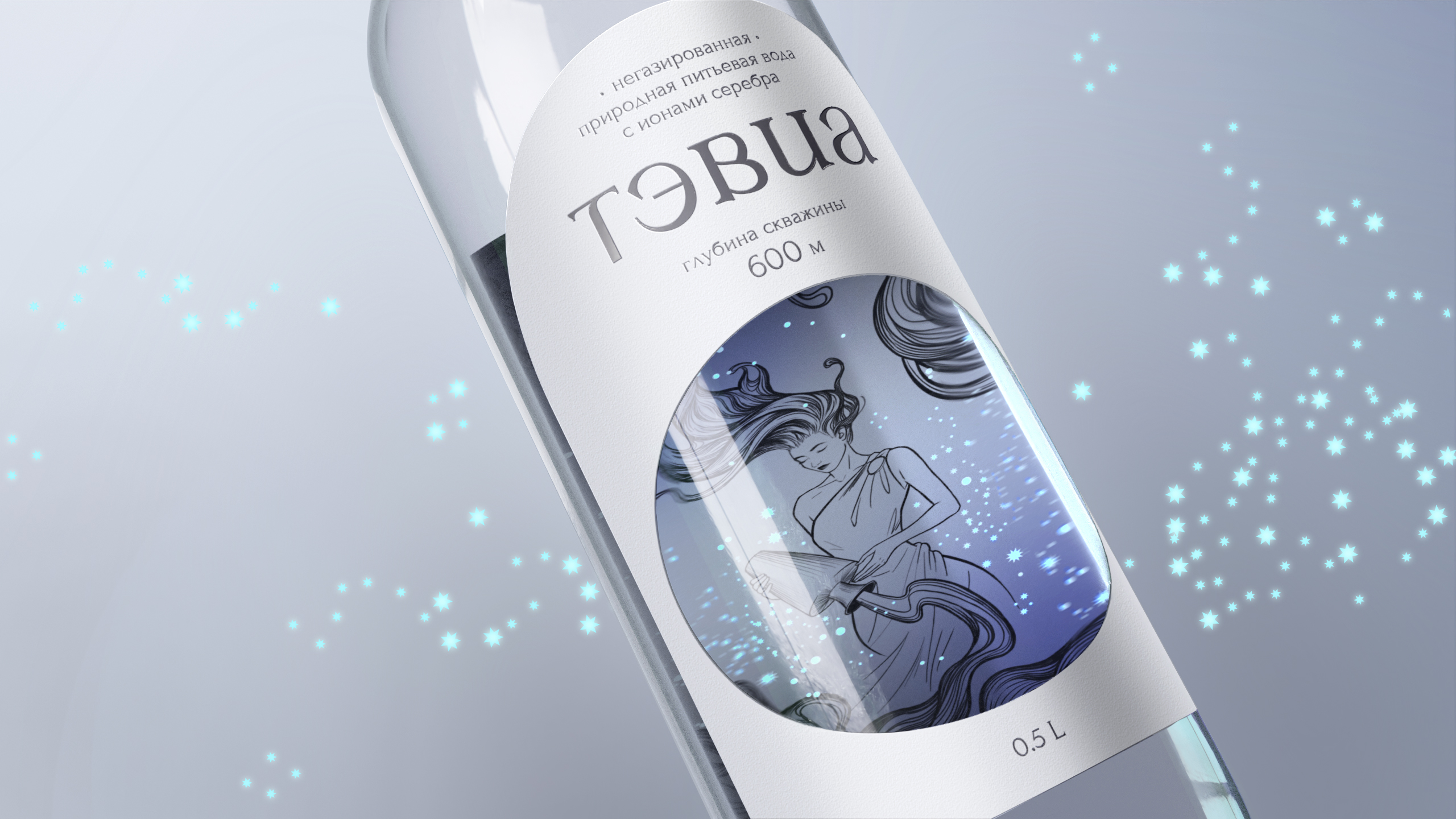
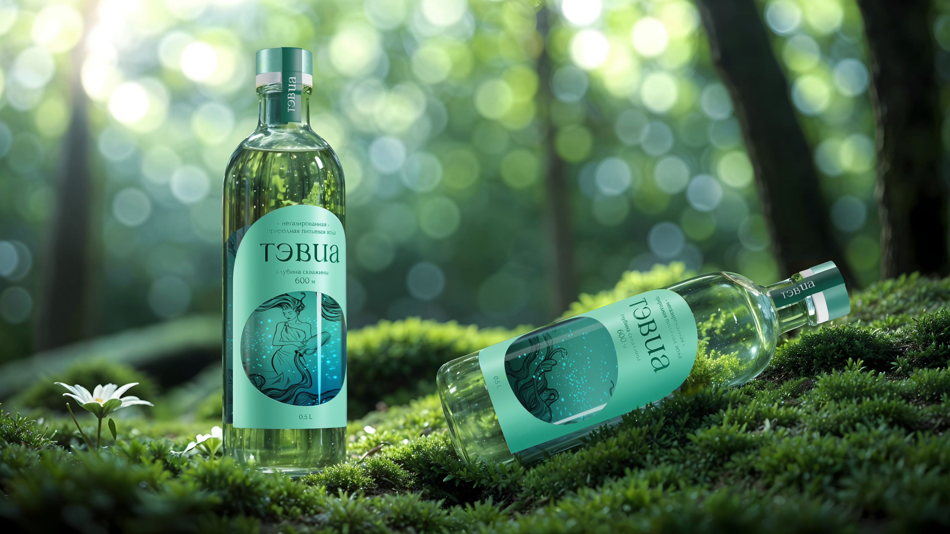
Лаконичная чистота, без лишних деталей, снаружи заставляет заглянуть внутрь, погрузиться на глубину и познать тайну жизненной силы водной стихии. Под толщей стекла и воды внутренняя иллюстрация преломляется, создает эффект глубины, привлекает и вызывает желание рассматривать.
EN
The laconic cleanliness, without unnecessary details, from the outside makes you look inside, dive into the depths and learn the secret of the vitality of the water element. Under the thickness of glass and water, the inner illustration is refracted, creates the effect of depth, attracts and causes a desire to consider.
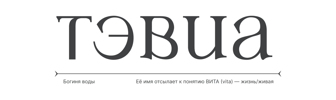
Нейминг
RU
Именно уникальная глубина добычи на уровне 600 метров стала основным инсайтом идеи дизайна упаковки питьевой воды. Концепт построен через легенду о богине подземной реки, повелительнице источника жизни. Её имя — Тэвиа, отсылает к понятию ВИТА (vita) — жизнь/живая. «Тэвиа» — богиня воды, мягкая и смиренная, воплощает в себе чистоту самой природы, ее воды вбирают живую энергию растений, земли и камня, превращаясь в бесценный источник жизни.
EN
It was the unique extraction depth at the level of 600 meters that became the main insight into the design idea of drinking water packaging. The concept is built through the legend of the goddess of the underground river, the lady of the source of life. Her name is Tavia, referring to the concept of VITA (vita) — life / alive. "Tavia" is the goddess of water, gentle and humble, embodies the purity of nature itself, its waters absorb the living energy of plants, earth and stone, turning into an invaluable source of life.
Этикетка
RU
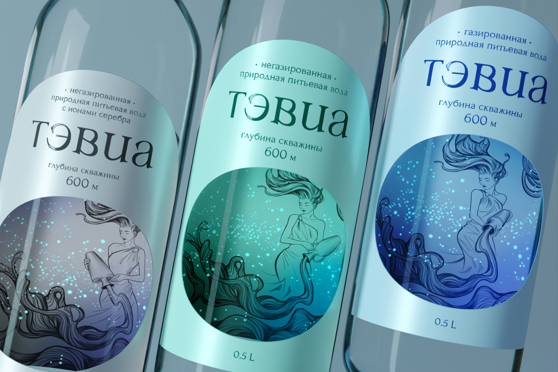
Конструкция этикетки, форма бутылки, иллюстрация и легенда подчеркивают преимущество продукта: добыча на уникальной глубине, мягкость, чистота и природность. Цвета каждой из этикеток не случайны — каждая из них олицетворяет природу: зеленый — растения, естественность, натуральность, серый — камень, полезные минералы, растворенные в воде, и серебро, как дополнительный компонент, голубой — вода, насыщенная кислородом, природной газации.
EN
The design of the label, the shape of the bottle, the illustration and the legend emphasize the advantage of the product: extraction at a unique depth, softness, purity and naturalness. The colors of each of the labels are not accidental — each of them represents nature: green — plants, naturalness, naturalness, gray — stone, useful minerals dissolved in water, and silver as an additional component, blue — water saturated with oxygen, natural carbonation.