ABOUT BRAND
[RUS]
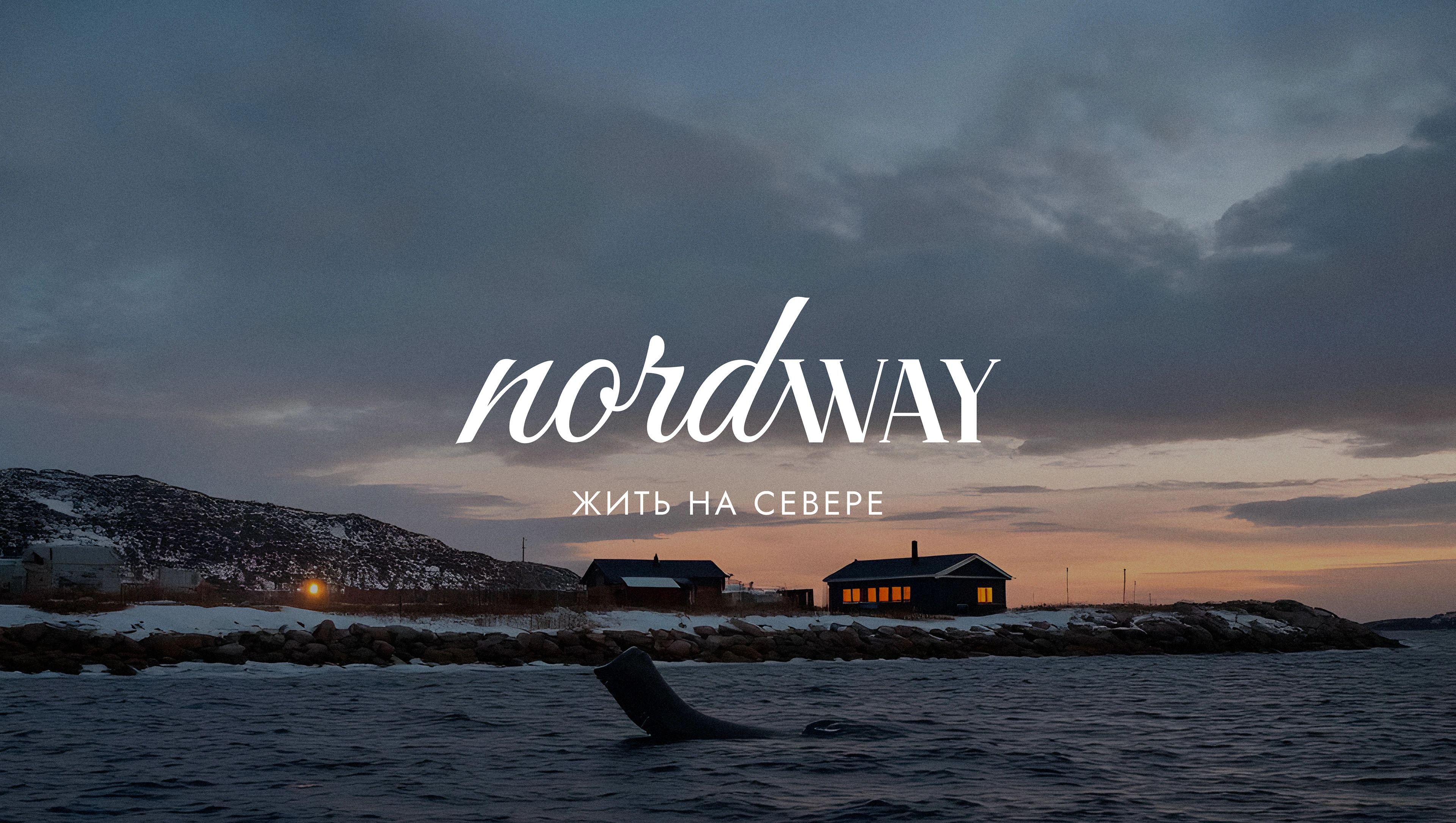
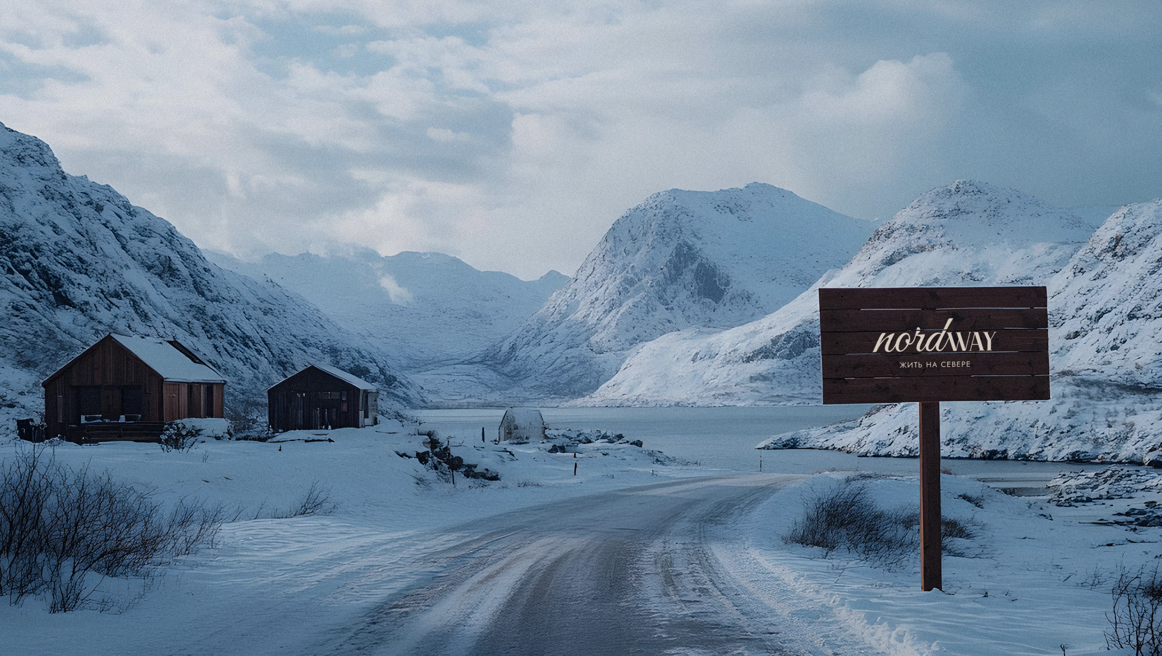
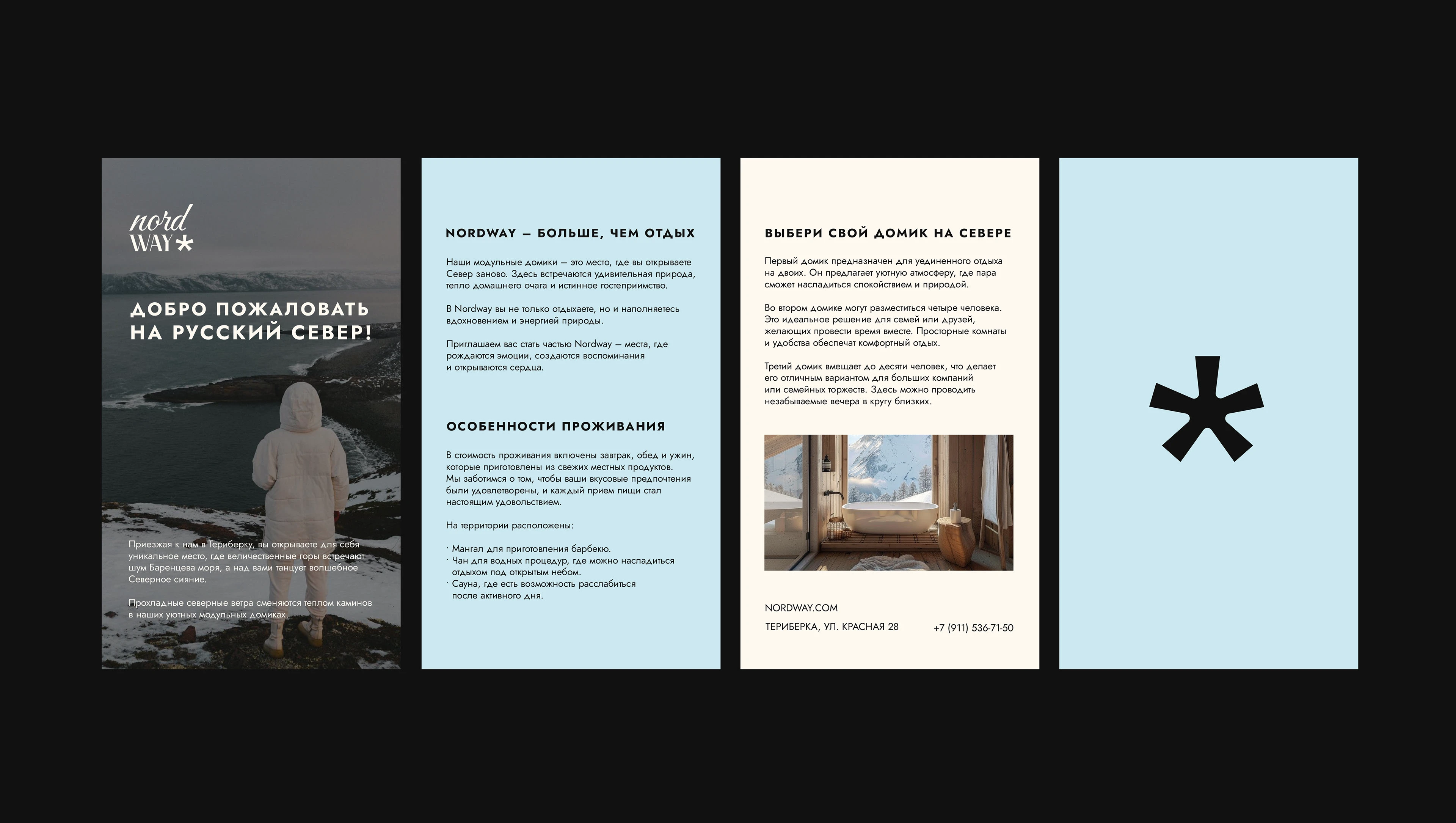
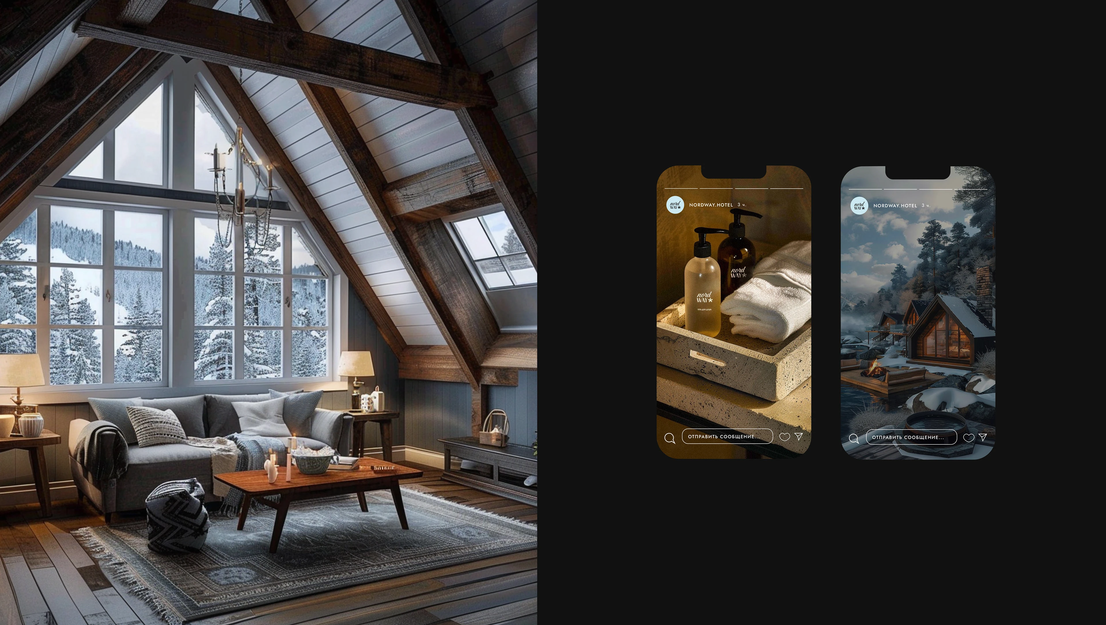
На берегу Баренцева моря, в самом сердце Териберки, мы создали пространство, где каждый сможет найти гармонию с природой. Современные деревянные домики с уютным домашним интерьером, оборудованные мангальной зоной, чаном и сауной, подарят вам настоящий комфорт вдали от суеты. Снежные горы, большие киты и волшебное северное сияние – это только начало вашего путешествия!
Наша миссия – подарить людям возможность открыть для себя русский Север и почувствовать его природную красоту, силу и спокойствие. Мы стремимся превратить каждый момент отдыха в Териберке в особенное приключение.
[ENG]
On the shores of the Barents Sea, in the heart of Teriberka, we have created a space where everyone can find harmony with nature. Modern wooden houses with a cozy home interior, equipped with a barbecue area, a vat and a sauna, will give you real comfort away from the hustle and bustle. Snowy mountains, big whales and the magical northern lights are just the beginning of your journey!
Our mission is to give people the opportunity to discover the Russian North and feel its natural beauty, strength and tranquility. We strive to turn every moment of our vacation in Teriberka into a special adventure.
ABOUT CONCEPT
[RUS]
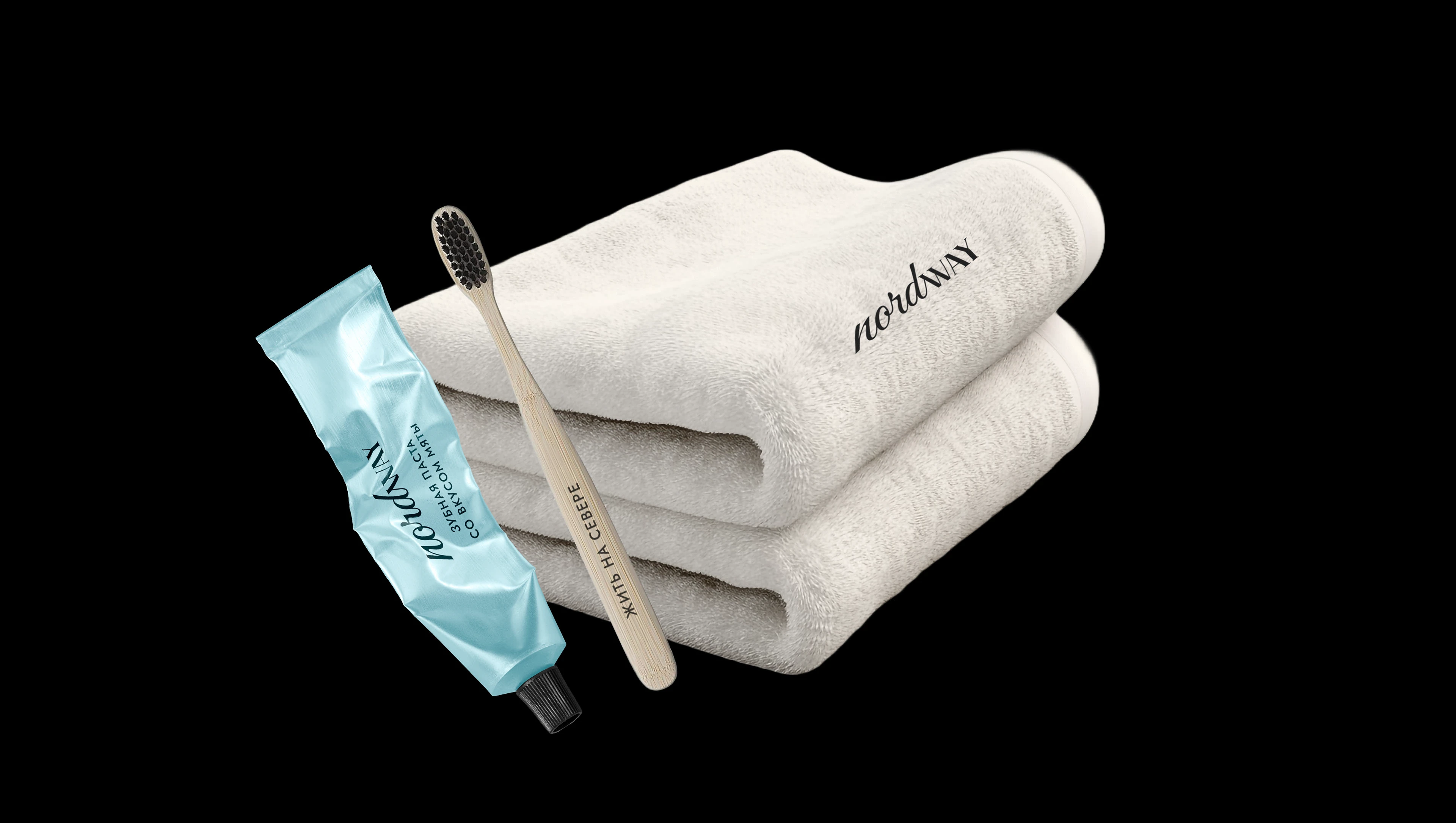
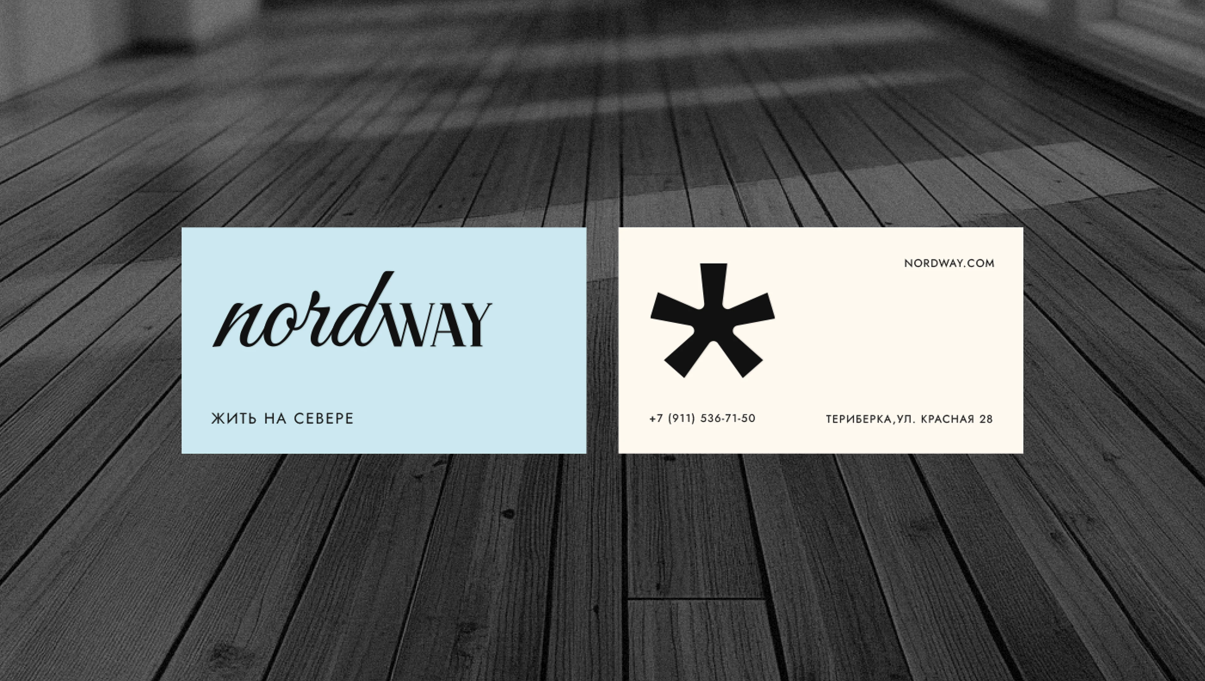
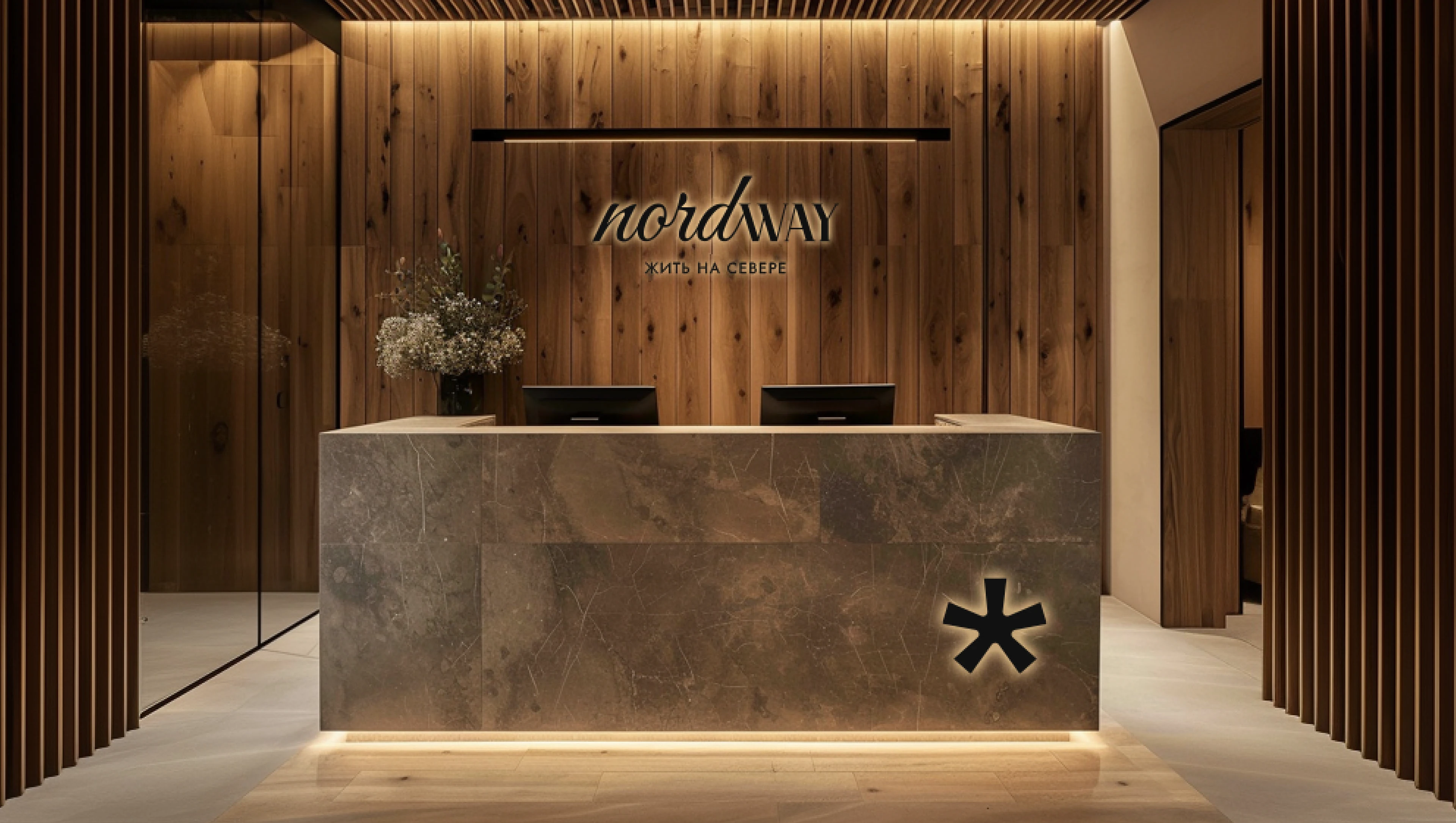
Логотип NORDWAY гармонично сочетает в себе динамику природы и мощь северной территории, рассказывая историю уникального бренда. Начальная часть логотипа выполнена наклонным шрифтом, который ассоциируется с плавностью волн северного моря, отражая природную стихию. Правая часть логотипа представлена более строгими и прямыми линиями, которые символизируют суровость, холод и мощь природы Русского Севера. Фирменный знак – звёздочка напоминает сияние северного неба.
Слоган бренда — «Жить на Севере» подчёркивает философию: каждый гость базы отдыха может стать настоящим полярником и проникнуться духом зимы на Севере.
[ENG]
The NORDWAY logo harmoniously combines the dynamics of nature and the power of the northern territory, telling the story of a unique brand. The initial part of the logo is made in an oblique font, which is associated with the smoothness of the waves of the North Sea, reflecting the natural elements. The right side of the logo is represented by stricter and straighter lines, which symbolize the severity, cold and power of the nature of the Russian North. The star–shaped trademark resembles the radiance of the northern sky.
The brand's slogan, Live in the North, emphasizes the philosophy: every guest of the recreation center can become a true polar explorer and feel the spirit of winter in the North.
THANK YOU FOR WATCHING!
Я открыта для сотрудничества.
Готова обсудить идеи и предложения!
I am open for cooperation.
Ready to discuss ideas and suggestions!
INSTAGRAM | TELEGRAM