CADENCE
CYCLING SPACE | ВЕЛОПРОСТРАНСТВО
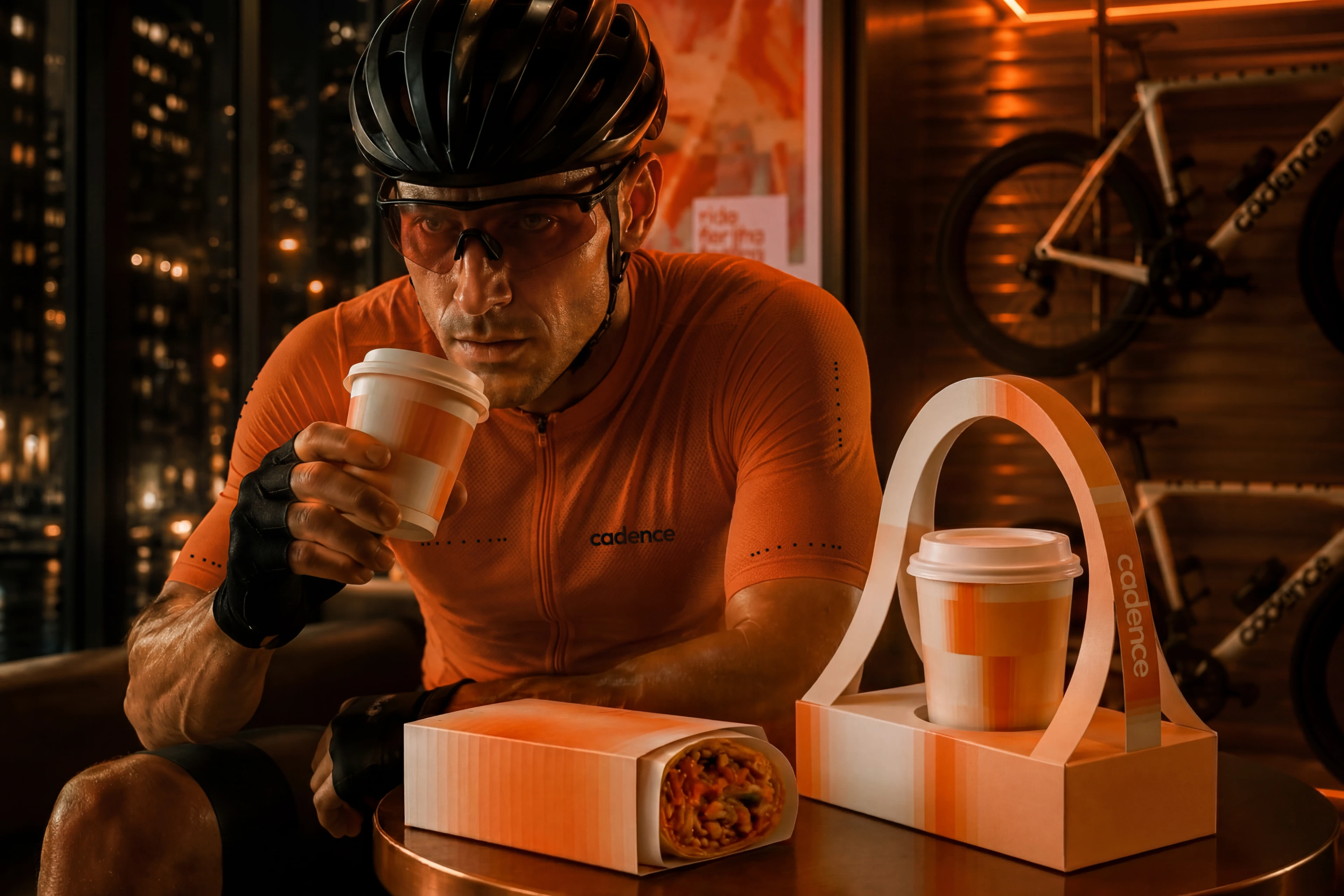
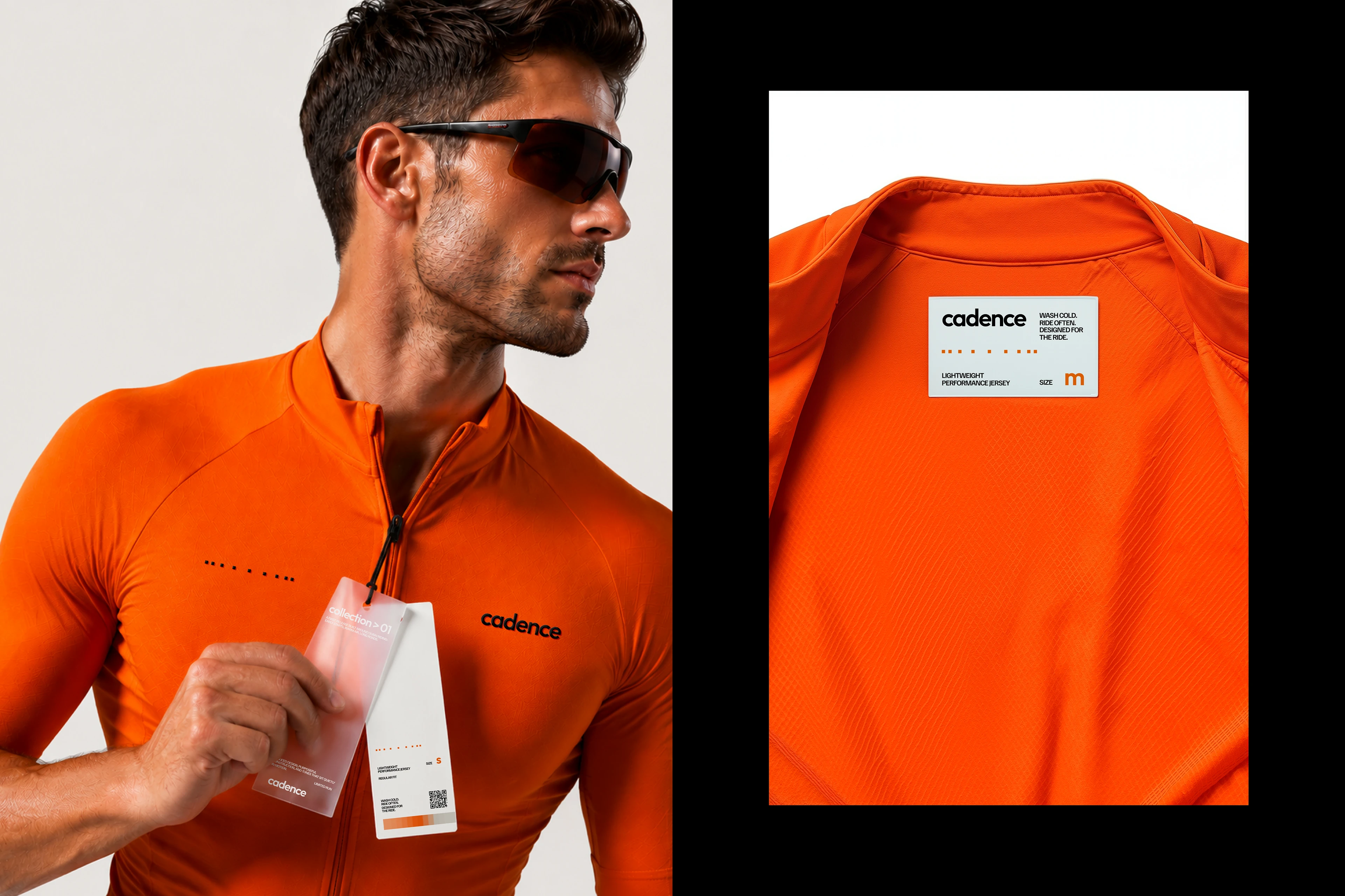
Cadence — велопространство в Дубае, объединяющее кафе, мастерскую, линию экипировки, совместные заезды и клубные события. Здесь готовятся к маршруту, встречаются с командой и возвращаются после поездки за кофе и общением.
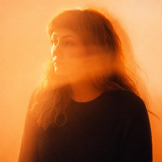
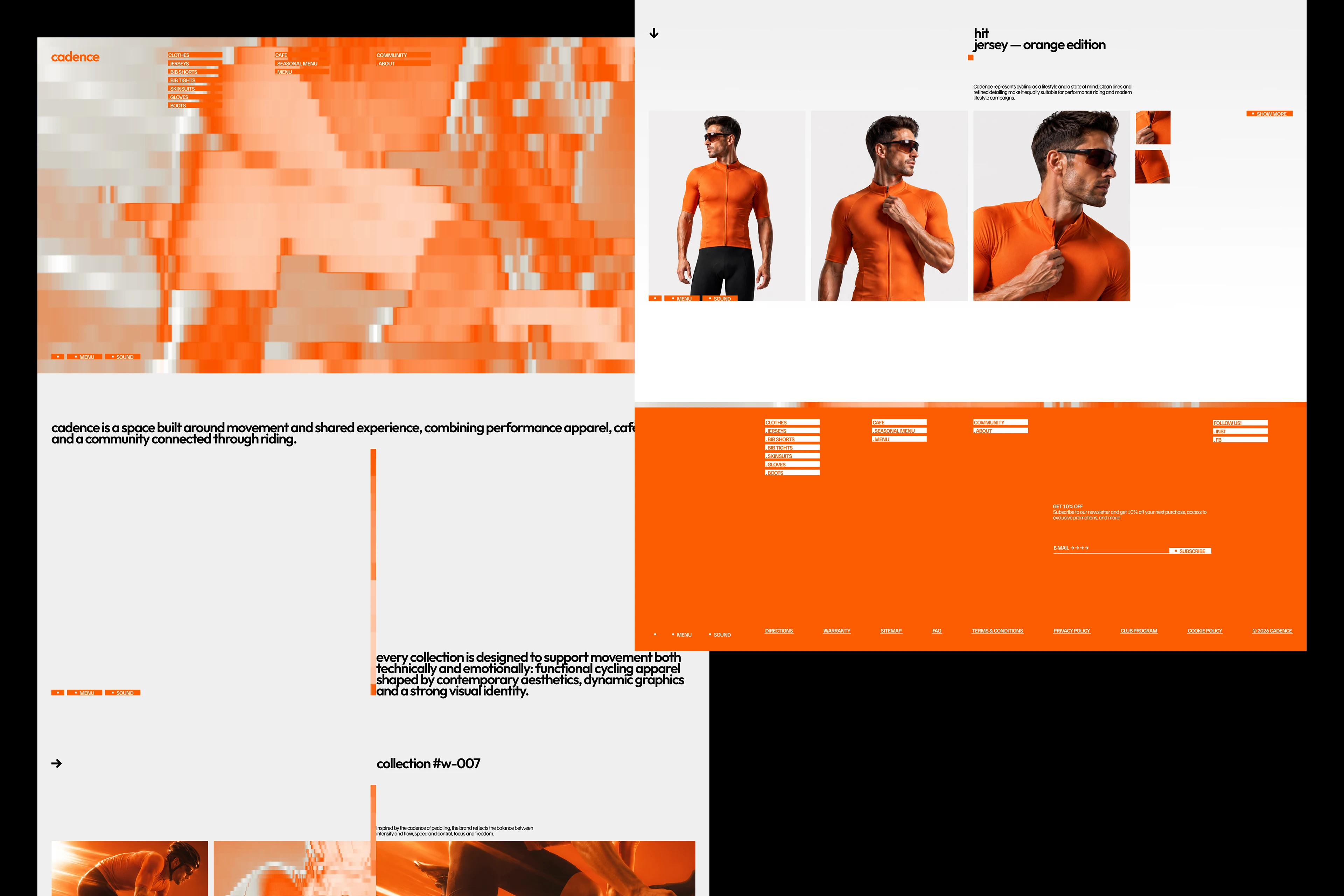
В основе графики — скорость, которую можно увидеть. Принцип фризлайта превращает движение велосипедиста в горизонтальный световой шлейф. Colorama переводит изображение в оранжевую и металлическую палитру, а Mosaic делит его на сетку вертикальных модулей. Каждый модуль сохраняет чёткие границы, но близкие оттенки оптически соединяются в градиент. Так возникает ощущение motion blur: неподвижная сетка растягивает изображение вслед за велосипедистом и делает его скорость видимой.
Логотип продолжает этот принцип. Спицы колеса, увиденные с торца, превращаются в точки и сохраняют ритм вращения. В анимации они приходят в движение и оставляют модульные шлейфы. Название объединяет систему: в велоспорте cadence означает частоту вращения педалей. В графике ритм выражен сменой цвета, а в логотипе — движением спиц и длиной их следа.
В key visual фотография показывает реальное движение, а графика раскрывает его скорость. На разных носителях изображение меняет масштаб: сохраняет узнаваемость на афишах, становится абстрактным на упаковке и превращается в цветовое поле на крупных поверхностях. Типографика поддерживает общий ритм. Округлые формы Outfit перекликаются с геометрией колеса, а плотный вертикальный рисунок Familjen Grotesk — с модульной графикой. Оранжевый передаёт энергию и свет ночного города, металлический отсылает к велосипедной раме и мастерской. В интерьере палитра проявляется в металле, контурной подсветке и отражающих поверхностях. Из-за дневной жары жизнь Cadence смещается на вечер. Здесь маршрут продолжается за пределами дороги — во встречах, общении и желании снова отправиться в путь.
EN
Cadence is a cycling hub in Dubai that brings together a café, workshop, performance apparel line, group rides and club events. It is a place to prepare for the route, meet the crew and return after the ride for coffee and conversation.
The visual identity is built around making speed visible.Inspired by light painting, the cyclist’s movement becomes a horizontal trail of light. Colorama translates the footage into the brand’s orange and metallic palette, while Mosaic divides it into a grid of vertical modules. Each module retains a sharp edge, yet similar shades optically merge into a gradient. This creates the impression of motion blur: a static grid stretches the image along the cyclist’s path and reveals a sense of speed.
The logo follows the same principle. Viewed end-on, the spokes of a wheel become points that preserve the rhythm of rotation. In motion, they begin to move and leave modular trails behind them.
The name connects the entire system. In cycling, cadence is the rate at which the pedals turn. In the graphics, rhythm appears through changing colour; in the logo, through the movement of the spokes and the length of their trails.
In the key visuals, photography captures real movement while the graphic treatment reveals its speed. Across applications, the image shifts in scale: recognisable on posters, abstract on packaging and transformed into a colour field across large surfaces. Typography extends the same rhythm. Outfit’s rounded forms echo the geometry of the wheel, while the dense vertical structure of Familjen Grotesk reflects the modular graphics.
Orange conveys energy and the glow of the city at night. Metallic tones reference bicycle frames and workshop equipment. Inside the space, the palette becomes physical through metal surfaces, linear lighting and reflections. Dubai’s daytime heat shifts the life of Cadence into the evening. Here, the ride continues beyond the road — through new encounters, conversations and the desire to set out again.
Where the ride continues.
АВТОРЫ ПРОЕКТА
ИДЕЯ И ДИЗАЙН: СОФЬЯ ГРИЦУК
АРТ-ДИРЕКШН & АНИМАЦИЯ: ТАТЬЯНА КИРИЧЕНКО / KRECHET_STUDIO