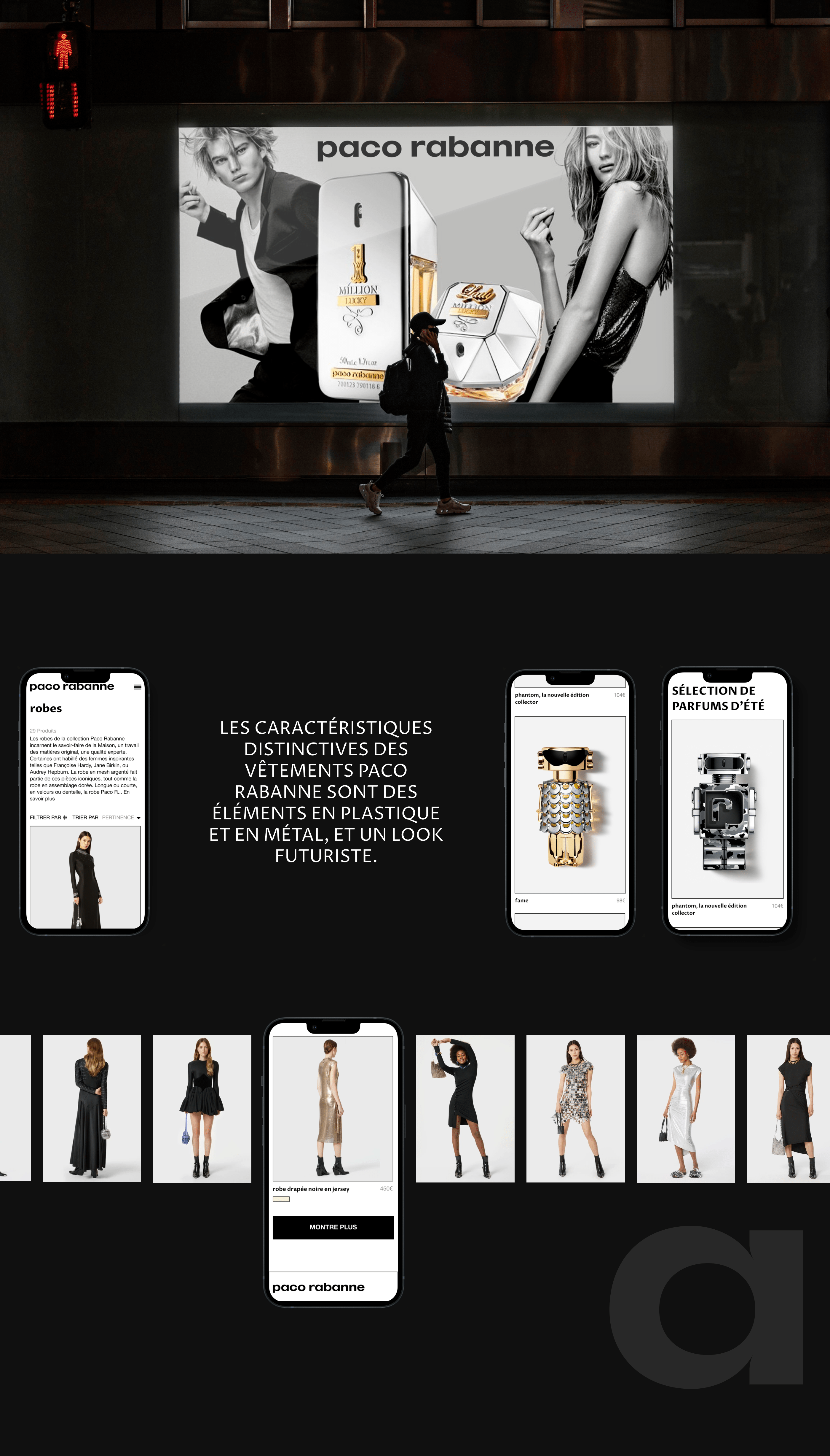
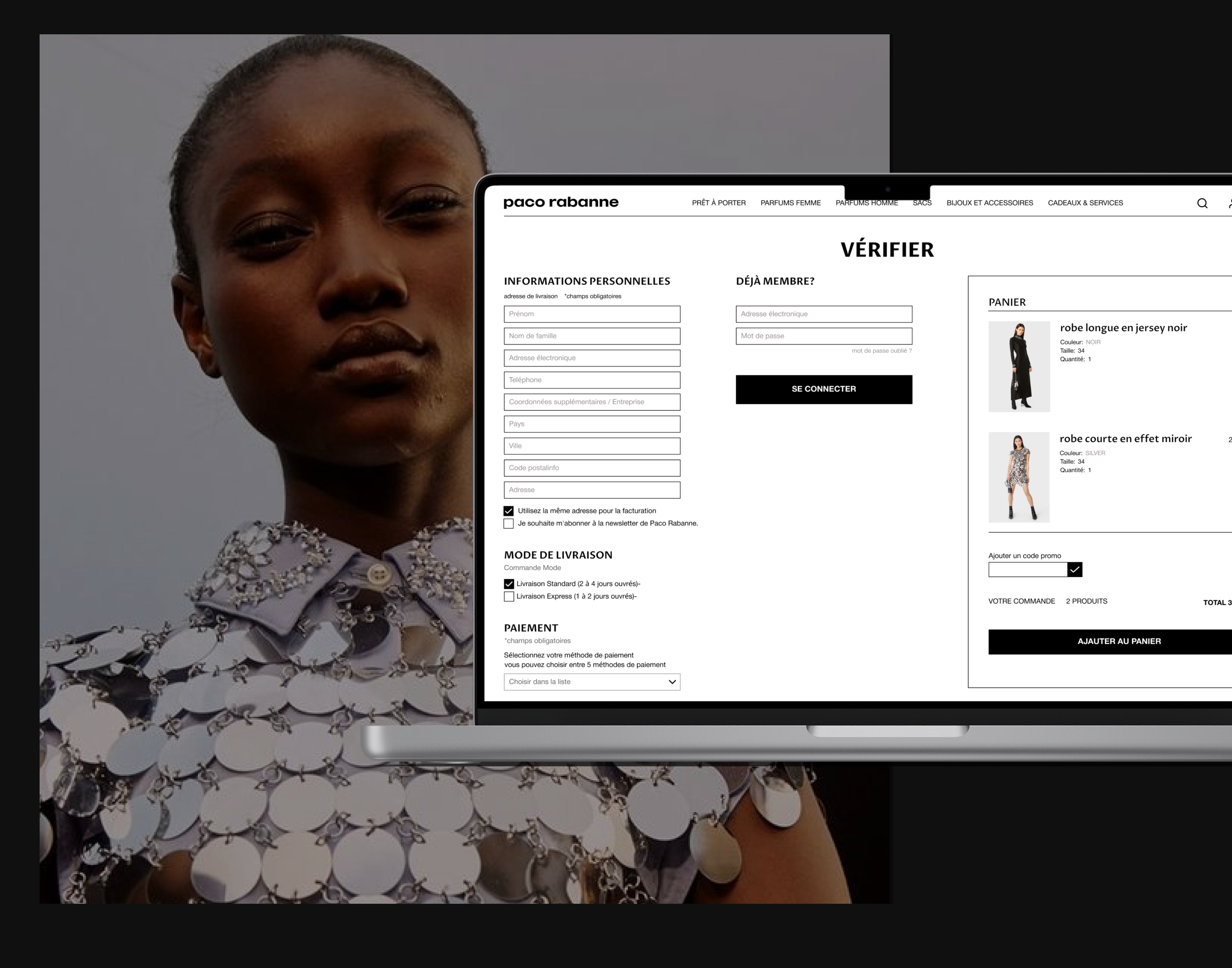
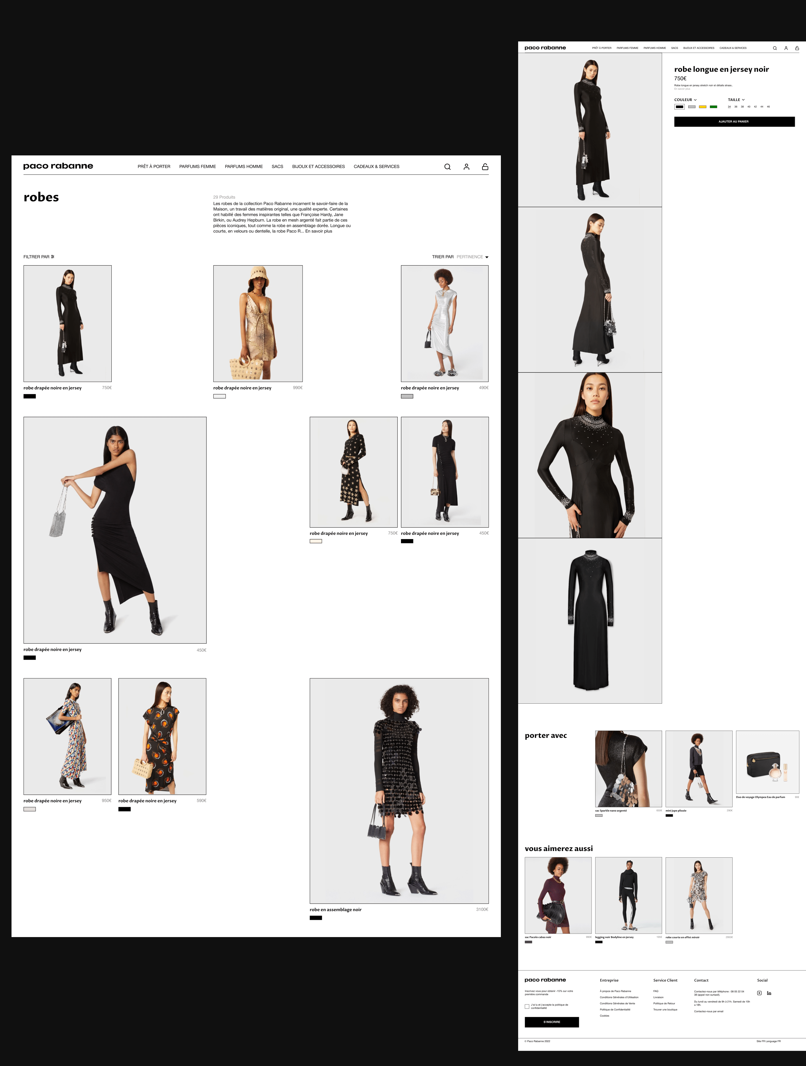
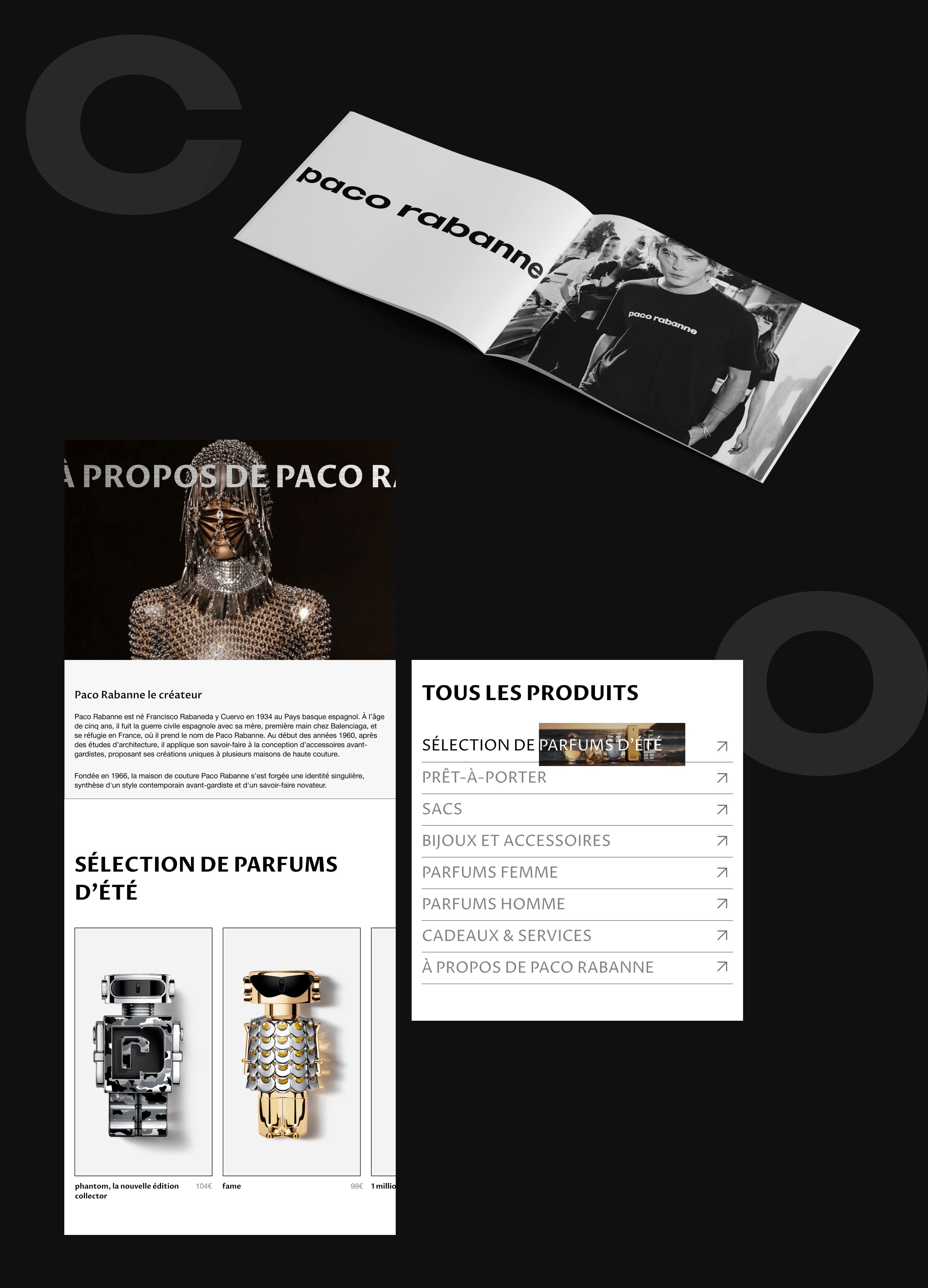
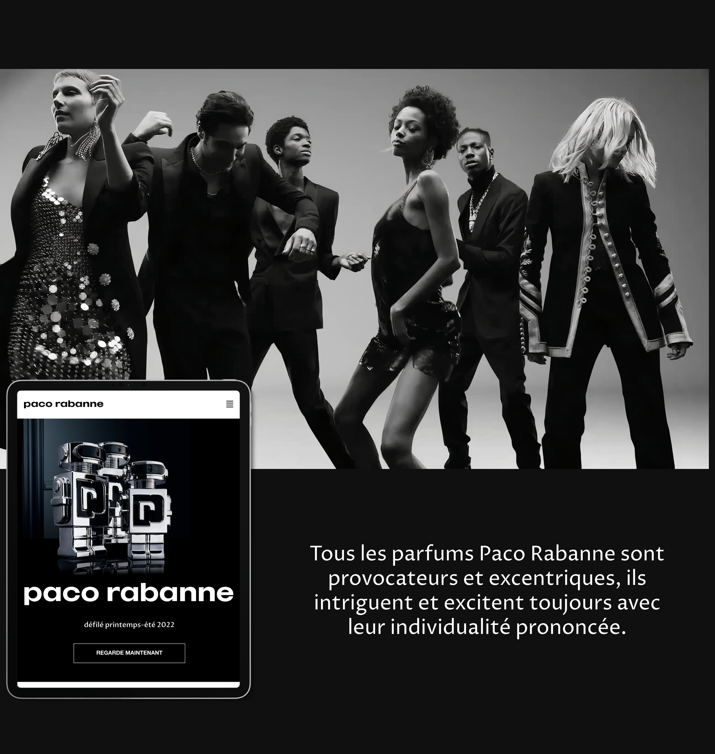
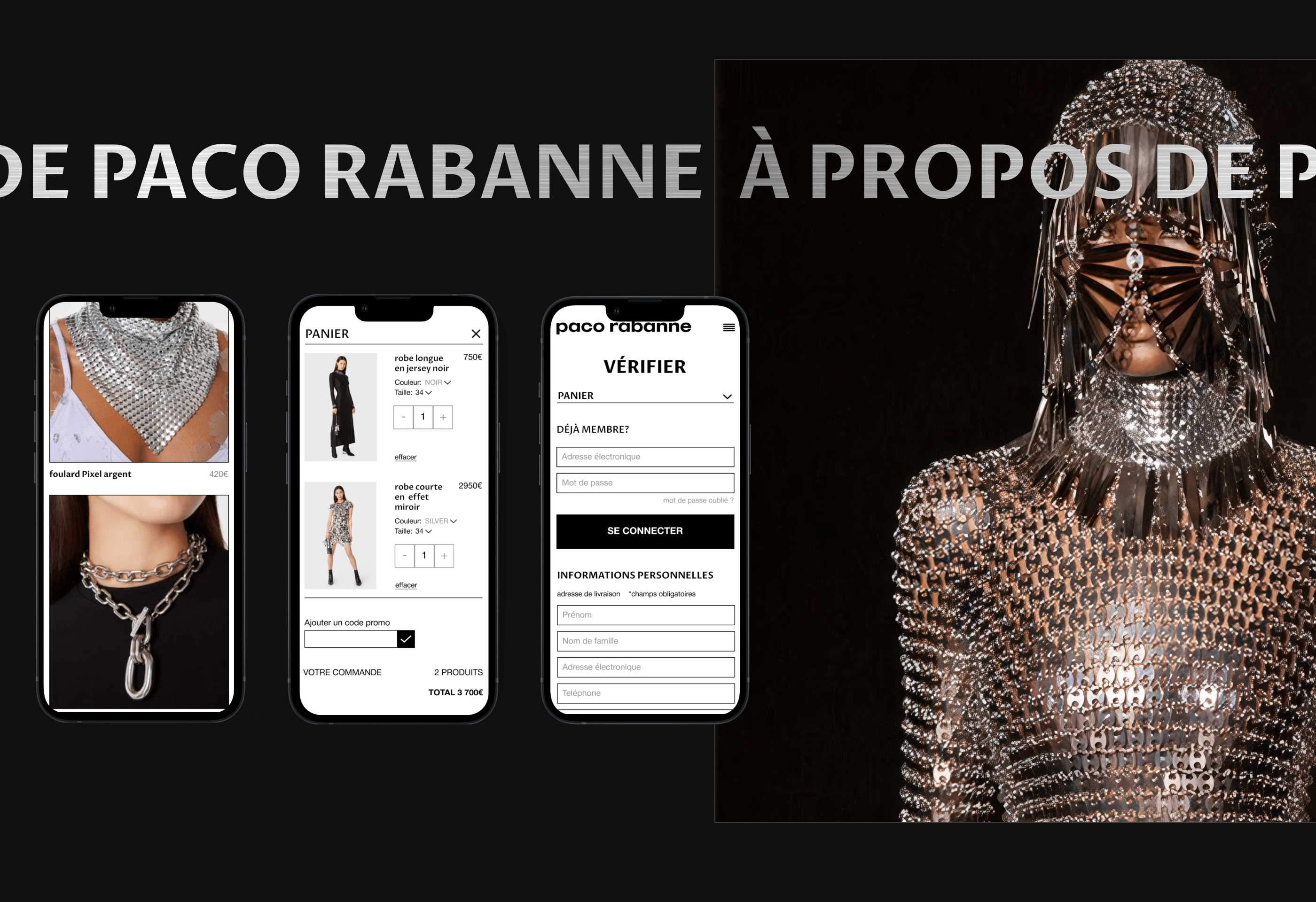
Details: added a synchronized hover area that points to the corresponding menu page,Fixed the text size from 12px, which was on the site to 14px, which helps the user to easily perceive information on the site, removed the skorra element in filtering, which allows the user to see all filtering items on one screen, working with typography: made text blocks readable due to the correct position of the text and its size,made the catalog more concise with an interesting grid, due to which each product looks unique and users pay more attention to it,particular attention was paid to adaptive versions (panshet and mole devices), making products and interface elements more obvious and easy to use, created simplicity and conciseness of visual elements, which allows the user not to get confused.