Packaging design for nuts
Our task
Pocket Nuts is a new brand of nuts. In this project, we were faced with the task of facilitating the brand’s market entry. In order to do this, we conducted analytics and developed a corporate design.
Client
Pocket Nuts
Services
Analytics
Packaging design
Corporate style
Copyright
The product
Nowadays, many of us want simple and understandable food solutions, that is to say products with a good composition and natural taste, which would come in handy when having an active schedule and help satisfy our desires here and now.
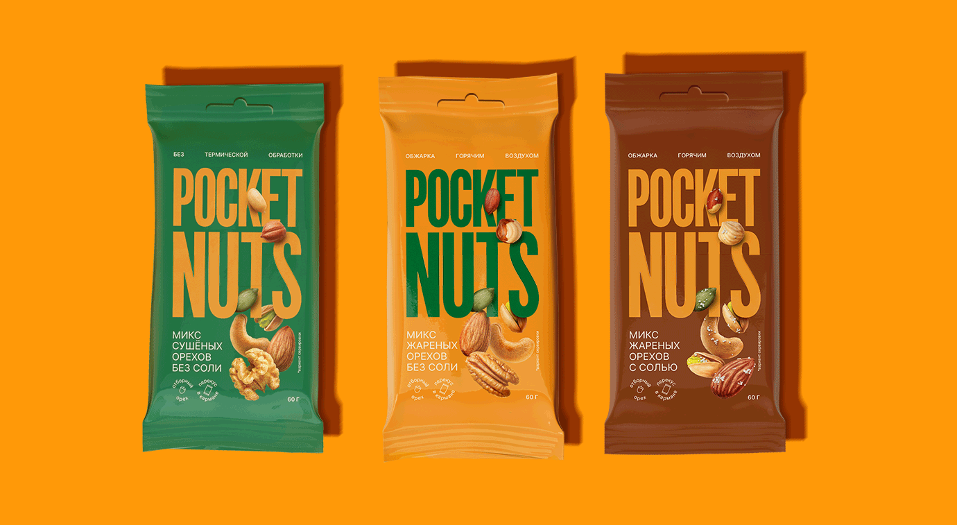
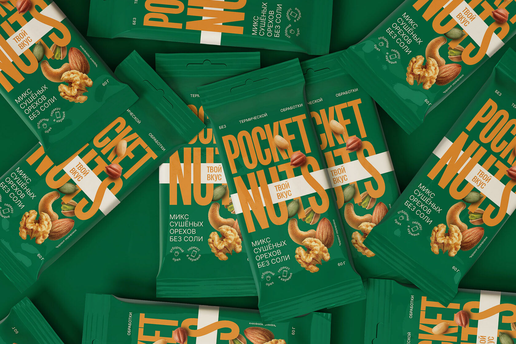
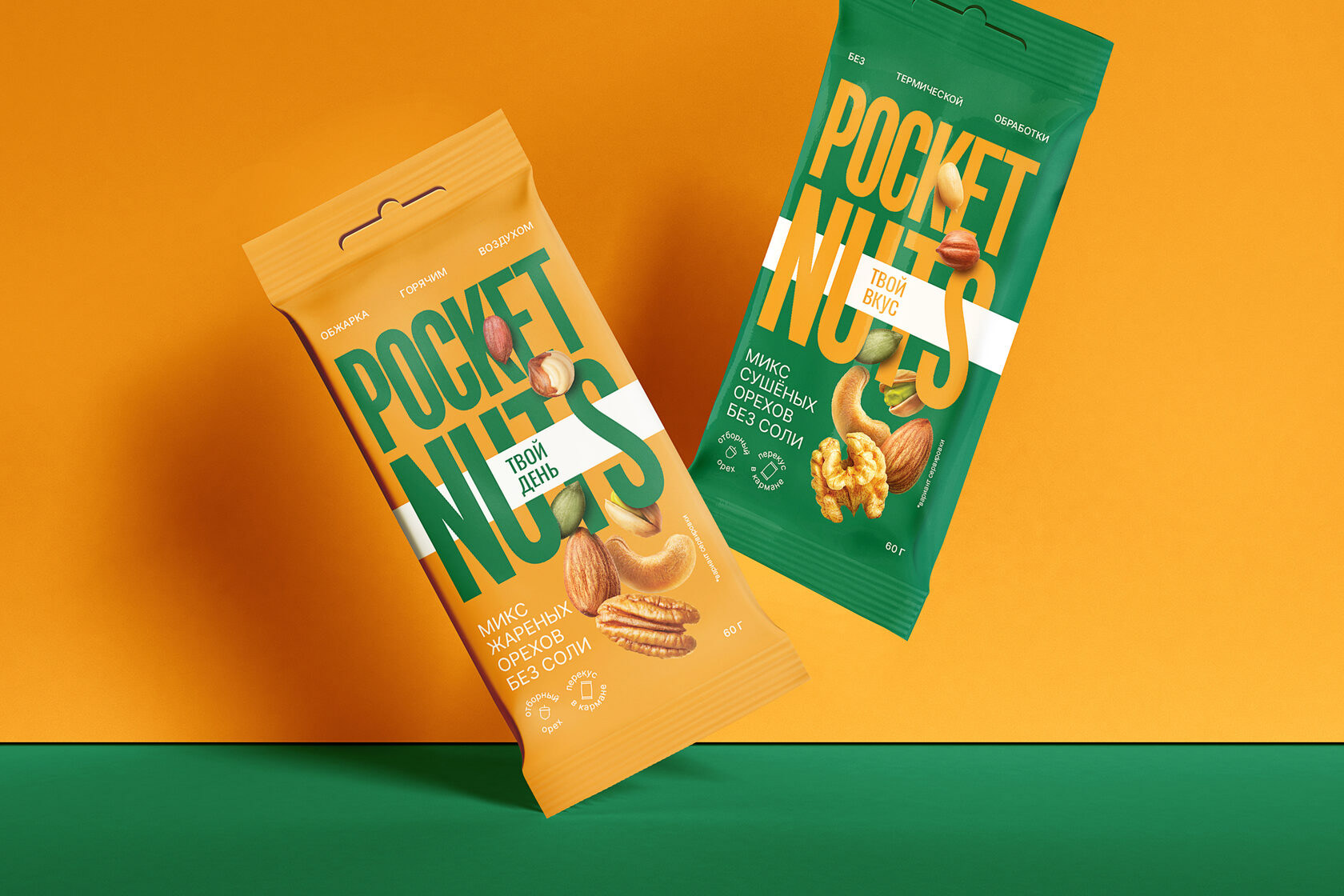
Pocket Nuts are a variety of nuts (pistachios, peanuts, almonds, cashews, peanuts to name a few. Their processing takes place with hot air, and without oil, and thanks to this they retained vitamins and minerals.
Analytics
1. The absence of modern solutions: most brands have a traditional design
2. The colour palette is limited to categorical shades: beige, orange, green
3. No emotional design: brands only speak about rational benefits
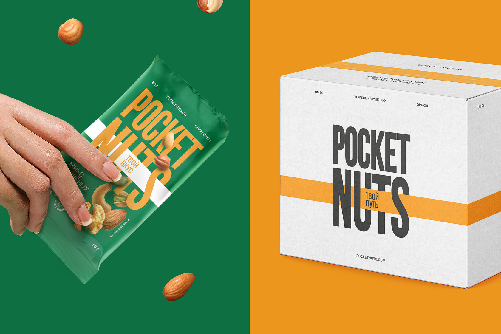
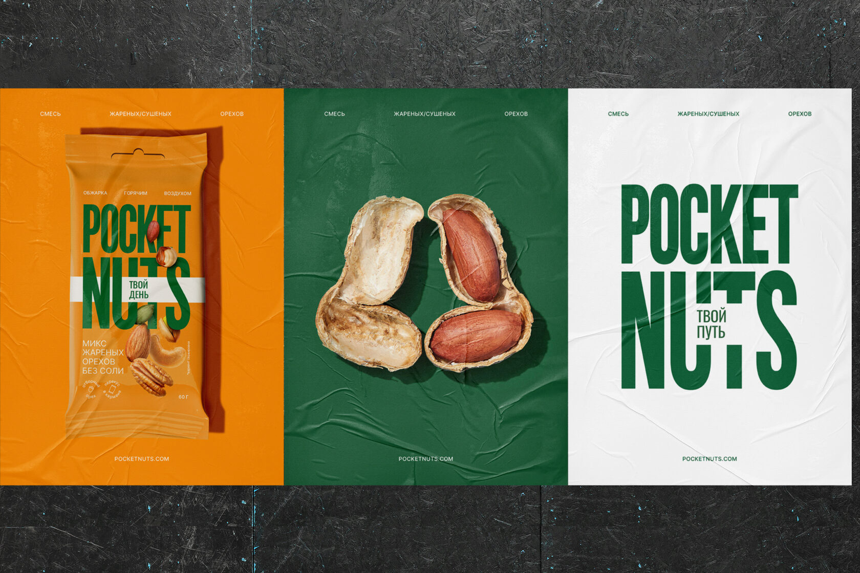
Design idea
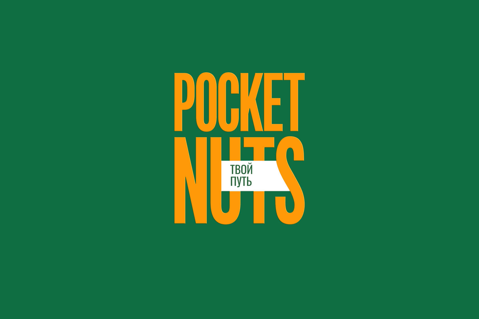
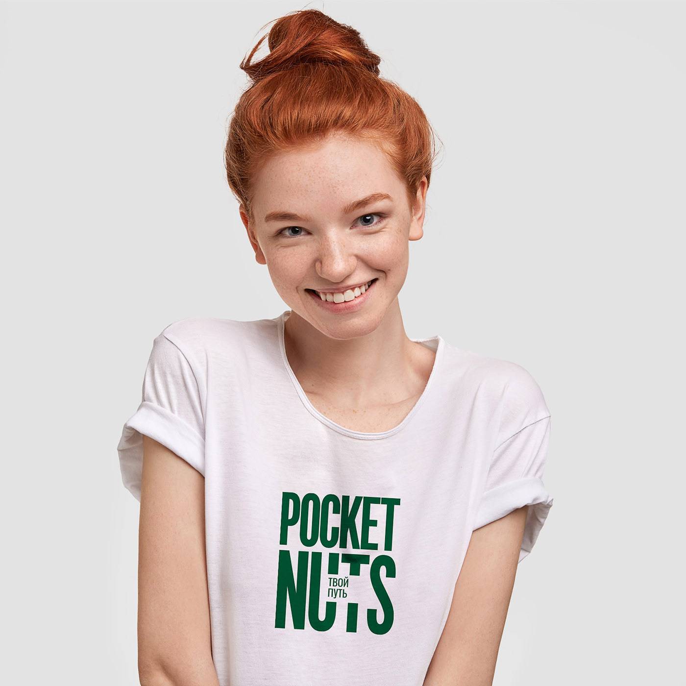
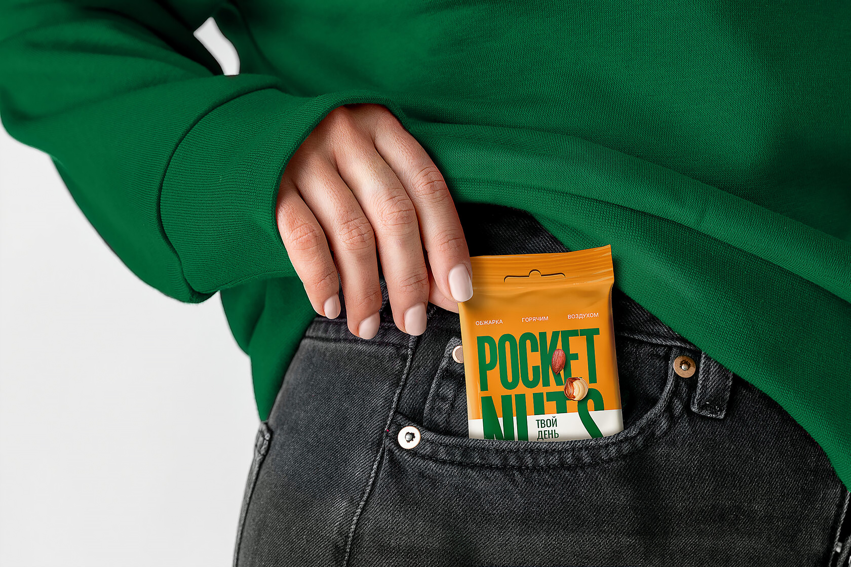
Your taste, your day, your journey
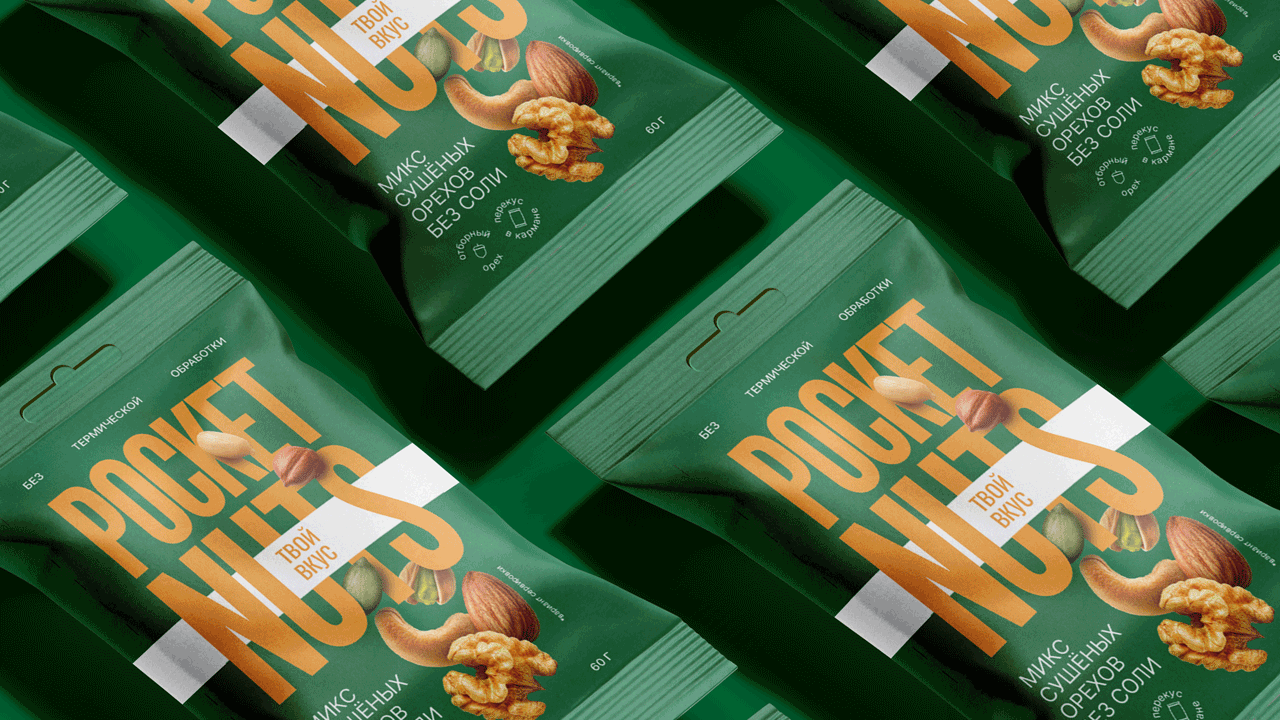
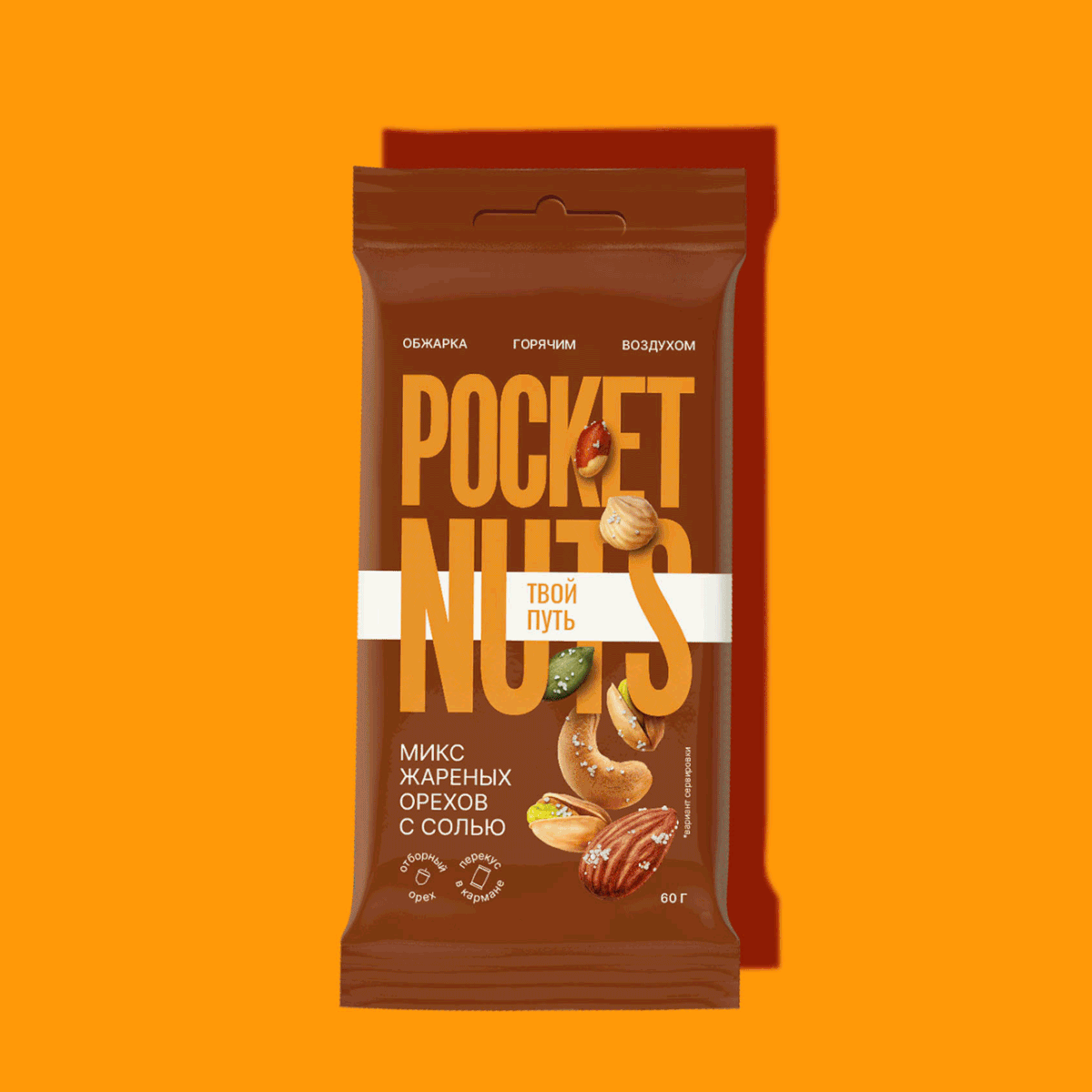
On the packaging, there is a large area dedicated to the label with an accent on typography in the centre of the composition. The elongated contorted font creates a sense of stability, as if balancing the frantic rhythm of time.
Word writing has different scales. This adds monumentality, draws attention to the name of the category.
The white stripe, inscribed in the typeface, enhances the mood of the concept, as if adjusting to the customer’s lifestyle.
An unusual solution in the logo comes in handy for the development of brand communications. The packaging as well as slogans and other messages in other types of communication allow to mirror the benefits of the product.
The food zone has a complex composition. The nuts are located at the bottom of the package and were moved to the background. This allowed us to keep the emphasis on the logo, which is of paramount importance for a new brand when entering the market.
At the same time, the product is largely depicted and does not disappear from the visibility zone, on the contrary, such a decision attracts attention to it.
The results
1. We created an emotional product design for a rational market
2. We helped the brand stand out from competitors with the help of a large logo, bright palette and mouth-watering food zone
3. We made it easier for the brand to be launched in an established market with a large number of players