Zelenaya Gryadka — Packaging
design for vegetables

Client
Zelenaya Gryadka
Services
Market analytics
Brand platform
Packaging design
Task
"Zelenaya Gryadka" is an eco-friendly brand of vegetables and salads. In the project,
the branding agency "Ferma" conducted analytics, developed the brand platform,
and designed the packaging.

Product
Our brand grows nutritious vegetables and salads. We offer daily products that help maintain well-being and vitality every day. Continuous quality control, high-quality and safe ingredients, and environmentally friendly conditions all contribute to the taste and benefits.
Background
Consumers today want to be healthy, manage their busy lives, and still have time for themselves.
They seek products that offer diverse ways to maintain their health and well-being, bringing real benefits.
Design concept
Life with tasty benefits
Get everything done, and manage everything around you. Living successfully in today's active schedule requires filling your body with real benefits. In developing our concept, we were inspired by the lively, energising brand "Zelenaya Gryadka".
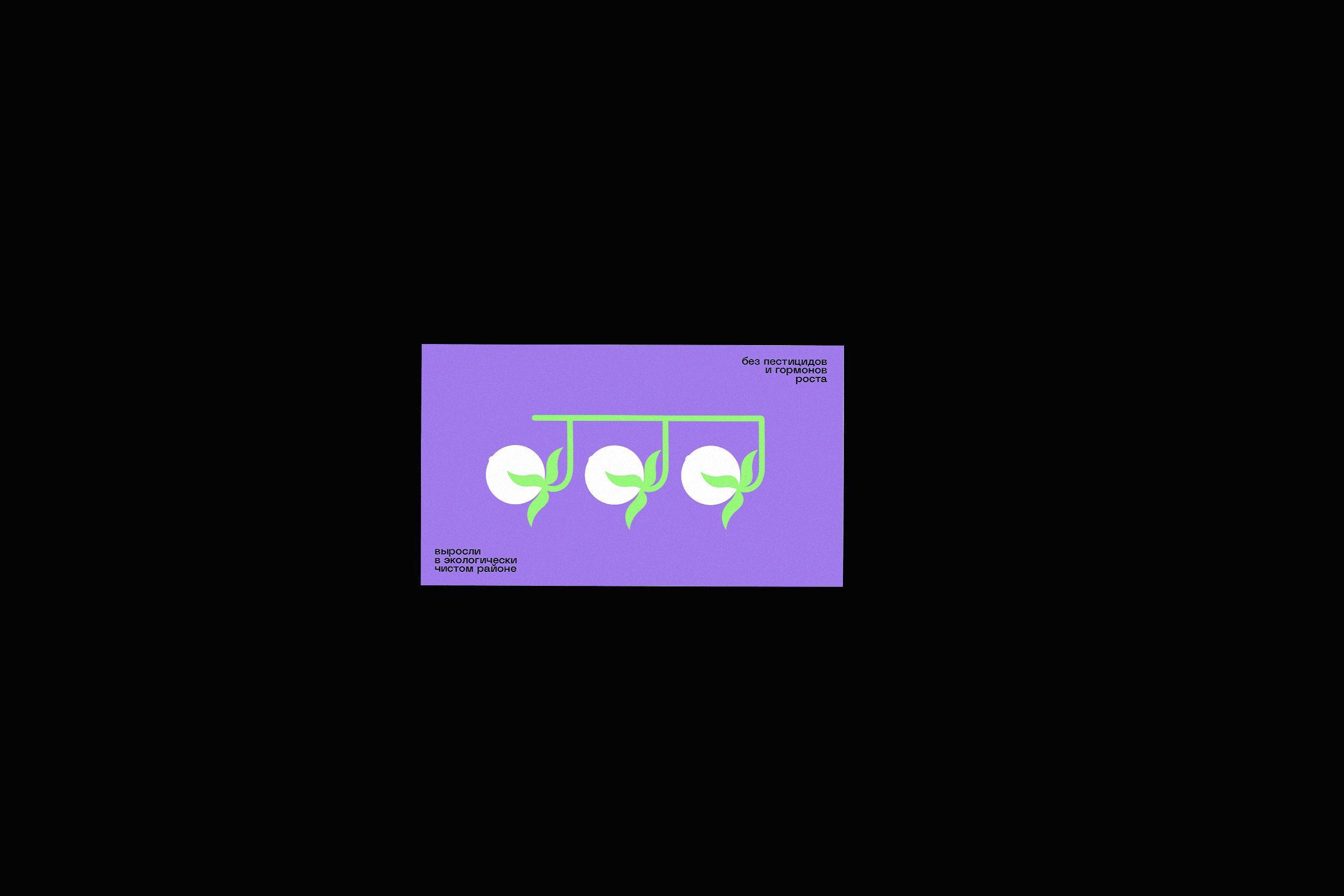
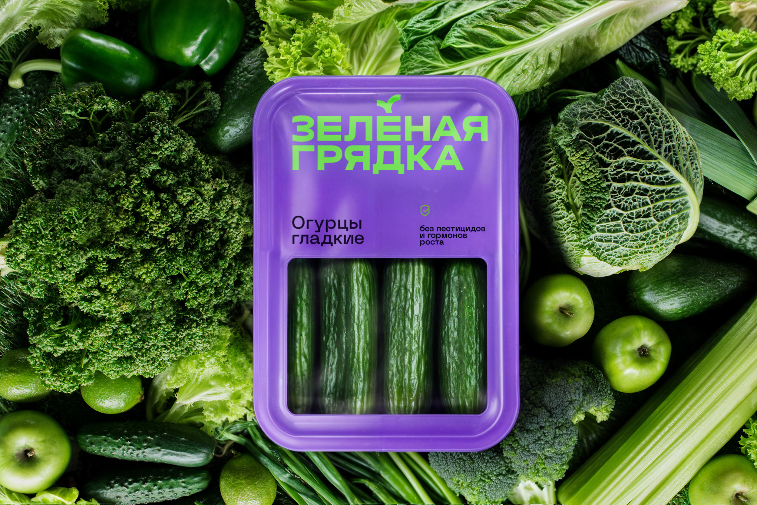
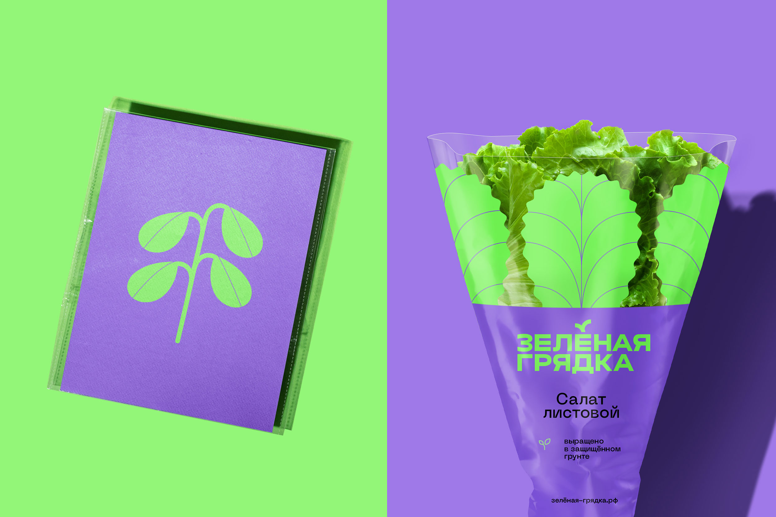
The logo features a modern font that is easy to print. The grotesque style adds brightness and confidence, creating a sense of reliability. The letter "Ё" in the logo resembles leaves of lettuce, tomatoes, and other vegetables, which is a nice association with the category. Illustrations complement the design. Smooth lines reflect the company's careful approach, appearing unique and distinctive.
Delicious is healthy,
and healthy is delicious
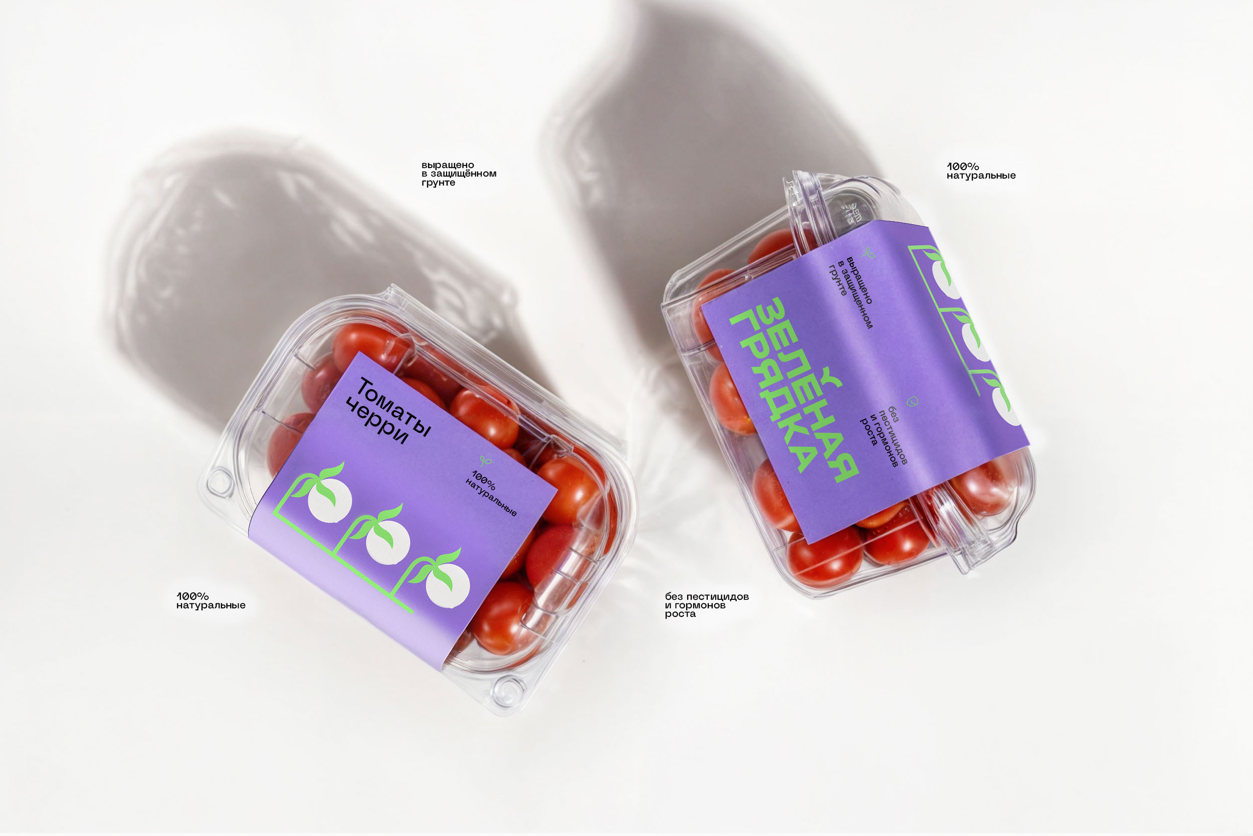
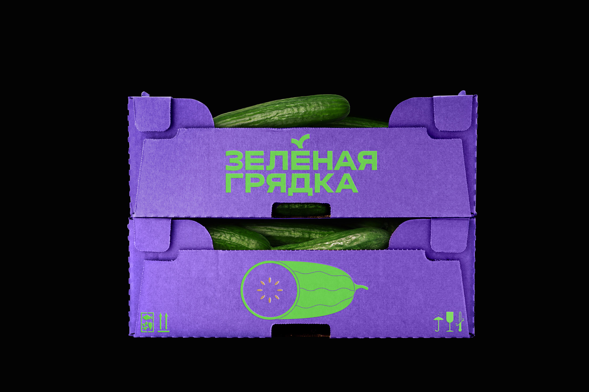
Packaging and brand style
The packaging utilizes cardboard in transparent flow packs with stickers. The bright background color attracts attention. Illustrations featuring tomatoes and other vegetables are used for product differentiation, making
it easier for consumers to identify.
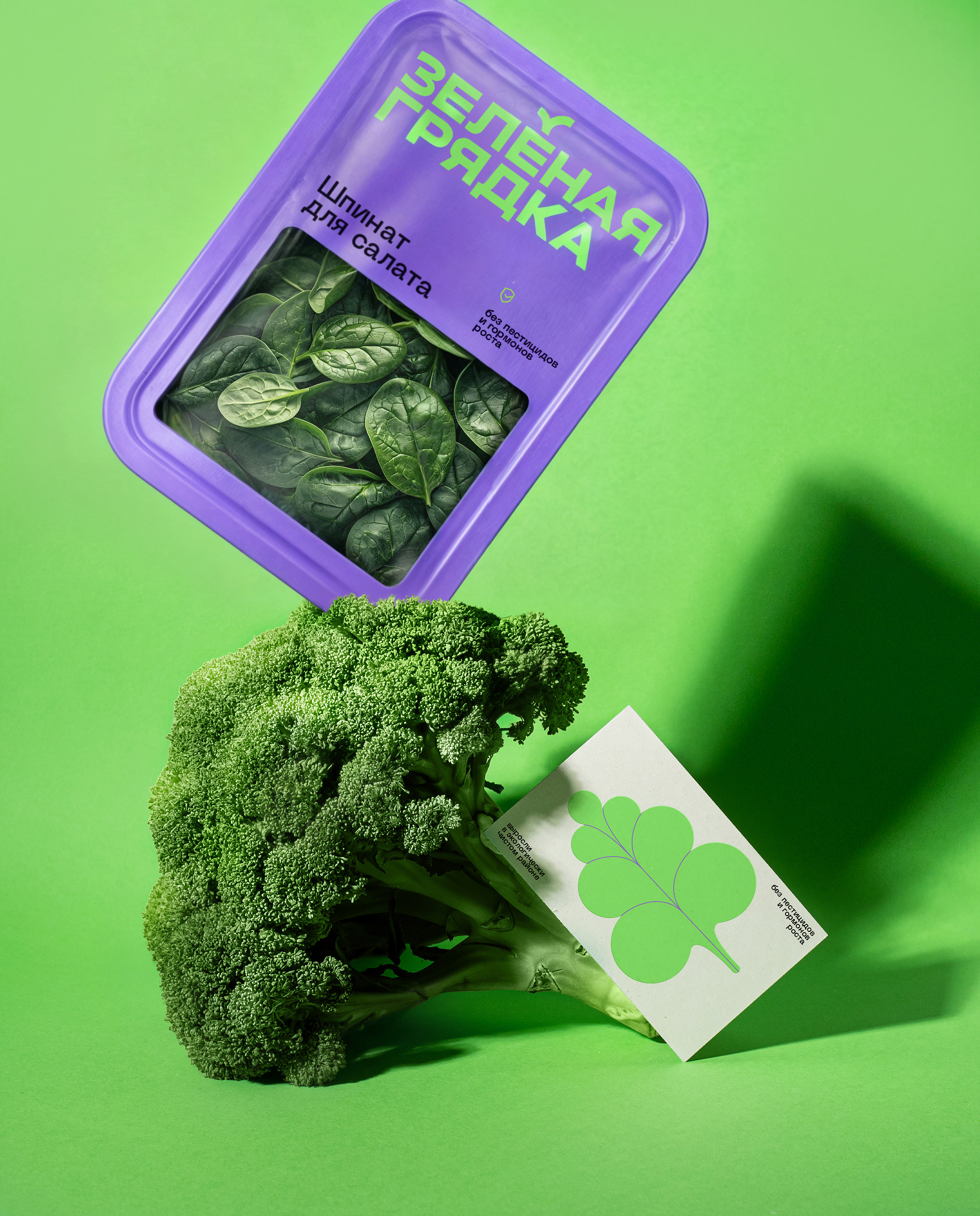
The color palette combines shades of purple and green. These soft tones create a friendly atmosphere and, at the same time, look unique — a fresh choice on the shelf.
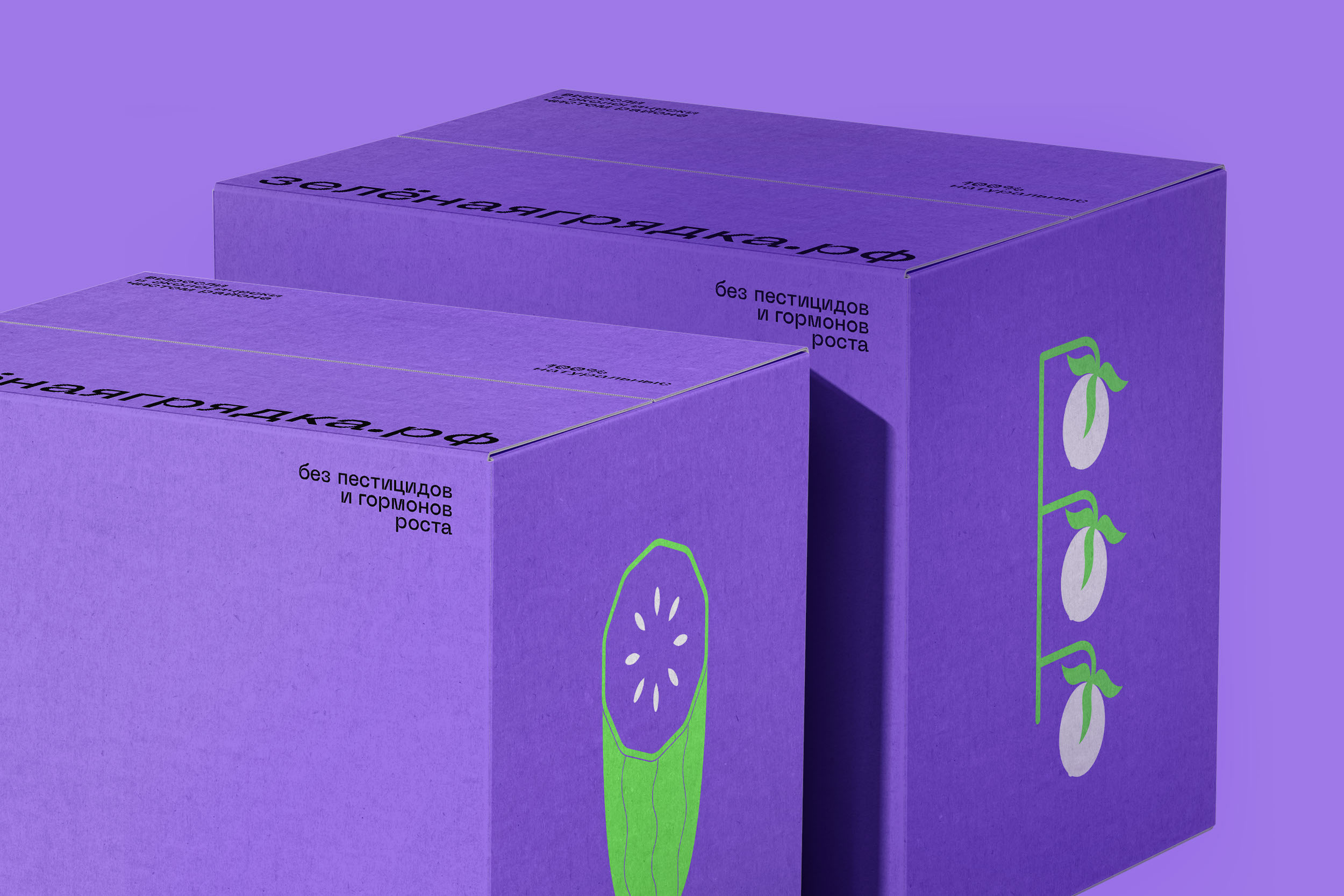
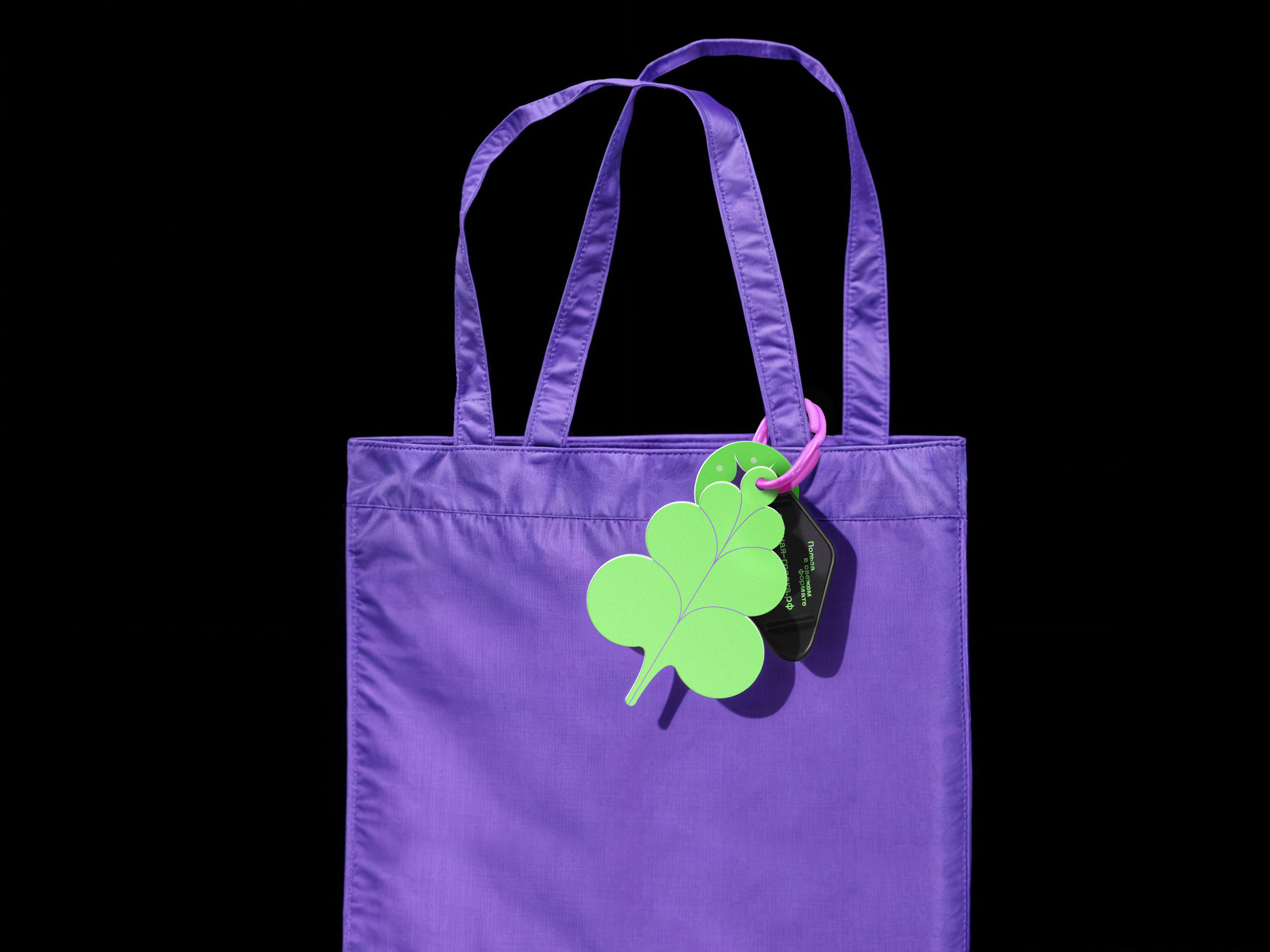
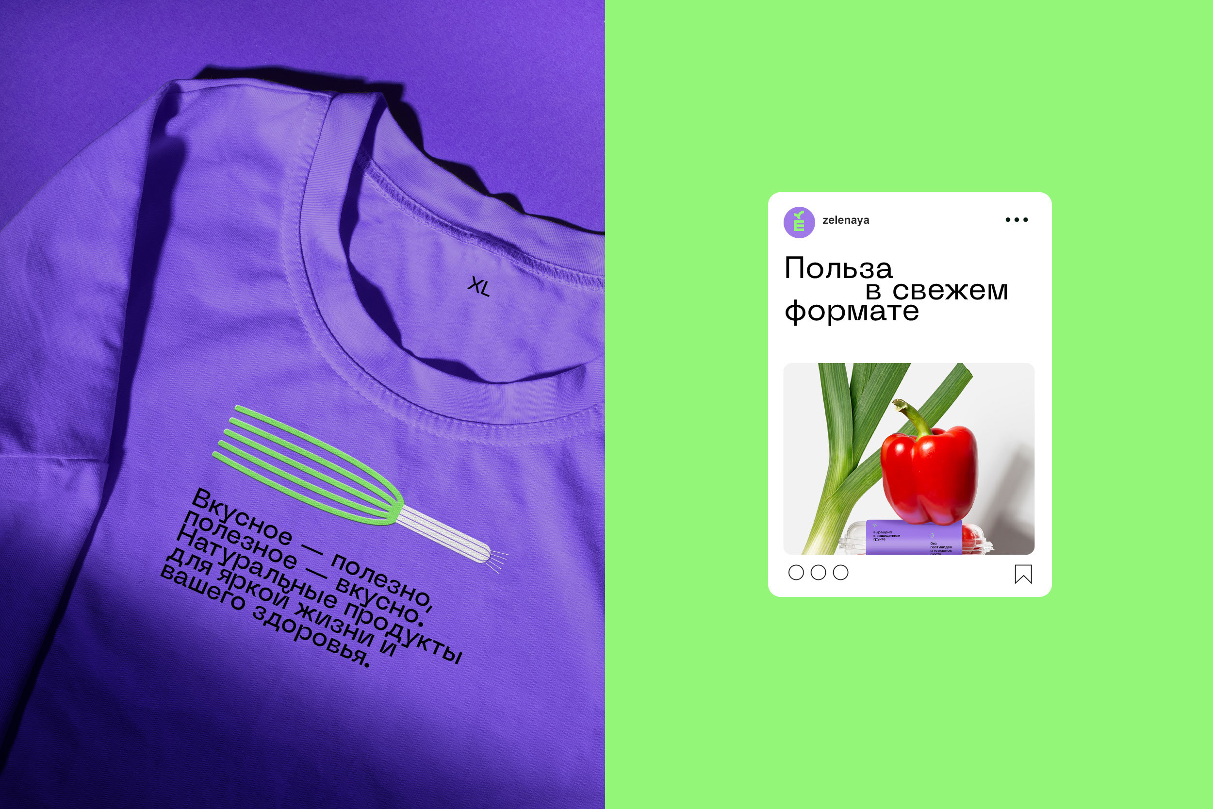
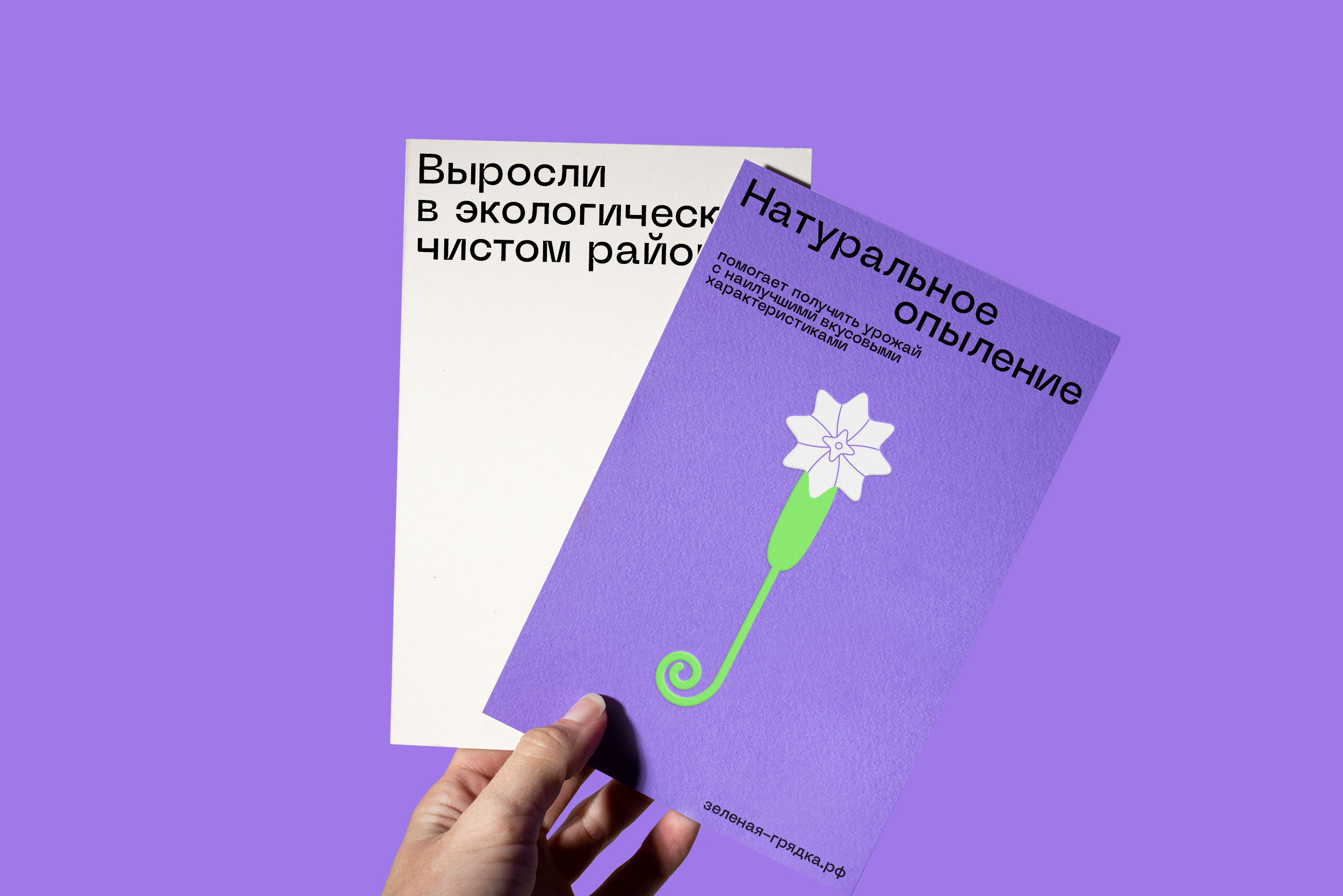
Brand style elements reflect the vibrant mood of the brand. Like in other design formats, they are complemented by illustrations and copy highlighting the product's advantages.

The results
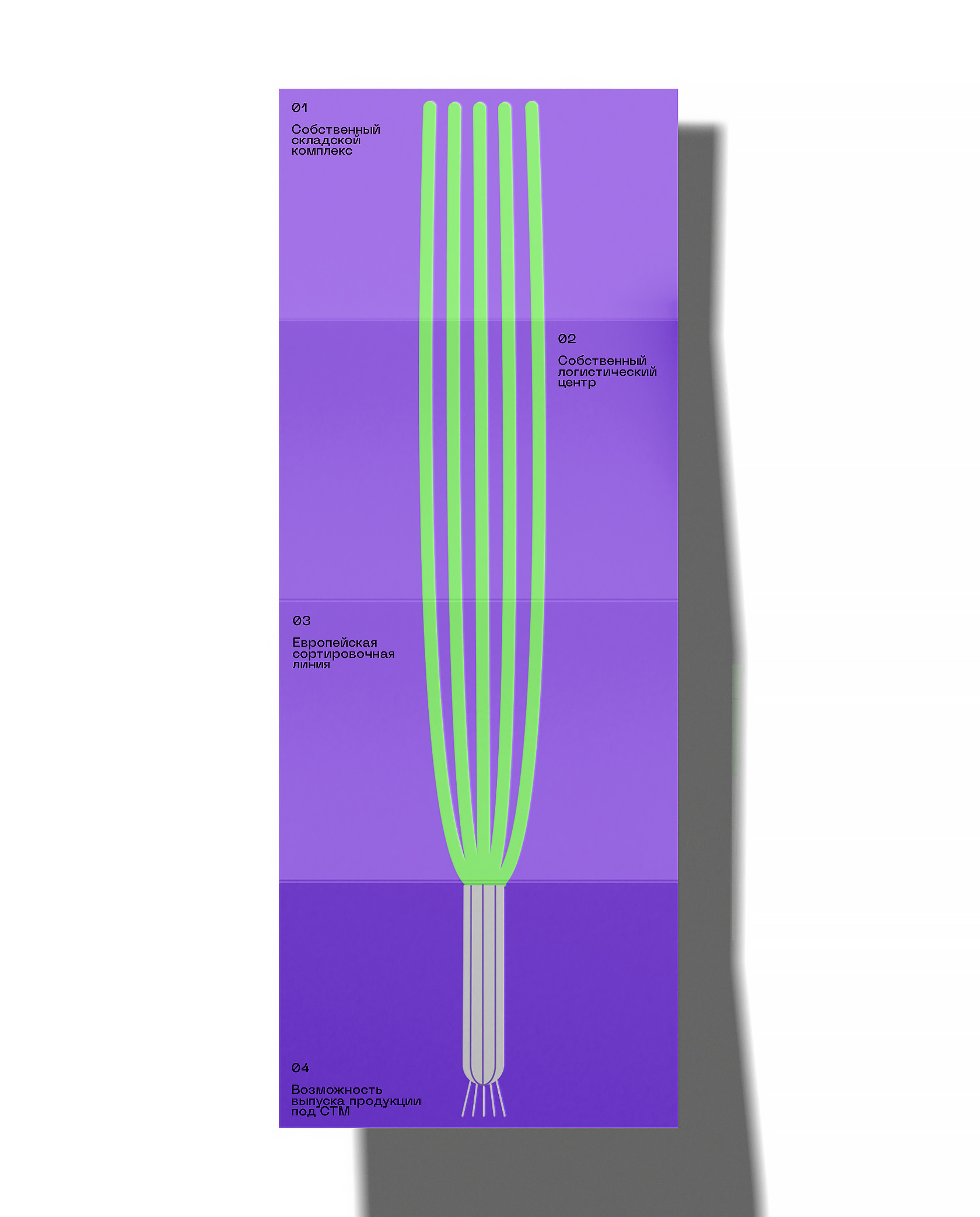
1. The new brand concept has been developed to highlight the key advantages of the product.
2. The brand has been given greater visibility on the shelf with the use of a contrasting colour palette.
3. Illustrations have been created to convey the caring approach of the brand.