Pharmacy of honest prices
Client
Zdravservice
Services
Analytics
Brand platform
Corporate style guidelines
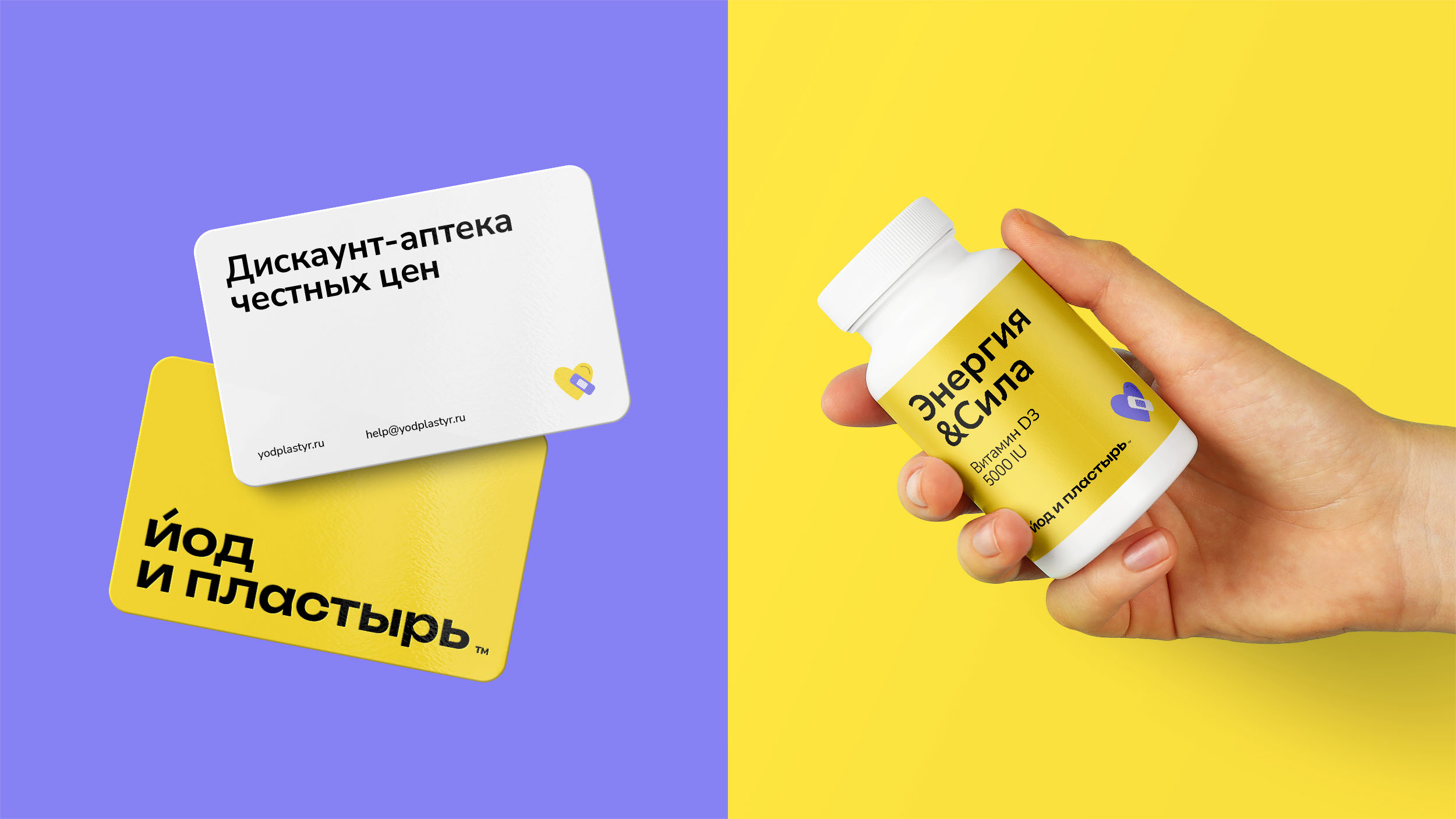
"Iod i plastyr" (Iodine and Plaster) is a discount pharmacy chain by "Zdravservice" company.
The branding agency "Ferma" has developed the corporate style.
In the project it was important to show the modern character of the brand and reflect
the friendliness inherent in the naming.
Product
In 2022, many pharmaceutical companies exited the Russian market. The new pharmacy chain "Iod i Plastyr"
sets itself the goal of supporting consumers during a challenging period. To achieve this, the company
is releasing vital medications at affordable prices.
Design concept
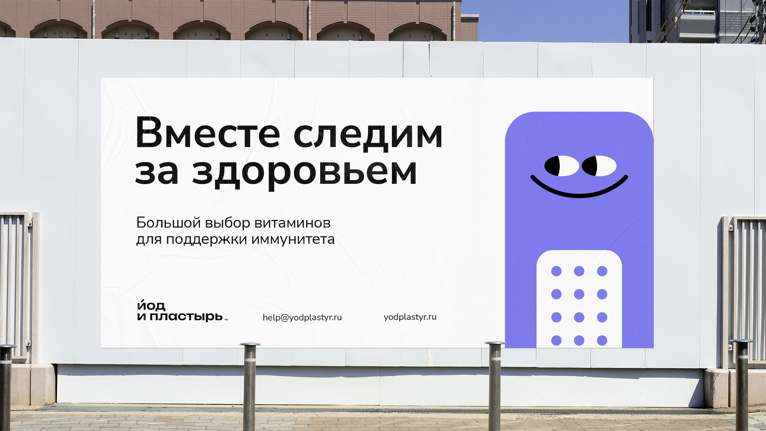
The brand that helps
Our brand is a hero of the new era, offering support in health matters and ready to assist people
in challenging situations. This idea inspired us to create a concept in a friendly style. The design
immerses you in the atmosphere of an expert brand with a welcoming, open, and kind message.
Design
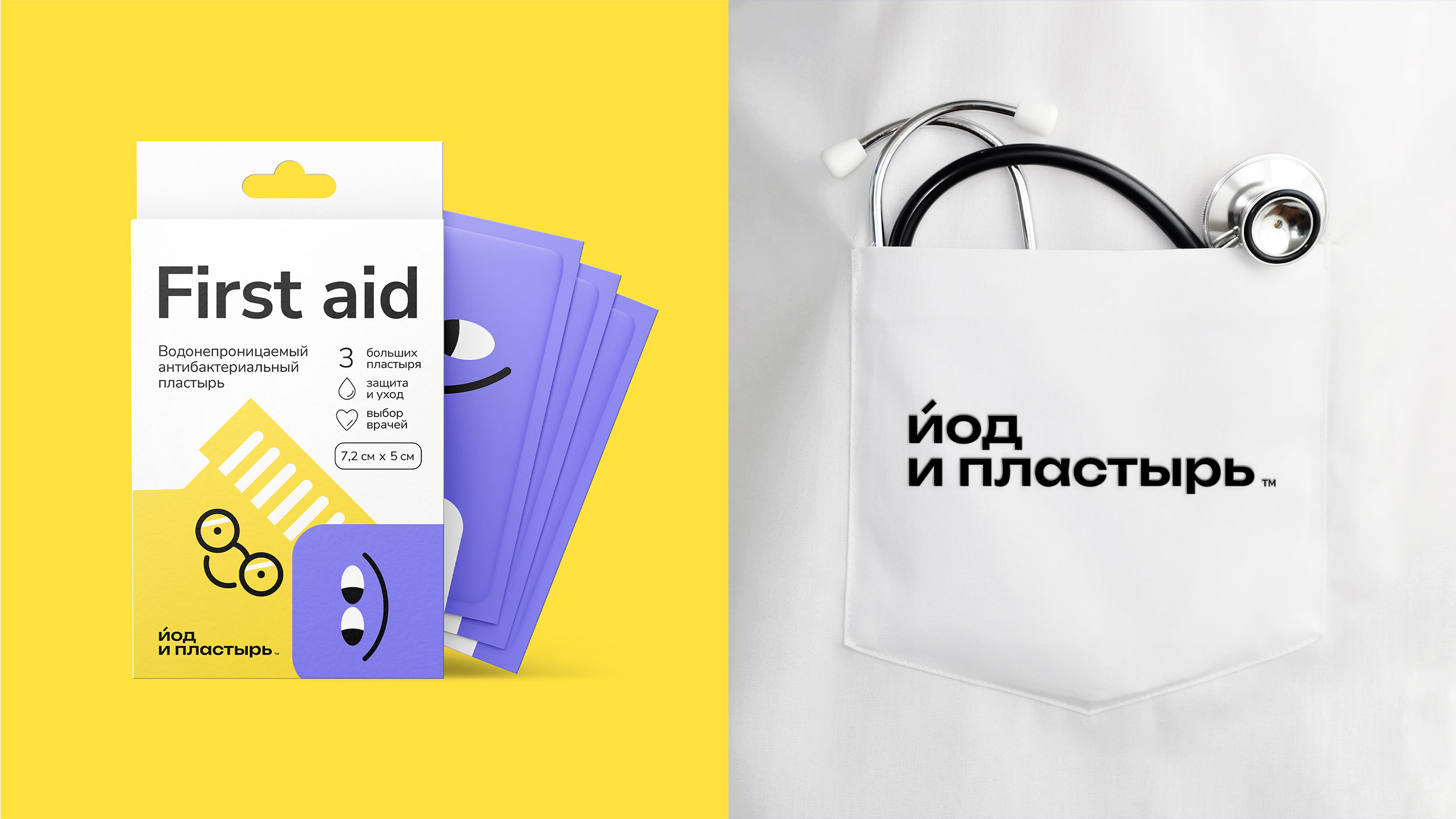
The design is centered around adorable characters — Iodine and Plaster. These are
the heroes who help each customer find the right medication. They embody a concept
of warm-heartedness. They look kind, optimistic, and they smile, which enhances trust.
The design is based on simple elements. Flat graphics, a typographic logo,
and a straightforward layout system all contribute to the image of an open and friendly brand.
Brand identity elements
The absence of complex forms in the design emphasizes the discount segment
and simplifies brand perception.
Clear and straightforward copy enhances the brand's friendly character.
Color palette
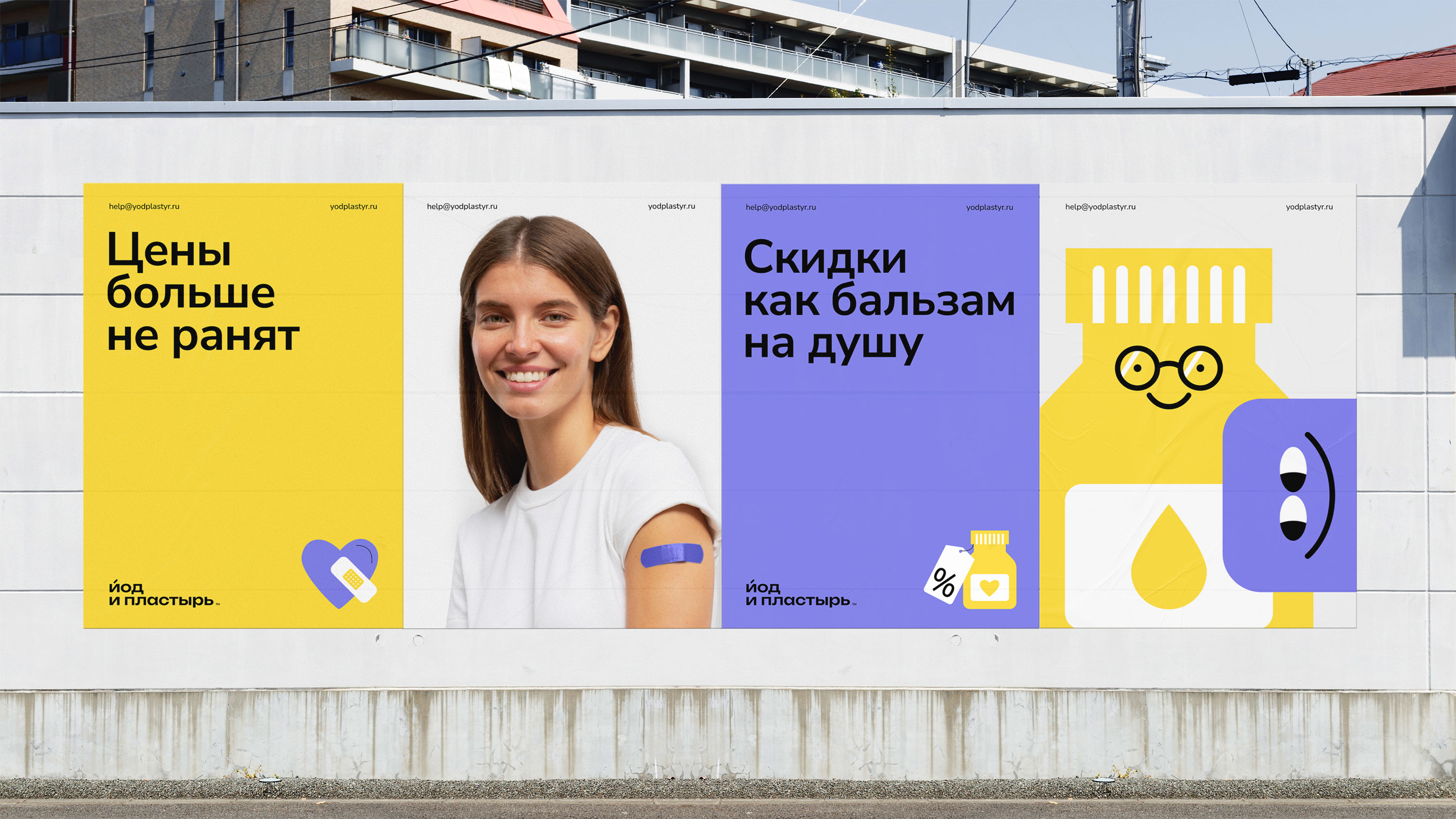
Our brand embodies optimism, motivating positive changes and inspiring with its energy.
Contrasting colors are central to the concept: yellow, white, and purple. This vibrant palette conveys a cheerful character.
Color palette
Our brand embodies optimism, motivating positive changes and inspiring with its energy.
Contrasting colors are central to the concept: yellow, white, and purple. This vibrant palette conveys a cheerful character.
Photographic style
Simple and inclusive images of people in warm, caring scenarios define our photographic style.
Brand copywriting
Our brand delivers clear and straightforward messages to consumers. Grotesque fonts without serifs ensure readability.
Design system
The concept is adaptable for development, blending simple graphic elements with accessible grotesque fonts. This design maintains visual appeal across digital and offline formats.
The results
1. Designed assets for the discount pharmacy.
2. Distinguished the brand from conservative competitors.
3. Established a welcoming corporate style that underscores the theme of care.