Taste of happiness in the design
of packaging for «Tyrolskie pirogi»
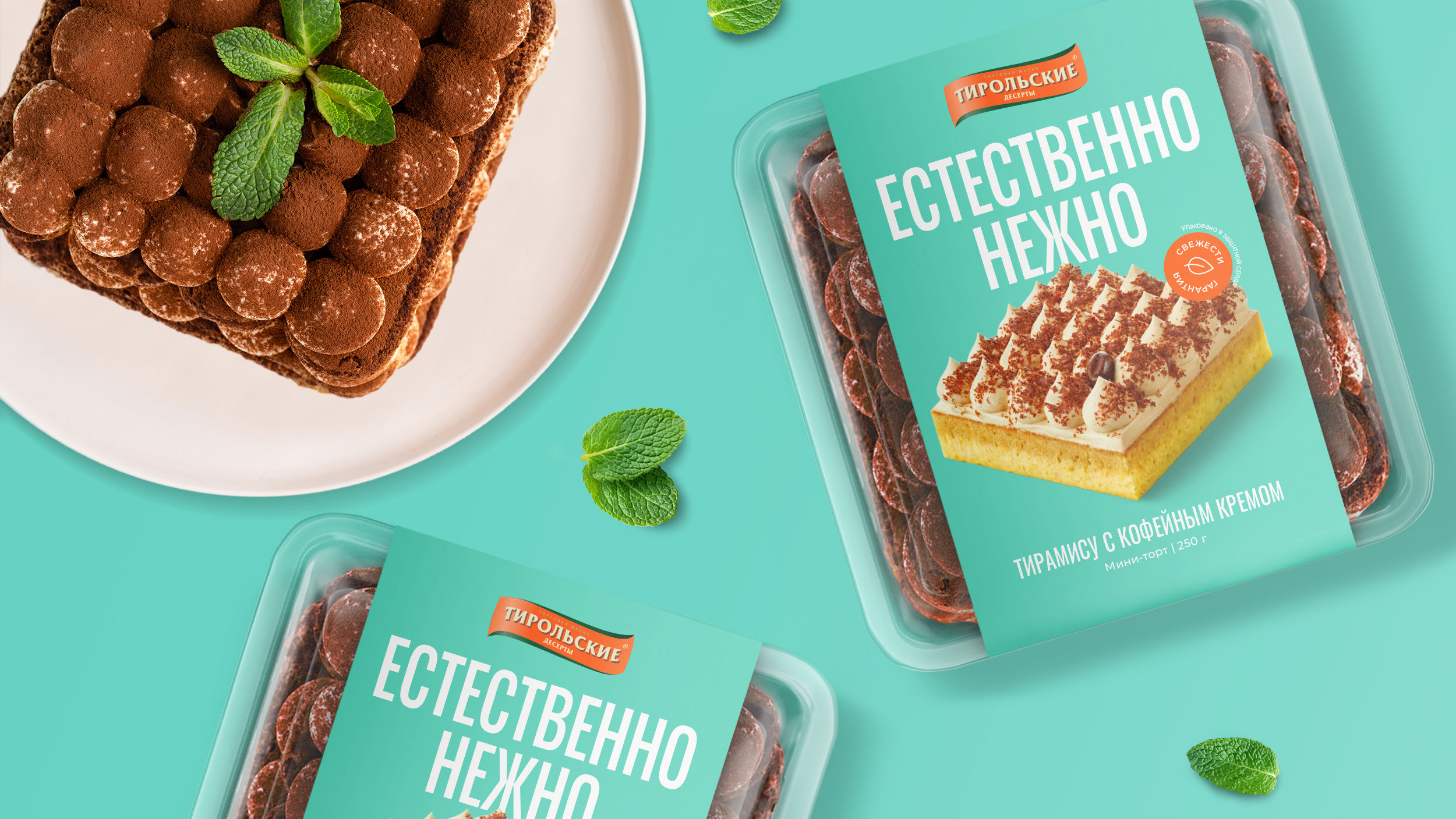
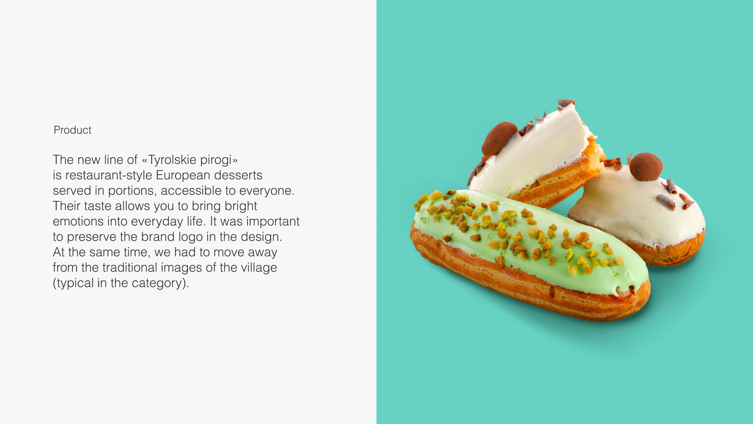
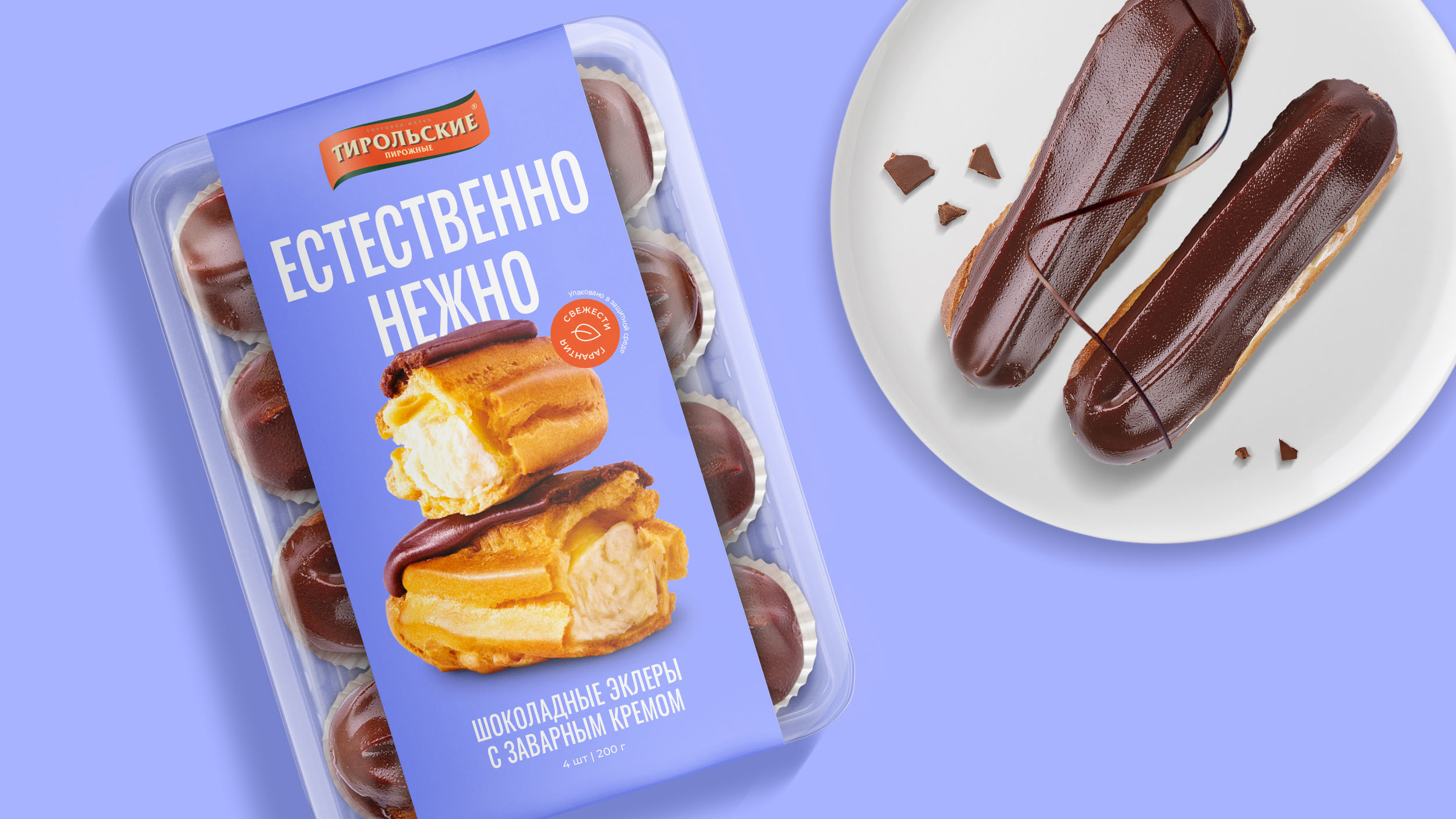
«Tyrolskie pirogi» produces confectionery products. The Ferma branding agency has developed a packaging design for a new dessert line. It was important to maintain the elements of the brand identity and reflect the idea of restaurant tastes in the middle segment.
Design idea
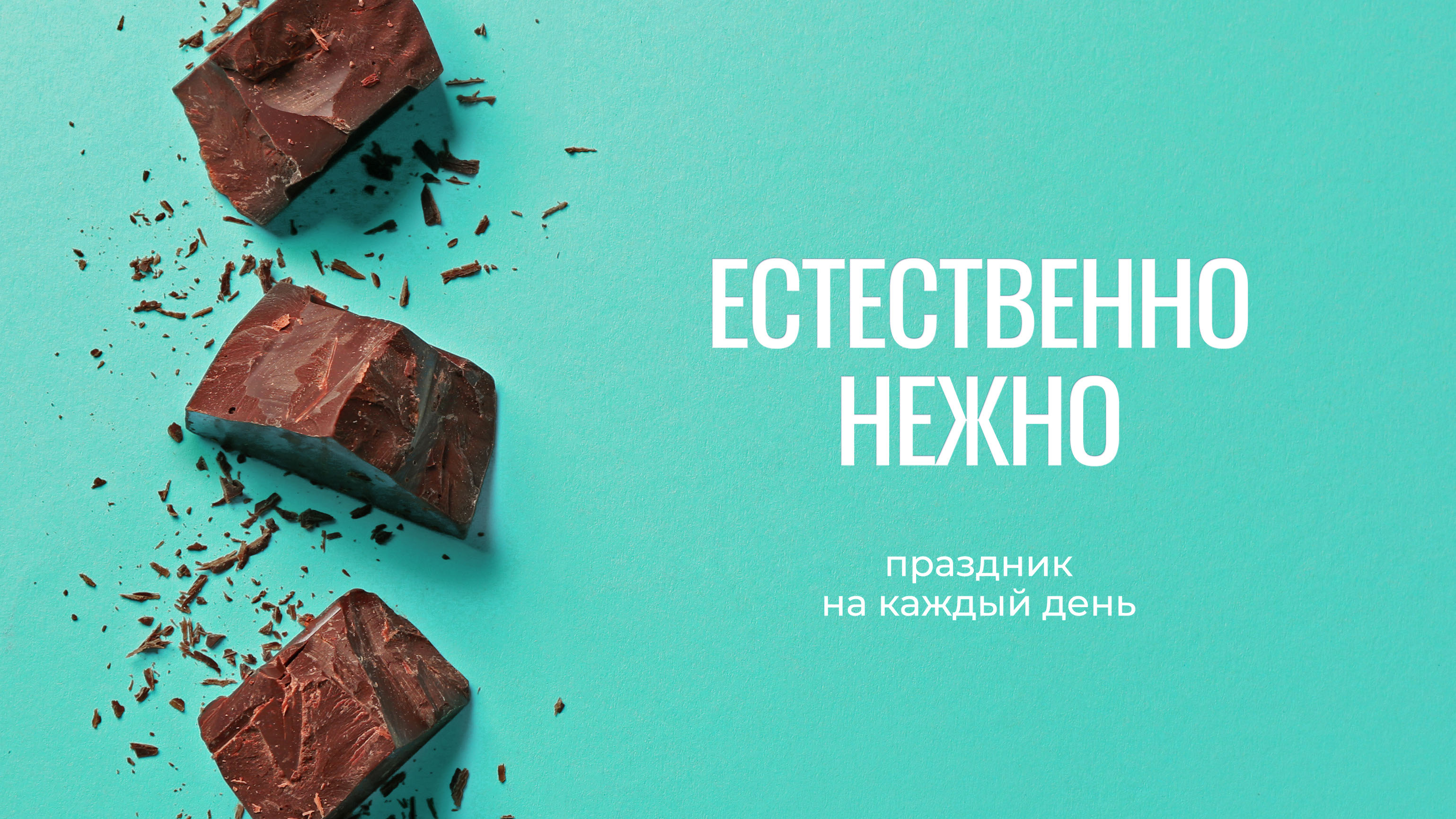
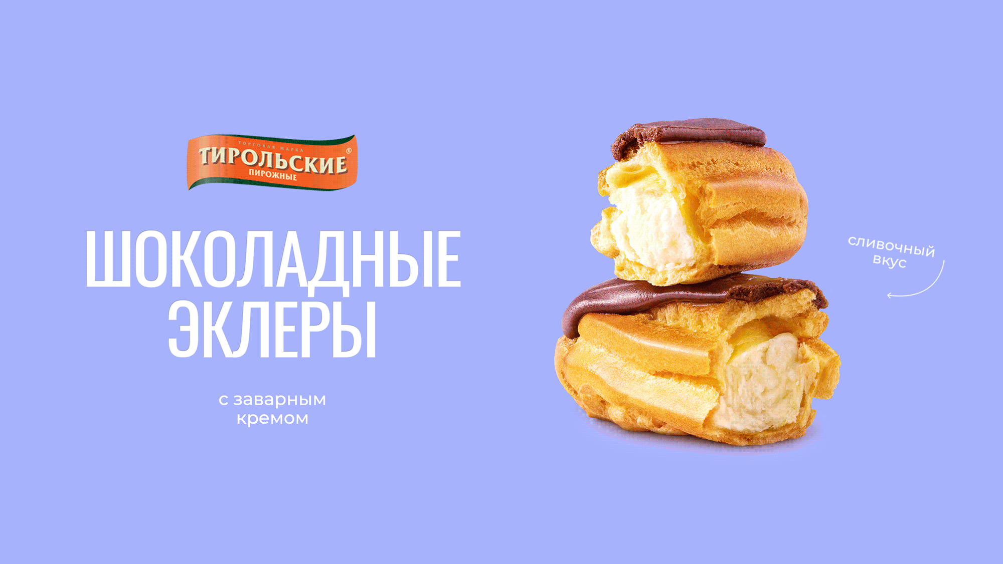
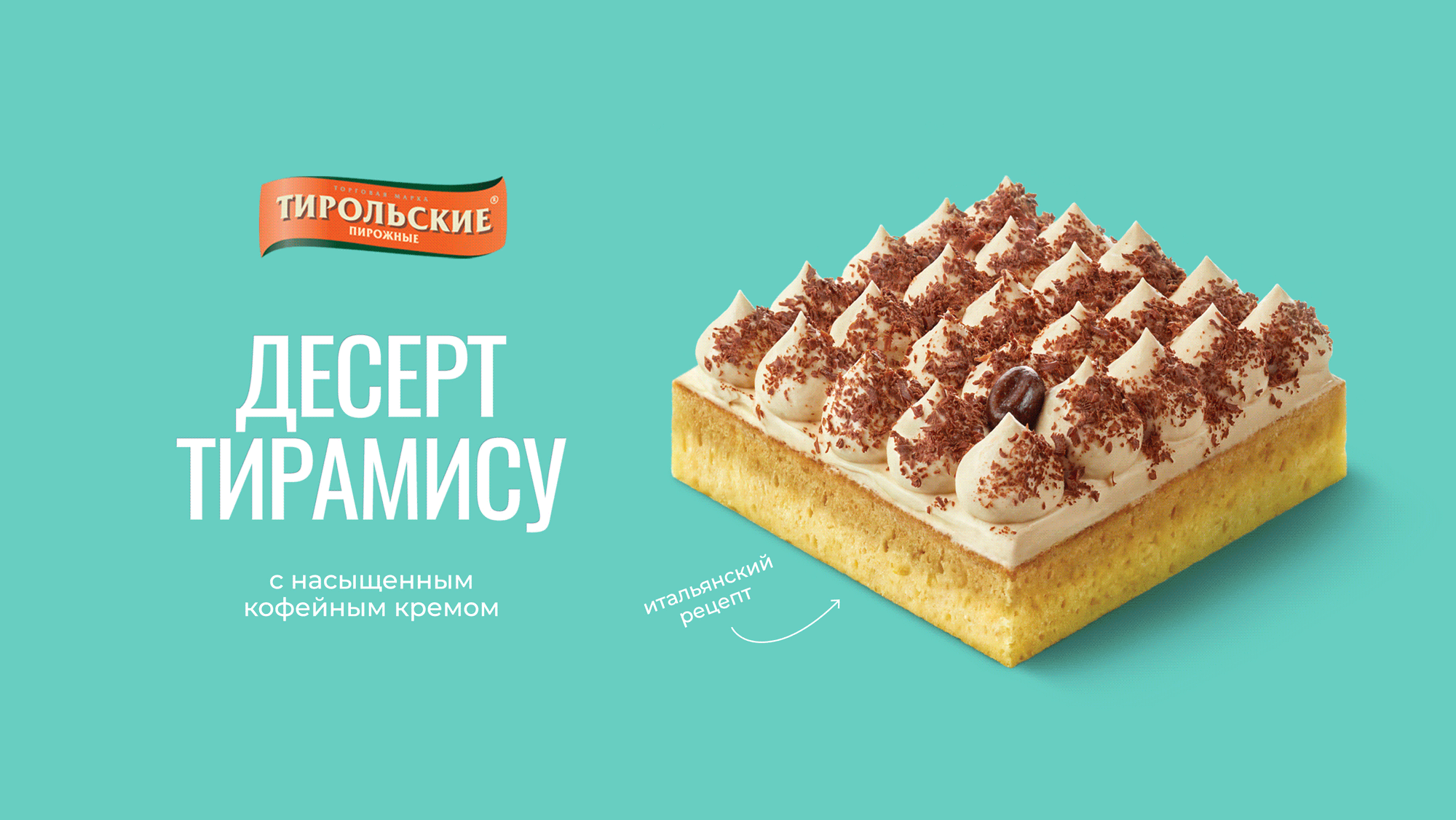
The design immerses you in a festive atmosphere. The emotional slogan reveals a story about delicate taste. Large, bold typography reinforces the key message while keeping the sans font looking minimalistic.
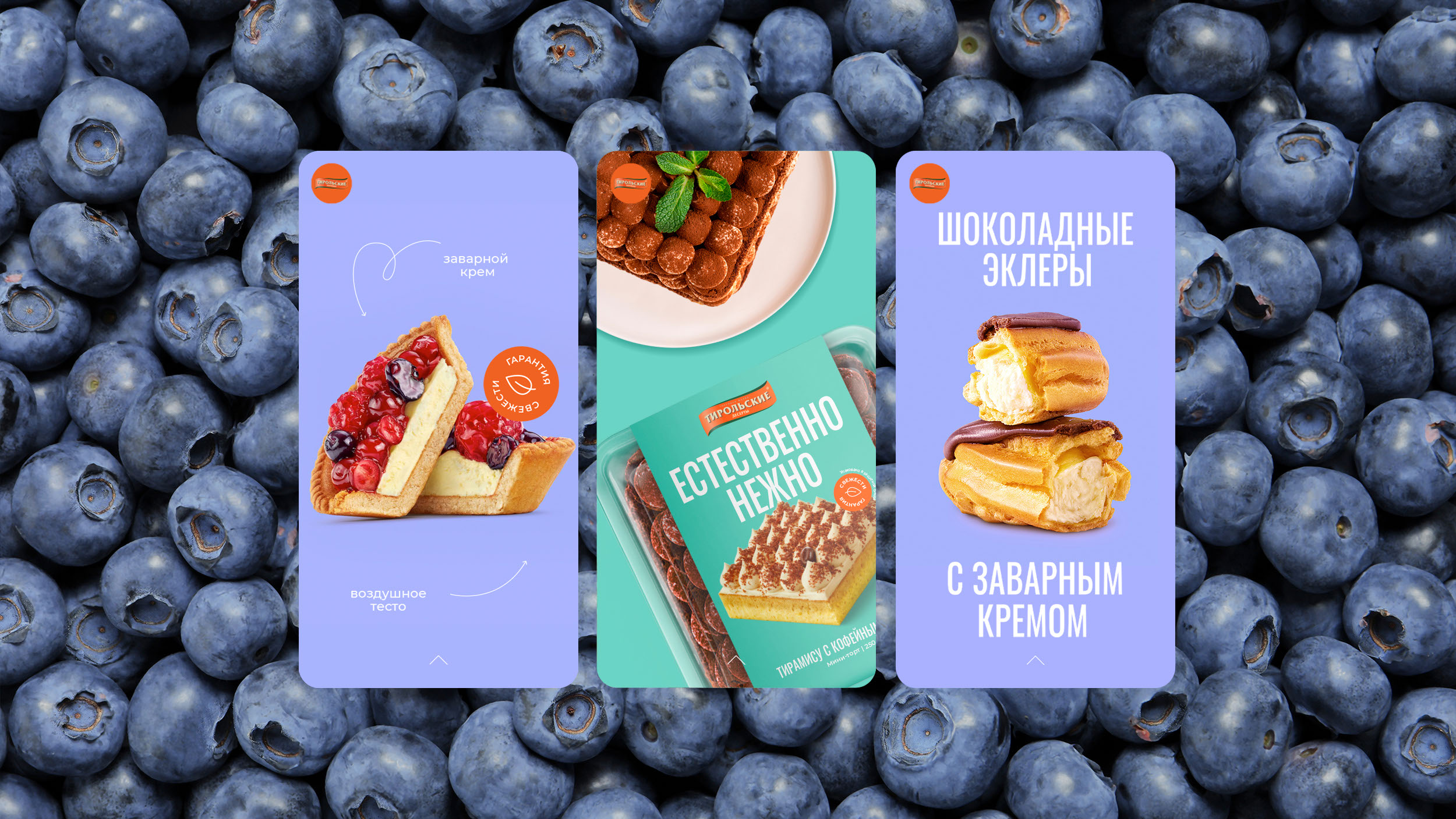
Photo
We took our photographs, especially for the project. We invited food stylists, product photographers, and retouchers. This made it possible to convey the juicy and delicate taste of desserts and cakes, creating the feeling of an appetizing product.
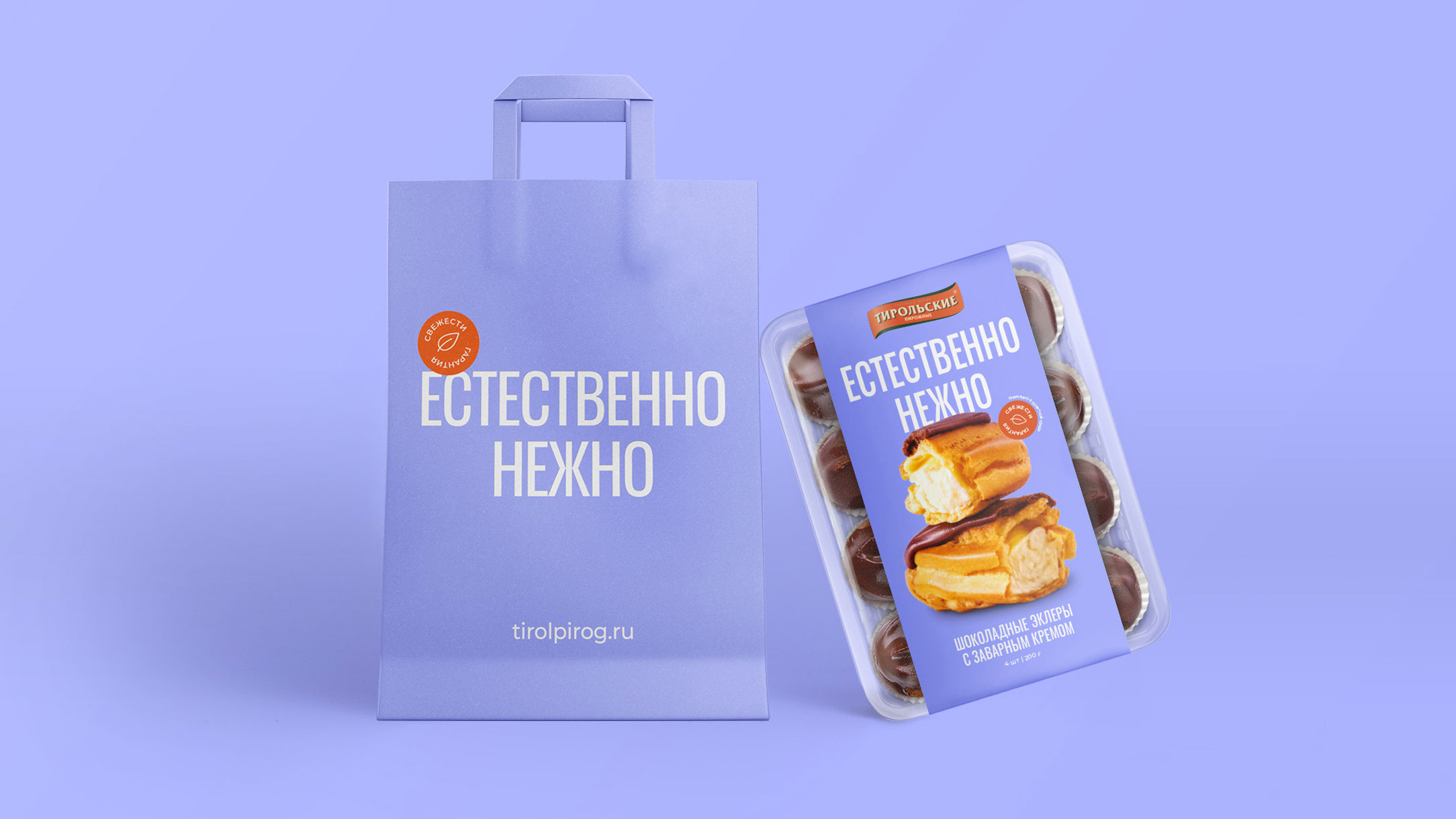
Brand elements
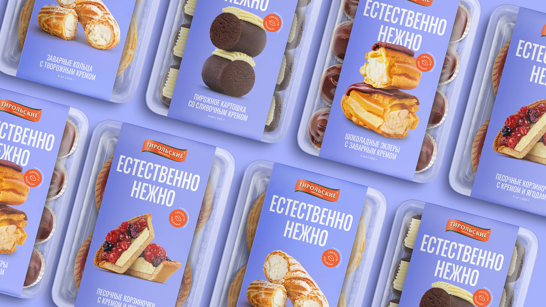
The brand logo is placed at the top of the package. It is located close to the typography and food zone.
This helps focus attention on the key elements of the brand. In addition, the product image interacts
with the text — an unusual solution for a dessert shelf.
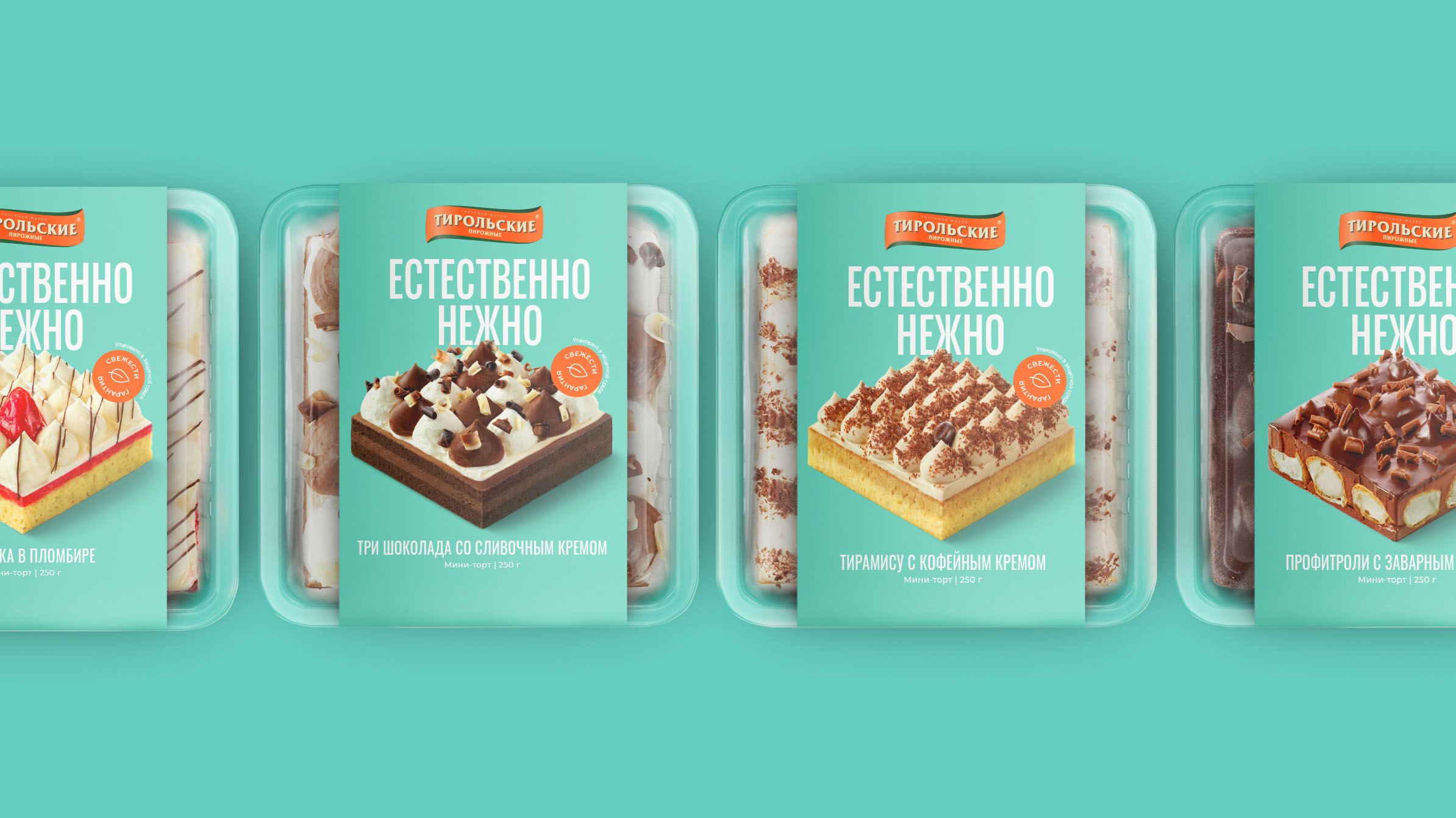
Palette
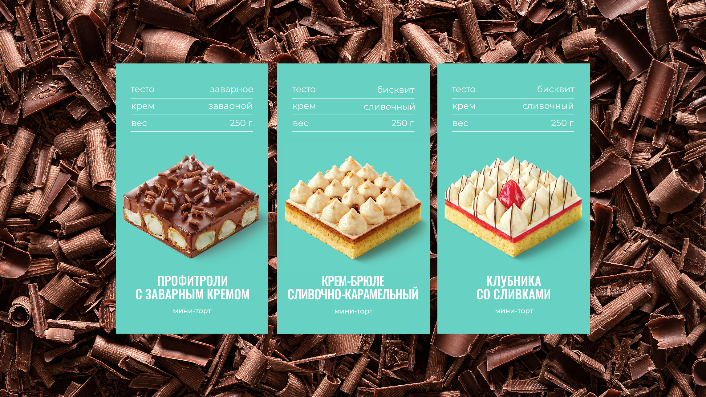
Different background shades help differentiate brand products. Fresh, rich colors are used to highlight
the modern nature of the concept.
System of elements
The design consists of a large brand zone, a bright palette, mouth-watering images of desserts, and inspiring copyright, creating a convenient system that can be easily adapted to different business needs - from branded media to layouts for social networks and the website.
Copyright
Typography plays an important role in design. The slogan creates differentiation between desserts and cakes and allows you to evaluate the main advantages: delicate taste, freshness, quality control, and thoughtful recipe.
Results
1. We developed a design for a new line, maintaining continuity
2. Provided differentiation between categories within the line
3. Reflected the atmosphere of taste and happiness.