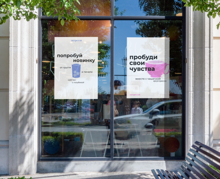
ОБРАТИ ВНИМАНИЕ | ЛОГОТИП И ФИРМЕННЫЙ СТИЛЬ ДЛЯ БРЕНДА ОДЕЖДЫ
ОБРАТИ ВНИМАНИЕ | ЛОГОТИП И ФИРМЕННЫЙ СТИЛЬ ДЛЯ БРЕНДА ОДЕЖДЫ
[RU] Обрати внимание - это бренд качественной одежды с необычными деталями для девушек, которым важно самовыражаться, быть в центре внимания, подчеркивать свою фигуру с помощью стильных образов.
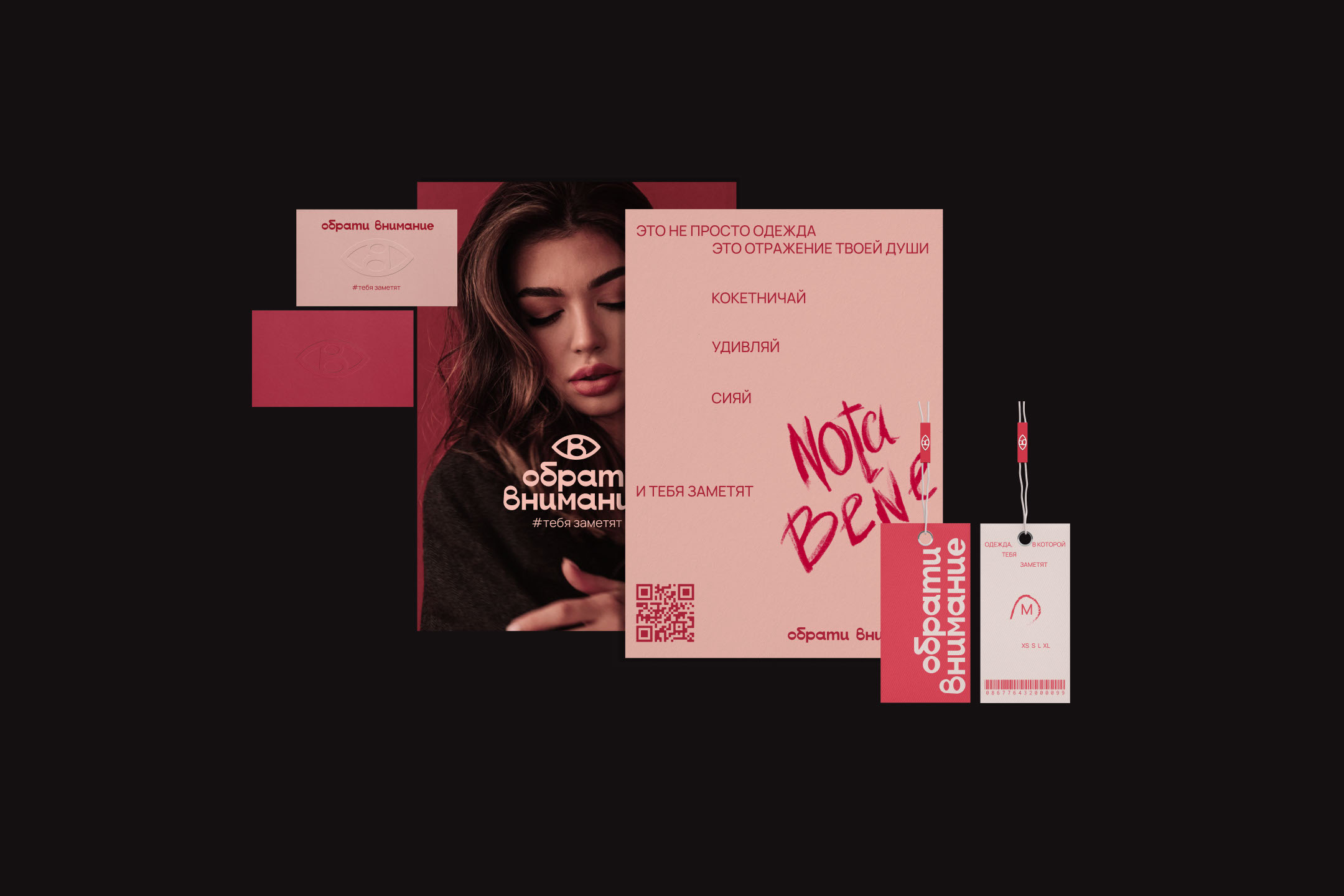
Шрифт для логотипа отрисован с нуля и представляет собой читаемый и понятный гротеск, слегка напоминающий рукописный шрифт засчет плавных изгибов букв и их нестандарнтых написаний.
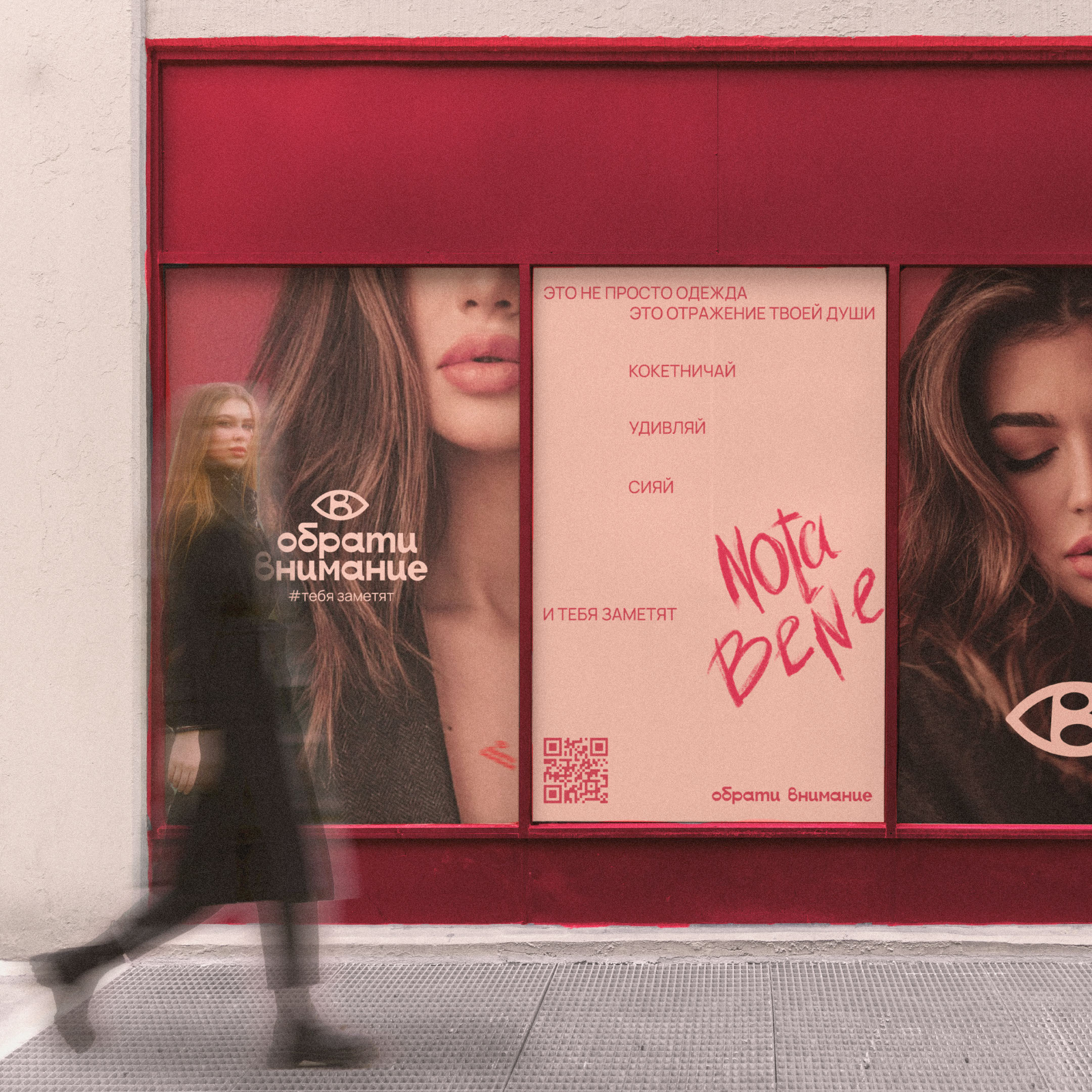
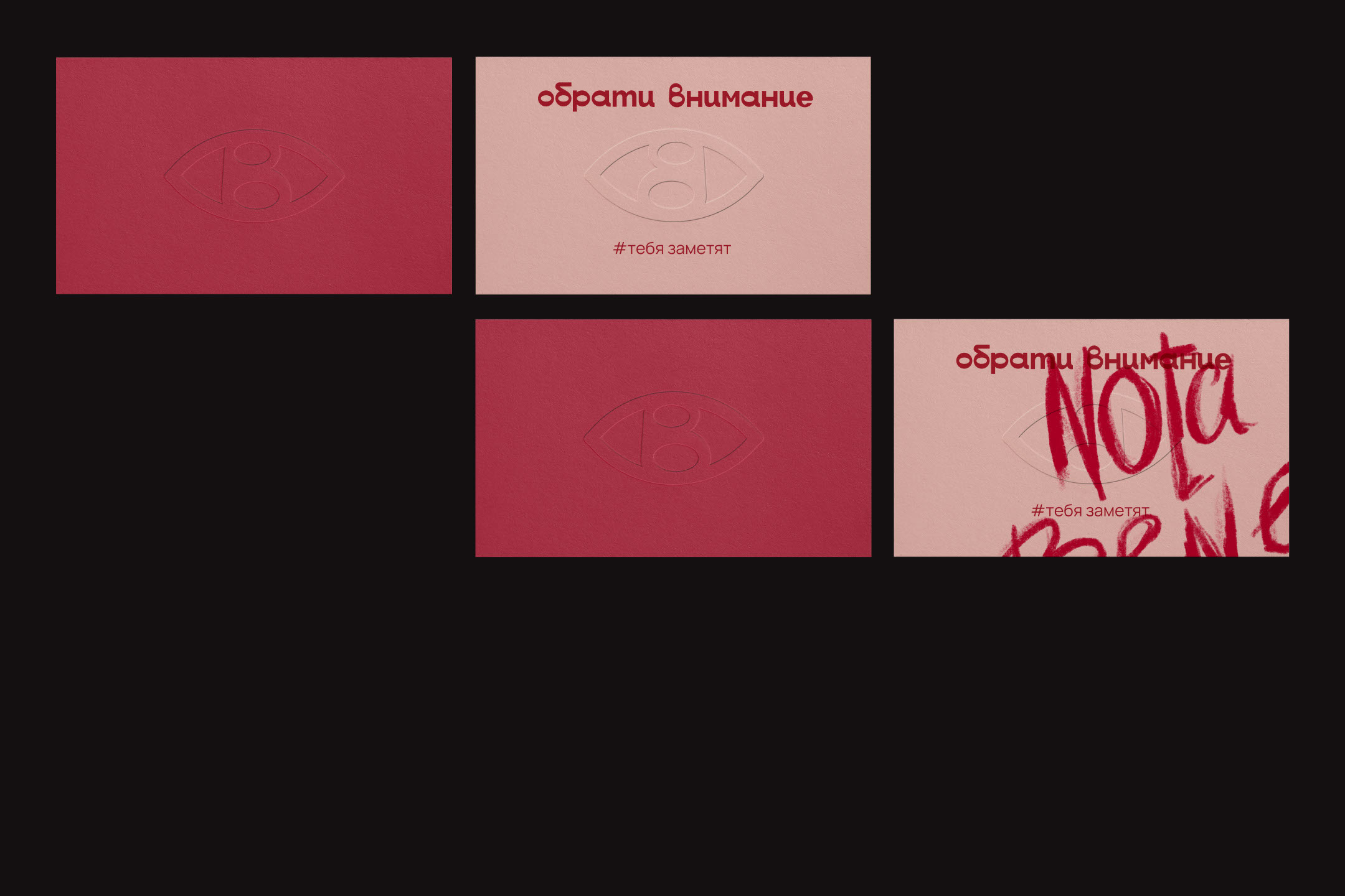
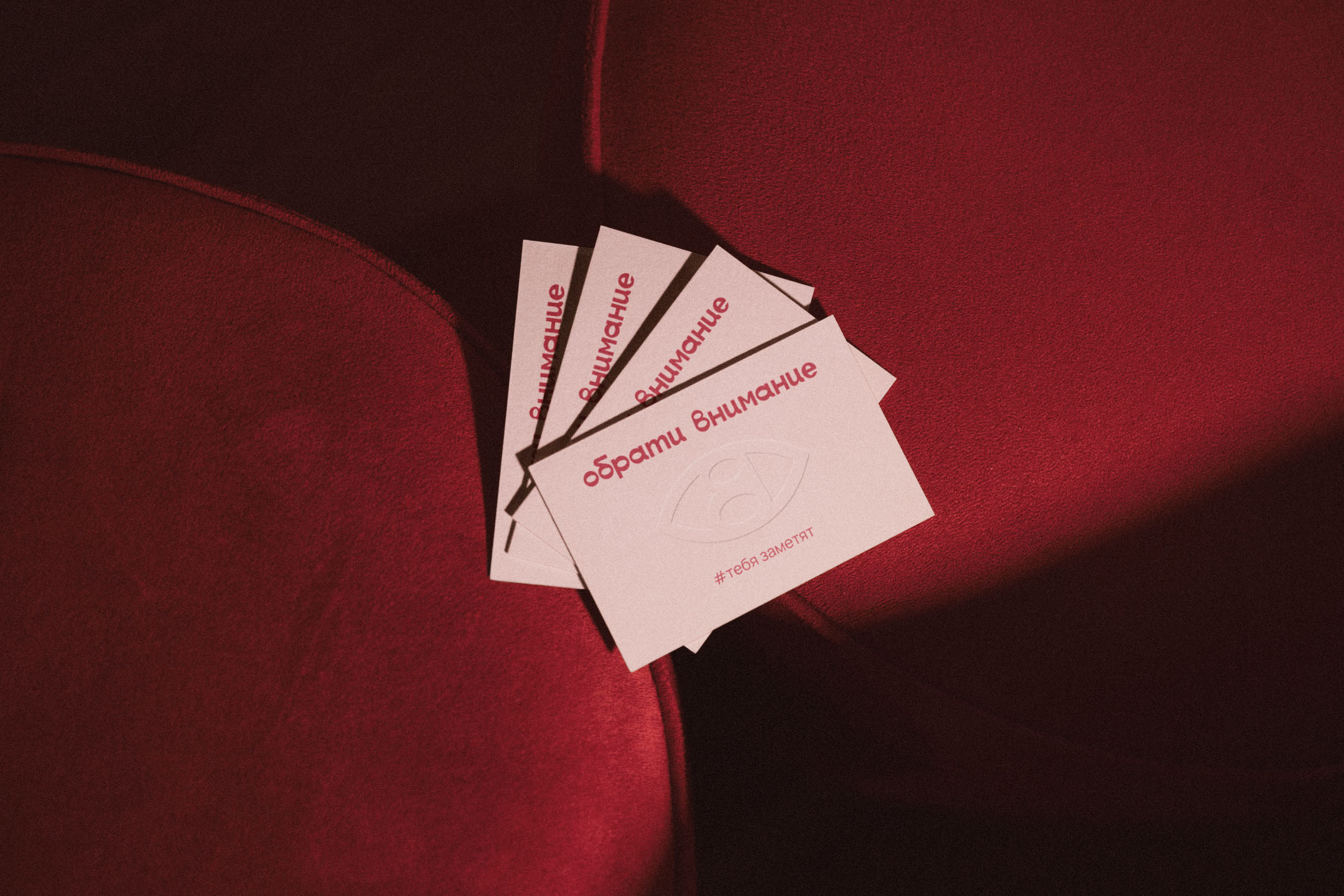
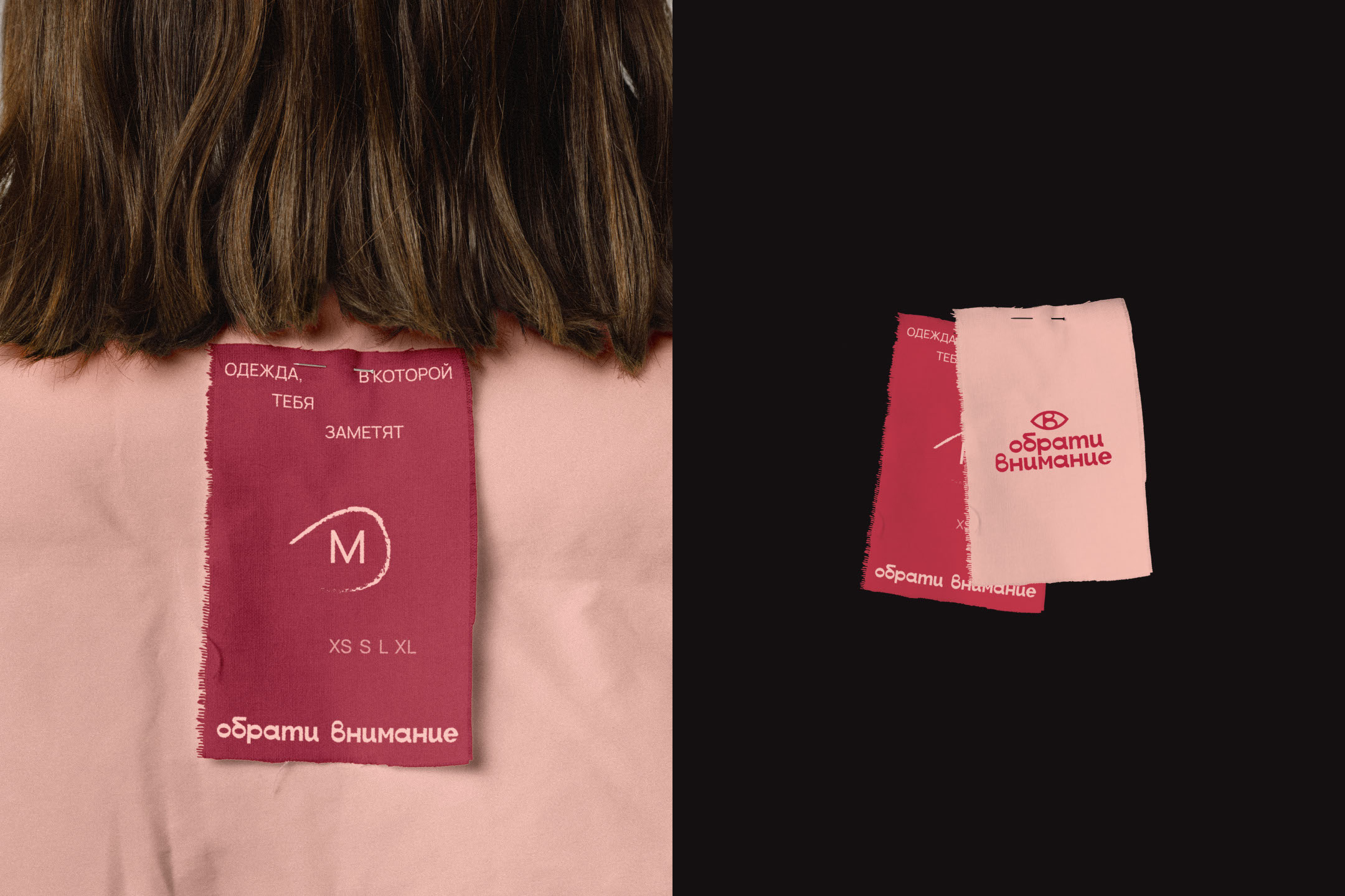
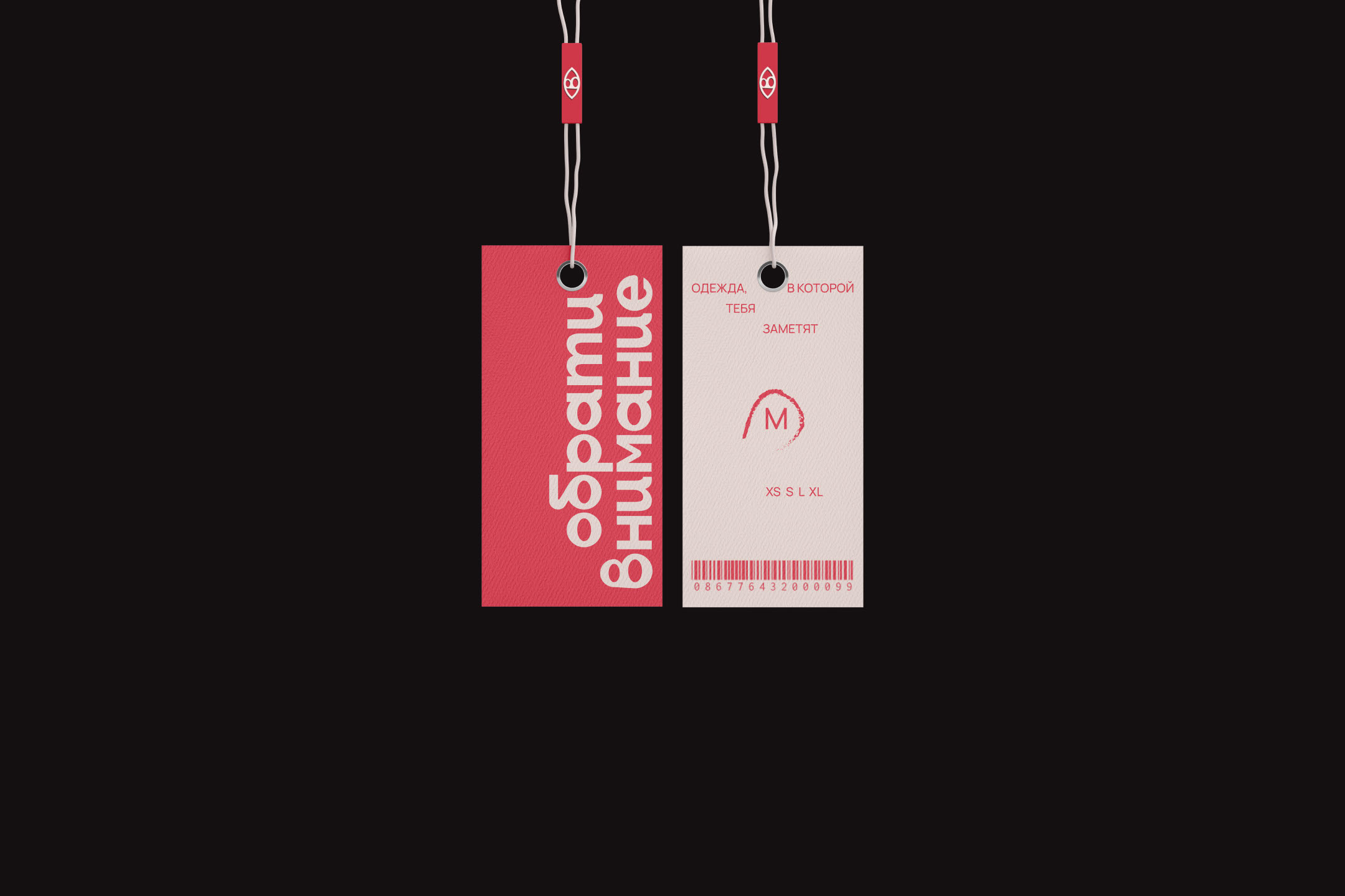
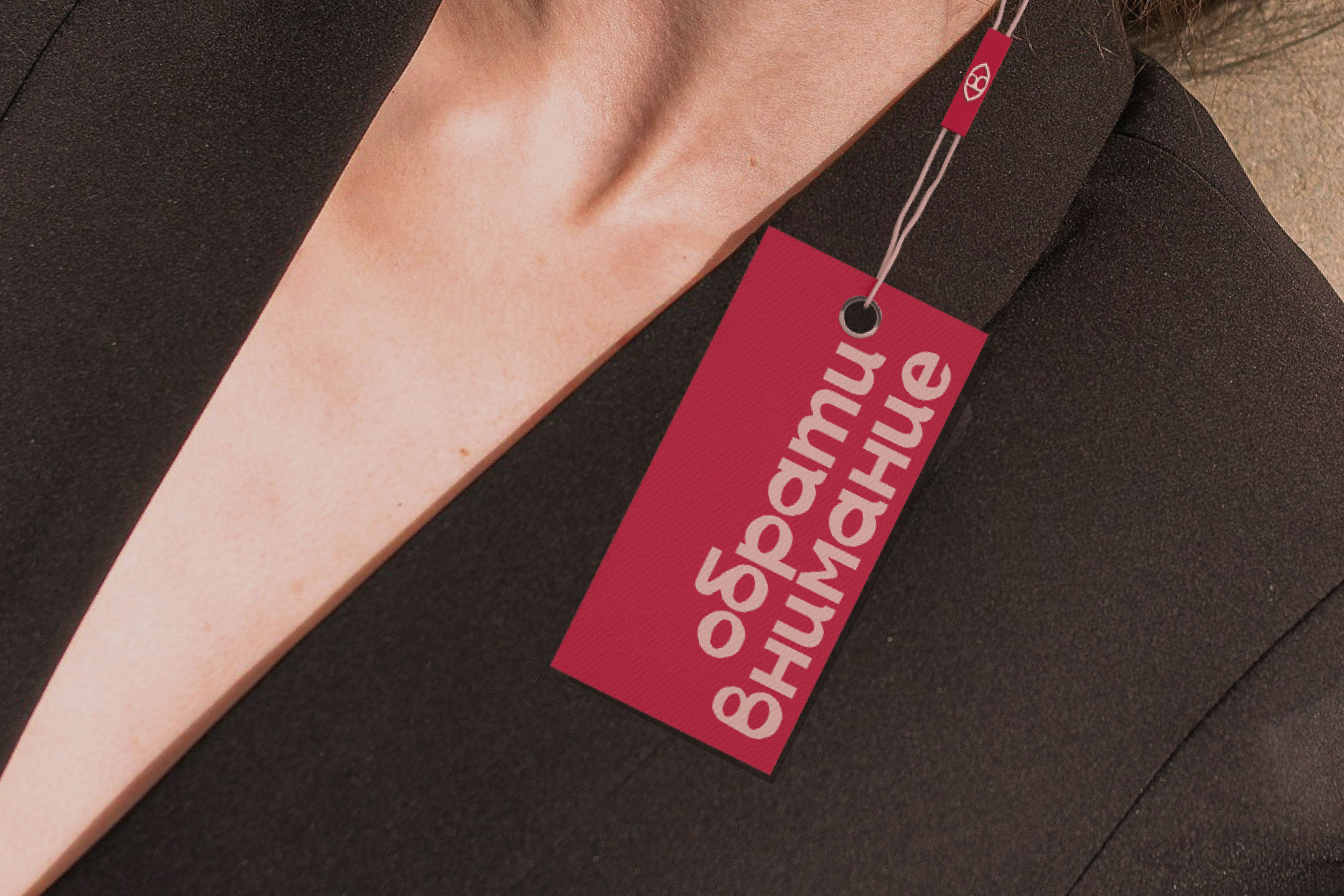
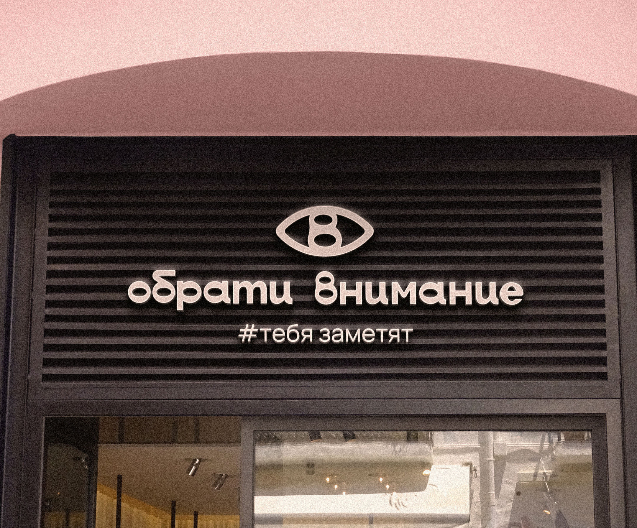
Логотип состоит из графического элемента, шрифтовой части и дескриптора “#тебя заметят”.
Особенностью логотипа являются внутрибуквенные просветы, похожие на разрез глаза, который олицетворяет название бренда. Данный логотип "обращает на себя внимание", выделяется среди конкурентов и отражает заложенные в бренд ценности и смыслы.
[EN] Obrati vnimanie - is a brand of high-quality clothing with unusual details for girls for whom it is important to express themselves, be the center of attention, and emphasize their figure with stylish looks.
The font for the logo was drawn from scratch and is a readable and understandable grotesque, slightly reminiscent of a handwritten font due to the smooth curves of the letters and their non-standard writing. The logo consists of a graphic element, a font part and the descriptor “#you will be noticed”. A special feature of the logo is the intraletter gaps, similar to the cut of an eye, which personifies the brand name. This logo “attracts attention”, stands out among competitors and reflects the values and meanings embedded in the brand.
Дизайн логотипа. Фирменный стиль. Нейминг. 2024.
Дизайнер - Васина Анастасия.
Заказать дизайн:


ФИРМЕННЫЙ СТИЛЬ | CORPORATE IDENTITY
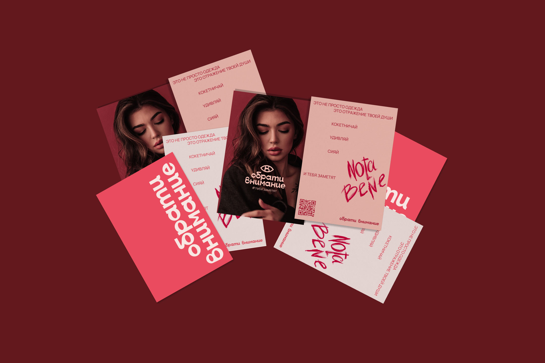
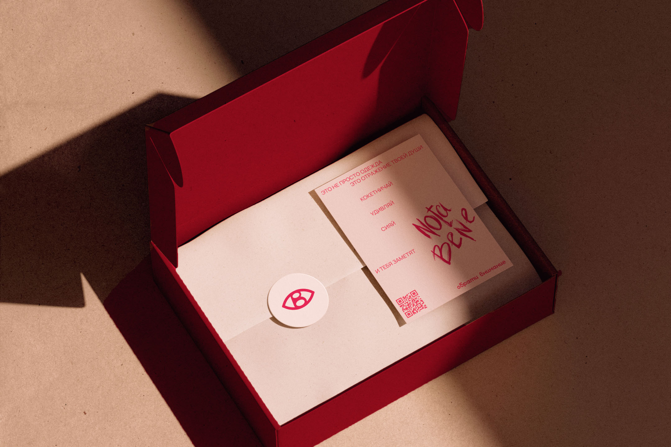
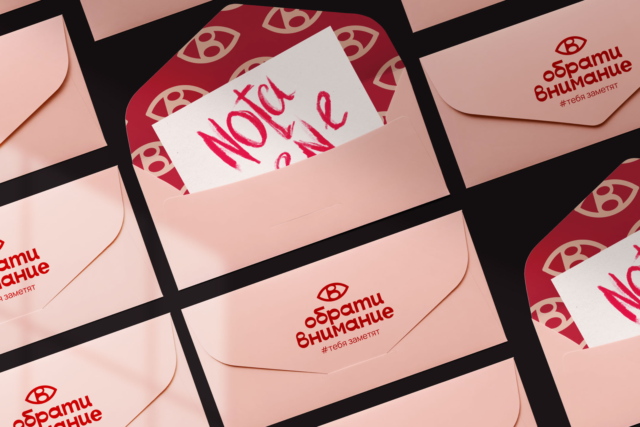
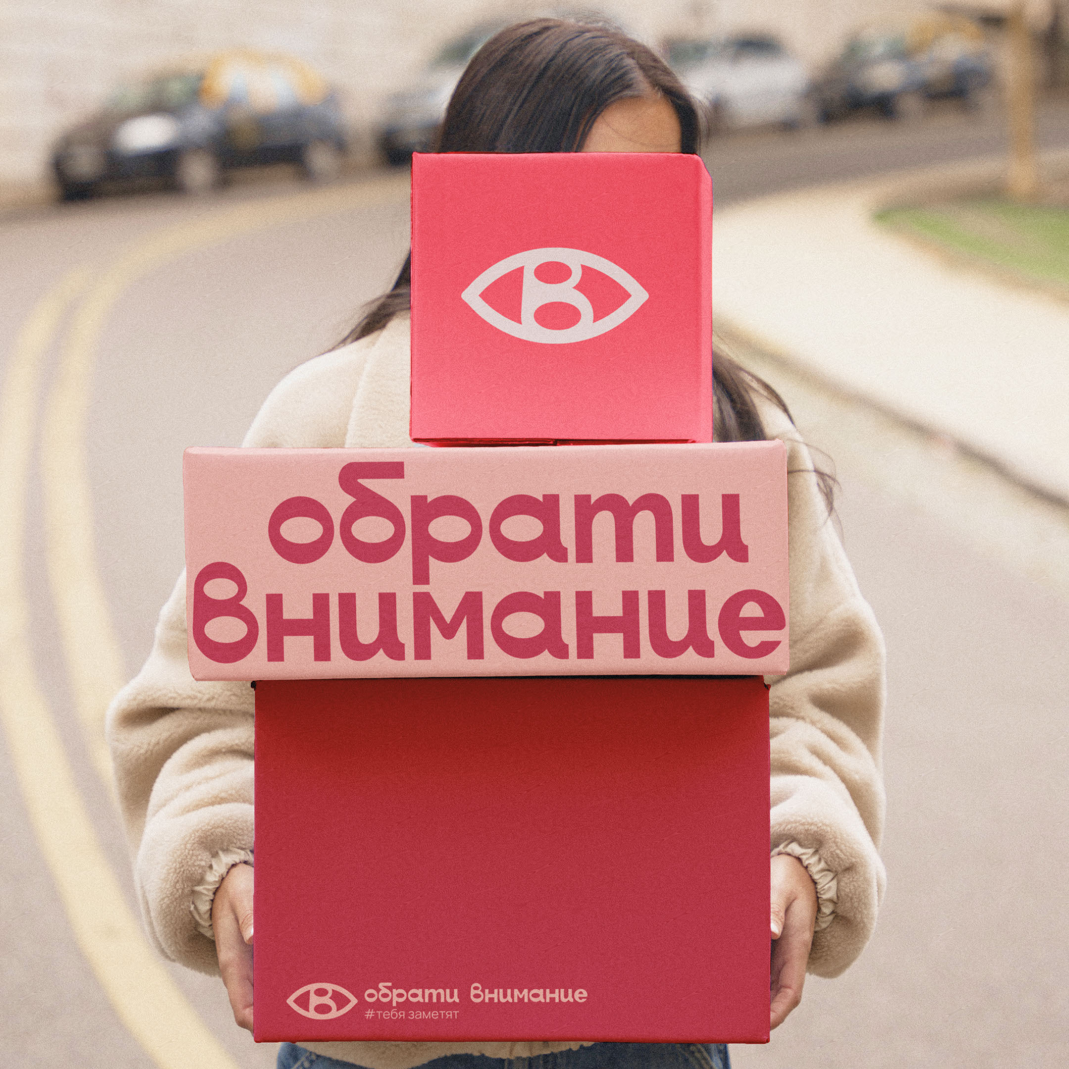
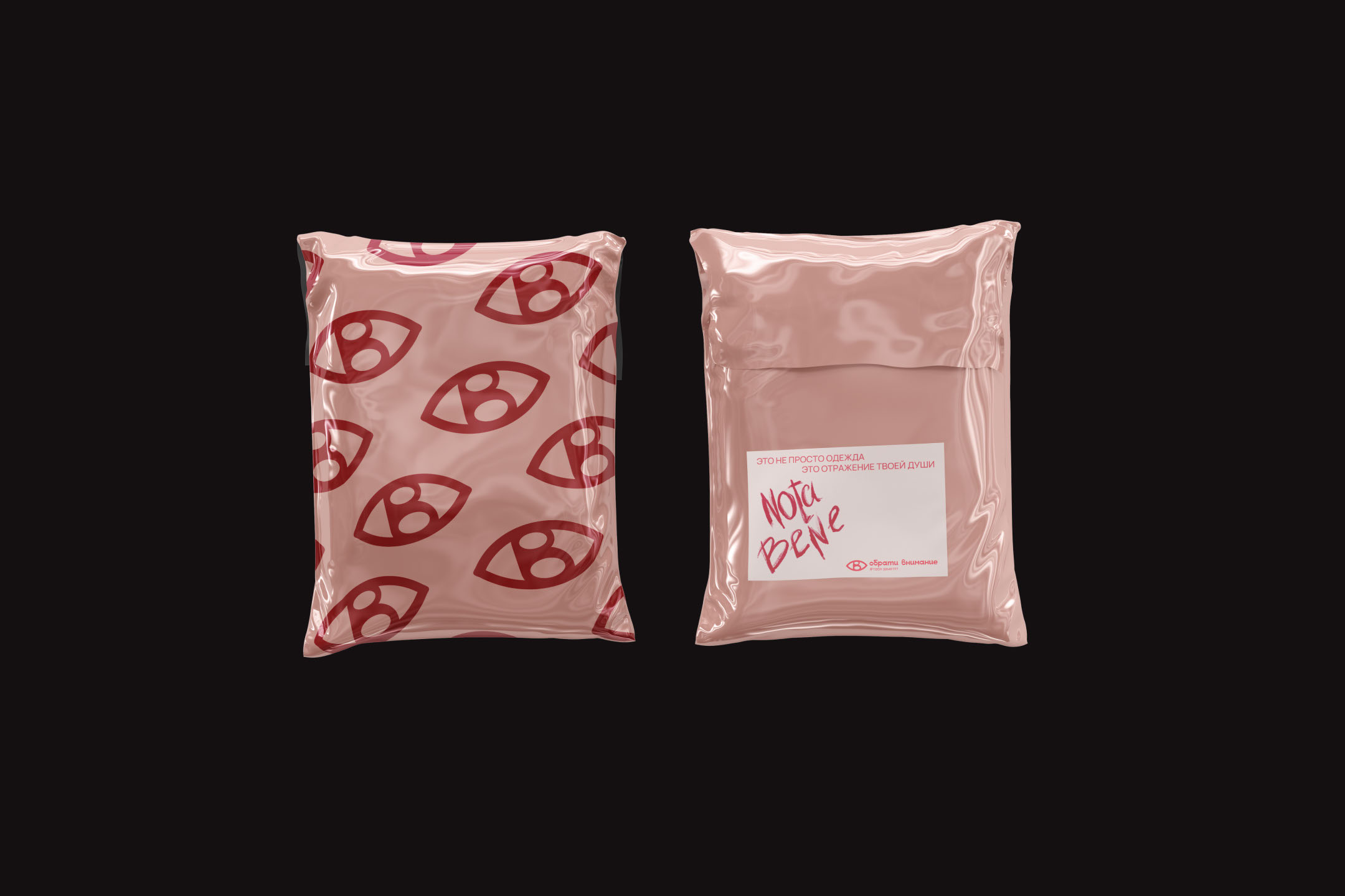
[RU] Фирменным знаком является "глаз", который полностью олицетворяет название бренда и является уникальным и оригинальным засчет того, что помимо заложенного в него смысла, создана с помощью двух букв “О” и “В”.
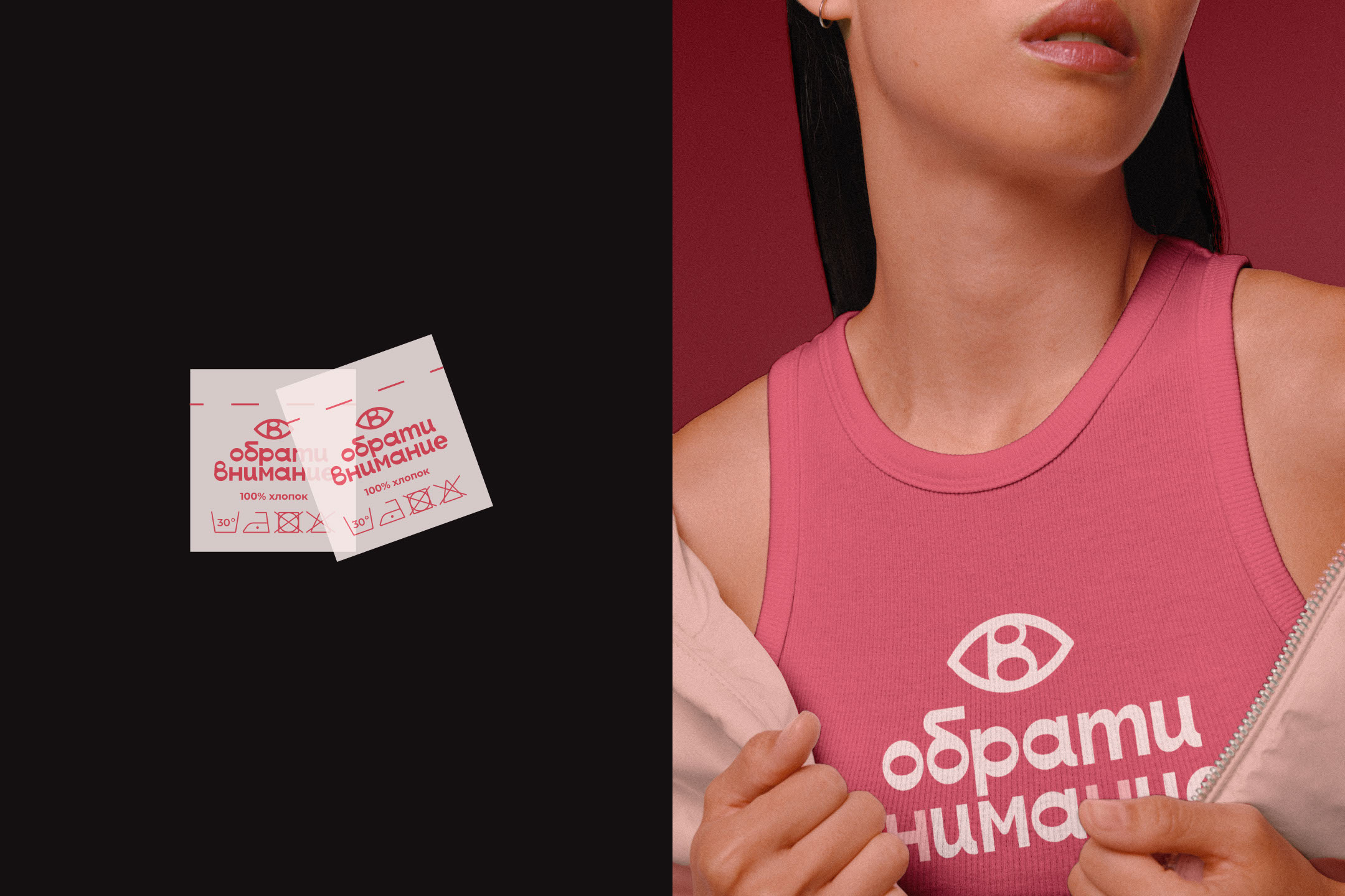
Цветовая палитра состоит из коралловых оттенков, так как коралловый считается символом энергии, жизни, активности и страсти, что олицетворяет архетипы бренда - любовник и заботливый. Цвета подобраны таким образом, что при сочетании определенных оттенков удовлетворяются потребности разных групп ЦА.
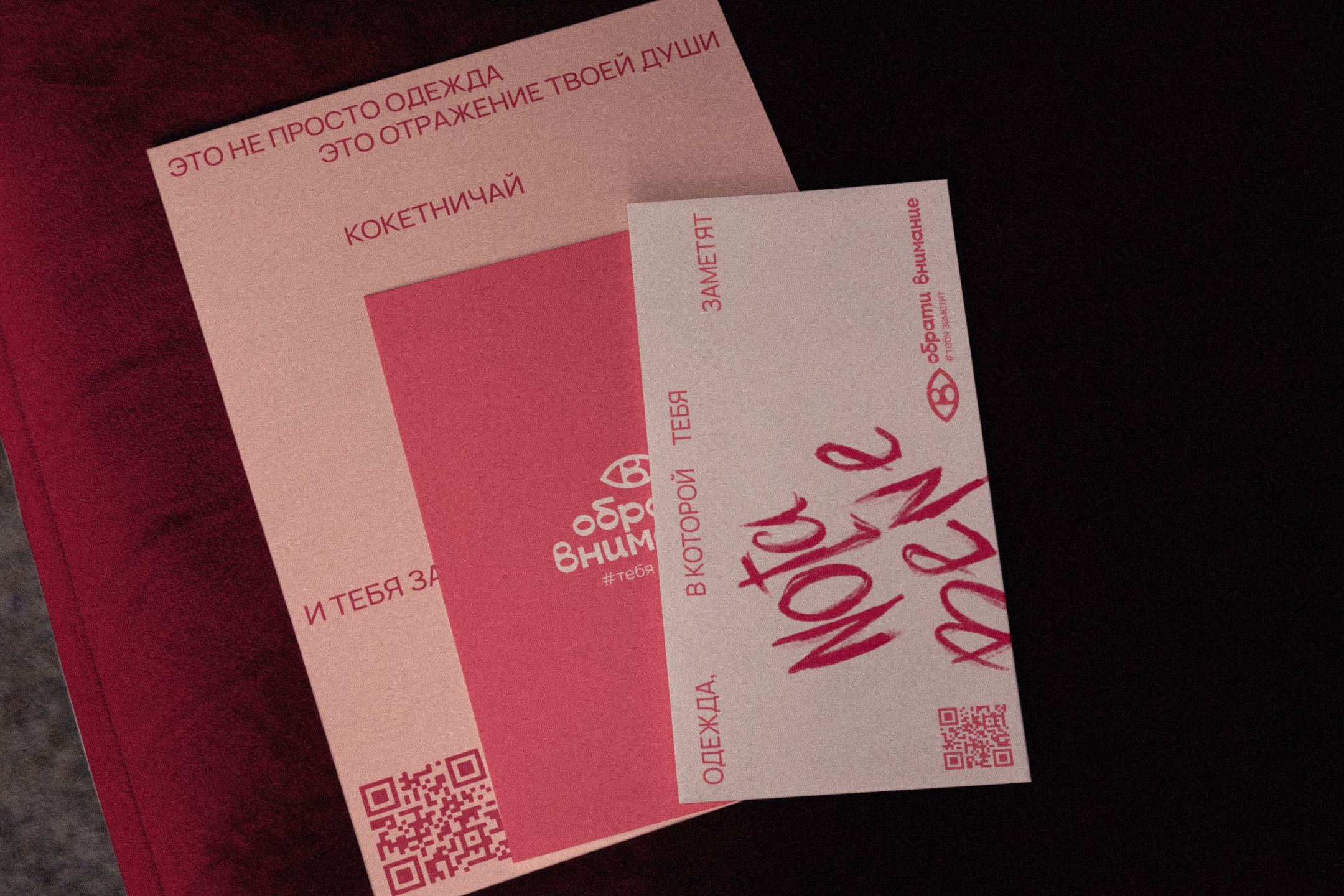
На носителях прослеживается элемент, написанный как будто бы помадой, - “Nota Bene”, что переводится с латинского как “обрати внимание”. Данное решение отражает кокетство и соблазн, но засчет шрифта, это не воспринимается как излишнее заигрывание.
[ENG] The trademark is the “eye”, which fully embodies the brand name and is unique and original due to the fact that, in addition to the meaning inherent in it, it is created using two letters “O” and “B”.
The color palette consists of coral shades, as coral is considered a symbol of energy, life, activity and passion, which represents the brand's archetypes - the lover and the caring. The colors are selected in such a way that when certain shades are combined, the needs of different target audience groups are met.
On the polygraphy there is an element written as if in lipstick - “Nota Bene”, which is translated from Latin as “pay attention”. This decision reflects coquetry and temptation, but due to the font, this is not perceived as excessive flirtation.


Александр Баранов

Мария Зана

Виктория Кудрявцева

Сергей Романов

PRO Арина Лихачева

Дарья Никитина

Юлия Малиновская

Ксения Тимоничева

PRO Ася Васина
Ася Васина
PRO Брендинг

PRO Ася Васина
Ася Васина
PRO Брендинг

PRO Ася Васина
Ася Васина
PRO Брендинг

PRO Ася Васина
Ася Васина
PRO Брендинг
Брендинг
PRO Ася Васина
Ася Васина
PRO 1 соавтор
Графика
PRO Ася Васина
Ася Васина
PRO Брендинг

PRO Ася Васина
Ася Васина
PRO Брендинг
PRO Ася Васина
Ася Васина
PRO Брендинг
PRO Ася Васина
Ася Васина
PRO Брендинг

PRO Ася Васина
Ася Васина
PRO Брендинг