
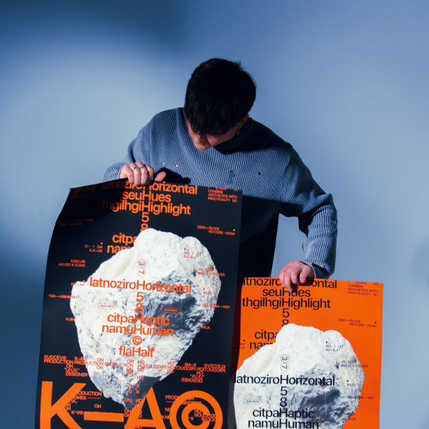
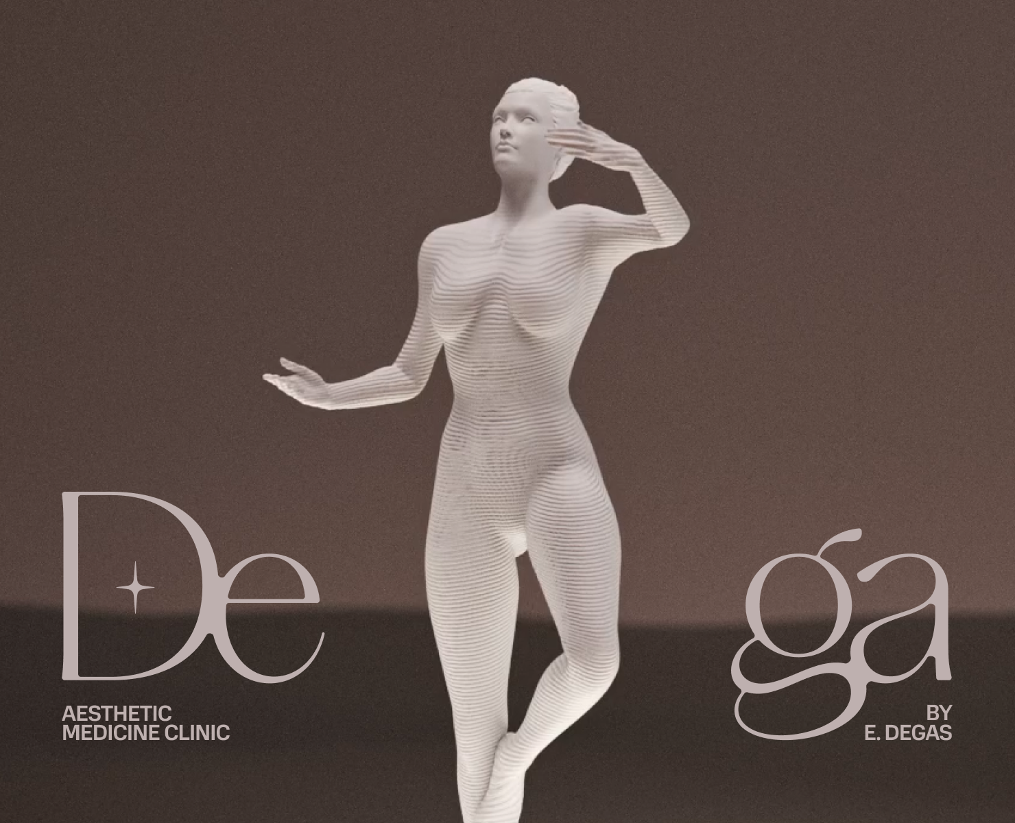
Konkritum
Лучшее
Интерфейсы
В лучшем на Dprofile
![[Case] Konkritum — Изображение №1 — Интерфейсы, Брендинг на Dprofile](https://cdn.dprofile.ru/public/4696/80713/587665205088731.66b4946263a62.gif)
Konkritum
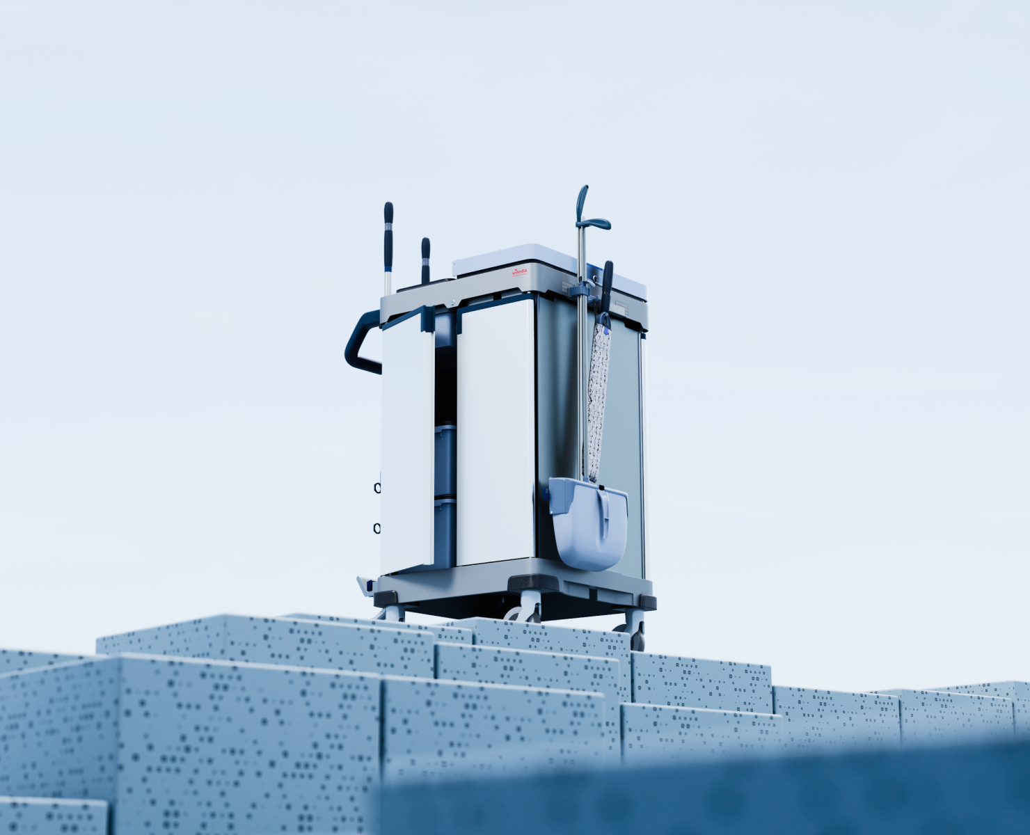
Concrete production and distribution company
Web and Branding (2023)
Taking a new perspective on the concrete production industry aimed to evoke feeling
of reliability, stability and prestige.
The stylistic choice is based on basic geometric shapes - square, rectangle, triangle - associated with stability, firmness, confidence. Evoking a feeling of seriousness and rigor, durability and stability.
These same forms serve as the basis
for the corporate identity. The elements take on the main features and characteristics, and create a system that can be traced through the media.
Inspired by geometric shapes the mark represents an individually designed letterforms
of the first and last letter of the name.
![[Case] Konkritum — Изображение №2 — Интерфейсы, Брендинг на Dprofile](https://cdn.dprofile.ru/public/4696/80713/e68c72205088731.66b494625bea7.jpg)
![[Case] Konkritum — Изображение №3 — Интерфейсы, Брендинг на Dprofile](https://cdn.dprofile.ru/public/4696/80713/c449c5205088731.66b49462608f7.jpg)
![[Case] Konkritum — Изображение №4 — Интерфейсы, Брендинг на Dprofile](https://cdn.dprofile.ru/public/4696/80713/181d6d205088731.66b494625cab0.gif)
![[Case] Konkritum — Изображение №5 — Интерфейсы, Брендинг на Dprofile](https://cdn.dprofile.ru/public/4696/80713/2bd175205088731.66b494626aa30.jpg)
![[Case] Konkritum — Изображение №6 — Интерфейсы, Брендинг на Dprofile](https://cdn.dprofile.ru/public/4696/80713/f27ab5205088731.66b494626d5ca.jpg)
![[Case] Konkritum — Изображение №7 — Интерфейсы, Брендинг на Dprofile](https://cdn.dprofile.ru/public/4696/80713/69e26a205088731.66b49462727b9.jpg)
![[Case] Konkritum — Изображение №8 — Интерфейсы, Брендинг на Dprofile](https://cdn.dprofile.ru/public/4696/80713/e80ff3205088731.66b494626faee.jpg)
![[Case] Konkritum — Изображение №9 — Интерфейсы, Брендинг на Dprofile](https://cdn.dprofile.ru/public/4696/80713/4fecba205088731.66b4946267114.jpg)
![[Case] Konkritum — Изображение №10 — Интерфейсы, Брендинг на Dprofile](https://cdn.dprofile.ru/public/4696/80713/67bb56205088731.66b494625e07f.jpg)
![[Case] Konkritum — Изображение №11 — Интерфейсы, Брендинг на Dprofile](https://cdn.dprofile.ru/public/4696/80713/dbdb65205088731.66b49462694c1.jpg)
![[Case] Konkritum — Изображение №12 — Интерфейсы, Брендинг на Dprofile](https://cdn.dprofile.ru/public/4696/80713/a1ca05205088731.66b49463b861b.jpg)
![[Case] Konkritum — Изображение №13 — Интерфейсы, Брендинг на Dprofile](https://cdn.dprofile.ru/public/4696/80713/aeec6d205088731.66b49463b9c67.jpg)
![[Case] Konkritum — Изображение №14 — Интерфейсы, Брендинг на Dprofile](https://cdn.dprofile.ru/public/4696/80713/33a2f8205088731.66b494626bf5d.jpg)
![[Case] Konkritum — Изображение №15 — Интерфейсы, Брендинг на Dprofile](https://cdn.dprofile.ru/public/4696/80713/bd9731205088731.66b494626eb90.jpg)
![[Case] Konkritum — Изображение №16 — Интерфейсы, Брендинг на Dprofile](https://cdn.dprofile.ru/public/4696/80713/96a123205088731.66b4946445ba4.jpg)
![[Case] Konkritum — Изображение №17 — Интерфейсы, Брендинг на Dprofile](https://cdn.dprofile.ru/public/4696/80713/ec0265205088731.66b4946444431.jpg)
![[Case] Konkritum — Изображение №18 — Интерфейсы, Брендинг на Dprofile](https://cdn.dprofile.ru/public/4696/80713/5541f2205088731.66b49464be7d8.jpg)
![[Case] Konkritum — Изображение №19 — Интерфейсы, Брендинг на Dprofile](https://cdn.dprofile.ru/public/4696/80713/c104eb205088731.66b49464bdc76.jpg)
![[Case] Konkritum — Изображение №20 — Интерфейсы, Брендинг на Dprofile](https://cdn.dprofile.ru/public/4696/80713/abfc66205088731.66b4946261a30.jpg)
![[Case] Konkritum — Изображение №21 — Интерфейсы, Брендинг на Dprofile](https://cdn.dprofile.ru/public/4696/80713/ec4ff1205088731.66b494655aada.jpg)
![[Case] Konkritum — Изображение №22 — Интерфейсы, Брендинг на Dprofile](https://cdn.dprofile.ru/public/4696/80713/8045b6205088731.66b494655976b.jpg)
![[Case] Konkritum — Изображение №23 — Интерфейсы, Брендинг на Dprofile](https://cdn.dprofile.ru/public/4696/80713/313e18205088731.66b4946609a48.jpg)
![[Case] Konkritum — Изображение №24 — Интерфейсы, Брендинг на Dprofile](https://cdn.dprofile.ru/public/4696/80713/769173205088731.66b494660acb1.jpg)
![[Case] Konkritum — Изображение №25 — Интерфейсы, Брендинг на Dprofile](https://cdn.dprofile.ru/public/4696/80713/5295fd205088731.66b494691a380.jpg)
![[Case] Konkritum — Изображение №26 — Интерфейсы, Брендинг на Dprofile](https://cdn.dprofile.ru/public/4696/80713/ee57b8205088731.66b4946919937.jpg)
![[Case] Konkritum — Изображение №27 — Интерфейсы, Брендинг на Dprofile](https://cdn.dprofile.ru/public/4696/80713/741182205088731.66b4946918eb5.jpg)
![[Case] Konkritum — Изображение №28 — Интерфейсы, Брендинг на Dprofile](https://cdn.dprofile.ru/public/4696/80713/91c1c4205088731.66b494691b8f2.jpg)
![[Case] Konkritum — Изображение №29 — Интерфейсы, Брендинг на Dprofile](https://cdn.dprofile.ru/public/4696/80713/b8a5a4205088731.66b4946919417.jpg)
![[Case] Konkritum — Изображение №30 — Интерфейсы, Брендинг на Dprofile](https://cdn.dprofile.ru/public/4696/80713/3dfc48205088731.66b494691ada9.jpg)
![[Case] Konkritum — Изображение №31 — Интерфейсы, Брендинг на Dprofile](https://cdn.dprofile.ru/public/4696/80713/b4425f205088731.66b494691d2a5.jpg)
![[Case] Konkritum — Изображение №32 — Интерфейсы, Брендинг на Dprofile](https://cdn.dprofile.ru/public/4696/80713/56317e205088731.66b494691b3bd.jpg)
![[Case] Konkritum — Изображение №33 — Интерфейсы, Брендинг на Dprofile](https://cdn.dprofile.ru/public/4696/80713/b8d858205088731.66b494691e7ac.jpg)
![[Case] Konkritum — Изображение №34 — Интерфейсы, Брендинг на Dprofile](https://cdn.dprofile.ru/public/4696/80713/219524205088731.66b494691dd10.jpg)
![[Case] Konkritum — Изображение №35 — Интерфейсы, Брендинг на Dprofile](https://cdn.dprofile.ru/public/4696/80713/59675e205088731.66b494691c83e.jpg)
![[Case] Konkritum — Изображение №36 — Интерфейсы, Брендинг на Dprofile](https://cdn.dprofile.ru/public/4696/80713/22b543205088731.66b494691bddb.jpg)
![[Case] Konkritum — Изображение №37 — Интерфейсы, Брендинг на Dprofile](https://cdn.dprofile.ru/public/4696/80713/2a0d7d205088731.66b49462710c9.jpg)
![[Case] Konkritum — Изображение №38 — Интерфейсы, Брендинг на Dprofile](https://cdn.dprofile.ru/public/4696/80713/4007cd205088731.66b49467411fa.jpg)
![[Case] Konkritum — Изображение №39 — Интерфейсы, Брендинг на Dprofile](https://cdn.dprofile.ru/public/4696/80713/a473bf205088731.66b494674060d.jpg)
![[Case] Konkritum — Изображение №40 — Интерфейсы, Брендинг на Dprofile](https://cdn.dprofile.ru/public/4696/80713/9849f0205088731.66b4946262f18.jpg)
![[Case] Konkritum — Изображение №41 — Интерфейсы, Брендинг на Dprofile](https://cdn.dprofile.ru/public/4696/80713/7d9016205088731.66b4946264f66.jpg)
![[Case] Konkritum — Изображение №42 — Интерфейсы, Брендинг на Dprofile](https://cdn.dprofile.ru/public/4696/80713/4cf1d1205088731.66b49466b6da5.gif)
![[Case] Konkritum — Изображение №43 — Интерфейсы, Брендинг на Dprofile](https://cdn.dprofile.ru/public/4696/80713/09134e205088731.66b49466b842a.jpg)
![[Case] Konkritum — Изображение №44 — Интерфейсы, Брендинг на Dprofile](https://cdn.dprofile.ru/public/4696/80713/042430205088731.66b49467cdbb7.jpg)
![[Case] Konkritum — Изображение №45 — Интерфейсы, Брендинг на Dprofile](https://cdn.dprofile.ru/public/4696/80713/fb65f6205088731.66b49467ccde0.gif)
![[Case] Konkritum — Изображение №46 — Интерфейсы, Брендинг на Dprofile](https://cdn.dprofile.ru/public/4696/80713/9a9b75205088731.66b494626625f.jpg)
![[Case] Konkritum — Изображение №47 — Интерфейсы, Брендинг на Dprofile](https://cdn.dprofile.ru/public/4696/80713/0912eb205088731.66b4946267fdf.jpg)
![[Case] Konkritum — Изображение №48 — Интерфейсы, Брендинг на Dprofile](https://cdn.dprofile.ru/public/4696/80713/de5b00205088731.66b49469ea132.jpg)
![[Case] Konkritum — Изображение №49 — Интерфейсы, Брендинг на Dprofile](https://cdn.dprofile.ru/public/4696/80713/5d5fe8205088731.66b49469e8a0e.jpg)
![[Case] Konkritum — Изображение №50 — Интерфейсы, Брендинг на Dprofile](https://cdn.dprofile.ru/public/4696/80713/90525e205088731.66b4946a72dd4.jpg)
![[Case] Konkritum — Изображение №51 — Интерфейсы, Брендинг на Dprofile](https://cdn.dprofile.ru/public/4696/80713/b7e3c0205088731.66b4946a72563.jpg)
![[Case] Konkritum — Изображение №52 — Интерфейсы, Брендинг на Dprofile](https://cdn.dprofile.ru/public/4696/80713/d9e370205088731.66b494627379b.jpg)
![[Case] Konkritum — Изображение №53 — Интерфейсы, Брендинг на Dprofile](https://cdn.dprofile.ru/public/4696/80713/cc31c8205088731.66b494625f8e9.jpg)

Welovegraphics

PRO Тамара Радке

PRO + Марина Талипова
PRO Артем Кудрявцев

PRO + Александр Лагута

PRO + Саша Кудрявцев

PRO + Лёша Юрков

PRO + Круг Agency


Chipsa
Chipsa
Студия, 1 соавтор
Интерфейсы
Chipsa
Chipsa
Студия, 1 соавтор

Dprofile Award 2025
Лучшее
Интерфейсы
Chipsa
Chipsa
Студия, 1 соавтор
Интерфейсы
Chipsa
Chipsa
Студия, 2 соавтора

Анастасия Дианова
+1
Лучшее
Интерфейсы
Chipsa
Chipsa
Студия, 2 соавтора

Ilya Gorodilov
+1
Dprofile Award 2025
Лучшее
Интерфейсы
Chipsa
Chipsa
Студия, 1 соавтор
Лучшее
Интерфейсы
Chipsa
Chipsa
Студия, 1 соавтор
Dprofile Award 2025
Лучшее
Интерфейсы
Chipsa
Chipsa
Студия, 1 соавтор

Лучшее
Интерфейсы
Chipsa
Chipsa
Студия, 2 соавтора

Александр Педченко
+1
Лучшее
Интерфейсы
Chipsa
Chipsa
Студия, 2 соавтора
Анастасия Дианова
+1