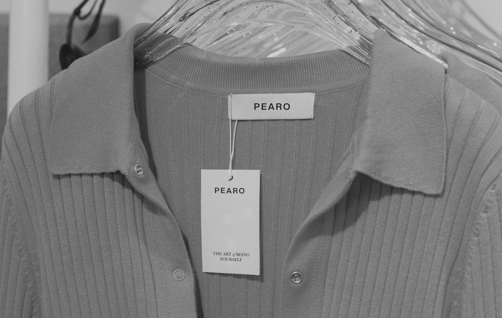
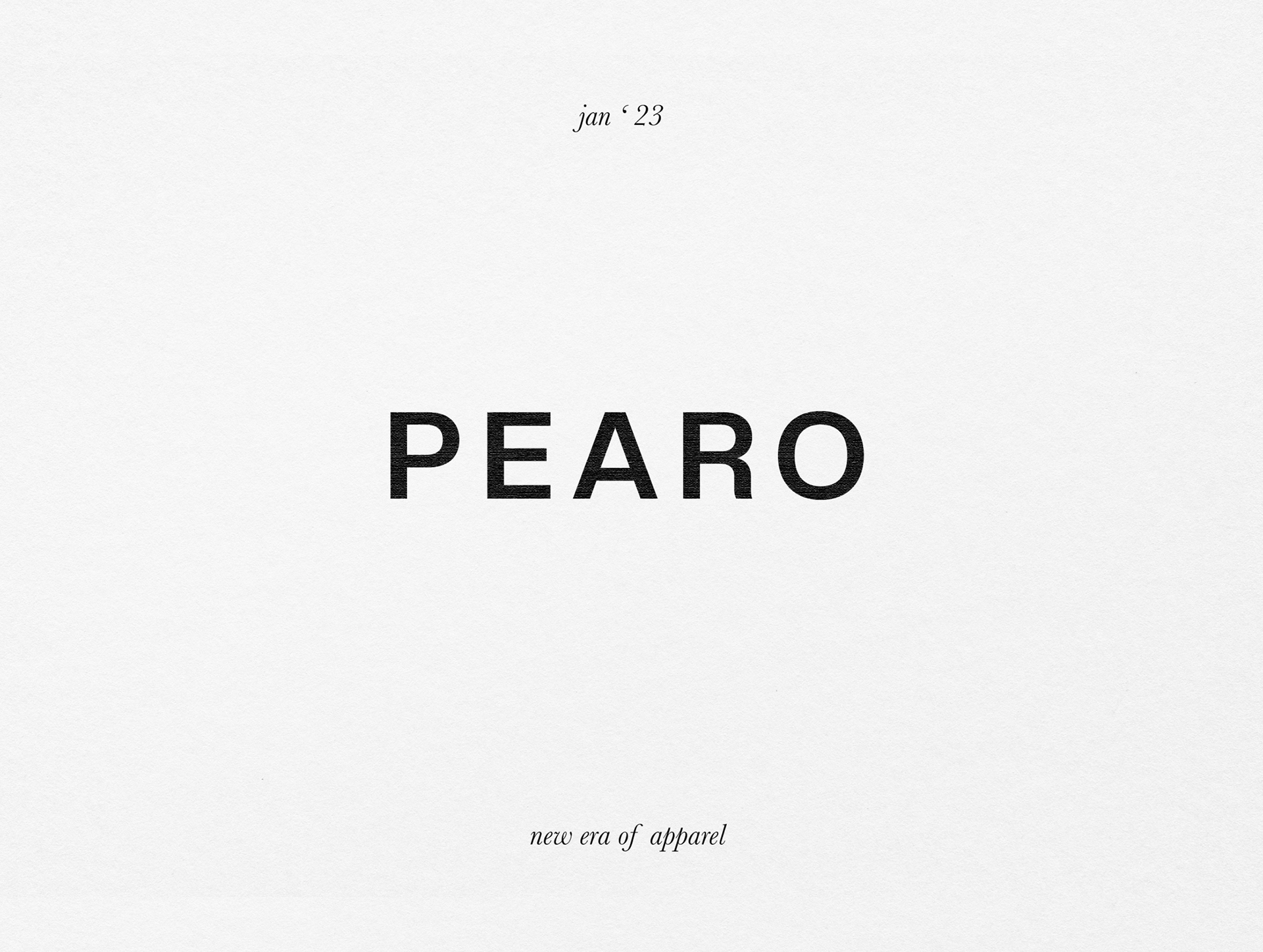
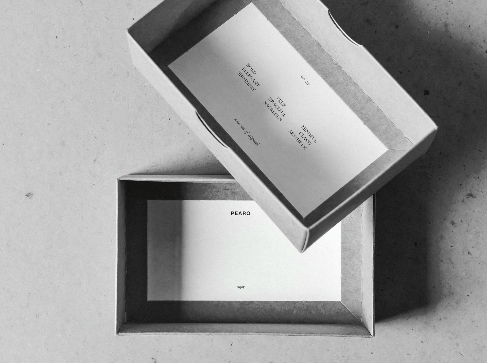
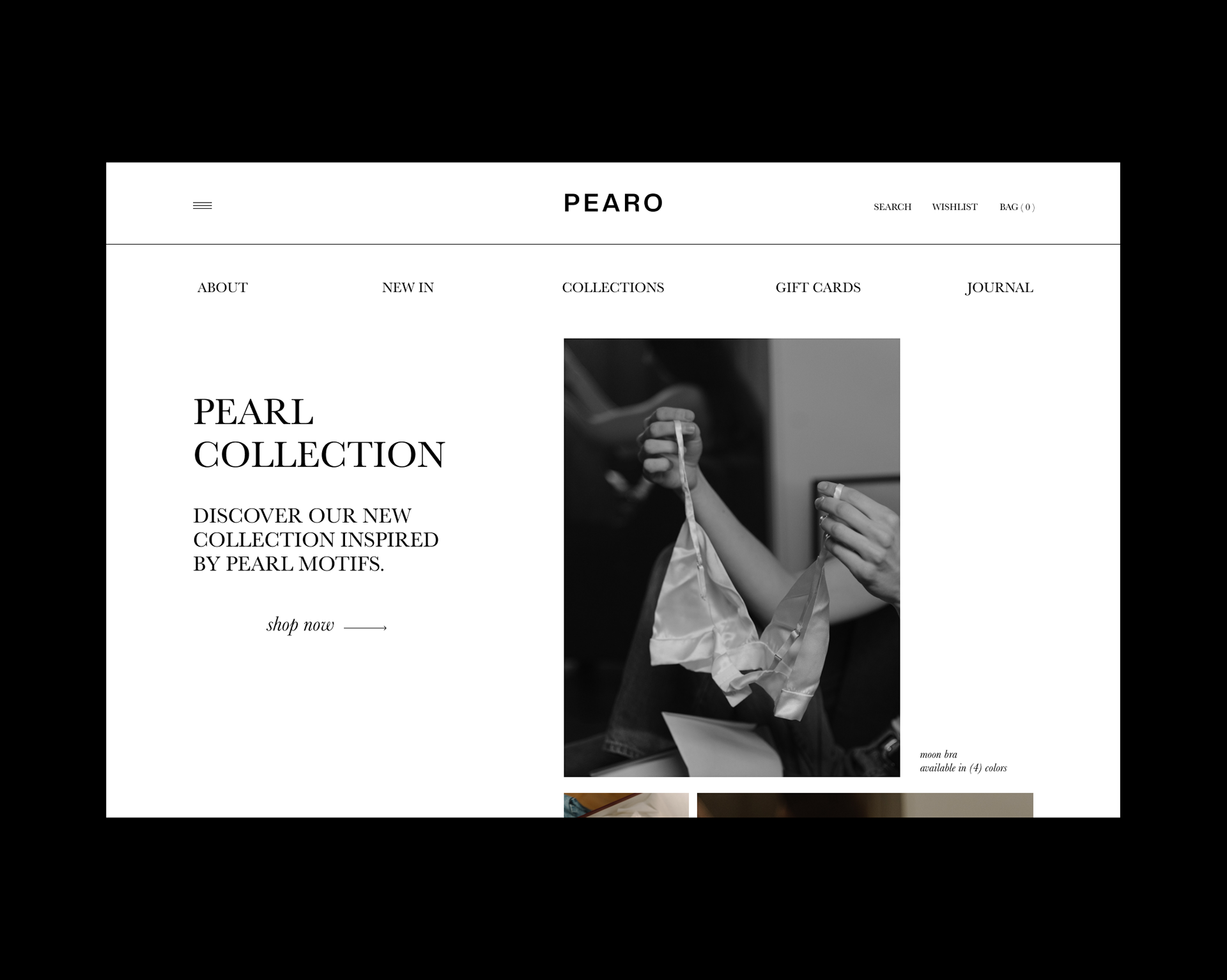
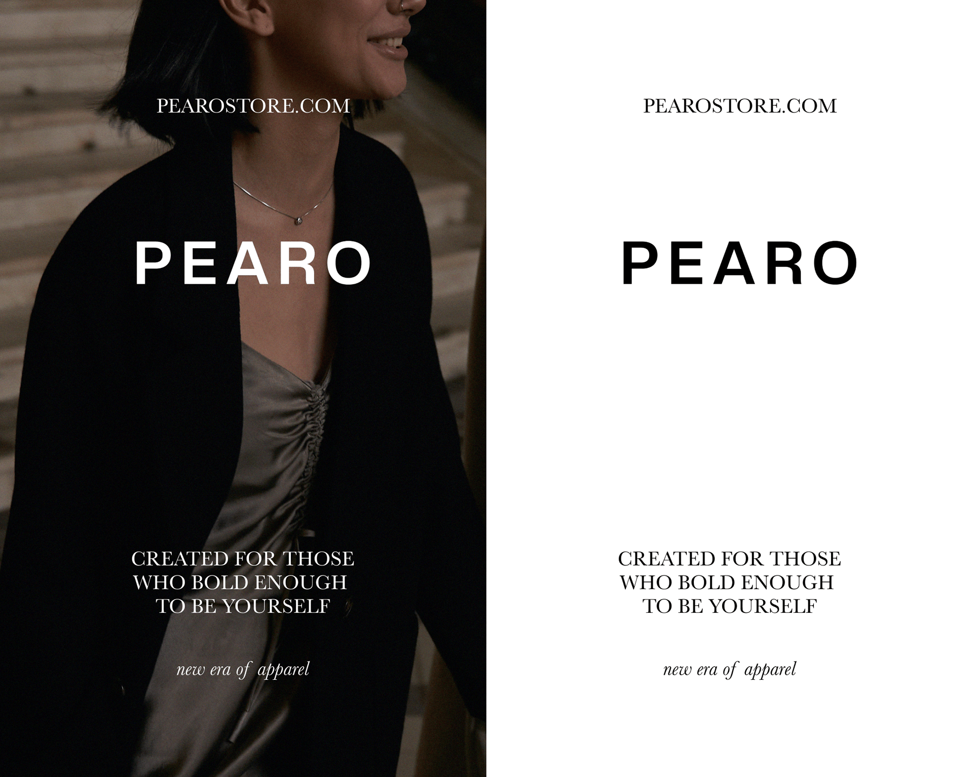
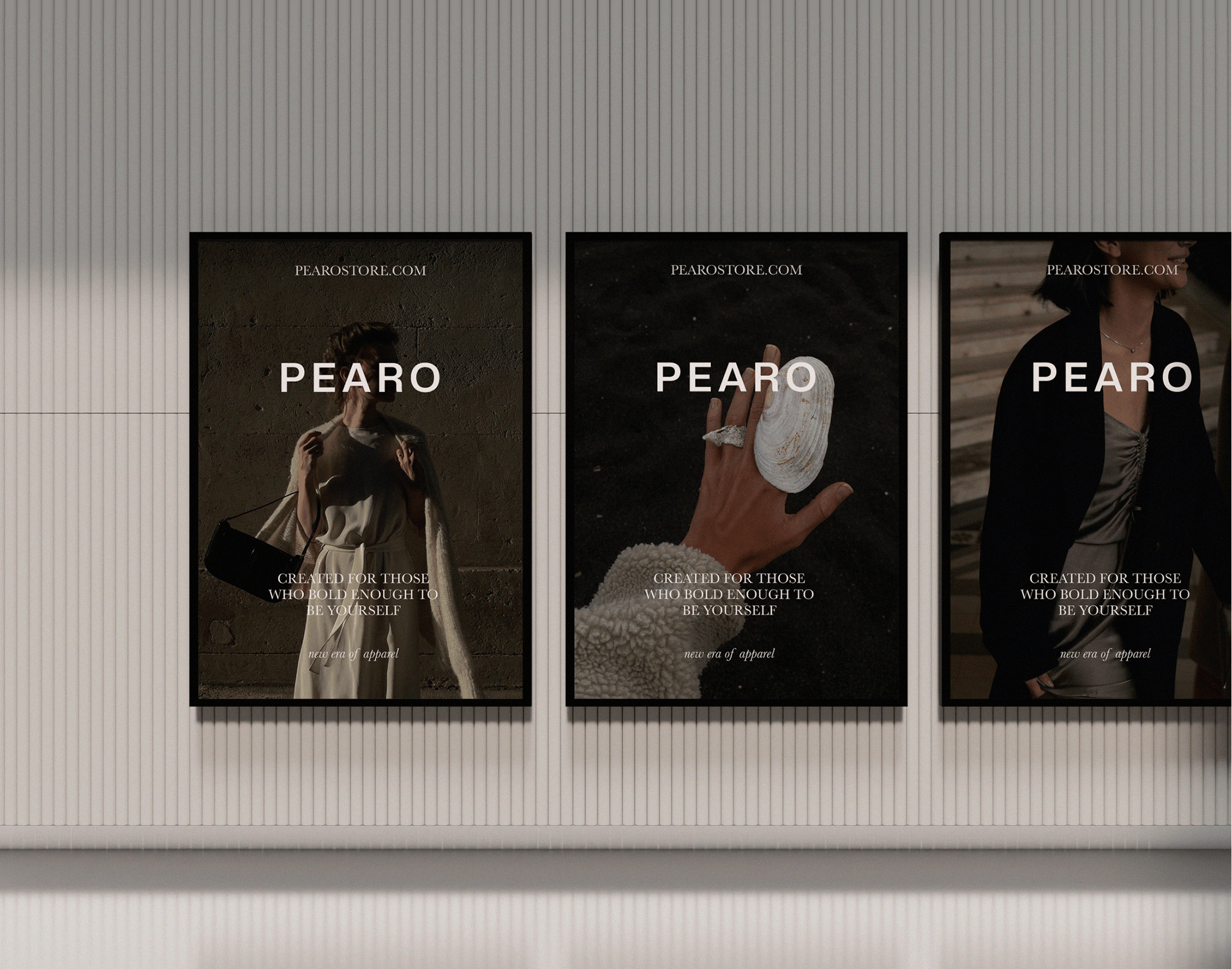
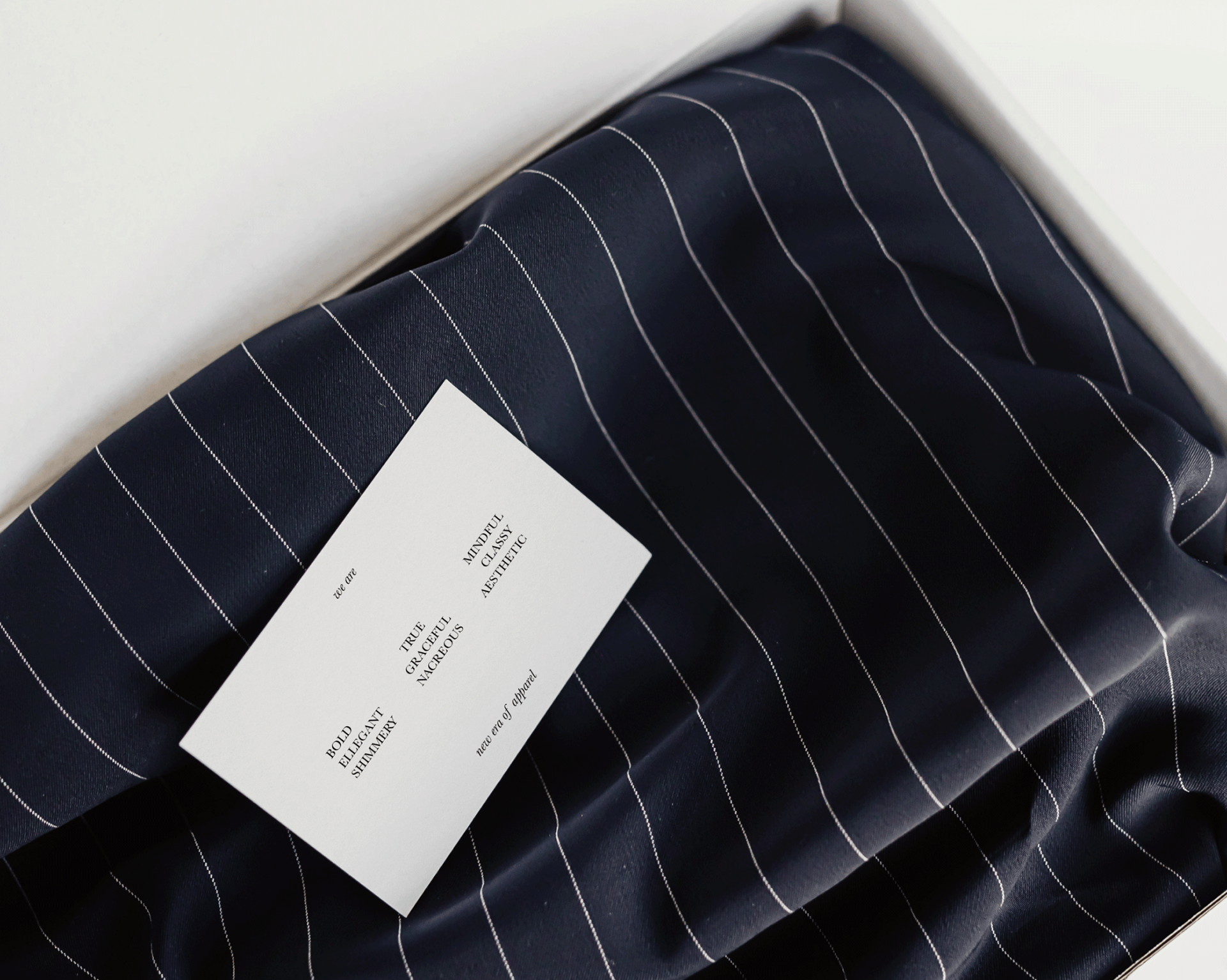
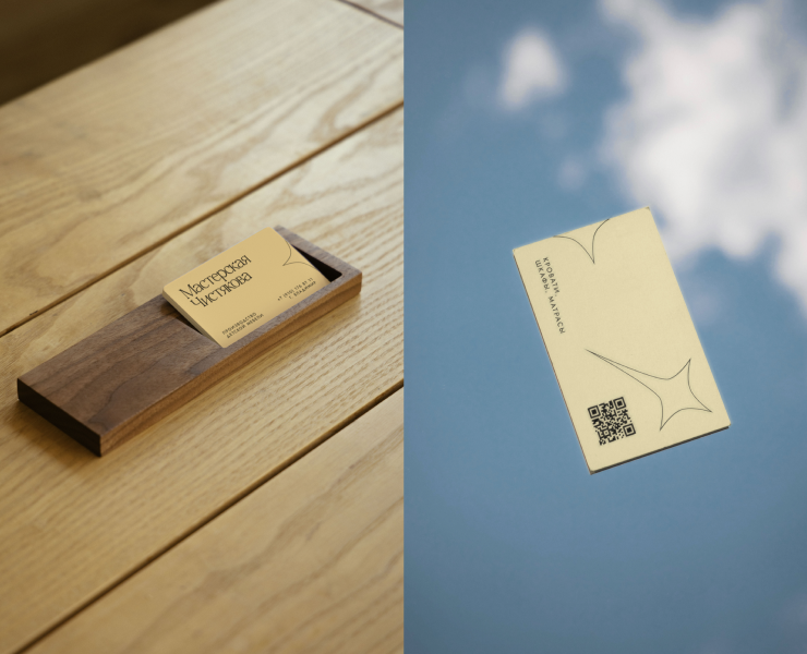
Pearo is a new era of apparel for those who are not afraid to be yourself by combining different styles in clothing. For example, to throw a rough jacket over a silk dress. This idea was reflected in logotype, which on one hand is very simple and stable, but R letter has a hint of elegance by analogy with a jacket over a silk dress. The typeface choice and combining different font styles are focused on strengthening this feeling of being yourself.
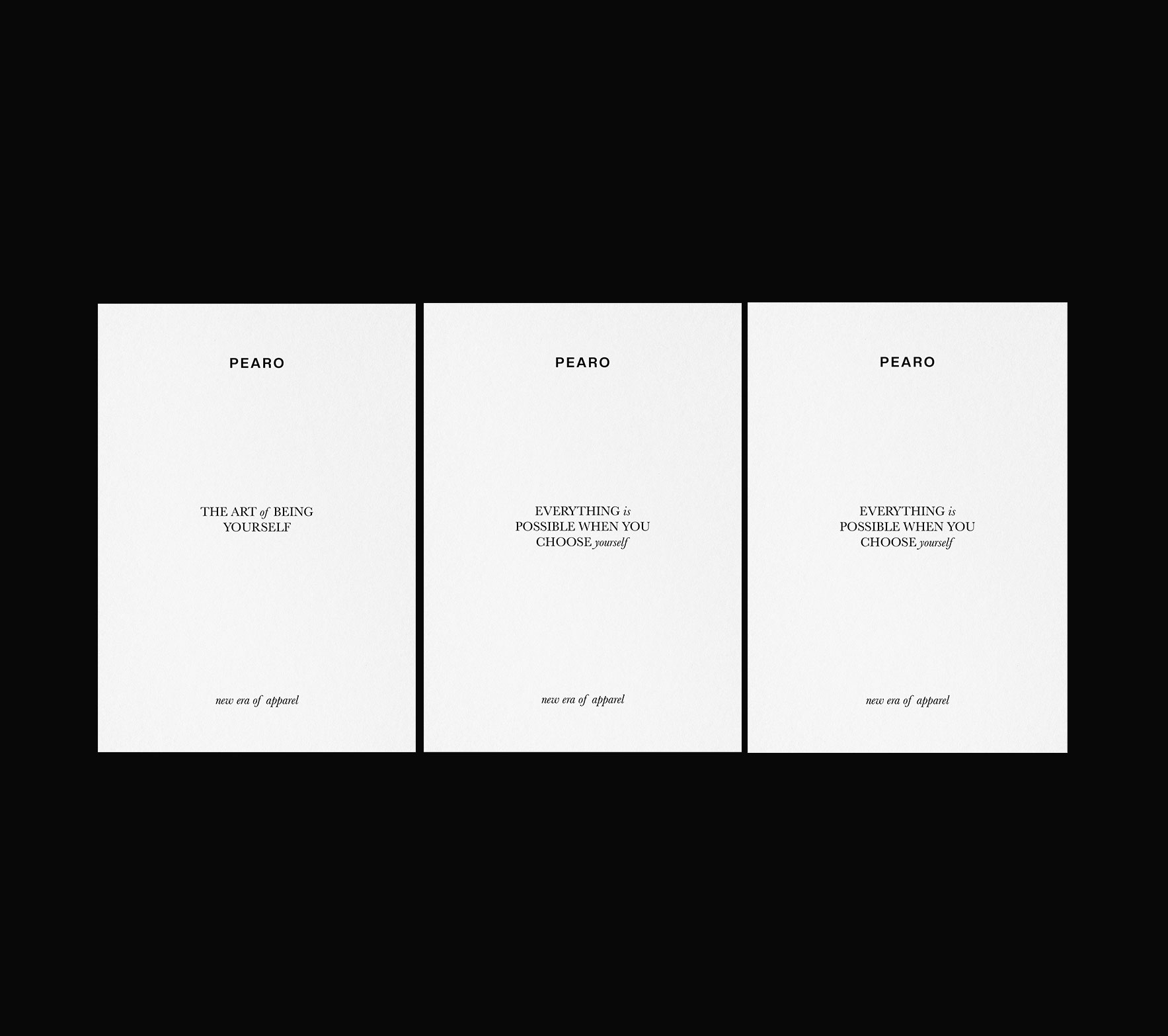
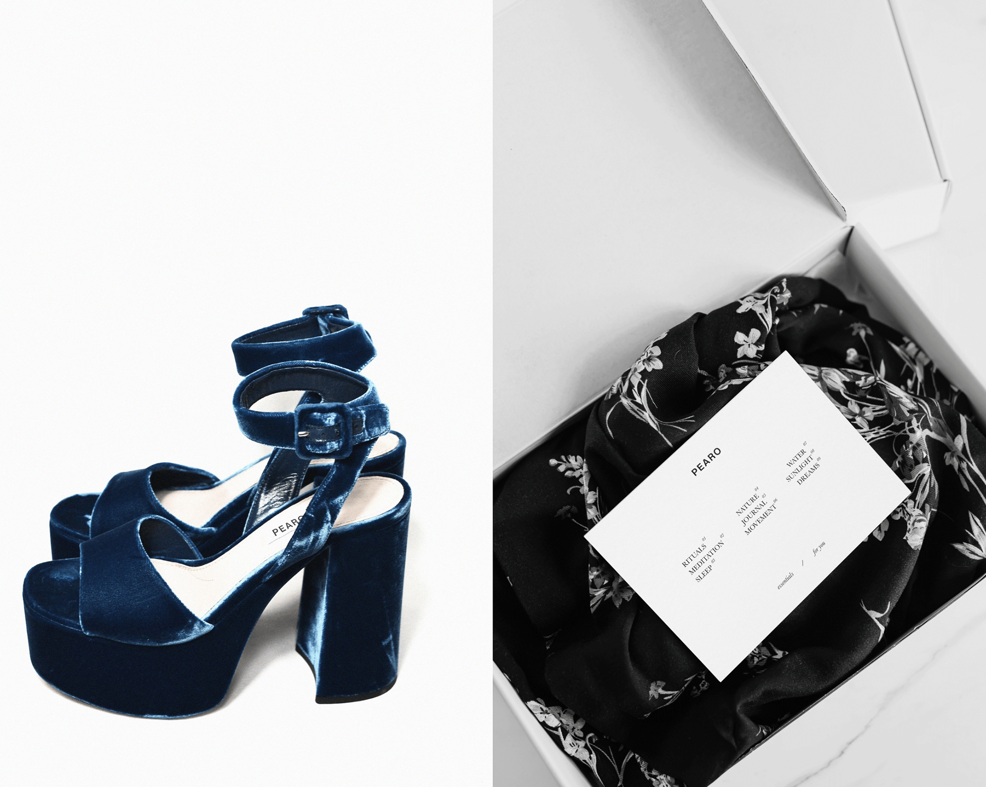
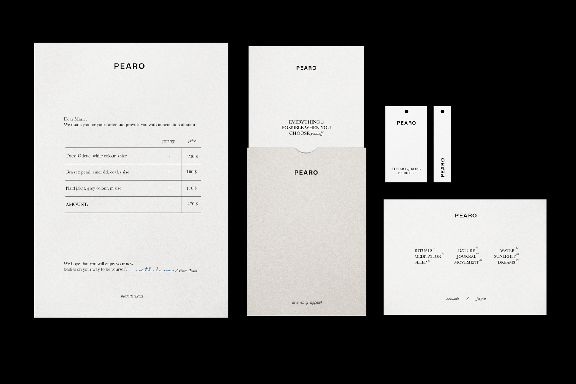
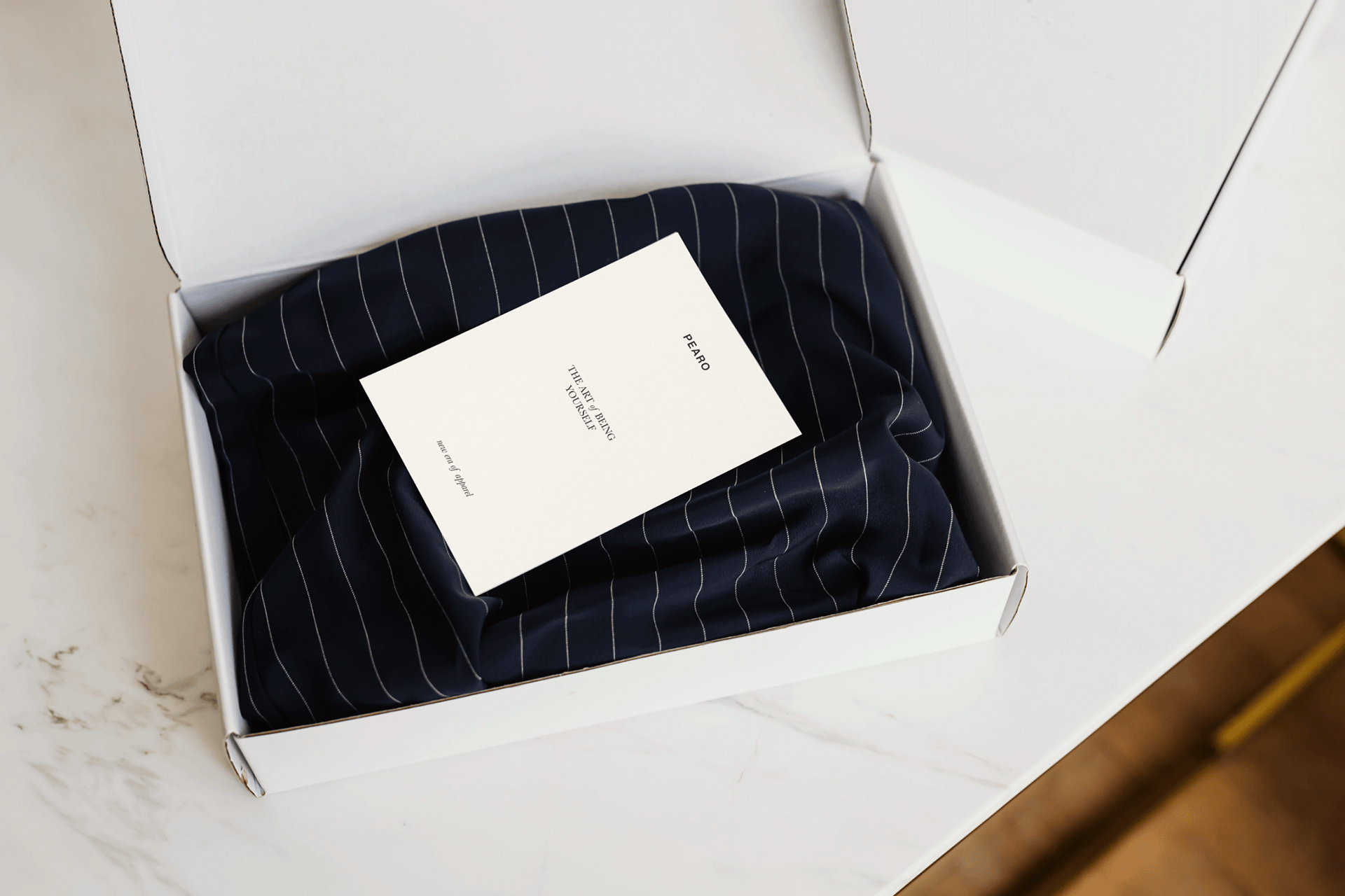
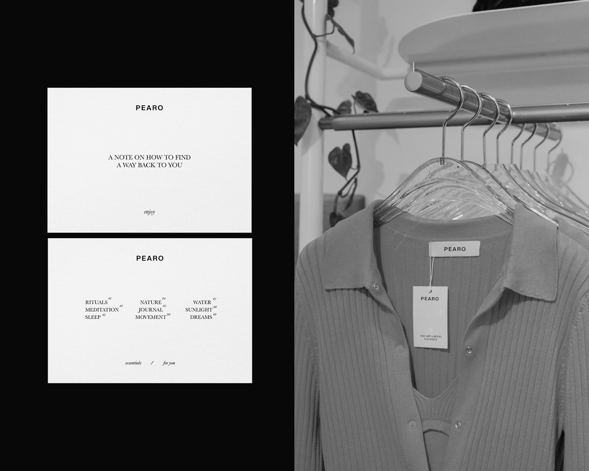
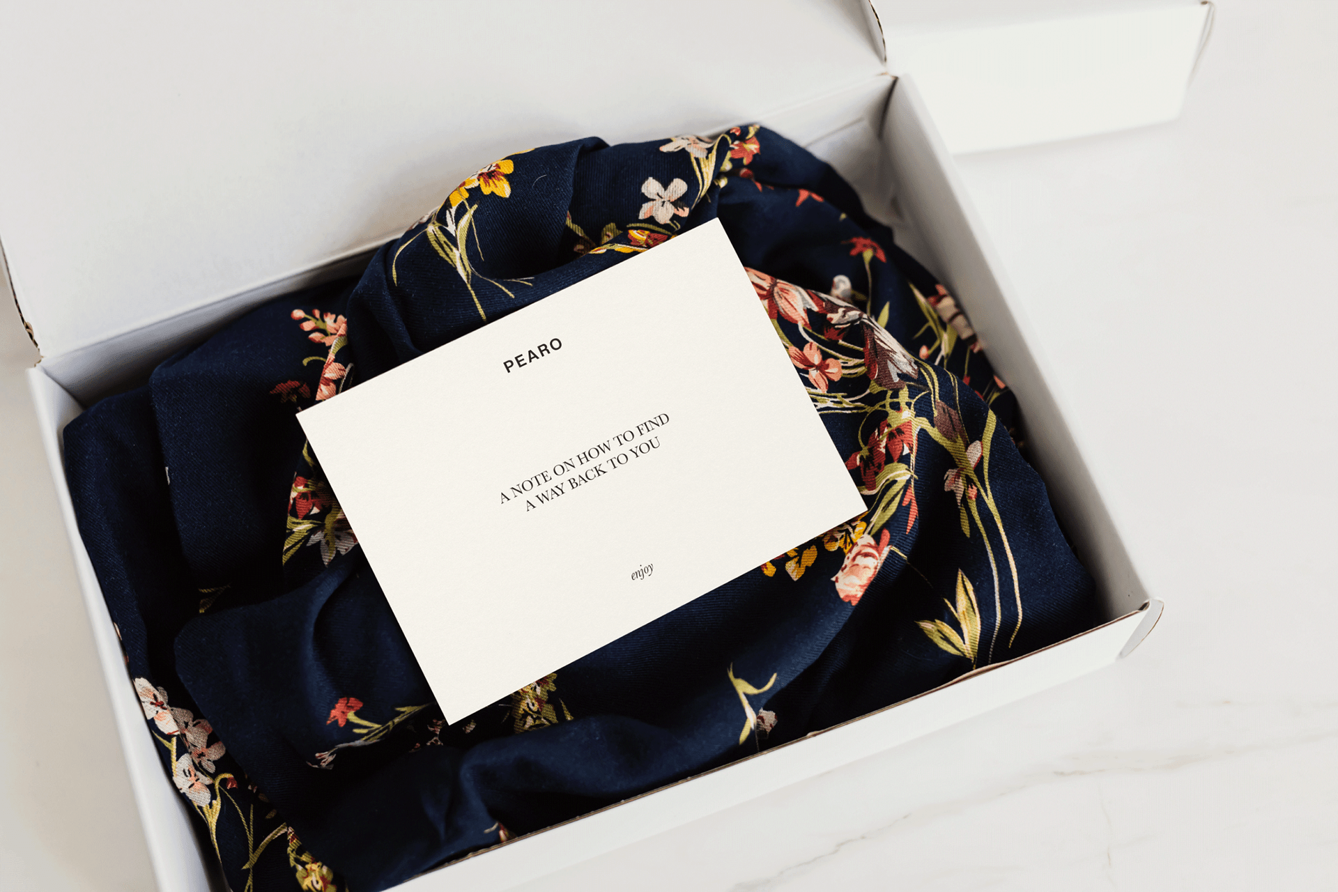
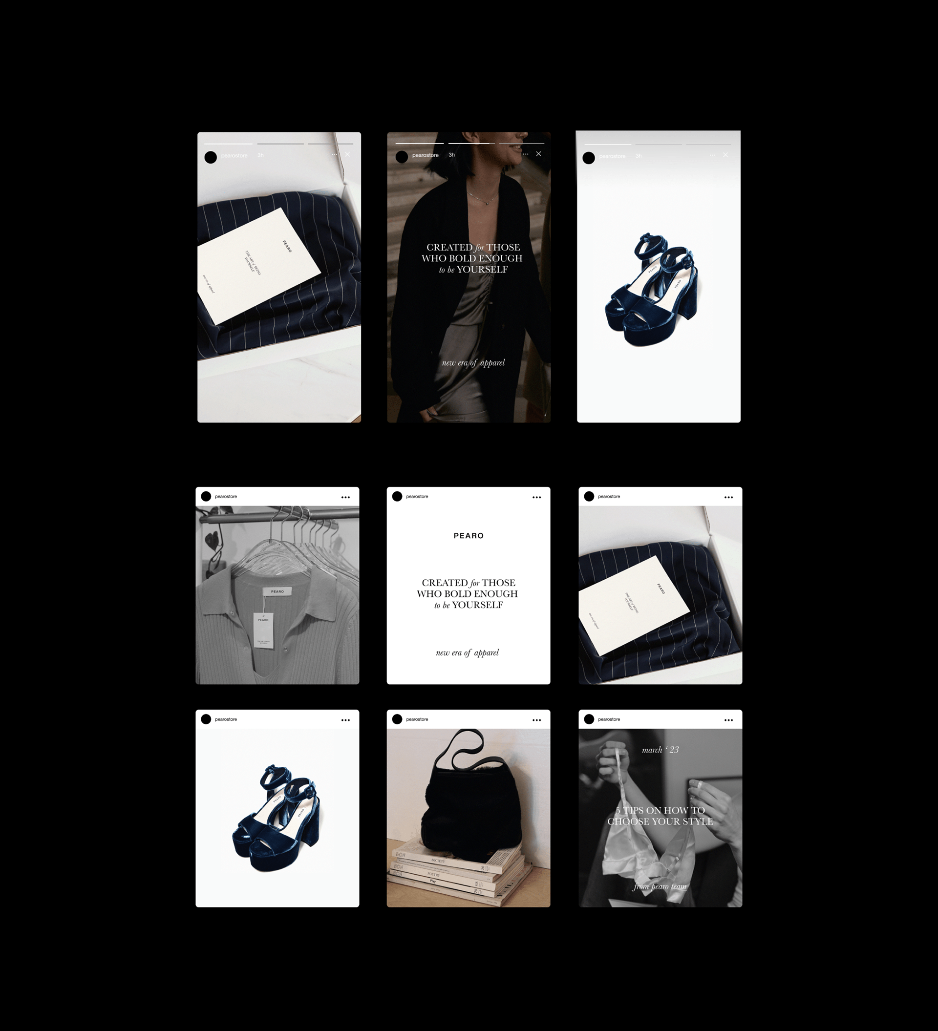
The brand also uses the most perse materials in clothing from silk to velvet, however it can be described as laconic and sophisticated with a value of minimalism. Since the brand values literally "being yourself", we came up with an idea to create gift postcards with a note on how to find yourself with kind reminders like rituals, sleep, meditation, movement.
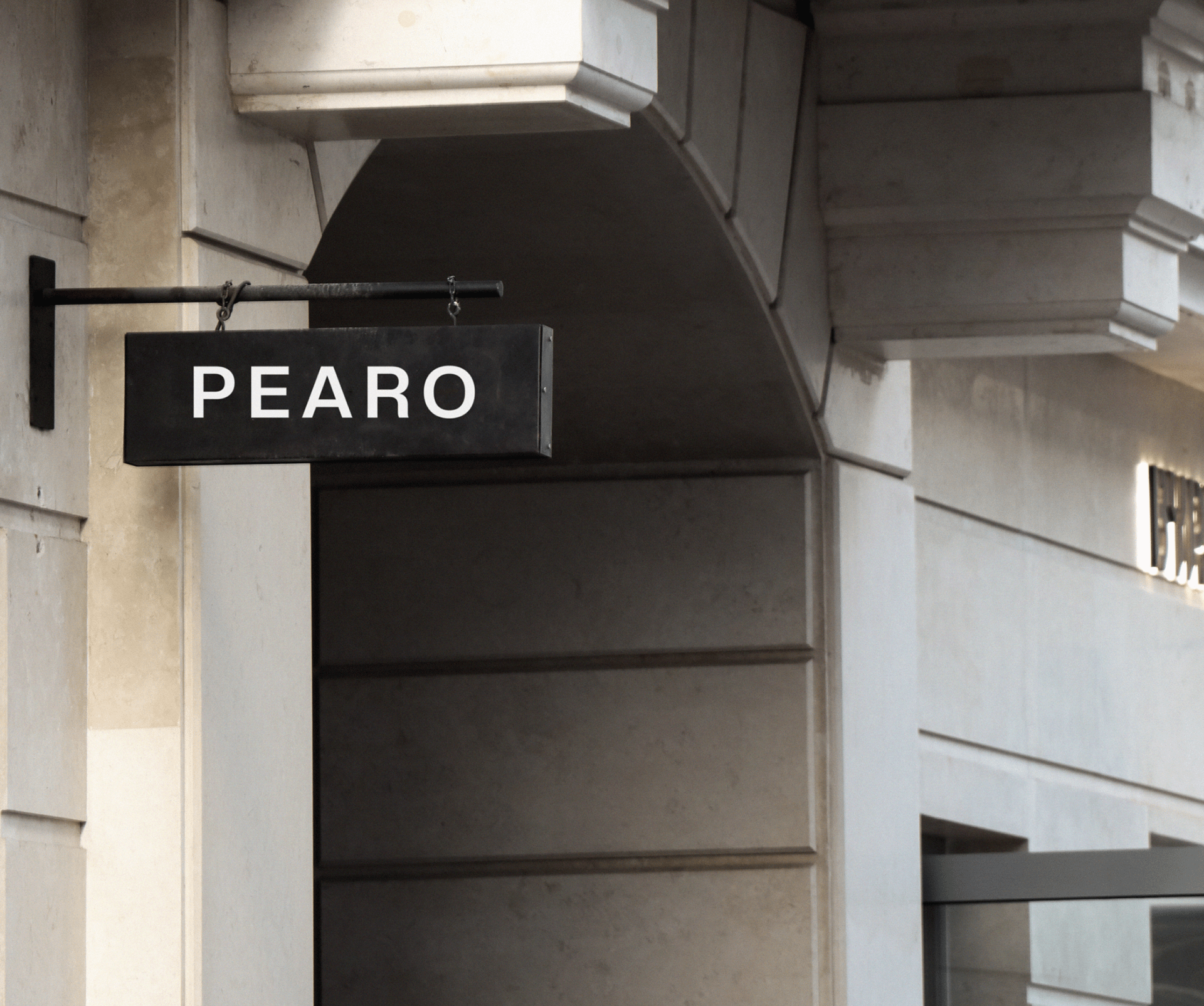
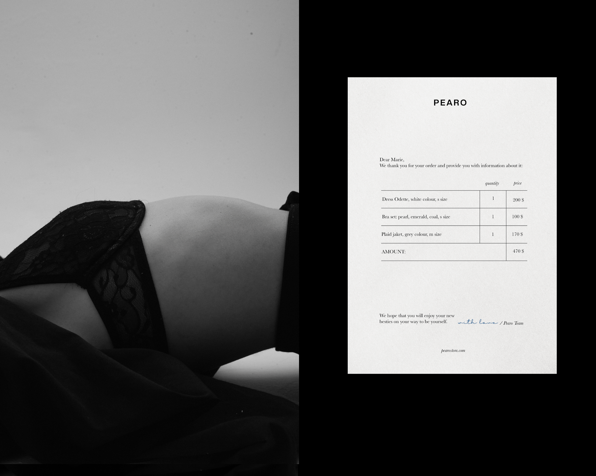
Brand Identity design embodies sophisticated, elegant nature of Pearo brand, along with the coverage of such vital aspect as importance of being yourself in apparel (and in life). This message is supported by minimalistic and prices usage of typeface, attention to details both in design and the content.
Thank you for watching!
I am available for new projects.
gmail / telegram / instagram