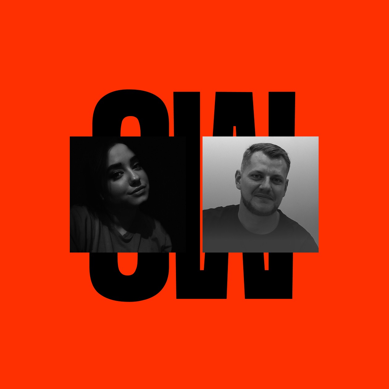
Chat2Desk™ brand identity 2023
Chat2Desk identity guidelines are meant to help coordinate the customer-facing communications.
Identity should be used in a consistent and prominent way on all materials, web\app and communications.
Client: Chat2Desk an international team
Art Director & Designer: Anton Pishun
Area: New-York | USA
las directrices de identidad de Chat2Desk están pensadas para ayudar a coordinar las comunicaciones de cara al cliente.
La identidad debe utilizarse de forma coherente y destacada en todos los materiales, web\app y comunicaciones.
© all rights I hope reserved
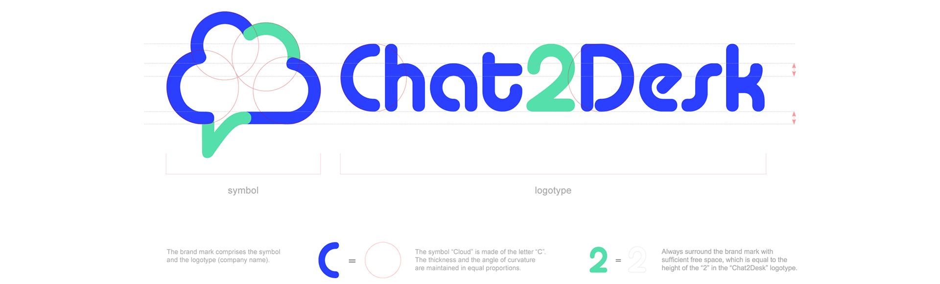
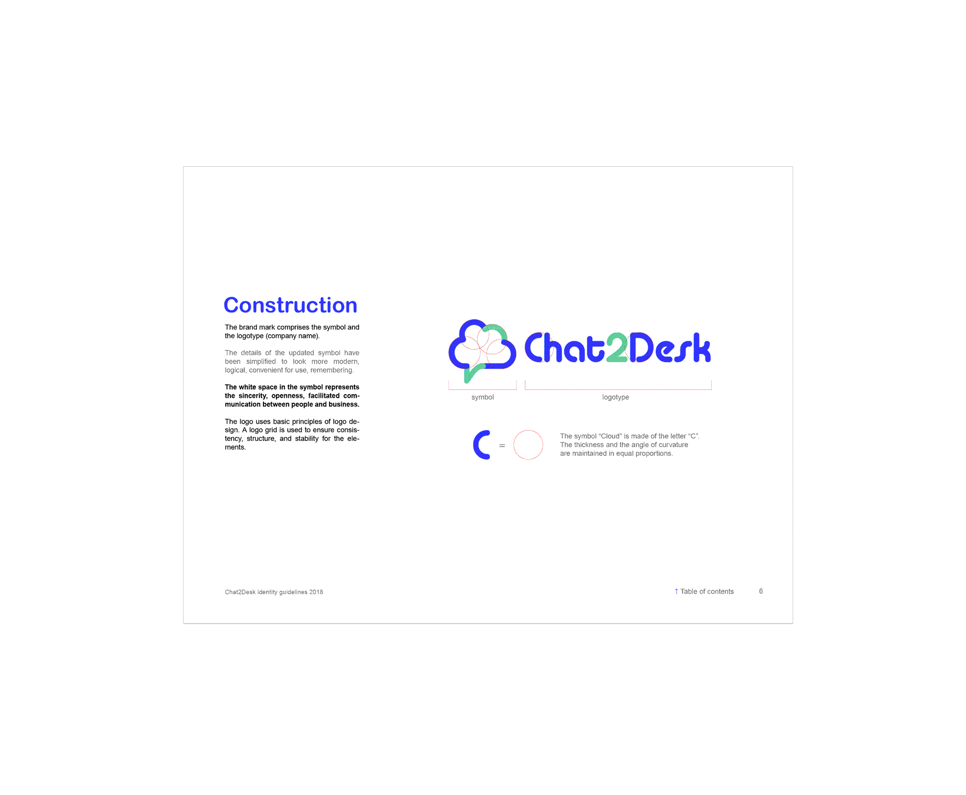
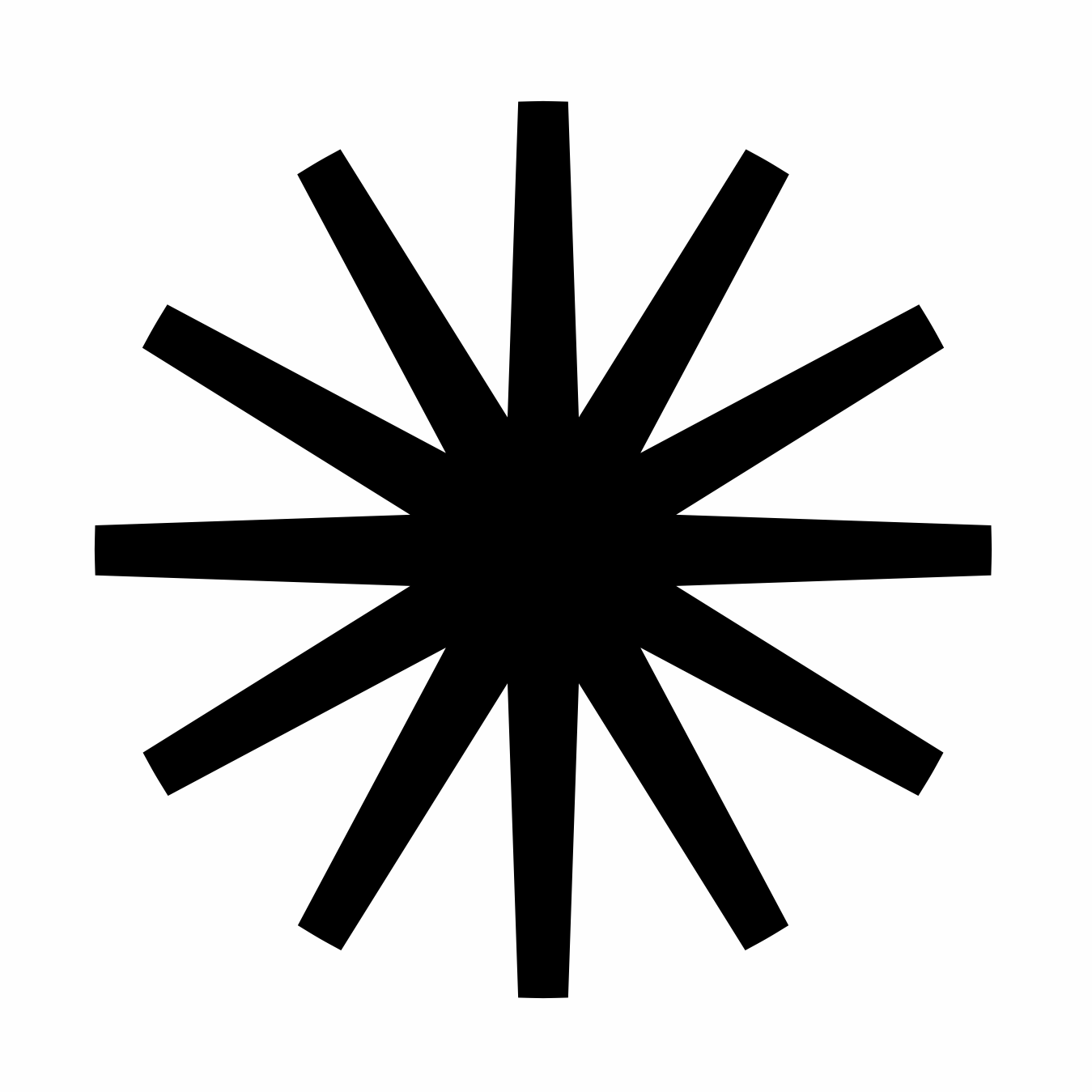
Logo construction
the details of the symbol have been simplified to look more modern,
logical, convenient for use, remembering.
The white space in the symbol represents the sincerity, openness, facilitated communication between people and business.
The logo uses basic principles of logo design. A logo grid is used to ensure consistency, structure, and stability for the elements.
Logo construction
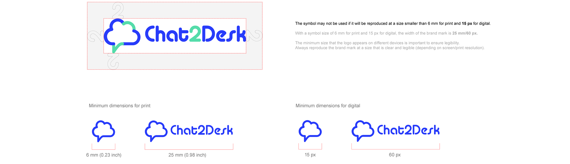
clear space
The clear space is the smallest distance allowed between the logo and any other graphic object; logo, physical or digital page edge or copy.
Think of it as the logo’s comfort zone.
This rule defines the minimum empty space, but doesn’t limit it in terms of enlargement. Leave more space around the logotype and don’t surround it closely with other elements.
Guidelines
colour, typeface, text, style elements, polygraphy, pen, clothes, outdoor advertising, presentation, social media.
Colour palette, main and additional typeface, text layout, primary and additional style element, business card, letterhead, folder, envelope C4 and DL / E65, notepad, plastic and paper bag, pen, polo & t-shirt, roll-up, billboard, poster, presentation template (white and dark background), social media (facebook, twitter, linkedIn, instagram, vkontakte), icons, letter signature.
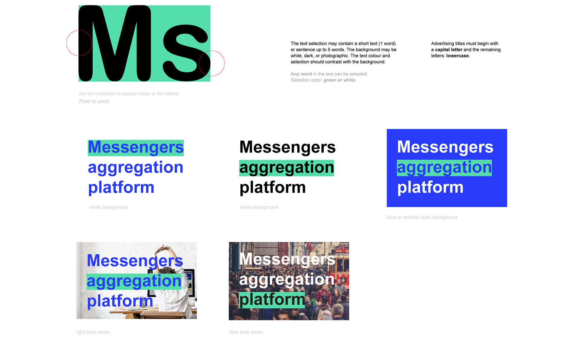
Text selection
The main purpose of the text selection is to visually highlight or set apart
an area or to act as a background for shadowing the main text message.
95% of the information on the web is written language. It is only logical to say that
a company should use the main discipline of shaping written information: Typography.
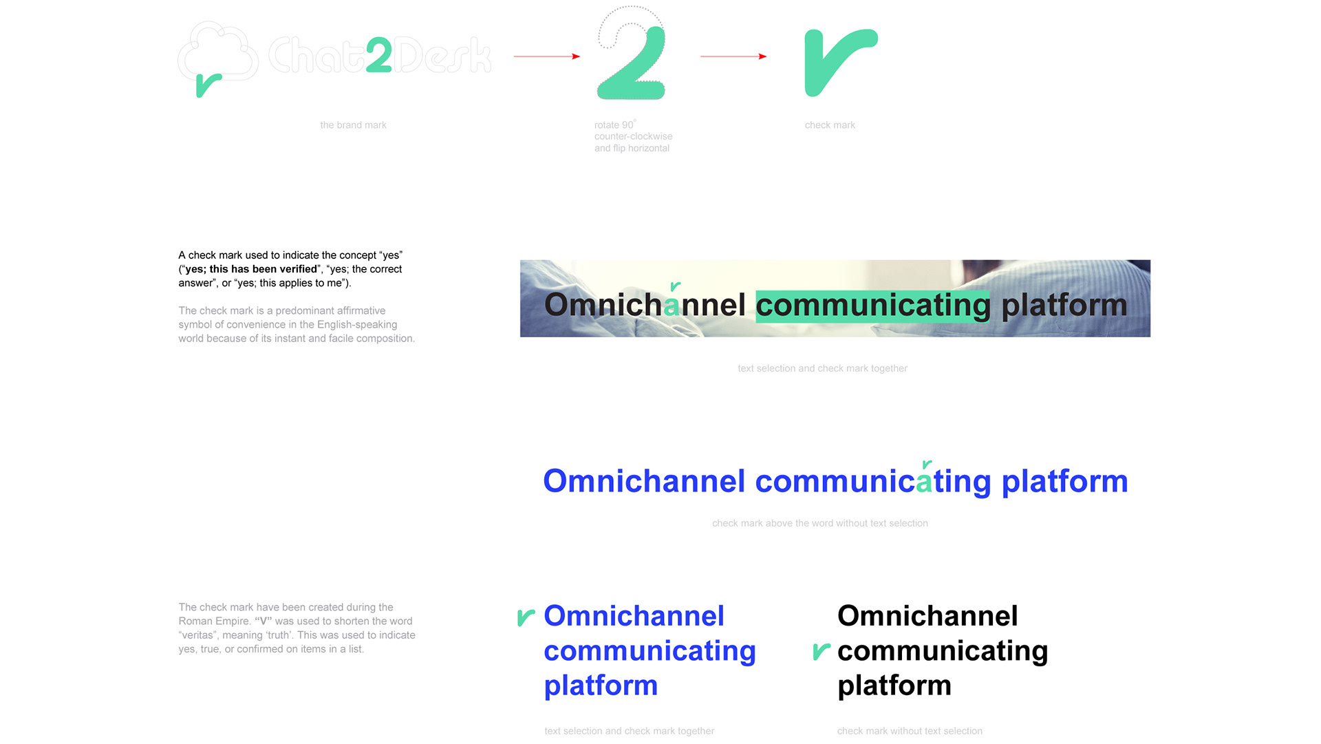
Check mark
Alongside the main identifying element: text selection, an additional
element designed to make the style more interesting and recognizable
has been created: the check mark, which may be used with all materials.
Any word in the text can be with the check mark. Color: only green.
Corporate style
colour palette
It’s pretty simple, consists of colours: blue, green, grey, black and lots of whitespace.
Blue (ultramarine) is primary brand color.
Green (seafoam) is used sparingly within the product to allow content to take center stage, and to create more energetic communications.
Black is a rich black composition, used primarily in headlines and body copy.
Grey used for signatures to photos and diagrams. And small text to explain the main paragraph.
Corporate style
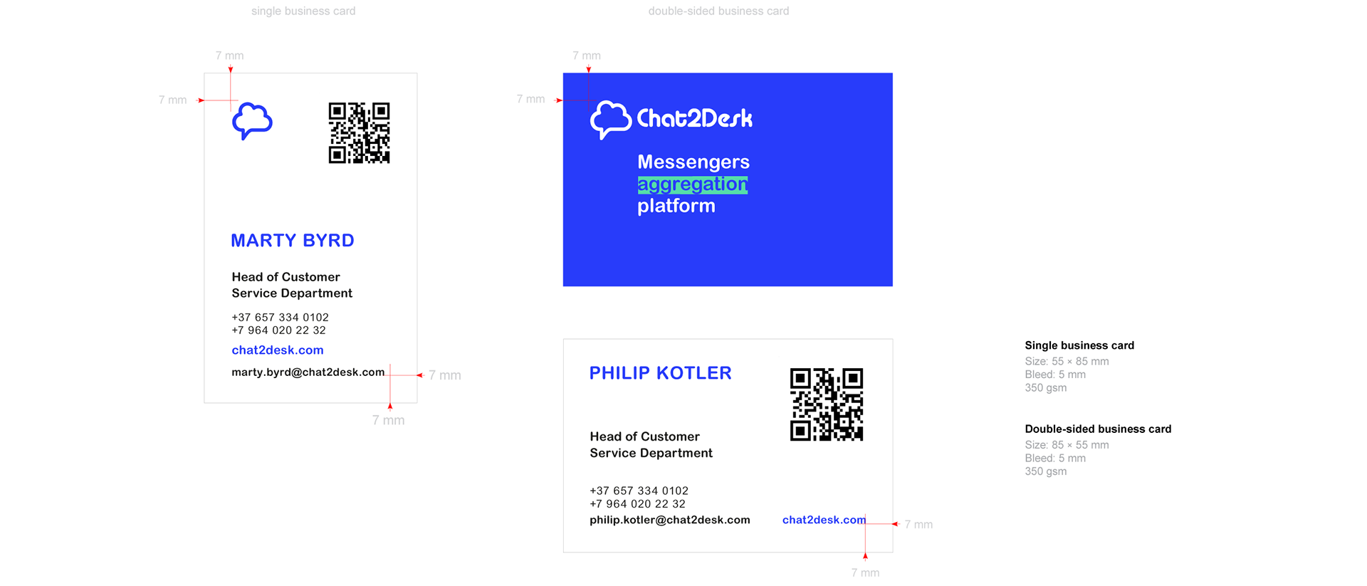
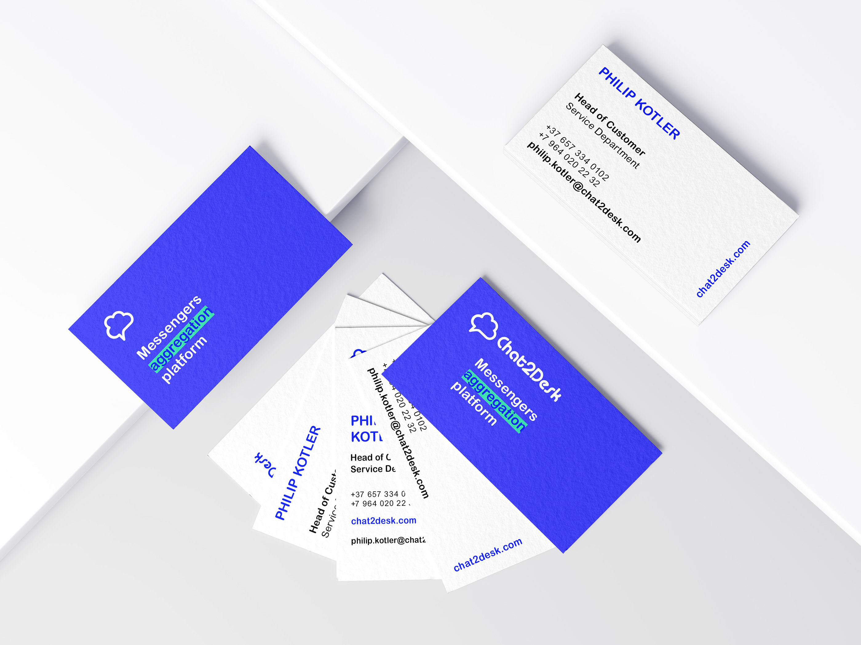
business cards
Chat2Desk – digital company and you might think that business cards don’t matter anymore.
But they can offer a lot. Here’s why they’re still important for business and how you can get the most out of yours.
Business cards in Western Europe standard cut size: 85 × 55 mm (3.35 × 2.17 in)
Printing
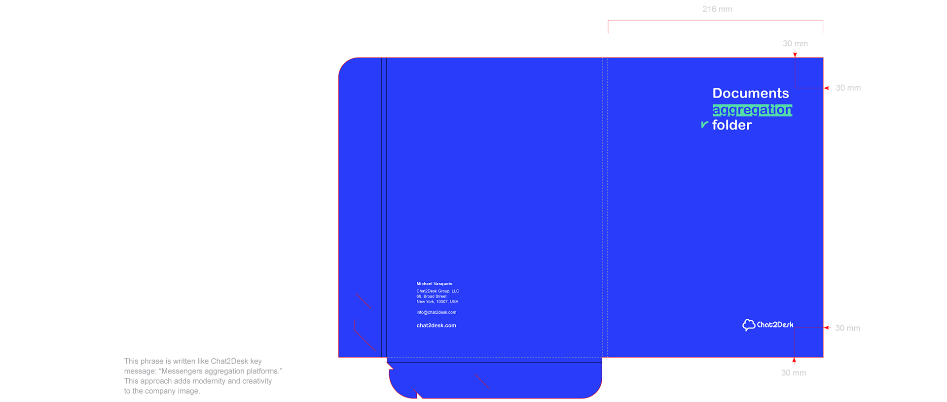
folder for documents
On the front of the folder: “Documents aggregation folder”
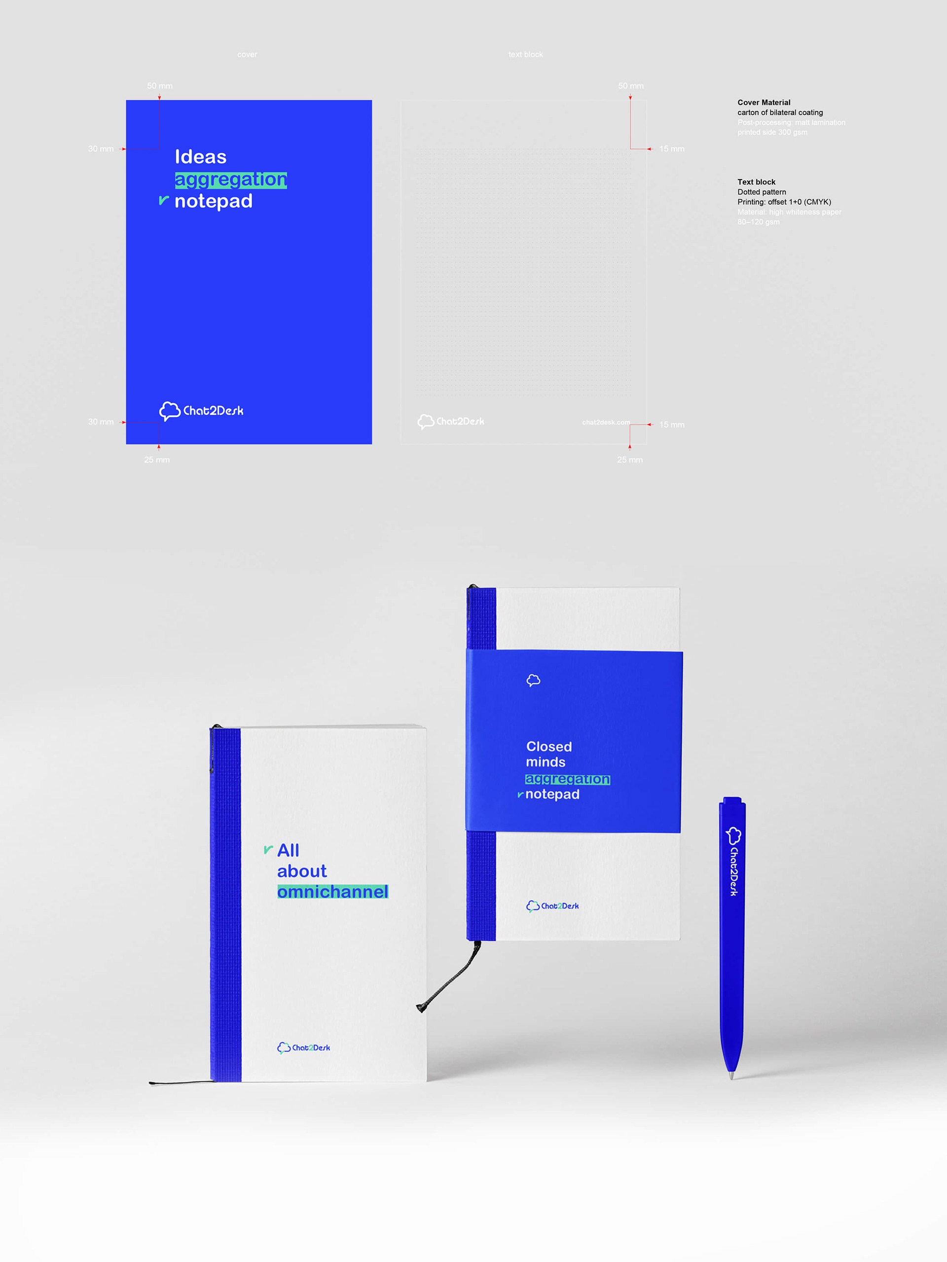
Folded size: 216 × 305 × 5 mm / Material: bilateral coating carton
Printing: offset 4 + 0 (CMYK) / Post-processing: matt lamination printed side 300 gsm
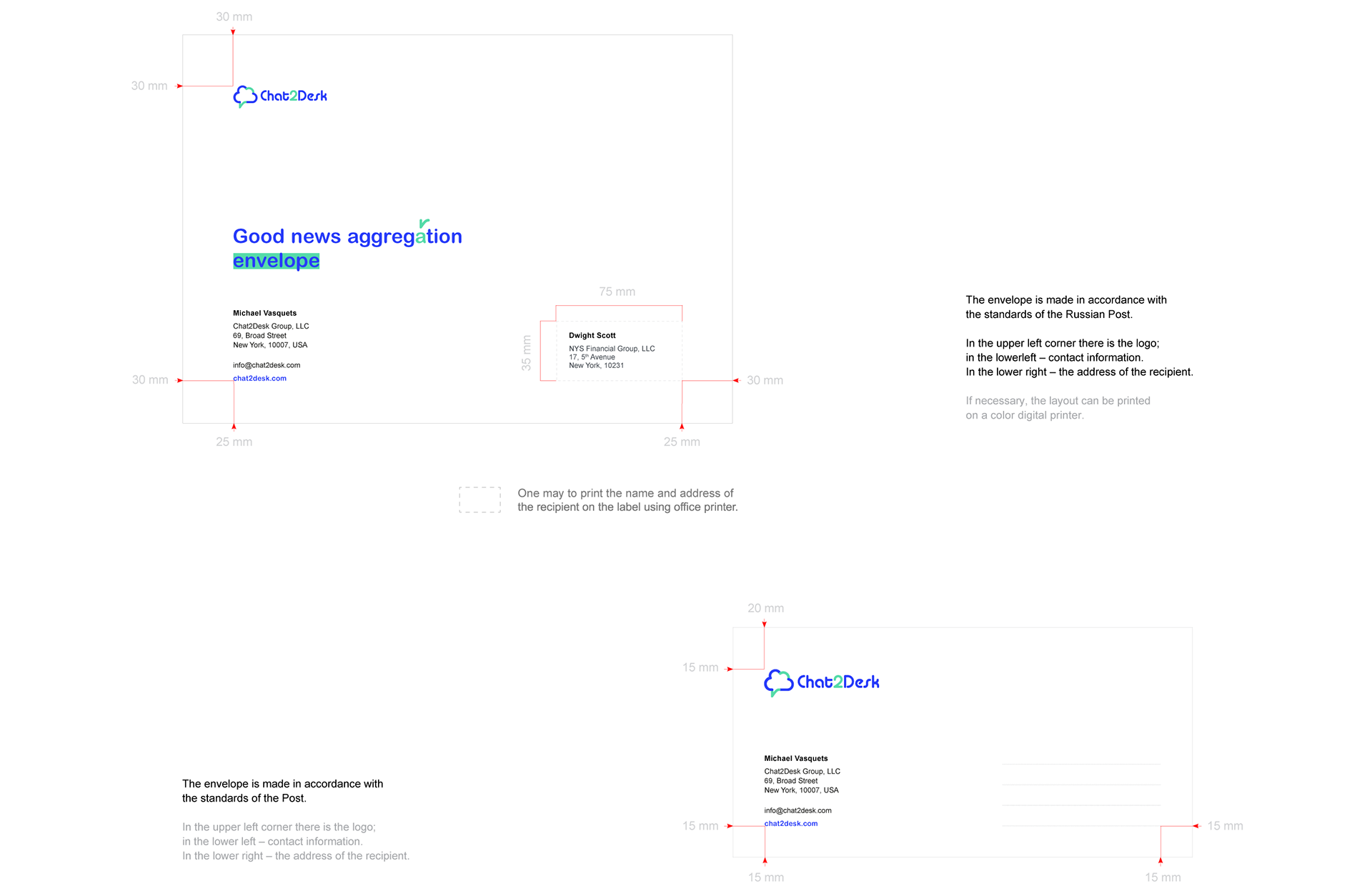
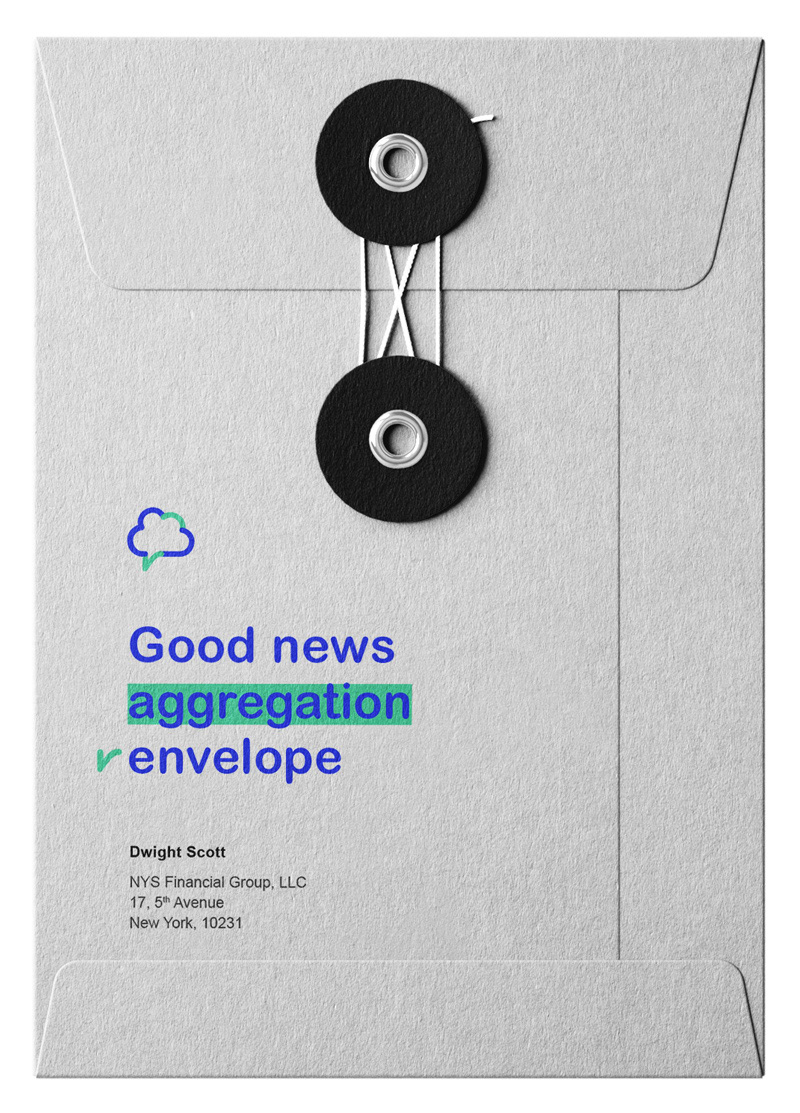
envelope C4 & DL / E65
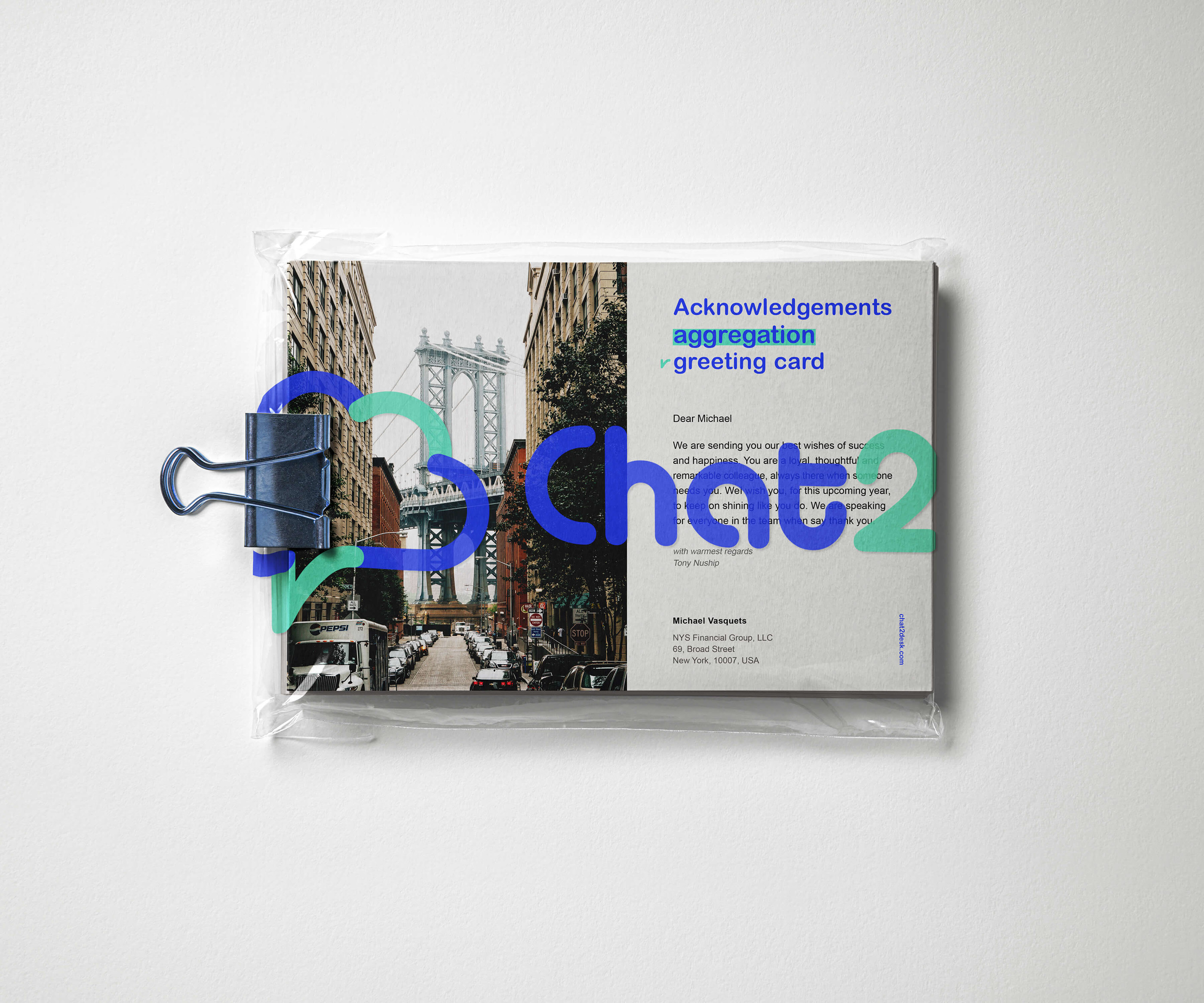
“Good news aggregation envelope” — allows to make an impression to the letter receipt before the envelope will be open.
Size: 324 × 229 mm / Size: 220 × 110 mm
Material: high white paper 80–100 gsm
On the cover of the notepad: “Ideas aggregation notepad”
Size: 148 × 210 (A5)
Binding on the upper side with a white color spring
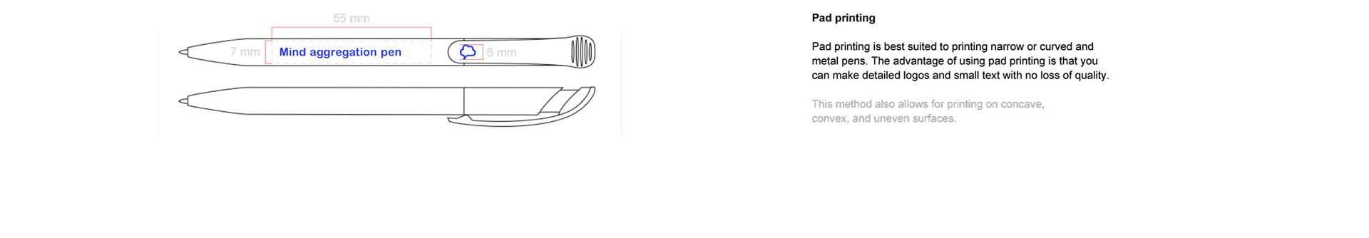
“Mind aggregation pen”
Pen and pencils, due to narrow proportions,
are one of the exceptional cases of a custom logo size.
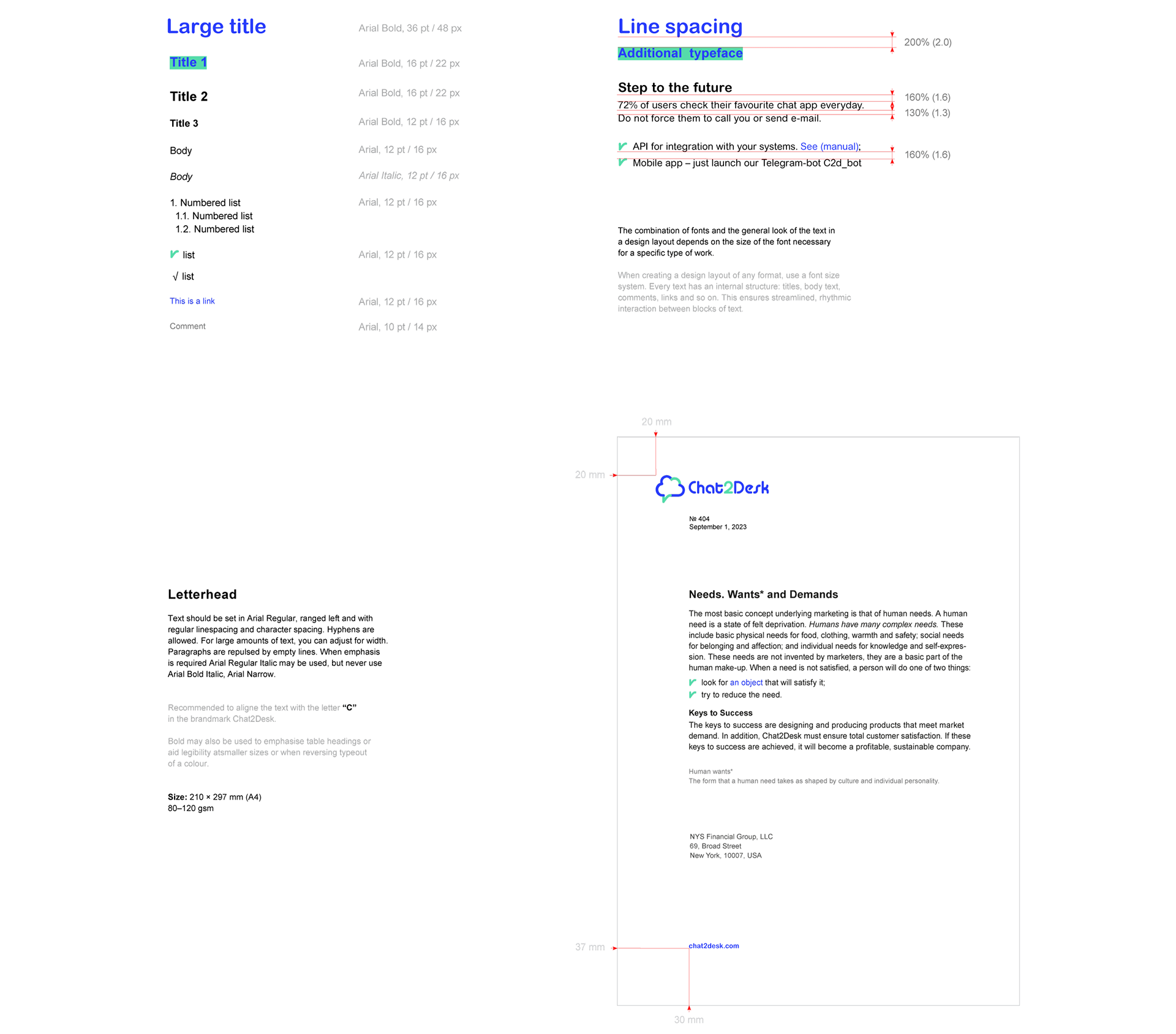
Word processing
fonts
Main typeface: Arial Rounded MT Pro Cyr Regular The fonts used are a central element of the corporate style. The style stipulates the use of two typefaces: Arial Rounded for the main font and Arial as an additional font. Arial Rounded offers a varied palette of styles and serves as the jobbing font for setting both headers and texts in promotional materials.
Font consistency is an important visual cue that reinforces an organization’s brand. These fonts should always be used for customer-facing materials (brochures, presentations, letters, etc.) when the intent of a piece is to promote the organization or a goal is to reinforce the brand.
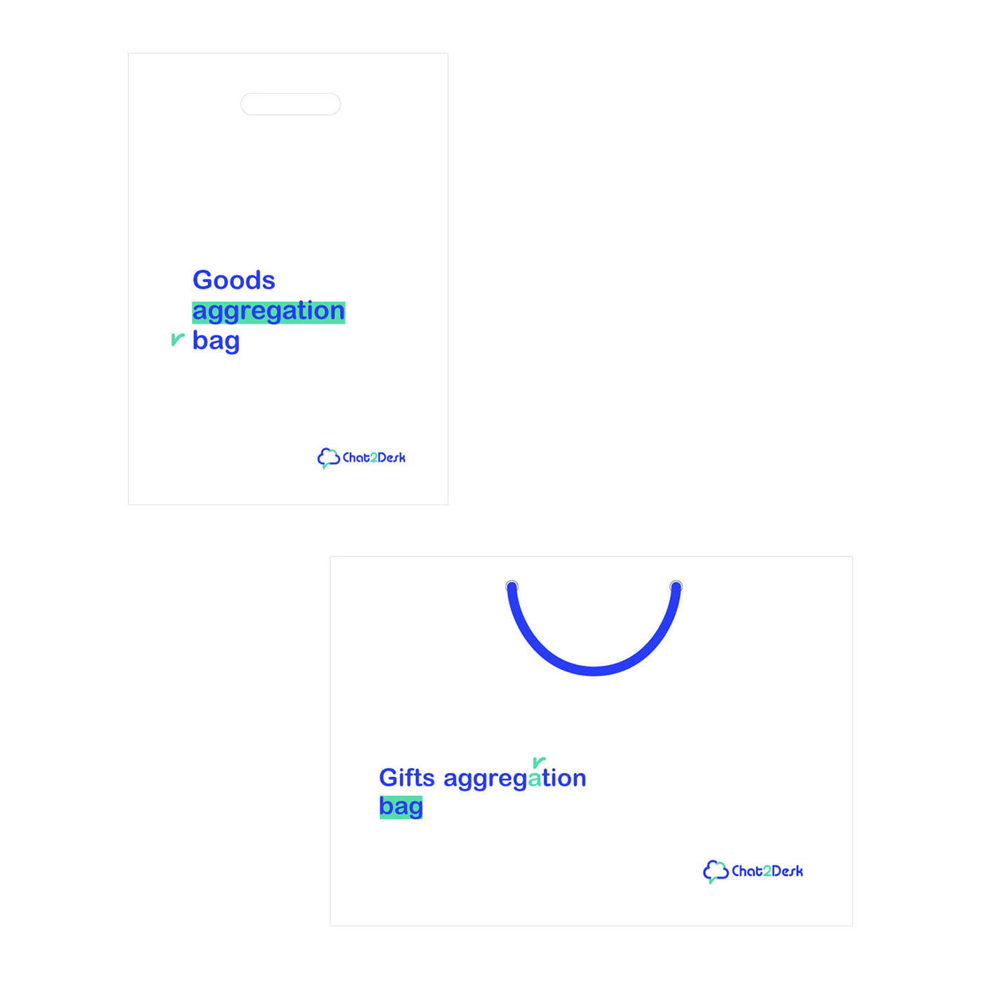
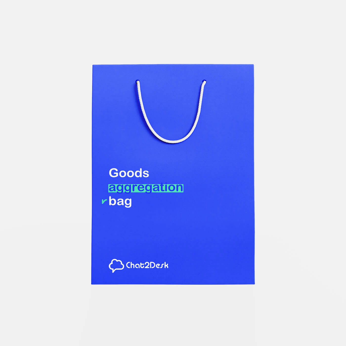
Plastic
“Goods aggregation bag”. Opaque white plastic bag with cut handles
Size: 297 × 420 mm / 50–90 μm
Plastic promotional carry bag – very affective way of getting brand recognition offline.
Paper
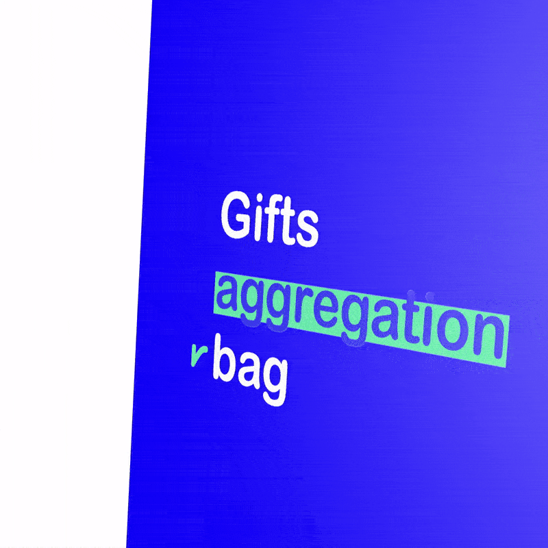
“Gifts aggregation bag”.
Paper white bag with cord handles for corporate gifts.
Paper bag are renewable, recyclable, reusable and compostable.
Size: 420 × 297 mm / Matt lamination printed side. 210–90 gsm
Paper bags just seem friendlier to the environment.
They don’t have that slick petroleum look like plastic bags do and they fold up neatly to stack in your cupboard for next time.
Size: 6000 × 3000 mm
Chat2Desk advertising is always stripped down to a core message.
We like to display short and simply copy in bold.
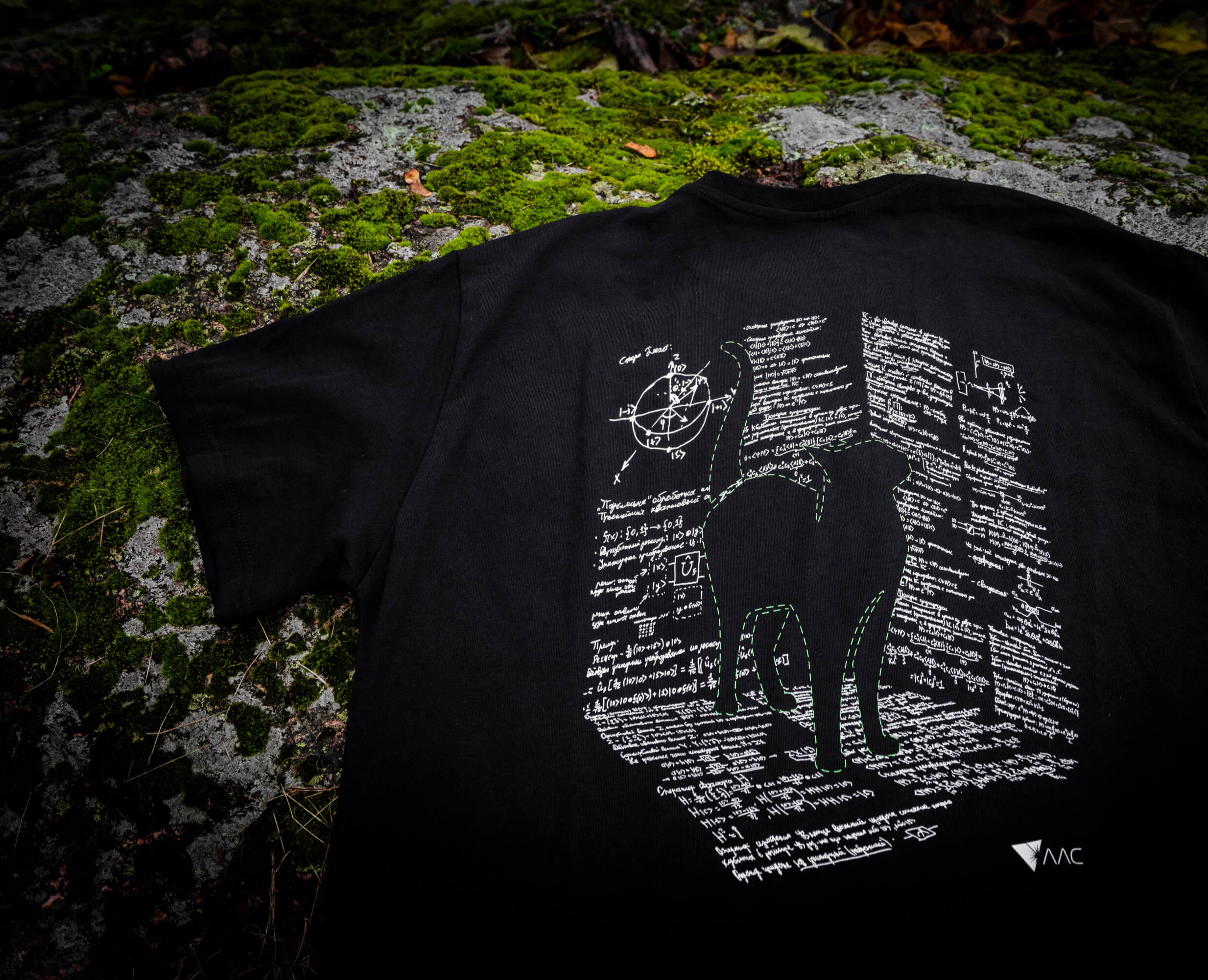
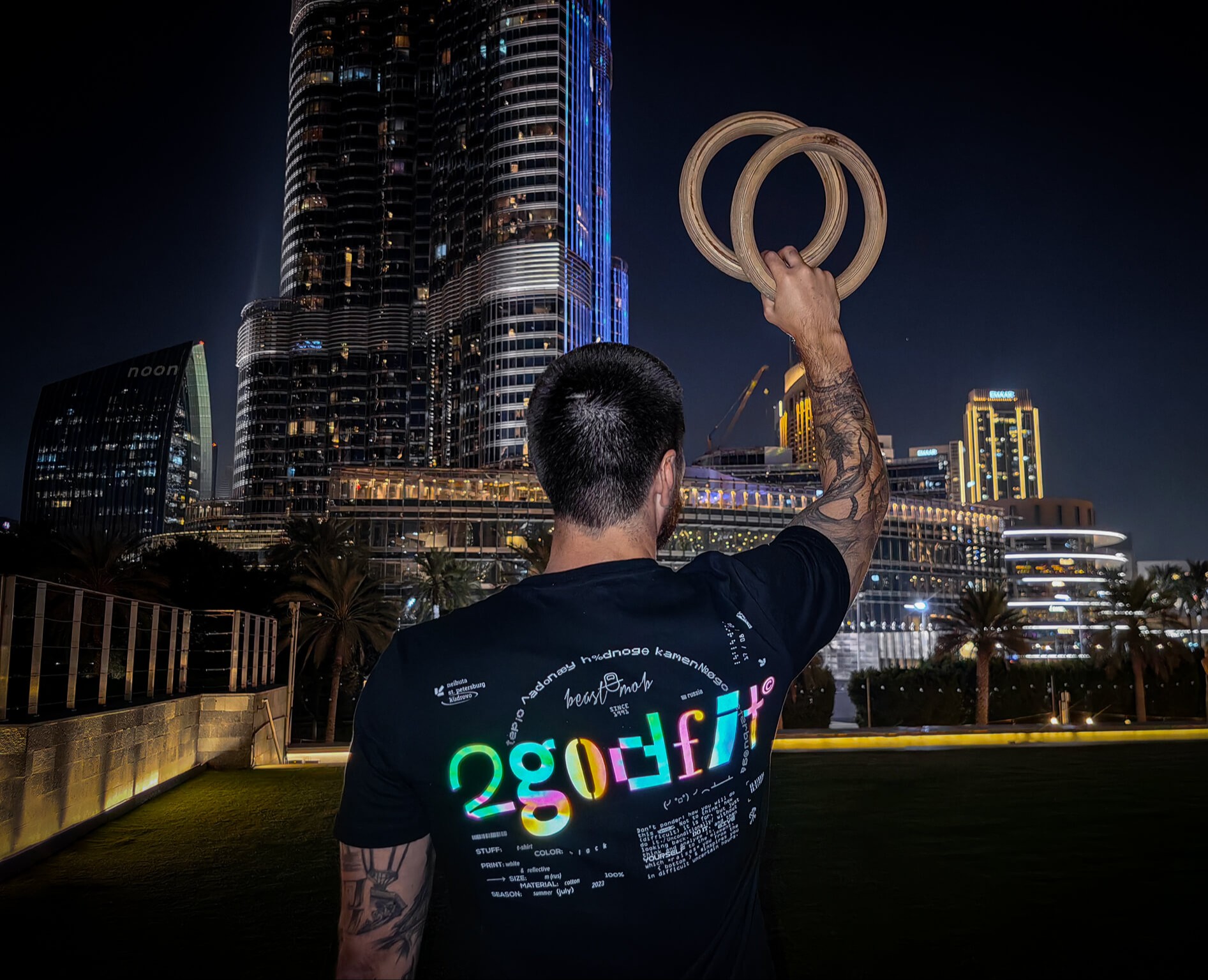
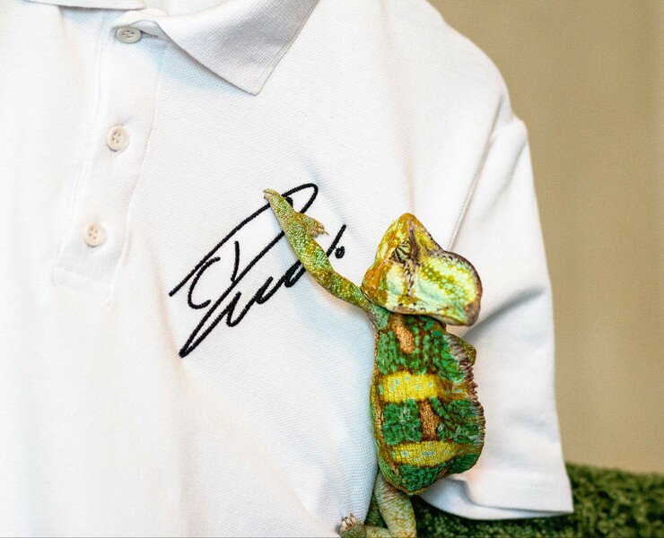
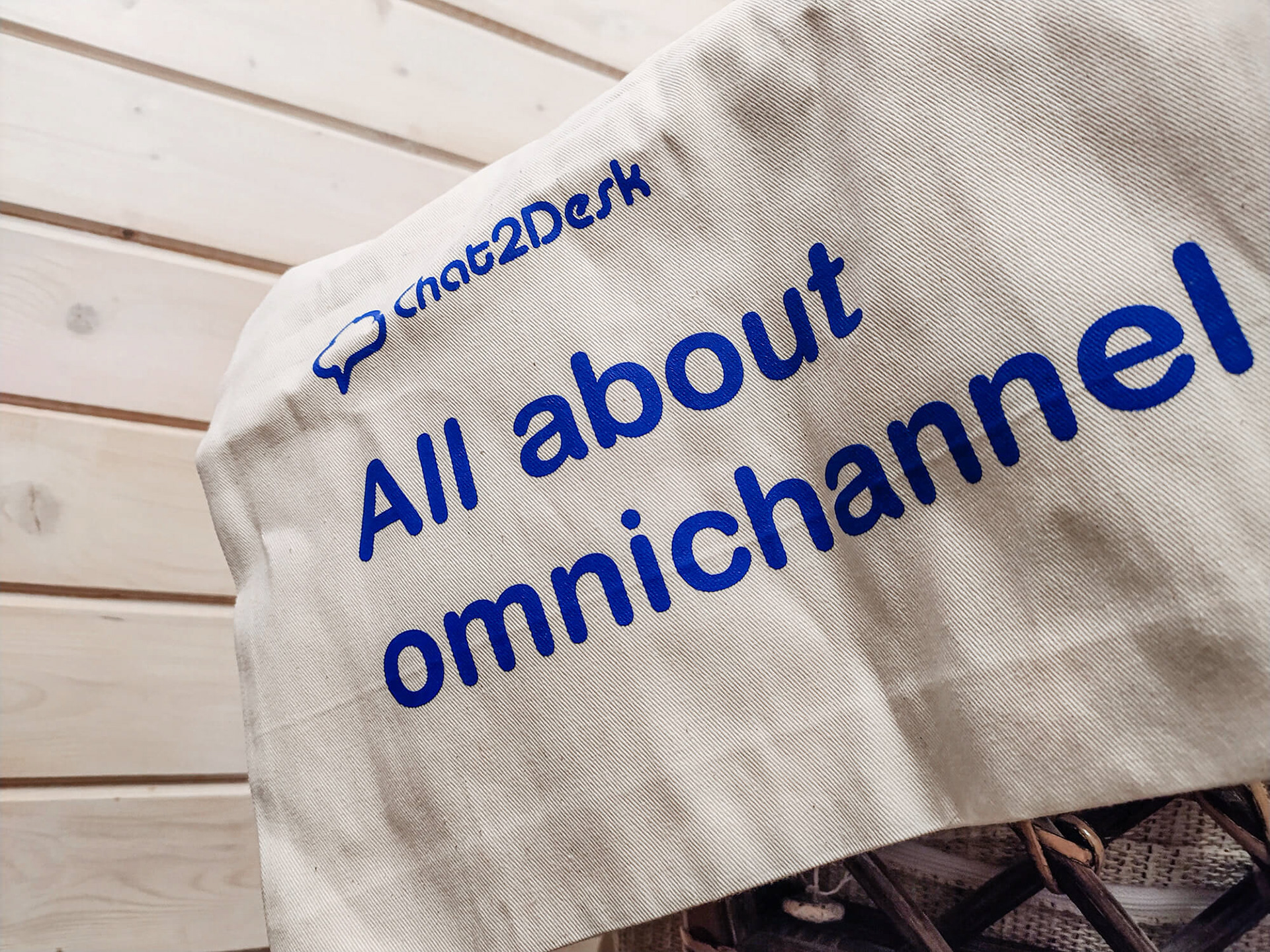
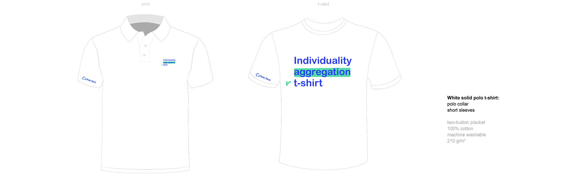
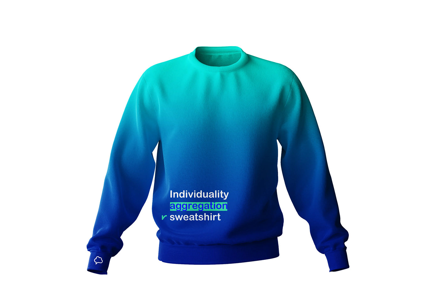
“Inpiduality aggregation polo”
Text size: 80 × 40 mm
White solid t-shirt: short narrow sleeves
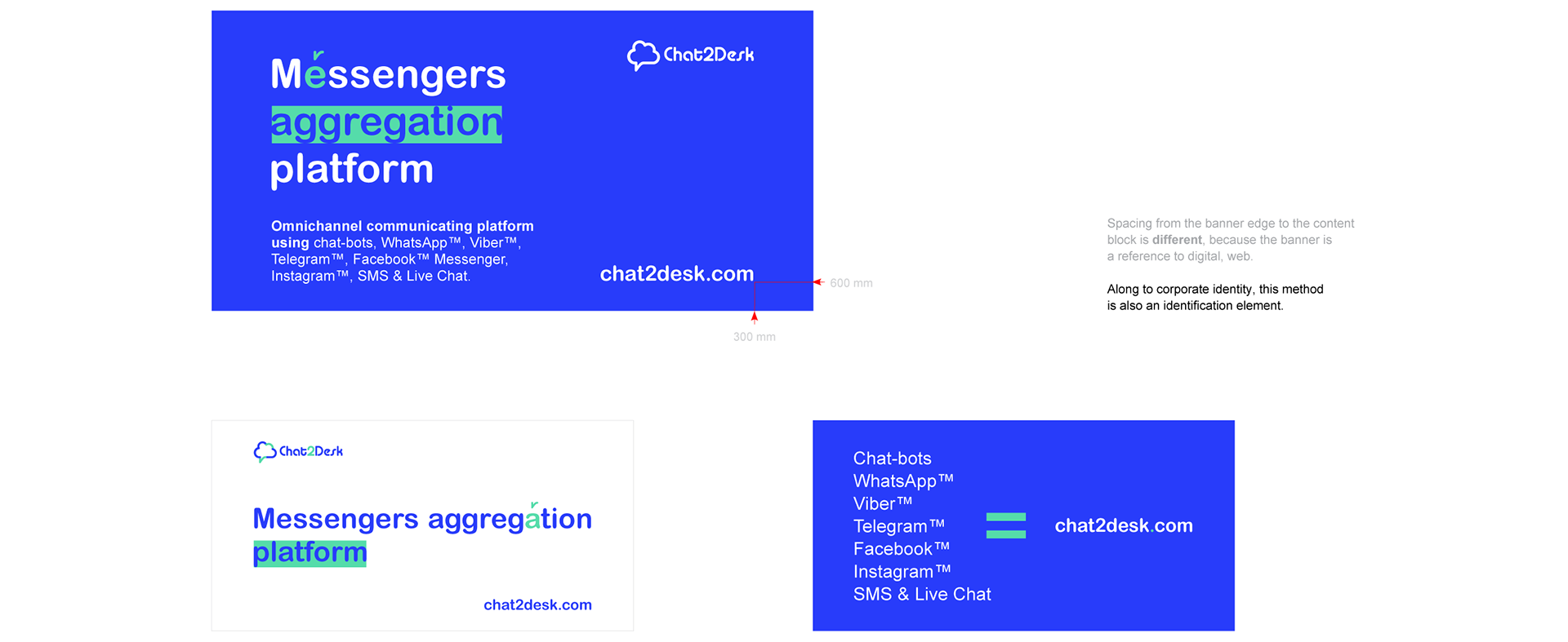
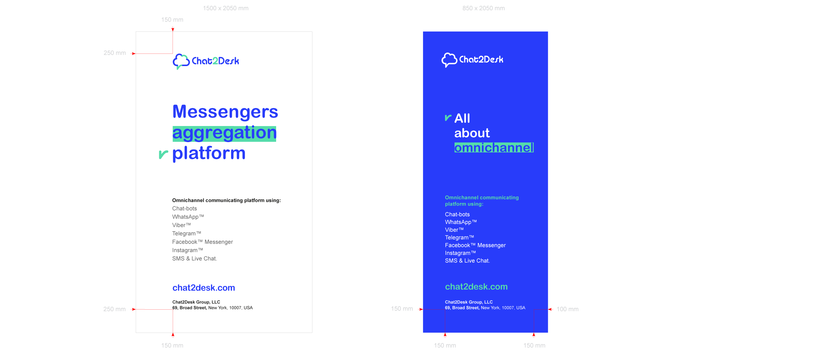
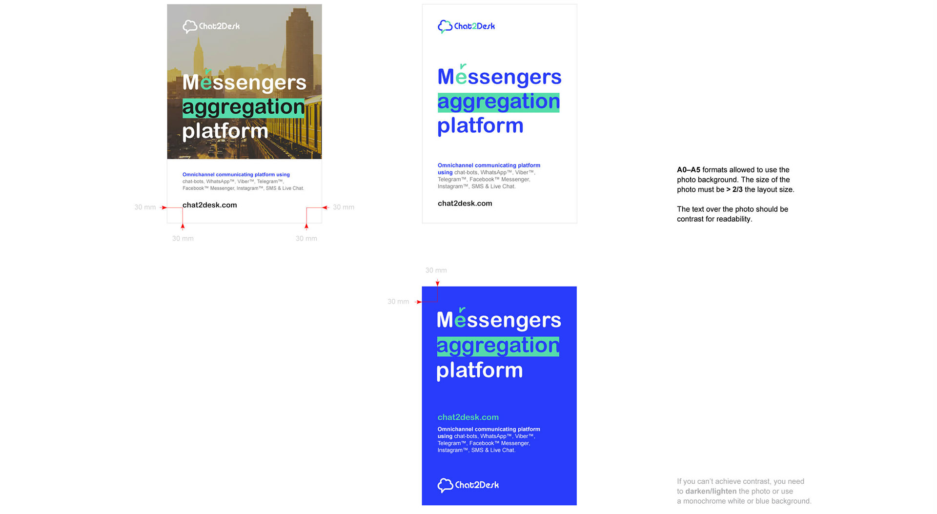
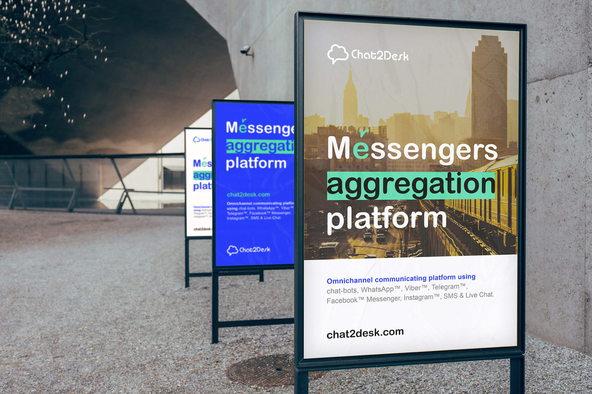
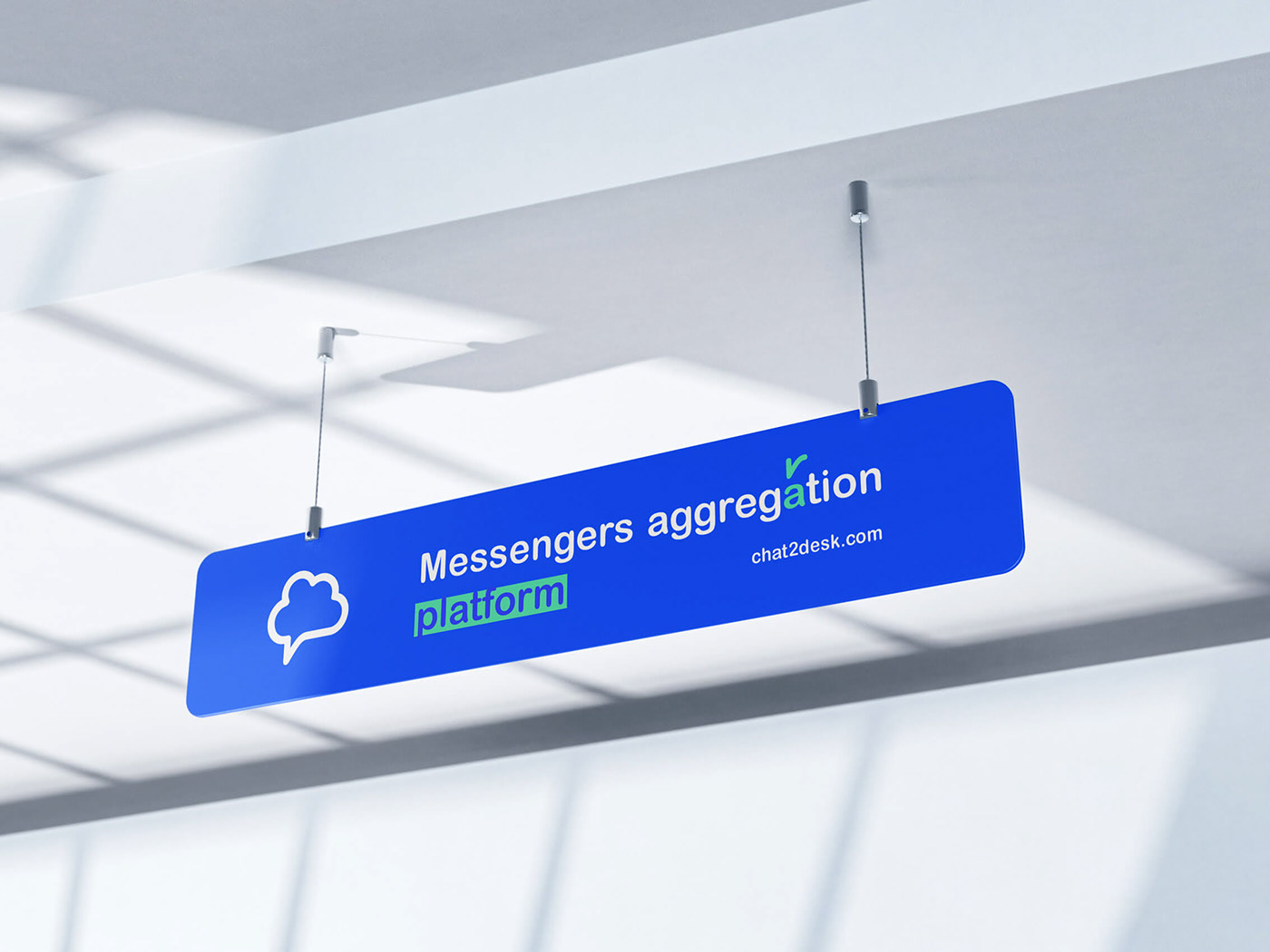
“Messengers aggregation platform”
Size: 1500 × 2050 mm
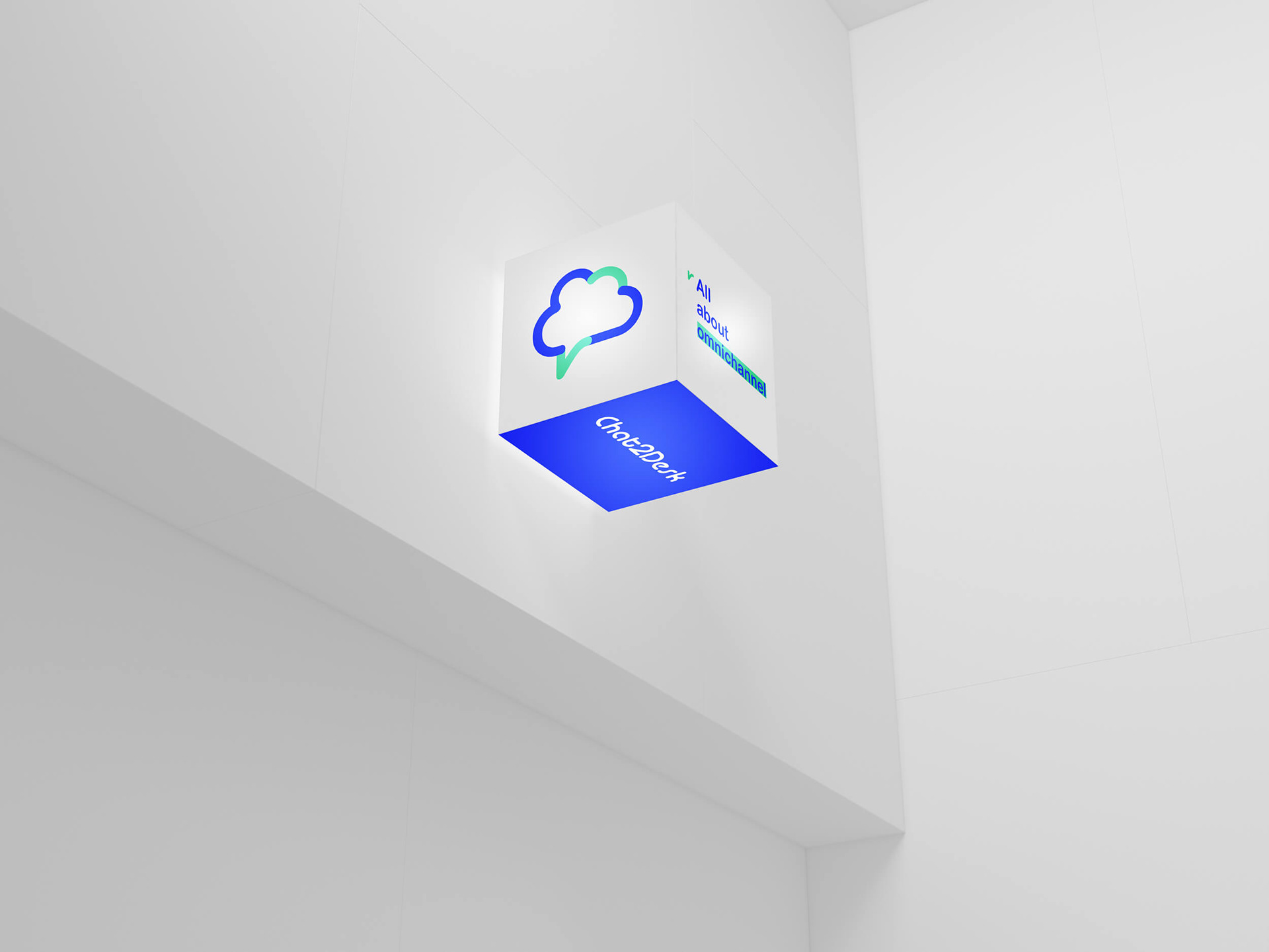
“All about omnichannel”
Size: 850 × 2050 mm
For visual communication and to promote Chat2Desk in media, an advertisement
has been developed with a choice of 3 backgrounds: white, blue and a photograph.
Size (as example): 297 × 420 mm (A3)
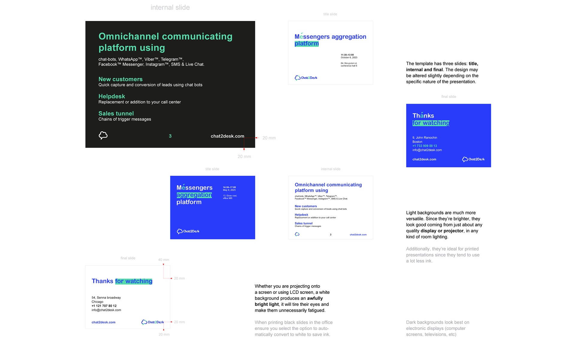
White & dark background
Size: 254 × 190 mm (4:3)
Try not to place too many words onto a single slide
and also avoid the use of low-quality images or illustrations.
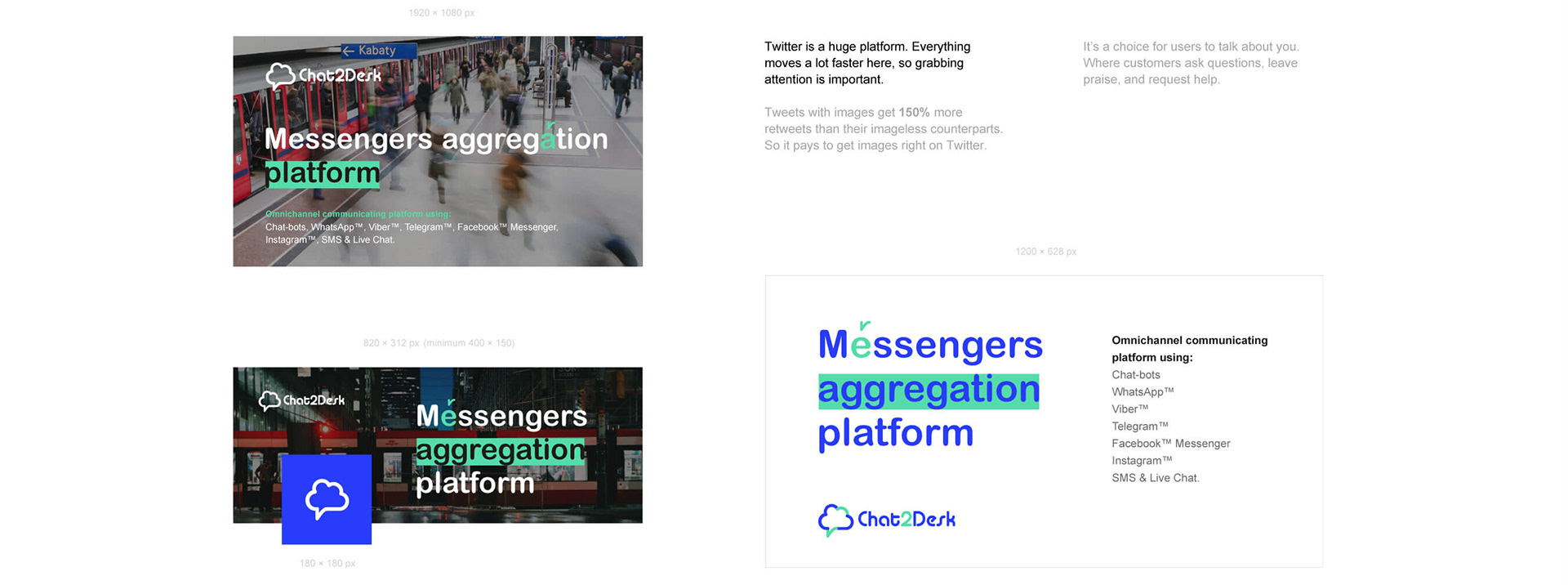
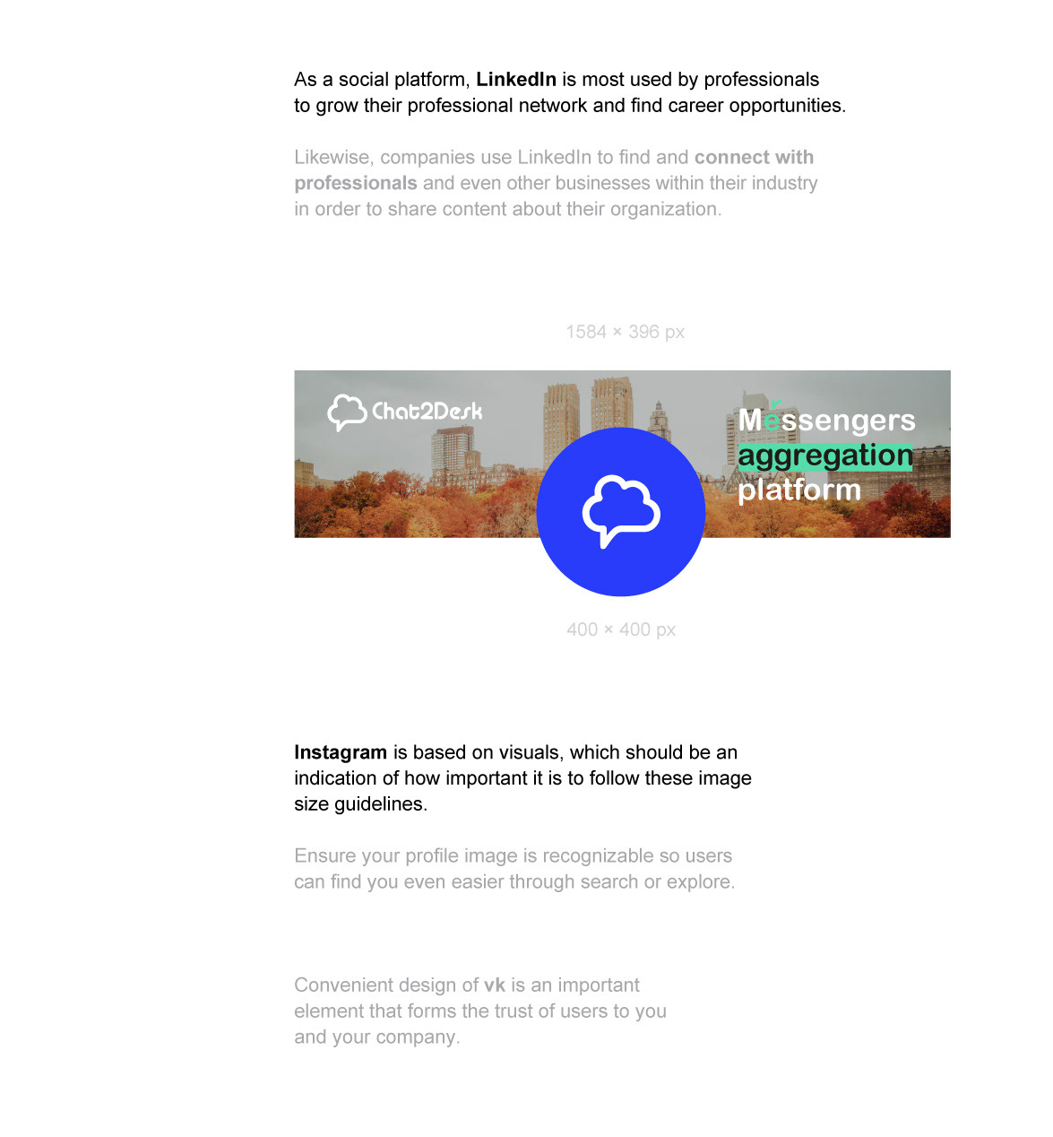
Meta / Twitter / LinkedIn / vk / Instagram
For marketing, photo dimensions vary according to where and how
it’s shared – from cover photos, to timeline images, to profile pictures.
Images with a logo or text may be best as a PNG file.
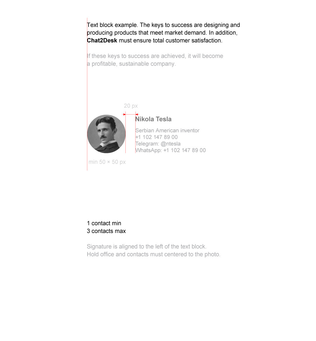
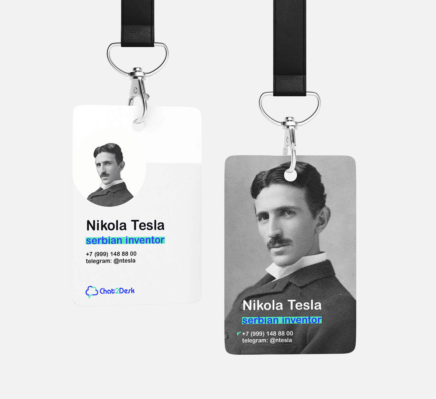
Use greyscale photo in the letter’s footer.
Photo will appear as 50 × 50 px on desktop (minimal size). Recommended size 200 × 200 px
Name: Arial bold, size 14 pt. Hold office and contacts: Arial regular, 12 pt
Colour, typeface, text, style elements, polygraphy, pen,
clothes, outdoor advertising, presentation, social media.
© credits
Art Direction, Branding, Presentation
facebook instagram vk
+7 967 55 30 555
➥ pishun.a@mail.ru
© Anton Pishun. all rights I hope reserved
2023


![Primatek [offline & online] — Брендинг, Графика на Dprofile](https://cdn.dprofile.ru/files/3/2850/COVER/b0ea4b02-544a-42af-a3a5-82a3fbccda2c_69234702.jpg)