Client and task
UDS is a real estate developer. For the past 15 years, the company has been operating in four regions across Russia. The company is part of the UDS Group holding company, which is active in 11 lines of business, from development and construction to residential and
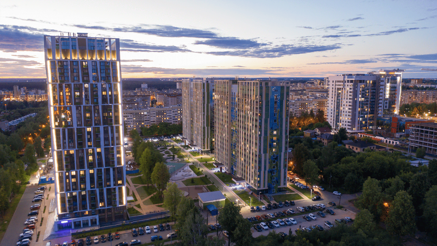
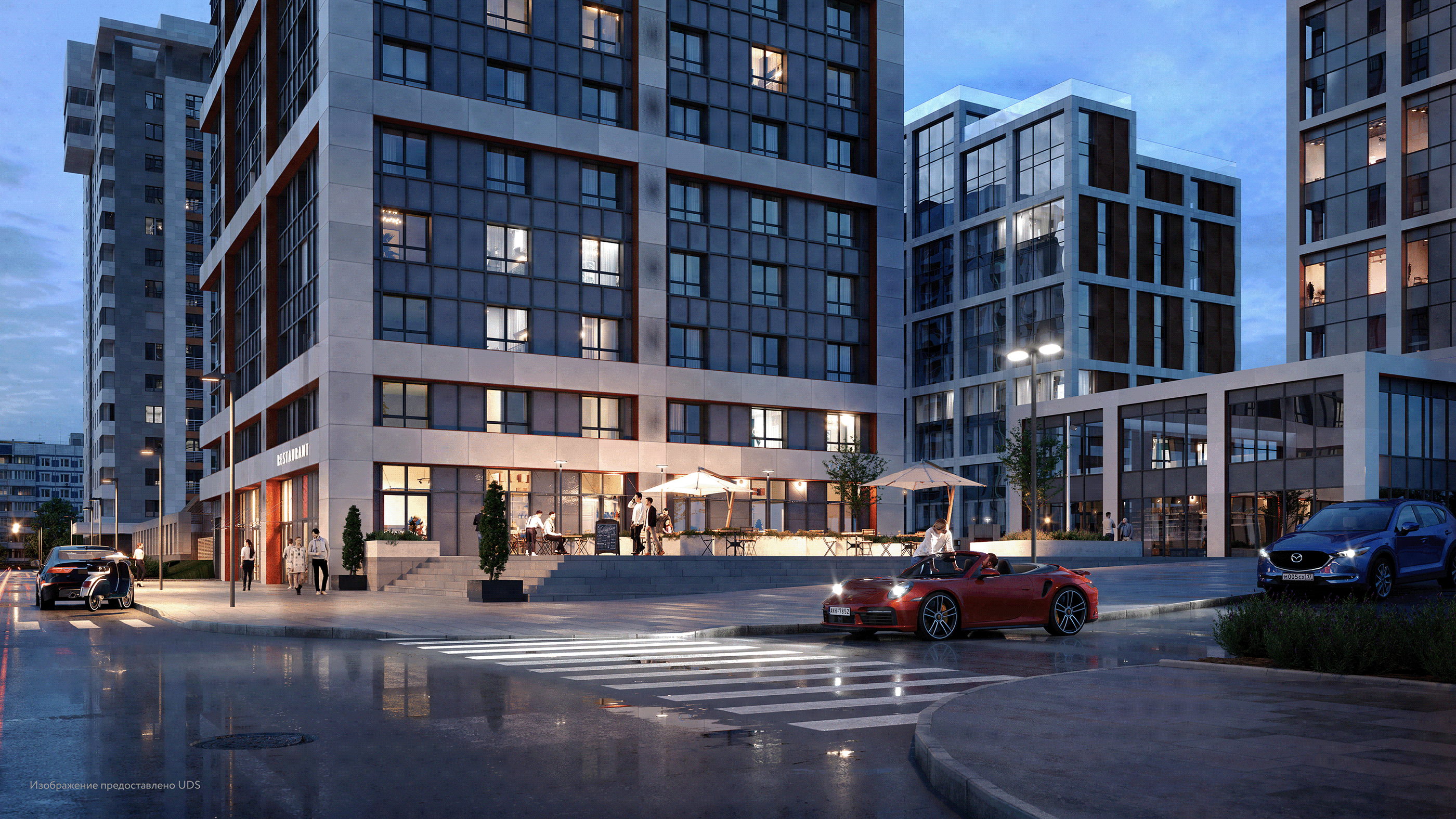
non-residential property management. In 2021, the developer set an ambitious task: to enter the federal market. The company is currently working on the Kinetik residential housing project in Moscow.
We were tasked with comprehensively rebranding the company and establishing the external appearance of the brand in a way that would reflect the standard and quality of company products.
Positioning
In addition to the merits of its products and services, USD has a conceptual advantage:
it doesn’t just build bland complexes for the sake of square meterage. For every building, there is a vision for the people who will live there.
In the new positioning, we combined the company’s internal work ethic with the needs of customers who will be living, working, and raising children in these spaces.
Ideas create opportunities
UDS is synonymous with a personalized approach, new ideas, vibrant energy, and good judgement, and creates opportunities for inpiduals from all walks of life. It creates the best possible environment to enable every resident and their family to live the life of their dreams.
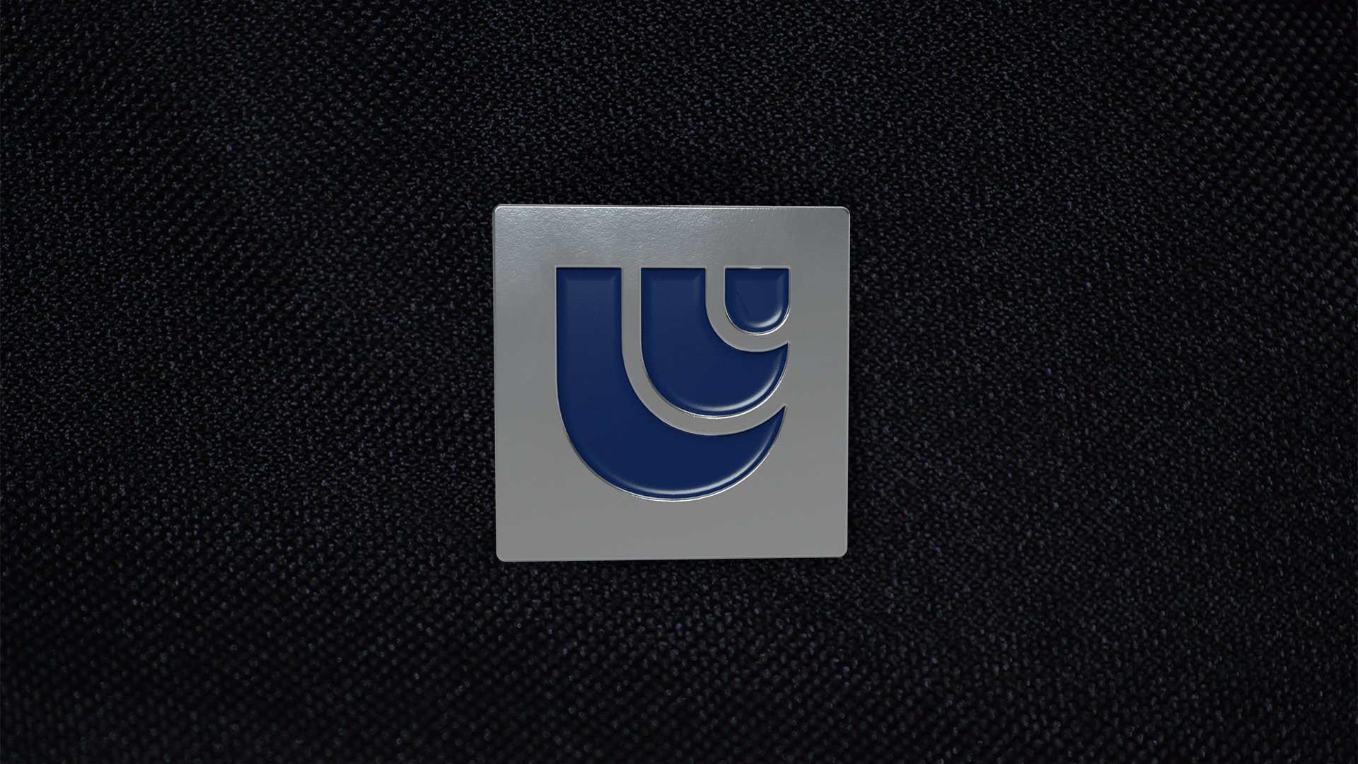
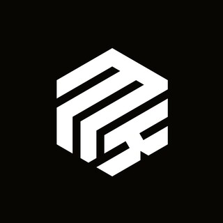
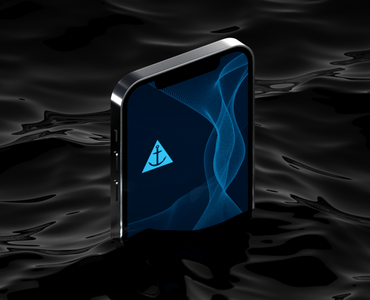
Logo
It was important to ensure that the logo could also work as an emblem. We developed
a symbol that would reflect the brand positioning and clearly illustrate outlook, scalability, and flow. To ensure brand recognition in new markets, we made the symbol particularly memorable and easy to describe in conversation, or even reproduce on paper.
The logo can be used as an inpidual element, such as for an app icon, or alongside font.
Naming
In collaboration with the client, we decided to change the name of UralDomStroy to UDS. This new name had to retain its connection to the original, so consumers wouldn’t treat it as an entirely new brand. Still, it provided a refreshing new identity for the company as it prepared to enter new markets.
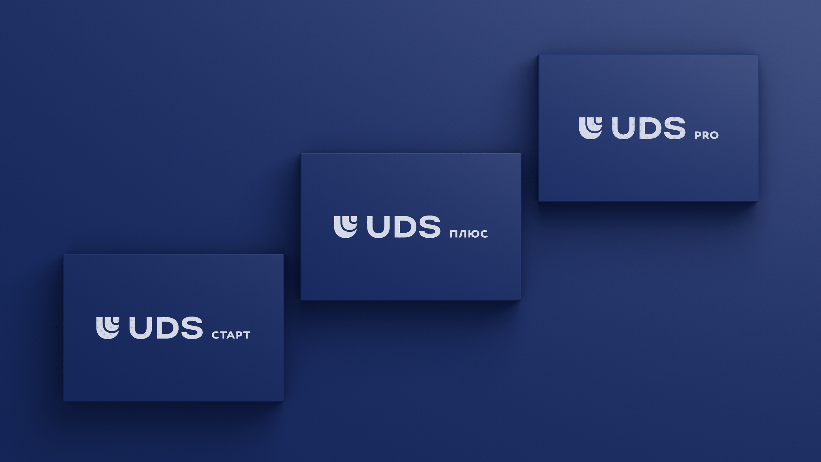
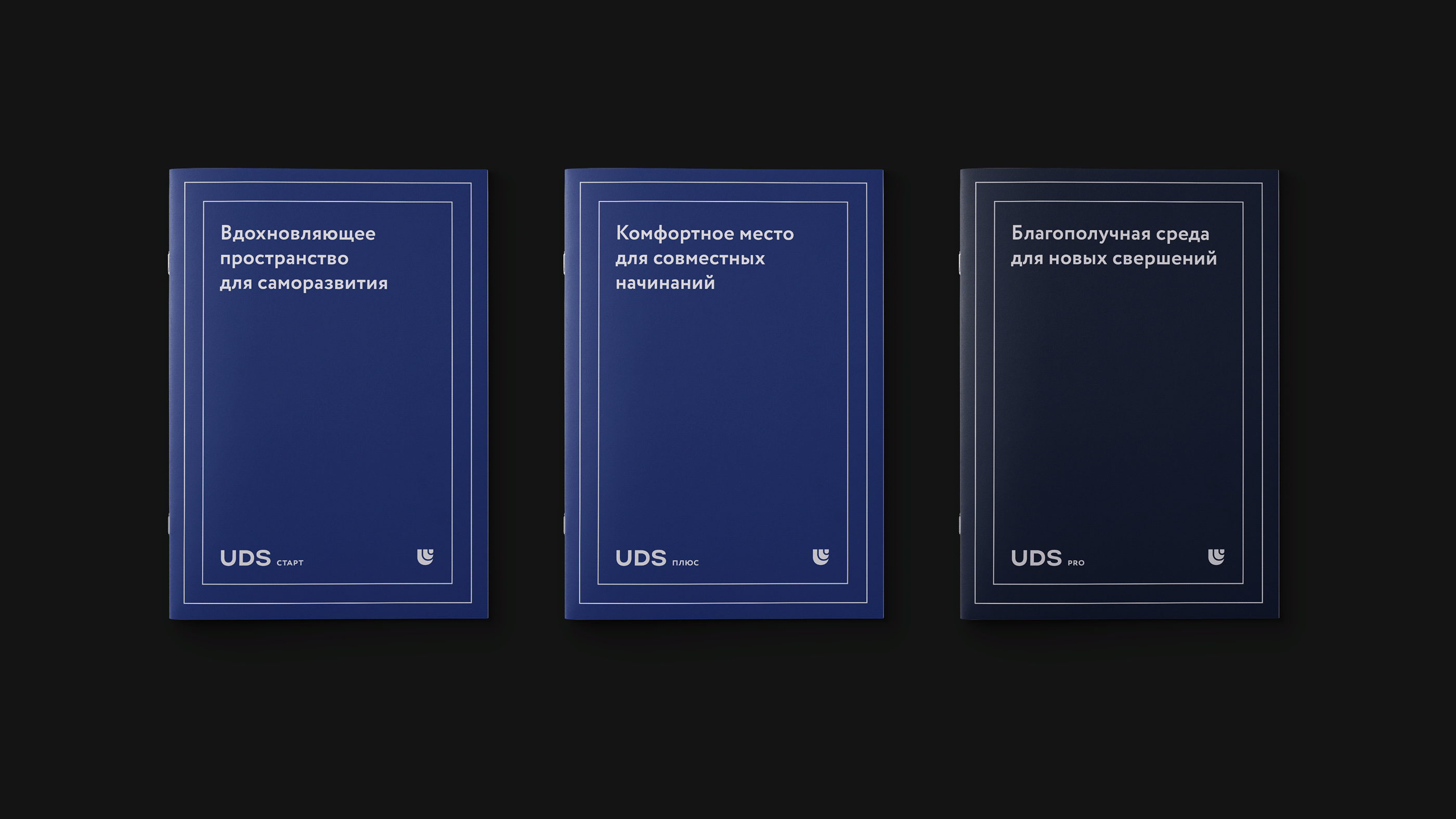
We also defined new, unique segments for UDS. They are similar to the typical “standard”, “comfort”, and “business” segments, but include more than would generally be expected from accommodations at each level. For this, it was important to develop original, yet easily understandable labels that could work either separately or together.
Visual concept
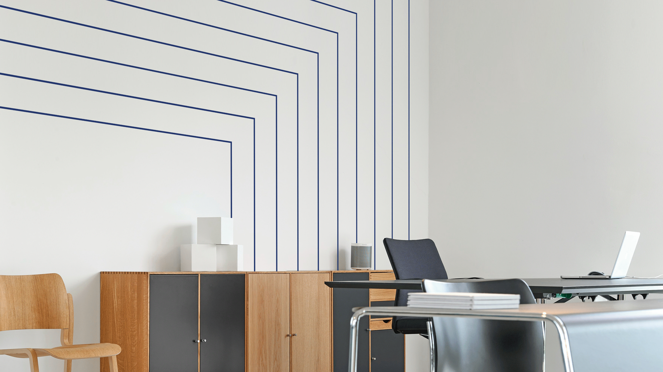
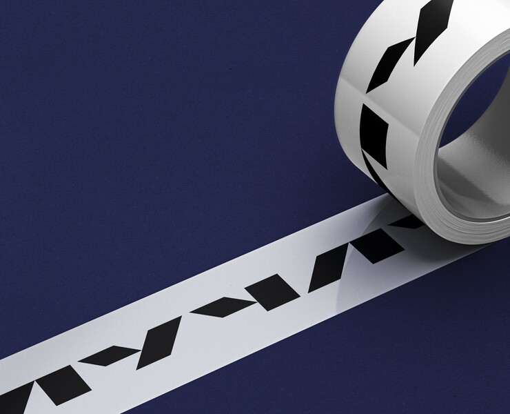
The brand’s visual identity was based on the concept of constant development and advancement. These ideas were implemented using an ambitious grid that linked together every element of the concept. We embedded images conveying perspective, fusion, and movement into the graphics. The grid serves as the key visual identifier of the corporate style.
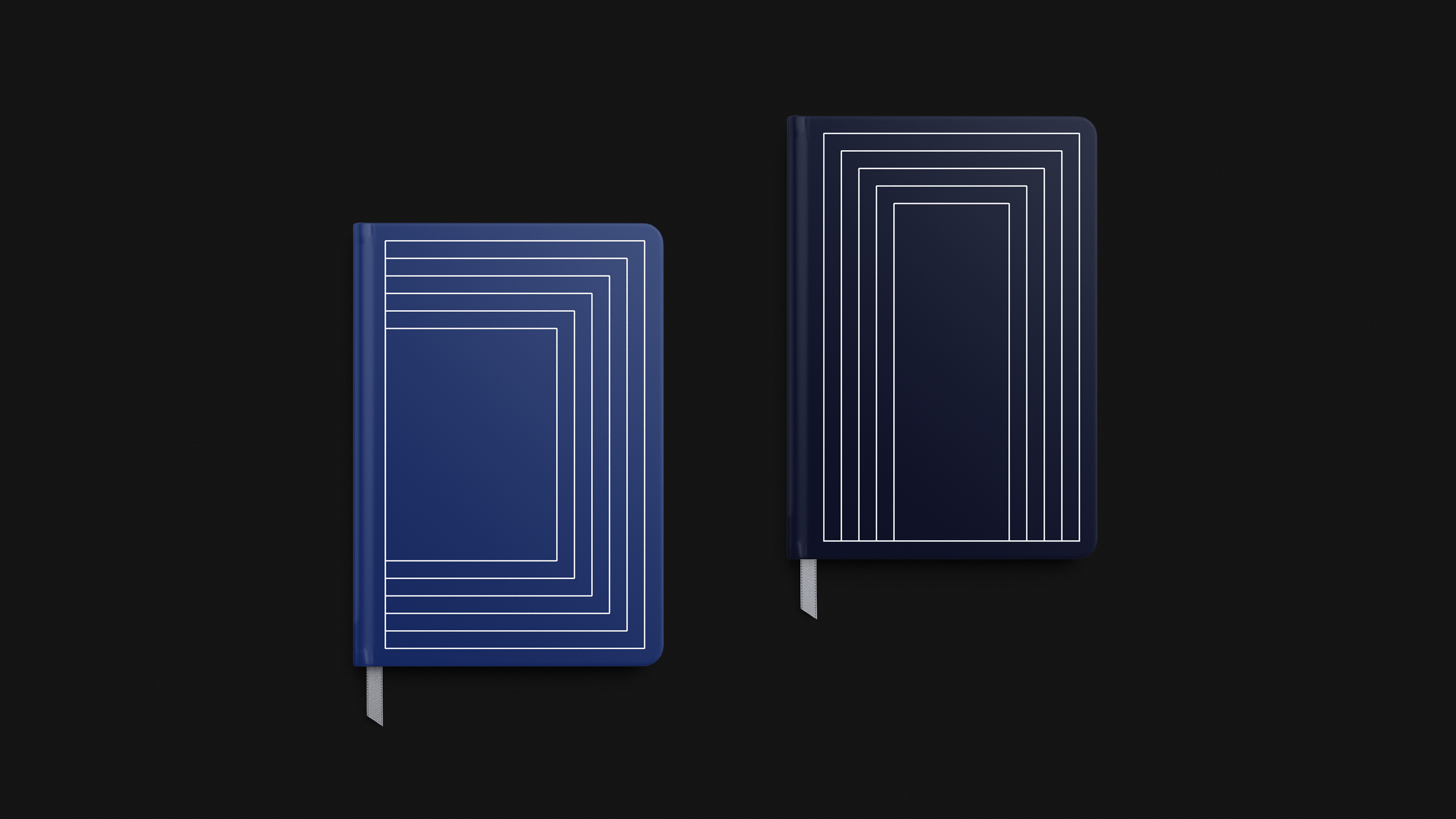
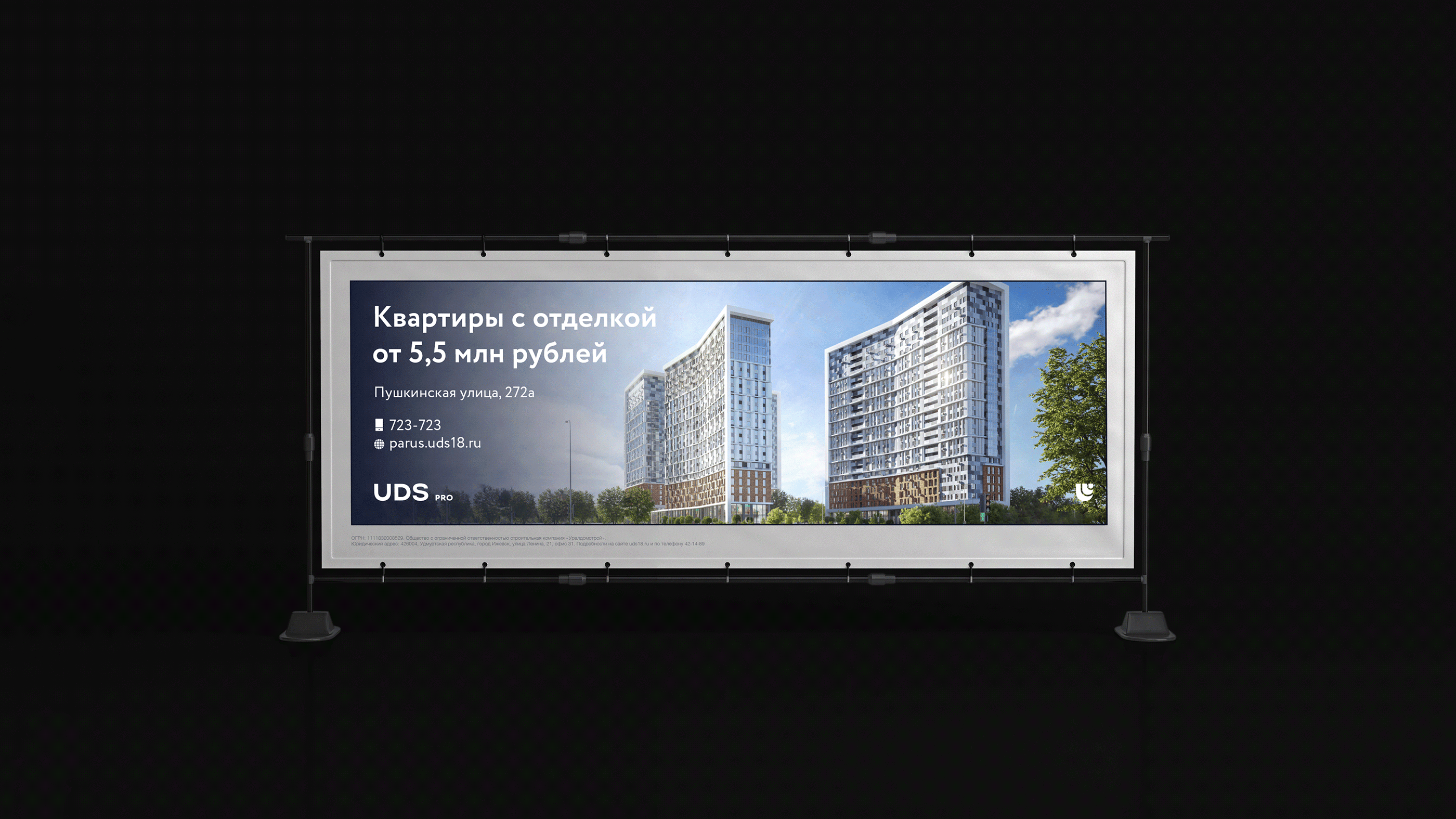
We used color coding to delineate the various levels of accommodation. The “Start” and “Plus” classes are denoted by royal blue. “Pro” is a dark blue.
For the visual identity, it was important to develop tools that would be both easy to use and varied.
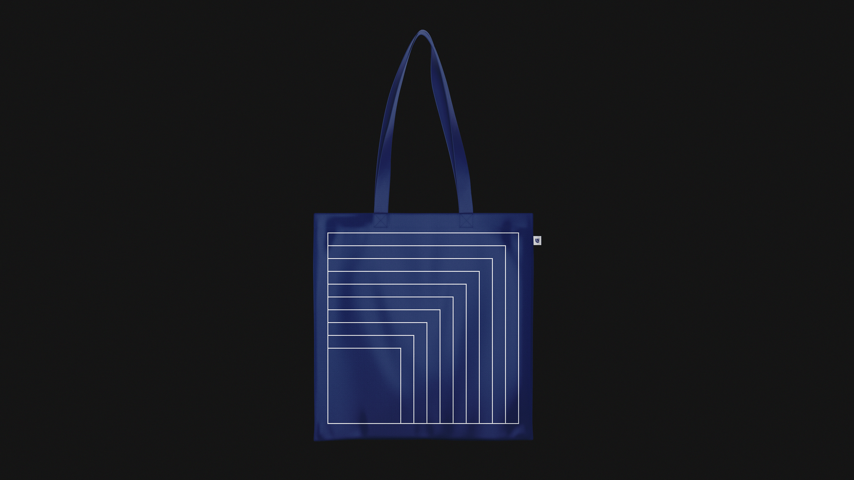
The brand grid can be adapted according to media type and can serve as a functional element of the layout.
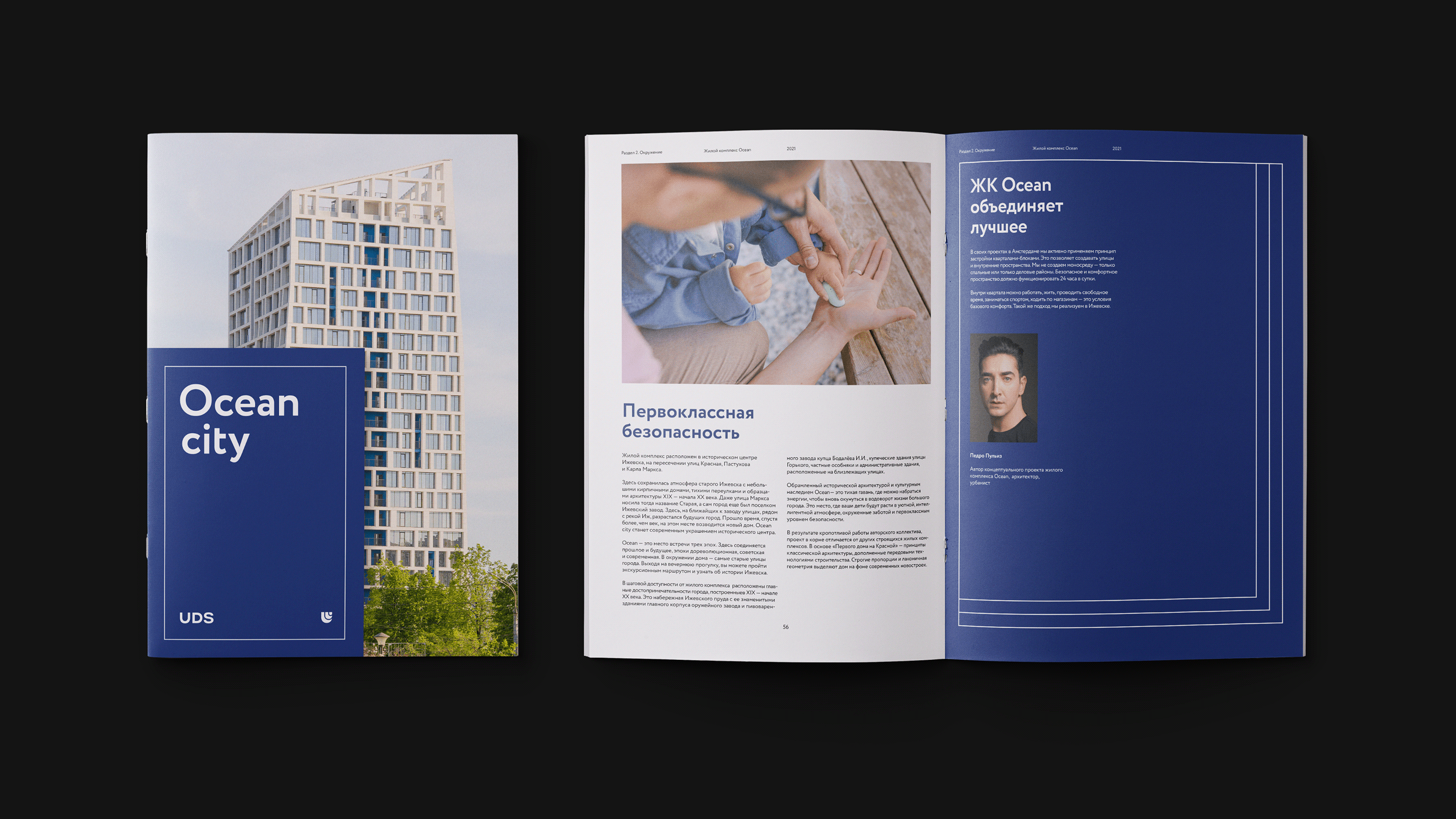
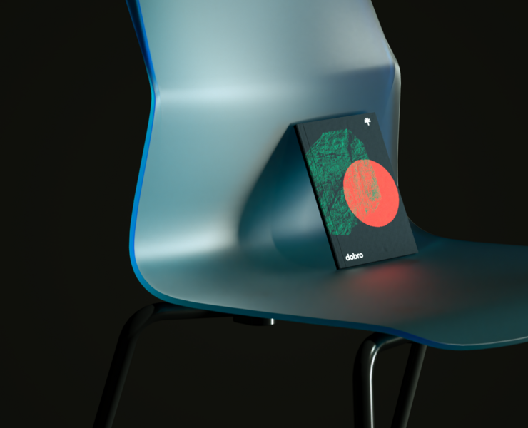
The container for content used in printed materials and social media is also a key brand identifier.
In addition, UDS office interiors are decorated with the brand graphics we developed.
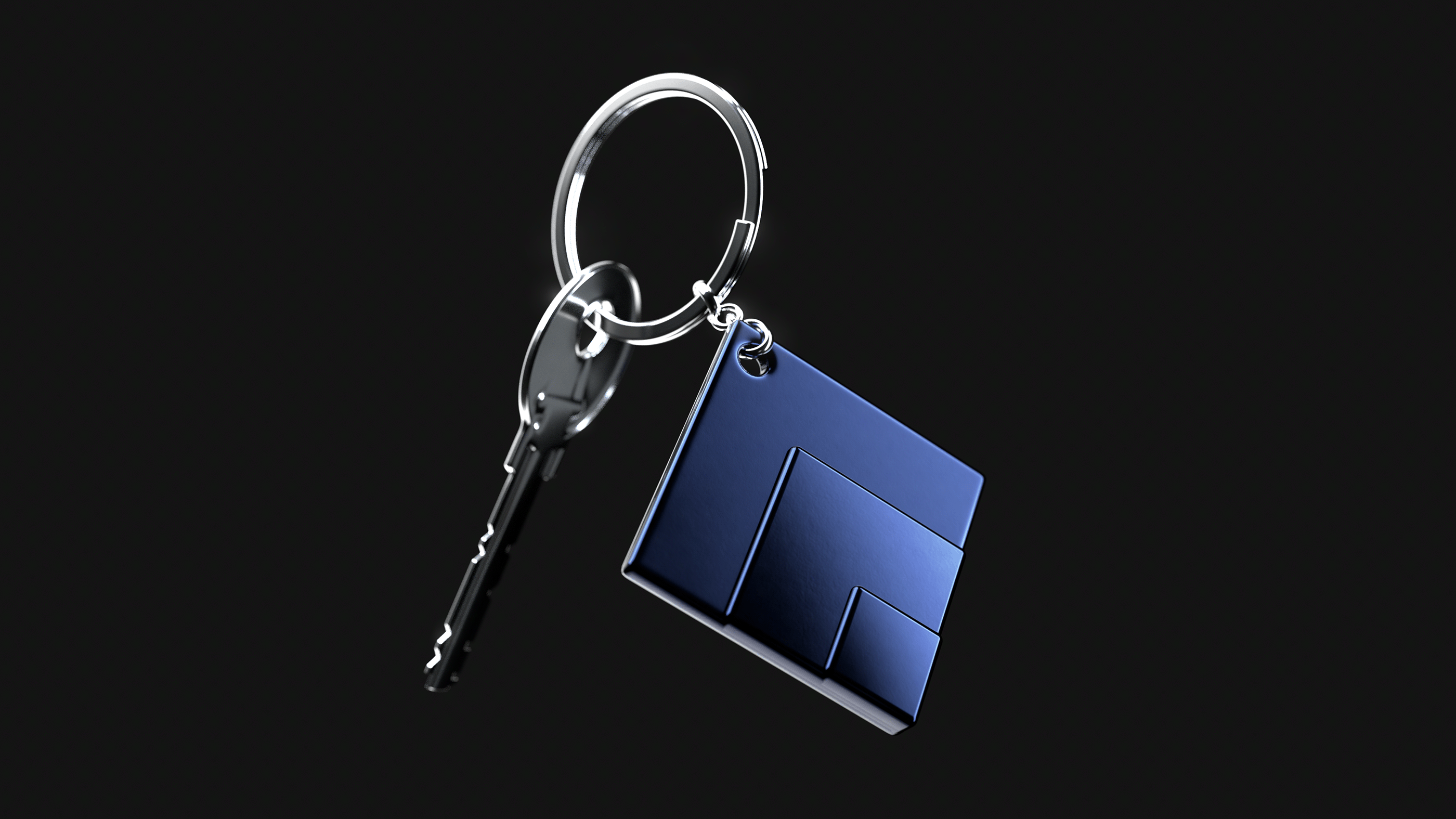
The key identifier can be reproduced on flat surfaces or 3-D objects.
Brandbook
We created an extensive manual to facilitate work with the new corporate style. This manual describes the technical guidelines for using the identifier, tone of voice, and brand positioning.
UDS has offices in three cities, and each building has its own brand. That’s why it was important to create a detailed manual that the entire team could use, including in relation to strategy, brand management, and content marketing.
We worked with the client to implement a project that systematized the brand’s image and identity. This enabled the company to introduce its new positioning and visual style. Now, UDS resembles the projects it implements: confident, respectable, and contemporary.
Project Participants
Art Director: Pavel Konyukov
Designers: Maria Troitskaya, Andrey Dorokhov
Producer: Julia Kulikova
Strategist: Olga Yakushenko