Branding for furniture manufacturer Dobro
Dobro is a newly established producer of comfortable, designer furniture for the modern office. The brand was created by harnessing the technological expertise of DiKom, which has been producing functional metal furniture since 1992. The inspiration behind the creation of the brand came from the brothers Andrey and Vladimir Dorokhin.
Dobro transcends functionality and strives for an approach that brings together art
and craftsmanship, feelings and knowledge, humans and their environment.
We were tasked with developing the brand’s visual concept from scratch to reflect the company’s philosophy.
Brand concept
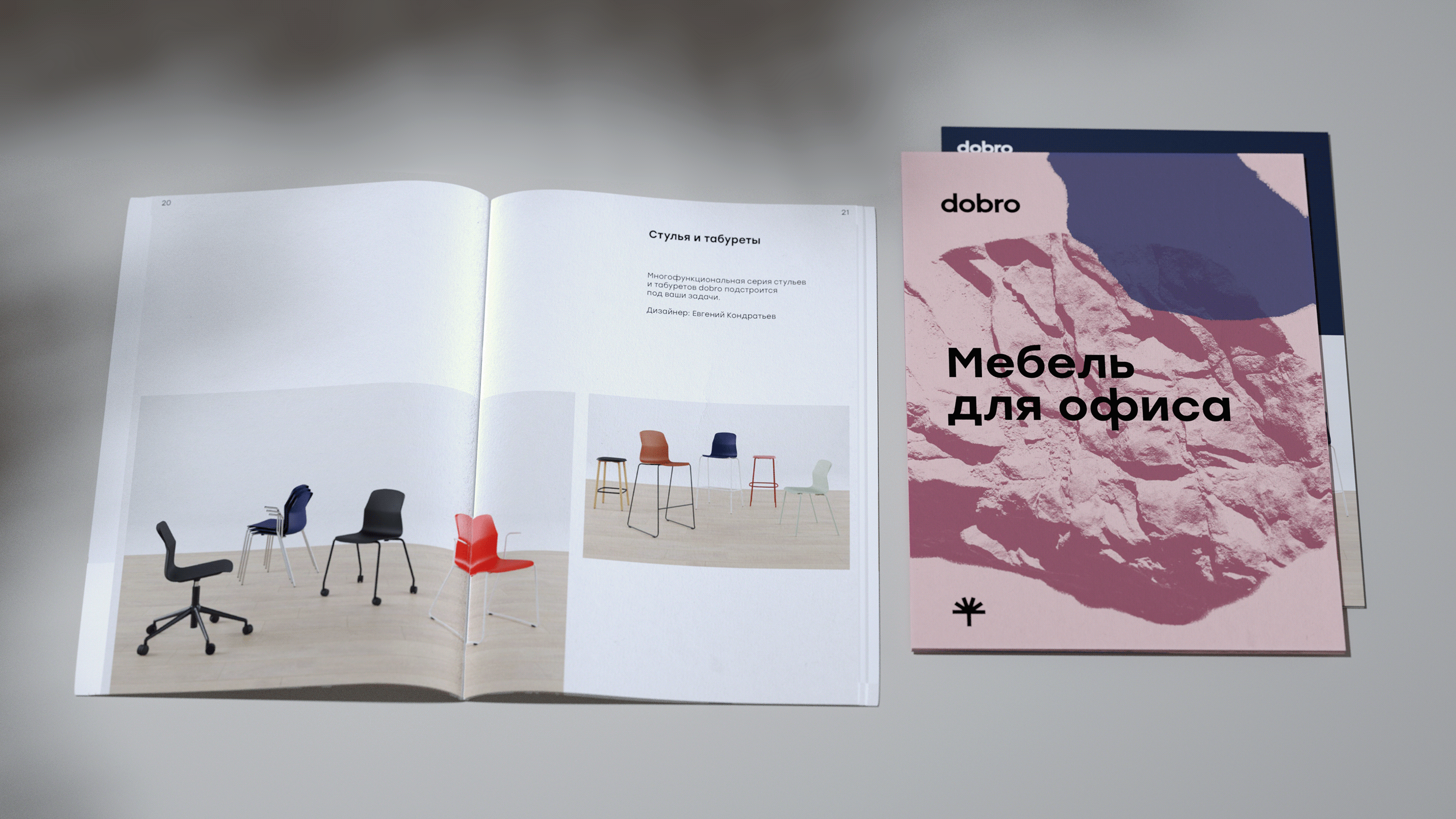
Dobro produces high-quality modular office and home furniture. The brand is founded on the principle of a basic format to which functional, aesthetic, and emotional characteristics can be added.
Every product has a basic configuration that can be customized with additional accessories and materials to create an entirely unique piece of furniture.
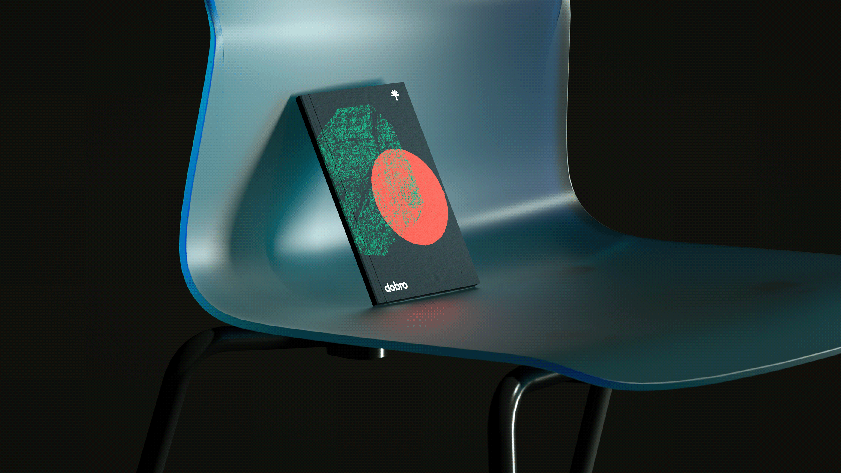
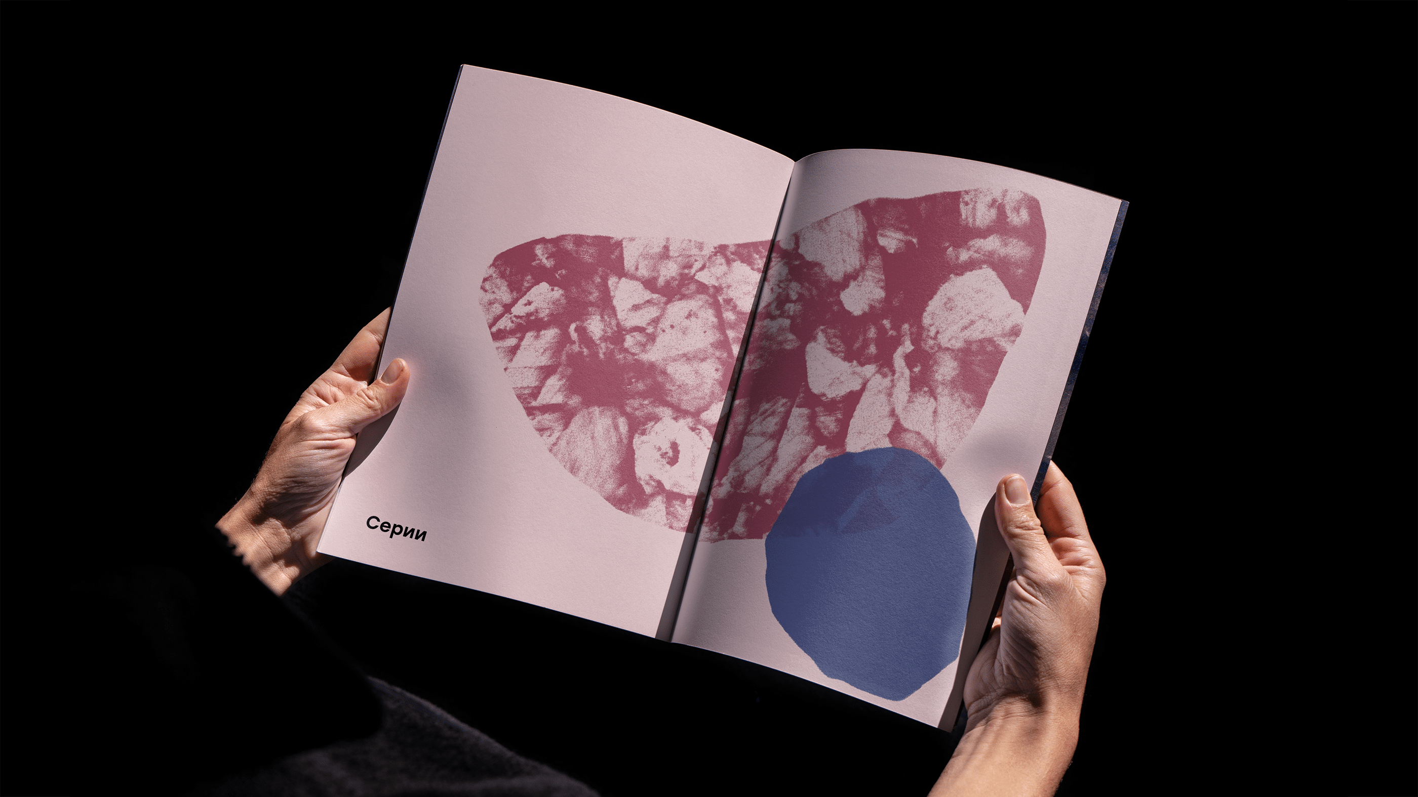
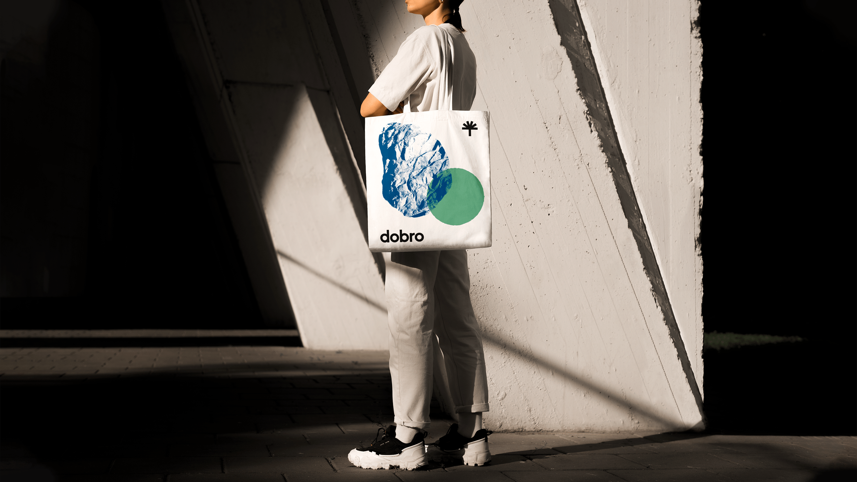
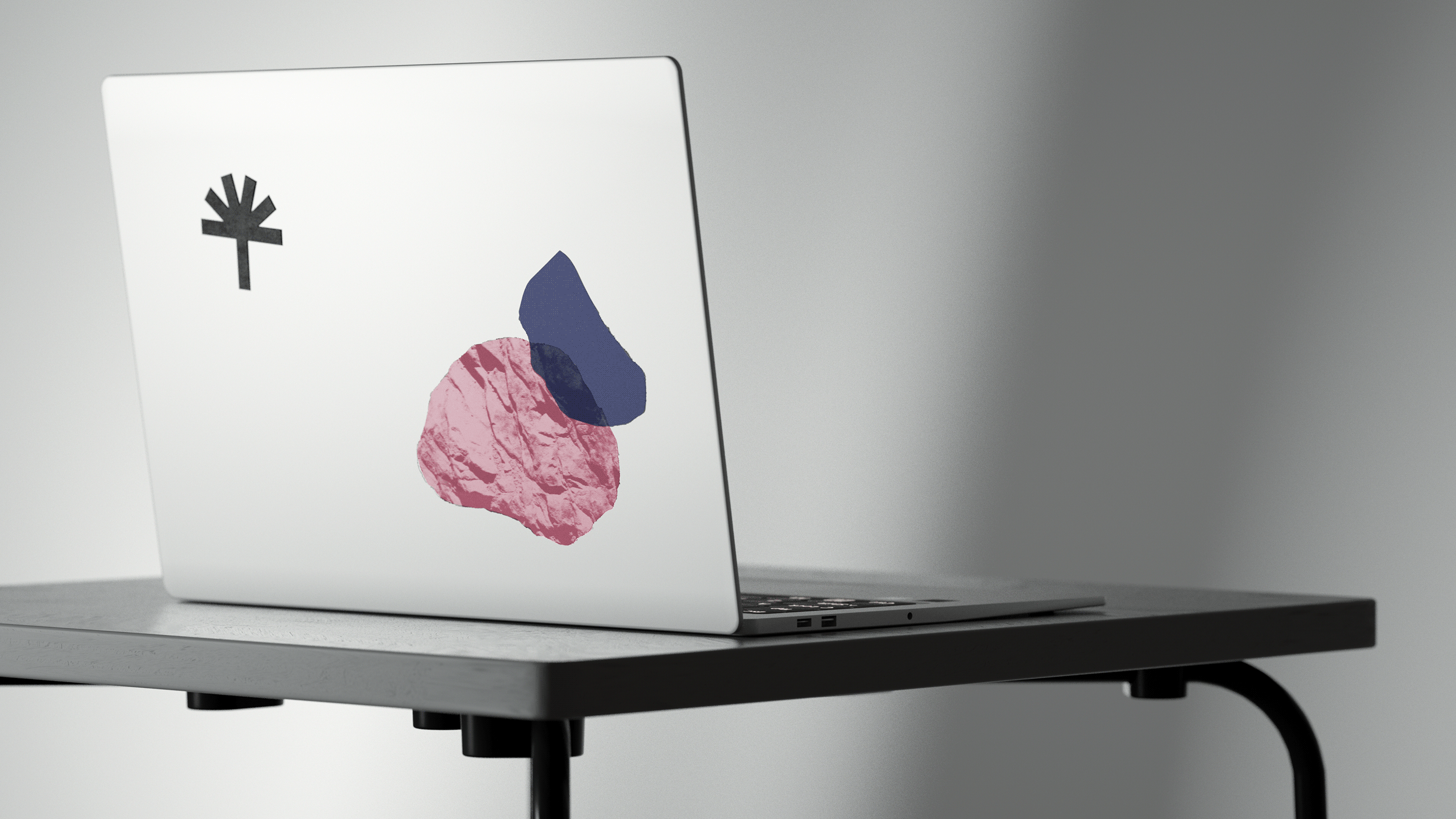
For the trademark, we wanted to reflect the company’s persity of sentiments, emotions, collections, materials, and accessories, as well as their various combinations. The image of an umbrella represents the departure from a generic, basic format in favor of variety.
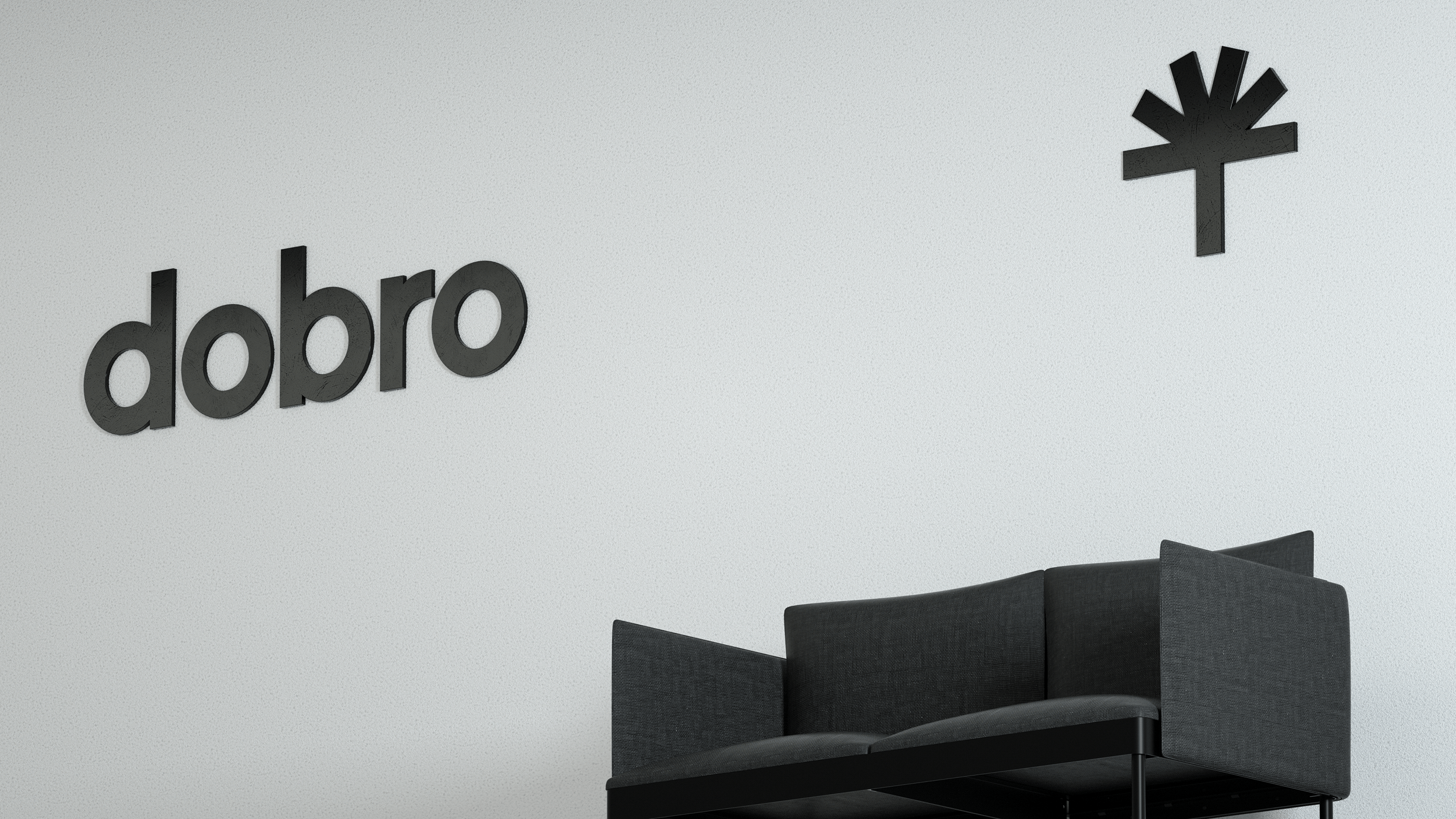
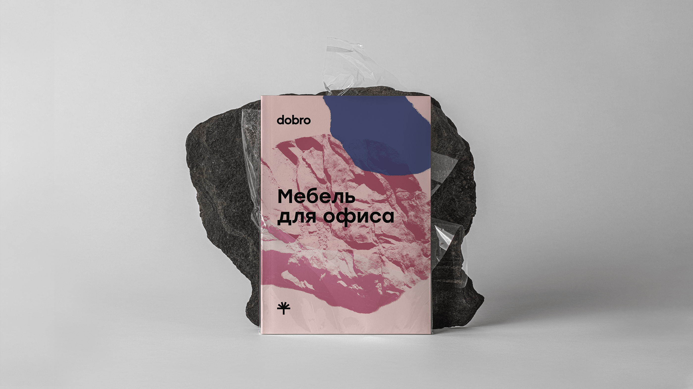
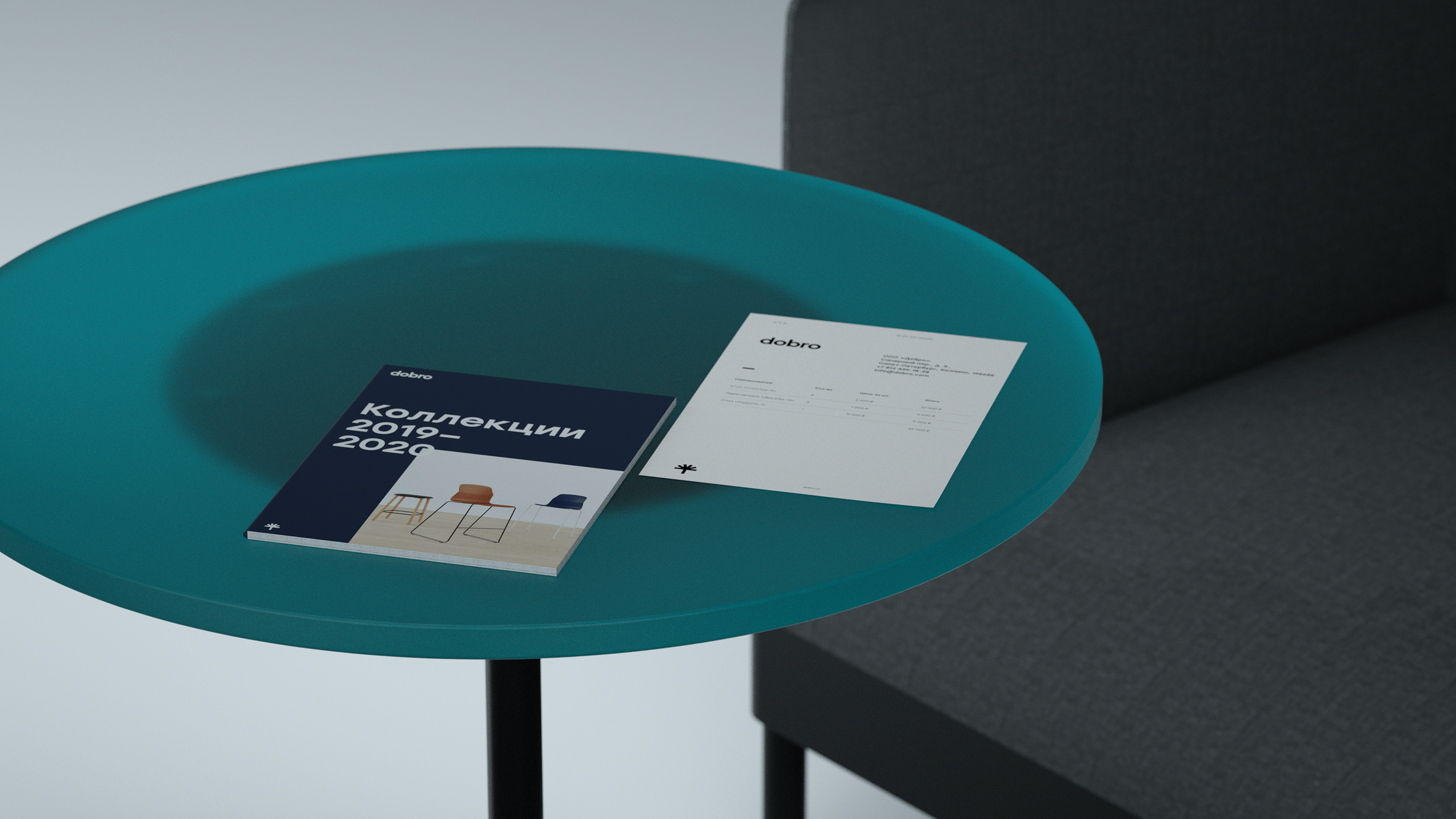
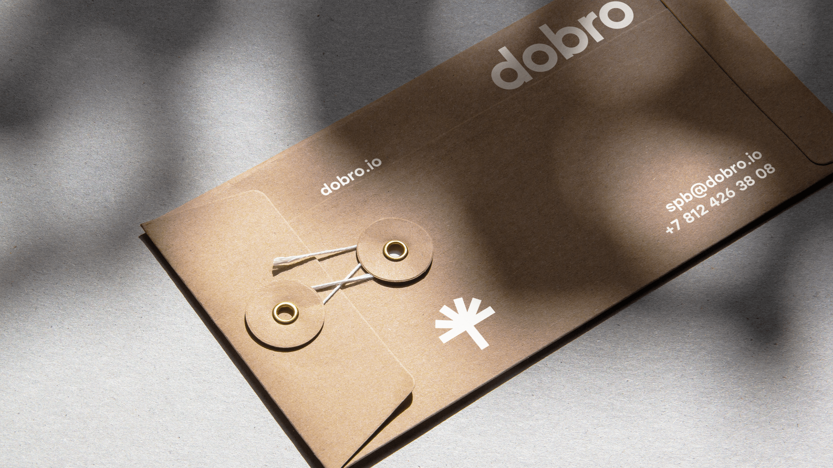
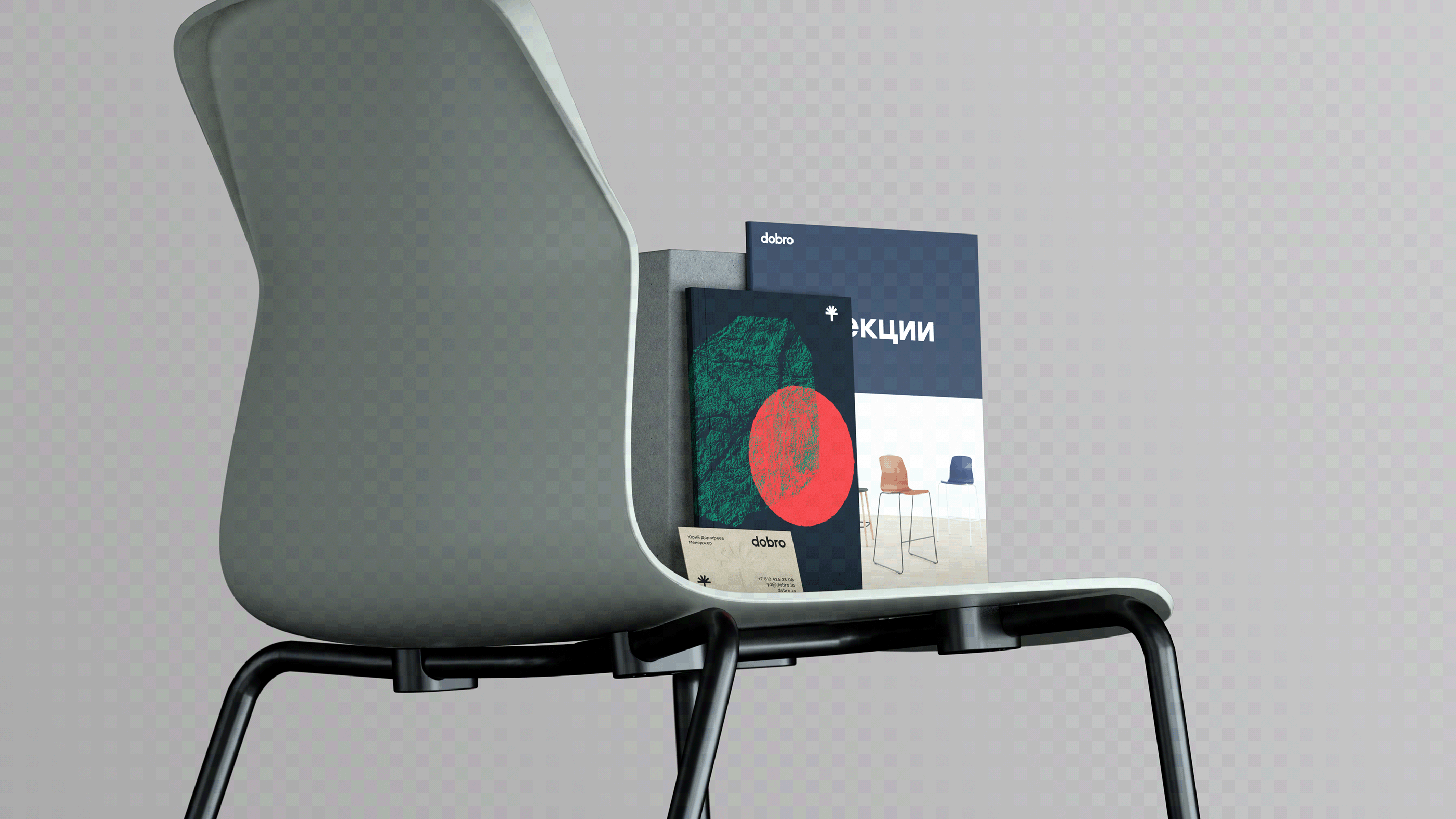
Logo
The simple and concise logo echoes the trademark. The letters are based on the geometric modules that are featured in the construction of the furniture itself.
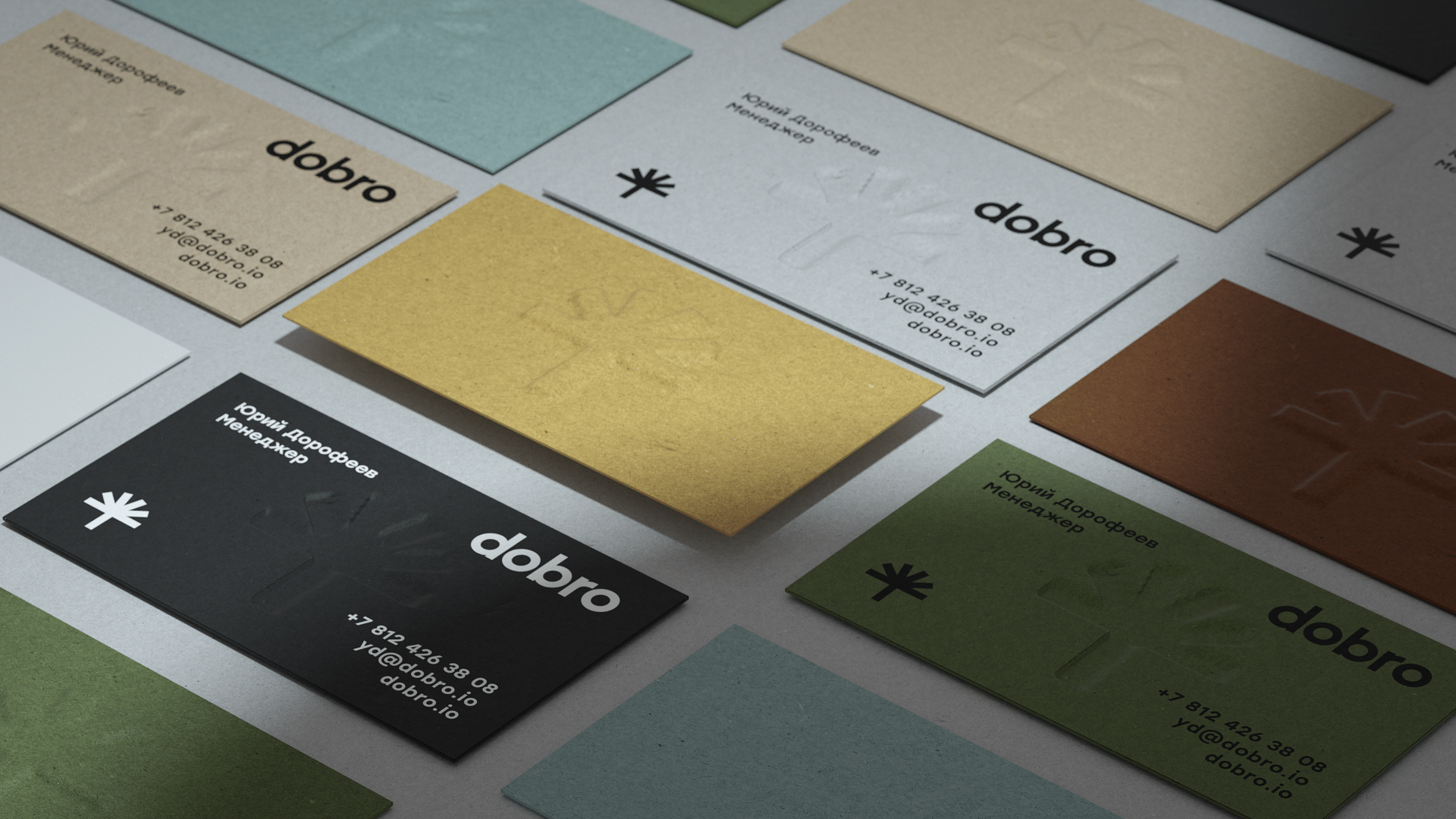
The trademark, logo, and font are constants in the brand’s signature image. They are neutrally depicted in black and white. Abstract graphics are used to bring added meaning to the visuals.
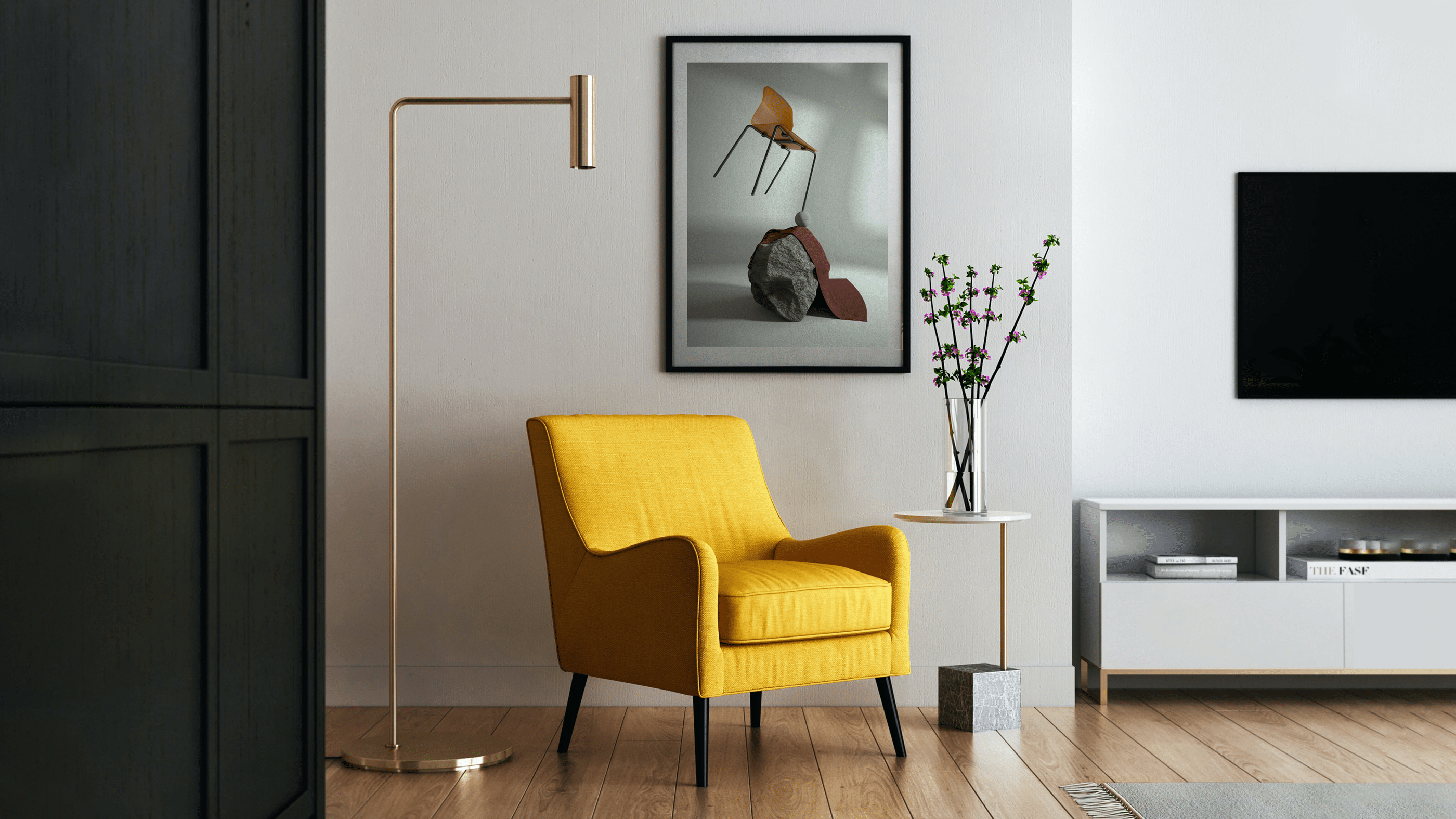
Shapes merge and interact to form various designs, highlighting the persity of the brand. The textures of natural materials emphasize the company’s eco-friendly approach to production and create the sensation of being close to nature.
Colors interact with each other through the use of transparency and overlapping. This use of color was inspired by Josef Albers, another influential designer in the Bauhaus movement.
Matte card stock is used for printed items. This is pleasant to touch, just like the material used in Dobro furniture. Embossing, letter print, and lacquering are used to add expressiveness and distinction.
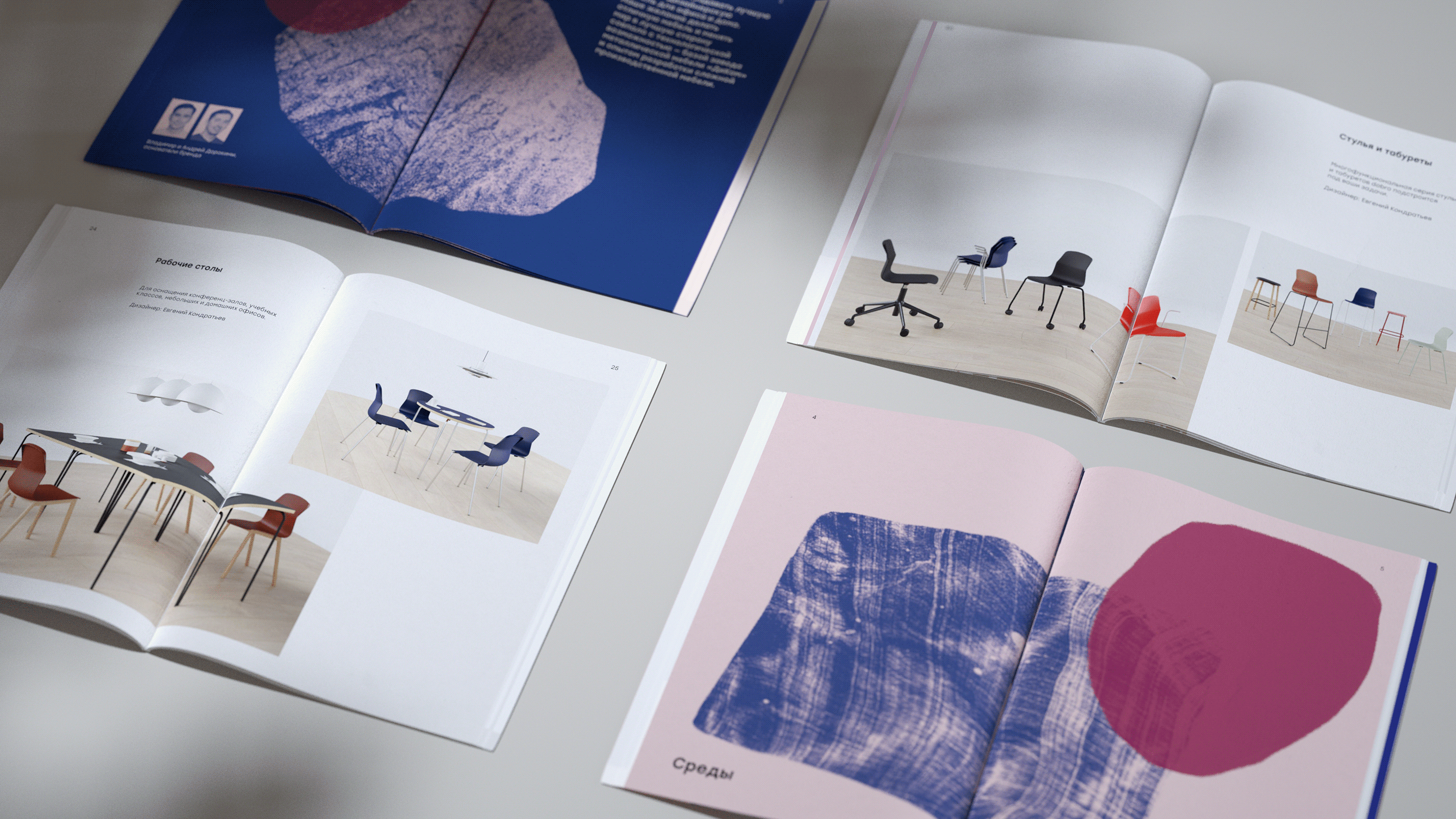
Image illustrations can be used to decorate various materials.
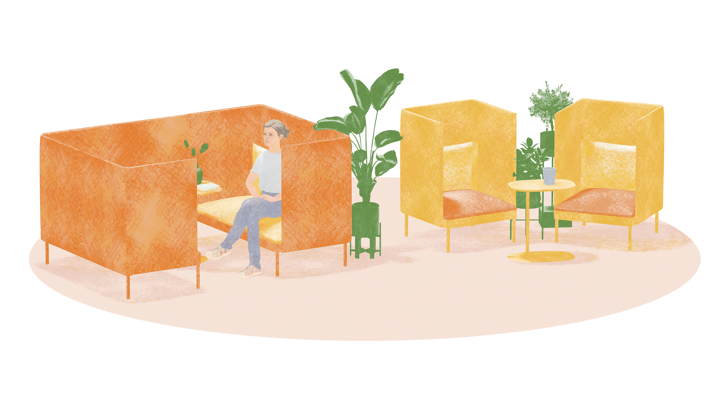
Abstract shapes and textures are employed heavily throughout the visual media, both in the photorealistic visuals portraying furniture models and in the design of real spaces.
The workspace illustrations show how Dobro furniture can be used to design spaces of any shape and size. This is a continuation of the texture theme that is embedded in the image graphics.
Project Participants
Art Director — Pavel Konyukov
Producers — Marina Girich, Ekaterina Ivanova
Designers — Anastasia Bazylnikova, Kirill Zharkoy, Ekaterina Burtseva
Case Designers — Artem Nikitin, Ekaterina Burtseva