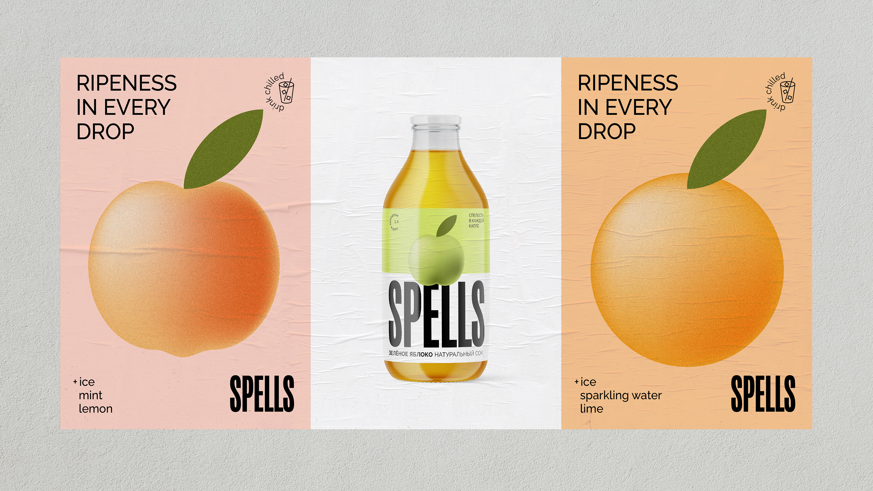
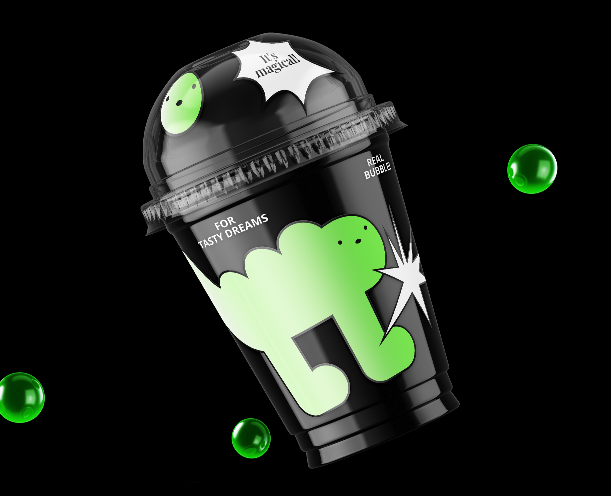
Spells
Client
OOO "Leader"
Services
Naming
Package design
Task
The Leader company has launched a private label of carbonated drinks on the market. We had to develop a name and a packaging design capable of differentiating the brand from its competitors in the North Caucasian Federal District while taking into account the possible expansion of the product portfolio.
The product
Iced tea drinks and juices became the first foodstuffs in the launch of Leader’s private label. These drinks are made from natural and juicy fruits, picked at the peak of their ripeness, having absorbed all the warmth and vitamins of the summer sun. The mild and warm climate and nature of this southern Russian region rendered the unique texture and unusual taste of these drinks, which make the brand stand out among other well-known brands.
Naming
It creates an emphasis on the brightness of taste, develops associations with the category and corresponds to 30 and 32 classes of the International Classification of Goods and Services.
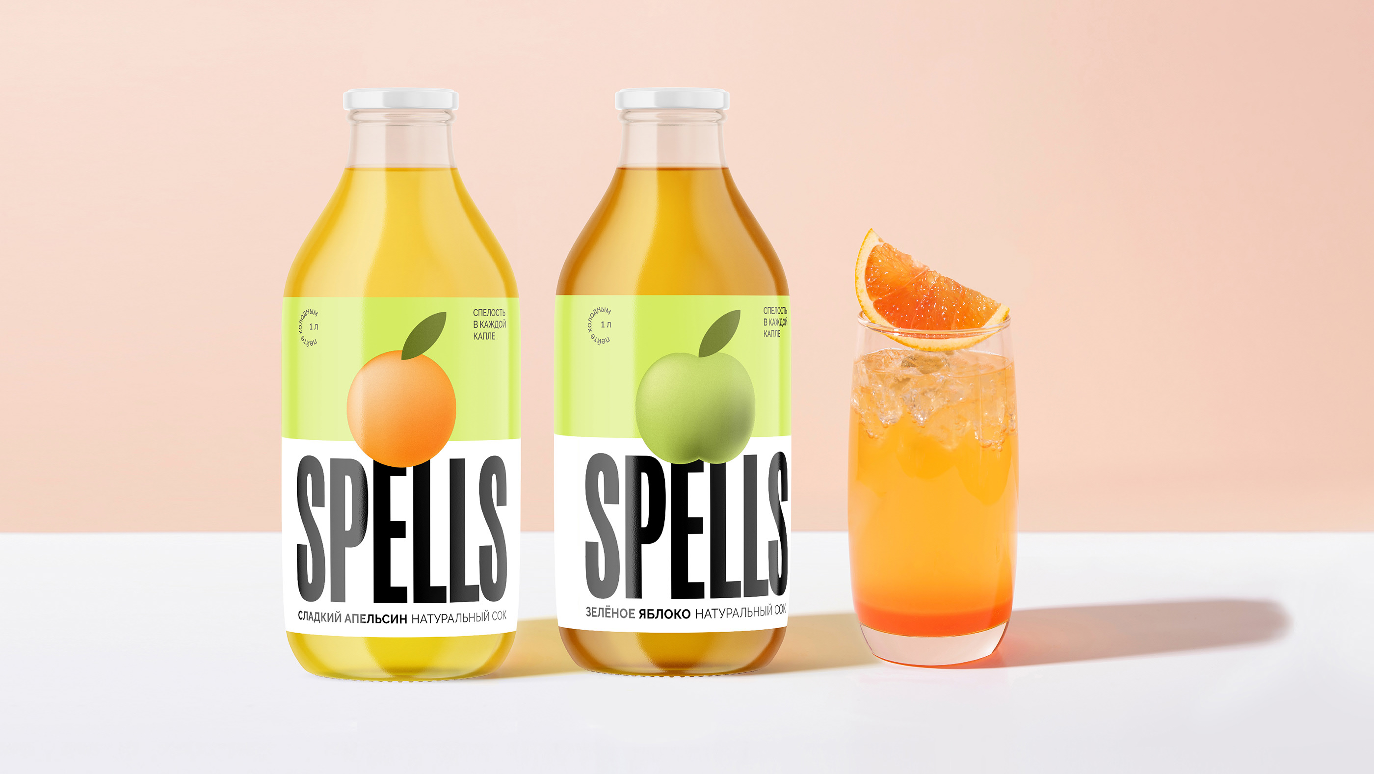
In the brand name, it was important for us to convey the taste and juiciness of the product, which is what makes it truly unique. SPELLS resembles the root of the Russian word "ripe" (“spelyy” in Russian), and in English it means “charms” or “magical aura”. SPELLS bewitches, charms, falls in love. It is a delight that is impossible to resist.
Imagine taking a sip of a cool drink and feeling all the expressiveness, energy, brightness of southern fruits and berries. This is SPELLS – every drop of which reminds us of ripeness, takes us into the atmosphere of a summer day.
Design idea
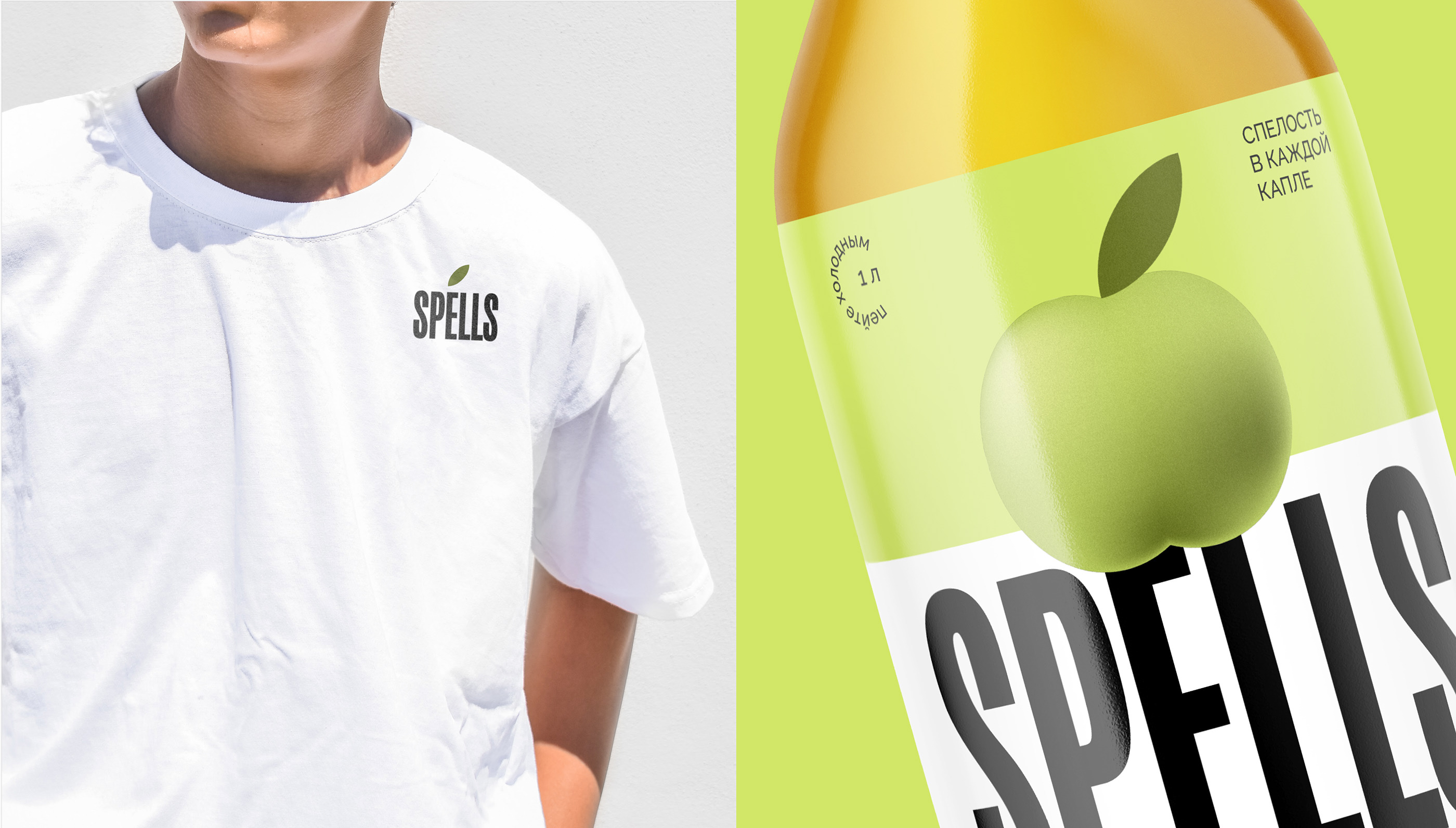
Ripeness in every drop
The design solution had to compete with big brands and at the same time attract the attention of the local audience.
SPELLS are juicy fruits harvested at the peak of ripeness. As they grow under the southern sun, these fruits are full of warmth, brightness and colourfulness. The features of these crops were embodied with the corporate name in a design that evokes the savour of every drop of SPELLS drinks.
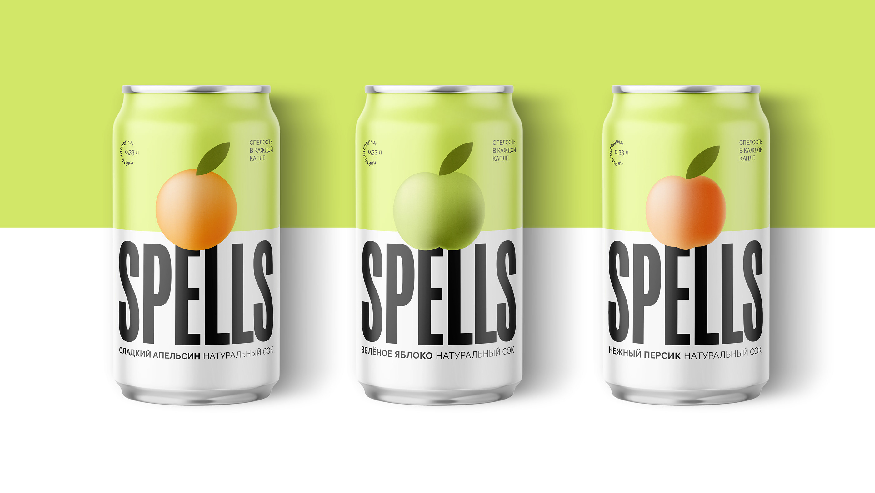
Design
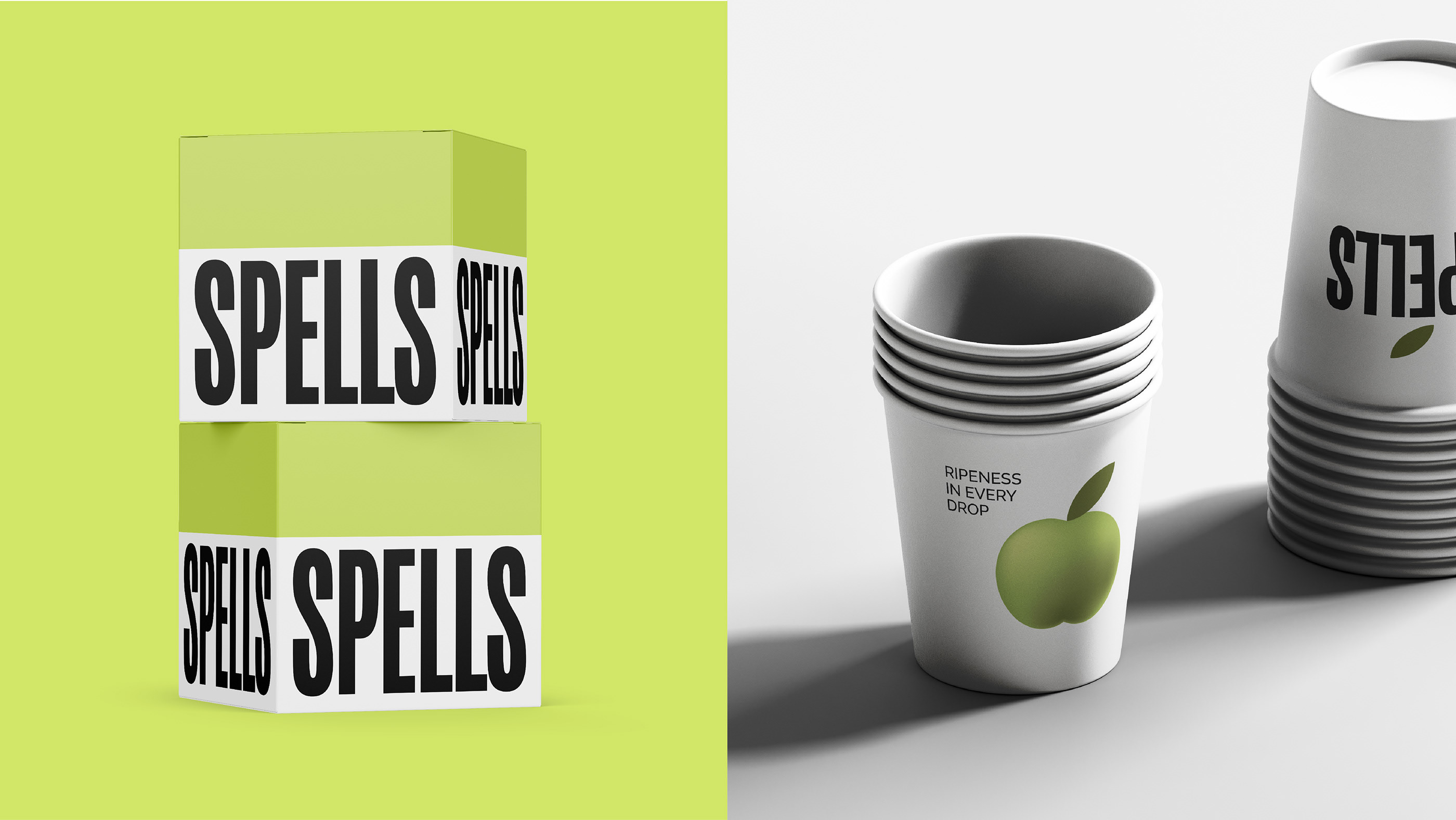
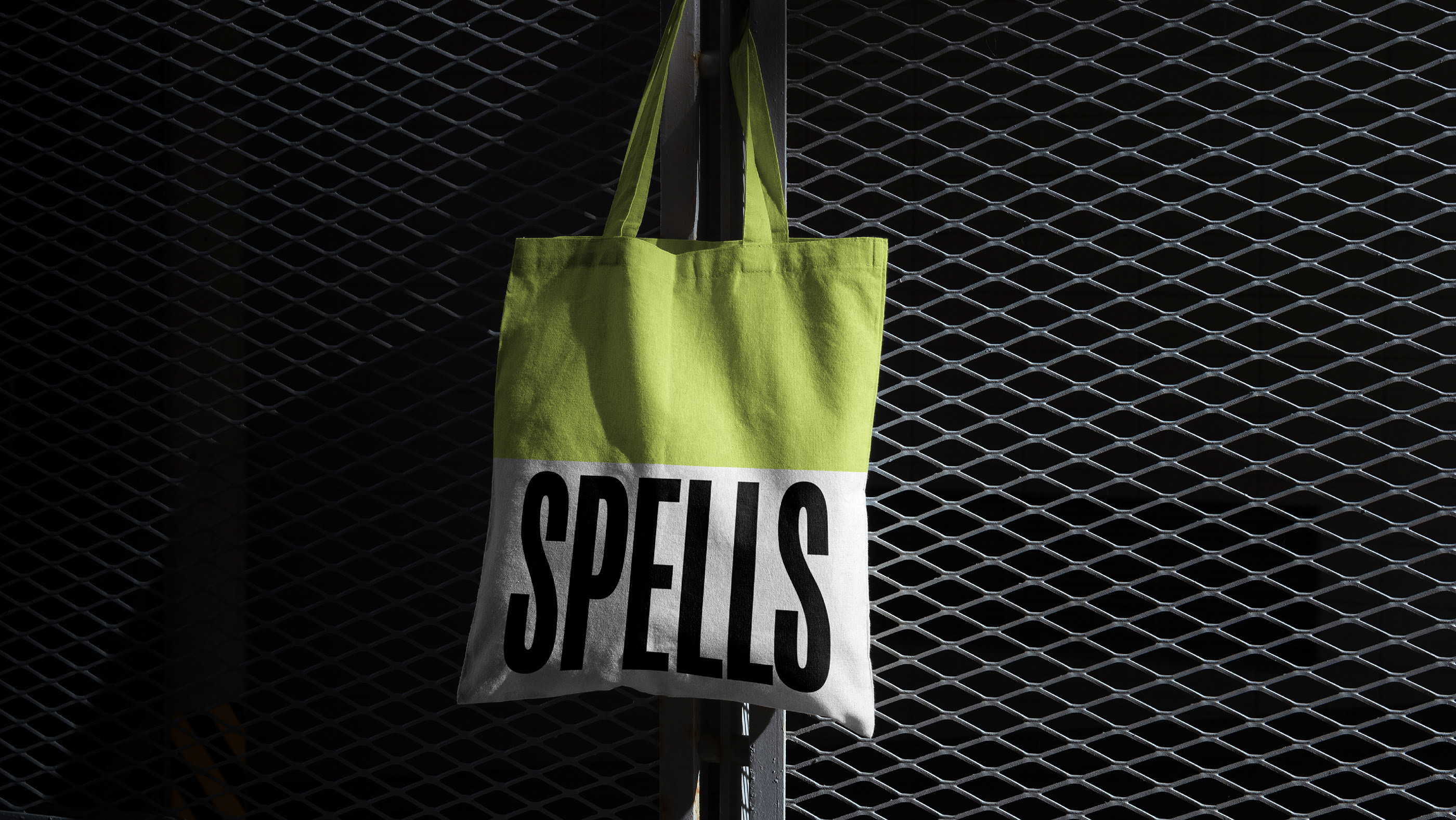
In the centre of the composition there is a large logo that occupies 60% of the label. This non-standard location at the bottom of the package attracts the attention of the consumer at the shelf and helps to remember the new name. The elongated typeface looks energetic and dynamic, emphasising the modern character of the brand.
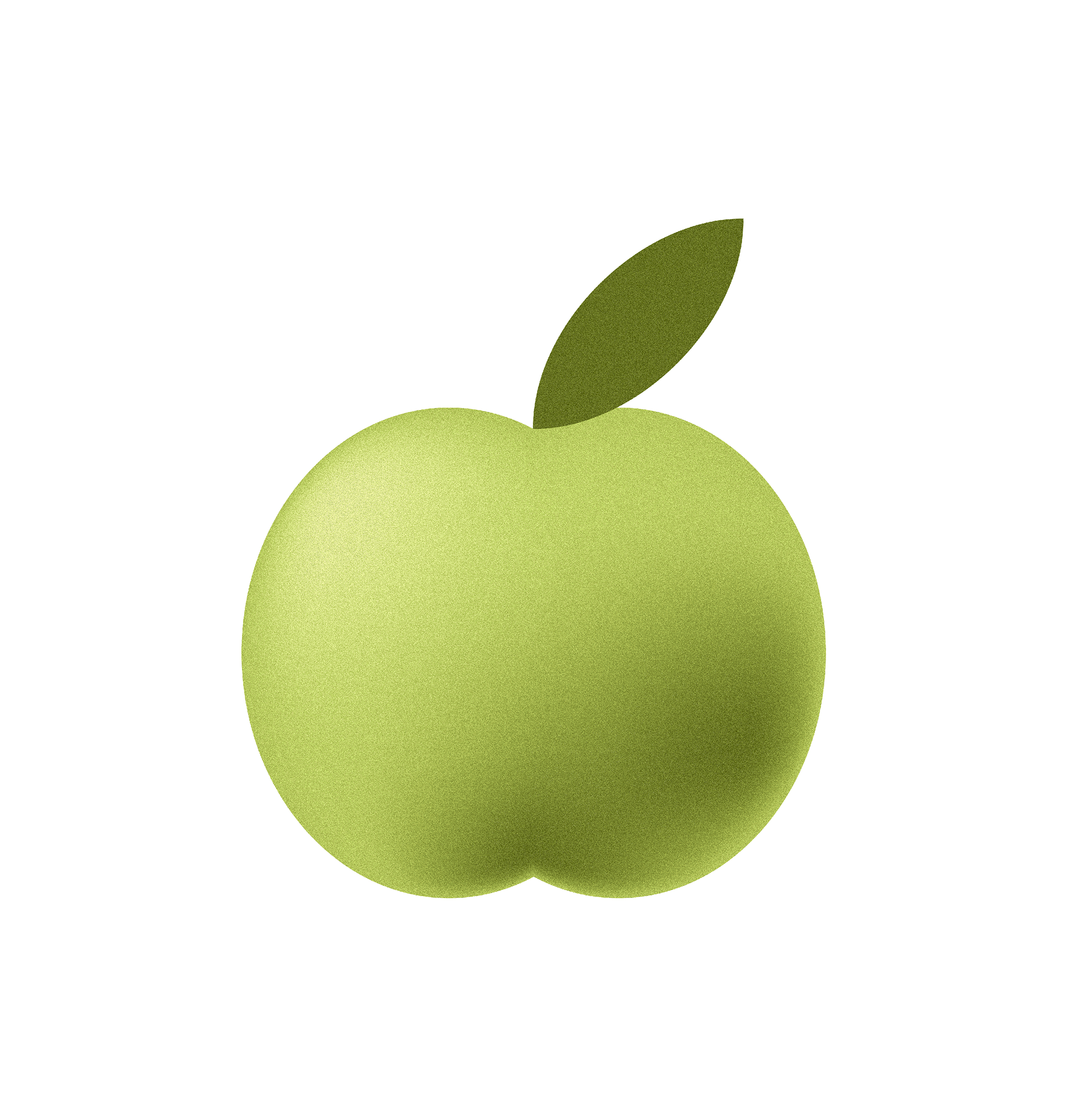
It was important for us to focus on fruits - beautiful, associated with warmth and sun. They are embodied by volumetric illustrations with an active gradient, which turned out to be fresh, as if plucked from a branch. This approach helps to rebuild the brand from the replicated decisions with photos in the food zone.
The contrasting white colour in the food zone echoes the main elements of the composition and highlights the product name. Additional colours support the tone of the main ingredient and thus form associative links for a more understandable SKU differentiation for the consumer.
For SPELLS, we have developed a design system that will allow us to easily adapt it to different designs as well as easily introduce new items into the product line.
The results
Emphasise in the design of the main USP – ripeness and juiciness the fruits and drinks. Developed a flexible design system for the further development of the brand’s products. Made the brand stood out among competitors due to a large brand zone and its unusual location.