Client & Task
OMK IT is the information technology division of OMK, one of Russia's largest metal producers.
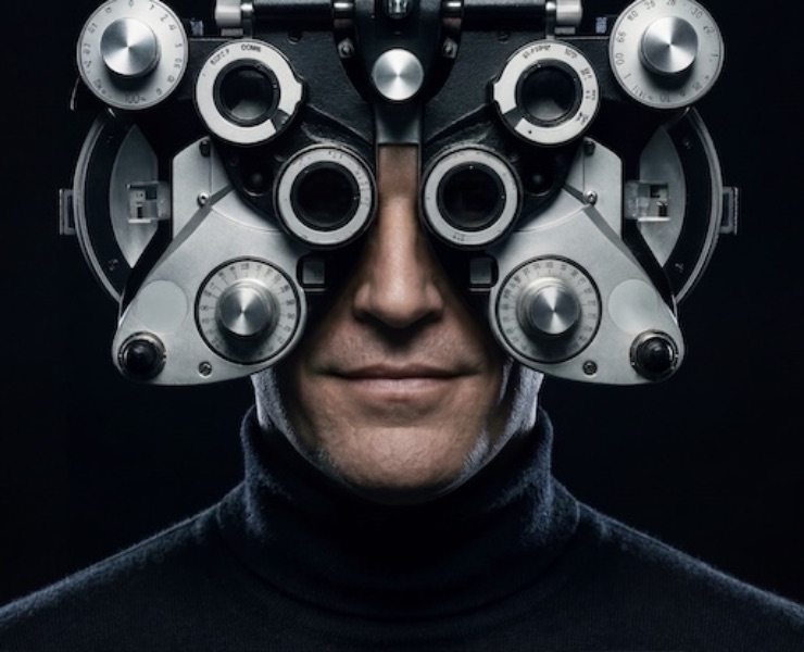
The new division's goals included quickly finding quality IT specialists. But this audience's profile differed significantly from the main pool of candidates at a metallurgical plant, so the division needed its own relevant HR brand.
Nimax's creative team formulated an employer value proposition (EVP) and developed a visual identity system based on it. Here's how it went.
The Solution
At the strategic stage, we developed the HR brand platform and EVP, and formulated the key message: "A team of professionals developing IT in industry together."
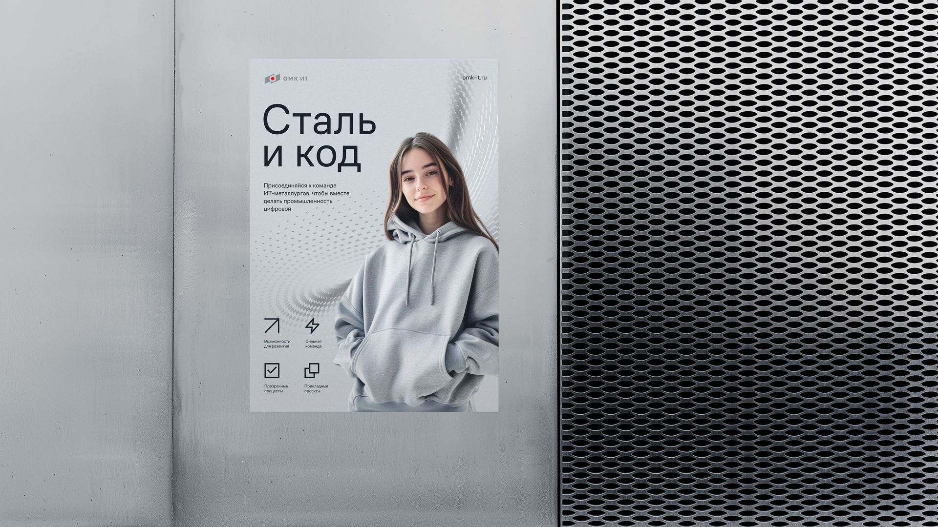
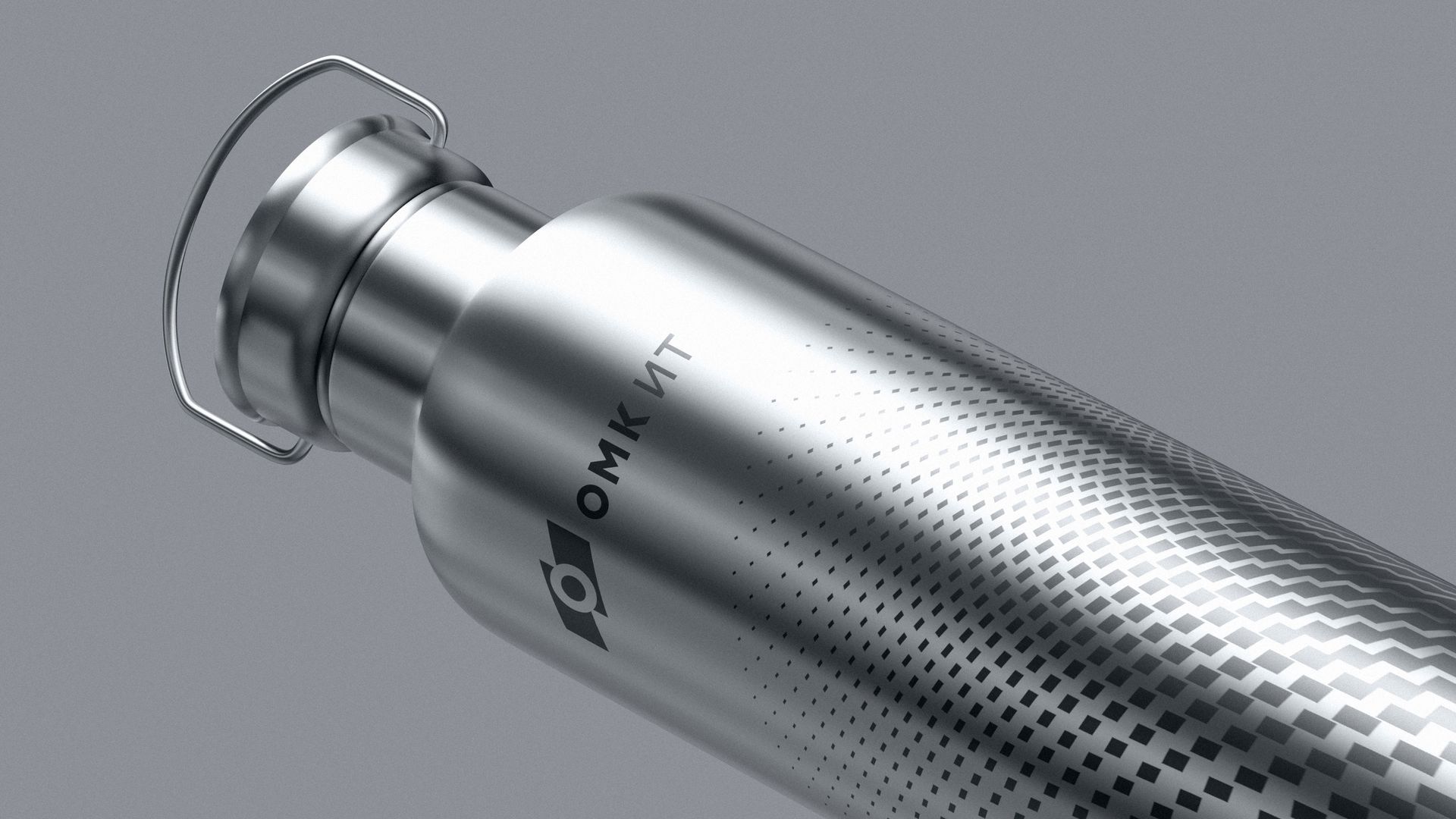
Based on the message, we came up with the tagline: "Steel and code. Together we make industry digital." The visual metaphor is built on the idea of digital metal, which supports the tagline. The elementary particles in the brand graphics reference particles of information, code, and the members of the OMK IT team, while the plastic surface formed from these particles symbolizes a sheet of metal, referencing the company's field of activity.
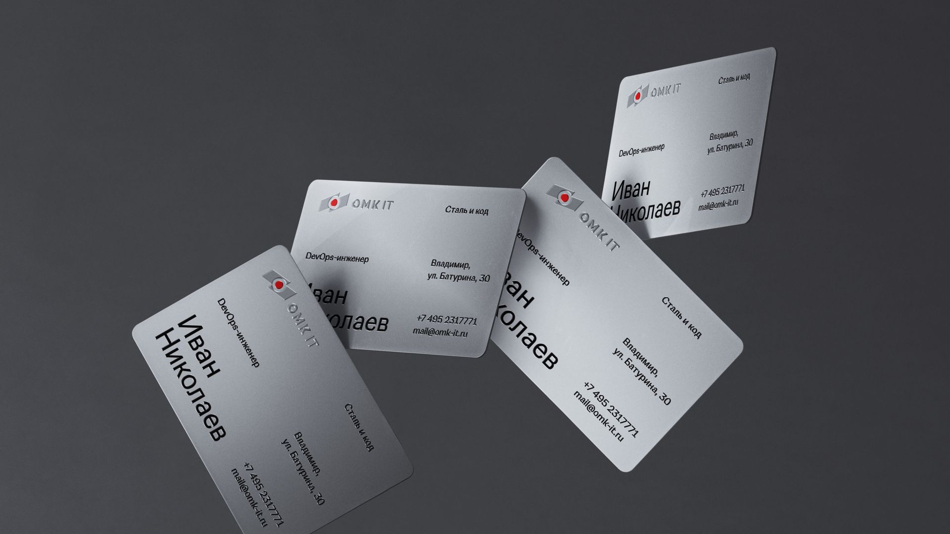
The logo and color scheme reference the parent OMK brand, but we significantly adjusted the feel so the new identity would be associated not with a rugged metallurgical plant, but with modern information technology — clear and appealing to an audience of IT specialists. The main space is dominated by a technological light gray. The factory's red was pushed into small, targeted accents.
The brand graphics were created in a 3D editor. We applied parametric and generative modifiers affecting the geometry of three-dimensional objects. Even in its "raw" wireframe form — right in the program's viewport — the graphics already looked mesmerizing.
Modern graphic tools made it possible to create variable compositions that look diverse in static form and come alive even more strikingly in animation.
Applications
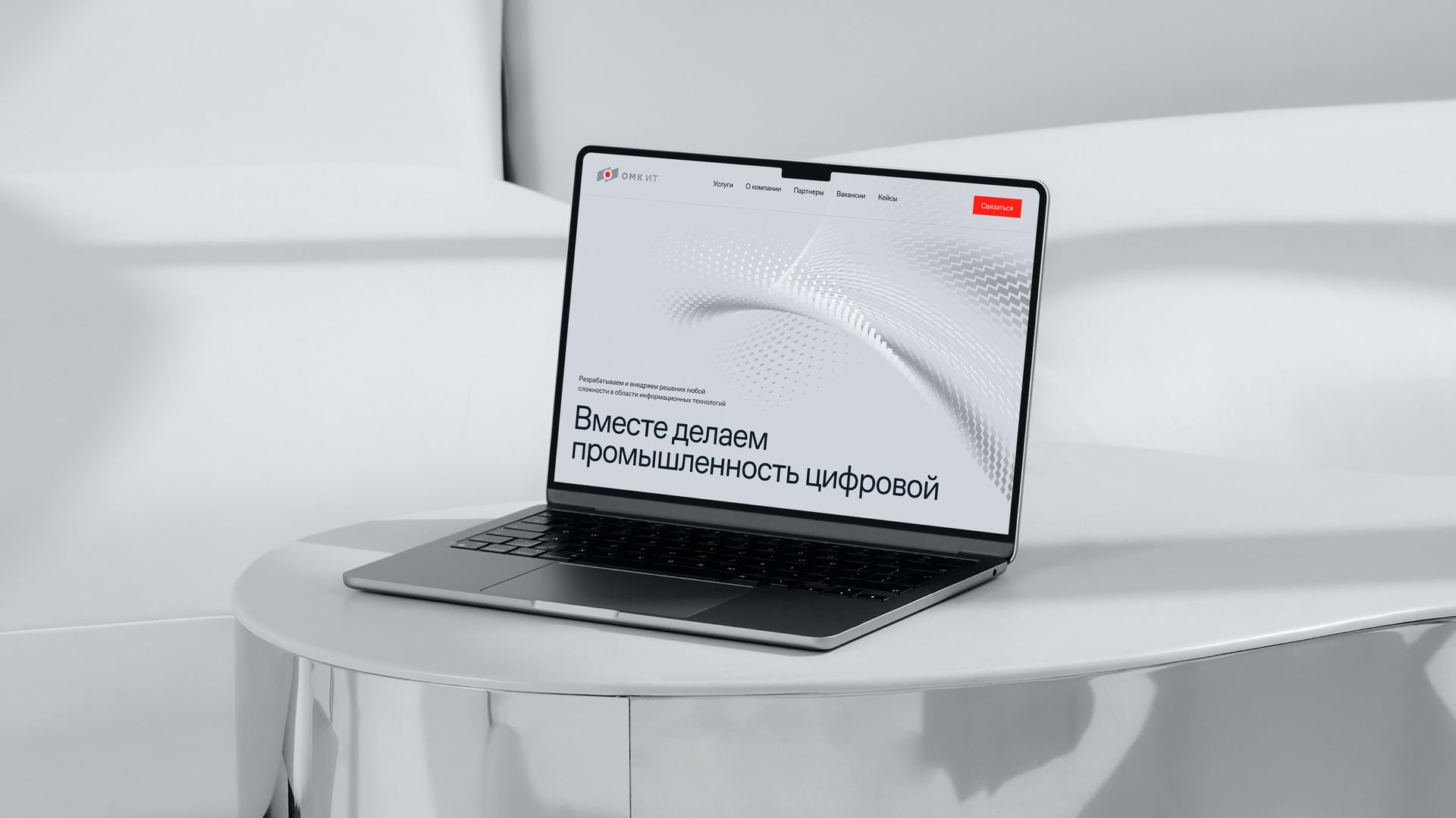
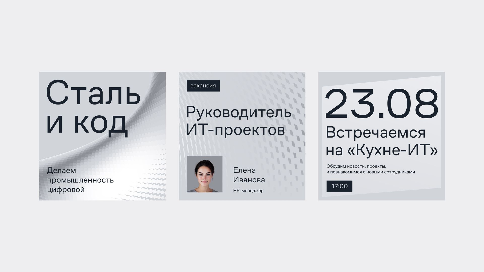
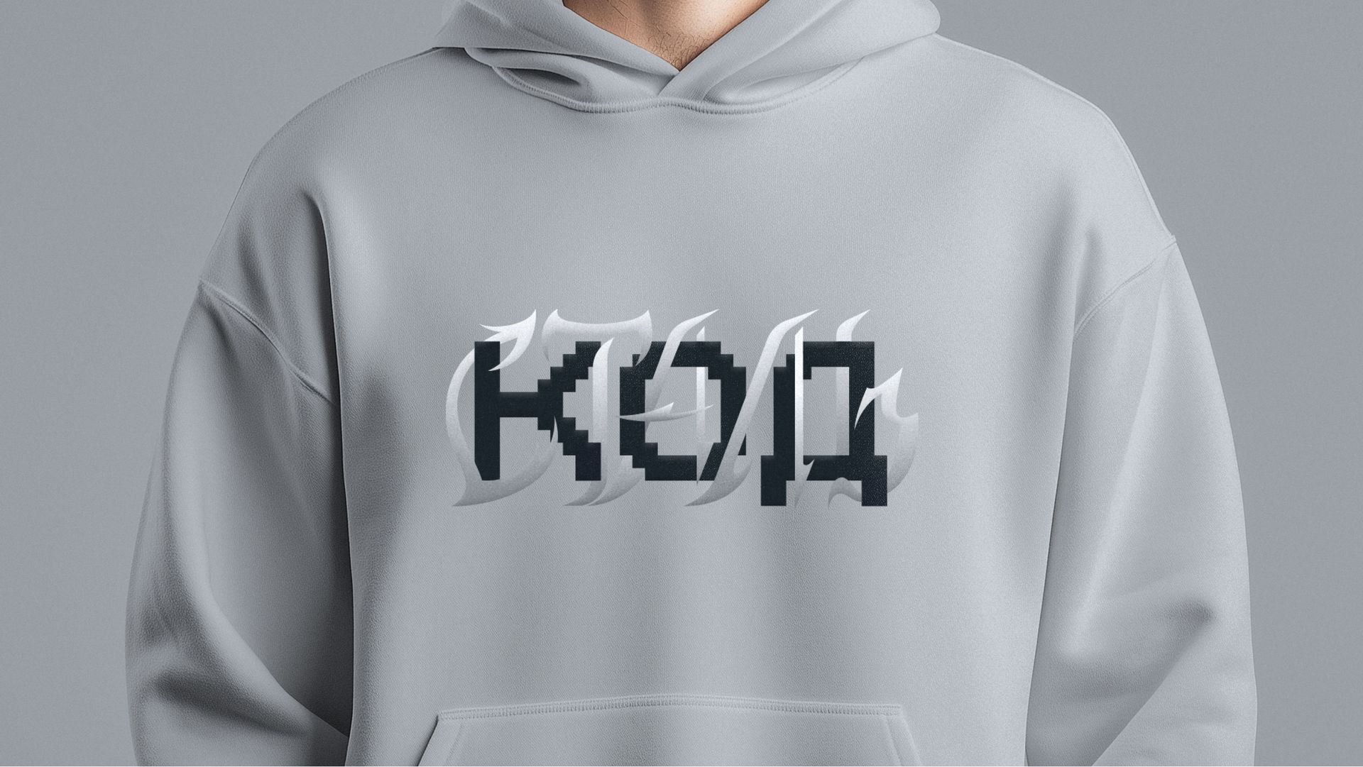
Three-dimensional graphics give the layouts depth and a technological mood. Concise typography works through contrast, emphasizing rationality and practicality.
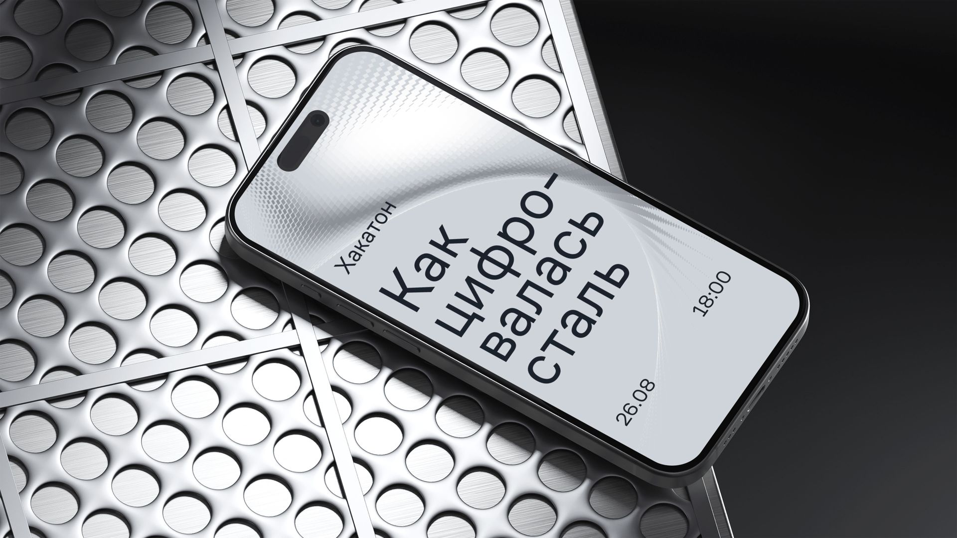
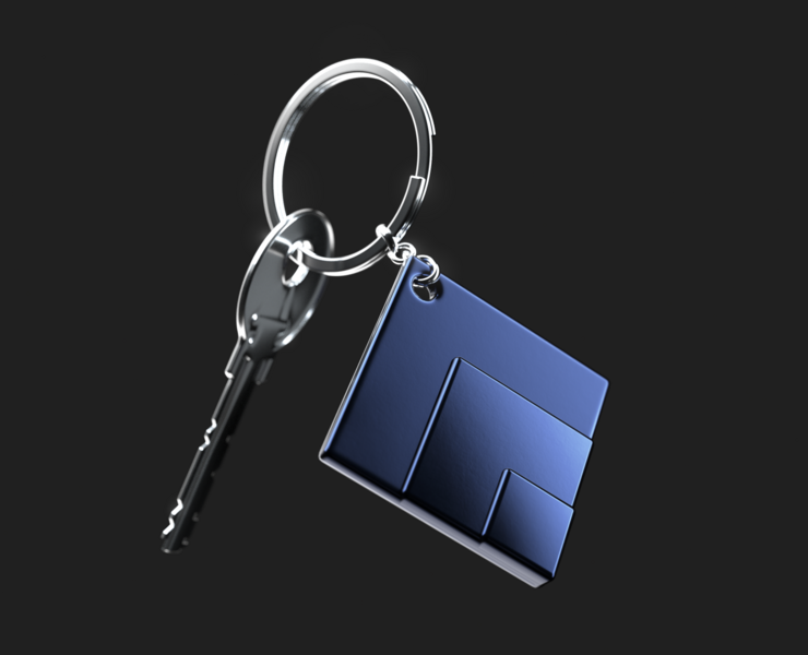
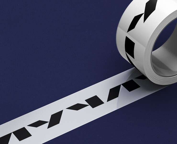
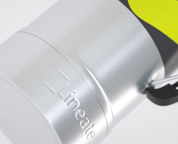
Physical media let us play out the concept in material form, through the use of metallic textures.
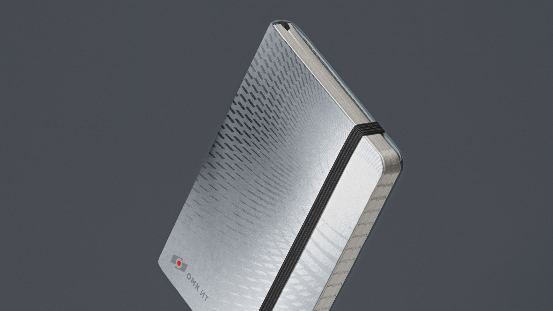
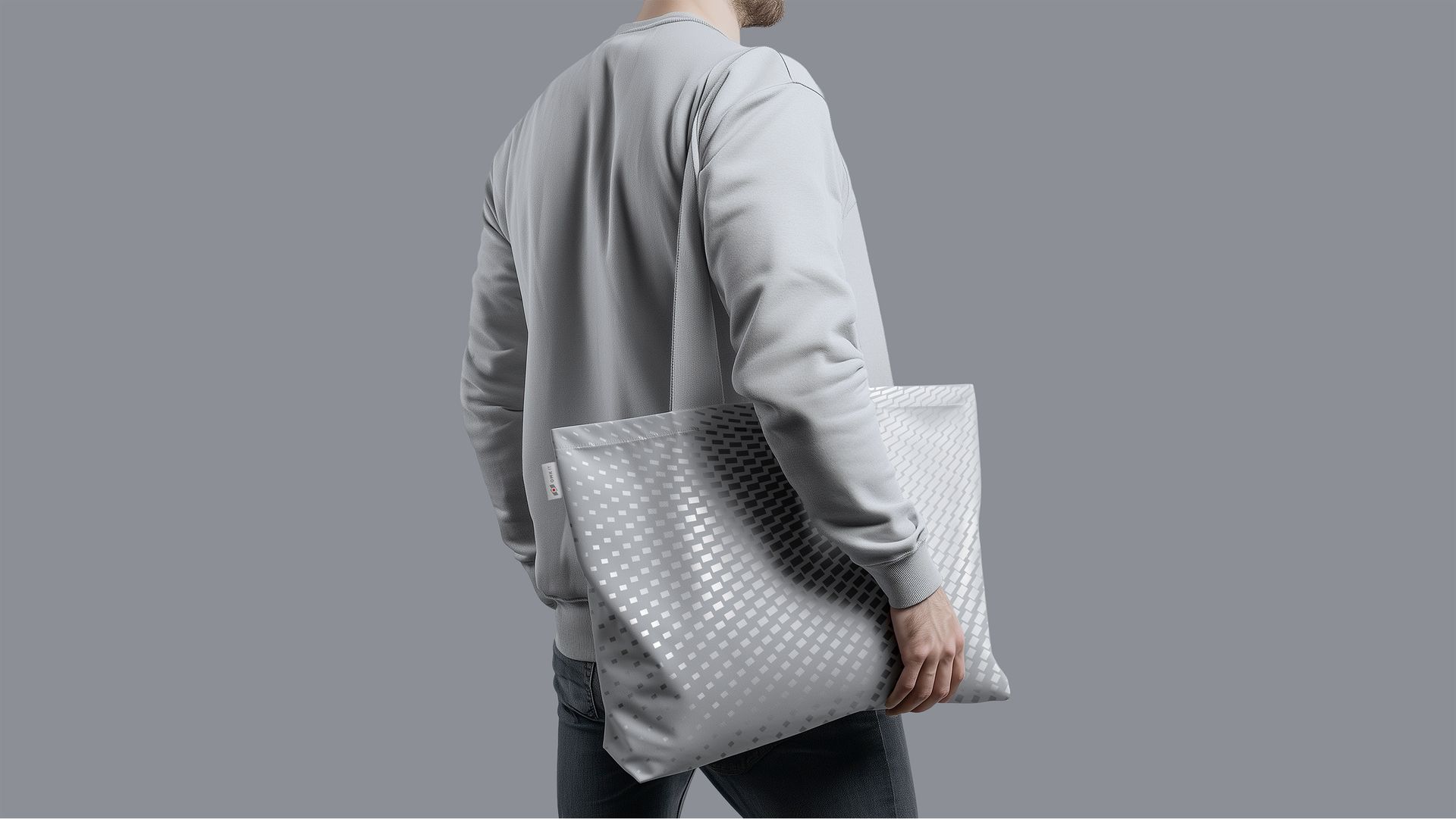
In core communications, the brand identity carries a professional, expert character. But there's room for drive, too. In internal communications, the brand can behave more emotionally — joking and being ironic.
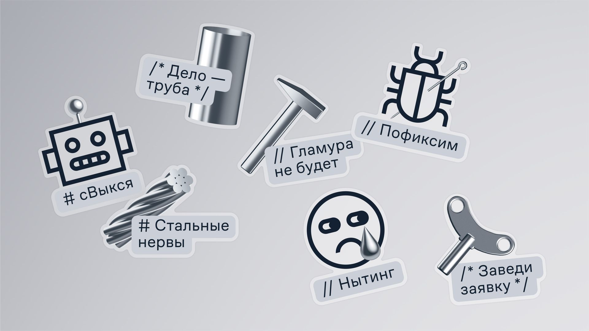
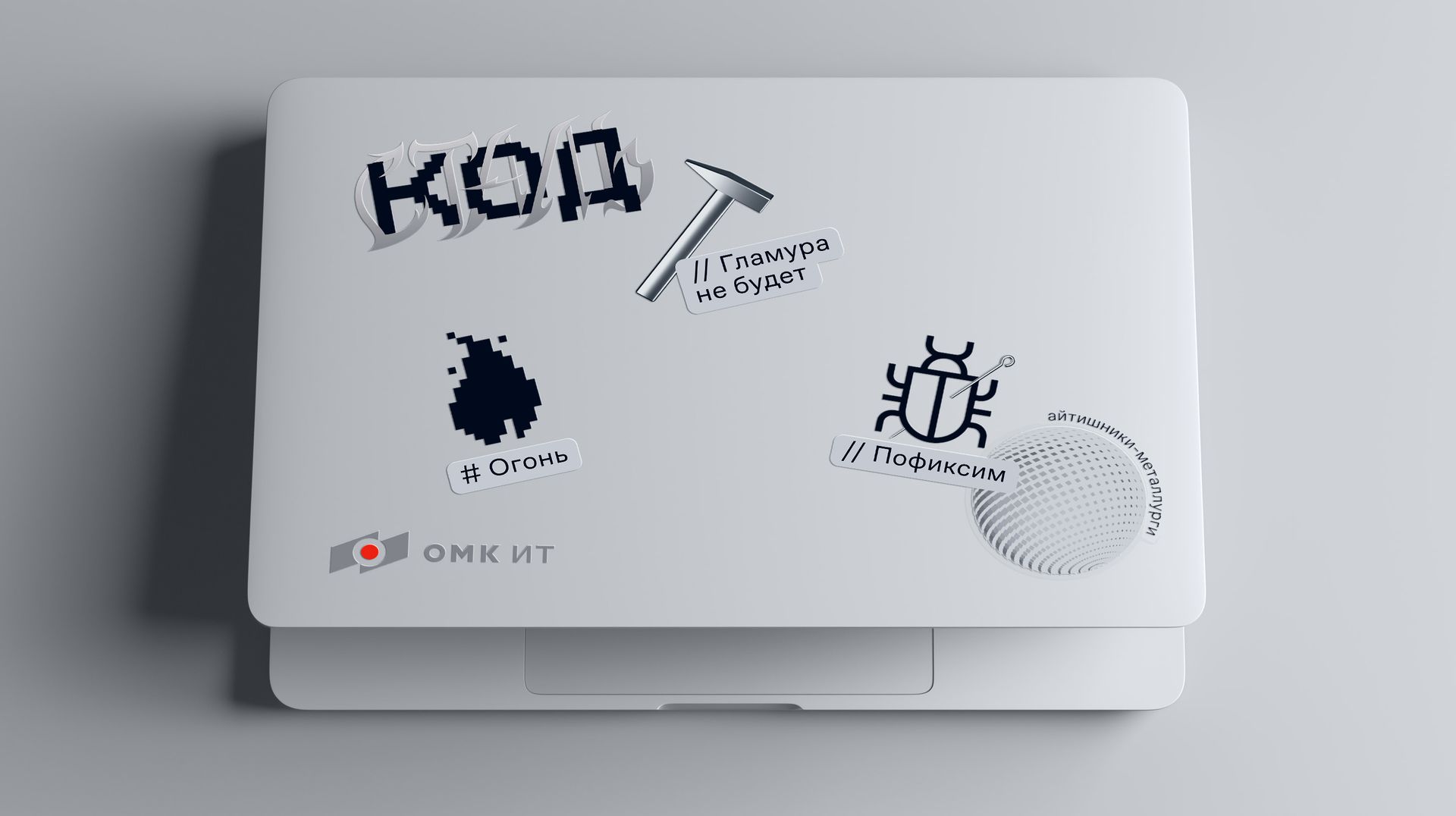
Project Team
Directors — Masha Sreda, Lera Gerus
Account Manager — Vanya Alekseev
Producer — Diana Yu, Lera Gerus, Nastya Babich
Brand Strategist — Olya Yakushenko
Communication Strategist — Anya Gabysheva
Creative — Katya Sukhikh
Copywriter — Anya Khudyakova
Art Director — Pasha Konyukov
Designer — Alyona Vinogradova
Case Assembly & PR — Katya Burtseva, Nastya Bubentsova, Anait Sarkisyan